Create a FREE Account
Instant access to 1,000+ real slides from top companies like McKinsey, BCG, Goldman Sachs, Google and many more!
First Name
Last Name
Email
Password
I agree to all
Terms & Privacy Policy
Thank you! Your submission has been received!
Oops! Something went wrong while submitting the form.
Have an account?
Sign in
Library
Templates
Courses
Pricing
My Account
My Slides
My Templates
✦ AI
AI Prompt Library
AI Search
Sign in
Start Here
Logout
My Saved Slides
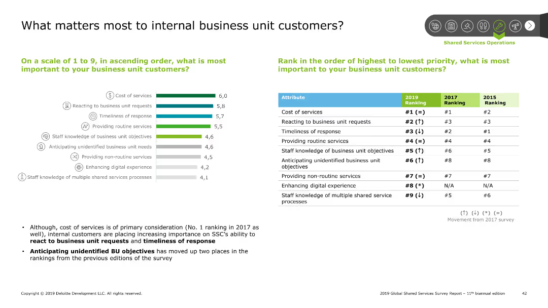
The slide features a combination of a column chart and a table. The column chart ranks importance factors for business unit customers, and the table shows rankings by year.
Customer and Market Segmentation
Professional Services
This slide identifies and ranks the factors most important to internal business unit customers, including cost of services and responsiveness, based on survey results.
Business unit customers, importance factors, ranking, survey
Mixed Chart
Deloitte
Saved
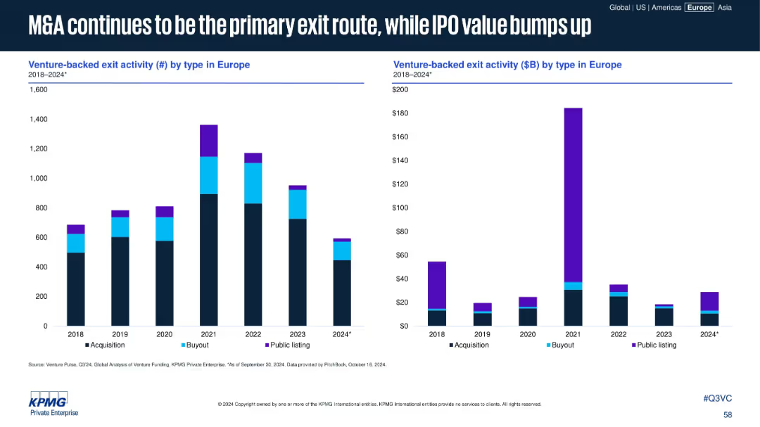
Two bar charts: Left (exit count by type), Right (exit value by type) from 2018–2024
Mergers and Acquisitions
Financial Services
This slide categorizes exit types by count and value. M&A remains the dominant path, but 2024 shows a renewed increase in IPO value, hinting at a reawakening public market despite fewer listings overall.
exit strategy, M&A, IPO, acquisition, venture-backed exits
Multiple Chart
KPMG
Saved
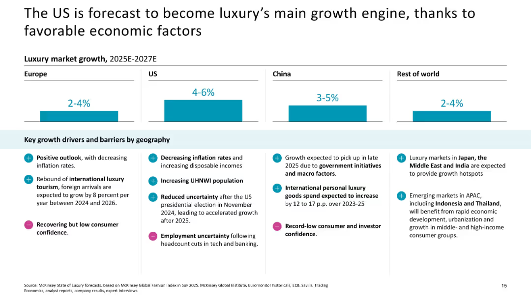
Column bar chart with regional growth forecasts and supporting bullet points
Strategic Planning
Consumer Goods
The slide forecasts the US as the primary growth driver for luxury between 2025–2027, citing lower inflation, political stability, and increased wealth, while noting regional barriers.
US market, economic drivers, forecast, inflation, UHNWIs, macro factors, regional barriers
Mixed Chart
McKinsey
Saved
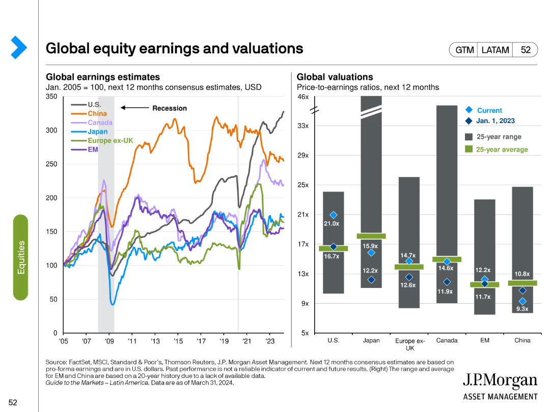
This slide includes a line chart for global earnings estimates and a bar chart for global valuations. Different colors represent various regions and time periods, highlighting trends and comparisons.
Financial Performance
Financial Services
It provides a comparison of earnings estimates and valuation metrics across global equity markets, helping to identify trends and potential investment opportunities based on relative valuations.
Global equities, earnings estimates, valuations, comparative analysis, trends
Multiple Chart
JP Morgan
Saved
The slide has a column chart showing the share of renewables in global power generation from 1995 to 2050, with different scenarios highlighted on the right.
Market Analysis and Trends
Energy & Utilities
The slide projects the growth of renewable energy in power generation, emphasizing the increase in wind and solar power.
renewables, power supply, energy, wind, solar, 2035
Mixed Chart
McKinsey
Saved
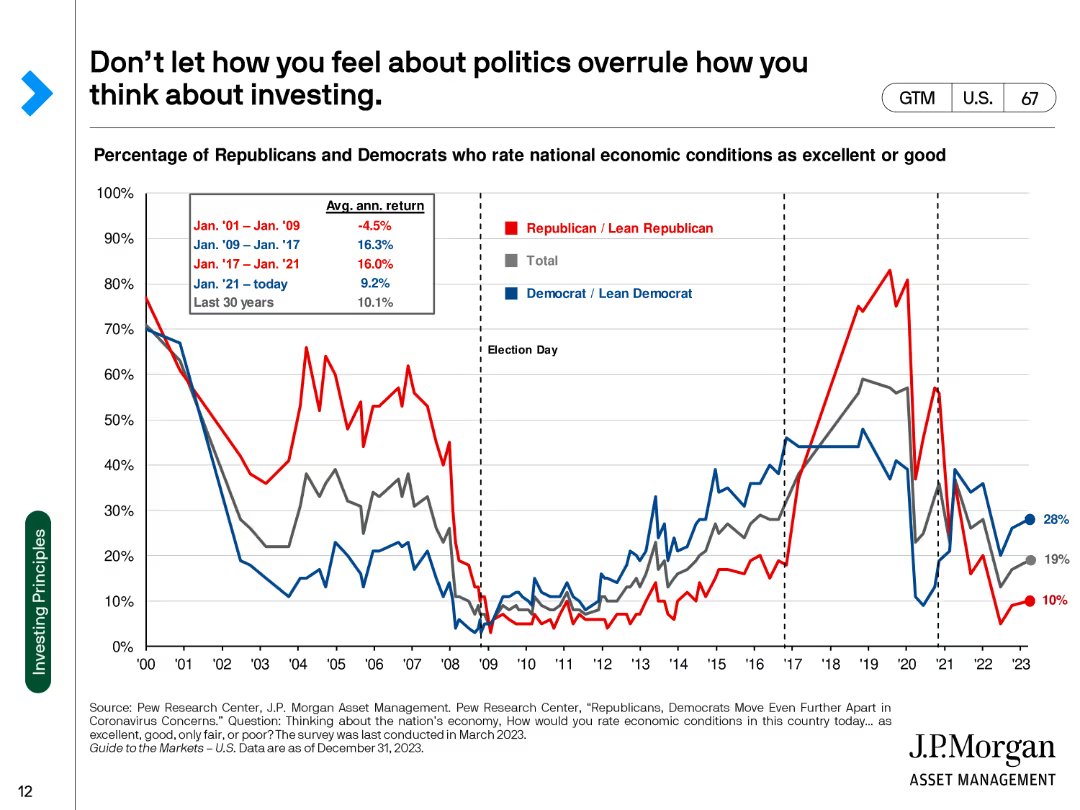
The slide contains a line chart showing the percentage of Republicans and Democrats who rate national economic conditions as excellent or good from 2000 to 2023.
Market Analysis and Trends
Financial Services
This slide analyzes the correlation between political affiliation and perception of national economic conditions, emphasizing that investment decisions should not be influenced by political biases.
Politics, Investing, Economic Conditions, Perception, Analysis
Single Chart
JP Morgan
Saved
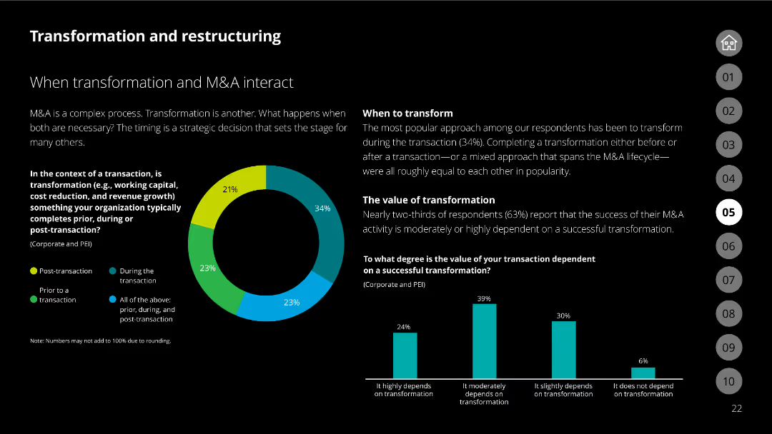
Slide with a pie chart and column charts, detailing the interaction between transformation and M&A. Highlights approaches and dependency on successful transformation.
Mergers and Acquisitions
Financial Services
This slide explores the relationship between transformation and M&A, presenting data on timing, transformation dependency, and the value placed on successful transactions.
M&A, transformation, interaction, timing, value, dependency, charts, pie chart, column chart
Multiple Chart
Deloitte
Saved
The slide features a circular flow chart with the text "Developer Focus" at the center. Surrounding elements include "API", "Trading Execution", and "Loans and Deposits". Icons represent corporations, institutions, and individuals.
Technology and Digital Transformation
Technology & Software
Showcasing Goldman Sachs' focus on serving developers by providing APIs and emphasizing the importance of technology in the financial sector. Services such as transaction banking and the Marcus platform are highlighted, illustrating a client-centric approach.
developers, APIs, banking, technology, Marcus
Diagram
Goldman Sachs
Saved
A diagram with three categories (breadth, scale, and insights) and their sub-components, representing the asset and wealth management capabilities of the firm.
Product and Service Analysis
Financial Services
An overview of the asset and wealth management services offered by the firm, categorizing them into breadth, scale, and insights. It showcases the firm's diverse asset management portfolio and its approach to providing comprehensive client solutions.
asset management, wealth management, client solutions, service analysis, comparative layout
Pillar
Goldman Sachs
Saved
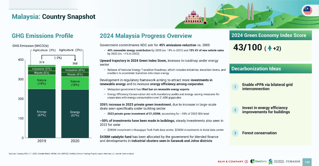
Dual-column layout with emissions bar chart on left and progress summary on right; includes index score and decarbonization ideas in boxes.
Strategic Planning
Government & Public Sector
The slide summarizes Malaysia’s GHG emissions profile and outlines the 2024 progress on decarbonization. It highlights emission reduction targets, the growth in green investment, regulatory updates, and presents a Green Economy Index Score of 43/100. Decarbonization strategies include vPPA enablement, building energy efficiency, and forest conservation.
Malaysia, emissions, decarbonization, energy efficiency, forest, vPPA, 2024, policy, Green Index
Mixed Chart
Bain
Saved
This slide features a line chart showing operational demand data across different scenarios, with a simple white background and minimal text explanations.
Market Analysis and Trends
Energy & Utilities
Presents data on operational demand scenarios for the NEM from AEMO’s 2019 Input, highlighting the model's approach and predictions over various timelines.
operational demand, NEM, AEMO, scenarios, energy, utilities, line chart
Mixed Chart
EY
Saved
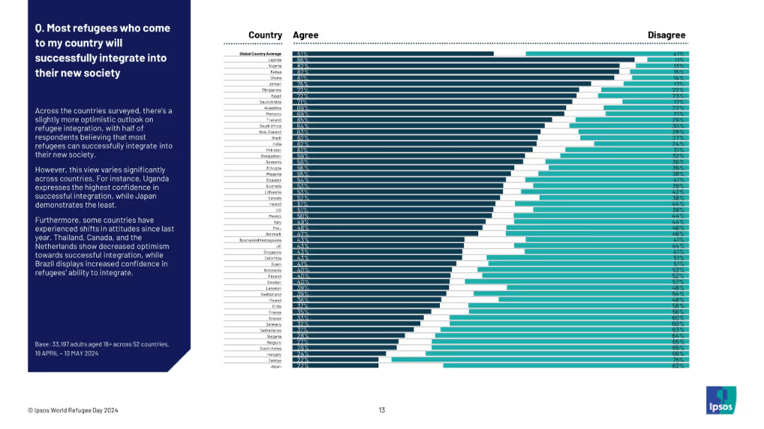
Ranked horizontal bar chart of countries by % agreement. Country names and bars on right; explanatory text on left side of slide.
Human Resources and Talent Management
Government & Public Sector
This slide explores confidence in refugee integration across countries. Uganda shows the highest agreement (63%), while Japan is lowest (27%). The global average is 51%, indicating a slightly optimistic but mixed global perspective. Regional and national variations highlight areas of perceived challenge or success in refugee integration.
integration, refugees, global trust, Ipsos survey, societal acceptance, immigration, cultural adjustment, country ranking, perception
Mixed Chart
IPSOS
Saved
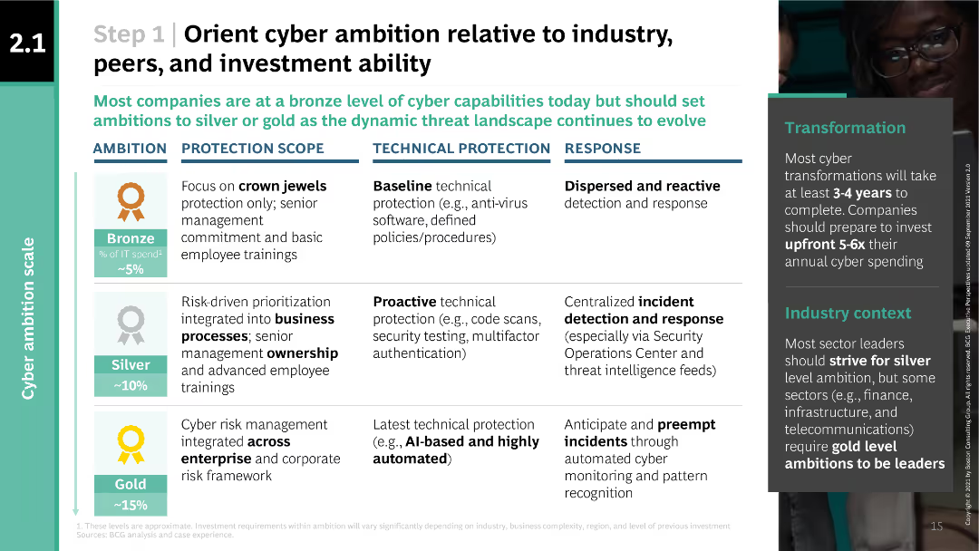
The slide features a table outlining different levels of cyber ambition (bronze, silver, gold) and their corresponding protection scope, technical protection, and response measures.
Strategic Planning
Professional Services
This slide helps organizations align their cyber ambition with industry standards, peer benchmarks, and investment capabilities. It provides detailed descriptions of bronze, silver, and gold levels of cyber ambition and their respective cybersecurity measures.
cyber ambition, industry standards, investment, protection scope, technical protection, response measures, BCG
Table
BCG
Saved
Consists of multiple bar charts comparing factors influencing employee turnover.
Human Resources and Talent Management
Professional Services
Offers insights into the drivers of employee turnover, valuable for developing effective retention strategies.
Employee Turnover, Retention Strategies, Job Satisfaction, HR Management, Workforce Analysis
Single Chart
PwC/Strategy&
Saved
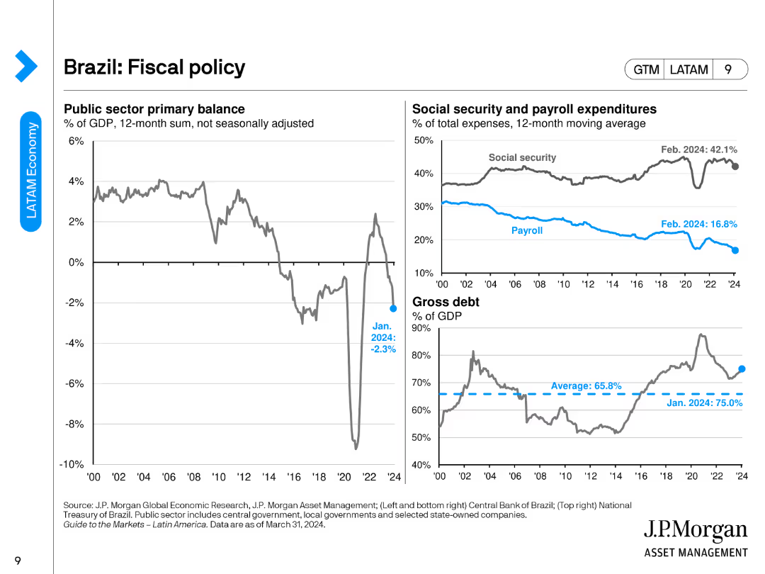
The slide features a line chart showing the public sector primary balance, a combined line/bar chart for social security and payroll expenditures, and a line chart depicting gross debt as a percentage of GDP.
Regulatory and Compliance
Financial Services
The slide presents Brazil's fiscal policy overview, including public sector balance, social security, payroll expenditures, and gross debt metrics.
Brazil, fiscal policy, public sector balance, social security, gross debt
Multiple Chart
JP Morgan
Saved
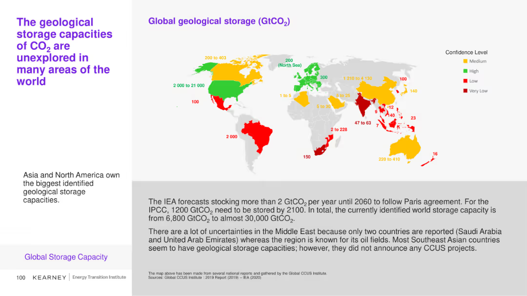
This slide includes a map and a bar chart illustrating the global geological storage capacities of CO2 with varying confidence levels across different regions. Color coding (green, yellow, red) indicates confidence levels.
Market Analysis and Trends
Environmental Services & Sustainability
The slide explores the identified geological storage capacities for CO2 globally, emphasizing areas with the highest potential and the uncertainties in certain regions like the Middle East.
CO2 storage, geological capacity, global map, confidence levels
Graphic
Kearney
Saved
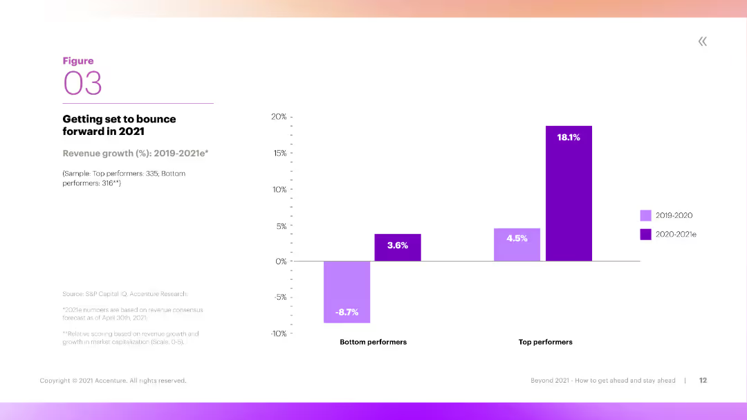
This slide includes a column chart comparing revenue growth rates of bottom performers and top performers over two periods. The chart is clear, with different colors representing different time periods and performance levels.
Market Analysis and Trends
Financial Services
The slide highlights the anticipated revenue growth for 2021, showing the difference between bottom and top performers. It indicates that top performers are expected to see significant growth, rebounding strongly from previous lows.
Revenue Growth, Performance, Top Performers, 2021, Comparison
Mixed Chart
Accenture
Saved
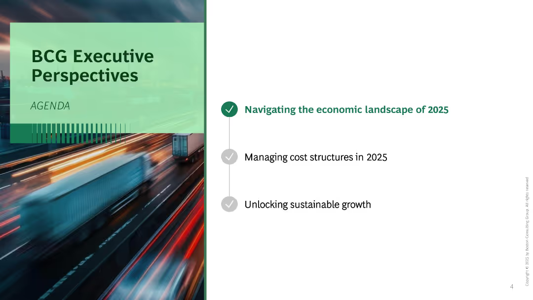
Split layout with blurred motion background photo on the left and agenda list on the right. Three bullet points listed vertically with one highlighted.
Industry Overview
Professional Services
This is an agenda slide introducing three focus areas for the presentation: economic landscape, cost structure, and sustainable growth in 2025. A motion-blurred image of trucks on a highway implies urgency or transformation.
agenda, executive perspective, 2025, growth, economy, transformation, BCG
Agenda
BCG
Saved
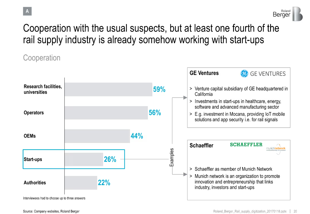
Horizontal bar chart of cooperation partners; side notes with examples (GE Ventures, Schaeffler)
Strategic Planning
Transportation & Logistics
Demonstrates the rail supply industry's cooperation landscape, noting that startups are emerging partners alongside universities, OEMs, and operators. Provides real-world examples of collaboration.
rail industry, cooperation, startups, innovation, GE Ventures, Schaeffler, ecosystem, collaboration strategy
Mixed Chart
Roland Berger
Saved
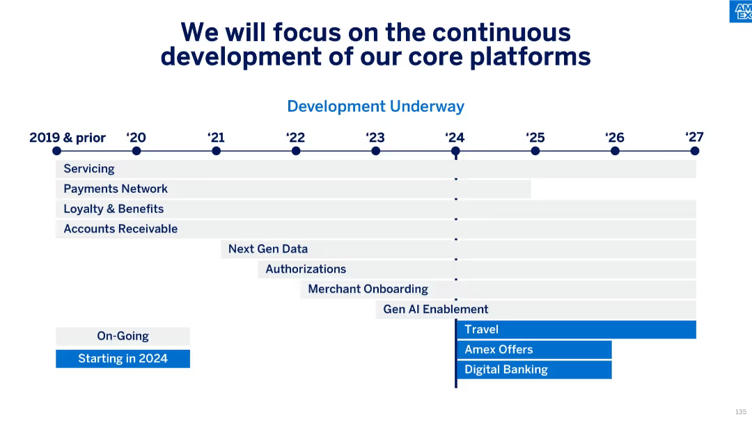
Timeline diagram mapping multi-year platform development initiatives from 2019 to 2027, categorized by function (e.g., Servicing, Payments Network, Gen AI Enablement), with new initiatives starting in 2024.
Technology and Digital Transformation
Technology & Software
This roadmap slide outlines key platform developments over time, highlighting areas such as payments, servicing, AI enablement, and onboarding. Several strategic initiatives begin in 2024, including digital banking and Amex Offers, showing a continued commitment to tech evolution.
core platforms, roadmap, platform development, AI enablement, digital banking, tech investment, transformation, timeline
Table
McKinsey
Saved
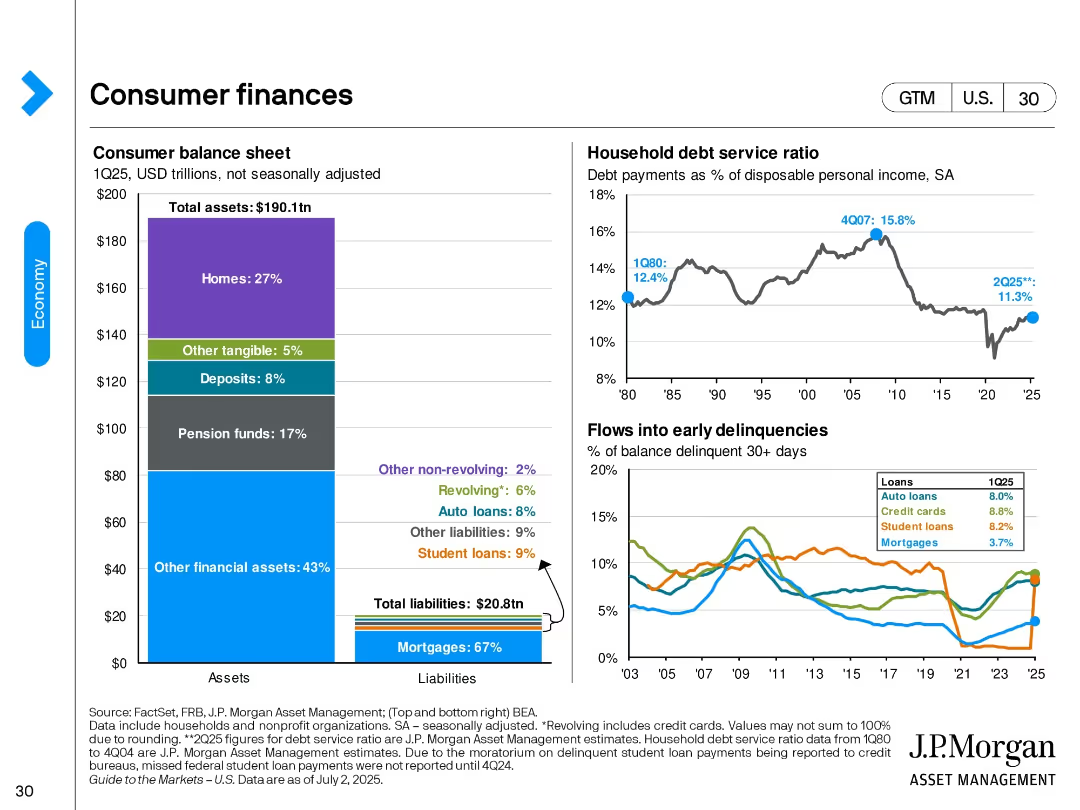
Three-panel design: asset/liability bar chart, household debt service line graph, and delinquency line graph segmented by loan type.
Performance Metrics and KPIs
Financial Services
This slide reviews the U.S. consumer balance sheet for 1Q25, debt service ratio trends, and delinquency rates by loan type. It shows a stable financial position with manageable debt levels and an increase in auto and credit card delinquencies.
consumer debt, household finance, delinquencies, mortgages, loans, balance sheet, debt ratio, financial health
Multiple Chart
JP Morgan
Saved
US map in hexagonal tile format; color coded by case rates; comparison of Oct 01 and Nov 01, 2020; arrows show progression.
Risk Assessment and Management
Healthcare & Pharmaceuticals
This slide illustrates the change in US state-level COVID-19 cases over a month using a hex map. Each tile’s color shows incidence rate per 100k people, highlighting the geographical shifts in case burden over 30 days.
COVID-19, US states, incidence rate, map, time comparison, healthcare, McKinsey
Single Chart
McKinsey
Saved
The slide is split into two main sections, with a red theme. On the left, bullet points are aligned vertically, detailing the SASB standard. On the right, bullet points explain the TCFD standard, alongside their respective logos.
Financial Performance
Industrial & Manufacturing
This slide explains LANXESS’s improvement in reporting standards according to SASB and TCFD, outlining key performance indicators and acknowledging the need for better climate-related financial disclosures.
LANXESS, SASB, TCFD, sustainability, reporting standards, climate-related disclosures, KPIs, financial information, environmental, governance
Table
Morgan Stanley
Saved
This slide includes column charts comparing operational costs and volumes in various financial services from 2017 to 2022.
Operational Efficiency
Financial Services
Highlights JP Morgan's operational efficiency gains in key areas like cash payments, equities trading, and fund services over five years. It showcases how strategic operational management has enabled them to handle significant volume growth without proportionate increases in costs.
operational, efficiency, cost, volume
Mixed Chart
JP Morgan
Saved
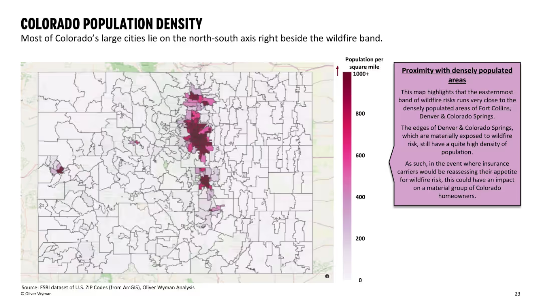
Heatmap-style ZIP code map showing population per square mile with a pink-to-purple gradient, paired with text commentary.
Market Analysis and Trends
Government & Public Sector
Highlights that Colorado’s urban centers lie adjacent to high wildfire risk areas. The map emphasizes potential insurance impacts on populated regions like Denver and Colorado Springs.
population density, wildfire adjacency, Denver, Colorado Springs, urban risk
Mixed Chart
Oliver Wyman
Saved
Previous
Next
If nothing, comes up, please save your slides first
Create a FREE account to continue browsing
Receive Instant Access to 1,000+ slides from companies like McKinsey, Google, and Goldman Sachs
First Name
Last Name
Email
Password
I agree to all
Terms & Privacy Policy
Thank you! Your submission has been received!
Oops! Something went wrong while submitting the form.
Have an account?
Sign in
Column Chart
Heatmap
Chevron
Org Chart
Infographic
Callouts
Timeline
List
Graphic
Picture
Process Flow
Diagram
Paragraph
Map
Table
Framework
Subtitle
Takeaway Box
Icon
Other Chart
Radar Chart
Waterfall Chart
Mekko Chart
Pie Chart
Scatter Plot
Line Chart
Bar chart
Bullet points