Create a FREE Account
Instant access to 1,000+ real slides from top companies like McKinsey, BCG, Goldman Sachs, Google and many more!
First Name
Last Name
Email
Password
I agree to all
Terms & Privacy Policy
Thank you! Your submission has been received!
Oops! Something went wrong while submitting the form.
Have an account?
Sign in
Library
Templates
Courses
Pricing
My Account
My Slides
My Templates
✦ AI
AI Prompt Library
AI Search
Sign in
Start Here
Logout
My Saved Slides
Combination of table and column charts comparing sector performance, with emphasis on technology, financial, and communication sectors. Annotations explain key trends and figures.
Market Analysis and Trends
Financial Services
Evaluates year-over-year performance of critical economic sectors, providing a snapshot of industrial impacts on market capitalization.
sector performance, market analysis, economic trends
Mixed Chart
PwC/Strategy&
Saved
A column chart showing ownership model splits and a table detailing profitability across leasing, subscription, rental, and sharing models.
Market Analysis and Trends
Transportation & Logistics
Explores the rise of alternative vehicle ownership models, projecting potential growth and profitability of leasing, subscription, rental, and sharing models by 2035.
alternative ownership, leasing, subscription, rental, sharing
Mixed Chart
PwC/Strategy&
Saved
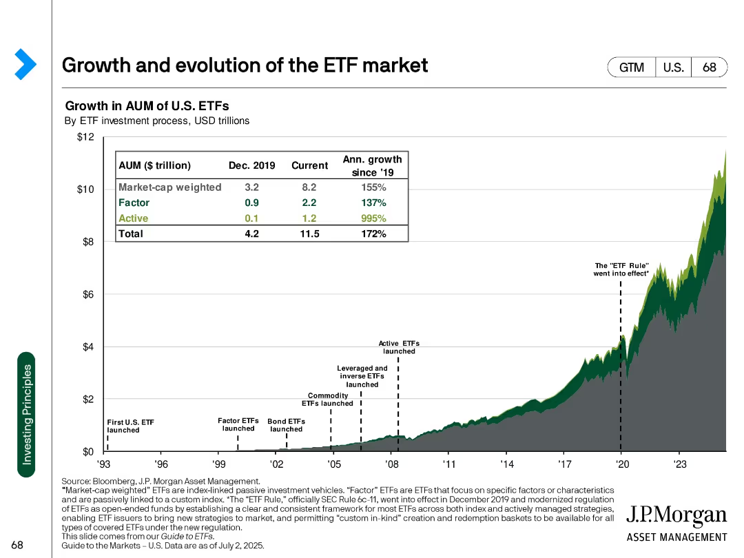
Line and area chart with annotation markers, table overlay showing AUM growth across ETF types
Market Analysis and Trends
Financial Services
Illustrates the historical growth of U.S. ETFs by investment strategy (market-cap weighted, factor, active) with notable regulatory milestones and growth metrics.
ETF, AUM, passive investment, market-cap, growth, regulation, active ETFs, factor, J.P. Morgan, U.S. market
Single Chart
JP Morgan
Saved
The slide features a column chart comparing world biofuel demand by fuel type (solid biofuels, liquid biofuels, CHP from waste, biogases) for 2017. It highlights the dominance of traditional biofuels and the distribution of advanced biofuels.
Market Analysis and Trends
Energy & Utilities
This slide provides an overview of world biofuel demand by different fuel types, emphasizing the overwhelming dominance of traditional biofuels and the distribution of advanced biofuels across various categories.
world biofuel demand, fuel type, traditional biofuels, advanced biofuels, 2017, solid biofuels, liquid biofuels, CHP from waste, biogases
Single Chart
Kearney
Saved
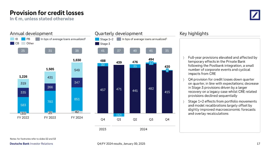
Two bar graphs showing annual and quarterly development of credit loss provisions. Segment categories and stage breakdowns shown.
Risk Assessment and Management
Financial Services
Shows Deutsche Bank’s annual and quarterly provisions for credit losses, including breakdown by segment and loan stage. Notes effects from Postbank integration and cyclical events. Q4 2024 saw a decline in Stage 3 provisions due to a legacy recovery.
credit losses, provision, risk, loan quality, Postbank, stage 3
Multiple Chart
Deutsche Bank
Saved
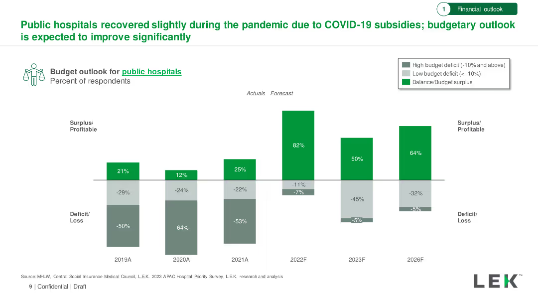
Bar chart showing budget outlook for public hospitals from 2019 to 2026, with actuals and forecasts. Includes surplus/deficit percentages.
Financial Performance
Healthcare & Pharmaceuticals
Analysis of the financial recovery of public hospitals during the pandemic, with an optimistic budget outlook forecasted through 2026.
Public Hospitals, Budget Outlook, COVID-19, Financial Recovery, Forecast
Single Chart
LEK
Saved
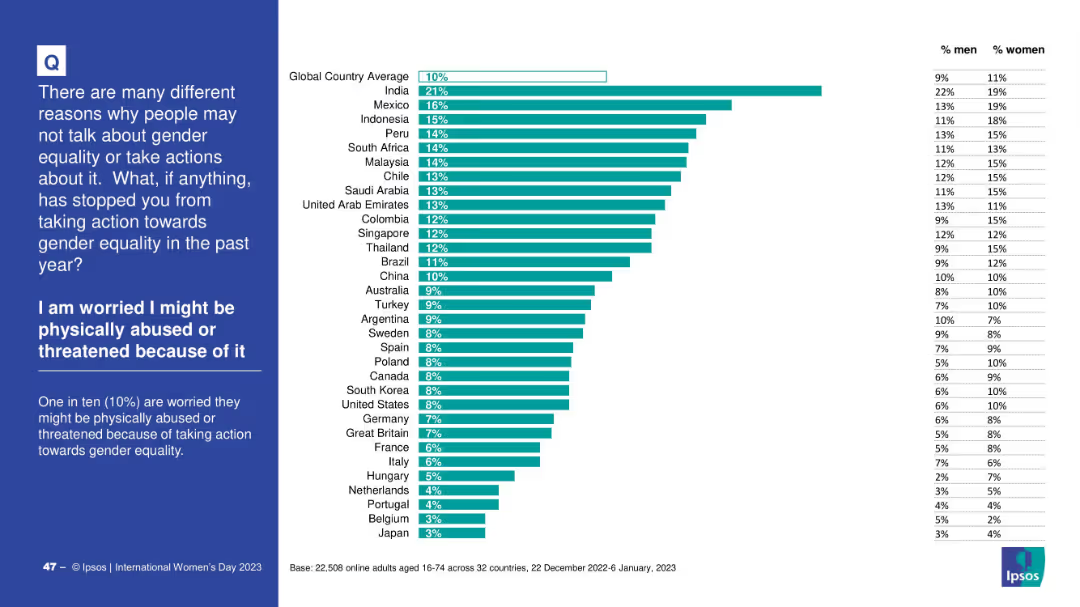
Horizontally ranked bar chart with % values by country and a gender split table on the right; left side panel in blue for context and explanation.
Risk Assessment and Management
Government & Public Sector
This slide shows the proportion of respondents by country who fear physical abuse or threats for taking action toward gender equality. India ranks highest at 21%. The global average is 10%, with a gender breakdown showing some differences.
threat, abuse, fear, gender equality, country comparison, survey data, risk, Ipsos
Mixed Chart
IPSOS
Saved
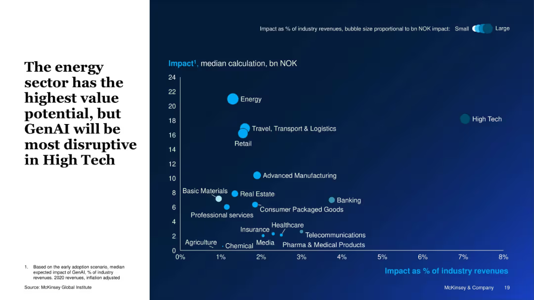
Bubble chart with axes showing impact as % of industry revenue vs. NOK value; bubble size represents overall impact.
Investment Analysis
Artificial Intelligence
This slide visually compares the expected GenAI impact across sectors. The energy sector offers the highest value (in NOK), while high tech is most disrupted (highest % revenue impact). Bubble sizes represent the magnitude of economic value potential.
Sector Impact, GenAI Disruption, Energy, High Tech, Value Potential, Bubble Chart, Revenue Impact, Industry Analysis
Single Chart
McKinsey
Saved
Two sets of vertical column charts comparing the returns of S&P 500 and MSCI World index sectors over different time periods (1 month, YTD, 1 year). Sectors include Communication Services, Discretionary, Staples, Energy, etc.
Market Analysis and Trends
Financial Services
Compares sector-wise returns for the S&P 500 and MSCI World indices over different time periods. Useful for analyzing sector performance and making informed investment decisions.
index sectors, S&P 500, MSCI World, sector analysis, return analysis, time periods
Multiple Chart
Morgan Stanley
Saved
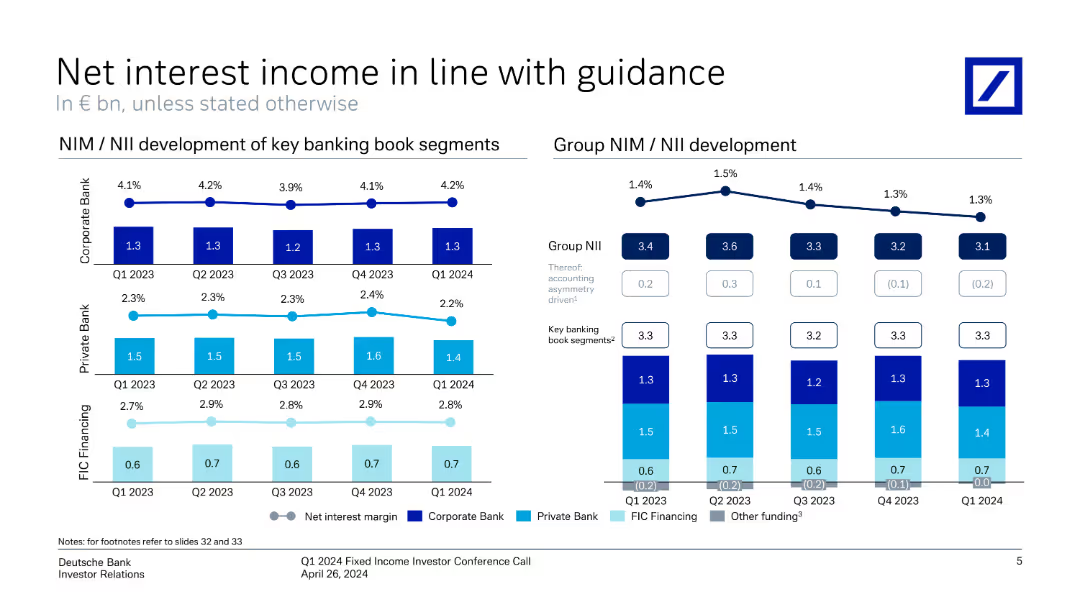
The slide features line charts and vertical column charts showing the development of net interest income and margins for different banking segments.
Financial Performance
Financial Services
The slide presents Deutsche Bank's net interest income and margin trends, showing alignment with guidance and segment performance from Q1 2023 to Q1 2024.
net interest income, financial guidance, banking segments, performance, Deutsche Bank, Q1 2024, investor relations, financial metrics, quarterly trends
Multiple Chart
Deutsche Bank
Saved
The slide is a content slide featuring a combination of text and a large pie chart illustrating the share of global GHG emissions by ETSs in 2022. The background is dark, with highlighted sections for emphasis on key points.
Regulatory and Compliance
Government & Public Sector
It explains the principles of carbon pricing, comparing ETS and carbon taxes, and discusses their implementation challenges and benefits. The slide includes data on the global GHG emissions covered by ETSs and insights into various countries' carbon pricing strategies to foster sustainability and emissions reduction.
Carbon Pricing, ETS, GHG Emissions, Regulatory, Compliance
Mixed Chart
EY
Saved
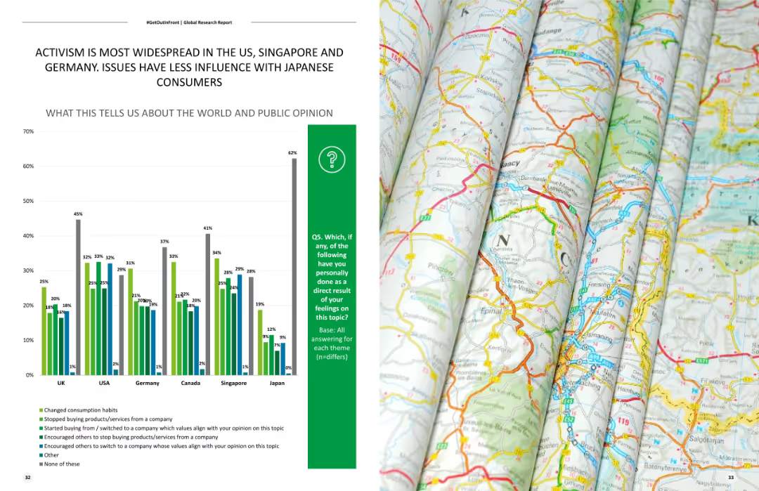
Shows a column chart comparing levels of activism across different countries, highlighting the differences in public engagement with various social issues.
Market Analysis and Trends
Government & Public Sector
Compares levels of activism across multiple countries, focusing on public engagement with social issues in the US, Singapore, Germany, and Japan.
Activism, country comparison, social issues, public engagement, market trends
Mixed Chart
Deloitte
Saved
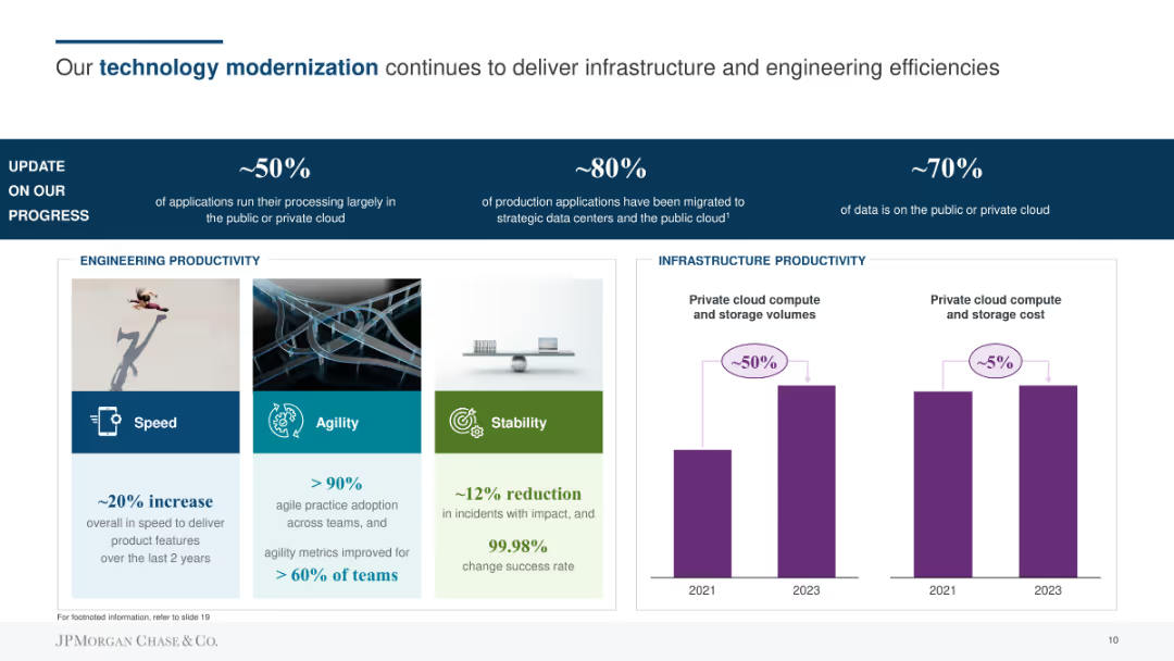
The slide contains a title with a blue underline, three sections highlighting percentages of progress in technology modernization, and a section with three visuals (speed, agility, stability) alongside column charts showing infrastructure productivity.
Technology and Digital Transformation
Financial Services
The slide details JPMorgan Chase & Co.'s technology modernization progress, focusing on application processing in the cloud, migration of production applications, and data storage. Highlights improvements in engineering and infrastructure productivity.
technology, cloud, infrastructure, productivity, progress
Mixed Chart
JP Morgan
Saved
This slide showcases a title at the top, a vertical axis dividing the slide into two parts, with the left side listing momentum drivers such as payments and logistics, and the right side displaying icons representing emerging enablers like ESG and digital inclusion. The layout is clean with a white background and contrasting blue and green elements.
Strategic Planning
Technology & Software
The slide emphasizes the progress in momentum drivers for the digital economy and introduces new enablers emerging for the 'Digital Decade'. It could be used to discuss strategic planning in various industries, assessing the progress and planning for the integration of these enablers to enhance digital transformation initiatives and sustainable growth.
Momentum Drivers, Progress, Digital Economy, ESG, Digital Inclusion, Data Infrastructure, Sustainable Growth, Strategic Planning
Header Horizontal
Bain
Saved
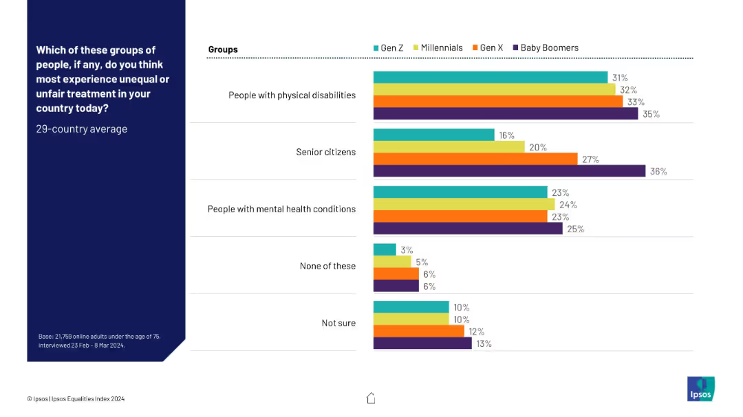
Bar chart with four color-coded generational groups (Gen Z, Millennials, Gen X, Baby Boomers), displaying perceived unfair treatment across various groups. Clean layout, left-aligned question, right-aligned bars.
Market Analysis and Trends
Government & Public Sector
This slide presents generational perceptions of which groups experience unfair treatment, with Baby Boomers consistently selecting "Senior citizens" and "People with physical disabilities" more than other groups. It shows slight generational variation in empathy or awareness levels toward marginalized groups.
discrimination, generational differences, public opinion, inequality, disability, senior citizens, mental health, survey, social justice, Ipsos
Mixed Chart
IPSOS
Saved
A column chart showing reasons for buying investments during the pandemic. There is a large 40% graphic to the left indicating the percentage of buyers, and a list of reasons with bars on the right.
Market Analysis and Trends
Financial Services
The slide explains why Canadian investors bought investments during the pandemic, highlighting regular contributions, undervalued assets, high returns, guarantees, lower risks, and other reasons.
investments, pandemic, buying, Canadian, reasons
Multiple Chart
IPSOS
Saved
This slide features multiple column charts and tables comparing IPO activities in the Shanghai, Shenzhen, Beijing, and Hong Kong stock exchanges.
Market Analysis and Trends
Financial Services
The slide highlights the IPO market performance in Mainland China and Hong Kong, showing data on the number of IPOs and proceeds, along with the top sectors for each stock exchange.
China IPO market, Hong Kong IPOs, stock exchanges, financial trends, sector analysis
Multiple Chart
EY
Saved
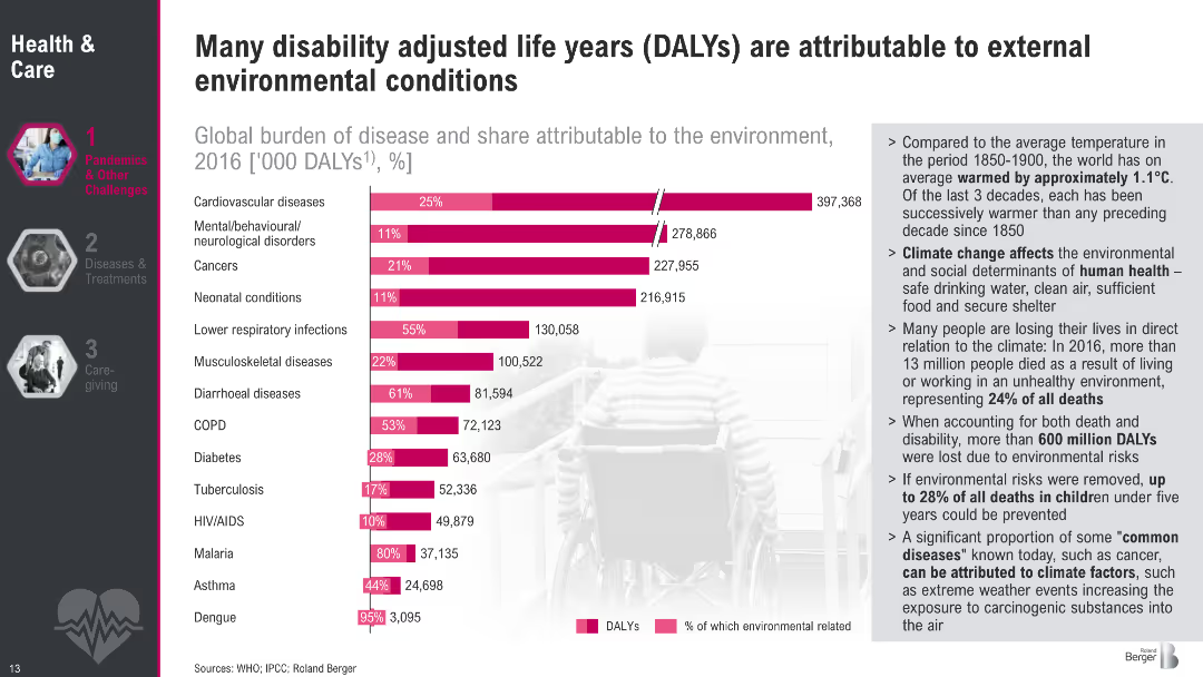
Bar chart comparing diseases and DALYs with pink bars indicating environmental attribution. Includes a sidebar with detailed bullet points on climate impact.
Performance Metrics and KPIs
Healthcare & Pharmaceuticals
The slide highlights the contribution of environmental factors to various diseases using DALYs. It shows that up to 28% of childhood deaths and over 600 million DALYs are due to environmental risks. Key diseases like cardiovascular issues and respiratory infections have large environmental components. Sidebar notes contextualize global warming and its impact on human health determinants such as air, water, and housing.
DALYs, environmental risks, disease burden, cardiovascular, respiratory, child mortality, WHO, climate impact
Mixed Chart
Roland Berger
Saved
Data visualization slide with charts and a photo, presenting statistics related to the report's findings on women's well-being.
Technology and Digital Transformation
Professional Services
Provides a visual representation of data regarding improvements and continuing challenges in women's well-being at work, emphasizing both progress and areas needing attention.
Data, Women, Well-Being, Progress, Challenges
Agenda
Deloitte
Saved
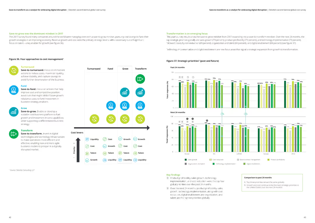
The slide has a comparative layout, listing four cost management strategies (turnaround, fund, grow, transform) with corresponding icons and a column chart comparing strategic priorities over the past and future 24 months.
Strategic Planning
Professional Services
The slide details different strategic approaches to cost management, highlighting key priorities such as liquidity, cost, talent, and growth. It shows survey results on top strategic priorities globally.
cost management strategies, strategic planning, liquidity, talent, growth, survey results
Multiple Chart
Deloitte
Saved
Contains three charts: a line chart of LatAm y/y real GDP (2019 Q4 = 100) from 2015-2025F, a column chart of 2024F y/y real GDP, and a line chart of LatAm employment.
Market Analysis and Trends
Financial Services
Examines Latin America's economic performance in 2023 and provides forecasts for 2024, highlighting GDP, employment trends, and economic challenges.
Latin America, GDP, Employment, 2024, Trends
Multiple Chart
EY
Saved
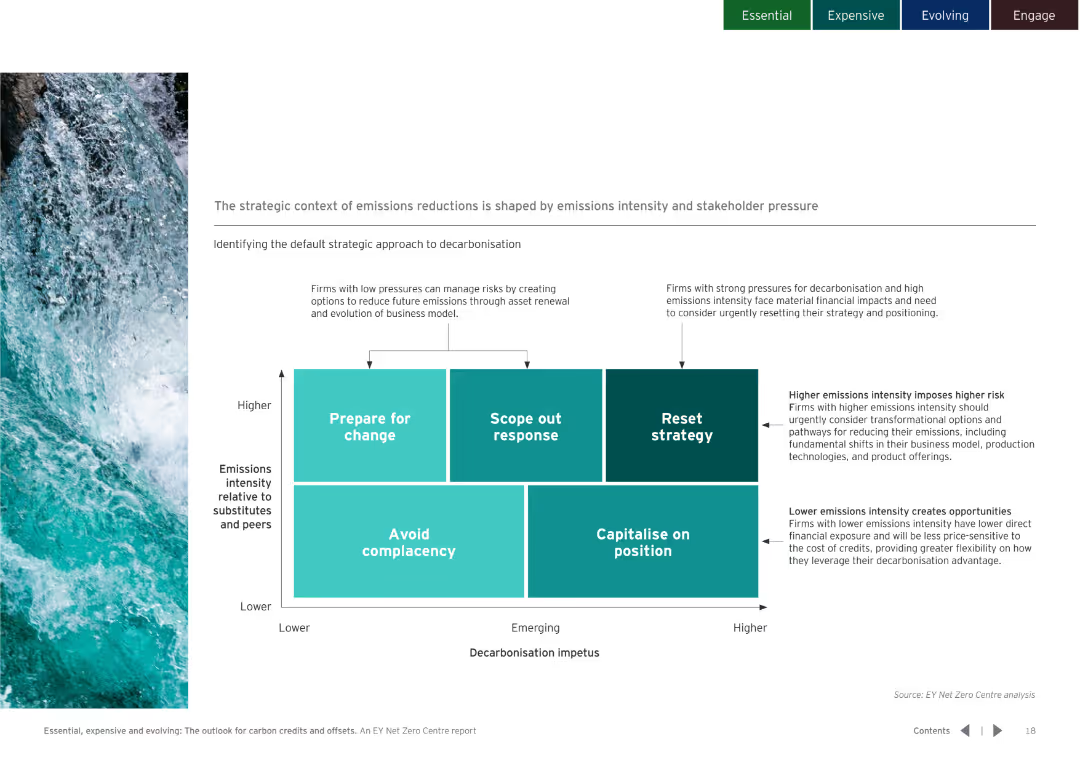
Includes a matrix diagram showing different strategic approaches to decarbonisation based on emissions intensity and stakeholder pressure.
Strategic Planning
Environmental Services & Sustainability
Identifies strategies for firms based on their emissions intensity and decarbonisation impetus, suggesting actions from preparing for change to capitalizing on position.
Emissions, reduction, strategy, decarbonisation, intensity, stakeholder, pressure, sustainability
Diagram
EY
Saved
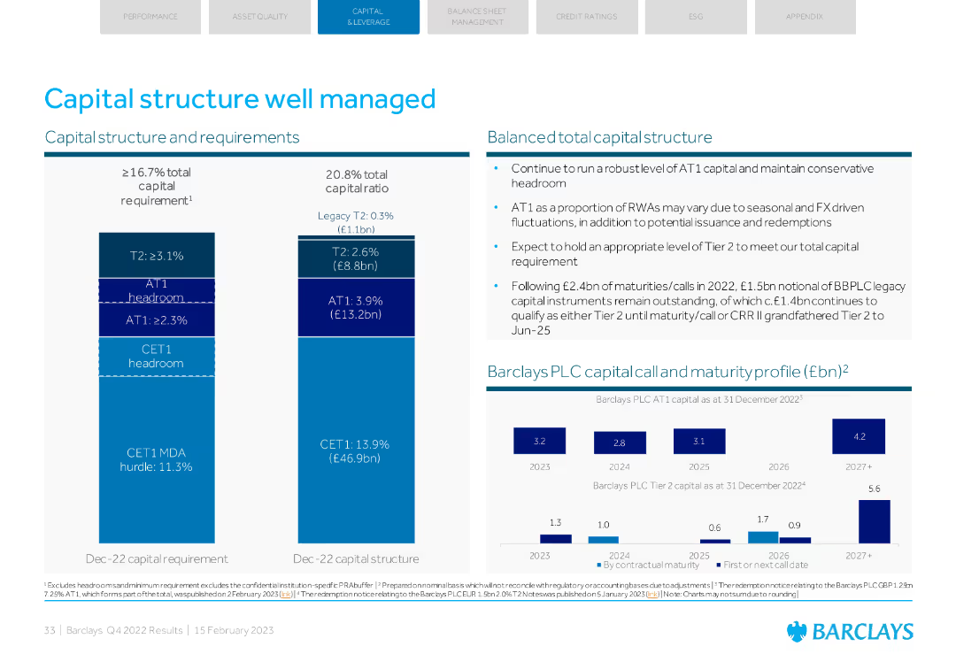
A detailed visual with column charts and text explaining capital structure and requirements, along with maturity profile.
Strategic Planning
Financial Services
Describes Barclays' capital structure, requirements, and balanced total capital structure. Includes maturity profiles and expectations for future capital requirements.
capital structure, requirements, maturity, total capital, planning
Multiple Chart
Barclays
Saved
A slide filled with various charts and graphs: pie charts for gender and age distribution, bar charts for income, and employment status, and a map showing the regional distribution of respondents.
Customer and Market Segmentation
Financial Services
Provides demographic information about the survey respondents, including gender, age, region, income, employment status, household composition, marital status, and education level.
demographics, gender, age, income, employment
Multiple Chart
IPSOS
Saved
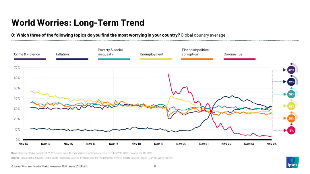
Multi-line graph with six colored trend lines tracking key global concerns over 10+ years.
Market Analysis and Trends
Professional Services
This slide visualizes long-term concern trends globally, showing the rise and fall of key issues such as crime, inflation, inequality, corruption, unemployment, and Covid-19. It captures the evolution of global anxieties and contextualizes present concerns within a longer historical frame.
global trends, concern evolution, long-term tracking, Ipsos, crime, inflation, unemployment, Covid-19
Multiple Chart
IPSOS
Saved
Previous
Next
If nothing, comes up, please save your slides first
Create a FREE account to continue browsing
Receive Instant Access to 1,000+ slides from companies like McKinsey, Google, and Goldman Sachs
First Name
Last Name
Email
Password
I agree to all
Terms & Privacy Policy
Thank you! Your submission has been received!
Oops! Something went wrong while submitting the form.
Have an account?
Sign in
Column Chart
Heatmap
Chevron
Org Chart
Infographic
Callouts
Timeline
List
Graphic
Picture
Process Flow
Diagram
Paragraph
Map
Table
Framework
Subtitle
Takeaway Box
Icon
Other Chart
Radar Chart
Waterfall Chart
Mekko Chart
Pie Chart
Scatter Plot
Line Chart
Bar chart
Bullet points