Create a FREE Account
Instant access to 1,000+ real slides from top companies like McKinsey, BCG, Goldman Sachs, Google and many more!
First Name
Last Name
Email
Password
I agree to all
Terms & Privacy Policy
Thank you! Your submission has been received!
Oops! Something went wrong while submitting the form.
Have an account?
Sign in
Library
Templates
Courses
Pricing
My Account
My Slides
My Templates
✦ AI
AI Prompt Library
AI Search
Sign in
Start Here
Logout
My Saved Slides
Multiple column charts show the change in assets under management (AuM) for Wealth Management, Swiss Bank, and Asset Management from 3Q22 to 4Q22.
Market Analysis and Trends
Financial Services
Details the impact of market events on asset management, with significant net asset outflows and adverse FX impacts, contributing to an 8% decrease in AuM.
assets under management, market events, net outflows, FX impact, financial services
Multiple Chart
Credit Suisse
Saved
Combines text with icons representing different learning strategies, alongside percentage data and top industry reporting.
Strategic Planning
Professional Services
Outlines methods for developing marketing skills, emphasizing in-house training and partnerships, key for strategic HR and capacity building.
skill development, in-house training, partnerships, industry focus, talent management
Table
Deloitte
Saved
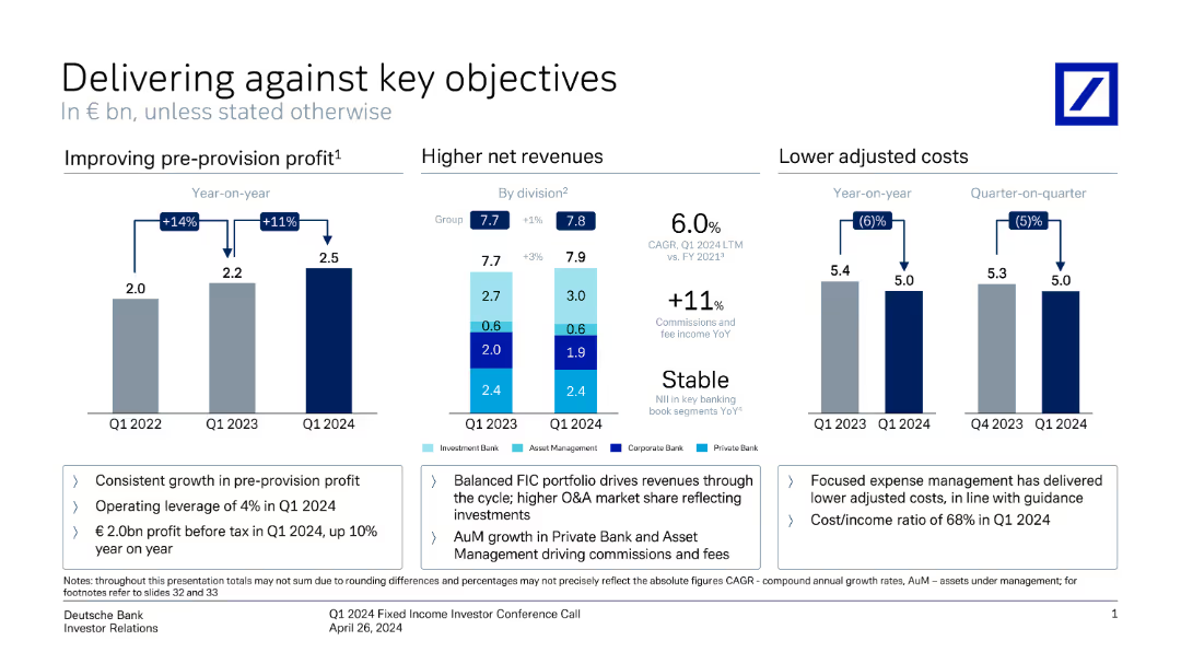
This slide contains three vertical column charts comparing pre-provision profit, net revenues, and adjusted costs over different periods. Annotations provide key metrics.
Financial Performance
Financial Services
It shows Deutsche Bank's performance metrics, highlighting improvements in profit, revenue, and cost management from Q1 2022 to Q1 2024.
profit, revenue, costs, financial performance, metrics, comparison, Deutsche Bank, investor relations, growth, Q1 2024
Multiple Chart
Deutsche Bank
Saved
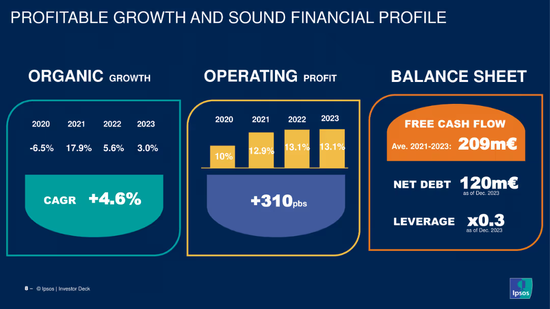
The slide features a three-column layout with data on organic growth, operating profit, and balance sheet metrics. Uses a combination of column charts and callouts.
Financial Performance
Financial Services
Shows the company's financial performance from 2020 to 2023 with metrics on organic growth, operating profit, and balance sheet, highlighting free cash flow and net debt.
growth, profit, balance sheet, financial performance, metrics
Mixed Chart
IPSOS
Saved
This slide shows a set of circular charts displaying Australian consumers' top values in healthcare, such as access to care, cost-effectiveness, and relief from pain and anxiety.
Market Analysis and Trends
Healthcare & Pharmaceuticals
It presents the top values Australian consumers hold in healthcare, emphasizing the importance of access to care, cost-effectiveness, and relief from negative experiences.
Australian consumers, healthcare values, access to care, cost-effectiveness, pain relief
Mixed Chart
EY
Saved
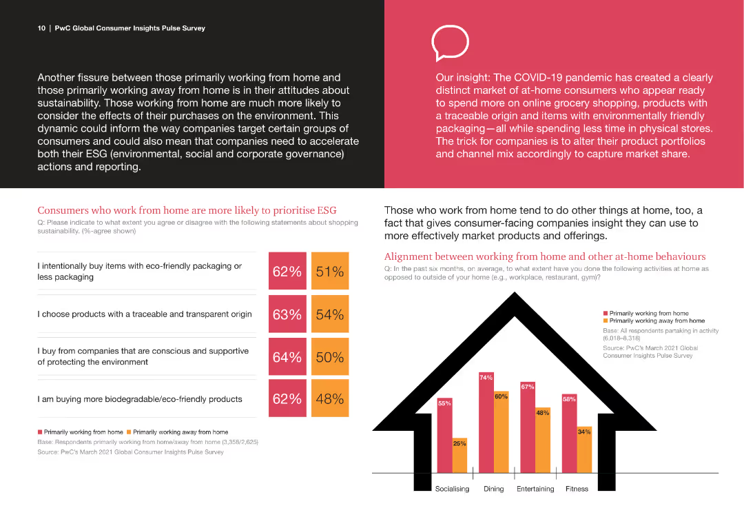
The slide features multiple elements, including text blocks, a column chart, and comparison statistics. The design uses a black background for text and bright colors for charts.
Market Analysis and Trends
Consumer Goods
The slide compares attitudes towards ESG among consumers who work from home vs. those who do not. It includes statistics on eco-friendly purchases and behaviors related to working from home.
ESG, Consumer Behavior, Remote Work, Sustainability, Market Trends
Mixed Chart
PwC/Strategy&
Saved
Contains a column chart comparing H2/CO ratios across different production methods, with key comments on the right explaining the implications of these ratios.
Technology and Digital Transformation
Energy & Utilities
Highlights the importance of the H2/CO ratio in hydrogen production, comparing different methods and discussing the impact on end applications and flexibility.
Hydrogen, CO ratio, production methods, flexibility, end applications
Mixed Chart
Kearney
Saved
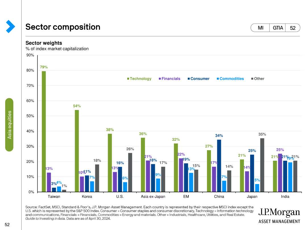
Column chart showing sector weights as a percentage of index market capitalization across different countries and regions.
Market Analysis and Trends
Financial Services
Analyzes the sector composition of various markets, focusing on the weight of sectors like technology, financials, and consumer goods in different regions.
sector weights, index, market capitalization, column chart, financial analysis, technology, regional analysis, sector comparison
Single Chart
JP Morgan
Saved
Visuals include a flowchart of the whistleblowing process and a pie chart with data on types of cases reported. There is emphasis on the roles and numbers related to the whistleblowing cases.
Risk Assessment and Management
Financial Services
Overview of the whistleblowing process at Barclays, highlighting the pathway for raising concerns and the breakdown of cases in 2023. This aids in assessing internal risk management and corporate governance practices.
whistleblowing, risk management, governance
Multiple Chart
Barclays
Saved
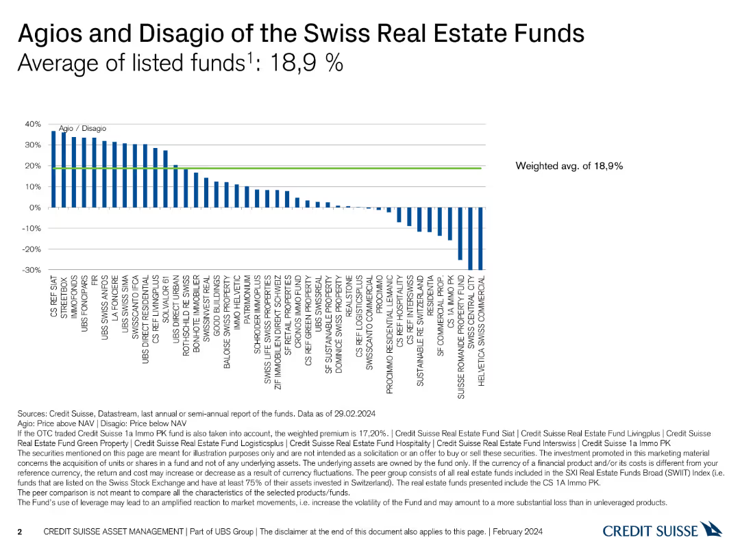
Column chart showing agios and disagios of various Swiss real estate funds, including a weighted average.
Market Analysis and Trends
Real Estate & Construction
Compares the premium and discount (agio/disagio) across listed Swiss real estate funds, providing a weighted average analysis.
Swiss real estate, agio, disagio, market analysis, funds
Single Chart
Credit Suisse
Saved
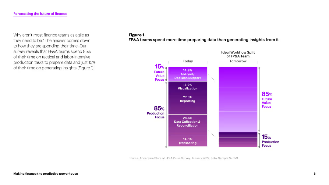
This slide contains a column chart comparing the time FP&A teams spend on various tasks today versus the ideal workflow split for tomorrow. The chart uses shades of purple to indicate the percentages of time spent on different tasks. The layout is clean with ample white space.
Strategic Planning
Financial Services
The slide discusses how FP&A teams currently spend 85% of their time on production tasks and only 15% on generating insights. It suggests a shift towards more analysis and decision support activities.
FP&A, data preparation, insights generation, workflow, finance
Mixed Chart
Accenture
Saved
The slide contains two column charts. The first chart shows corporate cash as a percentage of current assets by sector. The second chart shows research & development and capital expenditure by sector.
Financial Performance
Financial Services
This slide details cash and capital expenditure in the United States by sector, focusing on corporate cash holdings and investment in research & development. It is used for financial performance analysis and strategic planning.
United States, cash, capital expenditure, sector, research & development, financial performance
Multiple Chart
JP Morgan
Saved
A column and a pie chart analyzing consumer interest in purchasing insurance directly from vehicle manufacturers, presented in a clear and direct format.
Strategic Planning
Transportation & Logistics
This slide explores consumer interest in purchasing vehicle insurance directly from manufacturers, indicating potential market shifts and opportunities for OEMs to disrupt traditional insurance models.
Insurance purchasing, OEM strategy, consumer interest, market disruption
Multiple Chart
Deloitte
Saved
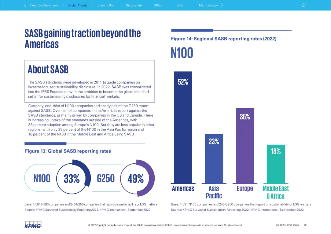
Left side explains SASB framework; right shows global and regional adoption bar charts
Regulatory and Compliance
Professional Services
Discusses adoption of the SASB framework for sustainability disclosure. It shows that the Americas lead (52%), followed by Europe (35%), with lower uptake in Asia Pacific (23%) and Middle East & Africa (18%). Global rates for N100 and G250 are also included.
SASB, sustainability disclosure, ESG standards, global adoption, Americas, G250, N100
Multiple Chart
KPMG
Saved
Diagram integrates circular and connective elements to discuss the relevance of certified second-hand goods for luxury brands and retailers.
Strategic Planning
Retail & E-commerce
Explores the strategic relevance of certified second-hand goods in the luxury market, focusing on brand and retail perspectives.
certified second-hand, luxury market, brand strategy, retail innovation, market trends
Vertical Flow
BCG
Saved
Bar charts comparing the services' share of Gross Value Added (GVA) to total GVA for various countries from 2000, 2020, and projected for 2050.
Technology and Digital Transformation
Technology & Software
The slide shows the increasing share of services in the Gross Value Added (GVA) of different countries, indicating a shift from manufacturing to service-oriented economies. It discusses the structural trends that contribute to this shift and its implications for future economic growth.
Services, GVA, Structural Trends, 2050
Mixed Chart
Roland Berger
Saved
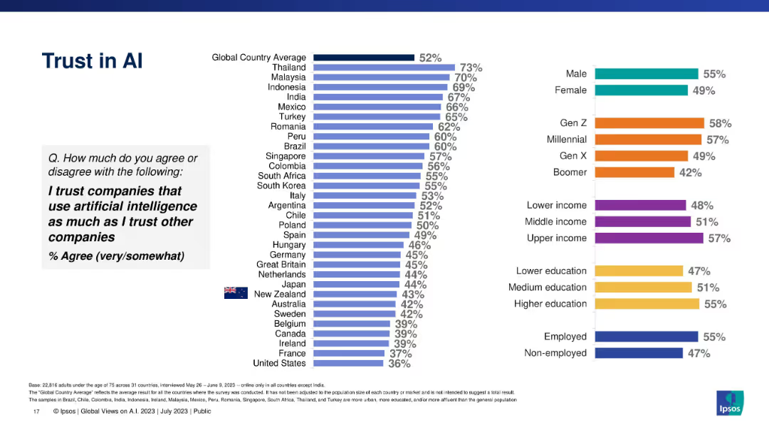
Vertical bar chart displaying trust in AI-using companies vs. other companies, segmented globally.
Risk Assessment and Management
Artificial Intelligence
Explores whether people trust AI-using companies as much as traditional companies, showing global and demographic variations, with Thailand leading and U.S. trailing.
trust, corporate AI, consumer confidence, demographic variation, Ipsos, ethical business
Multiple Chart
IPSOS
Saved
This slide features bar charts comparing today's critical leadership roles with projections for the next 2-4 years. The design is straightforward with clear labels for easier comprehension.
Human Resources and Talent Management
Professional Services
This slide discusses the evolving roles of leaders in a boundaryless business world, focusing on harnessing disruption, resilience, and engagement across geographies. It shows current and future trends in leadership focus areas, particularly highlighting the increased need for innovation and adaptability in the coming years.
Leadership, Innovation, Resilience, Future, Roles
Multiple Chart
Deloitte
Saved
A dark background slide with column charts showing survey results on healthcare experience, with white and yellow text.
Market Analysis and Trends
Healthcare & Pharmaceuticals
It highlights consumer ratings of healthcare system optimization for equitable treatment, with 49% above average, 26% average, and 25% below average.
healthcare, consumer experience, survey, Germany
Mixed Chart
EY
Saved
The slide features a stacked bar chart comparing domestic supply chain costs and freight costs by transport mode, with a cost estimate for the industry.
Financial Performance
Transportation & Logistics
It analyzes the distribution of supply chain costs in the cement industry, highlighting the significant contribution of freight and transportation modes.
Freight, supply chain, cement, costs, road, shipping, rail, transport, industry, analysis
Single Chart
LEK
Saved
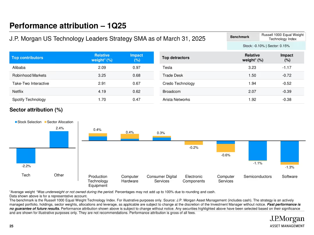
Top half is a table showing top contributors and detractors with weights and impact. Bottom half features a horizontal bar chart of sector attribution split by stock selection and allocation, color-coded blue and yellow. Simple grid layout with clear headings.
Performance Metrics and KPIs
Financial Services
This slide reports the Q1 2025 performance attribution of the J.P. Morgan US Technology Leaders Strategy. It breaks down relative performance impacts by top/bottom contributors and by sector, highlighting where alpha was generated or lost. Notable performance gains came from names like Alibaba and Robinhood, while Tesla and Trade Desk detracted. The sector attribution chart helps assess the role of selection vs. allocation.
attribution, Q1 2025, stock performance, sector impact, contributors, detractors, portfolio analysis, J.P. Morgan, tech strategy
Mixed Chart
JP Morgan
Saved
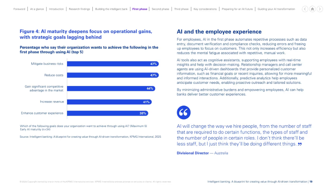
Split design: bar chart on the left with top 5 AI goals; descriptive text and a quote on the right. Blue and purple color scheme. Balanced and minimalistic.
Performance Metrics and KPIs
Financial Services
The slide shows that at early AI maturity, organizations prioritize operational improvements such as risk mitigation and cost reduction over strategic goals. It explains how AI enhances employee experience through automation, reducing manual effort and improving decision-making and customer interactions. A quote adds perspective on AI’s workforce impact.
AI maturity, operations, efficiency, cost, employee, experience, early phase
Mixed Chart
KPMG
Saved
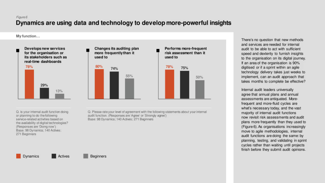
Column charts comparing development of new services, changes in auditing plans, and frequent risk assessments among Dynamics, Actives, and Beginners.
Technology and Digital Transformation
Professional Services
The slide describes how internal audit functions are leveraging data and technology to develop powerful insights, with Dynamics leading in frequent risk assessments and new services.
Data insights, technology, internal audit, new services, risk assessment
Multiple Chart
PwC/Strategy&
Saved
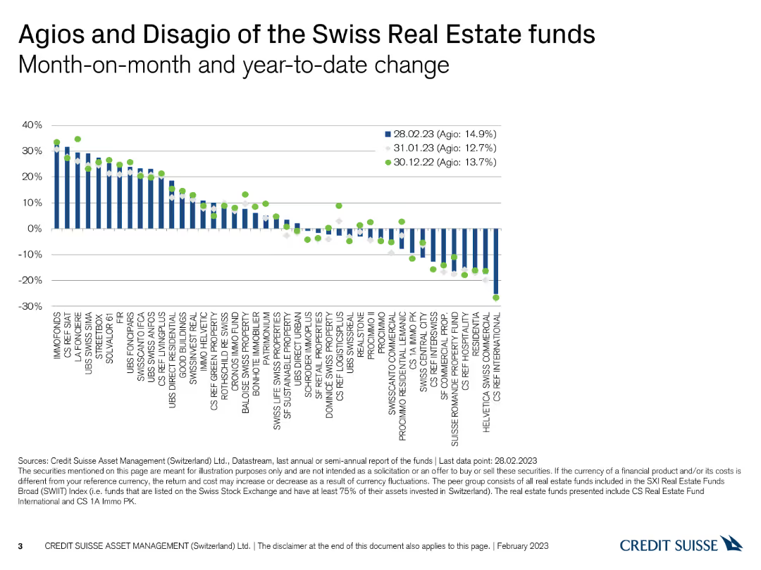
The slide displays a column chart with dots representing month-on-month and year-to-date changes in agios and disagios.
Financial Performance
Real Estate & Construction
This slide compares the monthly and year-to-date changes in agios and disagios of Swiss real estate funds, providing performance insights.
Swiss real estate, agio, disagio, performance, monthly change
Single Chart
Credit Suisse
Saved
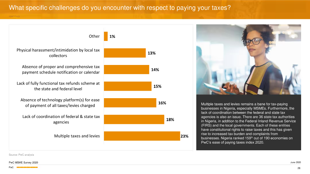
The slide features a horizontal bar chart illustrating challenges in tax payment, such as multiple taxes and lack of coordination. An image of a woman with glasses is on the right side.
Regulatory and Compliance
Financial Services
It highlights the specific tax-related challenges businesses face, with multiple taxes and levies, and lack of coordination between federal and state tax agencies being prominent. It elaborates on the systemic issues in Nigeria's tax system.
Taxes, Challenges, Compliance, Coordination, PwC
Mixed Chart
PwC/Strategy&
Saved
Previous
Next
If nothing, comes up, please save your slides first
Create a FREE account to continue browsing
Receive Instant Access to 1,000+ slides from companies like McKinsey, Google, and Goldman Sachs
First Name
Last Name
Email
Password
I agree to all
Terms & Privacy Policy
Thank you! Your submission has been received!
Oops! Something went wrong while submitting the form.
Have an account?
Sign in
Column Chart
Heatmap
Chevron
Org Chart
Infographic
Callouts
Timeline
List
Graphic
Picture
Process Flow
Diagram
Paragraph
Map
Table
Framework
Subtitle
Takeaway Box
Icon
Other Chart
Radar Chart
Waterfall Chart
Mekko Chart
Pie Chart
Scatter Plot
Line Chart
Bar chart
Bullet points