Create a FREE Account
Instant access to 1,000+ real slides from top companies like McKinsey, BCG, Goldman Sachs, Google and many more!
First Name
Last Name
Email
Password
I agree to all
Terms & Privacy Policy
Thank you! Your submission has been received!
Oops! Something went wrong while submitting the form.
Have an account?
Sign in
Library
Templates
Courses
Pricing
My Account
My Slides
My Templates
✦ AI
AI Prompt Library
AI Search
Sign in
Start Here
Logout
My Saved Slides
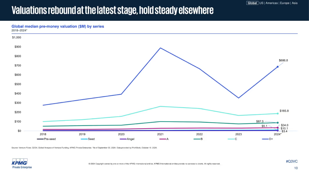
Line chart similar in style to previous, plotting median pre-money valuations across funding series; D+ shows significant increase in 2024; uses same visual and color scheme.
Investment Analysis
Financial Services
The slide displays median pre-money valuations across venture funding series from 2018 to 2024, showing that while early and mid-stage valuations are flat, late-stage valuations (Series D+) have seen a strong recovery. It emphasizes how later-stage optimism is rebounding first.
startup valuation, venture capital, pre-money, funding stages, D+ recovery, series B, investment climate, 2024, KPMG, VC metrics
Single Chart
KPMG
Saved
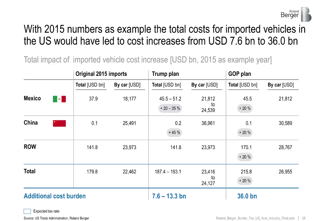
Comparative table showing import costs from Mexico, China, and ROW under original 2015 values, Trump plan, and GOP plan, with added tax burdens
Pricing Strategies
Industrial & Manufacturing
Demonstrates projected cost increases in imported vehicles under proposed US trade/tax policies using 2015 data. The Trump and GOP plans raise costs substantially, particularly from Mexico, with per car cost increases clearly noted.
imported vehicles, trade policy, tax plan, GOP, Trump, cost increase, automotive imports, pricing impact
Table
Roland Berger
Saved
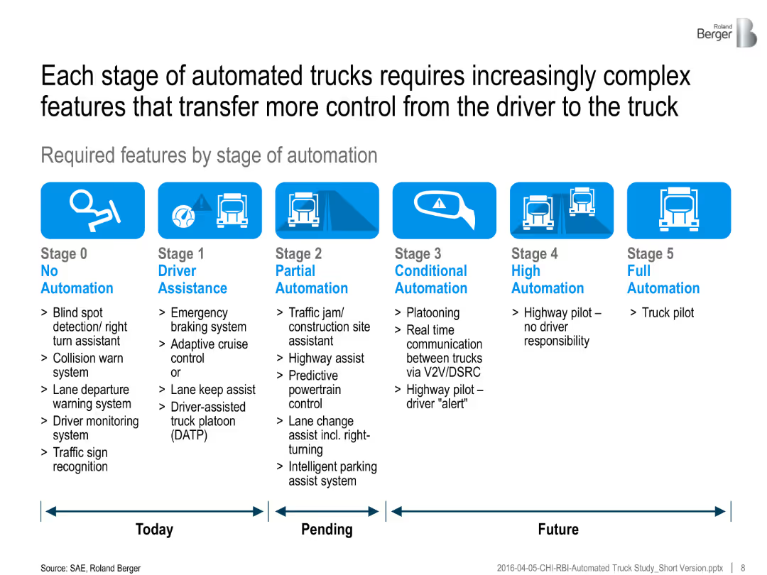
Infographic showing six automation stages with bullet lists of required features for each. Timeline divided into "Today", "Pending", and "Future".
Technology and Digital Transformation
Transportation & Logistics
The slide details the technological requirements needed at each SAE automation stage, focusing on the increasing complexity and integration of vehicle systems.
automation stages, truck features, control systems, technology evolution, vehicle sensors, SAE roadmap, intelligent transport
Linear Flow
Roland Berger
Saved
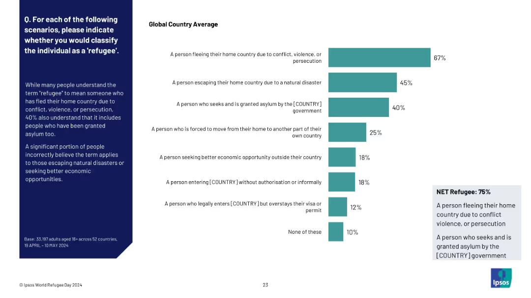
Side-by-side layout with a classification bar chart showing varying understandings of "refugee"
Regulatory and Compliance
Government & Public Sector
The slide evaluates public understanding of who qualifies as a refugee. Most correctly identify those fleeing violence/persecution or granted asylum, but many also incorrectly include those fleeing disasters or seeking better jobs. The "Net Refugee" figure is 75%.
refugee definition, public understanding, asylum, classification, migration types, Ipsos, global perception
Mixed Chart
IPSOS
Saved
The slide features two column charts with and without bold effects, highlighting Tufte's principle to remove bold effects for clarity.
Technology and Digital Transformation
Professional Services
The slide explains how removing bold effects can enhance the clarity and effectiveness of data presentations, following Tufte's data-to-ink ratio principle.
Tufte, data-to-ink, ratio, survey, responses, visualization, bold effects, chart, clarity, design
Multiple Chart
EY
Saved
Contains column charts, data tables, and trend lines. The slide is visually rich with information on cross-border and outbound IPO activities in the Asia-Pacific region.
Market Analysis and Trends
Financial Services
Discusses the trends in cross-border and outbound IPO activities in the Asia-Pacific region for 2019, including transaction sizes and the performance of main and junior markets.
cross-border IPO, Asia-Pacific, market trends, 2019, transactions
Multiple Chart
EY
Saved
A column chart depicting the multiples of annual gross salaries required to purchase a 70 sqm dwelling.
Market Analysis and Trends
Real Estate & Construction
This slide assesses housing affordability by showing how many annual gross salaries are needed to purchase a standard-sized dwelling.
housing affordability, gross salaries, dwelling, market analysis, real estate, affordability index
Mixed Chart
Deloitte
Saved
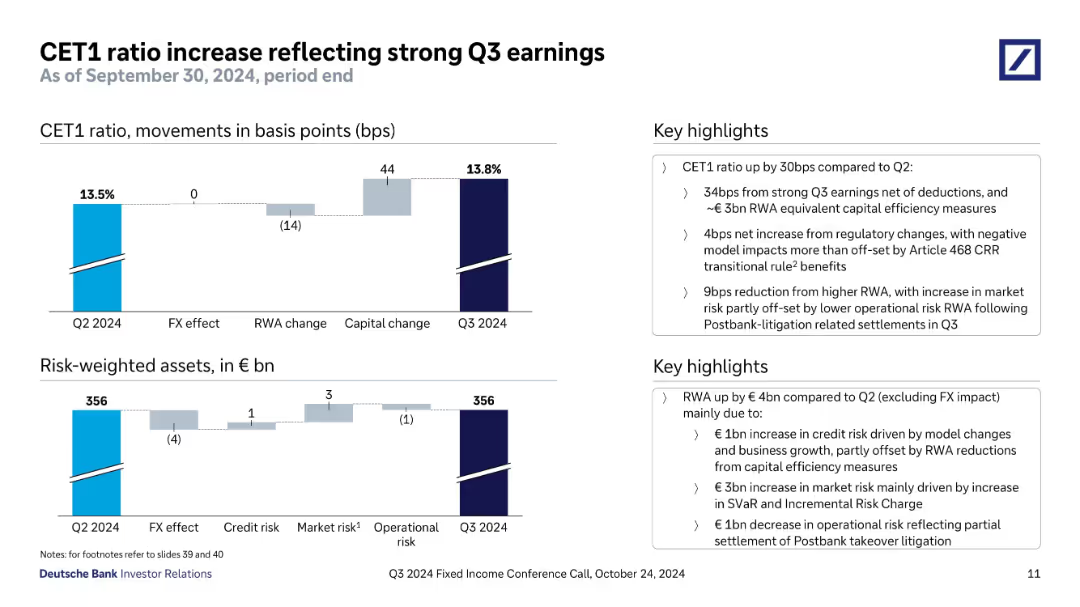
Top chart shows CET1 ratio change in basis points; bottom chart shows changes in risk-weighted assets. Key drivers annotated. Sidebar text summarizes the changes and regulatory impacts.
Regulatory and Compliance
Financial Services
Shows CET1 ratio improvement to 13.8% in Q3 2024, driven by strong earnings and capital efficiency. Regulatory changes and RWA movements are detailed, with breakdowns by credit, market, and operational risks.
CET1 ratio, capital adequacy, Q3 earnings, RWA, risk-weighted assets, regulatory change, Postbank litigation
Multiple Chart
Deutsche Bank
Saved
Tabular comparison of industry use cases for immersive tech, accompanied by relevant isometric illustrations.
Technology and Digital Transformation
Technology & Software
Describes horizontal and vertical use case scenarios for immersive tech across various industries, highlighting specific applications and their significance.
Immersive tech, industries, use cases, application, significance
Header Horizontal
McKinsey
Saved
The slide displays column charts showing the gender distribution of Black employees across various professional levels within the venture capital industry. Textual notes on survey data are also provided.
Human Resources and Talent Management
Professional Services
This slide examines the gender distribution of Black employees within the venture capital industry, comparing data from 2018, 2020, and 2022, and highlighting trends and disparities.
Black employees, Gender distribution, Diversity, VC industry, Professional levels
Multiple Chart
Deloitte
Saved
Features a column chart on the usage of stablecoins, including conversion to fiat currency and payments.
Market Analysis and Trends
Financial Services
The slide presents data on the usage of stablecoins among Canadians, highlighting top uses like converting to fiat currency, making payments, and earning yield, while also showing a significant portion who have never used them.
Stablecoins, usage, Canadians
Mixed Chart
IPSOS
Saved
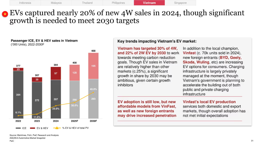
EV/ICE bar and line graph dominates left; right section has red-highlighted EV market commentary and stats
Technology and Digital Transformation
Industrial & Manufacturing
Vietnam's EV share hit ~20% in 2024 with a goal of 30% by 2030. The slide credits VinFast and foreign OEMs like BYD and Geely, but notes infrastructure and cost challenges. Adoption remains below expectations despite policy and private sector support.
Vietnam, EV market, VinFast, BYD, Skoda, infrastructure, foreign entrants, 30% target, 4W vs 2W EVs
Mixed Chart
PwC/Strategy&
Saved
Bar and line graphs represent quarterly backlog and book-to-bill trends with annotations.
Strategic Planning
Professional Services
Reviews historical financial data, highlighting backlog volumes and book-to-bill ratios.
Backlog, book-to-bill, financial trends, quarterly data, operational metrics
Multiple Chart
Booz Allen Hamilton
Saved
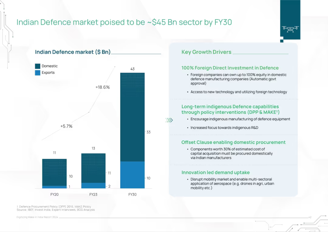
Vertical bar graph of domestic vs. export defense market; key drivers listed in a right-hand box
Investment Analysis
Government & Public Sector
The slide forecasts India’s defense market to grow to $45B by FY30, driven by FDI, indigenous manufacturing policies (DPP & MAKE), and innovation demand. A bar chart shows domestic and export splits over time, with strong CAGR. Offset policies and local R&D promotion are emphasized.
defense market, India, FDI, exports, MAKE policy, offset clause, R&D, FY30, military, manufacturing
Mixed Chart
BCG
Saved
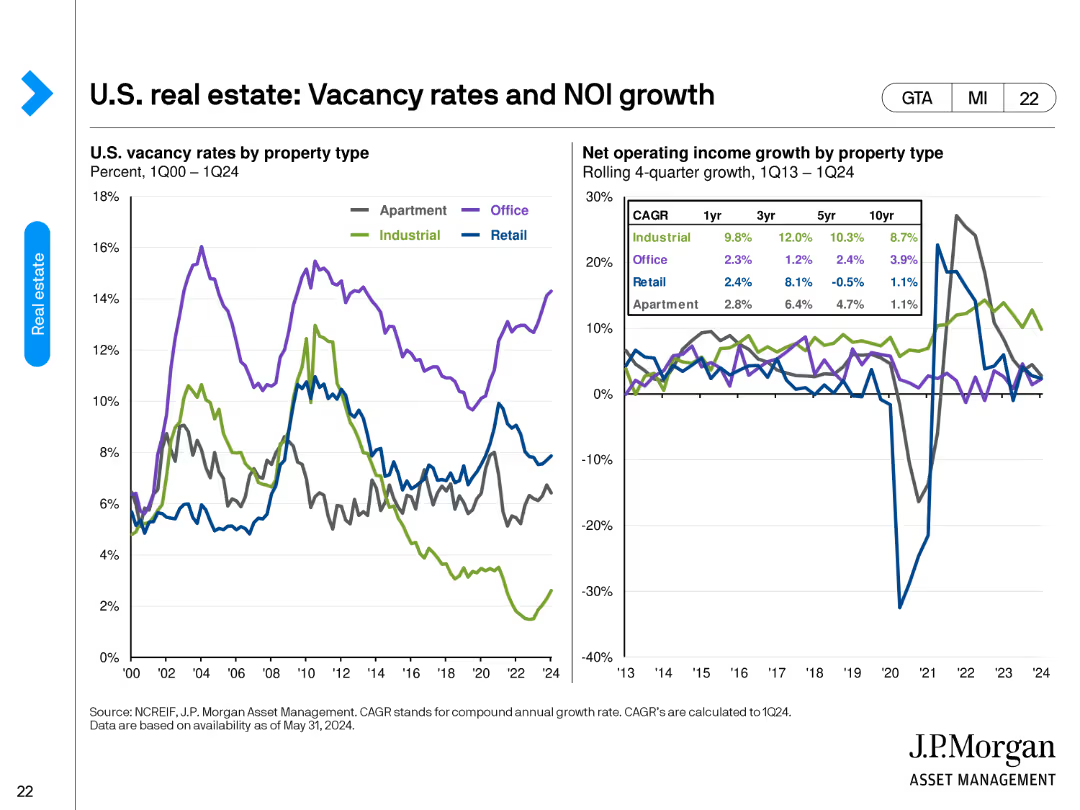
The slide shows two charts. The left chart illustrates U.S. vacancy rates by property type from 1Q00 to 1Q24. The right chart depicts net operating income (NOI) growth by property type over different periods (1yr, 3yr, 5yr, 10yr).
Market Analysis and Trends
Real Estate & Construction
The slide compares vacancy rates and NOI growth across different property types in the U.S. real estate market. It helps in understanding occupancy trends and income performance for various property segments.
vacancy rates, NOI growth, property types, real estate market, income performance, trends
Multiple Chart
JP Morgan
Saved
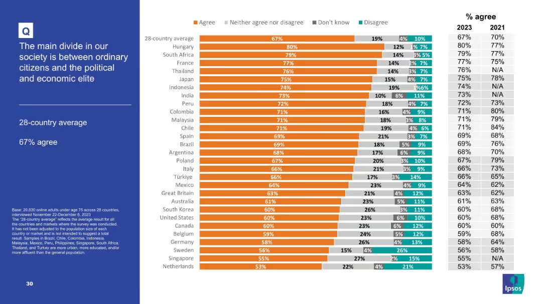
Chart-driven layout emphasizing agreement levels; similar structure to other slides.
Market Analysis and Trends
Government & Public Sector
Highlights societal polarization, with 67% average agreement that a main societal divide exists between ordinary people and elites. Top countries include Hungary, South Africa, and France, signaling global concern over inequality and power.
societal divide, elite vs citizens, polarization, survey, inequality, governance
Mixed Chart
IPSOS
Saved
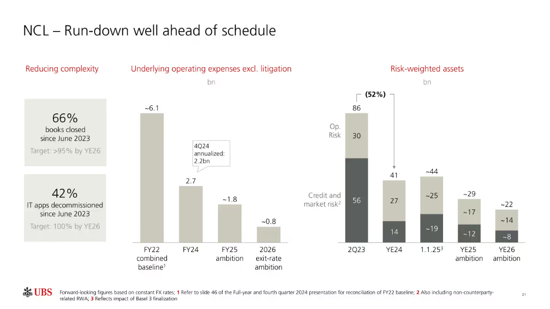
Three vertical bar chart sections showing complexity reduction, operating expenses, and RWA declines. Large numeric callouts and brief annotations.
Operational Efficiency
Financial Services
Highlights UBS’s progress in reducing non-core and legacy (NCL) complexity, operating expenses, and risk-weighted assets. Includes targets for FY25 and YE26 and progress on IT decommissioning and book closures.
UBS, NCL, run-down, complexity, RWA, operating expenses, FY25, YE26, decommissioning, risk management
Multiple Chart
UBS
Saved
The slide contains sets of column charts for three years and text annotations. It also includes a line graph overlaid on the charts.
Market Analysis and Trends
Financial Services
This slide evaluates the shift in market focus by CEOs in China, specifically their reduced preference for the US market. It could be used to discuss changes in international business strategies and economic forecasts.
China, CEOs, Market Focus, US, Growth Ambitions, Trends, Economic Strategy
Multiple Chart
PwC/Strategy&
Saved
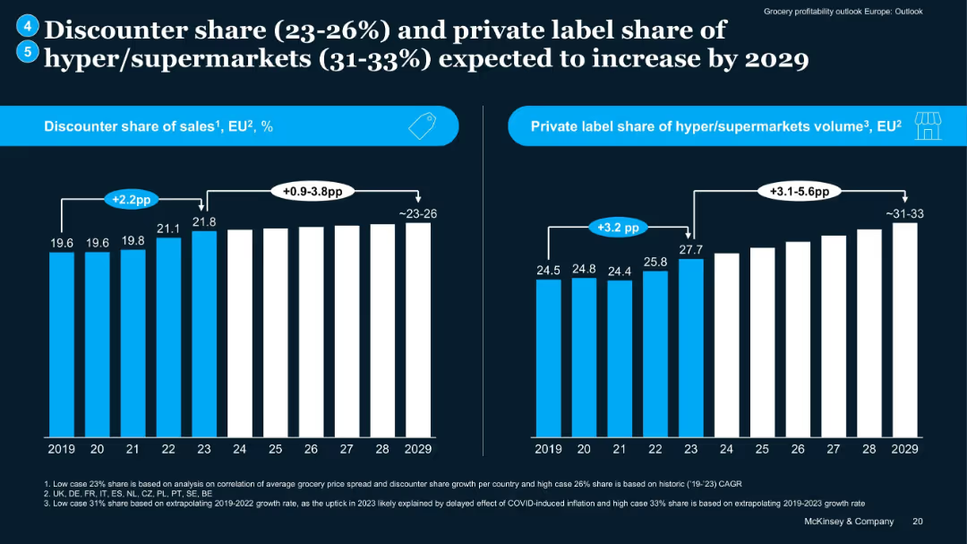
Two bar charts: left for discounter sales share, right for private label volume share, covering 2019–2029.
Market Analysis and Trends
Retail & E-commerce
Projects continued growth in discounter market share and private label volume among hypermarkets. Notes impact of COVID inflation on trend upticks, with forward projections extending to 2029, suggesting increased margin pressure and competition.
discounter growth, private label, projections, grocery trends, EU
Multiple Chart
McKinsey
Saved
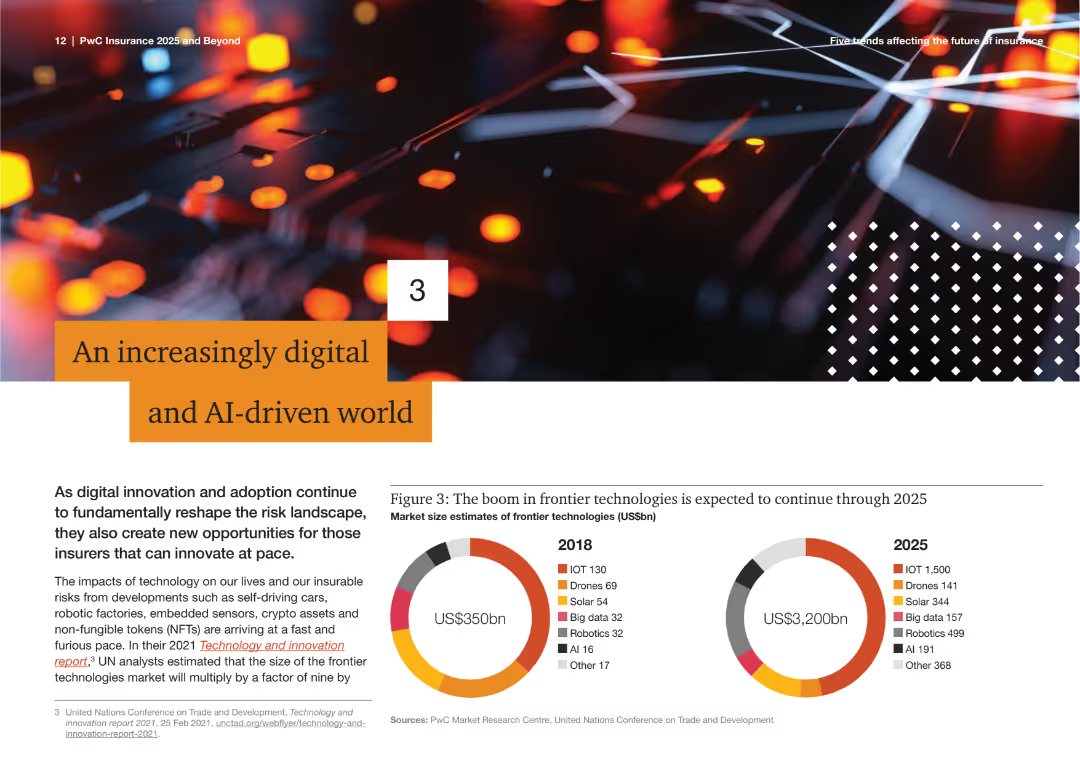
The slide shows a visually appealing graphic with a pie chart comparing market size estimates for frontier technologies in 2018 and 2025, including IoT, drones, solar, big data, robotics, AI, and other technologies.
Technology and Digital Transformation
Technology & Software
This slide discusses the rapid growth of digital and AI technologies, highlighting market size estimates for various frontier technologies from 2018 to 2025. It emphasizes the transformative impact of these technologies on the industry.
Digital Transformation, AI, Technology Growth, Market Size, Frontier Technologies, IoT, Drones, Robotics, Big Data, Solar
Multiple Chart
PwC/Strategy&
Saved
Features multiple pie charts displaying the percentage use of AI in different operational areas.
Operational Efficiency
Technology & Software
Outlines the use of AI in daily operations across various industries, focusing on customer experience and operations, and highlights the sectors and processes where AI has the most significant impact.
AI, operations, customer experience, day-to-day, industries
Multiple Chart
Deloitte
Saved
This slide uses a column chart to show the GDP uplift from 2012 to 2030 due to the NBN network, with annotations and color coding to differentiate between years and projections.
Financial Performance
Telecommunications
The slide presents the economic impact of the NBN network in Australia, highlighting the GDP contribution and projected future benefits, useful for discussing telecommunications' economic impact.
NBN, GDP, Australia, economic impact, telecommunications, projection, financial analysis
Mixed Chart
Accenture
Saved
Pie charts displaying the percentages of companies engaging in public and private actions in response to a Supreme Court decision. Each chart shows a small minority engaging actively.
Customer and Market Segmentation
Professional Services
This slide presents data on corporate responses to a controversial Supreme Court decision, highlighting a general reluctance to take public stands, with slightly more openness towards private actions.
Corporate Ethics, Supreme Court, Roe vs Wade, Public Actions, Private Actions, Pie Chart, Survey Data
Multiple Chart
Deloitte
Saved
Features images and captions related to sustainable rubber sourcing, statistical data, and information on projects in different regions to improve sustainability in the rubber supply chain.
Market Analysis and Trends
Industrial & Manufacturing
Presents information on Michelin's approach to sustainable natural rubber procurement and their efforts to drive sustainability across the tire industry, including supplier assessments and impact projects.
Sustainable, Natural Rubber, Michelin, Supply Chain, Sustainability, Agriculture, Smallholders, Global Impact, Supplier Assessment, Roadmap 2025
Header Vertical
Morgan Stanley
Saved
A bar graph with a percentage breakout showing the prioritization of personalized product offerings by executives.
Market Analysis and Trends
Professional Services
Evaluates the importance placed on personalized products in business strategy, as seen by different company sizes and executive roles.
Personalization, Executive Priorities, Bar Graph, Product Strategy
Single Chart
Kearney
Saved
Previous
Next
If nothing, comes up, please save your slides first
Create a FREE account to continue browsing
Receive Instant Access to 1,000+ slides from companies like McKinsey, Google, and Goldman Sachs
First Name
Last Name
Email
Password
I agree to all
Terms & Privacy Policy
Thank you! Your submission has been received!
Oops! Something went wrong while submitting the form.
Have an account?
Sign in
Column Chart
Heatmap
Chevron
Org Chart
Infographic
Callouts
Timeline
List
Graphic
Picture
Process Flow
Diagram
Paragraph
Map
Table
Framework
Subtitle
Takeaway Box
Icon
Other Chart
Radar Chart
Waterfall Chart
Mekko Chart
Pie Chart
Scatter Plot
Line Chart
Bar chart
Bullet points