Create a FREE Account
Instant access to 1,000+ real slides from top companies like McKinsey, BCG, Goldman Sachs, Google and many more!
First Name
Last Name
Email
Password
I agree to all
Terms & Privacy Policy
Thank you! Your submission has been received!
Oops! Something went wrong while submitting the form.
Have an account?
Sign in
Library
Templates
Courses
Pricing
My Account
My Slides
My Templates
✦ AI
AI Prompt Library
AI Search
Sign in
Start Here
Logout
My Saved Slides
Uses a clear, organized format with numbered sections, bullet points, and descriptive paragraphs, along with minimal iconography.
Strategic Planning
Financial Services
Outlines strategic priorities such as customer engagement, leveraging technology, risk management, talent cultivation, and financial performance.
strategy, customer engagement, technology, risk management, talent cultivation, financial performance, strategic priorities
Table
JP Morgan
Saved
This slide visually separates Macquarie's business activities into annuity-style and markets-facing activities, each with its net profit contribution. The information is presented using colored sections, clear text hierarchy, and minimal icons. The design is clean, focused, and easy to follow.
Financial Performance
Financial Services
The slide offers an overview of Macquarie's business divisions and their contributions to net profit, illustrating the company's diversified revenue streams. It can be used to convey Macquarie’s business model and profitability across various sectors, crucial for investor and stakeholder presentations.
Macquarie, business overview, net profit contribution, annuity-style activities, markets-facing activities, revenue streams, financial services
Multiple Chart
Morgan Stanley
Saved
A table with key financial metrics on the left, a list of goals as a 5-year consumer opportunity in the center, and a column chart displaying forward pre-tax margin on the right.
Financial Performance
Financial Services
A financial overview showcasing past earnings and future goals for consumer and wealth management margins, indicating a strategic focus on increasing profitability.
Margins, consumer, wealth, profitability, financial
Mixed Chart
Goldman Sachs
Saved
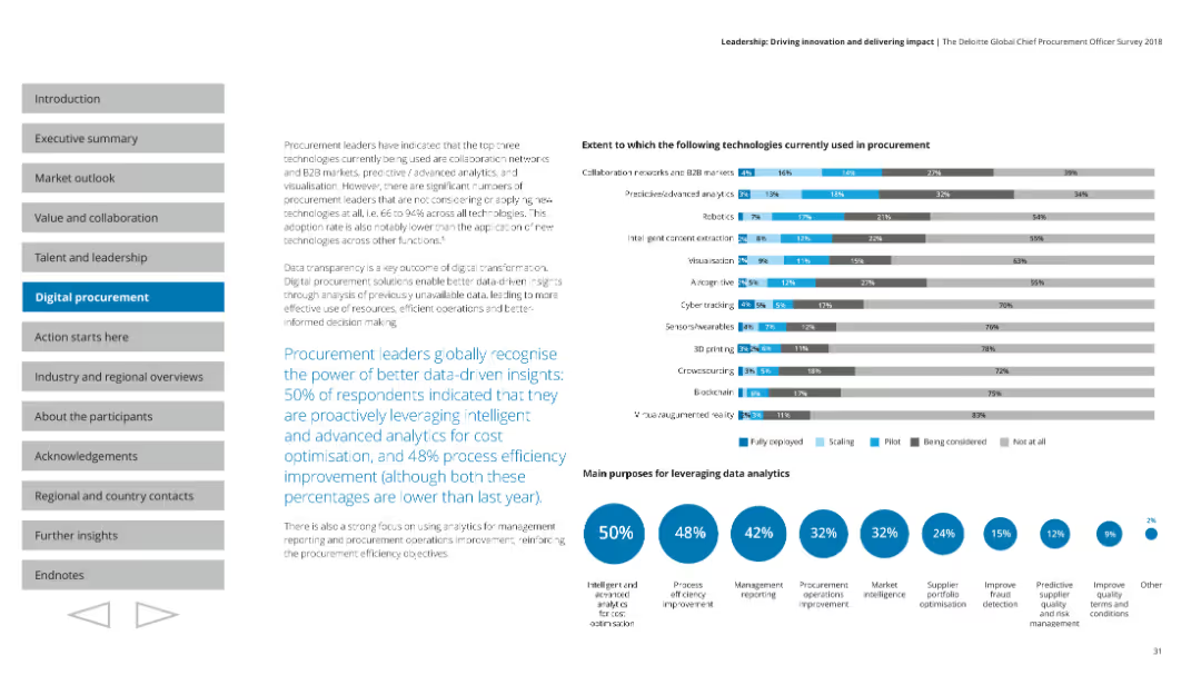
Shows a variety of charts including column and pie charts, focused on the current usage and scaling of different technologies in procurement.
Technology and Digital Transformation
Professional Services
Highlights the importance of data-driven insights in procurement, detailing the main purposes and current use of various technologies.
Data analytics, procurement, technology usage, scaling
Multiple Chart
Deloitte
Saved
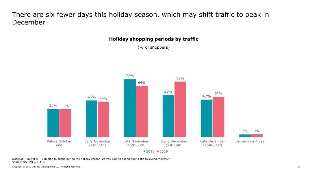
This slide includes a column chart displaying the percentage of shoppers across different shopping periods for two years, emphasizing the impact of fewer holiday days.
Market Analysis and Trends
Retail & E-commerce
It examines how a shorter holiday season influences shopper traffic, potentially shifting the peak shopping period to December.
holiday, shopping, traffic, peak, December
Single Chart
Deloitte
Saved
The slide presents a table with multiple columns and rows detailing material-based technologies for hydrogen conversion, including their density, energy input, process maturity, advantages, and disadvantages. It uses color coding to differentiate technology advantages (Low, Medium, High).
Market Analysis and Trends
Energy & Utilities
This slide offers a comprehensive comparison of various hydrogen conversion and reconversion technologies. It includes key metrics like density, energy input, and process maturity, along with a summary of advantages and disadvantages for each technology.
Hydrogen, Conversion, Technology, Energy, Advantages
Table
Kearney
Saved
The slide includes multiple bar charts comparing the change in transportation modes across different regions. Each chart represents changes in percentages and is colored based on region.
Market Analysis and Trends
Transportation & Logistics
Compares regional responses in transportation mode usage shifts before and after a global crisis.
transportation, regional, mode shift, crisis, comparison
Multiple Chart
McKinsey
Saved
A bar chart showing reasons for switching vehicle brands, using varying shades of teal. The chart includes percentages and is straightforward in layout.
Market Analysis and Trends
Transportation & Logistics
This slide presents reasons why consumers consider switching vehicle brands, with the desire for something different being the most dominant factor. Useful for analyzing brand loyalty and consumer behavior in the automotive sector.
Brand loyalty, consumer behavior, market analysis, vehicle brands, switching reasons
Single Chart
Deloitte
Saved
This slide includes a bar chart showing the percentage of respondents standardizing the purchase of various medical supplies and equipment across regions.
Operational Efficiency
Healthcare & Pharmaceuticals
This slide highlights the trend of hospitals standardizing purchasing practices for medical consumables and equipment, with a regional comparison of priorities.
purchasing standardization, medical supplies, diagnostic equipment, hospital priorities, regional comparison
Single Chart
LEK
Saved
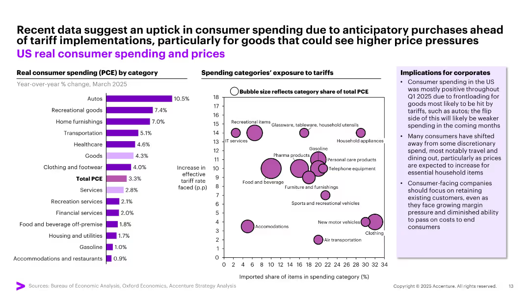
Left: Bar chart of real consumer spending by category. Right: Bubble chart showing spending category exposure to tariffs.
Pricing Strategies
Consumer Goods
Indicates temporary increases in US consumer spending due to anticipatory purchases ahead of tariffs—especially for autos and recreational goods. Accompanied by bubble plot detailing categories most exposed to tariff hikes, highlighting risks and opportunities for pricing strategy.
tariff impact, consumer behavior, pricing, spending categories, strategy
Multiple Chart
Accenture
Saved
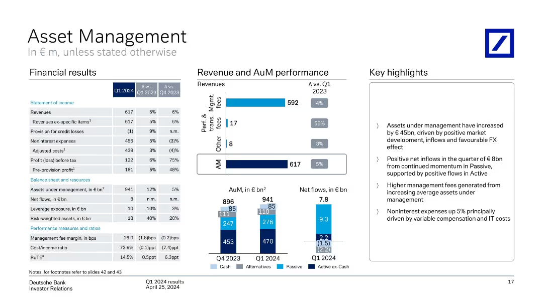
Financial table on left, revenue/AuM bar charts in center, highlights on right
Financial Performance
Financial Services
Asset Management unit posted growth in assets under management and revenues in Q1 2024. Highlights include favorable FX, passive inflows, and higher fees. Expenses rose due to compensation and IT costs.
asset management, AuM, net flows, passive investment, revenue, FX
Multiple Chart
Deutsche Bank
Saved
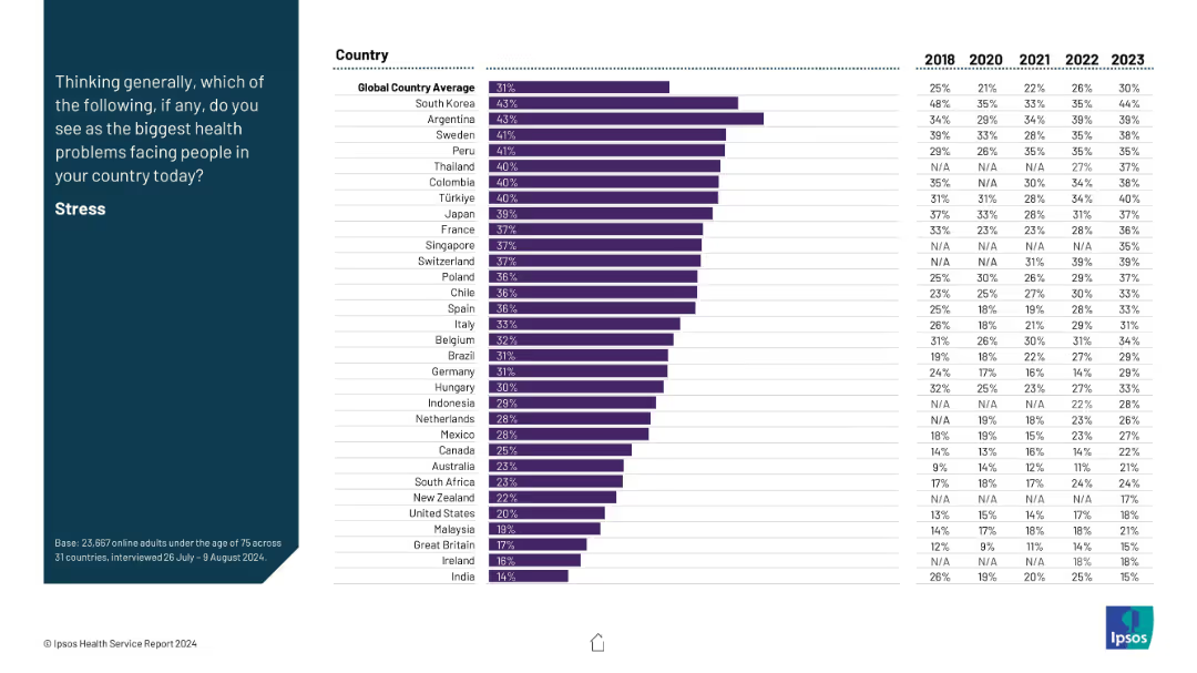
Layout consistent with previous: prompt on left, bar chart on right with time series from 2018–2023 for each country.
Market Analysis and Trends
Healthcare & Pharmaceuticals
This slide tracks stress perception as a major health issue across countries, with time series data. South Korea and Argentina show the highest concern. A global upward trend is visible, with stress becoming increasingly recognized as a health challenge.
stress, global health, trends, mental well-being, survey data
Mixed Chart
IPSOS
Saved
Contains a bullet list of firmwide funding sources and column chart detailing funding sources by type in billions. Text emphasizes the increased role of deposits and diversification of debt. There's a growth trajectory in the deposit percentage as a share of unsecured funding from 2019 to 2022.
Financial Performance
Financial Services
Discusses the diversified funding sources for firmwide operations, including the increasing significance of deposits. It presents a comparative financial analysis of the company's funding structure over several quarters, highlighting the strategic use of unsecured long-term and short-term debt.
funding sources, deposits, unsecured debt, diversification, financial strategy, column chart
Mixed Chart
Goldman Sachs
Saved
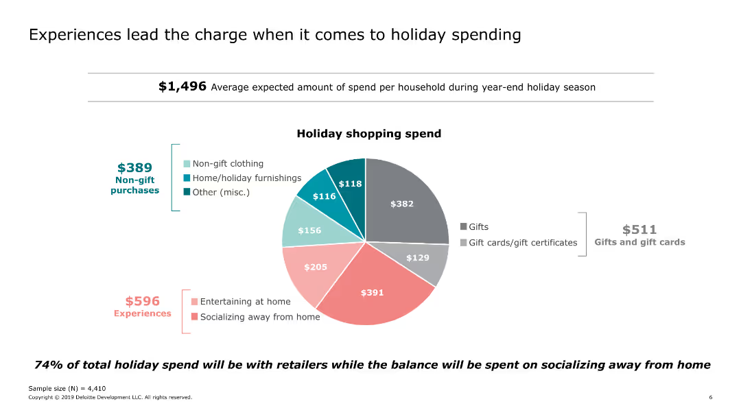
Includes a pie chart showing the distribution of holiday shopping spend across different categories.
Market Analysis and Trends
Retail & E-commerce
Examines the average holiday spending per household, highlighting the significant portion allocated to experiences such as socializing and entertaining at home.
holiday, spending, experiences, socializing, categories, gifts
Single Chart
Deloitte
Saved
Features bar graphs showing the percentage of metaverse-related tech usage in Southeast Asia by country and a side text explanation.
Market Analysis and Trends
Technology & Software
Analyzes the distribution of metaverse-related technologies across Southeast Asian countries, indicating regional market preferences.
Metaverse, AR, VR, Cryptocurrencies, NFTs, Market Distribution, Southeast Asia, Technology Usage
Multiple Chart
Bain
Saved
A global map highlighted in purple shades with yield percentages for various countries prominently displayed, facilitates a geographical comparison of equity yields.
Market Analysis and Trends
Financial Services
This visual slide displays global equity yields, simplifying the comparison of investment returns across countries, which can guide international investment strategies.
global, equity yields, investment returns, geographical comparison, countries, map, strategy, finance
Graphic
Morgan Stanley
Saved
Vertical bar chart comparing agreement/disagreement across countries; left-aligned title text on blue background; data columns for 4 previous years.
Market Analysis and Trends
Environmental Services & Sustainability
Compares public opinion across 32 countries on whether businesses will be failing employees/customers if they don’t act on climate change. Shows percentage agreeing/disagreeing, with trend data from 2021–2024.
climate change, business responsibility, global opinion, Ipsos, environment, sustainability, country comparison, public perception, trends
Mixed Chart
IPSOS
Saved
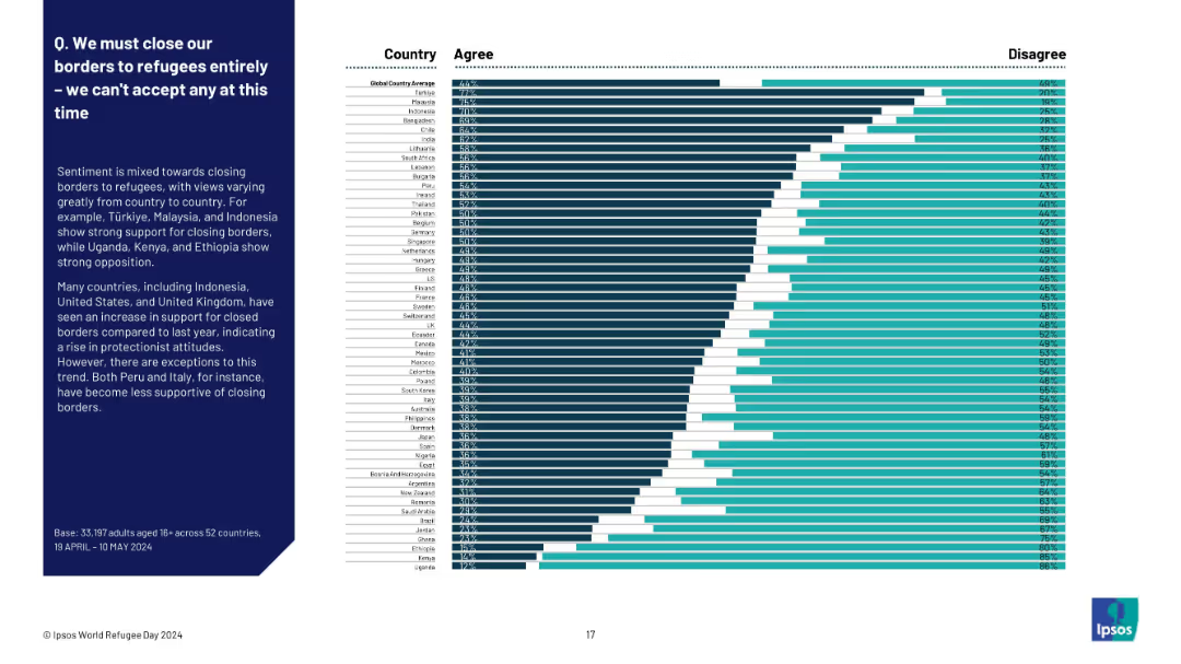
Full-width horizontal bar chart with country-wise breakdown from highest to lowest agreement
Market Analysis and Trends
Government & Public Sector
This slide presents a ranked list of countries based on public agreement with fully closing borders to refugees. Türkiye, Malaysia, and Indonesia show strong agreement, while Uganda, Kenya, and Ethiopia show the least. It reflects global protectionist sentiment shifts.
border policy, protectionism, refugee sentiment, Ipsos, country comparison, closure support, migration, attitudes
Mixed Chart
IPSOS
Saved
A simple title slide with the phrase "Country spotlights" centered on a blue background, accented by a pattern of lines and dots.
Regulatory and Compliance
Government & Public Sector
This is a title slide marking the transition to country-specific insights or highlights within the presentation, likely introducing a section focusing on individual SEA countries and their digital economy status.
title slide, country spotlights, section introduction, SEA, digital economy
Header Horizontal
Bain
Saved
This slide features two graphs. The left graph is a bar chart showing the NPV of expected losses in various industries over 10 years. The right graph, also a bar chart, displays the frequency of operational disruptions by duration.
Risk Assessment and Management
Financial Services
The slide provides an analysis of the financial impact of operational disruptions across various industries, highlighting the percentage of losses relative to annual EBITDA and the frequency of such disruptions.
disruptions, EBITDA, industry, financial impact, operation
Multiple Chart
McKinsey
Saved
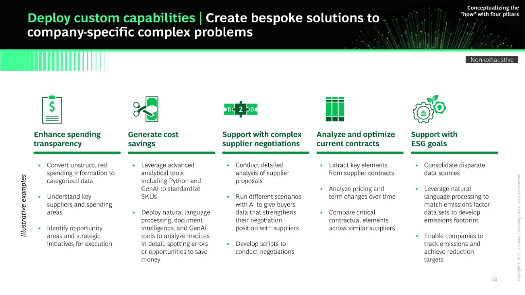
Horizontal column layout with icons and bullet lists under five use cases (e.g., ESG, cost savings). Green and black color palette.
Product and Service Analysis
Technology & Software
The slide outlines how custom GenAI solutions can address company-specific procurement challenges such as ESG compliance, supplier negotiations, cost analysis, and spending transparency. Use cases are well-illustrated with practical examples and supported by AI-driven data analytics.
custom AI, ESG, transparency, contract analysis, supplier negotiation, GenAI, procurement solutions
Pillar
BCG
Saved
This slide provides a snapshot of FCG key figures and product categories, along with revenue split pie charts and a map showing the location of six plants in Europe. The layout is clear and informative, with distinct sections for each data point.
Product and Service Analysis
Industrial & Manufacturing
Showcasing the European leadership of FCG in engineered fabrics and films, this slide offers a detailed breakdown of company metrics, product categories, and their market spread. It's suited for market analysis, showcasing company strengths, and informing decisions in tech and manufacturing sectors.
engineered fabrics, European market, leadership, product categories
Mixed Chart
Morgan Stanley
Saved
This slide uses a mix of text and pie charts to illustrate the characteristics of highly resilient boards, their behaviors, and differentiating factors.
Strategic Planning
Professional Services
The slide identifies key traits of highly resilient boards, focusing on their ability to handle emerging risks, align strategy with risk management, and sustain business operations.
resilient boards, strategic planning, risk management, professional services, behaviors, pie charts, resilience
Multiple Chart
EY
Saved
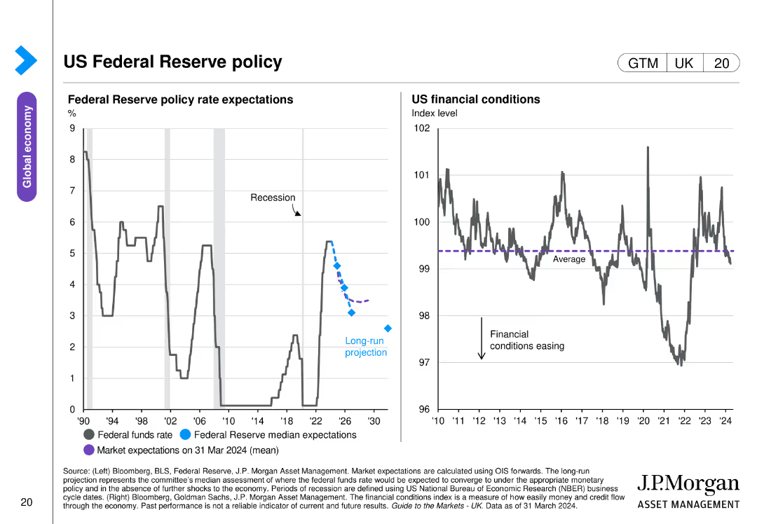
Two line charts side by side, showing Federal Reserve policy rate expectations and US financial conditions. Uses color coding and projection markers.
Regulatory and Compliance
Financial Services
Details Federal Reserve policy rate expectations and US financial conditions, highlighting projections and financial stability indicators.
Federal Reserve, policy, rate, financial, US
Multiple Chart
JP Morgan
Saved
Utilizes a column chart to compare marketer concerns about customer data privacy across different types of data. The design is straightforward, using shades of grey to represent different levels of concern, with clear labeling and an insights section that explains the significance of the findings.
Regulatory and Compliance
Professional Services
This slide assesses the level of concern marketers have regarding customer privacy, particularly useful in discussions about regulatory compliance and risk management in sectors like banking and finance where data sensitivity is high. Provides a basis for understanding industry attitudes towards privacy concerns.
customer privacy, data sensitivity, regulatory compliance, finance, risk management
Mixed Chart
Deloitte
Saved
Previous
Next
If nothing, comes up, please save your slides first
Create a FREE account to continue browsing
Receive Instant Access to 1,000+ slides from companies like McKinsey, Google, and Goldman Sachs
First Name
Last Name
Email
Password
I agree to all
Terms & Privacy Policy
Thank you! Your submission has been received!
Oops! Something went wrong while submitting the form.
Have an account?
Sign in
Column Chart
Heatmap
Chevron
Org Chart
Infographic
Callouts
Timeline
List
Graphic
Picture
Process Flow
Diagram
Paragraph
Map
Table
Framework
Subtitle
Takeaway Box
Icon
Other Chart
Radar Chart
Waterfall Chart
Mekko Chart
Pie Chart
Scatter Plot
Line Chart
Bar chart
Bullet points