Create a FREE Account
Instant access to 1,000+ real slides from top companies like McKinsey, BCG, Goldman Sachs, Google and many more!
First Name
Last Name
Email
Password
I agree to all
Terms & Privacy Policy
Thank you! Your submission has been received!
Oops! Something went wrong while submitting the form.
Have an account?
Sign in
Library
Templates
Courses
Pricing
My Account
My Slides
My Templates
✦ AI
AI Prompt Library
AI Search
Sign in
Start Here
Logout
My Saved Slides
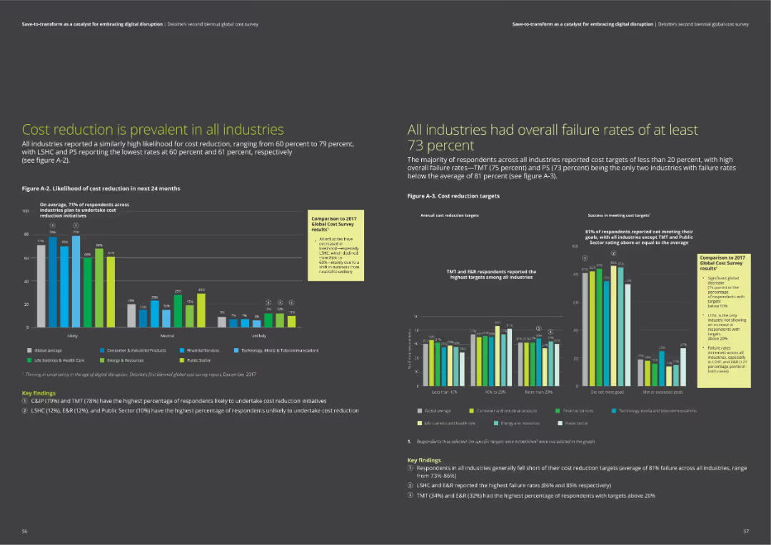
The slide contains a bar chart comparing the likelihood of cost reduction across industries over the next 24 months and a chart on annual cost reduction targets.
Risk Assessment and Management
Professional Services
The slide discusses the prevalence of cost reduction initiatives across different industries, highlighting survey data on likelihood and targets. It emphasizes the high failure rates in meeting cost reduction targets across industries.
cost reduction, industry analysis, failure rates, survey data, cost targets
Multiple Chart
Deloitte
Saved
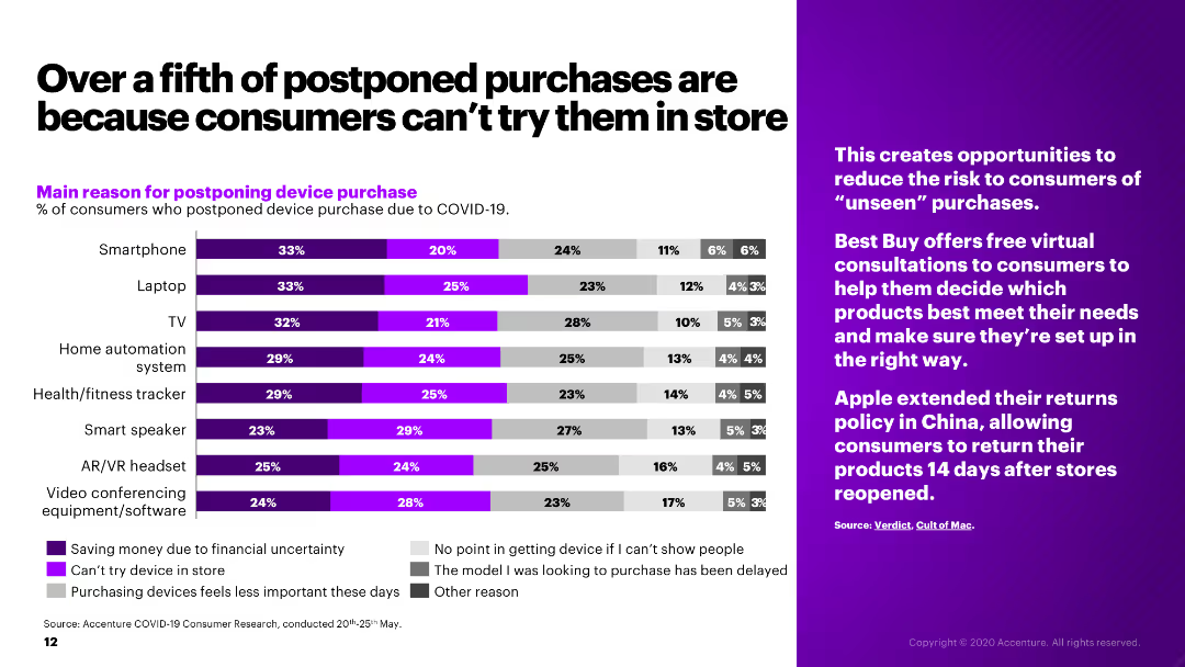
The slide presents a bar chart showing the main reasons for postponing device purchases due to COVID-19, alongside a sidebar with relevant industry insights.
Market Analysis and Trends
Retail & E-commerce
The slide examines the reasons for postponing electronic device purchases during COVID-19, such as financial uncertainty and inability to try products in-store.
postponed purchases, COVID-19, consumer behavior, electronics, retail
Mixed Chart
Accenture
Saved
Slide includes bar charts depicting investment amounts in sectors like renewables and built environment, alongside icons and minimal text.
Market Analysis and Trends
Environmental Services & Sustainability
Discusses major investments in renewables by corporates, highlighting specific projects and investment amounts.
renewables, corporate investment, solar energy, built environment
Mixed Chart
Bain
Saved
Horizontal bar chart showing top priorities for HR within the next 12 months, with focus on key talent retention.
Strategic Planning
Professional Services
Discusses key HR priorities to focus on in the upcoming year, vital for strategic HR planning and operational adjustments.
HR, priorities, strategy, talent retention, planning
Single Chart
PwC/Strategy&
Saved
A graphically dense slide with multiple data presentations, including bar charts, icons, and callouts to highlight key figures. The slide presents information in contrasting colors of blue and yellow, with clear demarcations for different sections. Visuals include statistics on battery electric vehicles (BEVs), charts showing a premium vs. overall market share, and highlighted quotations for emphasis. There is a clear hierarchy of information from top to bottom with a strong visual flow.
Technology and Digital Transformation
Industrial & Manufacturing
Discusses the advantage of the company's tires in electric vehicles (EVs) and presents data on the adoption of BEVs. It provides insights on market share and future sales projections, relevant for conversations on technology strategy in the automotive sector.
electrification, OEM, BEVs, market share, technology, tires, electric vehicles, sales projections, automotive
Mixed Chart
Morgan Stanley
Saved
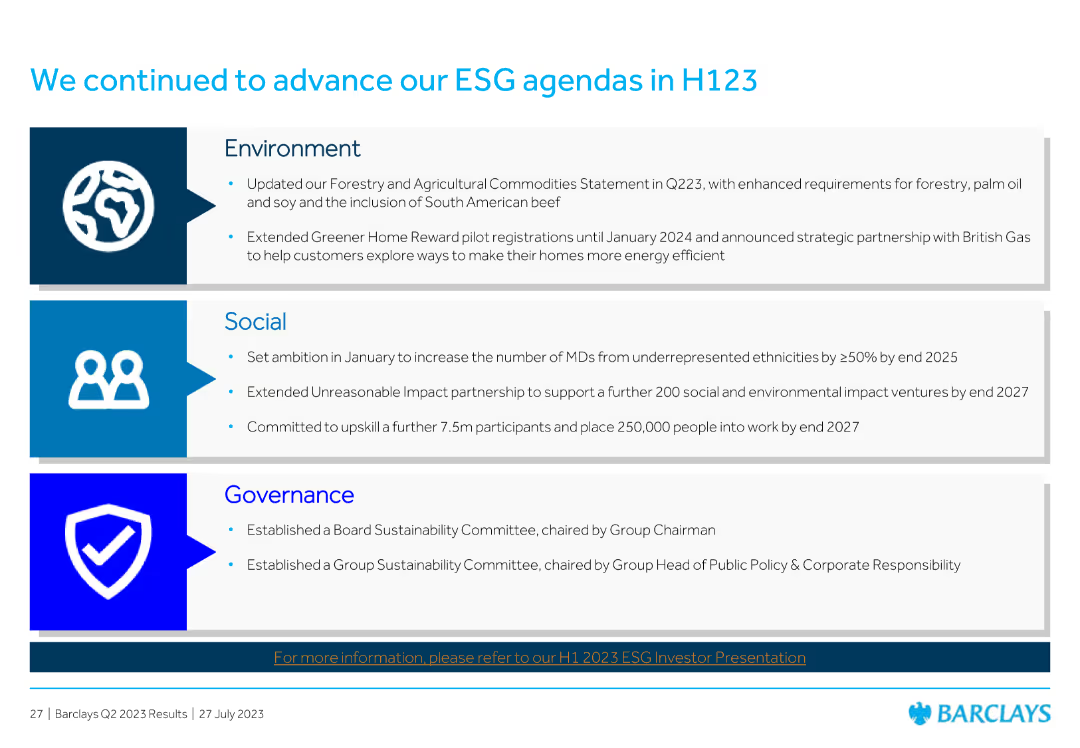
Features column charts showing CET1 ratio movements and key messages related to financial metrics.
Financial Performance
Financial Services
Highlights CET1 ratio movements and the significant headroom to the MDA, including regulatory updates and key financial data.
CET1, ratio, MDA, financial, regulatory
Header Vertical
Barclays
Saved
The slide contains a text section and a bar chart. The chart shows the percentage of respondents citing different factors contributing to stress, with shades of green differentiating millennials and Gen Z. The design is clean, utilizing white space effectively.
Risk Assessment and Management
Technology & Software
The slide presents the main stress factors for millennials and Gen Z, such as family welfare, financial future, and job prospects. It provides a detailed bar chart on stress drivers and discusses the pandemic's impact on financial concerns and job security, offering insights into workforce stress management and planning.
Stress Factors, Millennials, Gen Z, Pandemic Impact, Financial Concerns, Job Security, Bar Chart, Workforce Management
Mixed Chart
Deloitte
Saved
Slide features column charts showing 3-5 year earnings growth, trailing 12-month P/E, and dividend yield, among others, for the S&P 500 index. The design includes a clear depiction of YTD data with highlights in red, contrasting with the gray for other data points.
Investment Analysis
Financial Services
Presents a year-to-date analysis of the S&P 500 index across various financial metrics, essential for understanding market trends and investment decisions.
S&P 500, YTD analysis, earnings growth, P/E ratio, dividend yield, financial statistics, market trend analysis, investment insights
Multiple Chart
Morgan Stanley
Saved
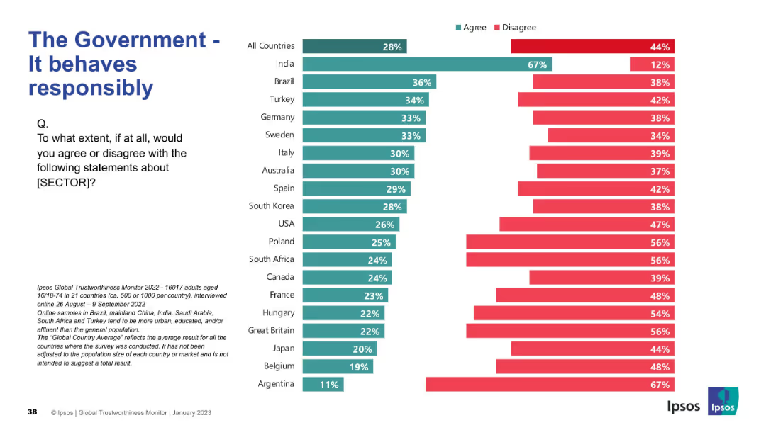
Same bar layout as previous slides; agree/disagree rating per country
Strategic Planning
Government & Public Sector
This slide presents opinions on whether governments act responsibly. India shows the highest agreement, but in most countries, disagreement exceeds agreement.
responsibility, trust, behavior, governance, Ipsos, ethics, survey results, international comparison
Mixed Chart
IPSOS
Saved
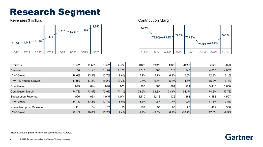
Bar and line charts with tabular financial data; left side features revenue metrics while the right shows contribution margin trends.
Performance Metrics and KPIs
Technology & Software
This slide breaks down the Research segment's quarterly and yearly revenue, contribution, and margin metrics from 1Q22 to 4Q23. It highlights stable growth in subscription revenues with declining non-subscription revenue and presents FX-neutral metrics.
Research, Revenue, Contribution, FX Neutral Growth, Subscription
Multiple Chart
Gartner
Saved
Two comparative area charts show the risk premia components for South American Chemicals Company using Morgan Stanley’s SICR Analysis vs. traditional analysis methods.
Strategic Planning
Financial Services
The slide explains the decomposition of risk premia into US treasury, sovereign-induced corporate credit, and corporate spread over sovereign spread. Useful for strategic risk analysis.
risk premia, SICR, corporate credit, sovereign spread, analysis
Multiple Chart
Morgan Stanley
Saved
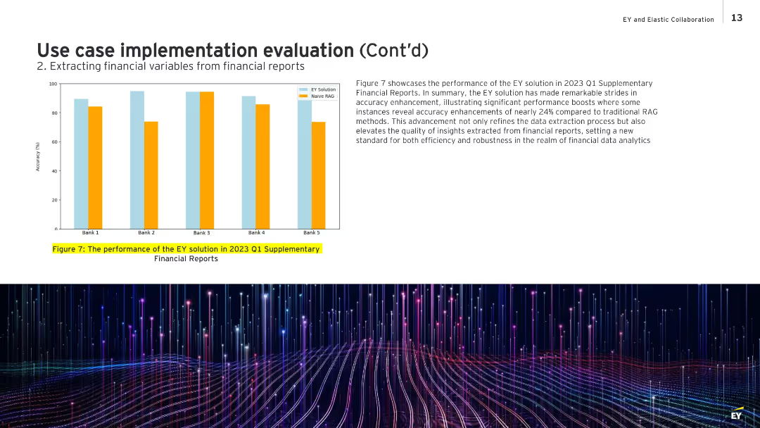
Bar chart on left showing comparative accuracy for five banks; text box on the right discusses the results.
Performance Metrics and KPIs
Financial Services
Highlights the performance improvement of EY’s data extraction system over traditional Naive RAG methods for Q1 2023 reports. The chart shows accuracy improvements of up to 24%, demonstrating robustness and quality in extracting actionable financial insights. It sets a benchmark for efficiency and reliability in financial data analysis.
financial accuracy, performance improvement, EY solution, Naive RAG, Q1 2023, analytics
Mixed Chart
EY
Saved
Includes pie charts and bar charts visually representing employment trends and sentiments.
Human Resources and Talent Management
Professional Services
Analyzes employment trends highlighting increasing job switches and wage pressures, useful for HR and organizational planning.
Employment Trends, Job Market, Wage Pressure, HR Planning, Organizational Strategy
Multiple Chart
PwC/Strategy&
Saved
The slide is filled with textual information, utilizing bullet points, icons, and colored boxes to distinguish sections. A small chart is present in the top-left corner. The visual complexity is moderate.
Market Analysis and Trends
Industrial & Manufacturing
The slide details the economic impact of the Tempest programme on the UK economy, projecting job support and GVA contribution. It serves as an analytical overview for stakeholders to understand the financial benefits and job creation prospects.
GVA, Tempest programme, economy, jobs, UK
Text Only
PwC/Strategy&
Saved
Column chart showing the perceived value of digital health solutions across various SEA countries.
Technology and Digital Transformation
Healthcare & Pharmaceuticals
This slide presents the value derived from digital health solution adoption in SEA, emphasizing better patient care and new revenue streams.
Digital health, SEA, patient care, revenue streams, adoption
Multiple Chart
LEK
Saved
This slide features a complex graph tracking GDP changes across countries with reference to industrial revolutions. The bold title is complemented by a timeline and legend. Design is data-heavy, with an inset quote and photo on the top right. The blue and black color scheme maintains a professional appearance.
Financial Performance
Technology & Software
Highlighting the economic impact of technological advancements, this slide provides a historical perspective by correlating GDP growth with industrial revolutions. It presents a data-driven analysis ideal for discussions on technology’s role in economic development and the potential future implications of the ongoing Fourth Industrial Revolution. This could be used to support investment strategies or policy-making in tech sectors.
Technology, GDP, Economic Impact, Data Analysis, Industrial Revolution, Growth, Historical, Investment
Mixed Chart
McKinsey
Saved
This slide features three main metrics: revenue, total installed base, and future revenue projections. It includes pie charts for product lines, geographies, and revenue models with purple color themes.
Financial Performance
Healthcare & Pharmaceuticals
Details the financial metrics and projections for the Molecular Diagnostics Business Unit, including product line distribution, geographical reach, and projected revenue from new product launches.
Revenue, Projections, Product, Geography, Healthcare
Multiple Chart
JP Morgan
Saved
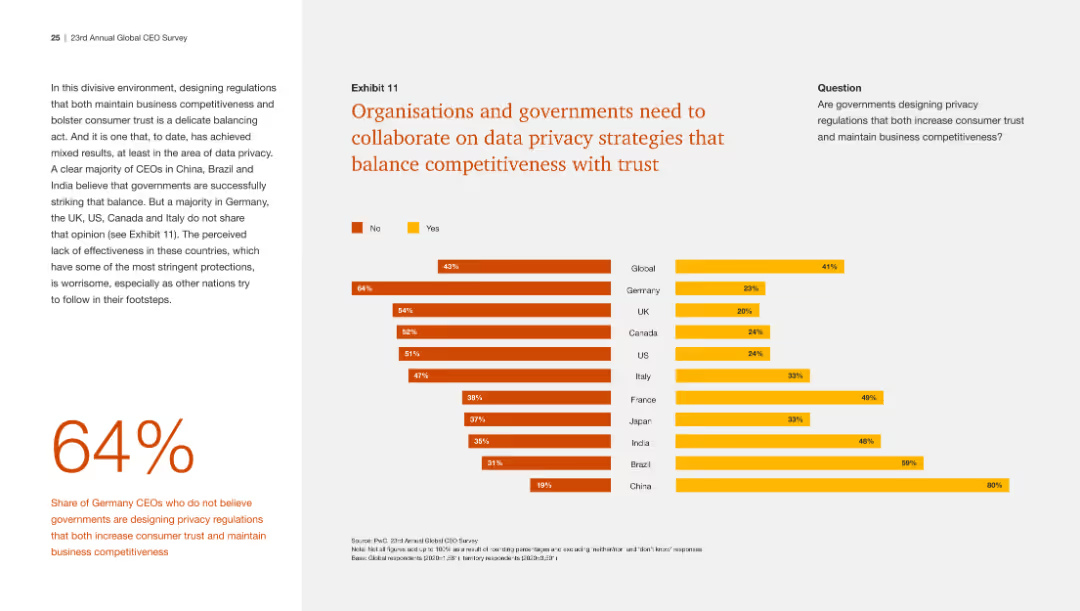
This slide presents a bar chart with global and regional data on whether CEOs believe governments are effectively balancing data privacy with competitiveness.
Regulatory and Compliance
Technology & Software
The slide shows a majority belief that data privacy regulations should balance competitiveness and consumer trust, with varying opinions by region.
Data privacy, competitiveness, government collaboration, regulations, CEO beliefs
Multiple Chart
PwC/Strategy&
Saved
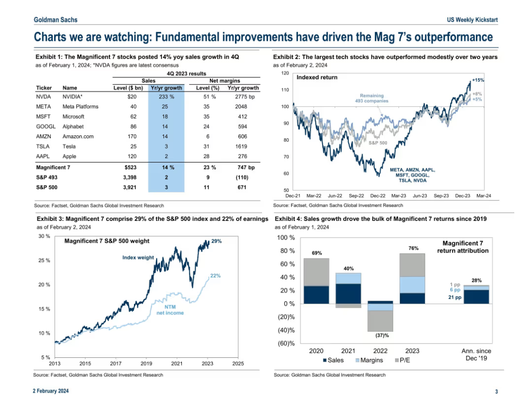
Grid layout of four exhibits; includes tables, line charts, and stacked bar charts to highlight performance and earnings contribution of the “Magnificent 7”.
Performance Metrics and KPIs
Technology & Software
The slide analyzes the top 7 tech-driven companies in the S&P 500, showing their sales growth, net margins, stock returns, and contribution to index weight and earnings. It emphasizes their outperformance and attributes it to fundamentals like revenue growth, with comparisons to the broader index.
Magnificent 7, sales growth, net margins, S&P 500, tech stocks, index weight, earnings, performance
Multiple Chart
Goldman Sachs
Saved
Composed of a colorful performance matrix, this slide visually distinguishes annual returns across various asset classes over multiple years for quick analysis.
Investment Analysis
Financial Services
Ideal for identifying historical performance trends, this data-driven slide allows investors to discern patterns and outliers in asset class returns over an extended period, aiding long-term strategic investment planning.
Asset Class, Annual Returns, Performance Trends, Data Matrix, Long-term Analysis, Color-Coded, Financial Planning
Table
Morgan Stanley
Saved
Column chart showing a slight increase from 5.1 to 5.2 between August 2021 and September 2022 in marketing leaders' effectiveness at demonstrating marketing's bottom-line impact to other C-suite members.
Customer and Market Segmentation
Professional Services
Discusses the effectiveness of marketing leaders in communicating the value of marketing strategies to other executives, showing a positive trend in their ability to link marketing efforts to company financials.
Marketing, Leadership, C-Suite, Communication, Bar Chart, Bottom-Line Impact, 2021-2022
Mixed Chart
Deloitte
Saved
The slide has a column chart showing SRU adjusted results in USD bn for 9M16 and 9M17, with segments for net revenues, pre-tax income, and operating expenses.
Financial Performance
Financial Services
This slide shows the reduction in pre-tax income drag on Group results from -2.5 bn to -1.5 bn, highlighting changes in net revenues and operating expenses.
pre-tax income, net revenues, operating expenses, income drag, financial results
Single Chart
Credit Suisse
Saved
Slide with two doughnut charts comparing helicopter deliveries, two pie charts on revenue segmentation, and bullet points. Red and grey shades are utilized, with a clean layout.
Product and Service Analysis
Transportation & Logistics
Analysis of helicopter delivery numbers and revenue by customer segment for FY2020 and FY2021, highlighting changes and focusing on different helicopter models within the AW family.
helicopter deliveries, revenue segmentation, AW family, defense, civil, OE, CS&T
Multiple Chart
Goldman Sachs
Saved
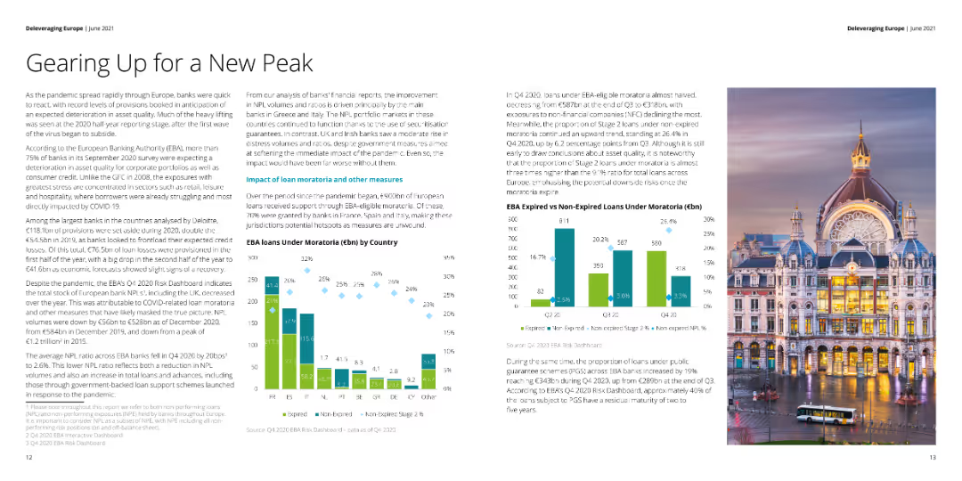
Column charts displaying NPL volumes, loan provisions by type, and Stage 2 loans for top Irish banks.
Risk Assessment and Management
Financial Services
Reviews the NPL volumes and provisions of leading Irish banks, examining risk mitigation strategies and trends.
Ireland, banks, NPL, risk, management
Multiple Chart
Deloitte
Saved
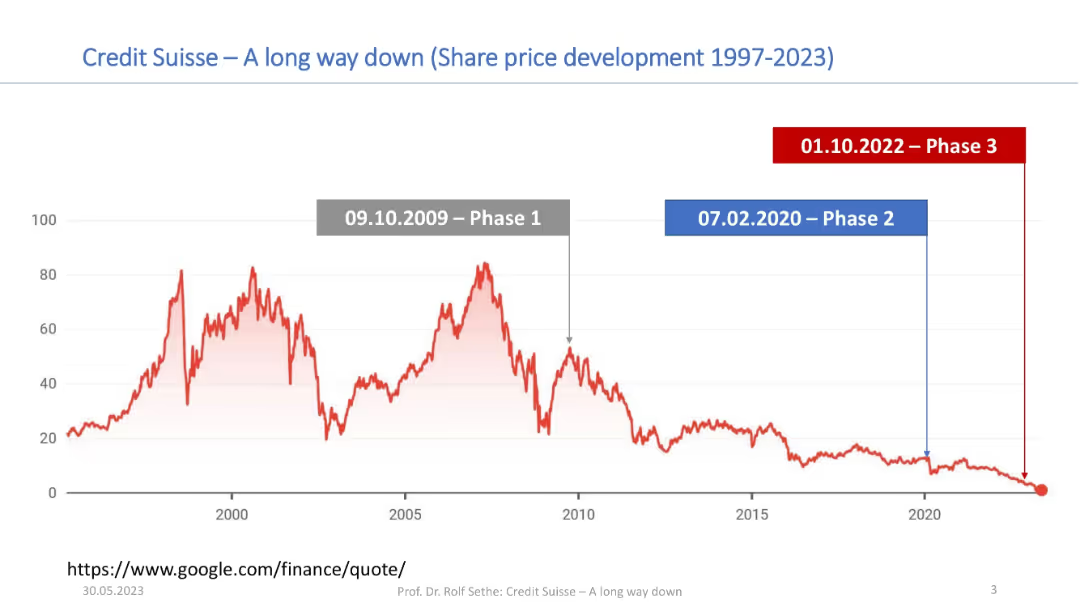
Long-term line graph (1997–2023) of Credit Suisse’s share price; three key decline phases marked by colored banners.
Market Analysis and Trends
Financial Services
A historical stock chart for Credit Suisse tracks its share price decline from 1997 to 2023, marked in three distinct phases. Major peaks and subsequent collapses are highlighted to show long-term performance trends leading to the firm’s downfall.
Credit Suisse, stock price, share performance, decline, phases, timeline, 1997–2023, financial history
Single Chart
Credit Suisse
Saved
Previous
Next
If nothing, comes up, please save your slides first
Create a FREE account to continue browsing
Receive Instant Access to 1,000+ slides from companies like McKinsey, Google, and Goldman Sachs
First Name
Last Name
Email
Password
I agree to all
Terms & Privacy Policy
Thank you! Your submission has been received!
Oops! Something went wrong while submitting the form.
Have an account?
Sign in
Column Chart
Heatmap
Chevron
Org Chart
Infographic
Callouts
Timeline
List
Graphic
Picture
Process Flow
Diagram
Paragraph
Map
Table
Framework
Subtitle
Takeaway Box
Icon
Other Chart
Radar Chart
Waterfall Chart
Mekko Chart
Pie Chart
Scatter Plot
Line Chart
Bar chart
Bullet points