Create a FREE Account
Instant access to 1,000+ real slides from top companies like McKinsey, BCG, Goldman Sachs, Google and many more!
First Name
Last Name
Email
Password
I agree to all
Terms & Privacy Policy
Thank you! Your submission has been received!
Oops! Something went wrong while submitting the form.
Have an account?
Sign in
Library
Templates
Courses
Pricing
My Account
My Slides
My Templates
✦ AI
AI Prompt Library
AI Search
Sign in
Start Here
Logout
My Saved Slides
Consists of bar graphs and a summary table detailing financial results and key performance indicators.
Financial Performance
Financial Services
Focuses on the financial outcomes of Q4 2023, showing changes in revenue and expenses, suitable for evaluating operational efficiency and financial health.
corporate bank, financial results, Q4, revenue, expenses
Mixed Chart
Deutsche Bank
Saved
The slide compares the compound annual growth rate (CAGR) of technology investments to other sectors using a bar graph and provides explanatory text for observed trends in deal value growth.
Market Analysis and Trends
Technology & Software
This slide contrasts the growth rates in technology venture investing with other sectors, highlighting periods of resilience and expansion. It discusses the macroeconomic conditions influencing these trends and the notable increase in deal values in technology, emphasizing the sector's robust performance compared to others.
technology growth, CAGR, venture investing, market analysis, sector comparison
Mixed Chart
Oliver Wyman
Saved
The slide shows a group of professionals in a meeting with a bar chart comparing satisfaction with risk function progress in 2023 vs. 2021. The chart is labeled with various risk management areas like "Reducing cost," "Ensuring risk is factored," and "Re-engineering." A series of percentages indicate increased satisfaction across the board. The image conveys an office setting.
Risk Assessment and Management
Technology & Software
This slide analyzes the satisfaction levels across different areas of risk management from 2021 to 2023. It reveals an increase in satisfaction in all listed areas, indicating a positive trend in the effectiveness of risk management strategies. Such insights are crucial for understanding the impact of implemented risk management improvements and strategizing future enhancements in organizational risk approaches.
risk management, satisfaction, progress, 2023, 2021, column chart, professional setting, office, analysis
Mixed Chart
Accenture
Saved
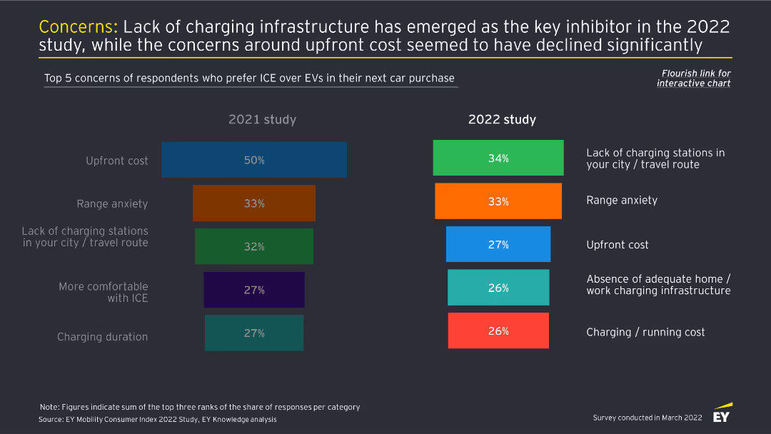
This slide features two column charts comparing the top five concerns about EV adoption between 2021 and 2022. Each concern is color-coded and ranked by percentage.
Market Analysis and Trends
Transportation & Logistics
The slide identifies the primary concerns of consumers preferring ICE over EVs, with lack of charging infrastructure being the top issue in 2022, and upfront cost concerns reducing significantly.
EV concerns, charging infrastructure, consumer behavior, market analysis, automotive industry
Multiple Chart
EY
Saved
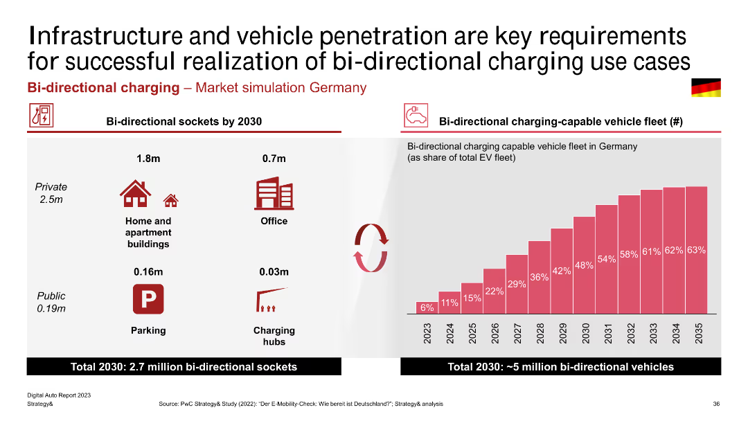
This slide presents a combination of infographics and column charts, highlighting projections for bi-directional sockets and vehicle fleet penetration in Germany by 2030. It includes icons and percentage bars.
Market Analysis and Trends
Energy & Utilities
The slide projects the number of bi-directional sockets and bi-directional charging-capable vehicles in Germany by 2030. It highlights the significant growth expected in private, office, and public charging hubs, emphasizing the infrastructure needed for this transition.
Bi-directional Charging, Infrastructure, Vehicle Penetration, Germany, Market Simulation, Charging Hubs, Projection
Mixed Chart
PwC/Strategy&
Saved
Three columns aligned left to right showing 'Secular Forces', 'Impact', and 'Opportunities' with related bullet points in blue boxes.
Market Analysis and Trends
Financial Services
Analyzing market opportunities arising from changes such as regulation, technology, and competitive dynamics, and their impacts and opportunities.
Secular Change, Regulatory Changes, Technology, Market Opportunities, Risk Intermediation, Client Financing, Client Experience
Linear Flow
Goldman Sachs
Saved
The slide contrasts five leading sectors against four nascent sectors in the digital economy using icons and a two-column layout. It's clean and straightforward, with a focus on sector categorization.
Market Analysis and Trends
Technology & Software
The slide categorizes the sectors within the digital economy, distinguishing between established and emerging areas, thus providing a quick overview of the market coverage.
Digital Economy, Market Coverage, Leading Sectors, Nascent Sectors, Sector Categorization
Header Horizontal
Bain
Saved
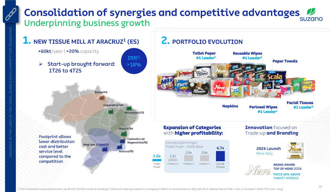
Two-section layout: left side features a map and mill expansion plan; right side shows product portfolio and profitability analysis. Clean corporate style with product visuals and icons.
Strategic Planning
Consumer Goods
The slide outlines Suzano's strategic initiatives, highlighting a new tissue mill in Aracruz and the evolution of its product portfolio. It emphasizes expansion in higher-margin categories like facial tissues and highlights innovation in branding. A map shows Suzano’s Brazilian footprint for logistical advantage.
tissue mill, product portfolio, brand leadership, Suzano, IRR, profitability, logistics, trade-up, branding
Mixed Chart
Goldman Sachs
Saved
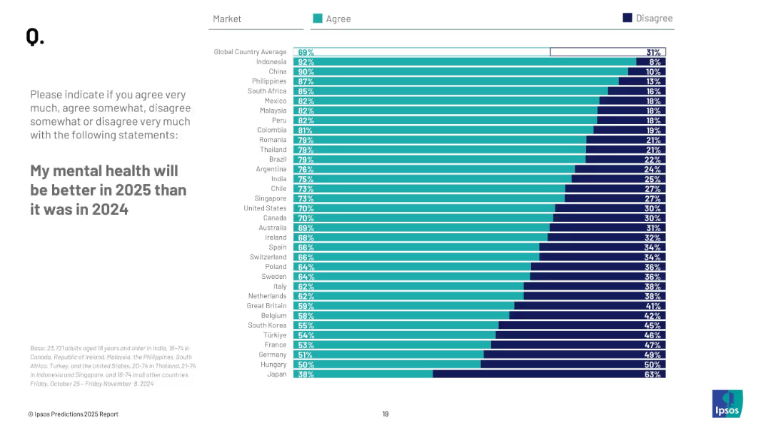
Horizontal bar chart with "Agree" and "Disagree" columns; left-aligned title and instructions; countries ranked by optimism in mental health.
Market Analysis and Trends
Healthcare & Pharmaceuticals
This slide displays how optimistic individuals are regarding their mental health in 2025 compared to 2024. It breaks down agreement/disagreement percentages per country with a global average.
mental health, optimism, wellbeing, survey, countries, Ipsos, 2025, expectations, global trends
Mixed Chart
IPSOS
Saved
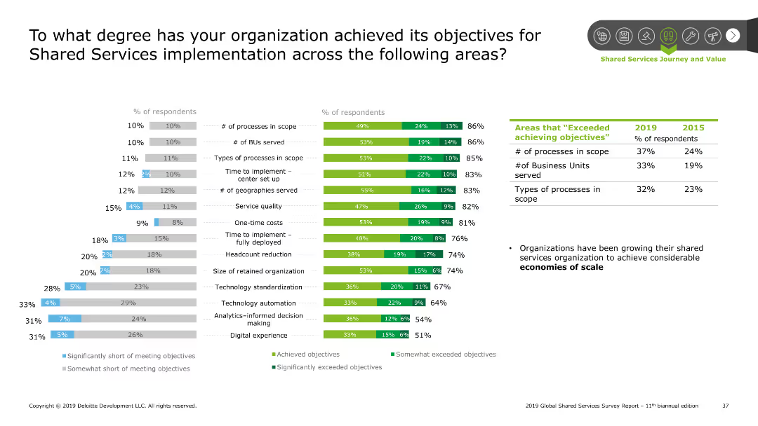
The slide features column charts showing the extent to which organizations have met their objectives in various aspects of shared services implementation.
Performance Metrics and KPIs
Professional Services
This slide measures the achievement of objectives in shared services implementation across different metrics such as processes, BUs served, and cost management.
Objectives, shared services, implementation, performance, metrics
Multiple Chart
Deloitte
Saved
Features comparative column charts and statistics on consumer activity changes, with clear visual elements to distinguish between the data points, emphasizing shifts in behavior and concerns.
Customer and Market Segmentation
Consumer Goods
Analyzes the evolving consumer behaviors in response to the COVID-19 pandemic, focusing on the increase in activities despite concerns, and the role of vaccination in enabling safer gatherings.
Consumer Behavior, COVID-19, Vaccination, Activities
Mixed Chart
BCG
Saved
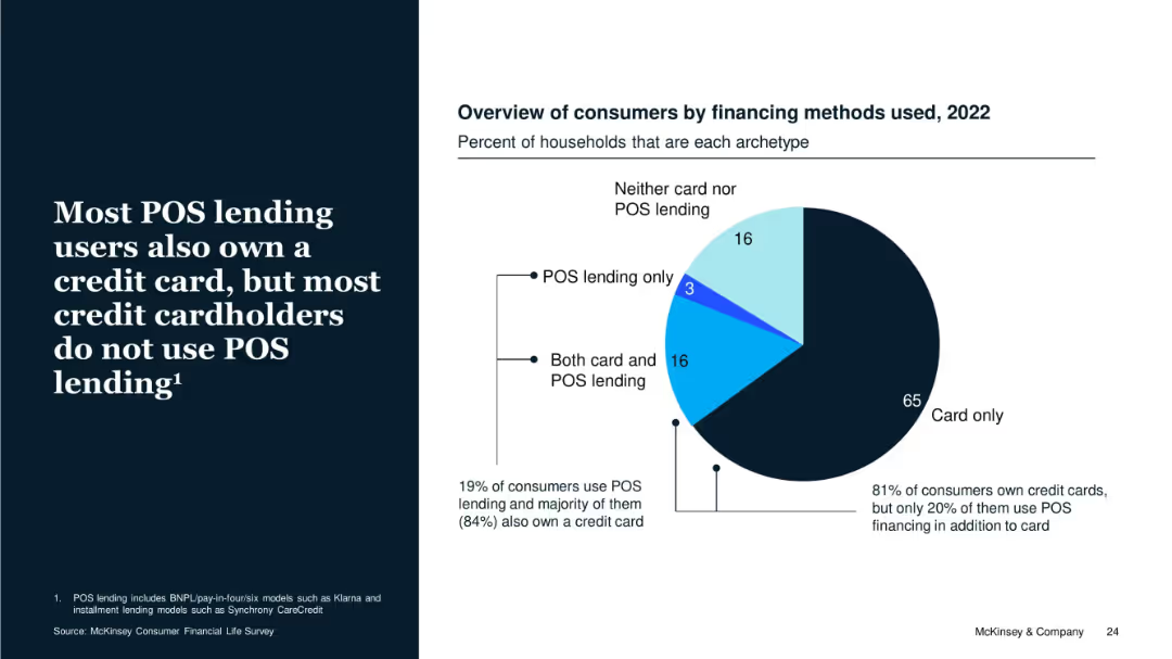
Pie chart with 2022 data on financing types among consumers. Includes explanatory text on the left with supporting percentages on chart.
Customer and Market Segmentation
Financial Services
The slide emphasizes that while 19% of consumers use POS lending, the majority also have credit cards. It highlights that POS lending is supplementary rather than substitutive to credit cards, with 81% of consumers owning cards and most not using POS lending.
POS Lending, Credit Cards, Consumer Types, Ownership, Financing, BNPL
Mixed Chart
McKinsey
Saved
Slide contains column chart and data points representing financial performance metrics for FY23.
Financial Performance
Financial Services
Detailed annual financial performance review of FY23, focusing on key metrics such as RoTE, income, and costs, beneficial for financial analysis and shareholder reports.
financial, performance, RoTE, income, costs
Mixed Chart
Barclays
Saved
This slide displays a column chart and a line graph. The column chart shows half-yearly rent reversion percentages, and the line graph tracks portfolio occupancy rates over time. The colors in the bar graph correlate with the periods shown on the x-axis. The line graph is superimposed to demonstrate the relationship between occupancy and rent reversion. There's also a note clarifying the occupancy calculation.
Financial Performance
Real Estate & Construction
Examines the portfolio's performance in terms of occupancy rates and rent reversion, suggesting high levels of retention and positive financial trends.
Portfolio Occupancy, Rent Reversion, Asset Management, Performance Analysis, Tenant Retention, Financial Indicators
Single Chart
Morgan Stanley
Saved
The slide uses a simple design with text and icons. It offers recommendations for future data strategies, focusing on knowing consumers, engaging on next-gen platforms, and privacy.
Strategic Planning
Professional Services
This slide provides strategic recommendations for marketers to adopt future-forward data strategies, emphasizing consumer understanding, engagement on modern platforms, and privacy considerations.
data strategies, recommendations, future-forward, consumer engagement, privacy
Header Vertical
Nielsen
Saved
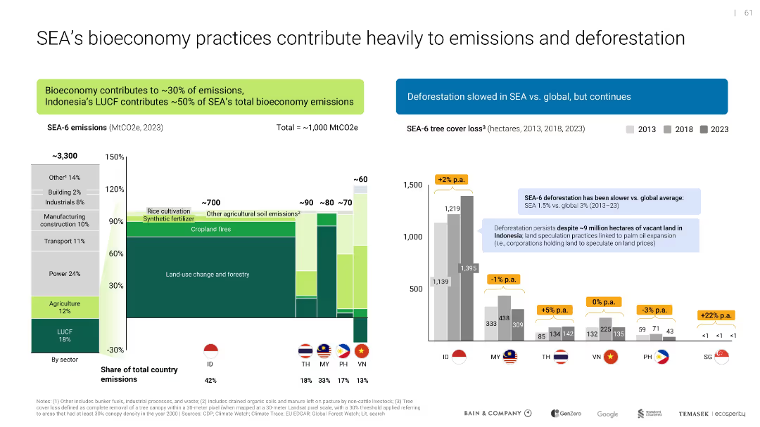
Side-by-side bar charts; one shows sector emissions breakdown, the other tracks deforestation trends by country
Risk Assessment and Management
Environmental Services & Sustainability
Analyzes emissions sources in SEA's bioeconomy, particularly land use change and agriculture. Deforestation data shows varied progress across countries, with Indonesia as a major contributor.
emissions, deforestation, LUCF, agriculture, SEA, sustainability, climate impact
Multiple Chart
Bain
Saved
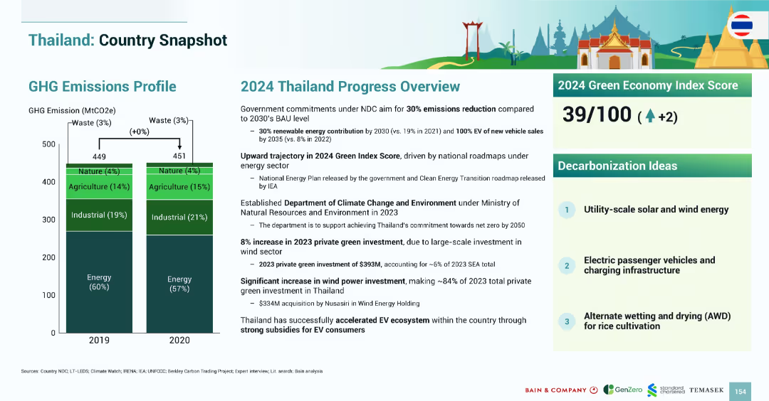
Layout mirrors previous country snapshots with emissions bar chart, 2024 progress narrative, index score, and decarbonization ideas.
Strategic Planning
Government & Public Sector
Thailand’s emissions profile remained stable between 2019–2020. The 2024 Green Index Score increased to 39/100. Green investments reached $393M in 2023, driven by wind power. Strategies emphasize EV adoption, utility-scale renewables, and rice cultivation water management.
Thailand, emissions, EV, wind power, solar, agriculture, AWD, 2024, Green Index
Mixed Chart
Bain
Saved
A large pie chart on the left and a bar graph on the right against a purple background with descriptive text boxes.
Strategic Planning
Telecommunications
Examines how the nbn™ network aligns with user values, indicating a significant agreement on its positive impact on their lives.
user values, nbn network, life impact, agreement percentage, life goals, value alignment, network benefits, survey data
Multiple Chart
Accenture
Saved
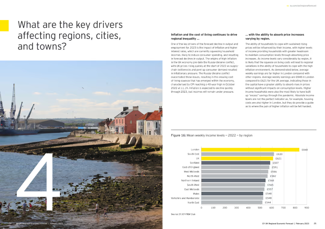
Features a large number "4" with an image of a coastal town, and a column chart showing mean weekly income levels by region for 2022.
Market Analysis and Trends
Government & Public Sector
Identifies key drivers affecting regions, cities, and towns, focusing on inflation, cost of living, and income disparities across the UK.
key drivers, regional impact, inflation, income levels, 2022, column chart
Mixed Chart
EY
Saved
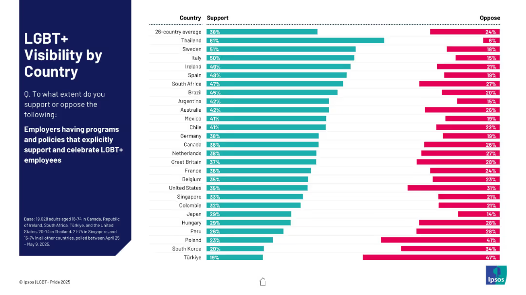
Horizontal bar chart showing support/oppose split for employer LGBT+ programs; countries listed vertically.
Market Analysis and Trends
Government & Public Sector
The chart shows public support for employers having LGBT+ inclusive policies. Thailand ranks highest at 61%, while Türkiye shows the lowest at 19%. Comparative trends are also included.
workplace, LGBT+, support, employers, policies, inclusion, countries
Mixed Chart
IPSOS
Saved
The slide uses a column chart to depict Australian residential work from FY07 to FY25, showing actuals and projections in three scenarios. It includes explanatory text boxes and scenario legends.
Market Analysis and Trends
Real Estate & Construction
Examines the resilience and sensitivity of residential construction work in Australia, comparing historical data to future projections and highlighting economic impacts.
Australia, residential, projections, economic impacts, construction
Mixed Chart
Deloitte
Saved
Displays a bar graph tracking the submission of annual reports by non-listed entities, with a stark visual question mark emphasizing missing data.
Regulatory and Compliance
Government & Public Sector
Examines report submission compliance among public and semi-public entities, highlighting gaps in submissions over the years. Useful for regulatory discussions and public sector transparency initiatives.
public sector, compliance, reports, transparency
Single Chart
PwC/Strategy&
Saved
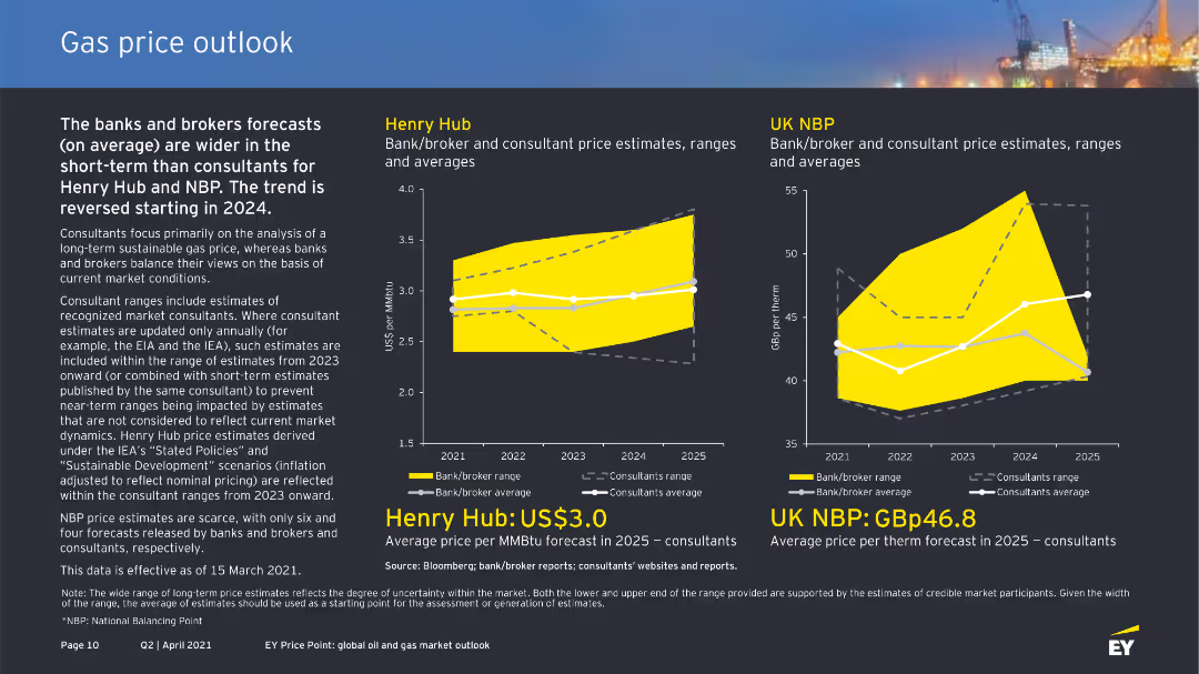
The slide shows column charts for Henry Hub and UK NBP gas price estimates by banks/brokers and consultants. It uses clear color coding and labels for different forecast ranges and averages.
Market Analysis and Trends
Energy & Utilities
This slide compares gas price forecasts for Henry Hub and UK NBP by banks, brokers, and consultants, noting a wider forecast range in the short term for banks and brokers and trend reversals starting in 2024.
gas price, Henry Hub, UK NBP, forecast, consultants
Multiple Chart
EY
Saved
Features two sections: a detailed definition of blockchain and a diagrammatic representation of how blockchain functions, highlighting nodes and blocks with minimalist icons and blue color tones.
Technology and Digital Transformation
Technology & Software
Provides a fundamental explanation of blockchain technology, describing its decentralized nature and the process of adding new data blocks to the network. Aimed at educating viewers new to blockchain concepts.
blockchain, digital ledger, decentralization, nodes, technology
Boxed
McKinsey
Saved
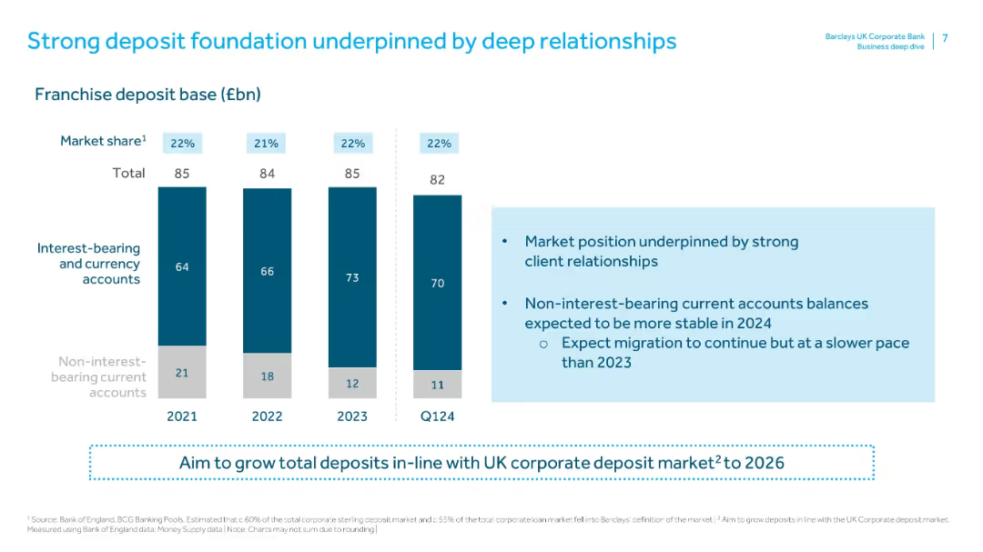
Contains vertical bars showing interest-bearing and non-interest-bearing accounts (2021–Q1 2024). Right side has a text box detailing market position and expectations for 2024.
Strategic Planning
Financial Services
Highlights Barclays UKCB’s strong market share (22%) and client relationships in deposits. It also shows a shift from non-interest to interest-bearing accounts and outlines expectations for stabilization and slower migration in 2024.
deposits, interest-bearing, market share, client relationships, account balances, deposit growth, franchise base, strategic planning
Mixed Chart
Barclays
Saved
Previous
Next
If nothing, comes up, please save your slides first
Create a FREE account to continue browsing
Receive Instant Access to 1,000+ slides from companies like McKinsey, Google, and Goldman Sachs
First Name
Last Name
Email
Password
I agree to all
Terms & Privacy Policy
Thank you! Your submission has been received!
Oops! Something went wrong while submitting the form.
Have an account?
Sign in
Column Chart
Heatmap
Chevron
Org Chart
Infographic
Callouts
Timeline
List
Graphic
Picture
Process Flow
Diagram
Paragraph
Map
Table
Framework
Subtitle
Takeaway Box
Icon
Other Chart
Radar Chart
Waterfall Chart
Mekko Chart
Pie Chart
Scatter Plot
Line Chart
Bar chart
Bullet points