Create a FREE Account
Instant access to 1,000+ real slides from top companies like McKinsey, BCG, Goldman Sachs, Google and many more!
First Name
Last Name
Email
Password
I agree to all
Terms & Privacy Policy
Thank you! Your submission has been received!
Oops! Something went wrong while submitting the form.
Have an account?
Sign in
Library
Templates
Courses
Pricing
My Account
My Slides
My Templates
✦ AI
AI Prompt Library
AI Search
Sign in
Start Here
Logout
My Saved Slides
The slide features multiple line charts comparing valuation premiums and EBITDA multiples across different company sizes.
Investment Analysis
Financial Services
This slide examines the scale advantages in trading premiums for large companies compared to smaller ones.
Scale, trading premium, EBITDA, line chart, comparative analysis
Multiple Chart
JP Morgan
Saved
The slide presents two column charts, the first illustrating the growth in revenue and expenses for CIB Treasury Services, and the second showing operating and non-operating deposits growth across client segments and regions.
Financial Performance
Financial Services
Geared towards financial strategists and investors, it highlights the robust growth of CIB Treasury Services, with a focus on revenue increases, expense management, and deposit growth, essential for evaluating business health and operational strategy.
CIB, treasury services, revenue growth, expense management, deposits, operational strategy, financial health
Multiple Chart
JP Morgan
Saved
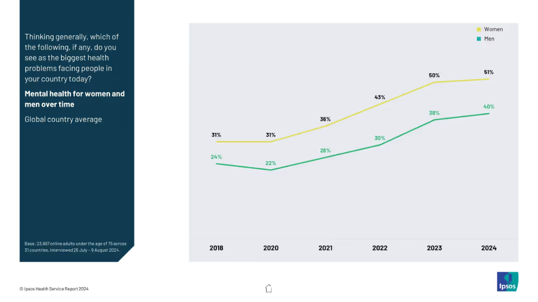
Line chart comparing mental health concern rates for women vs men, 2018–2024; two lines (yellow for women, green for men).
Market Analysis and Trends
Healthcare & Pharmaceuticals
This slide highlights gender differences in concern about mental health over time. It shows a consistent upward trend for both genders, with women showing higher levels of concern than men.
gender comparison, mental health, public sentiment, trend analysis, health disparitie
Mixed Chart
IPSOS
Saved
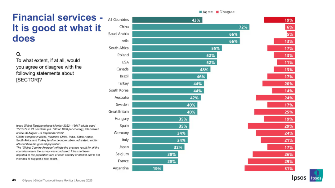
Bar chart split by "Agree" and "Disagree" responses by country; simple layout with clean segmentation
Strategic Planning
Financial Services
This slide presents a global perception of the financial services sector’s competence. China, India, and Saudi Arabia have high agreement (66–72%), indicating strong regional trust. The average global agreement is 43%.
financial services, competence, trust, international, agreement, Ipsos, bar chart, perception, countries
Mixed Chart
IPSOS
Saved
Features pie charts detailing Macquarie's term funding by currency, tenor, and type, with percentages and color differentiation for visual clarity.
Corporate Finance and Valuation
Financial Services
The slide conveys Macquarie's funding strategy, emphasizing diversification by currency, duration, and funding type, useful for stakeholders analyzing financial strategy and currency exposure.
funding, strategy, diversification, currency, finance, term, issuance, pie chart, financial, exposure
Multiple Chart
Goldman Sachs
Saved
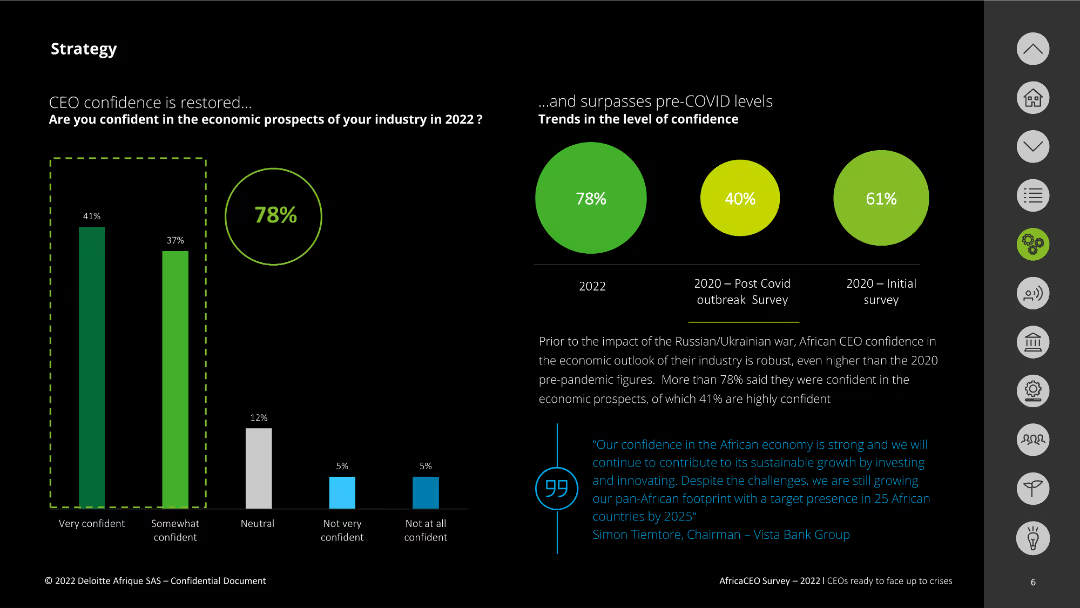
Vertical column chart showing CEO confidence in economic prospects by confidence level, and pie charts showing trends in confidence over time.
Strategic Planning
Financial Services
It discusses CEO confidence in economic prospects for 2022, comparing it with post-COVID and initial survey results, highlighting restored confidence.
CEO confidence, economic prospects, Deloitte, 2022, strategic planning, column chart, pie chart
Multiple Chart
Deloitte
Saved
Contains a two-column layout with a column chart for dividends per year on the left and a block of text with figures on share buybacks on the right.
Financial Performance
Financial Services
Displays dividend payments from 2020 to 2023 and details on share buyback in 2023, emphasizing shareholder value creation through dividends and share buybacks.
dividends, shareholder value, buyback, financials, growth
Mixed Chart
IPSOS
Saved
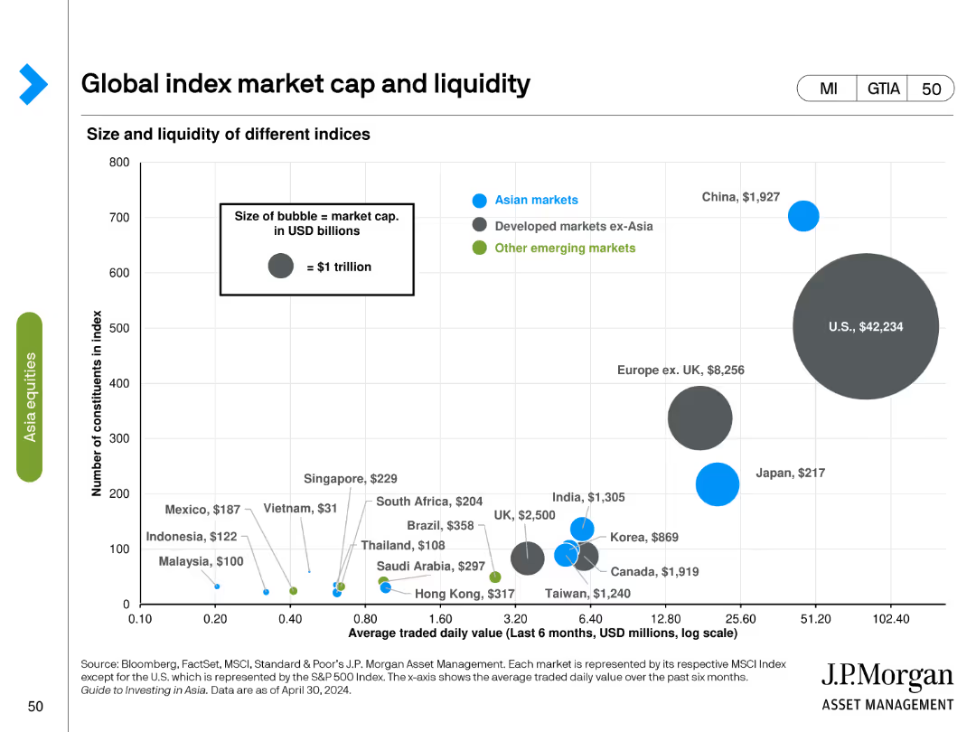
Bubble chart showing size and liquidity of different indices with average traded daily value and market cap. Bubble size represents market cap in USD billions.
Investment Analysis
Financial Services
Compares the market cap and liquidity of various global indices, highlighting differences in traded value and constituent count.
index, market cap, liquidity, bubble chart, financial analysis, global indices, daily value, investment, market size
Single Chart
JP Morgan
Saved
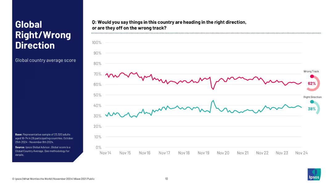
Full-width time-series line chart; visualizes percentage of people believing country is on right/wrong track.
Market Analysis and Trends
Professional Services
This slide tracks a global average of sentiment on national direction over the last 10 years. While there is volatility, a clear long-term trend shows more people believing things are on the wrong track. The gap remains persistent, reflecting ongoing global discontent.
direction sentiment, wrong track, global average, Ipsos, perception trend, dissatisfaction, 10-year trend
Multiple Chart
IPSOS
Saved
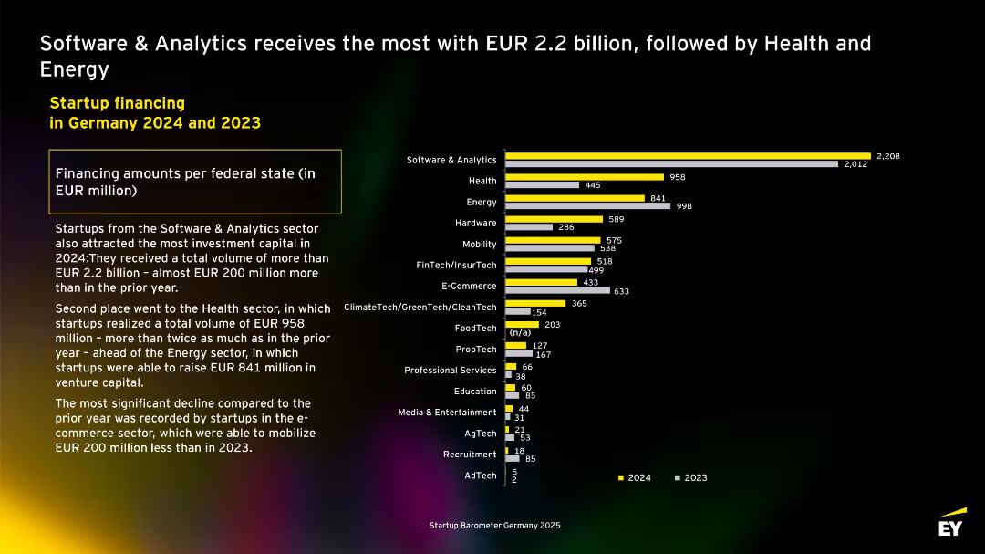
Horizontal bar chart with EUR million values for each sector in 2023 and 2024. Software & Analytics tops the chart with €2.2B. Side text explains sectoral trends and highlights the sharp decline in e-commerce funding.
Investment Analysis
Technology & Software
Tracks investment volumes by startup sector. Software & Analytics leads with €2.2B raised in 2024. Health and Energy follow. The slide notes year-over-year sectoral growth and decline, especially a notable drop in E-Commerce sector investments.
investment, sector funding, analytics, health, energy, e-commerce, Germany, startups
Mixed Chart
EY
Saved
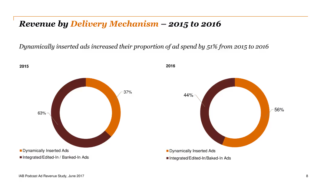
Two doughnut charts comparing dynamically inserted ads versus integrated ads between 2015 and 2016, showing an increase in dynamic ads from 37% to 56%.
Financial Performance
Media & Entertainment
The slide compares revenue by delivery mechanism, highlighting the increase in dynamically inserted ads from 2015 to 2016. Useful for analyzing shifts in advertising strategies.
revenue, delivery, mechanism, ads, dynamic
Multiple Chart
PwC/Strategy&
Saved
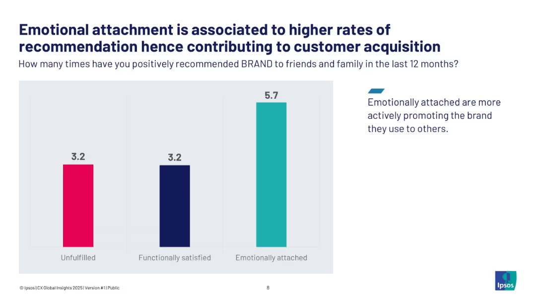
Vertical bar chart comparing unfulfilled, functionally satisfied, and emotionally attached brand recommend rates.
Customer and Market Segmentation
Consumer Goods
The slide illustrates how emotional brand attachment drives more positive customer recommendations, with emotionally attached customers recommending 5.7 times vs. 3.2 for others. This emotional engagement enhances acquisition through advocacy.
brand loyalty, emotional attachment, customer acquisition, advocacy
Single Chart
IPSOS
Saved
Contains a bar chart comparing ownership rates of various smart entertainment and smart home devices over two years.
Market Analysis and Trends
Telecommunications
Analyzes consumer engagement with smart home and entertainment devices, showing growth and preferences over time.
smart home, smart entertainment, device adoption, consumer trends, technology growth
Single Chart
Deloitte
Saved
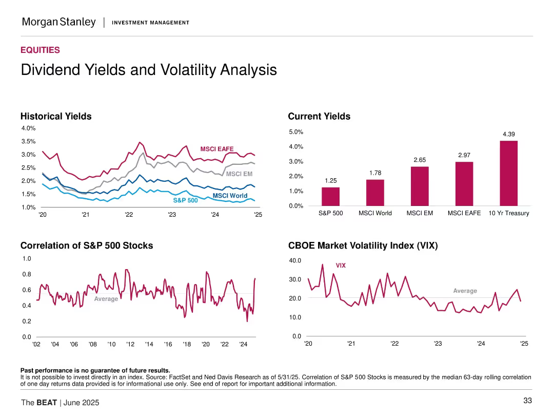
Multiple small charts: historical/current dividend yields, S&P stock correlation, VIX trend.
Risk Assessment and Management
Financial Services
Highlights dividend yield comparisons across indices (S&P 500, MSCI World, etc.) and explores volatility and stock correlation trends using VIX and median.
dividend yield, volatility, VIX, stock correlation, equities, MSCI, S&P 500, fixed income alternative, market stress
Multiple Chart
Morgan Stanley
Saved
A table outlines the top criteria LGBT+ talents consider when choosing an employer in various countries.
Human Resources and Talent Management
Professional Services
Prioritizes the aspects most important to LGBT+ talents in their employment decisions.
LGBT+, employment criteria, employer choice, top criteria
Table
BCG
Saved
A circular diagram slide depicting various digital solutions for end-to-end SME services with corresponding icons for each service category.
Technology and Digital Transformation
Financial Services
The slide showcases the ecosystem of digital solutions for SME services, suggesting a holistic approach to SME management. It's useful for understanding how digital services are becoming integrated to serve the end-to-end needs of small and medium enterprises.
SME Services, Digital Solutions, Ecosystem, Integration, Management
Diagram
Kearney
Saved
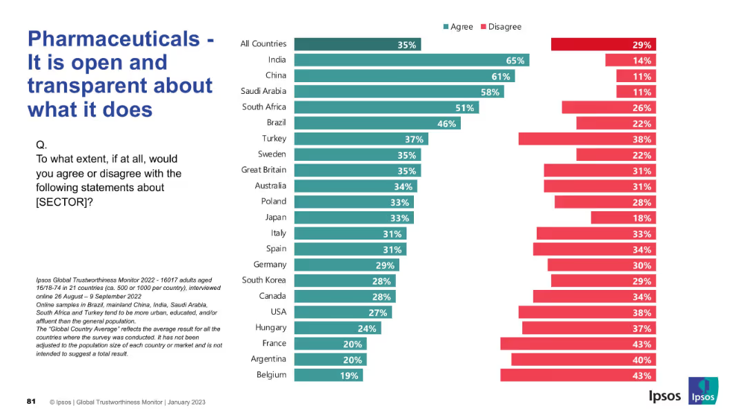
Horizontal bar chart by country with strong red presence (disagreement). Design format mirrors others, with clean layout and left-aligned question and title.
Market Analysis and Trends
Healthcare & Pharmaceuticals
The slide explores public belief in the pharmaceutical sector’s transparency. Agreement is notably low across most countries, especially in France, Belgium, and Argentina. Only China and India show majority agreement, highlighting widespread skepticism about openness.
transparency, communication, public opinion, pharma, survey, global data, Ipsos, accountability, openness, perception
Mixed Chart
IPSOS
Saved
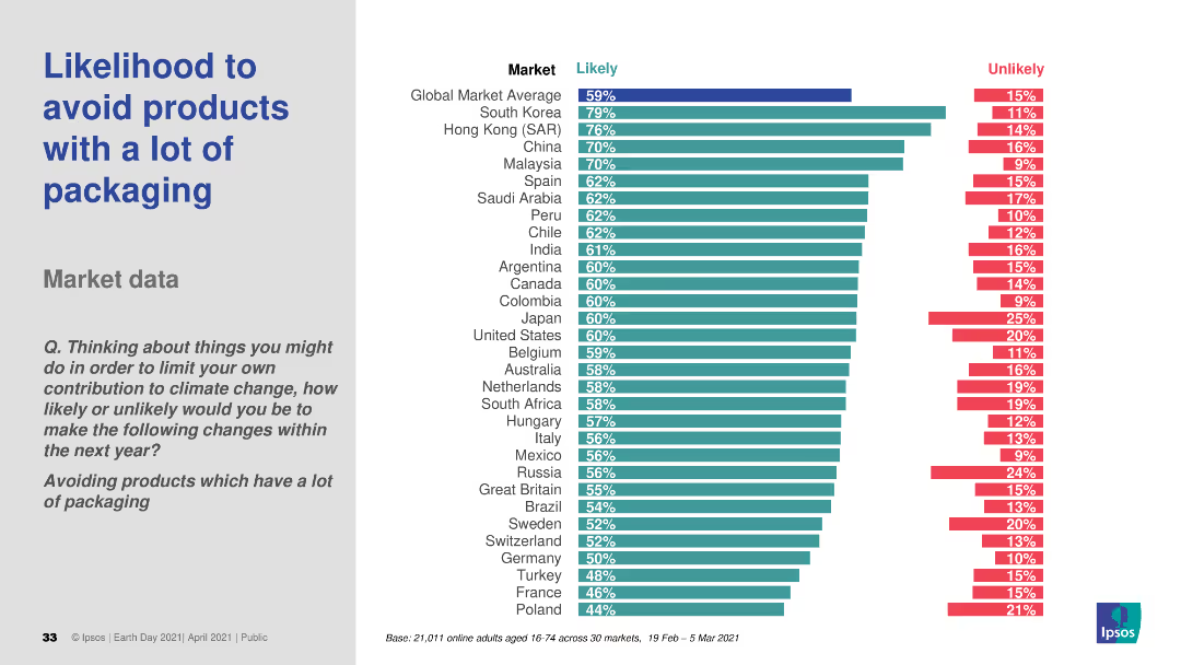
The slide features a column chart showing the likelihood of avoiding products with a lot of packaging across various markets. It uses two colors to indicate "Likely" and "Unlikely." The text includes a question and survey details.
Market Analysis and Trends
Environmental Services & Sustainability
The slide presents survey data on the likelihood of avoiding products with excessive packaging, comparing responses across different global markets.
packaging, avoidance, likelihood, survey, environmental impact
Multiple Chart
IPSOS
Saved
The slide displays column charts for multiple countries, comparing the change in new car purchase intent.
Market Analysis and Trends
Transportation & Logistics
Discusses the varying degrees of recovery in new car purchase intent across different markets during the pandemic.
car market, international, purchase intent, recovery trends
Multiple Chart
McKinsey
Saved
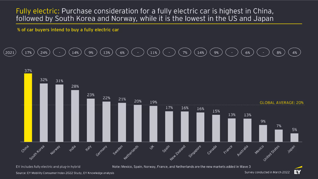
This slide features a column chart displaying the percentage of car buyers intending to buy a fully electric car across different countries. Each country is represented by a vertical bar with percentages labeled on top. The slide has a dark background with yellow highlights.
Market Analysis and Trends
Transportation & Logistics
The slide analyzes the intent to purchase fully electric cars in various countries, highlighting China as the highest and Japan as the lowest. It provides a comparison of consumer interest across 18 countries, showing the global average.
Electric cars, purchase intent, market analysis, consumer trends, automotive industry
Single Chart
EY
Saved
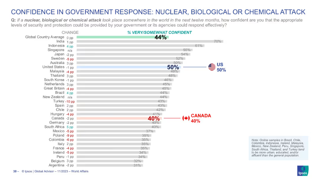
Horizontal bar chart with similar design as previous slide, red and blue highlights for Canada and US respectively
Risk Assessment and Management
Government & Public Sector
This chart assesses the confidence level of citizens in their governments' ability to respond to a nuclear, biological, or chemical attack. Global average is 44%, with Canada at 40% and the U.S. at 50%.
NBC attack, government trust, defense readiness, Canada, US, Ipsos, public opinion, comparative confidence
Single Chart
IPSOS
Saved
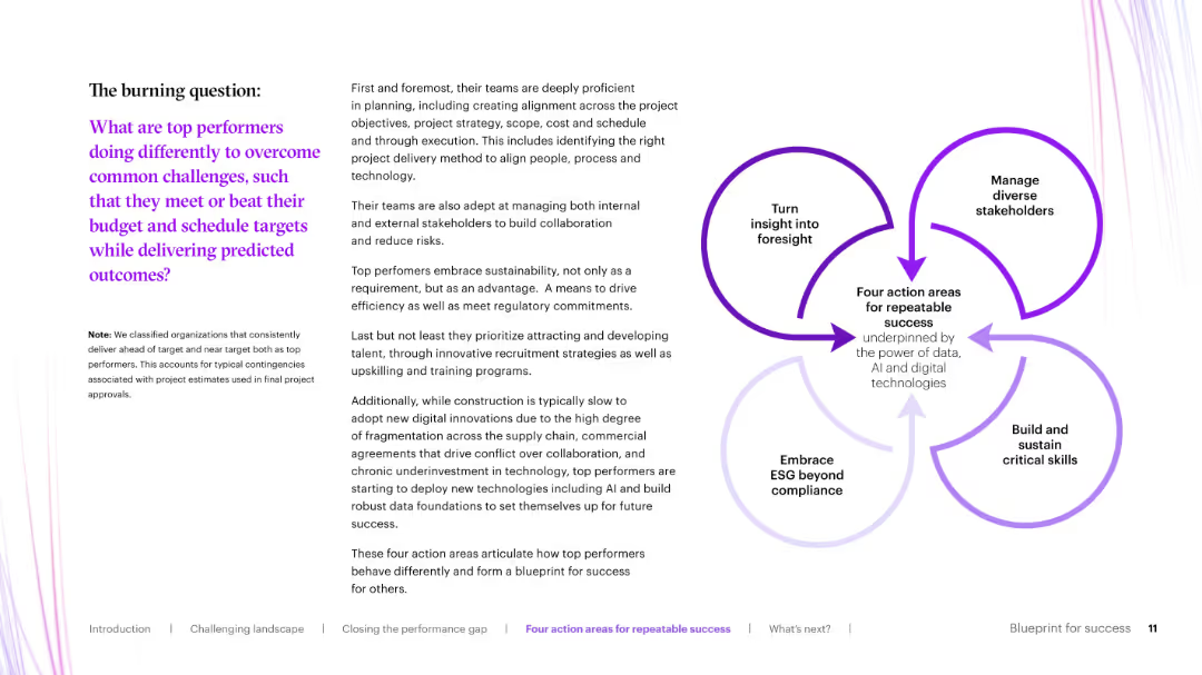
Text-heavy left layout with a circular infographic on the right showing "Four action areas for repeatable success."
Operational Efficiency
Real Estate & Construction
This slide introduces the key differentiators of top-performing organizations that succeed in delivering predictable capital project outcomes. It highlights four success pillars: foresight, stakeholder management, ESG, and skills development.
success factors, capital projects, ESG, foresight, stakeholder engagement
Framework
Accenture
Saved
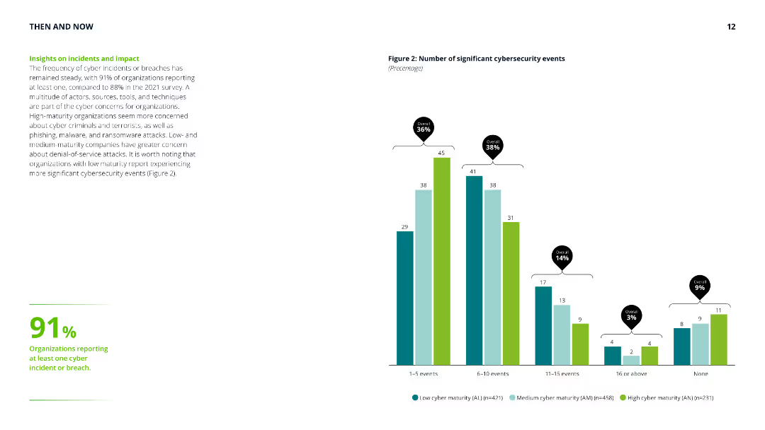
Column chart showing the number of significant cybersecurity events, with accompanying text highlighting the steady frequency of cyber incidents and differences in concerns across maturity levels.
Risk Assessment and Management
Technology & Software
Provides insights into the frequency and impact of cybersecurity incidents, emphasizing the concerns of low, medium, and high-maturity organizations and their experiences with cyber threats.
cyber security, incidents, impact, risk assessment, maturity levels, cyber threats, frequency, organization concerns
Mixed Chart
Deloitte
Saved
Contains comparative data and visual representations, including a column chart and side-by-side comparisons, on CO2 intensity and environmental impacts of nickel and lithium mining in Australia versus other countries. The slide uses distinct colors to differentiate between countries and includes detailed annotations explaining the significance of the data presented.
Competitive Landscape
Energy & Utilities
Showcases Australia's comparative advantage in mining due to lower CO2 emissions and stronger environmental credentials, which could appeal to ESG-sensitive customers and markets.
Australia, mining, environmental impact, CO2 emissions, nickel, lithium, competitive advantage, ESG credentials, global market, sustainable practices
Mixed Chart
Accenture
Saved
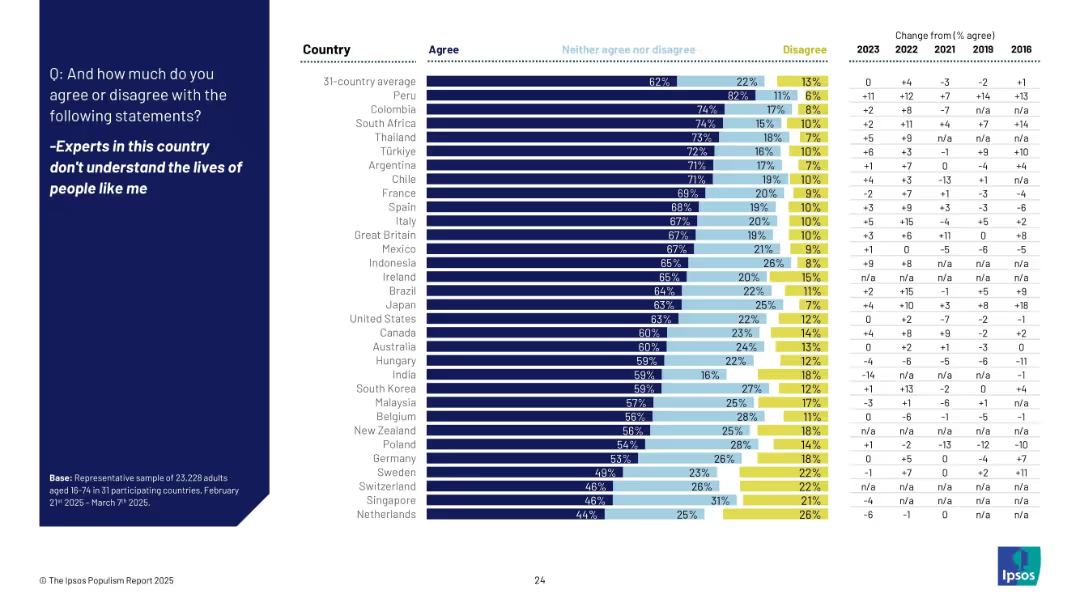
Full slide with horizontal bar chart by country showing % agree, neutral, and disagree, with right column showing change from past years.
Market Analysis and Trends
Government & Public Sector
The slide presents agreement levels with the statement that experts are disconnected from ordinary people's lives across 31 countries. Japan ranks mid-range, with notable increases in perception of disconnect in Italy and others.
experts, disconnect, public perception, agreement, international, trend, Ipsos, comparison, 2025, survey
Mixed Chart
IPSOS
Saved
Previous
Next
If nothing, comes up, please save your slides first
Create a FREE account to continue browsing
Receive Instant Access to 1,000+ slides from companies like McKinsey, Google, and Goldman Sachs
First Name
Last Name
Email
Password
I agree to all
Terms & Privacy Policy
Thank you! Your submission has been received!
Oops! Something went wrong while submitting the form.
Have an account?
Sign in
Column Chart
Heatmap
Chevron
Org Chart
Infographic
Callouts
Timeline
List
Graphic
Picture
Process Flow
Diagram
Paragraph
Map
Table
Framework
Subtitle
Takeaway Box
Icon
Other Chart
Radar Chart
Waterfall Chart
Mekko Chart
Pie Chart
Scatter Plot
Line Chart
Bar chart
Bullet points