Create a FREE Account
Instant access to 1,000+ real slides from top companies like McKinsey, BCG, Goldman Sachs, Google and many more!
First Name
Last Name
Email
Password
I agree to all
Terms & Privacy Policy
Thank you! Your submission has been received!
Oops! Something went wrong while submitting the form.
Have an account?
Sign in
Library
Templates
Courses
Pricing
My Account
My Slides
My Templates
✦ AI
AI Prompt Library
AI Search
Sign in
Start Here
Logout
My Saved Slides
This slide features multiple data visualizations: line charts showing the tech expense trend, column charts depicting cloud adoption and account opening metrics, and small multiples for mortgage funding and fraud prevention statistics. Each visualization includes performance indicators like percentage points and cost-to-fund ratios.
Technology and Digital Transformation
Financial Services
Demonstrating the impact of technology investments on operational efficiency, this slide provides an overview of tech-related improvements in processes and outcomes. Suitable for presentations on digital transformation or IT strategy.
technology, efficiency, digital transformation, cloud adoption
Multiple Chart
JP Morgan
Saved
This slide includes a pie chart of global seaborne trade volumes and on the right column showing the distribution of commodities transported by a shipping company.
Operational Efficiency
Transportation & Logistics
Details the volume and types of commodities transported globally by a shipping company in 2022, highlighting its role in global trade and operational focus on diverse commodity transport.
shipping, commodities, trade volumes, operational efficiency
Mixed Chart
Deutsche Bank
Saved
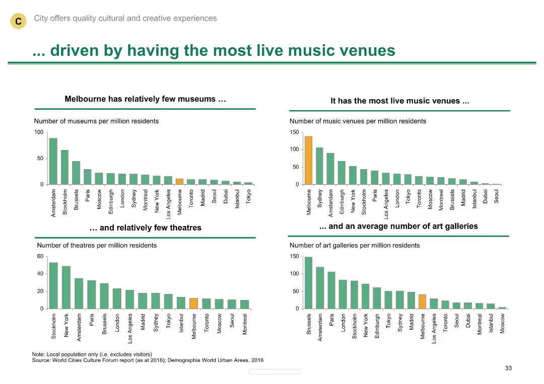
Multiple column charts comparing the number of museums, music venues, theatres, and art galleries
Market Analysis and Trends
Media & Entertainment
Shows Melbourne's leadership in live music venues and its relatively average number of theatres and galleries.
Live music venues, museums, theatres, art galleries, Melbourne
Multiple Chart
BCG
Saved
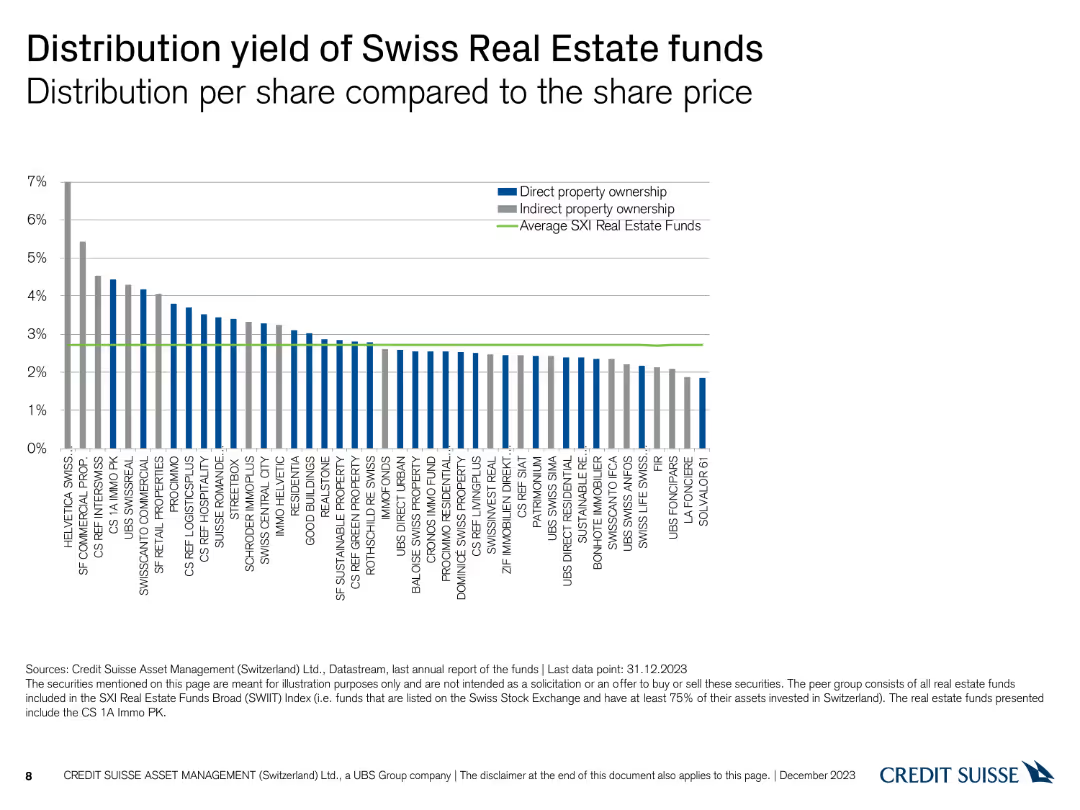
A column chart comparing the distribution yield per share for various Swiss real estate funds, with average yields highlighted.
Financial Performance
Financial Services
This slide compares the distribution yields of Swiss real estate funds, presenting data on direct and indirect property ownership against the average SXI real estate funds.
Distribution Yield, Real Estate Funds, Ownership, Yields
Single Chart
Credit Suisse
Saved
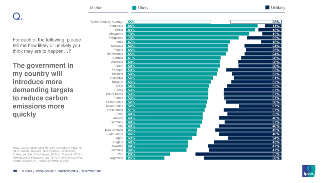
Country-based likelihood chart showing where citizens expect stricter carbon policy.
Regulatory and Compliance
Environmental Services & Sustainability
This slide explores public expectations for stricter carbon emission regulations. Countries like Indonesia and China show high confidence in future policy shifts. The global average is 55%, indicating moderate overall optimism.
carbon policy, climate action, regulations, Ipsos, government response, emissions
Mixed Chart
IPSOS
Saved
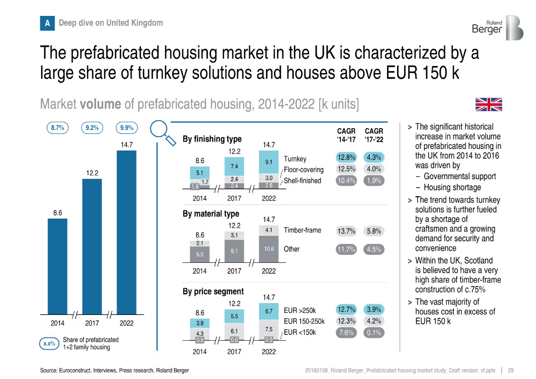
Vertical bars with detailed breakdowns by finishing type, material, and price; flag and notes on right
Customer and Market Segmentation
Real Estate & Construction
A deep dive into the UK market shows a strong preference for turnkey solutions and higher-value homes. Government support and housing shortages have driven growth. Timber-frame construction and higher price segments dominate.
UK housing, turnkey, timber-frame, pricing, prefabricated, market growth, segmentation
Multiple Chart
Roland Berger
Saved
Visuals include silhouette icons representing different approaches to implementing food trends, with percentages beside each icon. The design is clean and easy to interpret.
Customer and Market Segmentation
Agriculture & Food Production
Discusses the strategic approaches companies are taking to implement future food trends, like partnerships and acquisitions. It highlights the importance of collaboration across the food ecosystem for effective transformation.
food trends, strategic approaches, partnerships, ecosystem
Mixed Chart
Deloitte
Saved
The slide presents a two-column text format with a small section in the lower right corner depicting a U.S. map with colored dots indicating branch locations. The colors correspond to a legend identifying various cities. The layout is well-organized and easy to follow.
Financial Performance
Financial Services
Highlights the expansion of community centers and the role of Community Managers. It discusses trust-building with clients and providing financial education, with a focus on minority communities. The map shows branch locations across the U.S.
Community Banking, Financial Education, Branch Expansion, Trust-Building, Minority Communities, U.S. Map, Community Managers
Boxed
JP Morgan
Saved
Two charts: a column chart comparing long-term profitable vs a bar chart showing low-growth companies across industries; a heatmap comparing industry strengths.
Industry Overview
Professional Services
Analyzes long-term profitable growth in various industries, demonstrating different resilience and performance metrics.
Profitable growth, industry comparison, resilience, performance metrics, heatmap
Multiple Chart
Accenture
Saved
This slide contains a map of Australia with markers indicating various states and their climate targets. It includes several text boxes detailing the efforts of different states in achieving net-zero emissions by 2050.
Regulatory and Compliance
Government & Public Sector
This slide discusses how Australian state governments are supporting landowners with land restoration and biodiversity efforts to achieve net-zero emissions by 2050. It highlights different state initiatives and targets in the context of climate change.
Climate change, Net zero, Government, Land restoration, Biodiversity
Graphic
EY
Saved
Two-column layout with line and column charts depicting US ISM manufacturing index and US industrial production indexes from 2019-2024.
Market Analysis and Trends
Industrial & Manufacturing
Analyzes US manufacturing and industrial activity trends, highlighting constraints and expected improvements in 2024.
manufacturing, industrial production, US economy, interest rates, global demand
Multiple Chart
EY
Saved
Two primary visual elements are present. The left section shows a blue column chart detailing 'NET INTEREST-BEARING DEBT' in euros over five quarters, with a noticeable downward trend. The right section shows a grey-scale column chart of the 'MATURITY STRUCTURE OF INTEREST-BEARING DEBT' for the upcoming years, demonstrating an extended maturity profile. The upper right corner provides a real-life connection with an image of two people in a hallway, symbolizing the corporate world.
Financial Performance
Financial Services
Outlines the significant year-over-year reduction in net interest-bearing debt and the extension of its maturity profile, critical for financial planning and investment discussions.
debt reduction, financial planning, interest-bearing debt, maturity structure, y-o-y comparison, financial management, investment strategy
Multiple Chart
Goldman Sachs
Saved
Column chart showing the demand projection for various API-related roles over the next 12 months, including Software Developer, DevOps Engineer, and API Engineer, with a breakdown of current roles and future plans.
Human Resources and Talent Management
Technology & Software
The slide analyzes the demand for different API-related roles in software development, indicating which roles are likely to see increased hiring and which ones will remain stable or decrease.
API roles, demand, software development, projections
Single Chart
Gartner
Saved
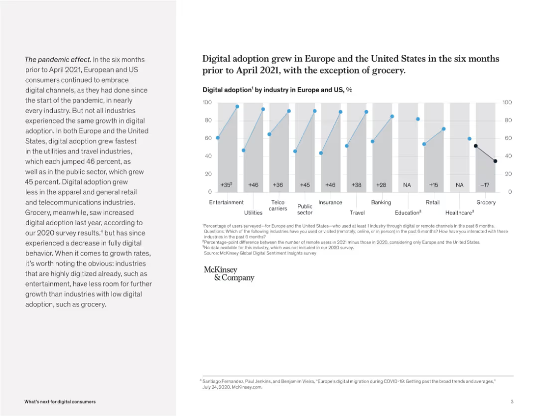
Bar chart comparing digital adoption by industry with growth metrics. Paragraph on the left gives context.
Market Analysis and Trends
Retail & E-commerce
This slide presents digital adoption rates by industry across Europe and the US. While most sectors saw growth in digital usage, the grocery sector notably declined, indicating a consumer shift back to physical channels.
digital growth, industry analysis, pandemic impact, retail trends, McKinsey, user behavior, grocery, Europe, US
Mixed Chart
McKinsey
Saved
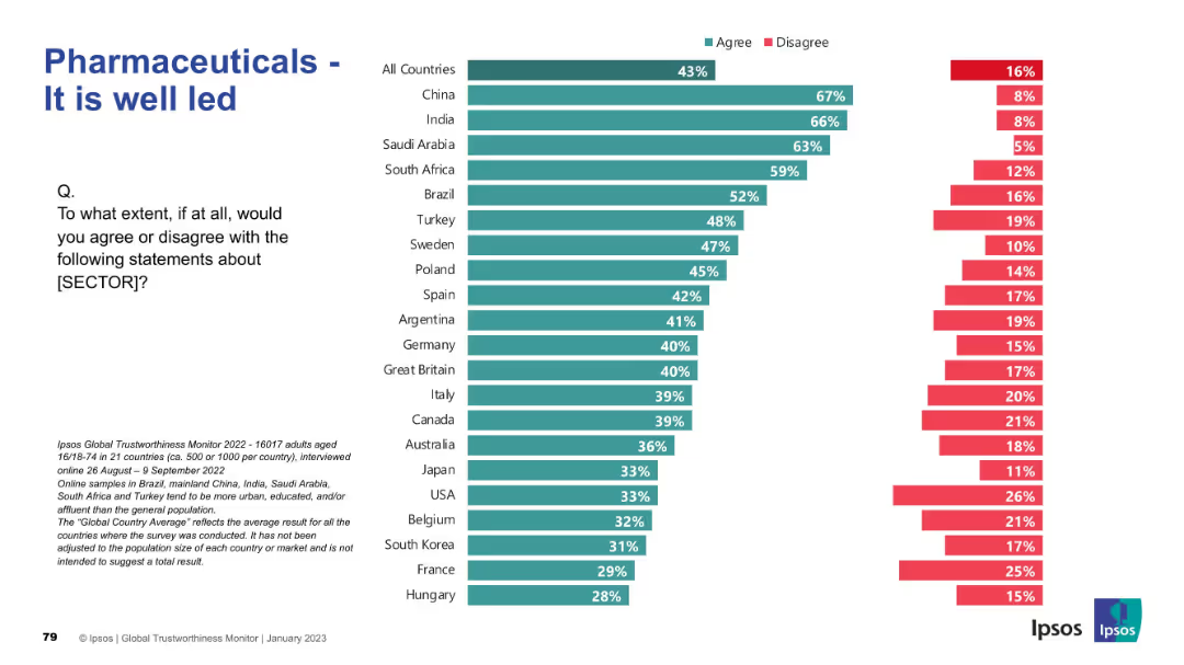
Teal/red bar chart by country on leadership perception. Layout consistent with previous slides: title left, chart right, question included.
Market Analysis and Trends
Healthcare & Pharmaceuticals
The slide assesses leadership perceptions in the pharmaceutical sector. China, India, and Saudi Arabia lead in agreement about strong leadership, while Japan, Hungary, and France score lowest. Global sentiment is mixed, reflecting trust gaps in governance.
leadership, governance, public trust, survey, Ipsos, pharma sector, healthcare, country comparison, management, global perception
Mixed Chart
IPSOS
Saved
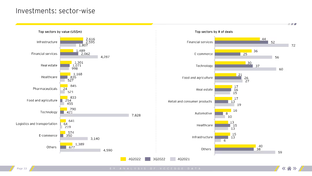
The slide presents two column charts. The left chart shows top sectors by value (US$m), while the right chart shows top sectors by number of deals. Different colors represent various quarters.
Market Analysis and Trends
Financial Services
This slide analyzes investments on a sector-wise basis, providing insights into which sectors attract the most value and deal numbers, useful for sector performance assessment.
Sector-wise analysis, investment value, deal count
Multiple Chart
EY
Saved
Engaging workplace setting with screens displaying virtual participants, yellow accents.
Strategic Planning
Technology & Software
The slide serves as a title slide for a section on the future of the workplace, indicating a focus on the evolution of work environments influenced by technology. It could be a conversation starter for discussions on hybrid work models, remote work policies, and technological integration in the professional services and tech industries.
Future, Workplace, Index, Technology, Hybrid Model, Remote Work, Professional Services, Evolution, Policies, Integration
Title
EY
Saved
This slide includes two column charts displaying median time to trial for family law final order cases over several years. Each chart shows a series of bars grouped by year, indicating an upward trend in the time required for trial.
Regulatory and Compliance
Government & Public Sector
The slide illustrates the increasing median time to trial in family law courts, emphasizing the growing backlog problem. It displays a comparative analysis of the time to trial over five years, signifying challenges in case handling and judicial efficiency.
median time, trial, family law, backlog, efficiency
Multiple Chart
PwC/Strategy&
Saved
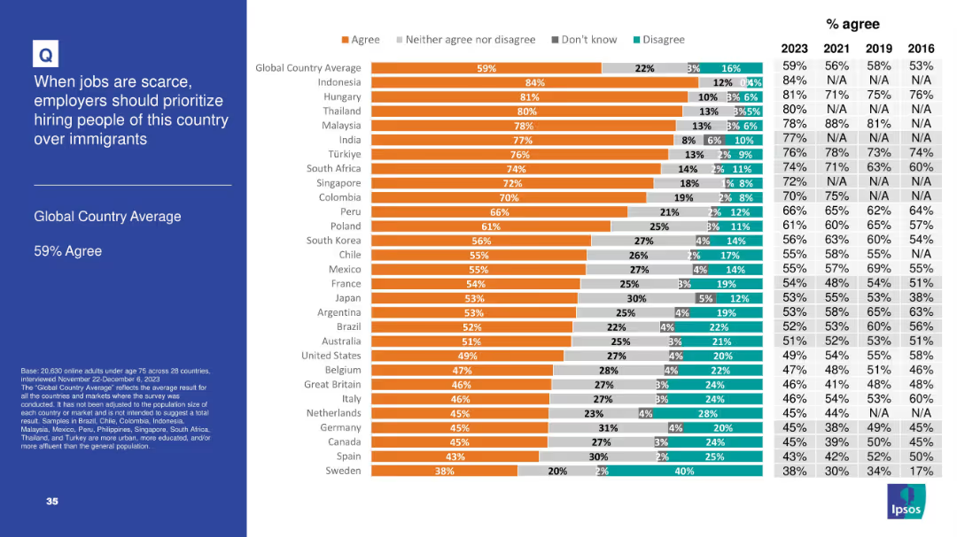
Horizontal bar chart with segmented agreement levels by country; includes historical comparison table (2016–2023) on the right and a bolded left-side title panel
Market Analysis and Trends
Government & Public Sector
The slide shows the level of agreement in 28 countries with the idea that employers should prioritize hiring nationals over immigrants when jobs are scarce. 59% globally agree, with particularly high support in Indonesia, Hungary, and Thailand.
immigration, employment, public opinion, nationalism, workforce, Ipsos, survey, global comparison, job scarcity, hiring priorities
Mixed Chart
IPSOS
Saved
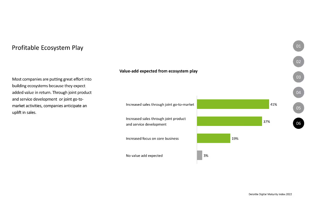
Contains a column chart displaying the expected value-add from ecosystem play, with bars in green and gray indicating percentages. The text on the left explains the rationale behind building ecosystems, highlighting benefits like increased sales and focus on core business.
Strategic Planning
Technology & Software
Describes the efforts companies are making to build ecosystems to enhance sales and focus on core business. The slide presents data on the anticipated value additions from joint go-to-market strategies and product development, with a small percentage expecting no value-add.
Ecosystem, Value-add, Sales, Development, Strategy
Mixed Chart
Deloitte
Saved
Two column charts showing cumulative annualized gross cost reductions and cumulative integration-related expenses, with projections.
Strategic Planning
Financial Services
The slide details the progress of cost-saving initiatives, expecting 50% of targeted saves by the 2024 exit rate, with future projections included.
cost plans, savings, projections, integration expenses, financial goals
Multiple Chart
UBS
Saved
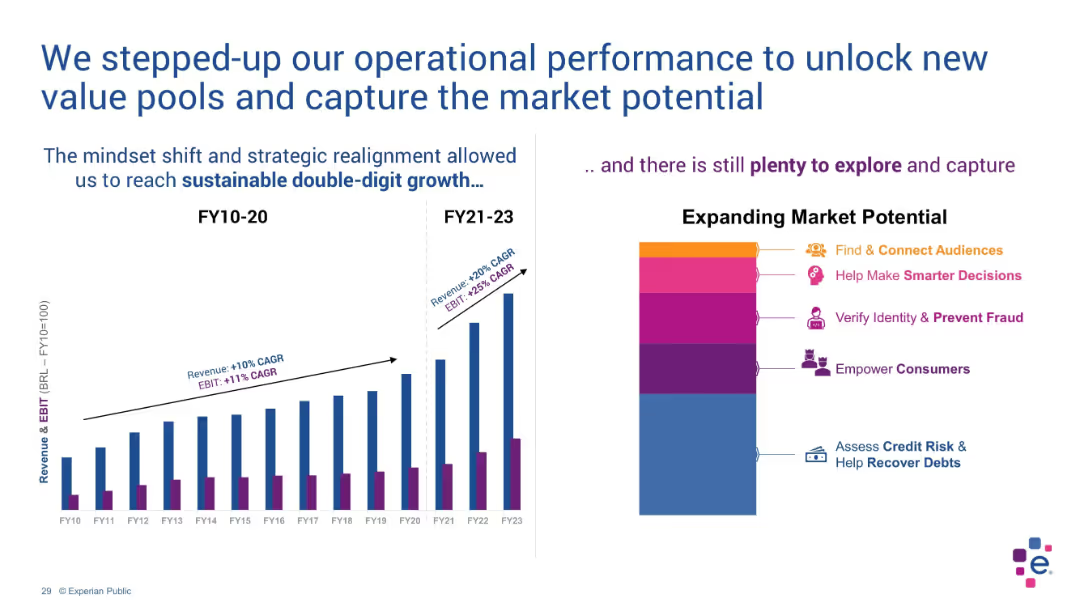
Dual-panel layout with bar chart on left and stylized stacked blocks on right
Operational Efficiency
Technology & Software
The slide illustrates growth acceleration in revenue and EBIT due to strategic shifts. The bar chart compares FY10–20 vs FY21–23 performance. A stylized chart shows market opportunities such as fraud prevention and consumer empowerment.
EBIT, revenue growth, strategy, double-digit, market potential, FY23
Multiple Chart
Barclays
Saved
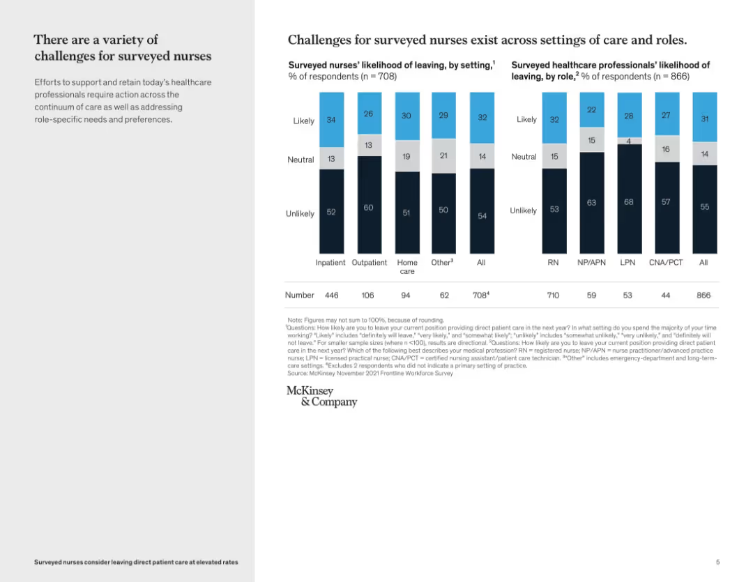
Two bar graphs comparing likelihood of leaving by care setting and by healthcare role; black, blue, and gray color scheme with callout boxes
Risk Assessment and Management
Healthcare & Pharmaceuticals
This slide details how nurse retention challenges vary by care setting and professional role. It shows outpatient nurses and LPNs have the highest likelihood of leaving, whereas CNA/PCTs and those in inpatient care are more likely to stay. The analysis suggests tailored retention strategies may be needed across roles and settings.
nurse roles, retention risk, care setting, survey results, workforce analysis, likelihood to leave, healthcare staffing
Mixed Chart
McKinsey
Saved
The slide is split into two main sections, with a red theme. On the left, bullet points are aligned vertically, detailing the SASB standard. On the right, bullet points explain the TCFD standard, alongside their respective logos.
Financial Performance
Industrial & Manufacturing
This slide explains LANXESS’s improvement in reporting standards according to SASB and TCFD, outlining key performance indicators and acknowledging the need for better climate-related financial disclosures.
LANXESS, SASB, TCFD, sustainability, reporting standards, climate-related disclosures, KPIs, financial information, environmental, governance
Table
Morgan Stanley
Saved
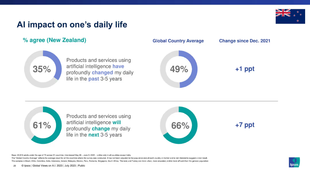
Two donut charts with New Zealand percentages vs. global averages for past and future AI impact.
Technology and Digital Transformation
Artificial Intelligence
Evaluates how people in New Zealand perceive the current and future impact of AI on their daily lives. Forecast shows higher expectations for the future than past experiences.
AI impact, daily life, digital change, New Zealand, Ipsos, future trends, consumer sentiment
Single Chart
IPSOS
Saved
Previous
Next
If nothing, comes up, please save your slides first
Create a FREE account to continue browsing
Receive Instant Access to 1,000+ slides from companies like McKinsey, Google, and Goldman Sachs
First Name
Last Name
Email
Password
I agree to all
Terms & Privacy Policy
Thank you! Your submission has been received!
Oops! Something went wrong while submitting the form.
Have an account?
Sign in
Column Chart
Heatmap
Chevron
Org Chart
Infographic
Callouts
Timeline
List
Graphic
Picture
Process Flow
Diagram
Paragraph
Map
Table
Framework
Subtitle
Takeaway Box
Icon
Other Chart
Radar Chart
Waterfall Chart
Mekko Chart
Pie Chart
Scatter Plot
Line Chart
Bar chart
Bullet points