Create a FREE Account
Instant access to 1,000+ real slides from top companies like McKinsey, BCG, Goldman Sachs, Google and many more!
First Name
Last Name
Email
Password
I agree to all
Terms & Privacy Policy
Thank you! Your submission has been received!
Oops! Something went wrong while submitting the form.
Have an account?
Sign in
Library
Templates
Courses
Pricing
My Account
My Slides
My Templates
✦ AI
AI Prompt Library
AI Search
Sign in
Start Here
Logout
My Saved Slides
The slide is divided into three columns comparing benefits of ESG in various categories, levels of ESG integration, and why companies are in the ESG game. It uses bar charts and percentages to compare different categories and their benefits.
Market Analysis and Trends
Environmental Services & Sustainability
The slide discusses the long-term value created by ESG initiatives, highlighting benefits like increased revenue, cost savings, and brand credibility. It also examines the integration levels of ESG in companies and the reasons behind their ESG initiatives.
ESG, value, benefits, integration, credibility
Multiple Chart
Kearney
Saved
A data-driven slide with bar graphs, column charts, and a pie chart. High density of information, contrasting colors, and significant textual content.
Market Analysis and Trends
Technology & Software
It presents a detailed analysis of digital consumer behavior in Indonesia, covering e-commerce, media usage, and a breakdown of the willingness to pay for sustainable products, intended for market analysis purposes.
digital consumers, Indonesia, e-commerce, media usage, sustainability
Multiple Chart
Bain
Saved
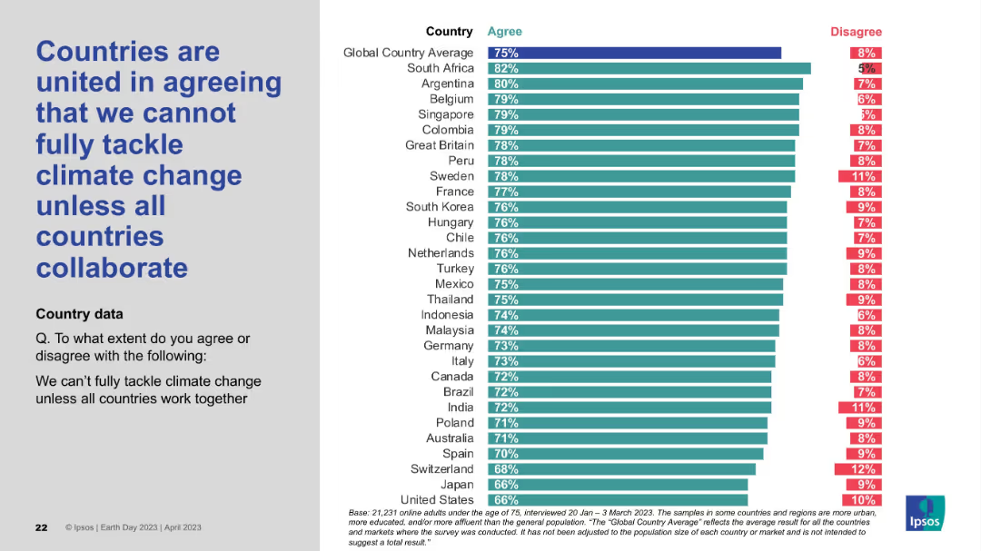
Layout consistent with others: statement on the left, bar chart showing agreement and disagreement levels by country on the right.
Strategic Planning
Environmental Services & Sustainability
The slide conveys a strong global belief that climate change cannot be addressed unilaterally and that international collaboration is essential. The agreement levels are high across most countries, reinforcing the shared view that climate action must be a global effort.
global cooperation, climate policy, collaboration, international unity, environmental challenge, Earth Day survey, Ipsos
Mixed Chart
IPSOS
Saved
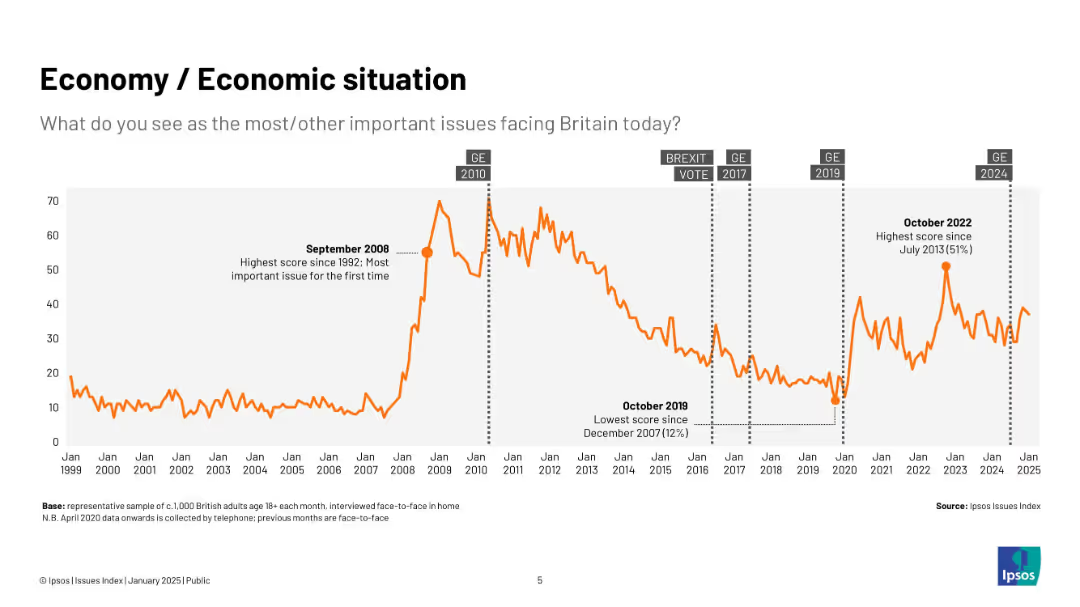
Line chart (1999–2025) tracking public concern over economic issues with key annotations like elections
Market Analysis and Trends
Government & Public Sector
This slide focuses solely on the economy, charting public concern since 1999. Peaks correspond with major events like the 2008 crisis and 2022 inflation spikes. Election dates are marked for reference.
economy, UK, public concern, Ipsos, inflation, crisis, timeline, elections, recession, graph
Single Chart
IPSOS
Saved
The slide displays bar charts and column charts to show the various sources of information used by Canadians to research crypto assets before purchase, comparing data from 2023 and 2022.
Market Analysis and Trends
Financial Services
This slide identifies the different sources of information used by Canadians to research crypto assets before making a purchase, highlighting trends and changes in source usage from 2022 to 2023.
research sources, crypto assets, purchase, information, comparison
Multiple Chart
IPSOS
Saved
The slide is divided into two columns with a dark background and a green bar on the left side for the section title "Summary." The right column contains text in white and green, highlighting various points under the headers "The Race for Innovation" and "Innovation options." The design is clean, and there is an effective use of bold text and bullet points to organize information hierarchically, making it easy to scan and digest.
Strategic Planning
Technology & Software
This summary slide synthesizes the innovation trends and options companies are pursuing. It is used to encapsulate the core messages of the presentation, focusing on companies' abilities to adapt and innovate in response to COVID-19, the decline of incumbent advantages, and strategic innovation directions. The slide provides a quick overview and is likely intended to precede a more in-depth discussion on these topics.
innovation trends, options, COVID-19 adaptation, incumbent decline, strategic focus
Agenda
BCG
Saved
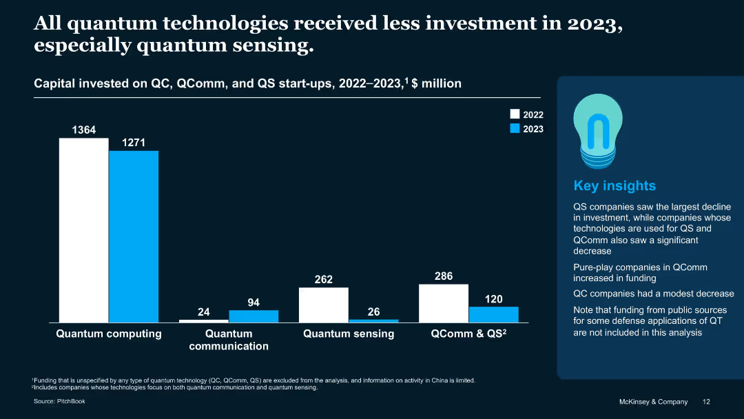
Bar chart comparing QC, QComm, and QS funding across 2022 and 2023 with a sidebar for insights
Investment Analysis
Artificial Intelligence
Visualizes declining investments in all QT segments, with QS experiencing the steepest drop. Also notes that QC saw only a modest decline, and QComm firms with a single focus saw funding increase. Public-sector defense applications are not included.
QS decline, quantum communication, QC funding, capital trends, 2023
Mixed Chart
McKinsey
Saved
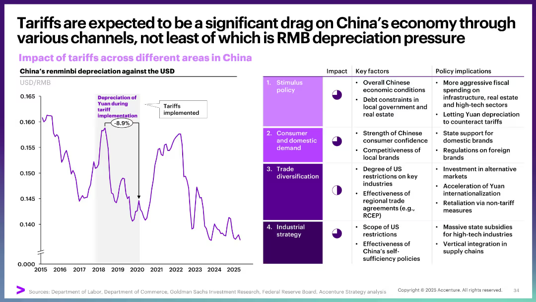
Dual-pane layout: left side shows a line graph of RMB depreciation; right side has a 4-row table with impact assessments
Market Analysis and Trends
Government & Public Sector
The slide highlights how tariffs are pressuring China’s economy via RMB depreciation and other channels like stimulus policy, consumer demand, trade diversification, and industrial strategy. It shows an 8.9% yuan depreciation during tariff periods and details policy responses across four sectors.
tariffs, RMB, depreciation, China, fiscal policy, trade, consumer, industrial strategy
Multiple Chart
Accenture
Saved
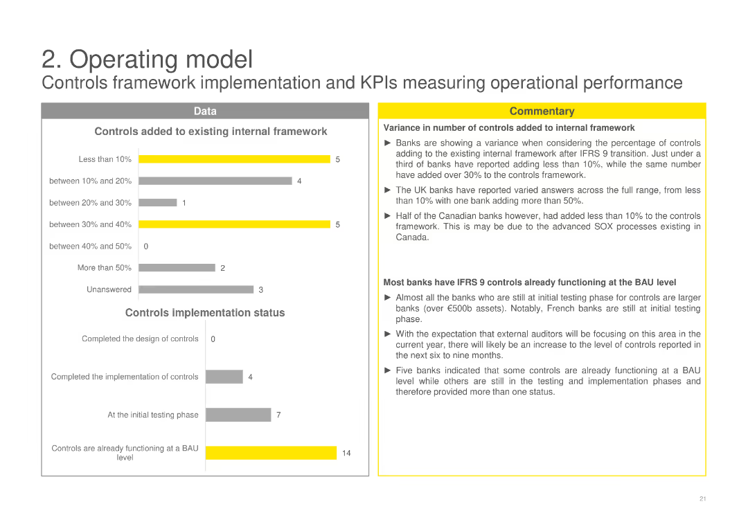
Features column charts on the number of controls added to the internal framework and their implementation status, with a commentary box analyzing the variances in control additions and implementation stages among banks.
Operational Efficiency
Financial Services
Reviews the addition of controls to internal frameworks and their implementation status post-IFRS 9, examining the variances in control enhancements and the stages of implementation across different banks.
controls framework, implementation status, IFRS 9, internal controls, financial services
Multiple Chart
EY
Saved
This slide features multiple column charts comparing global and Hong Kong trade show revenues from 2022 to 2027. It includes detailed annotations and percentage figures for annual growth and CAGR. The slide is designed with a clear separation between the charts and descriptive texts, which provide additional context on market trends and the impact of lifted quarantine measures.
Market Analysis and Trends
Media & Entertainment
Analyzes the growth of trade show revenues in Hong Kong, comparing it to global rates and detailing the factors influencing these trends, such as COVID-19 impacts and policy changes. This is particularly useful for understanding regional market dynamics within the global context.
Hong Kong, global comparison, trade shows, revenue growth, CAGR, market trends, COVID-19
Multiple Chart
PwC/Strategy&
Saved
The slide is dense with multiple column charts and text blocks, including bar and donut charts, to present a detailed analysis of mental health statistics across demographics.
Market Analysis and Trends
Healthcare & Pharmaceuticals
Provides an in-depth look at mental health concerns within younger demographics, using survey data to discuss stress, anxiety, and the impacts of social factors on mental well-being.
mental health, Gen Z, millennials, survey analysis, stress, anxiety, demographics, healthcare trends, social impact, psychological research
Multiple Chart
Deloitte
Saved
Central diagram showing wholesale payments and related business areas, with text boxes for client benefits and infrastructure.
Operational Efficiency
Financial Services
Explains the wholesale payments business, client payment facilitation, and the support of a shared infrastructure.
Wholesale Payments, Treasury Services, Merchant Acquiring, Trade Finance, Digital Infrastructure
Framework
JP Morgan
Saved
Contains bar and column charts comparing incentives for various clean technologies like hydrogen and carbon capture.
Regulatory and Compliance
Energy & Utilities
Reviews governmental incentives for scaling clean technologies, crucial for policy analysis and energy sector planning.
clean technology, incentives, hydrogen, carbon capture, energy policy, regulatory, energy sector
Multiple Chart
BCG
Saved
The title slide for a presentation with a vivid background image of a wheat field, the logos of EY and Parthenon, and the names of two managing directors.
Industry Overview
Agriculture & Food Production
This introductory slide sets the theme for a presentation on investing in the agricultural crop industry, likely to be part of a broader discussion on investment opportunities and strategies within the agriculture sector. The visual backdrop of crops establishes the industry context.
Agriculture, Crop Industry, Investment, EY-Parthenon, Managing Directors, Overview
Title
EY
Saved
The slide contains line charts comparing changes in the Consumer Price Index by CO2 accounting methods for EU27+UK and China, both production-based and consumption-based. It includes text explanations above the charts and color-coded lines for domestic and import data.
Regulatory and Compliance
Energy & Utilities
Discusses the impact of adopting a consumption-based accounting method on price indices for domestic and imported goods, suggesting a smoother change for domestic products compared to the production-based approach.
CO2 accounting, price index, domestic, import, consumption-based
Multiple Chart
EY
Saved
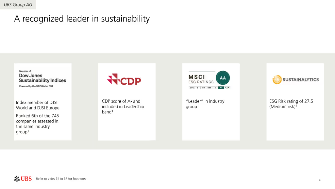
Four-column layout showcasing sustainability ratings and recognitions from different organizations like Dow Jones, CDP, MSCI, and Sustainalytics. Each column includes a logo and a brief description of the recognition.
Industry Overview
Environmental Services & Sustainability
Highlights UBS Group AG's achievements in sustainability, recognized by various rating agencies. Includes information on ratings, scores, and leadership positions in the sustainability sector.
Sustainability, Ratings, Recognition, Environment, Leadership, Achievements
Pillar
UBS
Saved
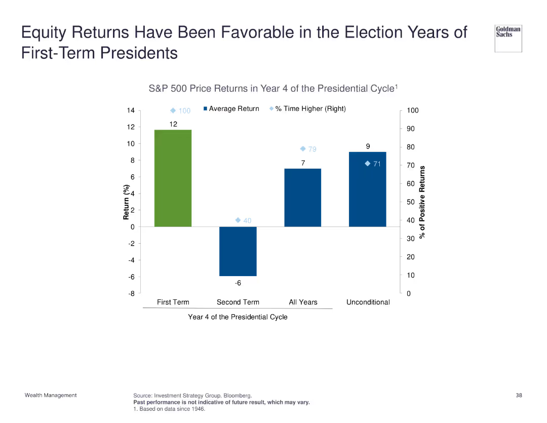
Column chart depicting S&P 500 price returns in year 4 of the presidential cycle, comparing first-term and second-term presidents, and average return statistics.
Market Analysis and Trends
Financial Services
Highlights that equity returns tend to be favorable during the election years of first-term presidents, supported by historical S&P 500 price return data across different presidential cycles.
equity returns, presidential cycle, election years, S&P 500
Single Chart
Goldman Sachs
Saved
The slide features a scatter plot with a diagonal trend, labeled "Exhibit 13". There's a legend at the top marking different regions with color-coded squares. The x-axis shows upskilling progress percentage and the y-axis shows CEO's belief in upskilling.
Market Analysis and Trends
Professional Services
The slide presents a correlation between the maturity of talent pools in various regions and the progress in establishing upskilling programs, suggesting regions with more mature talent are less likely to have made significant progress in this area.
upskilling, talent pools, regional comparison, CEO beliefs, progress
Mixed Chart
PwC/Strategy&
Saved
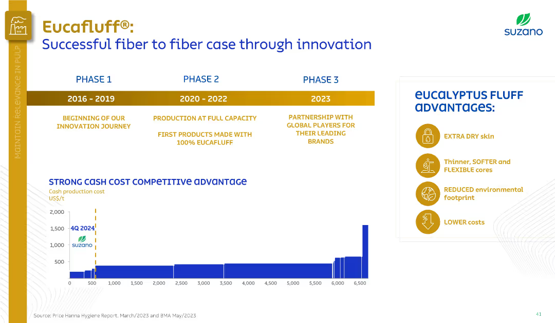
Timeline with three phases (2016–2023), bar chart of production costs, and a list of product advantages.
Product and Service Analysis
Consumer Goods
Showcasing Eucafluff® development, the slide highlights its innovation journey across three phases, production scalability, and cost competitiveness. Key advantages like softness, lower cost, and eco-friendliness are visually presented.
Eucafluff, product innovation, cost advantage, eucalyptus, hygiene
Mixed Chart
Goldman Sachs
Saved
The slide uses a simple layout with color blocks to denote different stages of a pandemic response. Icons and brief descriptions provide quick visual cues to the viewer.
Operational Efficiency
Healthcare & Pharmaceuticals
This content-oriented slide breaks down the various stages of pandemic response, from identification to recovery, with accompanying descriptions of epidemiological, economic, and social indicators, serving as an educational or planning resource in healthcare and government contexts.
Pandemic Stages, Healthcare, Response, Epidemiological Indicators, Economic Impacts, Social Indicators, Education, Planning
Vertical Flow
McKinsey
Saved
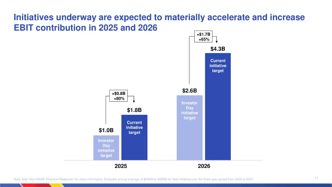
Column chart showing revised EBIT targets for 2025 and 2026; comparison of original and updated projections with labels for increase.
Strategic Planning
Transportation & Logistics
Communicates expected EBIT growth due to ongoing initiatives. The chart shows a material increase in EBIT targets for 2025 and 2026, emphasizing strategy execution effectiveness and operational uplift.
EBIT growth, initiatives, strategic plan, transportation, projections, acceleration, financial targets, operational improvement
Single Chart
JP Morgan
Saved
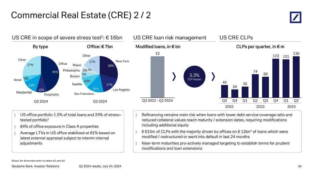
Multi-section layout with pie charts, bar chart, and supporting bullet points; visually divides analysis by loan type, office risk, and CLP trends.
Risk Assessment and Management
Financial Services
This slide delves deeper into US CRE loan risks, particularly the €16bn under stress testing, of which €7bn are office-related. It tracks €615m of CLPs linked to €12bn of restructured or defaulted office loans. A chart shows rising CLPs per quarter, emphasizing risk from refinancing and lower collateral values.
US CRE, CLP impact, refinancing risk, loan modification, office exposure
Multiple Chart
Deutsche Bank
Saved
Column chart showing financial management status of households in May 2020 and December 2020, with categories for well, quite well, getting by, etc.
Financial Performance
Financial Services
Highlights the financial management status of households during the COVID-19 pandemic, comparing perceptions between two periods.
financial management, COVID-19, household finances, comparison, economic stability
Single Chart
IPSOS
Saved
This slide presents a column chart comparing unlinked metro rides annually. Annotations and year markers provide a clear depiction of trends and significant data points.
Risk Assessment and Management
Transportation & Logistics
Offers a decade-long review of rail ridership, illustrating trends and discussing the factors influencing these patterns.
metro rides, annual trends, ridership data, transportation analysis
Single Chart
BCG
Saved
The slide shows a benchmarking set of AEP scores across various categories with bar charts indicating leader and other averages.
Performance Metrics and KPIs
Professional Services
It benchmarks AEP scores for team excellence, organizational alignment, buy/pay channels, performance management, and more, indicating quartile rankings.
AEP scores, benchmarking, team excellence, performance management, digital technology, organizational alignment
Multiple Chart
Kearney
Saved
Previous
Next
If nothing, comes up, please save your slides first
Create a FREE account to continue browsing
Receive Instant Access to 1,000+ slides from companies like McKinsey, Google, and Goldman Sachs
First Name
Last Name
Email
Password
I agree to all
Terms & Privacy Policy
Thank you! Your submission has been received!
Oops! Something went wrong while submitting the form.
Have an account?
Sign in
Column Chart
Heatmap
Chevron
Org Chart
Infographic
Callouts
Timeline
List
Graphic
Picture
Process Flow
Diagram
Paragraph
Map
Table
Framework
Subtitle
Takeaway Box
Icon
Other Chart
Radar Chart
Waterfall Chart
Mekko Chart
Pie Chart
Scatter Plot
Line Chart
Bar chart
Bullet points