Create a FREE Account
Instant access to 1,000+ real slides from top companies like McKinsey, BCG, Goldman Sachs, Google and many more!
First Name
Last Name
Email
Password
I agree to all
Terms & Privacy Policy
Thank you! Your submission has been received!
Oops! Something went wrong while submitting the form.
Have an account?
Sign in
Library
Templates
Courses
Pricing
My Account
My Slides
My Templates
✦ AI
AI Prompt Library
AI Search
Sign in
Start Here
Logout
My Saved Slides
Contains column charts showing car purchase intent across income levels in the US, Europe, and Asia.
Market Analysis and Trends
Transportation & Logistics
Analyzes how car purchase intentions among different income groups have aligned post-COVID-19.
income levels, car buying, market recovery, global trends
Multiple Chart
McKinsey
Saved
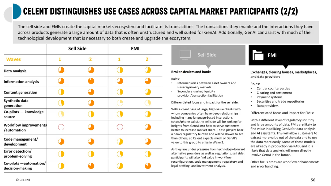
Similar format to prior slide; compares Sell Side and FMIs; includes role definitions and impact levels using pie indicators
Industry Overview
Financial Services
Shows AI-driven use cases across sell side (brokers/banks) and FMIs (market infrastructure). Highlights varying needs in data processing, regulatory burdens, and where GenAI adds value in areas like clearing, data management, and content generation.
sell side, FMIs, regulatory impact, GenAI value, data infrastructure
Mixed Chart
Oliver Wyman
Saved
Features a large central image with three text sections on the sides, focusing on challenges and discussions around digital trust.
Technology and Digital Transformation
Telecommunications
Details the debates regarding stakeholder expectations, data and privacy regulation, and risk area identification.
digital trust, stakeholder expectations, privacy regulation, risk identification
Header Vertical
McKinsey
Saved
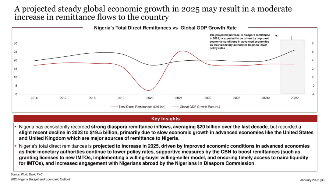
Dual-line chart comparing Nigeria’s remittances to global GDP growth; right-side projection box; red-highlighted insights box.
Market Analysis and Trends
Financial Services
Projects moderate increase in remittance inflows to Nigeria in 2025, driven by improved global economic conditions. Highlights historical remittance trends and links growth to falling interest rates and supportive policies by the CBN and Diaspora Commission.
remittances, diaspora, global GDP, economic growth, 2025, CBN, Nigeria, foreign inflows, IMTOs, diaspora engagement
Mixed Chart
PwC/Strategy&
Saved
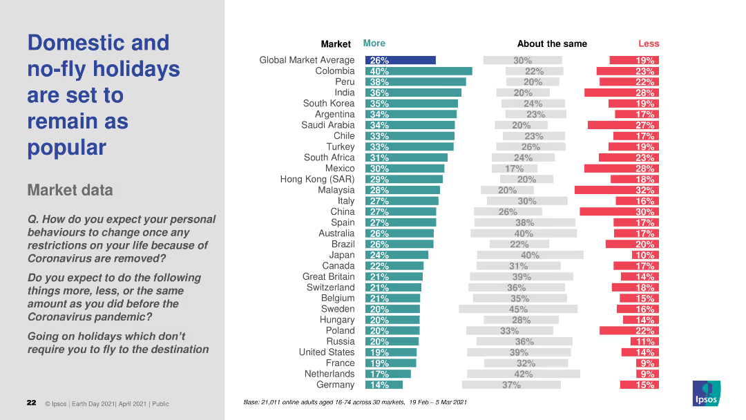
This slide contains a column chart comparing the expected changes in holiday preferences, focusing on domestic and no-fly holidays, across various global markets. The chart uses three color bars to represent "More," "About the same," and "Less."
Market Analysis and Trends
Hospitality & Tourism
The slide presents survey findings indicating that domestic and no-fly holidays will remain popular post-pandemic, comparing responses from multiple global markets.
holidays, travel, no-fly, domestic, market trends
Multiple Chart
IPSOS
Saved
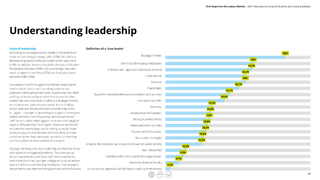
Horizontal bar chart showing traits of a 'true leader' with percentages, accompanied by detailed text discussing gender differences in leadership preferences.
Human Resources and Talent Management
Education & Training
This slide examines essential leadership traits according to respondents, highlighting strategic thinking and employee development as top characteristics.
leadership, strategic thinking, employee development, gender differences, traits
Mixed Chart
Deloitte
Saved
Includes multiple line graphs with a color-coded key, focusing on global GDP forecasts versus baselines.
Investment Analysis
Financial Services
Analyzes global economic forecasts with a focus on GDP growth projections and comparisons between baseline forecasts and actuals.
economy, GDP forecast, baseline, rebound, downturn, financial analysis
Multiple Chart
BCG
Saved
The slide features a blend of pie charts, bar graphs, and detailed textual information, using a mix of red, blue, and grey shades.
Financial Performance
Industrial & Manufacturing
The slide summarizes Leonardo's 2021 annual results, highlighting significant achievements such as revenue growth, backlog, and order value, along with a special focus on financial metrics.
annual results, revenue growth, financial metrics, backlog, orders, FOCF, ROIC, commercial momentum, EBITA
Multiple Chart
Goldman Sachs
Saved
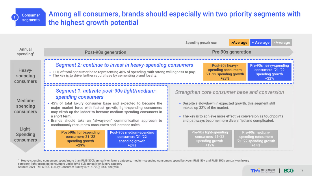
The slide uses a table to segment consumers by spending growth rate, with emphasis on post-90s generation. Various colors indicate growth rates and strategic advice.
Strategic Planning
Consumer Goods
This slide advises brands to focus on heavy-spending and light/medium-spending post-90s consumers due to their high growth potential, offering strategic insights.
Strategic Planning, Growth Potential, Consumer Segments, Brand Strategy, Spending Growth
Table
BCG
Saved
The slide presents a comparative table of various players in the market research industry, showing turnover and focus areas.
Competitive Landscape
Professional Services
The slide compares Ipsos with other market research companies, highlighting turnover figures and areas of specialization.
Comparative, Market Research, Turnover, Specialization, Ipsos
Multiple Chart
IPSOS
Saved
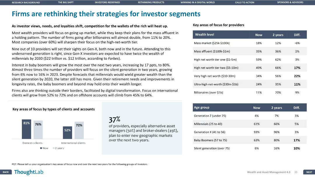
Column charts displaying key areas of focus for providers by wealth level and age group. Design is structured and clear, presenting comparative data effectively.
Strategic Planning
Financial Services
Discusses shifts in firm strategies for different investor segments, with data on focus areas for providers by wealth level and age group over the next two years.
strategies, investors, segments, focus, data
Mixed Chart
Deloitte
Saved
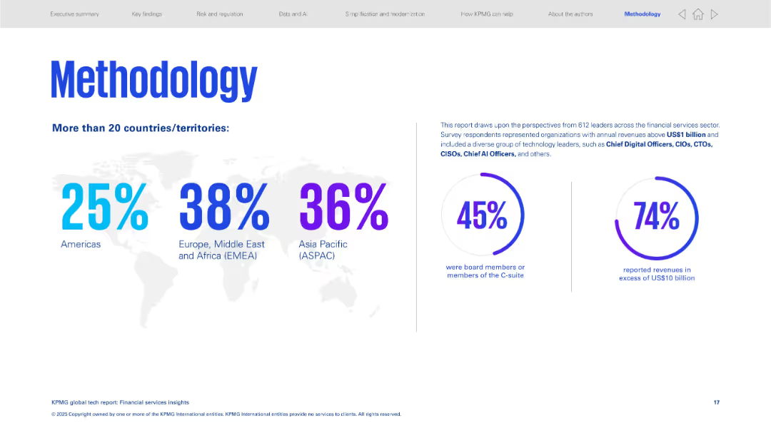
Clean design with a world map, percentage breakdown by region, and two large statistic circles on right.
Strategic Planning
Financial Services
Explains the methodology of the study, which included tech leaders across global financial sectors. Provides a regional breakdown of respondents and outlines their roles and revenue levels to validate the report's credibility.
methodology, survey, financial services, regional distribution, C-suite, high revenue firms
Mixed Chart
KPMG
Saved
The slide presents a balanced combination of text, icons, and a Venn diagram. The icons represent different business areas, while the diagram depicts the intersection of energy policies and current events.
Industry Overview
Energy & Utilities
This slide offers an overview of Seatruim's strategic focus on offshore renewables, new energy, and cleaner solutions, utilizing a Venn diagram to illustrate market positions and energy policy impacts. It could be used to outline the company's market strategy in the energy sector.
Energy, Renewables, Transition, Strategy, Market, Offshore
Pillar
Morgan Stanley
Saved
A simple yet informative matrix layout presents the investment positioning with icons indicating trends. Current views on asset classes are provided on the right, adding depth to the analysis.
Risk Assessment and Management
Financial Services
The slide showcases the credit team's current investment positions and outlook, useful for informing strategic asset allocation. It includes a matrix for comparative analysis of different investment classes, intended to guide portfolio adjustments.
Investment, Positioning, Credit, Risk
Table
Morgan Stanley
Saved
The slide is divided into three main sections with a color-coded theme of purple and white. It includes a column chart for the total spend breakdown, bullet points for opportunity levers, and projected progress numbers.
Operational Efficiency
Technology & Software
This slide presents a progress update on productivity targets, detailing cost efficiency strategies and accomplishments in software development and modernizing technology.
productivity, software development, technology modernization, cost efficiency, infrastructure, financial targets, engineering, automation, cloud
Mixed Chart
JP Morgan
Saved
Slide with a pie chart detailing the breakdown of tax revenue sources such as income, customs, and excise taxes. No property taxes are shown, indicating a specific fiscal focus.
Financial Performance
Government & Public Sector
Analyzes Namibia's tax revenue composition for 2018/19, showing major contributions from income taxes and customs. The slide aids in understanding the emphasis on indirect taxation and customs duties in the country's revenue structure.
Taxes, Income, Customs, Indirect, Revenue
Single Chart
PwC/Strategy&
Saved
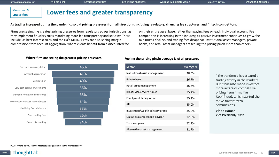
Column chart showing pricing pressures on firms. Another chart displays average percentage of pricing pressures by sector. Design is balanced and engaging.
Pricing Strategies
Financial Services
Addresses pricing pressures on firms from various factors including regulators and competitors, with detailed sector-wise analysis of average pricing pressures.
pricing, transparency, competition, fees, sectors
Mixed Chart
Deloitte
Saved
Column chart showing Ipsos US revenues vs. US research market with additional text highlighting key market metrics. Text boxes with various market statistics and competitive positions.
Market Analysis and Trends
Professional Services
Presents data on the market size, competitive landscape, and opportunities for growth in the US research market. Highlights Ipsos' position and potential for expansion.
Market Size, Growth, US Research Market, Ipsos, Revenues
Mixed Chart
IPSOS
Saved
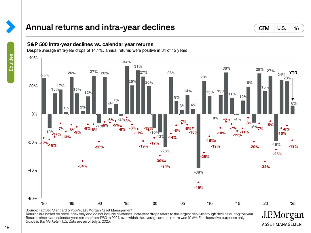
Vertical bar chart of calendar year returns with red dots showing intra-year drawdowns for each year from 1980 to 2025.
Risk Assessment and Management
Financial Services
This slide visualizes the volatility of annual S&P 500 returns by overlaying intra-year declines. Despite average intra-year drops of 14.1%, positive returns occurred in 34 of 45 years. The chart reinforces the notion that temporary declines do not always derail full-year performance.
S&P 500, intra-year decline, calendar return, volatility, drawdown, annual performance, investment risk, market resilience
Single Chart
JP Morgan
Saved
Shows a pie chart detailing the composition of total deposits and key bullet points on segment performance.
Financial Performance
Financial Services
Emphasizes the stability and diversity of the deposit base, with data on different segments and total deposits.
deposits, stable, franchise, diversity, segments
Mixed Chart
Barclays
Saved
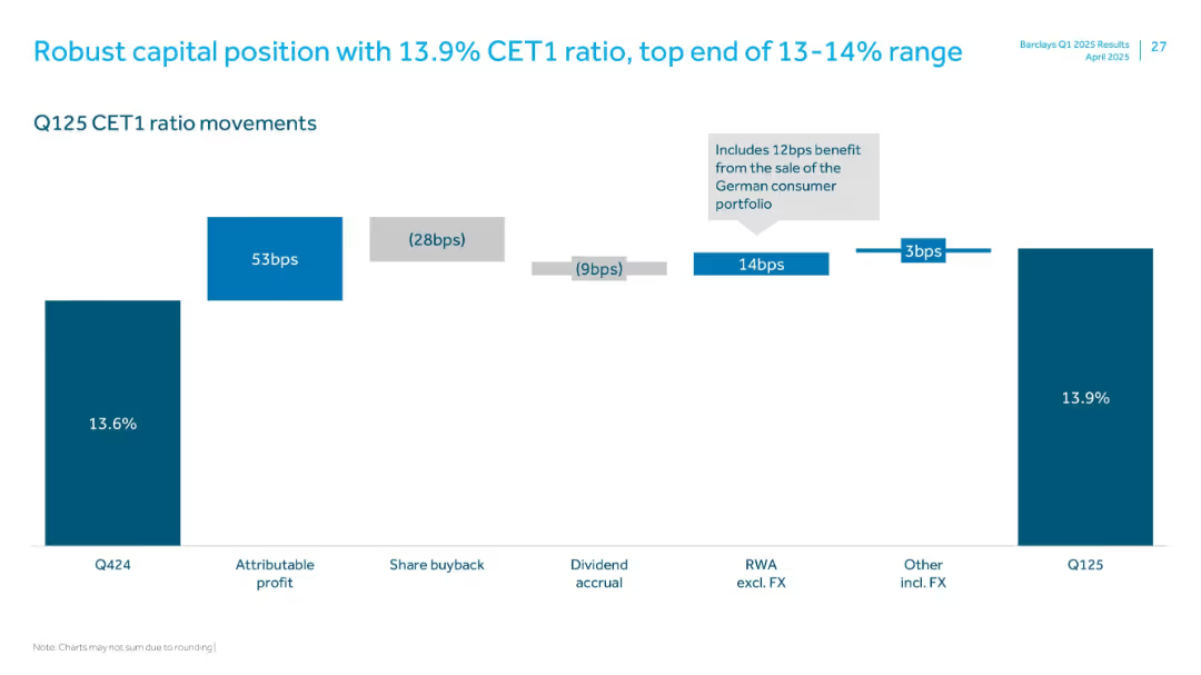
Waterfall bar chart with labeled segments showing CET1 ratio movements from Q424 to Q125
Financial Performance
Financial Services
Illustrates the movement in Barclays' CET1 ratio from Q424 to Q125, highlighting positive and negative contributors such as attributable profit, share buybacks, and RWA changes, ending at 13.9%.
CET1, capital ratio, profit, RWA, share buyback, FX, Q125
Single Chart
Barclays
Saved
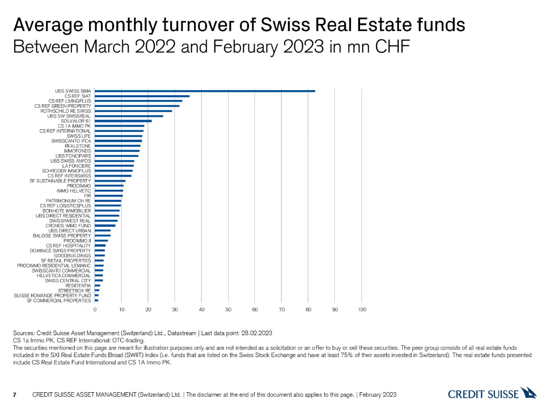
The slide includes a column chart displaying the average monthly turnover of Swiss real estate funds in million CHF.
Financial Performance
Real Estate & Construction
This slide reports the average monthly turnover of various Swiss real estate funds from March 2022 to February 2023, measured in million CHF.
Swiss real estate, turnover, monthly turnover, column chart, CHF
Single Chart
Credit Suisse
Saved
A column chart comparing equity ownership percentages among senior leadership in Permian Resources, in black and green.
Financial Performance
Energy & Utilities
Discusses the alignment of interests between Permian Resources' management and shareholders, with details on equity ownership and compensation strategies.
shareholder, equity, management, Permian Resources, alignment
Mixed Chart
Barclays
Saved
Slide presents a column chart comparing challenges within underwriting function by account size, using various colors to denote different account ranges.
Strategic Planning
Financial Services
The slide outlines the top challenges faced by underwriters in achieving business objectives with specific focus on different account sizes, highlighting issues like ineffective systems and lack of information.
underwriting, challenges, business objectives, account sizes, systems, information
Mixed Chart
Accenture
Saved
This slide features a column chart showing fixed income yields across various types of bonds, including developed market government bonds, investment-grade bonds, and others.
Investment Analysis
Financial Services
The slide presents an analysis of fixed income yields, comparing different bond types and their return correlations, useful for investment strategies.
fixed income, yields, bonds, investment-grade, high yield, emerging markets, correlation
Multiple Chart
JP Morgan
Saved
Previous
Next
If nothing, comes up, please save your slides first
Create a FREE account to continue browsing
Receive Instant Access to 1,000+ slides from companies like McKinsey, Google, and Goldman Sachs
First Name
Last Name
Email
Password
I agree to all
Terms & Privacy Policy
Thank you! Your submission has been received!
Oops! Something went wrong while submitting the form.
Have an account?
Sign in
Column Chart
Heatmap
Chevron
Org Chart
Infographic
Callouts
Timeline
List
Graphic
Picture
Process Flow
Diagram
Paragraph
Map
Table
Framework
Subtitle
Takeaway Box
Icon
Other Chart
Radar Chart
Waterfall Chart
Mekko Chart
Pie Chart
Scatter Plot
Line Chart
Bar chart
Bullet points