Create a FREE Account
Instant access to 1,000+ real slides from top companies like McKinsey, BCG, Goldman Sachs, Google and many more!
First Name
Last Name
Email
Password
I agree to all
Terms & Privacy Policy
Thank you! Your submission has been received!
Oops! Something went wrong while submitting the form.
Have an account?
Sign in
Library
Templates
Courses
Pricing
My Account
My Slides
My Templates
✦ AI
AI Prompt Library
AI Search
Sign in
Start Here
Logout
My Saved Slides
Contains a comparative analysis layout, contrasting traditional IPO processes with SPAC merger processes using a timeline format.
Strategic Planning
Financial Services
Compares traditional IPO and SPAC timelines, highlighting the efficiencies and shorter timelines associated with SPACs.
IPO, SPAC, timeline, traditional, comparison, process, planning
Linear Flow
PwC/Strategy&
Saved
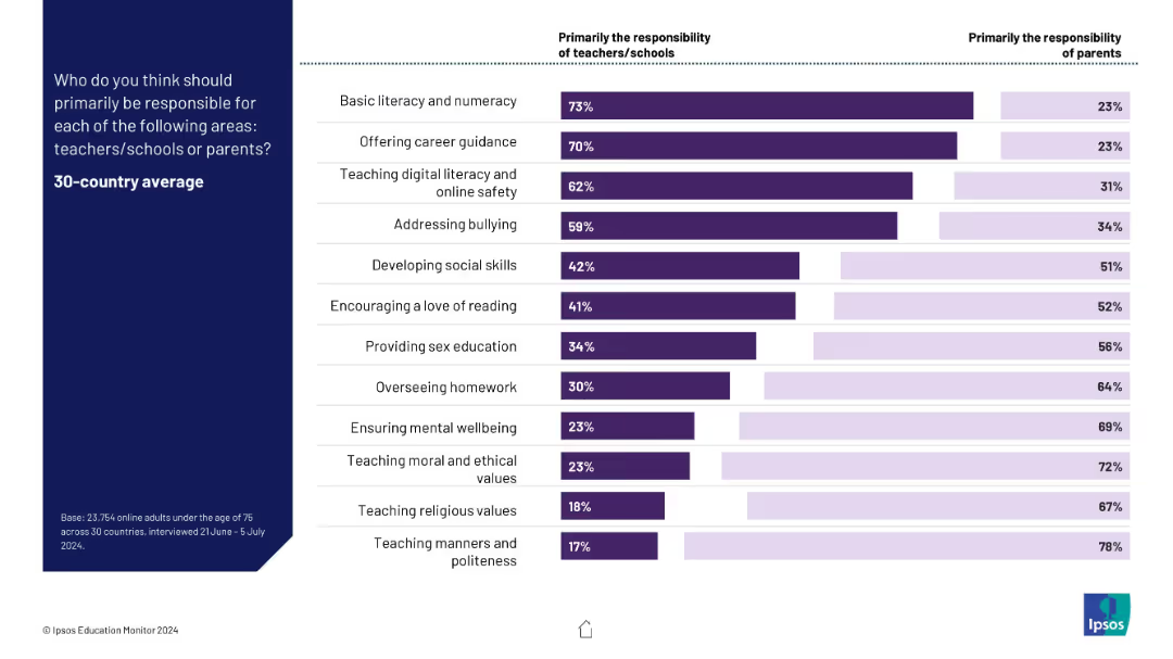
Horizontal bar chart comparing teacher/school vs parent responsibility for 13 educational tasks
Organizational Structure and Change
Education & Training
This slide outlines public opinion on who should be responsible for various educational roles. Basic literacy, digital safety, and career guidance are seen as school roles, while values, manners, and wellbeing are viewed as parental.
responsibilities, teachers, parents, education, digital literacy, ethics, homework
Mixed Chart
IPSOS
Saved
This slide displays a dot plot chart tracking expenditure execution rates over three fiscal years, each marked with a percentage.
Regulatory and Compliance
Government & Public Sector
Evaluates the efficiency of expenditure management in the government by showing the execution rates of allocated budgets.
Expenditure, execution rates, fiscal years, government spending
Single Chart
PwC/Strategy&
Saved
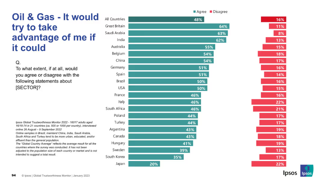
Reversed sentiment chart with “agree” indicating negative perception. Highest scores shown on top (e.g. Great Britain, Saudi Arabia, India).
Market Analysis and Trends
Energy & Utilities
Respondents indicate whether they believe the oil & gas sector would exploit them if it could. Unlike previous slides, high agreement reflects mistrust. The perception is notably high in Western and some developing countries.
Exploitation, Mistrust, Oil & Gas, Ipsos, Ethics, Global Trust, Sector Perception, Public View, Energy Industry
Mixed Chart
IPSOS
Saved
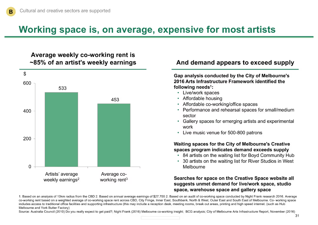
Column chart comparing average weekly earnings of artists with co-working rent
Market Analysis and Trends
Media & Entertainment
Illustrates the high cost of working space for artists in Melbourne and the demand exceeding supply.
Working space, cost, artists, Melbourne, demand
Mixed Chart
BCG
Saved
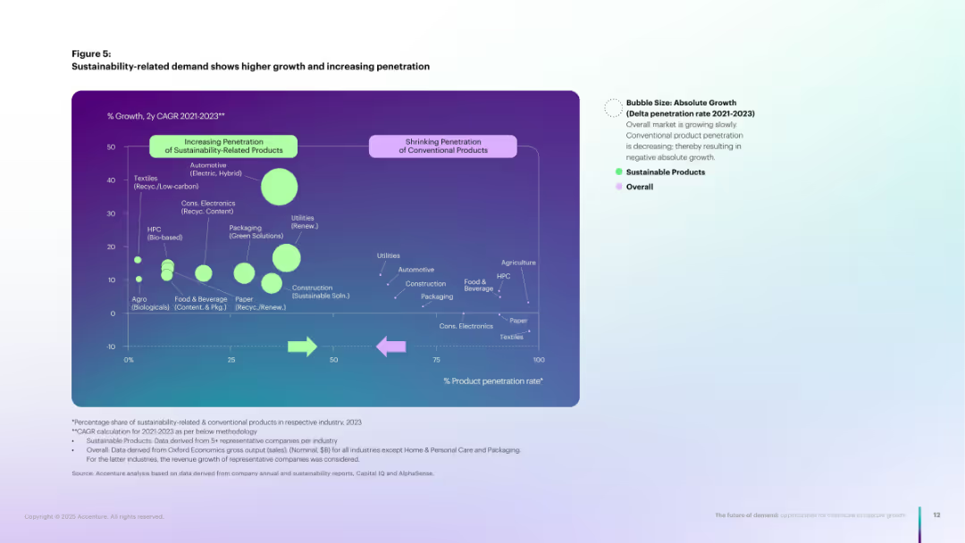
Bubble chart comparing CAGR and product penetration for sustainable vs. conventional products.
Market Analysis and Trends
Environmental Services & Sustainability
Bubble chart illustrating how sustainable products are gaining higher market penetration and faster growth compared to conventional ones. Emphasizes accelerating demand for bio-based, recycled, or renewable offerings.
Sustainable demand, CAGR, penetration, bubble chart, green growth
Single Chart
Accenture
Saved
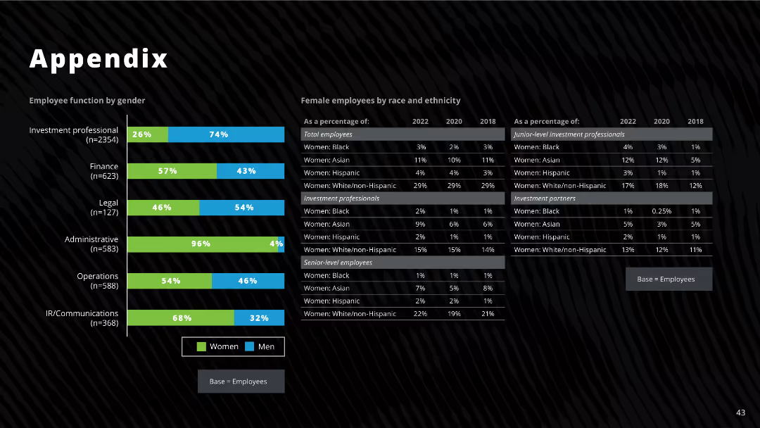
The slide features bar charts and tables showing employee function by gender, race, and ethnicity, including detailed percentages for different categories from 2018, 2020, and 2022.
Human Resources and Talent Management
Professional Services
The slide provides detailed demographic data on employees by function, gender, race, and ethnicity, highlighting changes over time.
employee demographics, gender, race, ethnicity, investment professionals, diversity
Mixed Chart
Deloitte
Saved
A column chart showing ownership model splits and a table detailing profitability across leasing, subscription, rental, and sharing models.
Market Analysis and Trends
Transportation & Logistics
Explores the rise of alternative vehicle ownership models, projecting potential growth and profitability of leasing, subscription, rental, and sharing models by 2035.
alternative ownership, leasing, subscription, rental, sharing
Mixed Chart
PwC/Strategy&
Saved
Slide displays detailed text content with logos representing various support entities within the FoodTech ecosystem.
Investment Analysis
Agriculture & Food Production
Describes the core entities supporting food innovation in Switzerland, with a focus on their contributions and origins.
Switzerland, FoodTech, support, innovation, entities
Header Vertical
Accenture
Saved
Stacked bar chart showing methods of communicating AI ethics to workforce.
Regulatory and Compliance
Technology & Software
Discusses how companies communicate AI ethics to their employees, including workshops, internal specialists, and ethical reporting methods.
AI ethics, communication, workshops, internal specialists, ethical reporting
Mixed Chart
Deloitte
Saved
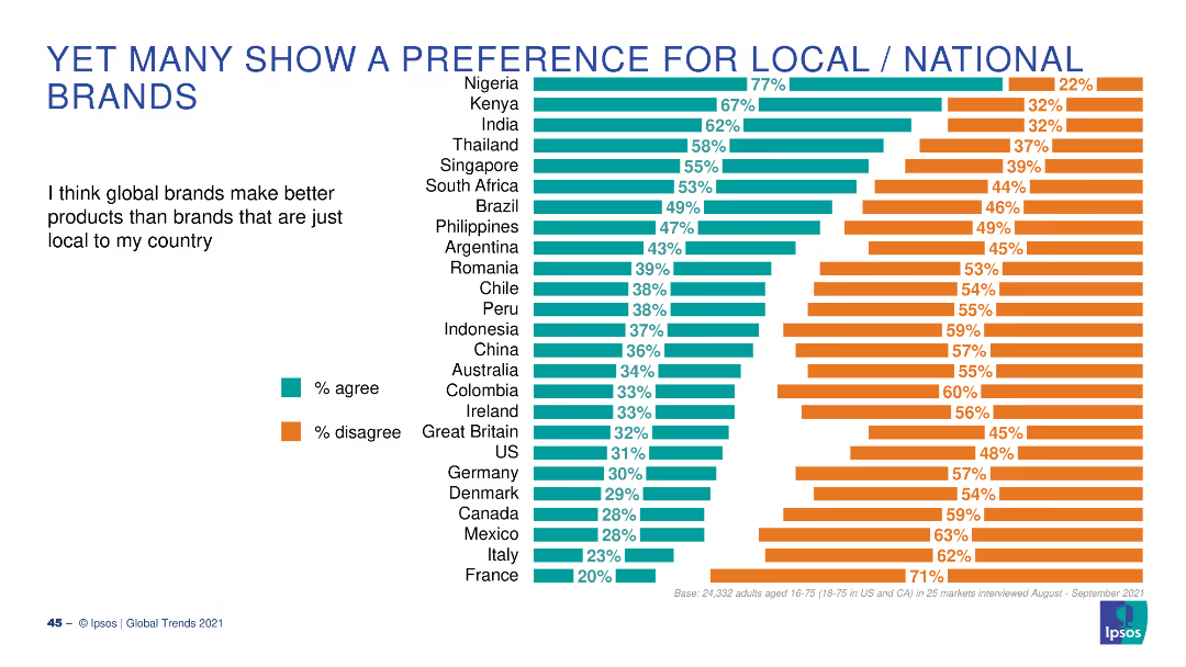
A bar chart with horizontal bars showing the percentage of people who agree or disagree that global brands make better products than local brands, across various countries.
Market Analysis and Trends
Consumer Goods
This slide presents survey results on consumer preferences for global vs. local brands, with data from multiple countries highlighting varying opinions.
local brands, global brands, preferences, consumer, survey
Multiple Chart
IPSOS
Saved
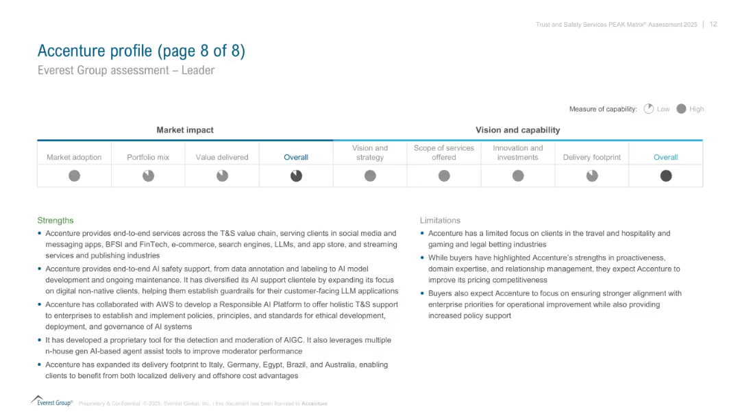
Split layout: radar-style visual for capabilities (top), text sections for strengths and limitations (bottom); corporate and professional style.
Competitive Landscape
Technology & Software
Final profile summary of Accenture in the PEAK Matrix assessment. Visualizes its performance across several dimensions (vision, services, investments). Text highlights Accenture’s strengths in AI safety and end-to-end solutions, with noted client and pricing focus limitations.
Accenture, PEAK Matrix, AI safety, capabilities, limitations, client focus, strengths
Mixed Chart
Accenture
Saved
Two line charts compare policy rates in various economies with commentary text on the right. The y-axis shows percentage rates, and the x-axis shows months/years.
Regulatory and Compliance
Financial Services
The slide examines the pause in rate hikes by central banks across major economies, analyzing policy rates for the US, Euro area, UK, Japan, Australia, China, India, and Brazil.
Monetary policy, central banks, rate hikes, economic conditions, policy rates
Multiple Chart
Accenture
Saved
The slide features a bar chart showing the progression of CET1 ratio targets over time, with explanatory text on each contributing factor.
Financial Performance
Financial Services
The slide presents the target CET1 ratio of greater than 13.5% by 2025, outlining the steps and capital actions required to achieve this financial stability goal.
CET1, ratio, target, financial, stability
Single Chart
Credit Suisse
Saved
This slide contains a series of column charts representing the Net Interest Income (NII) excluding markets with projections and impacts of various factors. A sidebar lists assumptions and sources of uncertainty related to the financial outlook. The color scheme differentiates current outlook from medium-term impacts.
Financial Performance
Financial Services
The slide provides a financial outlook on Net Interest Income (NII), excluding market influences, and accounts for the impact of the First Republic and other variables. The assumptions and uncertainties section aids in understanding the factors that may affect the bank's financial projections, offering a strategic view of the bank's future earning potential for investors and stakeholders.
NII, Financial Outlook, Projections, First Republic, Market Exclusion, Assumptions, Uncertainties, Financial Planning, Banking
Mixed Chart
JP Morgan
Saved
Mixed chart types showing EBITDA and organic revenue growth, with an accompanying legend and notes.
Strategic Planning
Financial Services
Provides analysis of earnings growth linked to organic revenue increase.
Earnings growth, organic revenue, financial analysis, EBITDA, performance
Mixed Chart
Booz Allen Hamilton
Saved
This slide features six gauge charts and a timeline. The top three charts indicate risk-weighted assets for 'Trading', 'Lending', and 'Operational Risk and CVA', each in a gauge format with color gradations from green to red. Below, a timeline marks key regulatory milestones for Basel III. The bottom three gauges represent capital buffers: GSIB, SCB, and CCyB. The overall design is structured, with blue as a dominant color and the use of arrows and timeline for historical and future projections.
Regulatory and Compliance
Financial Services
The slide presents the current and projected regulatory capital requirements, including Basel III endgame and various capital buffers like GSIB, SCB, and CCyB, with an emphasis on the uncertainty and preparation for potential regulatory changes.
Basel III, Regulatory, Capital, Risk, GSIB, SCB, CCyB, Timeline, Gauge Chart
Linear Flow
JP Morgan
Saved
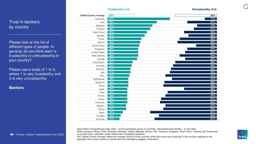
Traditional layout with explanation on left and bar comparison chart on right. Depicts trust scores of bankers by country.
Financial Performance
Financial Services
This slide shows how much people trust bankers globally. Indonesia and India lead in trustworthiness; Romania and Hungary have the lowest trust levels.
finance, bankers, trust score, country index, Ipsos, global, public perception, banking sector
Mixed Chart
IPSOS
Saved
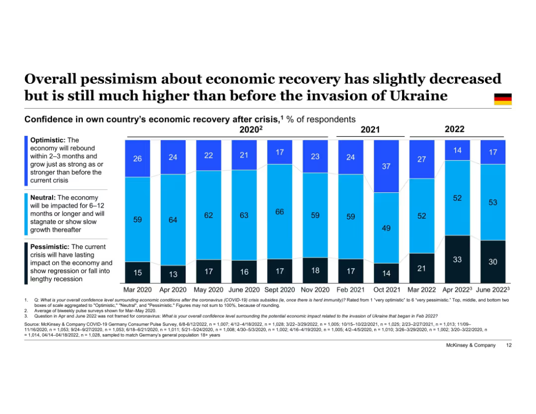
Vertical stacked bar chart timeline (Mar 2020–Jun 2022); bars segmented into "Optimistic," "Neutral," and "Pessimistic" confidence levels. German flag icon in top-right corner. Title at top, legend left side, data sourced from McKinsey surveys at bottom.
Market Analysis and Trends
Financial Services
This slide shows how German consumer sentiment on economic recovery has evolved since March 2020. While optimism slightly increased in June 2022, pessimism remains significantly higher than pre-Ukraine invasion levels. The chart illustrates the fluctuating recovery confidence over time.
economic recovery, consumer sentiment, Germany, optimism, pessimism, Ukraine invasion, timeline, confidence levels, McKinsey, survey results
Single Chart
McKinsey
Saved
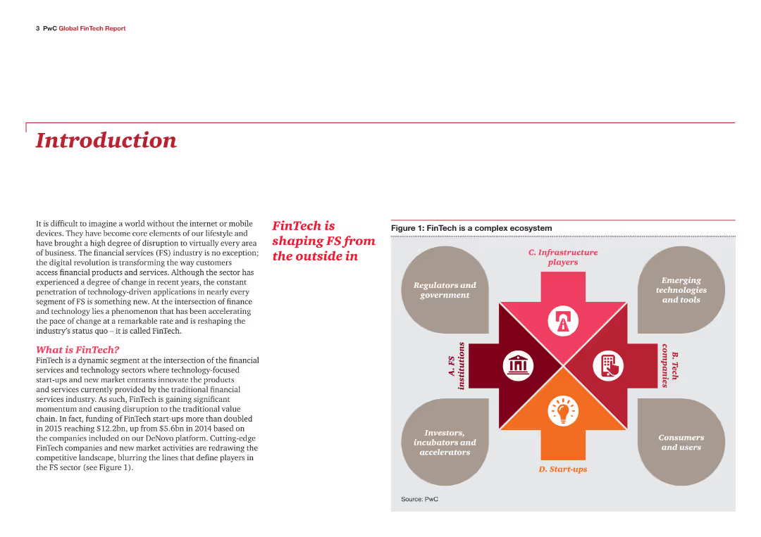
Introduction slide with text explaining the FinTech industry's impact on financial services. Includes an infographic showing the FinTech ecosystem, consisting of FS institutions, tech companies, start-ups, regulators, and government.
Industry Overview
Financial Services
This slide introduces the report on the FinTech industry's influence on financial services. It defines FinTech and highlights its role in transforming the industry through digital applications and technology-driven innovations, setting the stage for detailed analysis in the report.
FinTech, financial services, introduction, industry impact, digital transformation, ecosystem
Diagram
PwC/Strategy&
Saved
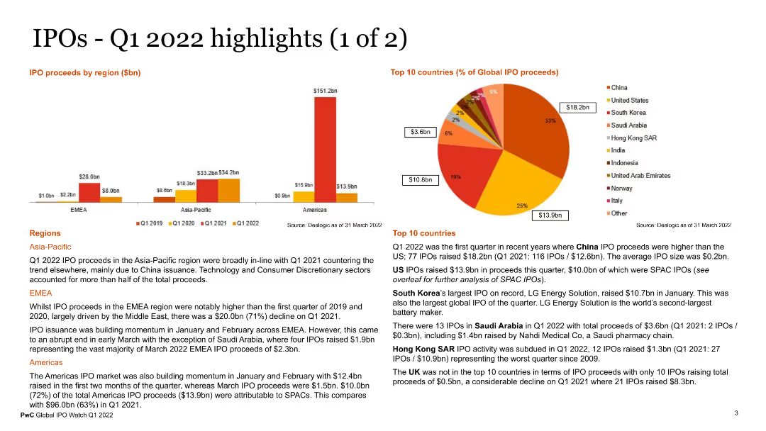
The slide features multiple visual elements, including a column chart for IPO proceeds by region, a pie chart for the top 10 countries by global IPO proceeds, and text sections detailing regional IPO activities in Asia-Pacific, EMEA, and the Americas. The charts use various colors to represent different data points.
Market Analysis and Trends
Financial Services
This slide presents key highlights of IPO activities in Q1 2022, with detailed regional analysis and top countries contributing to IPO proceeds. It provides a clear picture of global IPO trends and regional performance, useful for investors and market analysts.
IPO highlights, Q1 2022, regional analysis, global IPOs, financial trends
Multiple Chart
PwC/Strategy&
Saved
Slide shows a column chart comparing VAT rates across Southern African countries, using different colors for each country to facilitate comparison.
Competitive Landscape
Government & Public Sector
This slide provides a comparative analysis of VAT rates across Southern African countries, highlighting Namibia's position and its implications for trade and consumer prices in a regional context.
VAT, Rates, Comparison, Trade, Regional
Single Chart
PwC/Strategy&
Saved
Shows a stacked area chart of daily new COVID-19 cases by region and highlights key epidemic progression metrics.
Regulatory and Compliance
Healthcare & Pharmaceuticals
Analyzes regional COVID-19 case trends and the progress in vaccine rollout, emphasizing the significant drop in cases due to vaccination efforts.
COVID-19, case trends, vaccine rollout, regional data, public health, epidemic progression
Mixed Chart
BCG
Saved
Displays bar charts and segmented columns to show potential cost savings through procurement optimization, with percentage values.
Operational Efficiency
Financial Services
Highlights potential annual cost savings through various procurement optimization strategies, with detailed cost breakdowns.
procurement, cost savings, optimization, financial impact, bar charts, column charts, percentages, strategies, savings
Multiple Chart
Kearney
Saved
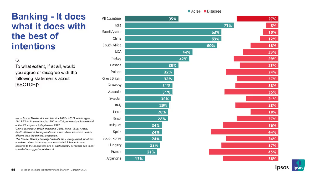
Standard bar chart format comparing agreement and disagreement globally. Green for agreement; red for disagreement.
Market Analysis and Trends
Financial Services
This slide presents whether the banking sector is perceived to operate with good intentions. High agreement is seen in India, Saudi Arabia, and China. Western countries display more critical views, with higher disagreement rates.
Banking, Intentions, Ethics, Global Survey, Financial Trust, Ipsos, Country Comparison, Public Perception
Mixed Chart
IPSOS
Saved
Previous
Next
If nothing, comes up, please save your slides first
Create a FREE account to continue browsing
Receive Instant Access to 1,000+ slides from companies like McKinsey, Google, and Goldman Sachs
First Name
Last Name
Email
Password
I agree to all
Terms & Privacy Policy
Thank you! Your submission has been received!
Oops! Something went wrong while submitting the form.
Have an account?
Sign in
Column Chart
Heatmap
Chevron
Org Chart
Infographic
Callouts
Timeline
List
Graphic
Picture
Process Flow
Diagram
Paragraph
Map
Table
Framework
Subtitle
Takeaway Box
Icon
Other Chart
Radar Chart
Waterfall Chart
Mekko Chart
Pie Chart
Scatter Plot
Line Chart
Bar chart
Bullet points