Create a FREE Account
Instant access to 1,000+ real slides from top companies like McKinsey, BCG, Goldman Sachs, Google and many more!
First Name
Last Name
Email
Password
I agree to all
Terms & Privacy Policy
Thank you! Your submission has been received!
Oops! Something went wrong while submitting the form.
Have an account?
Sign in
Library
Templates
Courses
Pricing
My Account
My Slides
My Templates
✦ AI
AI Prompt Library
AI Search
Sign in
Start Here
Logout
My Saved Slides
The slide presents a graph showing carbon abatement cost versus grid emissions for various business cases in different countries.
Market Analysis and Trends
Energy & Utilities
The slide evaluates the benefits and costs of electrolysis for different applications, emphasizing the impact of a country’s energy mix on its effectiveness.
electrolysis, energy mix, carbon abatement, benefits, country analysis
Single Chart
Kearney
Saved
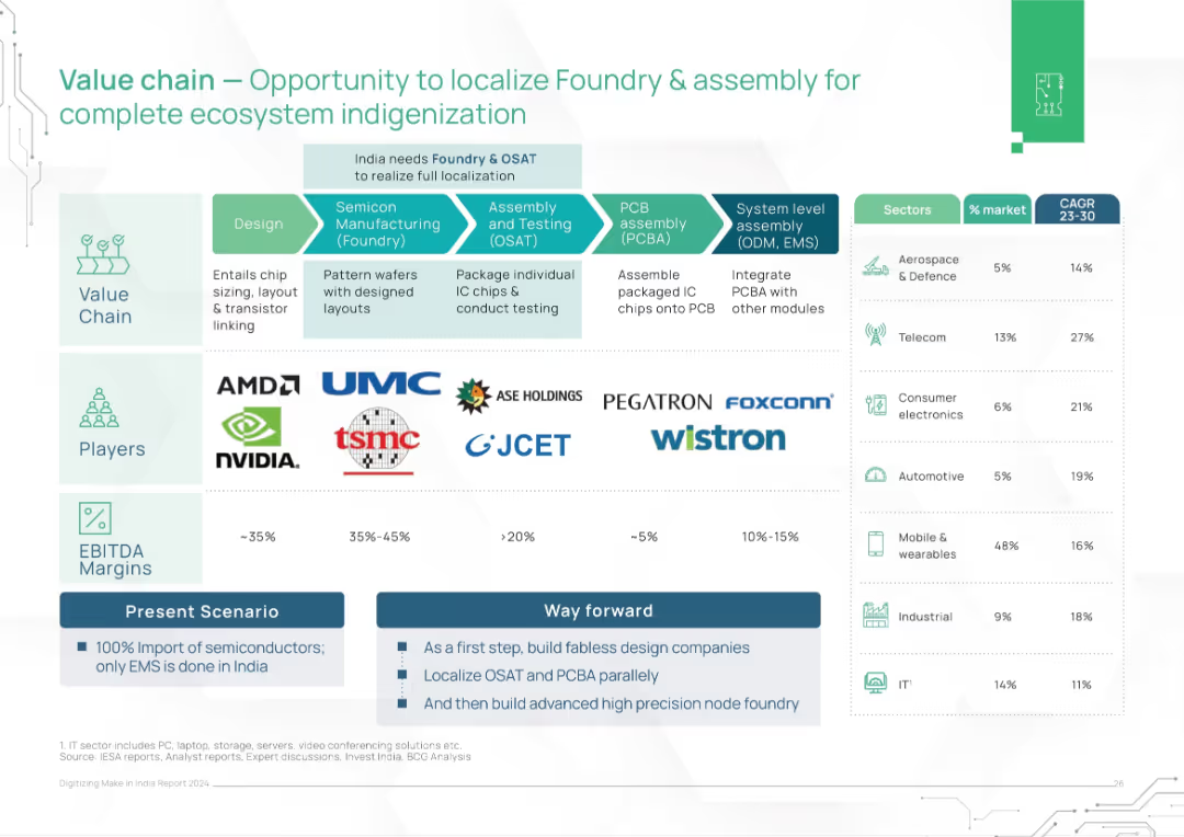
Flow diagram of the semiconductor value chain with players, EBITDA margins, and sector growth rates. Split into Present and Way Forward strategies.
Technology and Digital Transformation
Technology & Software
This slide maps the semiconductor value chain and highlights opportunities for India to localize high-value segments like foundry and OSAT. It suggests a phased roadmap to reduce dependence on imports and build a self-reliant chip ecosystem.
semiconductor, value chain, localization, foundry, OSAT, India, chip design, electronics manufacturing
Table
BCG
Saved
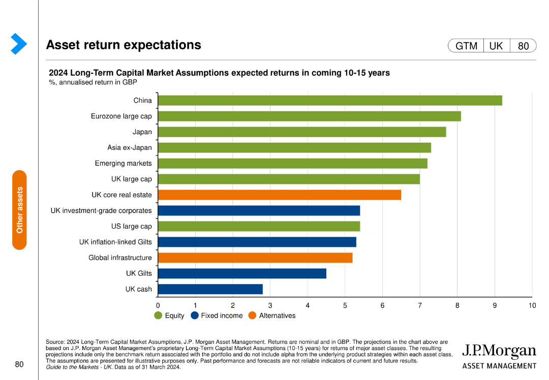
The slide features a horizontal bar chart depicting expected annualized returns of various asset classes over the next 10-15 years in GBP. The bars are color-coded by asset type.
Investment Analysis
Financial Services
The slide shows the expected returns for various asset classes such as equities, fixed income, and alternatives, providing insights for long-term investment strategies.
asset returns, investment, equities, fixed income, alternatives, J.P. Morgan, financial forecast, capital markets, annualized return, GBP
Single Chart
JP Morgan
Saved
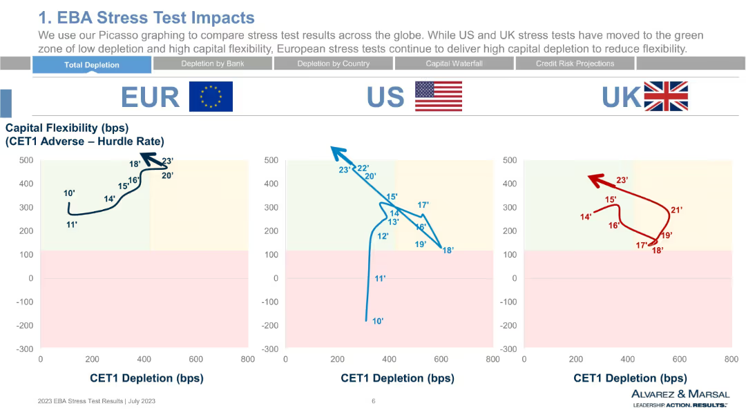
Line chart comparisons across EUR, US, and UK regions with national flags and CET1 depletion vs. capital flexibility axes. Uses color-coded backgrounds for impact zones.
Risk Assessment and Management
Financial Services
This slide compares CET1 depletion and capital flexibility by region (EU, US, UK) from 2010 to 2023. It shows regional trends and positions banks in “green” or “red” zones based on stress test outcomes. The EU shows high capital flexibility with moderate depletion, unlike the UK and US.
CET1, capital flexibility, EU vs US vs UK, stress testing, depletion, risk zones
Single Chart
Alvarez & Marsal
Saved
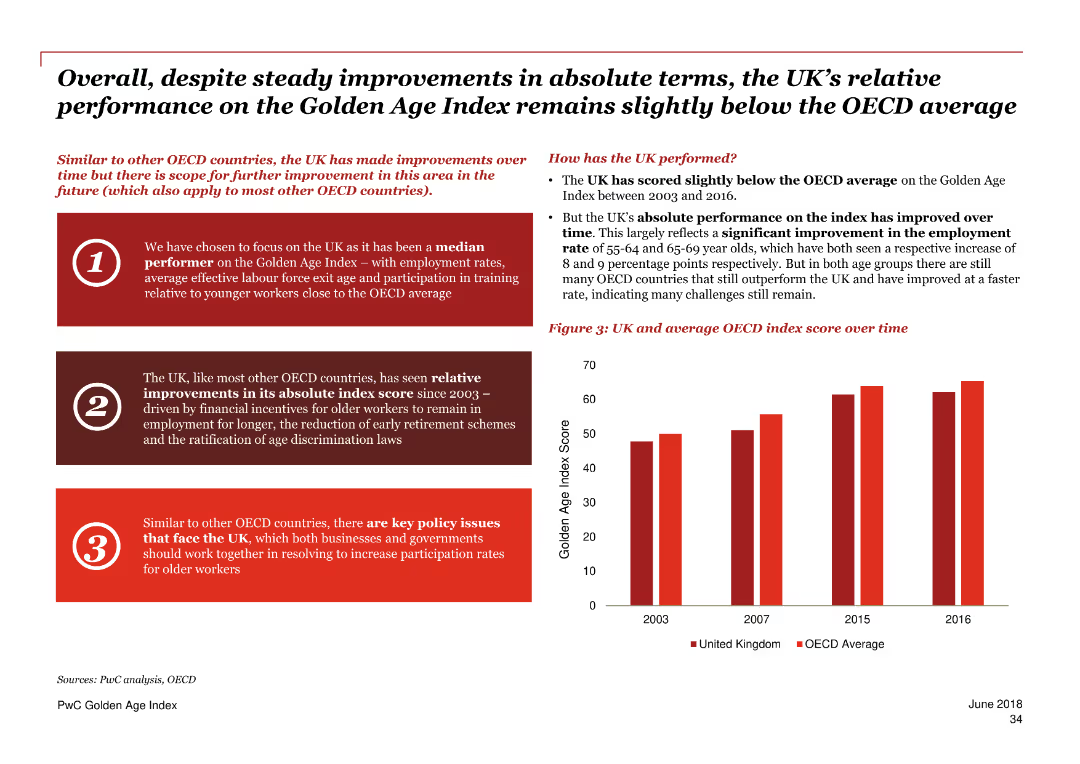
This slide includes a column chart comparing the UK’s Golden Age Index score over time to the OECD average. Text sections highlight the UK’s relative performance and key policy issues.
Performance Metrics and KPIs
Government & Public Sector
The slide reviews the UK’s performance on the Golden Age Index, showing steady improvements but remaining below the OECD average. It discusses factors driving these trends and key policy issues to enhance participation rates for older workers.
Golden Age Index, UK performance, OECD, employment, older workers, policy issues, index score, trends
Mixed Chart
PwC/Strategy&
Saved
The slide includes pie and column charts displaying trends in liquidity ratios and funding sources over several quarters. The information is organized in a clear, easy-to-follow layout.
Financial Performance
Financial Services
Outlines the funding and liquidity status of a financial institution, highlighting the diversified deposit base and liquidity ratios. Useful for financial analysis and discussions on maintaining liquidity in banking operations.
funding, liquidity, finance, banking, stability
Multiple Chart
Deutsche Bank
Saved
The slide includes a line graph tracking investor sentiment over time. It contrasts views on the stock market and the economy, with textual annotations explaining key trends and dates.
Market Analysis and Trends
Financial Services
Analyzes investor sentiment shifts regarding the stock market and economy, noting particularly low bullishness. Useful for market trend analysis and investment strategy planning.
Investor Sentiment, Bearish Trends, Bullish Sentiment, Stock Market, Economy, Market Analysis, Investment Strategy, Trend Tracking, Economic Outlook, Sentiment Change
Single Chart
BCG
Saved
Bar charts, color-coded data, percentage indicators.
Investment Analysis
Technology & Software
Illustrates CEO plans to increase digital investments post-COVID-19.
Digital, investment, CEOs, COVID-19, cybersecurity, sustainability, R&D, supply chain
Single Chart
PwC/Strategy&
Saved
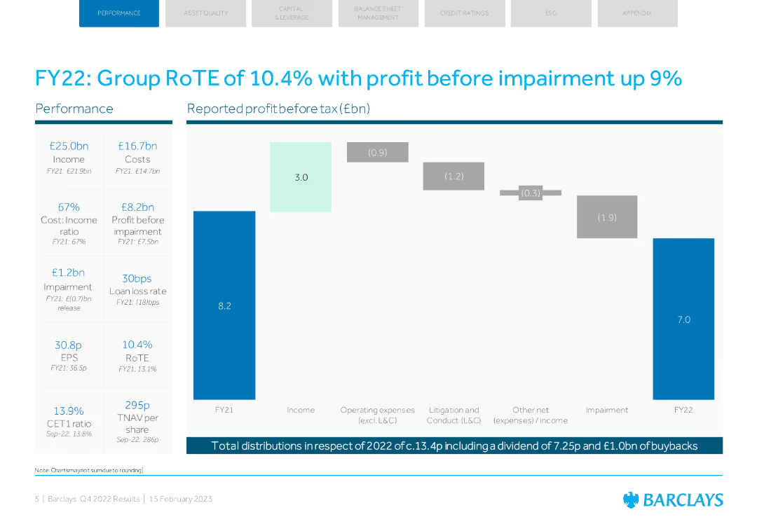
The slide features a column chart showing profit before tax, with key financial metrics listed alongside. The design is straightforward with blue tones.
Financial Performance
Financial Services
The slide provides an overview of Barclays' FY22 financial performance, highlighting a 10.4% RoTE and a 9% increase in profit before impairment.
RoTE, profit, financial performance, Barclays, FY22
Mixed Chart
Barclays
Saved
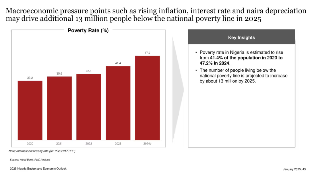
Bar chart showing poverty rate from 2020 to 2024e; side box with key insights; red and gray design.
Risk Assessment and Management
Government & Public Sector
Projects Nigeria’s poverty rate will rise to 47.2% in 2024, with 13 million more people expected to fall below the poverty line by 2025. Highlights inflation, interest rate hikes, and naira depreciation as key contributing macroeconomic pressures.
poverty rate, inflation, naira depreciation, interest rate, Nigeria, 2025, economic stress, social impact
Mixed Chart
PwC/Strategy&
Saved
Features two line charts: 'AAA Muni-to-Treasury Yield Ratios' and 'Credit Quality Spreads vs. AAA'. Both charts include timelines from 2014 to 2024, color differentiation for clarity, and a data table for current and historical metrics in a clean and organized manner.
Market Analysis and Trends
Financial Services
This slide offers an update on the municipal bond market, focusing on yield ratios and credit quality spreads. Aimed at investors or analysts, it provides a clear visual representation of the market's condition, comparing municipal bonds to treasury yields and assessing credit quality differences, crucial for strategic financial planning or market forecasting.
Yield Ratios, Credit Spreads, Municipal Bonds, Treasury, AAA
Multiple Chart
Morgan Stanley
Saved
Image of swirling light patterns. Column chart depicting the level of change in organizations impacting risk management functions.
Strategic Planning
Financial Services
This slide explores how organizations characterize the level of change impacting their risk management functions. It identifies the main areas requiring CRO attention in planned digital transformation initiatives, such as the use of GenAI, modernization of core functions, and cloud migration.
risk management, change, digital transformation, GenAI, cloud migration
Multiple Chart
EY
Saved
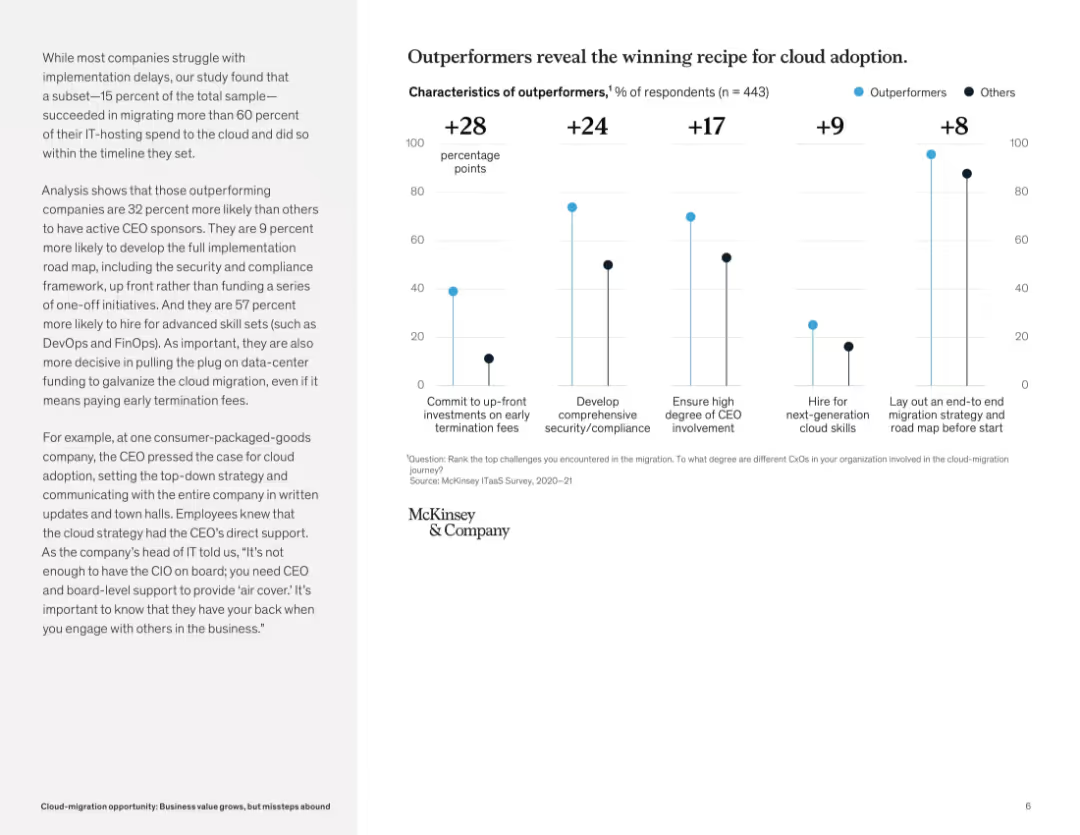
Vertical bar chart layout comparing outperformers and others across five cloud adoption success factors. Left-aligned narrative explanation.
Strategic Planning
Technology & Software
This slide identifies the traits of cloud migration outperformers, including executive sponsorship, comprehensive planning, and talent investment. Companies that commit to upfront investments and structured strategy are significantly more successful.
cloud adoption, best practices, CEO involvement, security, strategy, digital leadership, early investment, outperformers, migration success
Mixed Chart
McKinsey
Saved
Left block of stats and outcomes; right side features a circular infographic with five dimensions of Talent Advantage: culture, learning, rewards, health, and tech.
Human Resources and Talent Management
Professional Services
Describes how leading companies build a Talent Advantage across five dimensions to address workforce challenges. Includes stats on performance outcomes for talent-advantaged firms and emphasizes the strategic value of culture, learning pathways, reward systems, technology, and workforce planning to stay competitive.
Talent Advantage, workforce strategy, learning, rewards, culture, technology, retention
Vertical Flow
EY
Saved
Column chart showing percentage agreement that mental health needs more attention, with countries sorted from highest to lowest agreement.
Customer and Market Segmentation
Healthcare & Pharmaceuticals
Highlights the importance of mental health globally, with Nigeria showing the highest agreement. Indicates the global trend toward prioritizing mental health along with physical health.
mental health, global, priority, survey, agreement
Multiple Chart
IPSOS
Saved
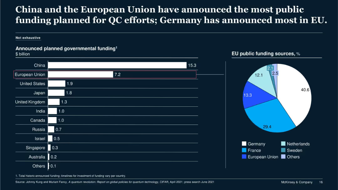
Bar chart and pie chart on dark background; shows announced QC funding by country and EU member source breakdown.
Regulatory and Compliance
Government & Public Sector
This slide compares global government funding commitments for quantum computing. China leads with $15.3B, followed by the EU at $7.2B. The pie chart reveals Germany’s dominance within the EU’s QC funding sources, followed by France and EU central programs.
public funding, quantum computing, China, EU, Germany, QC
Multiple Chart
McKinsey
Saved
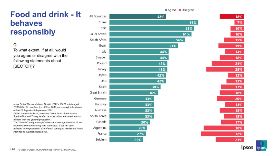
Split bar chart by country with “Agree” and “Disagree” percentages in teal and red; left-aligned question text.
Market Analysis and Trends
Consumer Goods
This slide shows the level of public agreement across countries with the statement that the food and drink sector behaves responsibly. It features a comparative bar chart of 21 countries showing agreement and disagreement rates.
trustworthiness, food sector, behavior, global opinions, Ipsos, consumer perceptions, responsibility, countries, chart, bar comparison
Mixed Chart
IPSOS
Saved
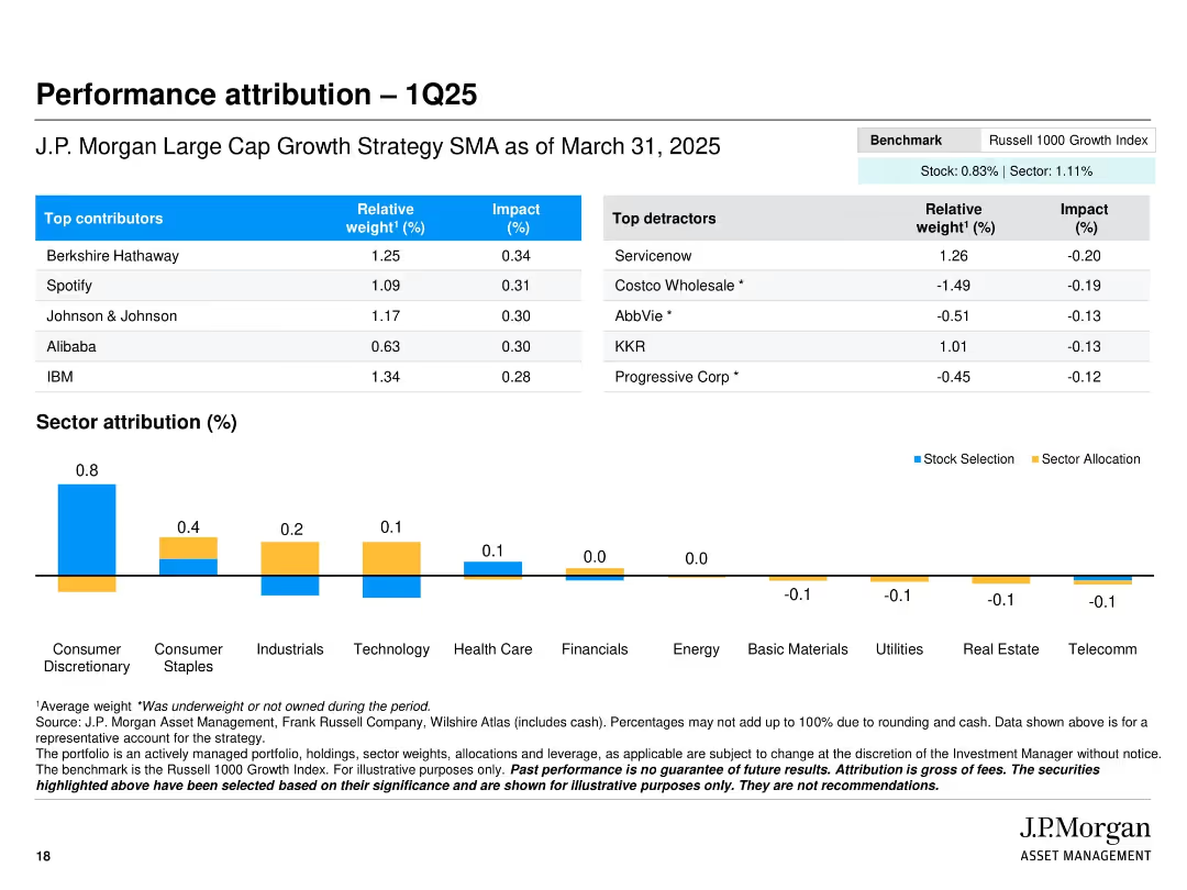
Split layout with tables of top contributors/detractors and a bar chart for sector attribution; clean benchmarking notes
Performance Metrics and KPIs
Financial Services
The slide presents performance attribution for Q1 2025, identifying top-performing and underperforming stocks in the J.P. Morgan Large Cap Growth Strategy. It includes relative weights and impact percentages, alongside sector attribution, helping to assess value-added performance sources.
Performance attribution, top contributors, detractors, sector performance, portfolio impact, Q1 2025, benchmark comparison, asset management
Mixed Chart
JP Morgan
Saved
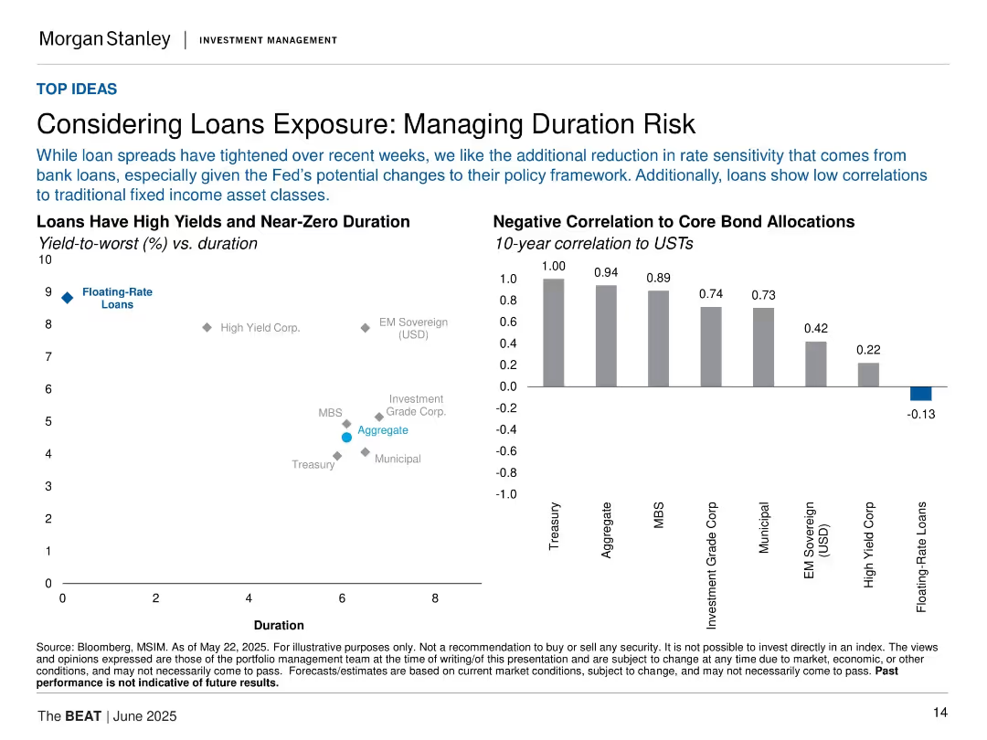
Two visualizations: scatter plot (yield vs. duration) and bar chart (correlation to USTs); grid layout.
Risk Assessment and Management
Financial Services
The slide highlights floating-rate loans as an attractive option for managing duration risk, especially given low correlations with core bond allocations. It shows yield/duration positioning and negative correlations to USTs.
loans, duration risk, floating-rate, correlation, fixed income, USTs, yield, bank loans, interest sensitivity
Multiple Chart
Morgan Stanley
Saved
This slide features two comparative line charts. The left chart compares EM and DM Real Yields using inflation forecasts, and the right chart shows the EM-DM Real Yield Differential.
Market Analysis and Trends
Financial Services
It highlights the real yield differences using inflation expectations and the narrowing yield differentials over the past year. Useful for comparing emerging and developed markets.
EM, DM, real yields, inflation, comparison
Multiple Chart
Morgan Stanley
Saved
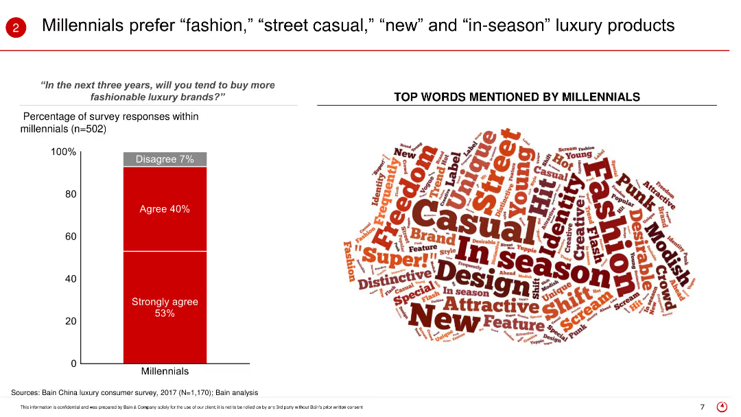
The slide uses a bar (column) chart to present the percentage of Millennials agreeing or strongly agreeing to buy more fashionable luxury brands in the next three years. It also features a word cloud illustrating the top words mentioned by Millennials when describing their luxury preferences.
Market Analysis and Trends
Retail & E-commerce
The slide focuses on the preferences of Millennials for luxury products, indicating a strong inclination towards fashion, street casual, new, and in-season items. It shows the survey results where a significant percentage of Millennials agree or strongly agree to buy more fashionable luxury brands in the coming years.
Millennials, luxury preferences, fashion, street casual, in-season, word cloud, consumer survey, future trends, buying behavior
Mixed Chart
Bain
Saved
The slide showcases a dashboard with multiple data visualizations, including line and bar charts, detailing customer debt, active debt, and highest debt customers.
Financial Performance
Energy & Utilities
This slide details customer debt metrics, including total debt amount, active debt, and highest debt customers, presented through various graphical elements for clear understanding.
customer debt, active debt, highest debt, utilities, metrics
Multiple Chart
EY
Saved
The slide compares two markets using photographs of cityscapes (Los Angeles and Chicago), side-by-side column charts, and key data points annotated around the images. The use of visuals and text is balanced, with emphasis on growth rates and market opportunities in both new and legacy markets.
Market Analysis and Trends
Financial Services
This comparative slide examines the performance and market opportunities in two distinct markets, Los Angeles (new) and Chicago (legacy). It highlights key statistics such as client numbers and CAGR, using column charts to contrast the revenue and loan growth in both cities. The visual representation aids in understanding the market dynamics and potential for expansion in each location.
new markets, Los Angeles, Chicago, market opportunity, revenue growth, loans, clients, prospects, CAGR
Multiple Chart
JP Morgan
Saved
Utilizes a series of column charts with descriptive text, using colors like red, orange, and beige to differentiate data points and time frames.
Regulatory and Compliance
Government & Public Sector
Examines the backlog of cases in courts, clearance rates, and the age of matters at the time of finalization to identify areas for process improvement.
Court backlog, clearance rates, case age, legal process, judicial efficiency, case management, finalization rates
Multiple Chart
PwC/Strategy&
Saved
The slide is divided into two main sections: a table with loan portfolio breakdown and a pie chart for loan distribution, accompanied by key credit metrics, set against a blue and white background.
Financial Performance
Financial Services
Showcasing a financial institution's loan portfolio and credit overview, this slide provides detailed breakdowns of loan types and performance metrics. It serves to convey financial health and risk distribution, highlighting secured loans and credit ratings.
loan portfolio, credit overview, metrics, financial health
Multiple Chart
Goldman Sachs
Saved
Previous
Next
If nothing, comes up, please save your slides first
Create a FREE account to continue browsing
Receive Instant Access to 1,000+ slides from companies like McKinsey, Google, and Goldman Sachs
First Name
Last Name
Email
Password
I agree to all
Terms & Privacy Policy
Thank you! Your submission has been received!
Oops! Something went wrong while submitting the form.
Have an account?
Sign in
Column Chart
Heatmap
Chevron
Org Chart
Infographic
Callouts
Timeline
List
Graphic
Picture
Process Flow
Diagram
Paragraph
Map
Table
Framework
Subtitle
Takeaway Box
Icon
Other Chart
Radar Chart
Waterfall Chart
Mekko Chart
Pie Chart
Scatter Plot
Line Chart
Bar chart
Bullet points