Create a FREE Account
Instant access to 1,000+ real slides from top companies like McKinsey, BCG, Goldman Sachs, Google and many more!
First Name
Last Name
Email
Password
I agree to all
Terms & Privacy Policy
Thank you! Your submission has been received!
Oops! Something went wrong while submitting the form.
Have an account?
Sign in
Library
Templates
Courses
Pricing
My Account
My Slides
My Templates
✦ AI
AI Prompt Library
AI Search
Sign in
Start Here
Logout
My Saved Slides
Slide features a title on top, two-column charts comparing Chase's delinquency rate to industry, and Chase's servicing cost per unit from FY14 to FY18. Red highlights draw attention to specific data points. Small text and footnotes are at the bottom.
Financial Performance
Financial Services
The slide presents financial data from 2014 to 2018, comparing Chase's mortgage delinquency rates and servicing costs against the industry average, emphasizing the company's risk management and cost efficiency.
delinquency rate, servicing cost, financial data, risk management, efficiency
Multiple Chart
JP Morgan
Saved
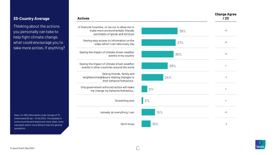
Vertical bar chart ranking factors that could personally encourage people to take action against climate change. Includes data on change from the previous year.
Human Resources and Talent Management
Environmental Services & Sustainability
The slide explores what motivates individuals to take climate action. Top motivators include financial incentives, accessible information, and direct experience with climate events, highlighting the need for policy and communication strategies that resonate personally.
behavior change, climate action, personal motivation, financial incentives, public awareness, Ipsos, sustainability, global opinion
Mixed Chart
IPSOS
Saved
Two columns of text with graphics, image of shopping experience on the side.
Customer and Market Segmentation
Retail & E-commerce
Insights into the top reasons for consumers shifting to offline channels, like 'look and feel' and easing of restrictions.
offline shopping, consumer behavior, market trends, retail, shopping
Boxed
Bain
Saved
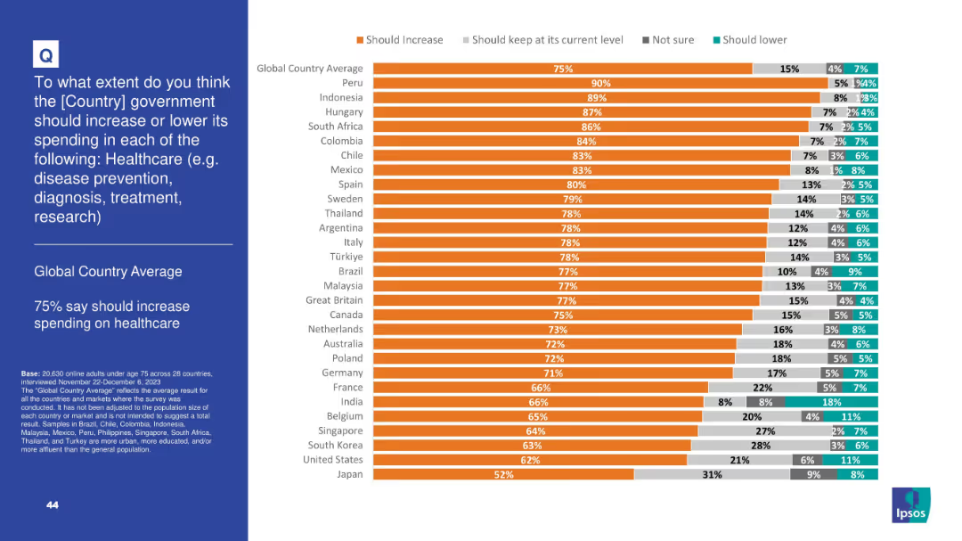
Horizontal bar chart showing majority support for increasing healthcare spending; includes granular response options and country-by-country breakdown
Strategic Planning
Healthcare & Pharmaceuticals
Healthcare is the top funding priority globally—75% agree spending should rise. Countries like Peru, Indonesia, and Hungary show particularly strong support. This reflects global concern for healthcare infrastructure and services.
healthcare, spending, public opinion, investment, hospitals, disease prevention, Ipsos, treatment, public services
Mixed Chart
IPSOS
Saved
The slide displays three sets of column charts showing changes in fee-based assets, loans, and deposits over time. Two shades of blue are used to differentiate between 2015 and 1Q’21 figures, with percentages indicating growth. Each set has two columns representing different business sectors. Annotations highlight rankings and industry positions.
Financial Performance
Financial Services
This slide shows the strategic growth of a wealth management business with a focus on fee-based assets, loans, and deposits. It emphasizes the company's industry-leading positions and substantial growth percentages over six years, suggesting a solid market presence and financial health.
Wealth management, strategic growth, fee-based assets, loans, deposits, industry ranking, financial health, market presence, business growth, performance analysis
Multiple Chart
Morgan Stanley
Saved
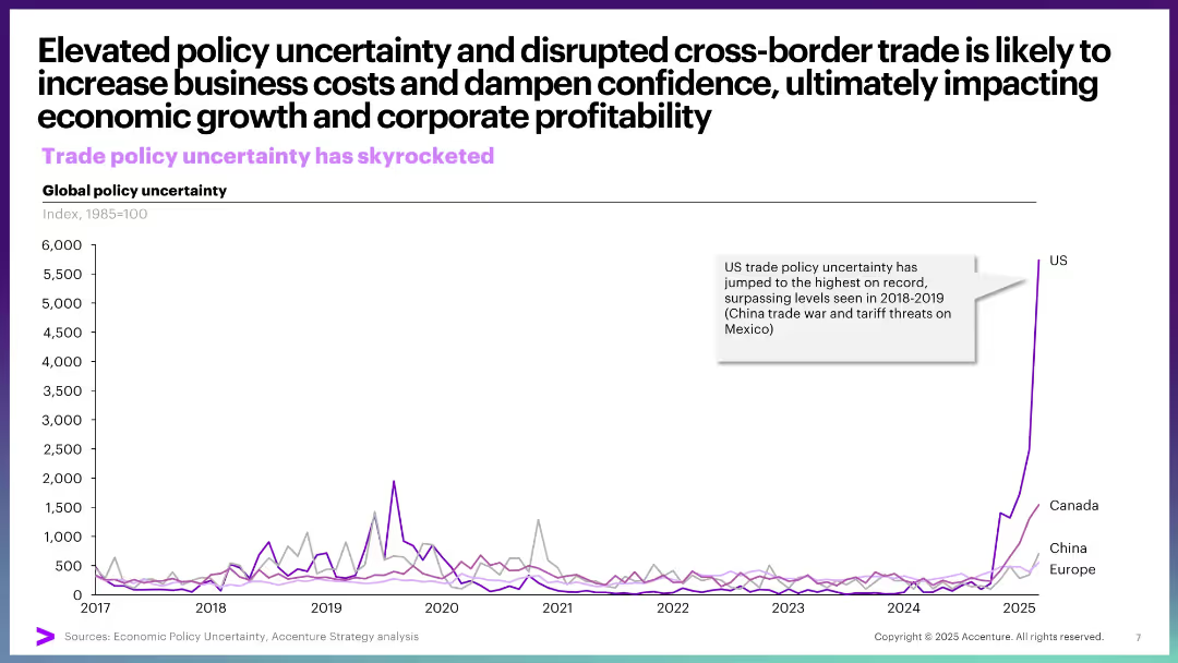
Single line graph showing global policy uncertainty from 2017–2025, with steep rise in US uncertainty in 2025. Clean, focused design with large title and sidebar annotation.
Risk Assessment and Management
Financial Services
This slide demonstrates the surge in US trade policy uncertainty, particularly in 2025, surpassing previous peaks from past trade conflicts. It connects uncertainty to potential risks for economic growth and corporate profits.
trade policy, uncertainty, US, cross-border trade, economic risk, tariffs, business cost, confidence, disruption
Single Chart
Accenture
Saved
This slide displays two sets of column charts for the years 2015 and 2025, indicating eComm market sizes and percentages.
Market Analysis and Trends
Retail & E-commerce
The slide presents a forecast for the eComm market growth in SEA by 2025, focusing on the increase in market value and percentage of retail. Indonesia's significant market share is highlighted, as are the growth rates for other SEA countries.
SEA, eCommerce, Indonesia, growth, forecast
Multiple Chart
Bain
Saved
The slide features a column chart on the right displaying the percentage of people using DeFi applications for various purposes. It is accompanied by a list of activities on the left. The layout is moderately complex.
Technology and Digital Transformation
Financial Services
This slide outlines the use of DeFi applications among crypto asset holders, with earning yields and minting NFTs being popular activities. It provides insights into DeFi usage trends.
DeFi, crypto, applications, activities, trends
Mixed Chart
IPSOS
Saved
The slide has two column charts and one line chart. The column charts compare gross fixed investment and gross debt as a percentage of GDP.
Financial Performance
Financial Services
This slide presents Mexico's public finances and private sector data, including gross debt, gross fixed investment, and public sector revenues and expenditures as GDP.
Mexico, public finance, private sector, GDP, investment, debt, revenues, expenditures
Multiple Chart
JP Morgan
Saved
The slide shows a stacked bar chart illustrating the status of net-zero CO2 policy implementations by country as of August 2020, with categories such as under discussion, pledged, proposed, political agreement, and in law.
Regulatory and Compliance
Government & Public Sector
The slide provides an overview of the status of net-zero CO2 policy implementations across more than 125 countries as of August 2020, categorizing them based on their implementation stage. It highlights the share of global CO2 emissions covered by these policies.
net-zero, CO2 policy, global, emissions
Single Chart
Kearney
Saved
A photo of Cologne Cathedral with a graph showing Germany's GDP growth and a detailed text explanation.
Market Analysis and Trends
Financial Services
This slide discusses Germany's economic conditions, highlighting GDP growth trends and the impact of COVID-19 on the economy.
Germany, GDP growth, economy, financial services, market analysis
Multiple Chart
Deloitte
Saved
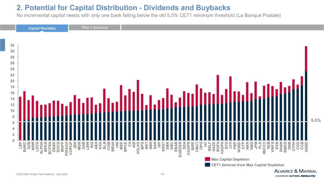
Bar chart comparing max capital depletion and CET1 adverse from depletion across multiple banks, with a 5.5% threshold line. Red and navy blue colors represent different data sets.
Strategic Planning
Financial Services
This chart shows the capital depletion and remaining CET1 capital for numerous European banks under adverse scenarios. It highlights potential for dividend distributions and buybacks, with only one bank falling below the CET1 threshold. The visual reveals bank-specific resilience and risk-adjusted capital strength.
capital distribution, CET1, stress test, dividends, buybacks, banks, EBA, capital depletion, financial resilience, CET1 threshold
Single Chart
Alvarez & Marsal
Saved
The slide features a line chart for inflation targeting and accumulated change, another line chart breaking down inflation into goods and services, and a line chart showing target policy rate and expectations.
Market Analysis and Trends
Financial Services
The slide discusses Mexico's inflation trends, monetary policy targets, and the breakdown of inflation between goods and services.
Mexico, inflation, monetary policy, target rate, economic trends
Multiple Chart
JP Morgan
Saved
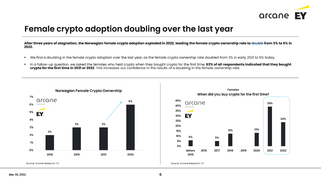
The slide contains a column chart showing the percentage of female crypto ownership from 2018 to 2022 and a survey on when females first bought crypto. It discusses the doubling of female crypto ownership in the past year and the implications of this trend.
Market Analysis and Trends
Financial Services
Discusses the doubling of female cryptocurrency ownership in Norway over the last year, highlighting survey findings that 63% of female respondents bought crypto for the first time in 2021 or 2022. Emphasizes the growing adoption among women.
Cryptocurrency, Female adoption, Norway, Survey, Trends
Multiple Chart
EY
Saved
The slide features two sets of bar charts comparing awareness and preference for traditional financial services in 2015 and 2017 across six markets.
Market Analysis and Trends
Financial Services
The slide illustrates the decline in barriers to FinTech adoption, such as lack of awareness and preference for traditional services, from 2015 to 2017 in various markets.
FinTech, barriers, adoption, awareness, traditional services
Single Chart
EY
Saved
Utilizes bullet points and connected thought bubbles to outline the integration blueprint process, emphasizing key decision points and framework.
Strategic Planning
Professional Services
Provides a detailed overview of the initial planning required for integration, focusing on key milestones, risks, and governance structure.
integration, blueprint, planning, governance, milestones, risks
Diagram
Deloitte
Saved
Displays a pie chart comparison of Hong Kong advertising revenue by segments for 2022 and 2027. The charts show a significant shift towards digital advertising over traditional formats like TV and newspaper. The design is straightforward with a clear visual representation of data changes over time, accompanied by concise text explanations.
Market Analysis and Trends
Media & Entertainment
Analyzes shifts in advertising revenue sources in Hong Kong, emphasizing the decline of traditional media and the rise of digital platforms. Useful for understanding market transitions and planning digital marketing strategies.
Hong Kong, advertising revenue, digital dominance, traditional media decline, market analysis
Multiple Chart
PwC/Strategy&
Saved
Features sensitivity analysis with column charts depicting hypothetical shifts in yield curve impacts on NII.
Risk Assessment and Management
Financial Services
Analyzes financial sensitivity to interest rate fluctuations, highlighting potential impacts on net interest income.
NII, sensitivity, interest rates, finance, risk management, forecasting
Multiple Chart
Deutsche Bank
Saved
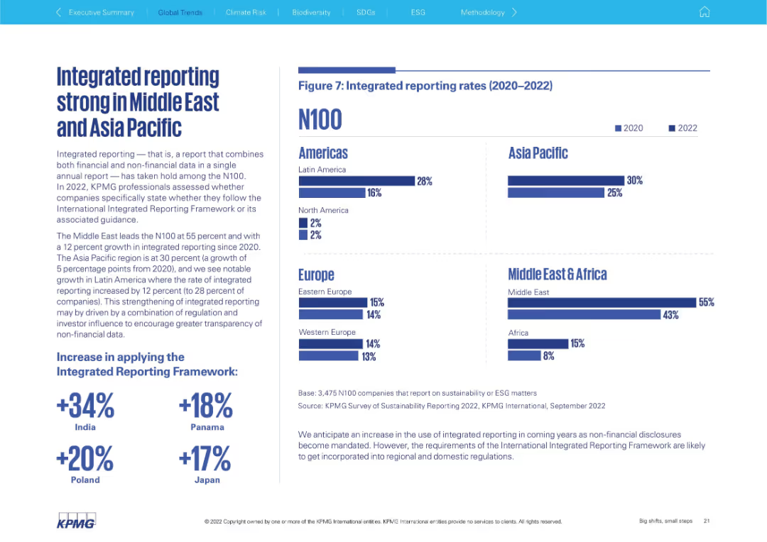
Text block on left explaining integrated reporting; right side has horizontal bar chart by region (2020 vs 2022)
Technology and Digital Transformation
Professional Services
Highlights the rise of integrated reporting (financial + non-financial data) among N100 companies, especially in the Middle East (55%) and Asia Pacific (30%). Bar chart compares 2020 vs 2022 across all regions.
integrated reporting, ESG, non-financial data, Middle East, Asia Pacific, transparency, framework adoption
Mixed Chart
KPMG
Saved
This matrix slide compares market outlooks across several regions and sectors, using color-coded arrows to indicate market conditions. Regions are listed vertically, while markets—housing, real estate, and infrastructure—are organized horizontally. Each cell contains an arrow representing the market condition: green for improving, orange for stable, and pink for weakening. The visual simplicity makes the data immediately accessible, while the cityscape in the background relates it to real estate and construction. The footer includes event identification.
Market Analysis and Trends
Real Estate & Construction
Provides an at-a-glance view of the Q2 market outlook across various regions, crucial for strategic decision-making in the context of housing, real estate, and infrastructure markets.
market outlook, regional analysis, housing market, real estate, infrastructure, market conditions, Q2 forecast, stability, visibility, strategic decision-making
Table
Goldman Sachs
Saved
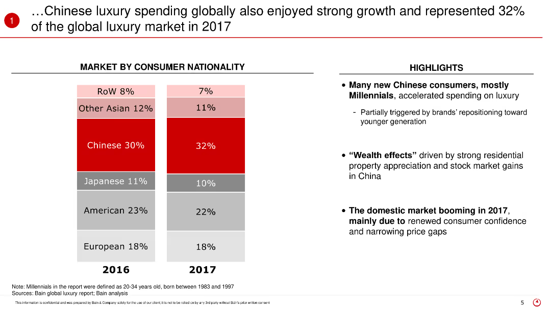
This slide features a stacked bar chart comparing the market share of luxury spending by consumer nationality between 2016 and 2017. The chart is accompanied by text highlighting the key insights and the factors contributing to the growth in Chinese luxury spending.
Market Analysis and Trends
Retail & E-commerce
The slide discusses the global luxury market in 2017, focusing on the significant contribution of Chinese consumers who represented 32% of the market. It highlights the increase in spending among Chinese Millennials and the factors driving this trend, such as the wealth effect and increased consumer confidence.
Luxury spending, Chinese consumers, global market, 2017, Millennials, market share, spending trends, consumer confidence, wealth effect
Mixed Chart
Bain
Saved
A dense, color-coded table displays annual asset performance from 1999 to 2023. Various asset classes are represented in colored squares, forming a grid that provides a visual performance history. Below, the source information is cited.
Investment Analysis
Financial Services
The slide is a comprehensive visual representation of the relative performance of various asset classes over a 25-year period, serving as a valuable tool for investment analysis and understanding market trends.
Asset performance, investment analysis, market trends, historical data, annual comparison, asset classes, financial history, relative performance, market research, data visualization
Table
Morgan Stanley
Saved
A column chart shows the levelized cost of hydrogen for mobility across different grid utilizations (wind, solar, grid wind, grid solar) for various capacities (1 MW, 10 MW, 100 MW) by 2030.
Market Analysis and Trends
Energy & Utilities
The slide discusses the potential for hydrogen to become competitive with internal combustion engine (ICE) fuels, noting the low levelized cost of hydrogen (LCOH) as low as $4 to $5 per kg.
hydrogen, mobility, levelized cost, grid, wind, solar, LCOH, ICE fuels, competitiveness, future cost
Multiple Chart
Kearney
Saved
Features a clean layout with column charts and clear text blocks, comparing annual financial metrics across three years.
Financial Performance
Financial Services
Provides an overview of Barclays' financial performance including RoTE, income, loans, deposits, and client assets. Details yearly comparisons and targets for upcoming years.
financials, RoTE, income, loans, deposits
Multiple Chart
Barclays
Saved
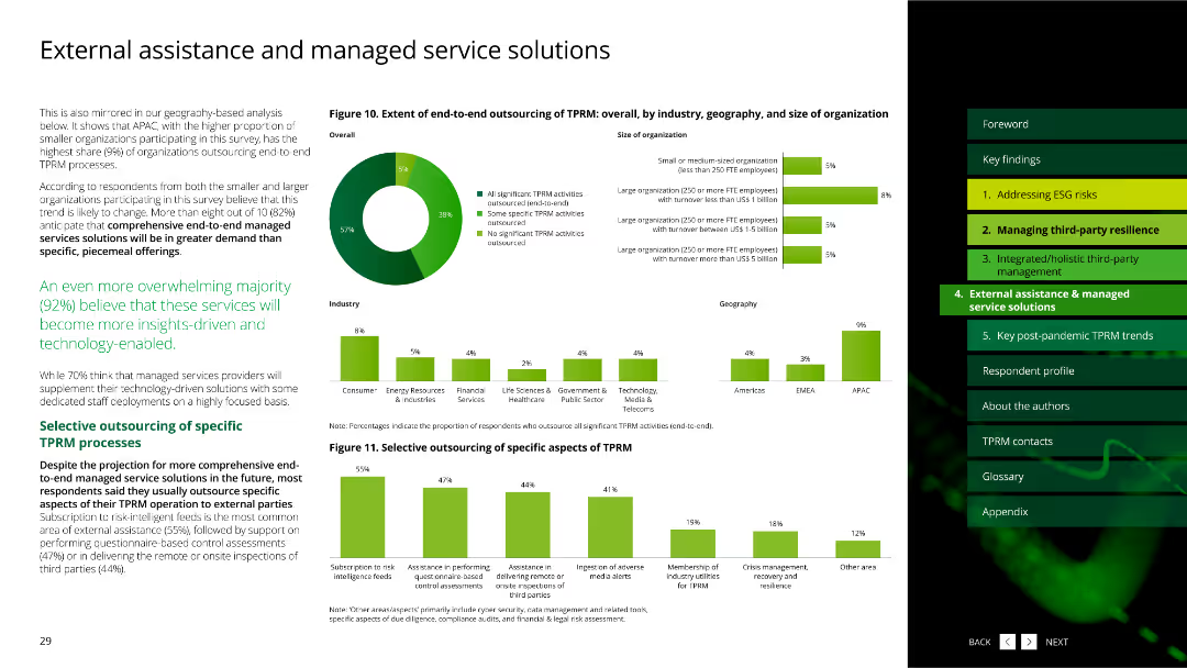
This slide includes a pie chart and multiple column charts with green bars, showing the extent of outsourcing in third-party risk management (TPRM) by various segments.
Strategic Planning
Professional Services
The slide discusses the extent of end-to-end outsourcing of TPRM processes, highlighting the differences across industries, geographies, and organization sizes.
outsourcing, third-party risk management, pie chart, column charts, industries, professional services
Multiple Chart
Deloitte
Saved
Previous
Next
If nothing, comes up, please save your slides first
Create a FREE account to continue browsing
Receive Instant Access to 1,000+ slides from companies like McKinsey, Google, and Goldman Sachs
First Name
Last Name
Email
Password
I agree to all
Terms & Privacy Policy
Thank you! Your submission has been received!
Oops! Something went wrong while submitting the form.
Have an account?
Sign in
Column Chart
Heatmap
Chevron
Org Chart
Infographic
Callouts
Timeline
List
Graphic
Picture
Process Flow
Diagram
Paragraph
Map
Table
Framework
Subtitle
Takeaway Box
Icon
Other Chart
Radar Chart
Waterfall Chart
Mekko Chart
Pie Chart
Scatter Plot
Line Chart
Bar chart
Bullet points