Create a FREE Account
Instant access to 1,000+ real slides from top companies like McKinsey, BCG, Goldman Sachs, Google and many more!
First Name
Last Name
Email
Password
I agree to all
Terms & Privacy Policy
Thank you! Your submission has been received!
Oops! Something went wrong while submitting the form.
Have an account?
Sign in
Library
Templates
Courses
Pricing
My Account
My Slides
My Templates
✦ AI
AI Prompt Library
AI Search
Sign in
Start Here
Logout
My Saved Slides
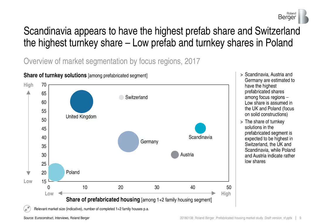
Bubble chart showing turnkey vs. prefab housing shares across European regions, with supporting bullet points on the right.
Market Analysis and Trends
Real Estate & Construction
This slide visualizes the share of turnkey solutions vs. prefabricated housing among various regions, highlighting Scandinavia and Switzerland. It emphasizes regional differences and infers market preferences and structural focuses (e.g., solid vs. prefab constructions).
prefabricated housing, turnkey solutions, regional segmentation, market share, construction methods, Scandinavia, Switzerland, bubble chart
Mixed Chart
Roland Berger
Saved
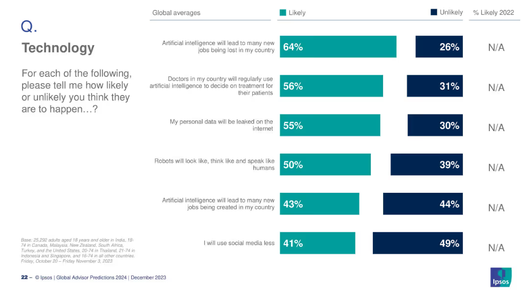
Vertical bar chart with multiple AI-related questions and global responses
Technology and Digital Transformation
Artificial Intelligence
This slide summarizes public opinion on multiple AI-related developments, including job loss, AI in healthcare, data leaks, robot behavior, and social media use. Each is represented by a separate bar with likely/unlikely stats.
AI, job loss, healthcare, data privacy, robots, social media, trends
Mixed Chart
IPSOS
Saved
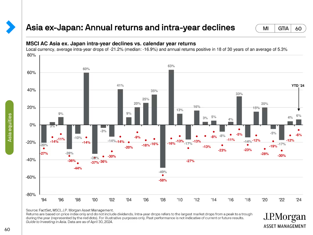
This slide contains a column chart showing annual returns and intra-year declines for MSCI AC Asia ex-Japan index. The bars represent annual returns while red dots show the intra-year declines.
Market Analysis and Trends
Financial Services
The slide illustrates the annual performance of the MSCI AC Asia ex-Japan index from 1994 to 2024, highlighting the average intra-year drops and annual returns to provide a historical perspective of market volatility and recovery trends.
MSCI AC Asia, annual returns, intra-year, financial services, market analysis, volatility, recovery, historical trends, 1994-2024, investment analysis
Single Chart
JP Morgan
Saved
Contains three sections with icons, bullet points, and financial charts, emphasizing investment justifications.
Investment Analysis
Financial Services
The slide provides reasons for investment, using a combination of text and charts to display financial growth and market position, appealing to potential investors.
Investment, Growth, Market Position, Financial Returns, Strategy
Pillar
Booz Allen Hamilton
Saved
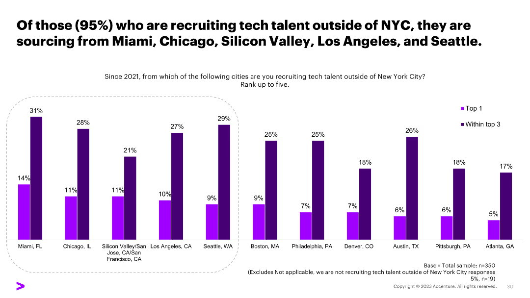
A column chart showing the top cities organizations are recruiting tech talent from outside of NYC, including Miami, Chicago, and others, with percentage values.
Human Resources and Talent Management
Professional Services
The slide indicates the cities where organizations are sourcing tech talent from outside of NYC, providing insights into geographic recruitment strategies.
recruitment, tech talent, NYC, sourcing cities, survey
Single Chart
Accenture
Saved
This slide features a medium-term target ROE walk for 2018 with blue column charts displaying the initial value and the end value, and floating bars representing the contributing factors. There's a legend and annotations for clarity. The layout is straightforward with a clear focus on the central graph.
Financial Performance
Financial Services
The slide presents Return on Equity (ROE) changes from 2018 actuals to medium-term targets, highlighting the impacts of net growth, higher capital, and other factors. The data suggests the company's financial strategy and projections, valuable in financial analysis or investor presentations.
ROE, financial analysis, projections, capital, growth, medium-term, actuals, impact, strategy
Single Chart
JP Morgan
Saved
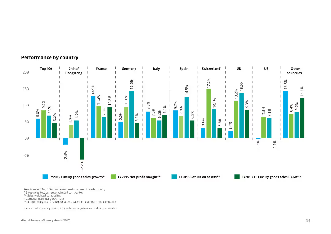
A column chart showing various financial metrics (luxury goods sales growth, net profit margin, return on assets, CAGR) for different countries, including Top 100, China/Hong Kong, France, Germany, Italy, Spain, Switzerland, UK, US, and other countries.
Financial Performance
Financial Services
The slide presents the performance of luxury goods by country, showing sales growth, net profit margin, return on assets, and compound annual growth rate for 2015. This data can be used to analyze market performance in the luxury sector.
performance, luxury goods, financial metrics, country comparison, sales growth
Single Chart
Deloitte
Saved
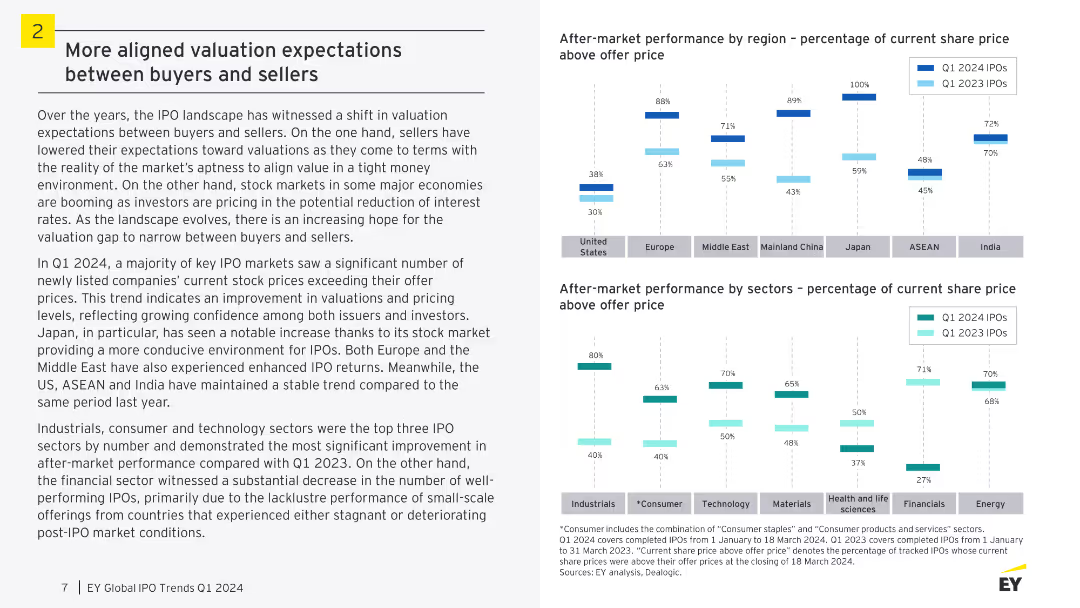
A slide with two column charts comparing after-market performance by region and sectors. The visual complexity is moderate, focusing on column charts with comparative data.
Market Analysis and Trends
Financial Services
The slide discusses the shift in valuation expectations in the IPO landscape, with improved confidence among issuers and investors. It highlights the after-market performance of IPOs in different regions and sectors, showing significant improvements in specific areas.
IPO, Valuation, Buyers, Sellers, Performance, Market
Multiple Chart
EY
Saved
Slide has text and icons related to luxury sub-segments like yachts and jets.
Product and Service Analysis
Consumer Goods
Examines specific luxury segments, noting growth trends and market changes, particularly focusing on sustainable options and innovations in luxury transport.
luxury cars, yachts, sustainable, market growth
Pillar
Bain
Saved
Column charts showing traffic distribution by type, focusing on mobile
Market Analysis and Trends
Technology & Software
Analyzes the predominant focus of luxury consumers on mobile platforms
Luxury, Consumer Attention, Mobile, Traffic Distribution
Single Chart
BCG
Saved
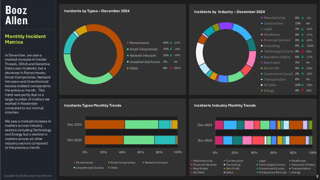
Four-panel dashboard layout with pie and bar charts showing incident types and affected industries; left panel includes summary text; uses a dark background with color-coded data elements.
Risk Assessment and Management
Technology & Software
This dashboard highlights cybersecurity incidents by type and industry for December 2024. Ransomware and email compromise are dominant threats, while financial services and healthcare industries were notably impacted. The slide also shows trends over the previous month and mentions increased threats in Technology and Energy sectors.
cybersecurity, incident metrics, ransomware, email compromise, unauthorized access, threat trends, Booz Allen, industry risk, data loss
Multiple Chart
Booz Allen Hamilton
Saved
The slide features four icons representing different aspects of the future of transactions: Tokenization, Crypto (fiat), Separated (integrated), and Private (public).
Strategic Planning
Technology & Software
This slide outlines the vision for the evolution of transactions in a digital world, highlighting concepts such as tokenization, cryptocurrency, and the integration of public and private networks.
tokenization, cryptocurrency, public networks, digital evolution, strategic vision
Pillar
EY
Saved
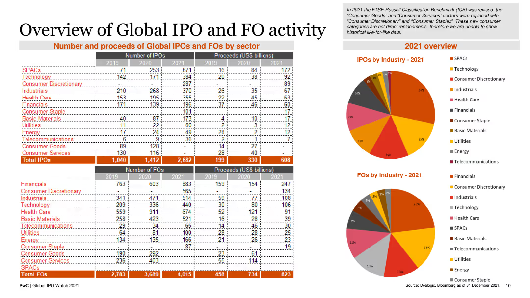
The slide comprises tables and pie charts showing the number and proceeds of global IPOs and FOs by sector for the years 2019, 2020, and 2021, along with sector breakdowns.
Market Analysis and Trends
Financial Services
It provides a comprehensive overview of IPO and FO activities by sector, including total numbers and proceeds, along with sector-specific insights.
IPOs, FOs, sector analysis, global trends, financial data
Multiple Chart
PwC/Strategy&
Saved
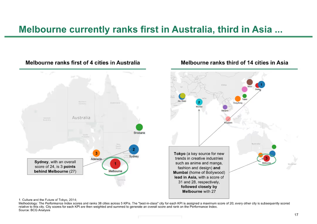
Two maps, one of Australia and one of Asia, showing city rankings with colored dots and text annotations
Competitive Landscape
Hospitality & Tourism
Shows Melbourne's rankings in cultural and creative city indexes within Australia and Asia, demonstrating its status
Melbourne ranking, city comparison, cultural cities, Asia, Australia, city performance
Header Horizontal
BCG
Saved
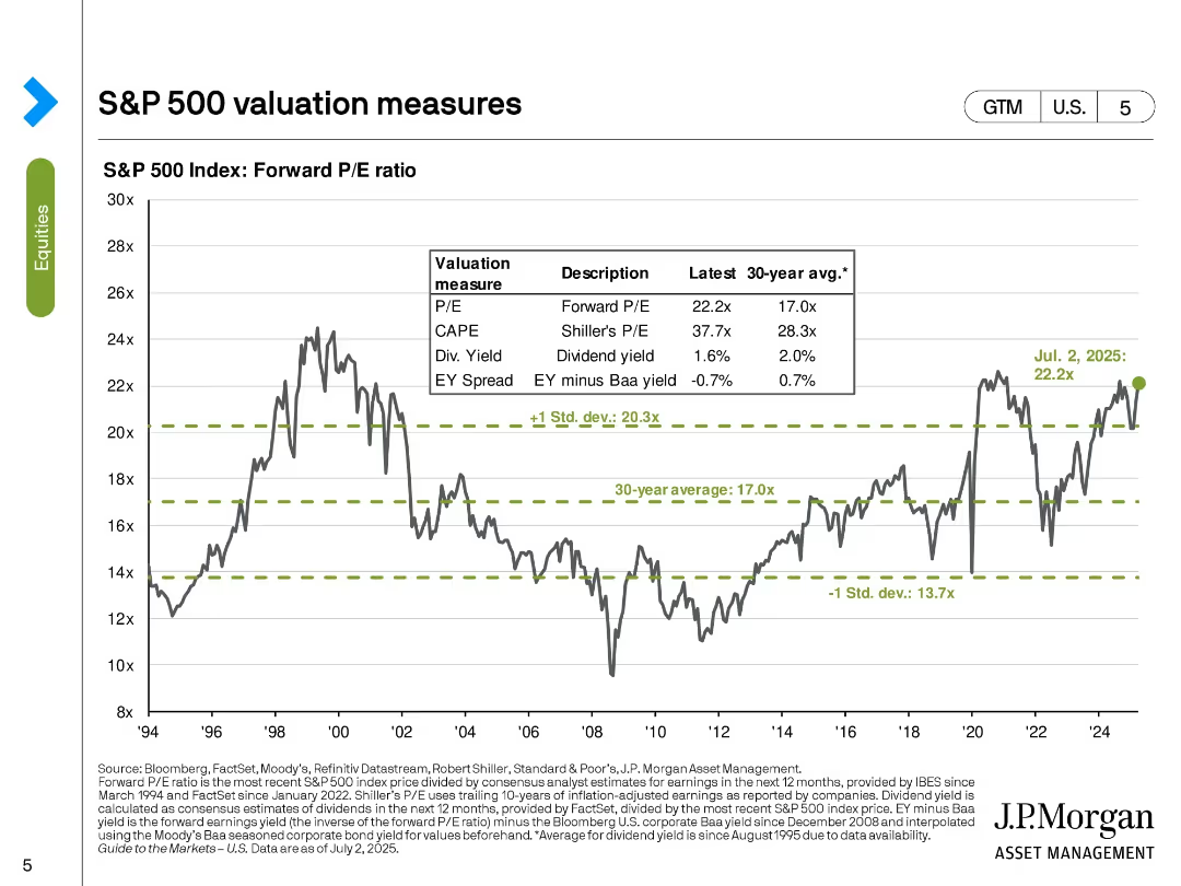
Line chart with horizontal benchmark lines and a data table overlay, tracking forward P/E ratio over time. Bold green text highlights recent data point.
Market Analysis and Trends
Financial Services
The slide presents the forward P/E ratio of the S&P 500, comparing the latest value (22.2x) with long-term averages and standard deviation bands. It includes a historical line chart from 1994 to 2025 and a summary table of related valuation metrics like CAPE, dividend yield, and EY spread.
P/E ratio, CAPE, EY spread, valuation, dividends, historical trend, market valuation, standard deviation, S&P 500, equity markets
Single Chart
JP Morgan
Saved
Includes bar charts depicting types of support managers seek for role effectiveness.
Organizational Structure and Change
Professional Services
Explores the types of support managers require to enhance their capabilities and role clarity.
support needs, managerial development, upskilling, role clarity, professional growth
Multiple Chart
BCG
Saved
Slide includes line graphs and column charts illustrating RWA productivity trends and projections in Global Markets and Investment Banking sectors.
Operational Efficiency
Financial Services
Focuses on the strategic plan to enhance RWA productivity in investment banking, underlining past performance and future targets.
RWA, productivity, strategy, investment banking, projections
Multiple Chart
Barclays
Saved
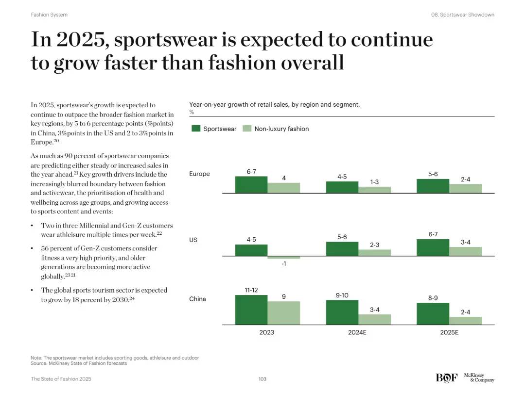
Text-based explanation on left; right-hand bar chart comparing YoY growth by region and segment (sportswear vs fashion)
Market Analysis and Trends
Consumer Goods
The slide projects that sportswear will outpace non-luxury fashion in growth across Europe, US, and China from 2023 to 2025. It attributes this to the rising popularity of athleisure, increasing fitness consciousness, and sports tourism. Bar charts highlight year-on-year growth differences between sportswear and fashion in each region.
sportswear, growth, fashion, retail sales, trends, regions, China, Europe, US
Mixed Chart
McKinsey
Saved
With a title at the top, the slide features a table of financial results, column chart of net revenues by segment, and a highlighted points section. It balances detailed data with clear visual elements.
Financial Performance
Financial Services
Designed to report the financial results of asset and wealth management, the slide compares quarter-over-quarter and year-to-date metrics. It may be used in financial analysis, strategic planning, or investor relations to showcase performance and operational highlights.
Asset Management, Net Revenues, Management Fees, Operating Expenses
Mixed Chart
Goldman Sachs
Saved
Large heading and paragraph on top; lower half shows a split bar chart overlaid on an AI-themed image comparing wonder vs. worry sentiment.
Strategic Planning
Artificial Intelligence
The slide sets up one of the six tensions surrounding AI adoption, showing that more people feel worry than wonder about AI’s future. It introduces the importance of managing AI development carefully to reduce fear.
fear, optimism, AI adoption, public sentiment
Mixed Chart
IPSOS
Saved
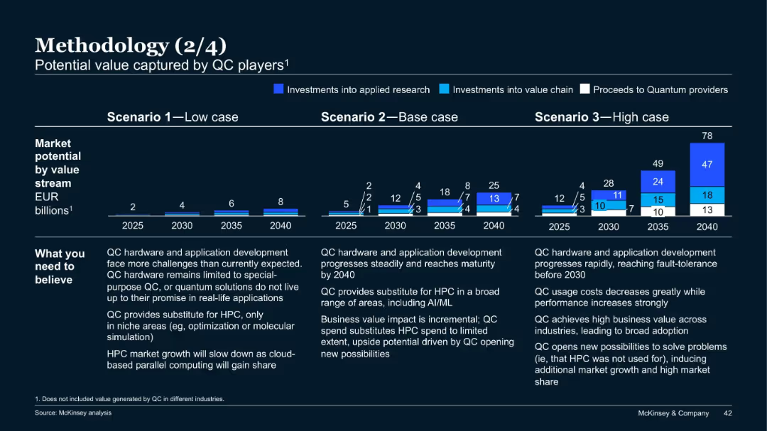
Three-scenario bar projection charts from 2025 to 2040; colored segments indicate investments and proceeds; notes on assumptions below charts.
Investment Analysis
Artificial Intelligence
This slide projects quantum computing (QC) market potential under low, base, and high scenarios, broken down by value stream. It explains what must be believed in each case and estimates value in EUR billions up to 2040 for each path.
quantum computing, market potential, investment, scenarios, projections, McKinsey
Mixed Chart
McKinsey
Saved
Column chart and satisfaction/importance grid showing key issues with public charging, including location, availability, price, and waiting time. The slide uses multiple visual elements to present dissatisfaction reasons.
Customer and Market Segmentation
Transportation & Logistics
This slide highlights the main areas of dissatisfaction among EV owners with public charging stations, focusing on issues like location availability, waiting times, and pricing. It uses a grid to map satisfaction and importance levels.
public charging issues, location availability, EV owners, dissatisfaction factors, waiting times
Multiple Chart
PwC/Strategy&
Saved
The slide includes multiple bar charts comparing the change in transportation modes across different regions. Each chart represents changes in percentages and is colored based on region.
Market Analysis and Trends
Transportation & Logistics
Compares regional responses in transportation mode usage shifts before and after a global crisis.
transportation, regional, mode shift, crisis, comparison
Multiple Chart
McKinsey
Saved
Left side has images representing innovators, governments, corporates, investors. Right side lists key focus areas and actions for driving projects.
Operational Efficiency
Technology & Software
The slide provides a deep dive into strategies and approaches for large-scale demonstration projects, emphasizing collaboration and innovative solutions.
Demonstration projects, Strategy, Collaboration, Innovators, Corporates
Vertical Flow
BCG
Saved
The slide features bar charts showing risks and opportunities percentages. Text boxes detail risks and opportunities, and a summary box highlights key takeaways.
Market Analysis and Trends
Industrial & Manufacturing
It shows survey results indicating a lower perceived need for repositioning in industrial services and IT functions due to digitalization, focusing on R&D and innovation.
Digitalization, industrial services, IT, risks, opportunities, R&D, innovation
Multiple Chart
Roland Berger
Saved
Previous
Next
If nothing, comes up, please save your slides first
Create a FREE account to continue browsing
Receive Instant Access to 1,000+ slides from companies like McKinsey, Google, and Goldman Sachs
First Name
Last Name
Email
Password
I agree to all
Terms & Privacy Policy
Thank you! Your submission has been received!
Oops! Something went wrong while submitting the form.
Have an account?
Sign in
Column Chart
Heatmap
Chevron
Org Chart
Infographic
Callouts
Timeline
List
Graphic
Picture
Process Flow
Diagram
Paragraph
Map
Table
Framework
Subtitle
Takeaway Box
Icon
Other Chart
Radar Chart
Waterfall Chart
Mekko Chart
Pie Chart
Scatter Plot
Line Chart
Bar chart
Bullet points