Create a FREE Account
Instant access to 1,000+ real slides from top companies like McKinsey, BCG, Goldman Sachs, Google and many more!
First Name
Last Name
Email
Password
I agree to all
Terms & Privacy Policy
Thank you! Your submission has been received!
Oops! Something went wrong while submitting the form.
Have an account?
Sign in
Library
Templates
Courses
Pricing
My Account
My Slides
My Templates
✦ AI
AI Prompt Library
AI Search
Sign in
Start Here
Logout
My Saved Slides
The slide features a pie chart with multiple segments showing public opinions on their influence over local decisions. Text boxes highlight net agreement and disagreement percentages.
Customer and Market Segmentation
Government & Public Sector
This slide presents survey results on public perceptions regarding their ability to influence local decisions, showcasing net agreement and disagreement percentages, and comparisons with past data.
public opinion, survey, influence, local decisions, perception, agreement, disagreement, comparison, pie chart
Mixed Chart
IPSOS
Saved
This slide has a dark background with a header, body text, and a column chart displaying percentages. Four circular percentage indicators show key insights related to consumer expectations in healthcare technology in Ireland.
Market Analysis and Trends
Healthcare & Pharmaceuticals
The slide presents the cautious optimism among Irish consumers regarding emerging healthcare technologies like AI and virtual presence. It outlines expected trends in digital health technologies, hospital-in-the-home models, and precision medicine.
healthcare, technology, AI, virtual presence, Ireland
Mixed Chart
EY
Saved
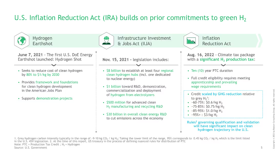
The slide is structured into three columns, each detailing different legislation acts and their contributions to green hydrogen initiatives, with bullet points.
Regulatory and Compliance
Government & Public Sector
This slide details the commitments of the U.S. government to green hydrogen through various acts, including the Hydrogen Earthshot, Infrastructure Investment and Jobs Act, and the Inflation Reduction Act, highlighting financial and policy support.
IRA, green hydrogen, legislation, infrastructure investment, Inflation Reduction Act
Table
BCG
Saved
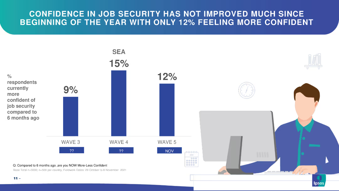
Bar chart showing changes in confidence in job security over three waves in SEA.
Market Analysis and Trends
Financial Services
The slide highlights respondents' confidence in job security over time, showing slight improvements.
job security, confidence, SEA, bar chart, trends
Single Chart
IPSOS
Saved
Features a pie chart with multiple segments in various shades of blue and green. Text is organized into two columns, providing detailed explanations of survey findings and their implications.
Human Resources and Talent Management
Professional Services
Explores preferred office space arrangements among respondents. Highlights preferences for open-plan spaces, private offices, and designated desks.
employment models, office space, preferences, open-plan, private offices, designated desks
Mixed Chart
Deloitte
Saved
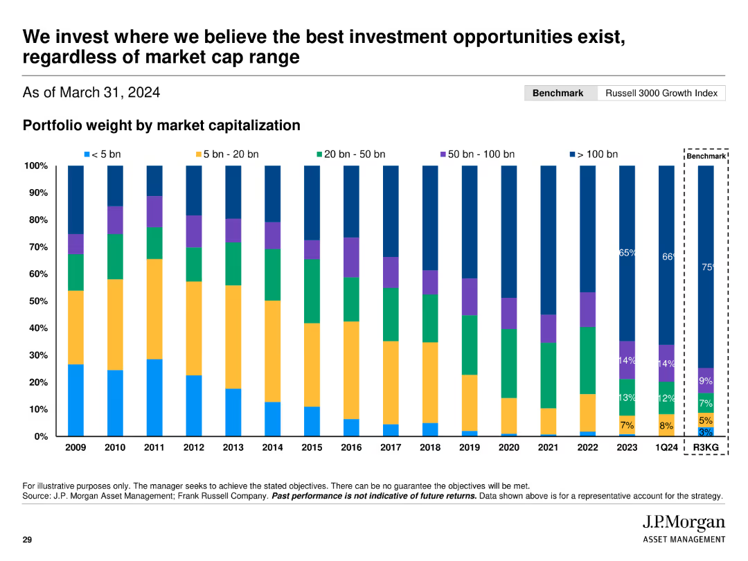
Shows a stacked bar chart depicting portfolio weight by market capitalization over time, compared to the benchmark.
Investment Analysis
Financial Services
Displays J.P. Morgan’s investment strategy focusing on market cap agnostic opportunities, illustrating portfolio weight distribution across different market cap ranges.
investment, opportunities, market cap, portfolio, weight, bar chart, benchmark
Single Chart
JP Morgan
Saved
Comparative chart of long-term senior unsecured debt credit ratings by Moody's, S&P, and Fitch for various banks, including UBS and its peers.
Competitive Landscape
Financial Services
Comparison of credit ratings of UBS against major competitors, highlighting the rating differences and outlooks from various agencies.
Credit ratings, comparison, competitors, Moody's, S&P
Table
UBS
Saved
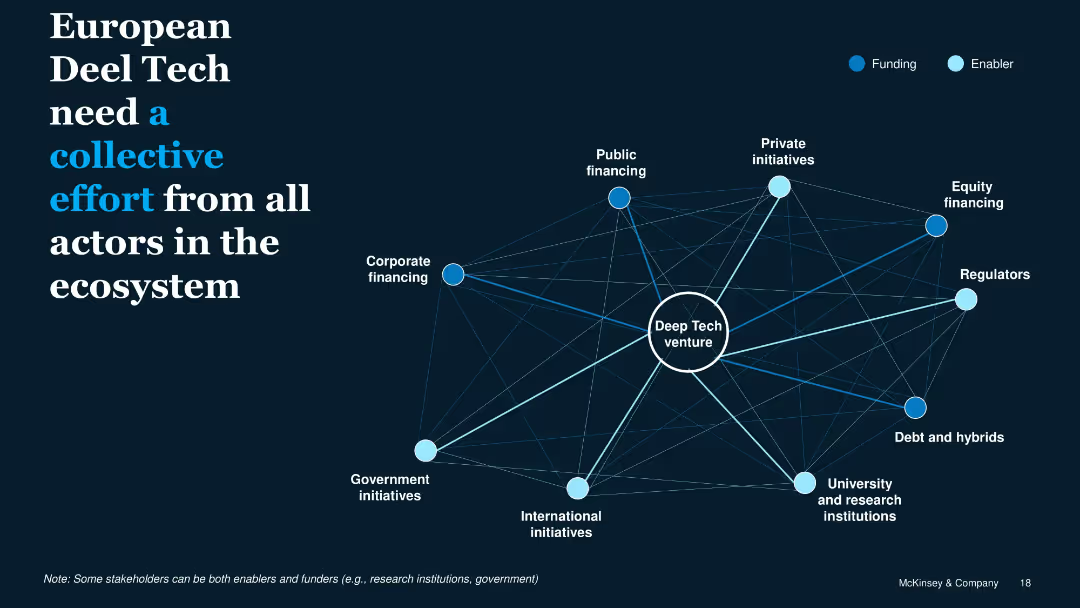
Network diagram with central Deep Tech node and surrounding ecosystem players categorized by Funding or Enabler
Organizational Structure and Change
Technology & Software
Emphasizes that successful Deep Tech ventures require coordinated actions among funding bodies (e.g., corporates, public finance) and enablers (e.g., regulators, universities), creating a connected innovation ecosystem.
ecosystem, collaboration, Deep Tech, funding, enablers, stakeholders
Framework
McKinsey
Saved
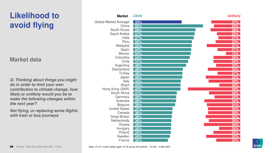
A bar chart (horizontal) comparing the likelihood of avoiding flights across various countries. Different colors are used to distinguish likely and unlikely responses.
Market Analysis and Trends
Transportation & Logistics
This slide analyzes the likelihood of consumers avoiding flights to reduce their carbon footprint. It presents comparative data across different countries, offering insights into changing travel behaviors due to environmental concerns.
air travel, sustainability, consumer behavior, environmental impact, comparative data
Multiple Chart
IPSOS
Saved
The slide presents three columns of information, each titled and color-coded (green, yellow, pink). Each section contains lists and a checkmark icon for key points.
Market Analysis and Trends
Healthcare & Pharmaceuticals
Discusses three possible future scenarios for pandemic recovery, detailing differences in vaccine efficacy, rollout speeds, and public health responses under each scenario.
pandemic, vaccines, scenarios, rollout, public health
Table
BCG
Saved
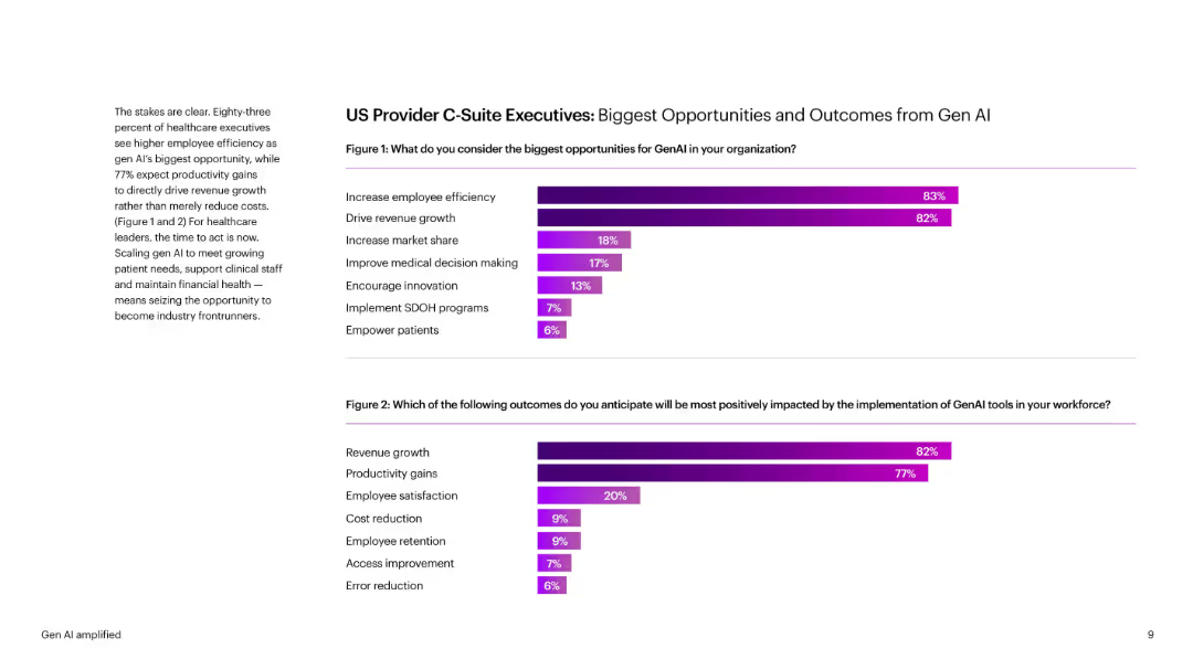
Side-by-side bar charts with percentages, purple gradient bars. Brief explanatory text on the left. Bold headings and clear labels enhance readability.
Technology and Digital Transformation
Healthcare & Pharmaceuticals
Shows healthcare executives’ views on GenAI benefits—primarily employee efficiency and revenue growth. Also shows anticipated outcomes like satisfaction and cost reduction. Provides quantitative survey data segmented by impact.
GenAI, healthcare, C-suite, productivity, revenue, satisfaction, decision-making
Multiple Chart
Accenture
Saved
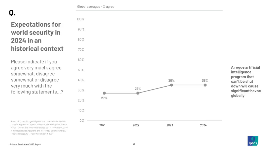
Line chart from 2021 to 2024; x-axis years, y-axis % agree; one question tracked over time; plain design
Risk Assessment and Management
Government & Public Sector
This slide tracks agreement over time (2021–2024) on the likelihood of a rogue AI causing global havoc. Agreement rose from 27% in 2021 to 35% by 2023–2024.
historical trend, AI risk, security perception, public opinion, Ipsos data, technology threat, chart
Mixed Chart
IPSOS
Saved
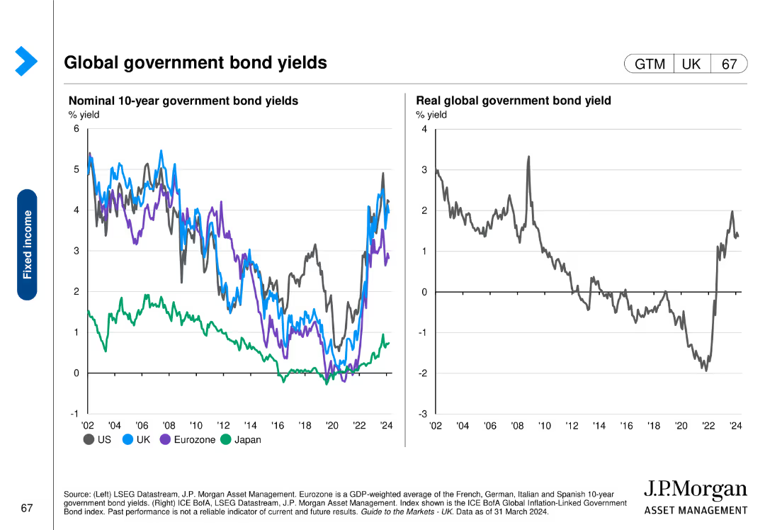
This slide contains two line charts. The first chart shows nominal 10-year government bond yields over time for various regions. The second chart shows real global government bond yields over time.
Financial Performance
Financial Services
The slide provides an analysis of nominal and real global government bond yields, offering insights into financial performance and trends.
global, government, bond yields, nominal, real, financial performance, analysis
Multiple Chart
JP Morgan
Saved
This slide features a 3D purple cube representing service divisions, alongside revenue figures and percentages, in a minimalist and modern design.
Technology and Digital Transformation
Technology & Software
The slide outlines the components of Accenture’s revenue generation by service type and emphasizes the significant contribution from their technology and consulting services.
revenue, services, technology, consulting, Accenture, growth model, digital transformation, contribution, percentage
Mixed Chart
Accenture
Saved
The slide includes column charts and tables summarizing IPO activities in European main and junior markets. It shows number of IPOs, proceeds, and details on stock exchanges and sectors.
Market Analysis and Trends
Financial Services
The slide reviews the subdued IPO market in Europe, discussing the cautious investor sentiment and regulatory efforts to stimulate activity. Data on IPOs, proceeds, and key stock exchanges and sectors are provided.
European IPOs, market trends, investor sentiment, regulatory efforts, financial analysis
Multiple Chart
EY
Saved
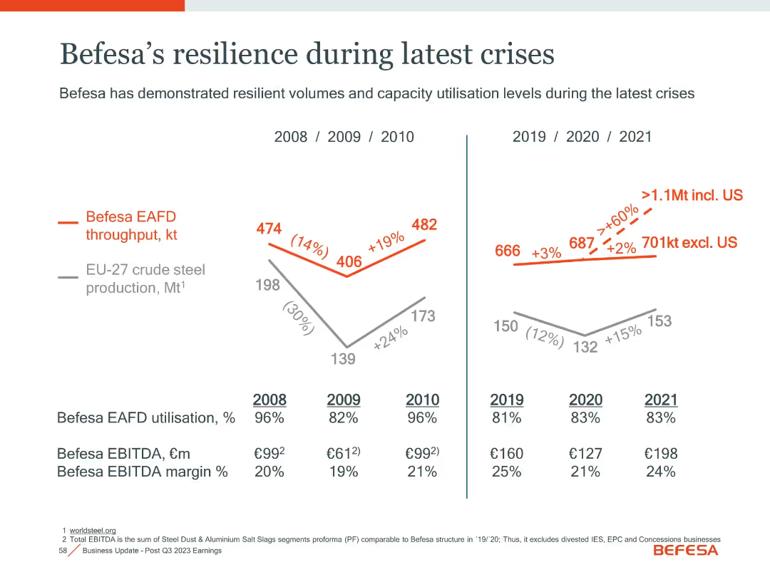
Dual time-series charts comparing steel production vs. Befesa throughput, with utilization and margin tables.
Risk Assessment and Management
Industrial & Manufacturing
Highlights Befesa’s operational stability during economic downturns (2008–2010, 2019–2021), maintaining high utilization and EBITDA margins despite steel production declines.
crisis resilience, utilization, EBITDA margin, steel production, stability
Single Chart
Goldman Sachs
Saved
The slide contains text and triangular charts depicting the excitement of software engineering leaders for various Generative AI applications and the planned uses by supply chain leaders.
Financial Performance
Technology & Software
This slide highlights the enthusiasm of software engineering leaders for Generative AI applications like code generation and the intended uses for supply chain leaders.
Generative AI, Use Cases, Software Engineering, Supply Chain, Code Generation
Multiple Chart
Gartner
Saved
A line graph correlating TCE increases with EBITDA gains, alongside a column chart of yearly EBITDA, illustrating financial leverage across a fleet.
Operational Efficiency
Transportation & Logistics
Demonstrates how adjustments in freight charge rates substantially affect annual earnings, providing insights into strategic financial management.
operating leverage, EBITDA, financial management, freight rates, strategic planning
Multiple Chart
Deutsche Bank
Saved
Features a comparison table of credit ratings from Moody’s, S&P, and Fitch for various banks as of February 2024.
Competitive Landscape
Financial Services
Compares long-term senior unsecured debt credit ratings of UBS and its peers across major rating agencies.
UBS, credit ratings, peer comparison, Moody’s, S&P, Fitch, competitive, landscape, debt
Table
UBS
Saved
Contains detailed text along with a world map illustrating 'DALYs' attributable to ambient air pollution per 100,000 population in 2016, and a bar chart showing data on EU energy-related CO2 emissions over time.
Regulatory and Compliance
Environmental Services & Sustainability
Provides an overview of the impacts of air quality on public health, focusing on DALY metrics to illustrate the global burden of disease linked to air pollution. Discusses the role of monitoring and policy in improving air quality standards.
Air Quality, Public Health, Pollution, DALYs
Graphic
PwC/Strategy&
Saved
This slide includes text boxes and a small bar chart with a mix of green and blue color schemes. It effectively uses space to separate different sections clearly, making it easy to follow.
Financial Performance
Financial Services
Discusses global economic indicators and CFO focuses in 2019, highlighting concerns about a potential US downturn and key economic risks. The slide aims to inform about macroeconomic trends and corporate strategies in response to economic forecasts.
global economy, CFO survey, US downturn, economic risks, GDP, macroeconomic trends
Mixed Chart
Deloitte
Saved
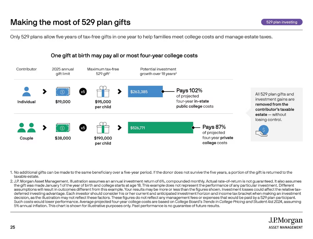
Icon row, side-by-side comparisons of individual vs. couple contributions with gift limits and investment projections.
Investment Analysis
Financial Services
This slide shows how front-loading 529 plan gifts can significantly fund future college expenses while reducing estate taxes. It compares the financial impact of individual vs. couple contributions and demonstrates how a lump sum at birth can cover nearly all four-year public college costs.
estate planning, 529 gifting, college savings, compound growth, tax-free
Mixed Chart
JP Morgan
Saved
Displays characteristics of blockchain like decentralization and encryption, using icons and short text blocks arranged around a central circular graphic that symbolically represents a blockchain network.
Technology and Digital Transformation
Technology & Software
Highlights the essential attributes of blockchain technology, including security, flexibility, and its decentralized nature. Suitable for discussions on how blockchain can be integrated into various business or technology solutions.
blockchain, decentralization, encryption, data security, flexibility
Diagram
McKinsey
Saved
The slide displays a column chart depicting net profit contribution over five years, paired with a pie chart outlining net operating income by category. The visuals are paired with clear descriptive texts.
Market Analysis and Trends
Financial Services
It outlines the company's profit growth over time and breaks down income by category. The pie chart shows the distribution of operating income, providing insights into the financial structure of the company’s commodities and global markets segment.
Net Profit, Operating Income, Commodities, Financial Analysis, Growth
Multiple Chart
Goldman Sachs
Saved
The slide features two column charts: one for EPS growth of various regions/styles and one for S&P 500 sectors, comparing expected EPS growth with previous year's growth.
Market Analysis and Trends
Financial Services
This slide analyzes the expected corporate earnings growth across different regions, styles, and S&P 500 sectors, comparing it with the previous year's growth figures.
EPS growth, regions, S&P 500, earnings, analysis
Multiple Chart
Morgan Stanley
Saved
Previous
Next
If nothing, comes up, please save your slides first
Create a FREE account to continue browsing
Receive Instant Access to 1,000+ slides from companies like McKinsey, Google, and Goldman Sachs
First Name
Last Name
Email
Password
I agree to all
Terms & Privacy Policy
Thank you! Your submission has been received!
Oops! Something went wrong while submitting the form.
Have an account?
Sign in
Column Chart
Heatmap
Chevron
Org Chart
Infographic
Callouts
Timeline
List
Graphic
Picture
Process Flow
Diagram
Paragraph
Map
Table
Framework
Subtitle
Takeaway Box
Icon
Other Chart
Radar Chart
Waterfall Chart
Mekko Chart
Pie Chart
Scatter Plot
Line Chart
Bar chart
Bullet points