Create a FREE Account
Instant access to 1,000+ real slides from top companies like McKinsey, BCG, Goldman Sachs, Google and many more!
First Name
Last Name
Email
Password
I agree to all
Terms & Privacy Policy
Thank you! Your submission has been received!
Oops! Something went wrong while submitting the form.
Have an account?
Sign in
Library
Templates
Courses
Pricing
My Account
My Slides
My Templates
✦ AI
AI Prompt Library
AI Search
Sign in
Start Here
Logout
My Saved Slides
Contains a circular flow diagram with icons representing different aspects of diligence such as Valuation, Commercial, and Tax. Clear, simple design with labeled segments and a central title.
Investment Analysis
Professional Services
This slide emphasizes the uniqueness of A&M's integrated diligence approach, showing how it combines various elements like Financial Accounting and Tax to create a comprehensive service.
Integrated, Diligence, Financial, Tax, Solution
Framework
Alvarez & Marsal
Saved
This slide features a world map showing the geographic distribution of survey respondents. Different sizes of green and blue dots indicate the number of Millennials and Gen Z participants from various regions.
Market Analysis and Trends
Media & Entertainment
The slide visualizes the geographic distribution of respondents from the primary survey conducted between November 2019 and January 2020. It provides a clear view of the global reach of the survey, highlighting regions with the highest participation, which is useful for understanding the demographic spread and diversity of opinions.
Geographic Distribution, Survey, Millennials, Gen Z, Map
Graphic
Deloitte
Saved
Slide displays a bar chart with timelines for anticipated productivity improvements from AI, with a focus on the next three years.
Technology and Digital Transformation
Technology & Software
Predicts the timeline for noticeable productivity improvements due to AI implementation across the surveyed companies.
AI, productivity, timeline, improvements, technology
Single Chart
Deloitte
Saved
The slide presents three scenarios (minimum, reference, and maximum scope) for hydrogen demand and related carbon impacts, using vertical column charts for each scope.
Strategic Planning
Energy & Utilities
The slide explores different scenarios for hydrogen demand by 2050, detailing the carbon impact and adjustments needed for each scope. It includes minimum, reference, and maximum scenarios, emphasizing the potential for reducing carbon emissions through hydrogen use.
hydrogen, scenarios, carbon impact, 2050, demand
Mixed Chart
Kearney
Saved
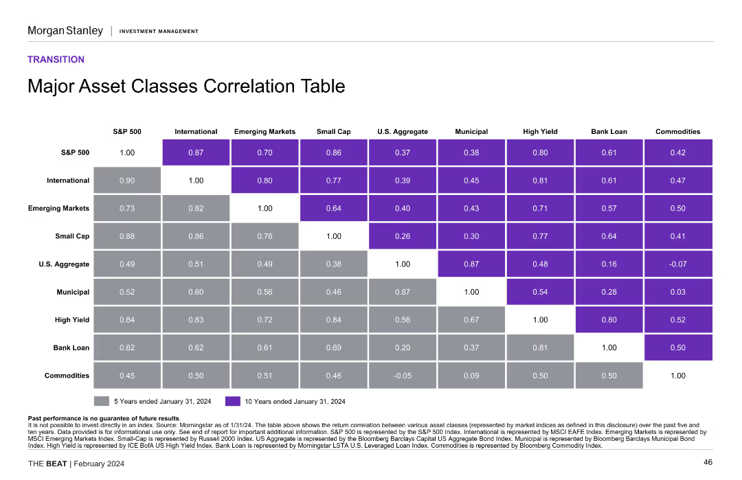
A correlation table showing the relationships between various asset classes such as S&P 500, International, Emerging Markets, Small Cap, U.S. Aggregate, Municipal, High Yield, Bank Loan, and Commodities over 5 and 10 year periods.
Investment Analysis
Financial Services
Presents the correlation between major asset classes over 5 and 10 years, providing insights into diversification benefits and investment strategy. Useful for portfolio management and risk assessment.
asset classes, correlation table, investment analysis, diversification, portfolio management
Table
Morgan Stanley
Saved
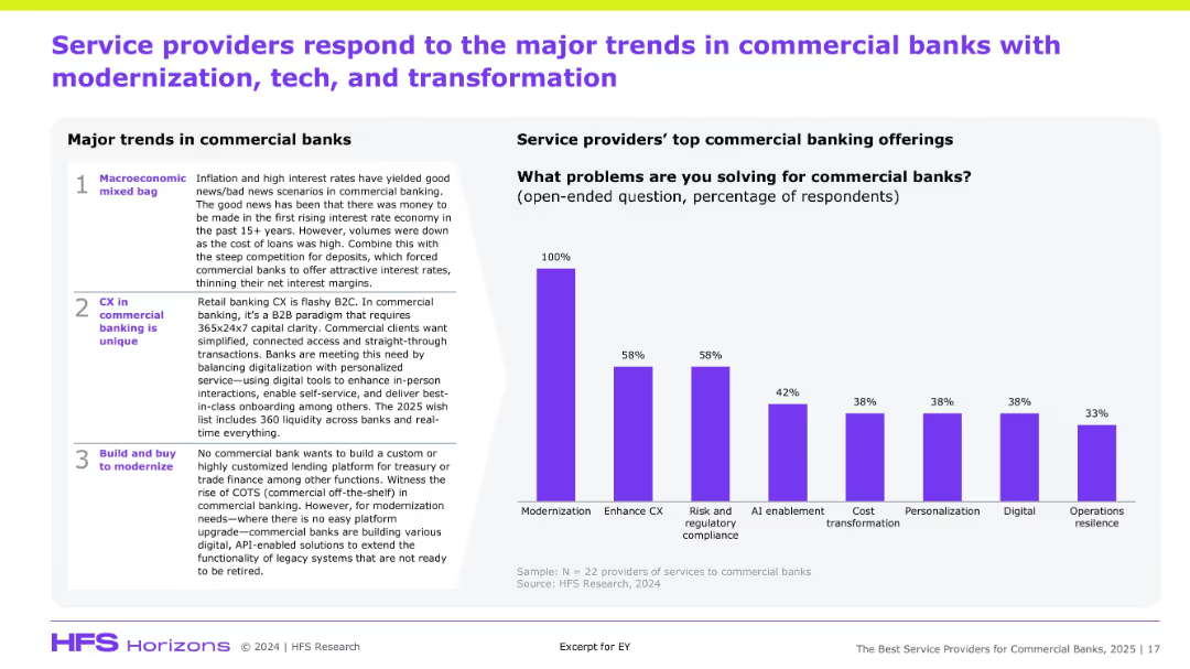
Two-column layout: left has major trends, right has a bar chart of service offerings; clean structured design with clear sectioning.
Market Analysis and Trends
Financial Services
This slide highlights the key commercial banking trends—macroeconomic conditions, unique CX needs, and modernization demands. The right-hand chart displays what banks expect from service providers, with modernization, CX enhancement, and regulatory compliance topping the list. The goal is to map demand signals from banks to vendor capabilities.
Commercial banks, modernization, CX, AI, compliance, vendor services
Mixed Chart
Accenture
Saved
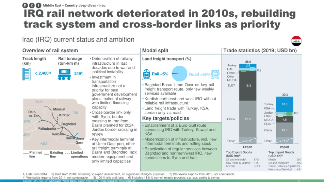
Layout with overview stats, modal split graphic, trade bar charts, and a small Iraq map showing rail routes; includes policy targets.
Strategic Planning
Transportation & Logistics
This slide presents Iraq’s rail system status, showing a small modal share for rail in freight transport and deteriorated infrastructure. It highlights key policies for modernization, expansion, and intermodal development, supported by trade data and network maps.
Iraq rail, infrastructure deterioration, modal split, trade statistics, policy targets, track rebuilding, intermodal terminals, cross-border links
Multiple Chart
Roland Berger
Saved
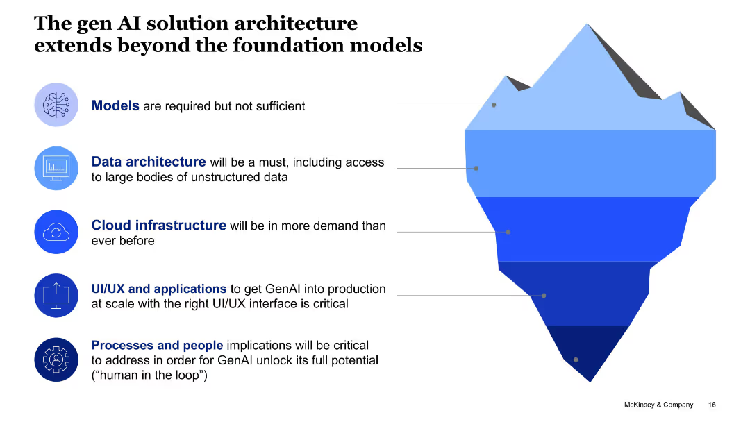
Iceberg diagram with labeled layers representing components like models, data architecture, and cloud infrastructure.
Technology and Digital Transformation
Artificial Intelligence
This slide emphasizes that foundational models alone aren't sufficient for Gen AI deployment. It highlights essential architecture components like cloud and data infrastructure, applications, and human-in-the-loop systems.
solution architecture, GenAI, foundation models, cloud, data, UI/UX, people processes
Uncategorized
McKinsey
Saved
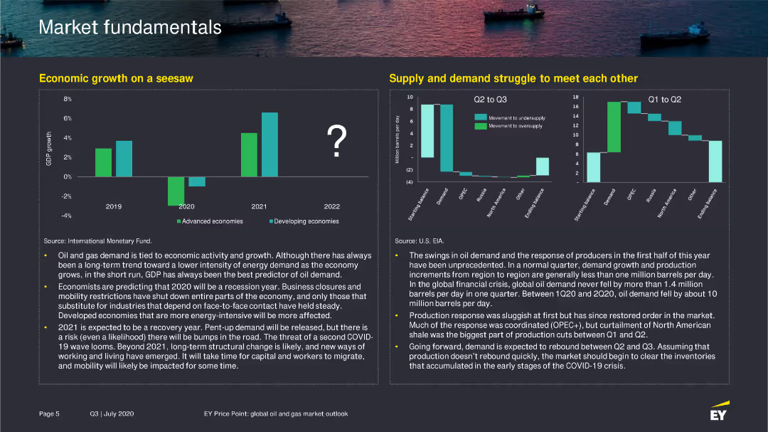
The slide contains a column chart showing GDP growth from 2019 to 2022 for advanced and developing economies, and a column chart on supply and demand fluctuations in the oil market.
Market Analysis and Trends
Energy & Utilities
Explains the variability in economic growth and oil demand, emphasizing the factors affecting these trends in the context of the global economy and energy sector.
GDP growth, oil demand, economic trends, 2022
Multiple Chart
EY
Saved
This slide is split into two parts, each featuring column charts. The left part displays population characteristics across several Indonesian islands with a focus on urban versus rural population. The right part shows the number of schools and students per school across different regions, highlighting differences in educational infrastructure relative to population density.
Market Analysis and Trends
Education & Training
The slide compares population density and school distribution across Indonesian islands, illustrating how demographic factors influence educational infrastructure.
population density, education, Indonesia, schools, students per school, urban, rural
Multiple Chart
BCG
Saved
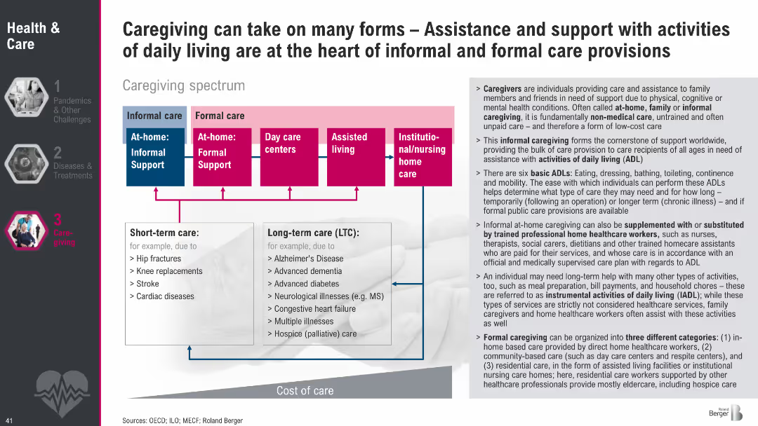
Diagram of caregiving spectrum from informal to formal care with color-coded boxes; side text explains caregiving types, ADLs, and care roles.
Human Resources and Talent Management
Healthcare & Pharmaceuticals
This slide outlines the caregiving spectrum, showing informal vs. formal care types and short-term vs. long-term needs. It also defines the roles of caregivers and the activities they support, emphasizing the importance of both unpaid and professional care structures in supporting daily living.
caregiving, informal care, formal care, ADLs, long-term care, support systems, care spectrum, eldercare
Diagram
Roland Berger
Saved
Features three numbered steps with corresponding icons, describing the process of operationalizing SDG initiatives, including templates, timelines, and tracking methods.
Strategic Planning
Professional Services
Offering a strategic blueprint, this slide outlines essential steps to operationalize and measure the impact of SDG initiatives, aiming to enhance clarity and accountability in sustainability efforts within corporate strategies.
SDGs, Strategic Planning, Operationalization, Impact Measurement, Accountability
Pillar
McKinsey
Saved
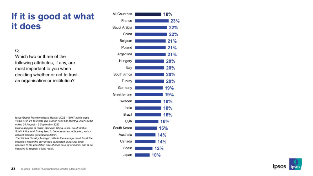
Title in large font, bar chart ranks countries by importance placed on competence. All countries average at top, followed by individual country values.
Market Analysis and Trends
Professional Services
Highlights country-level perspectives on the importance of organizational competence in trust decisions. France and Saudi Arabia rank highest; Japan ranks lowest.
competence, trust factors, country comparison, Ipsos, capability, trustworthiness
Mixed Chart
IPSOS
Saved
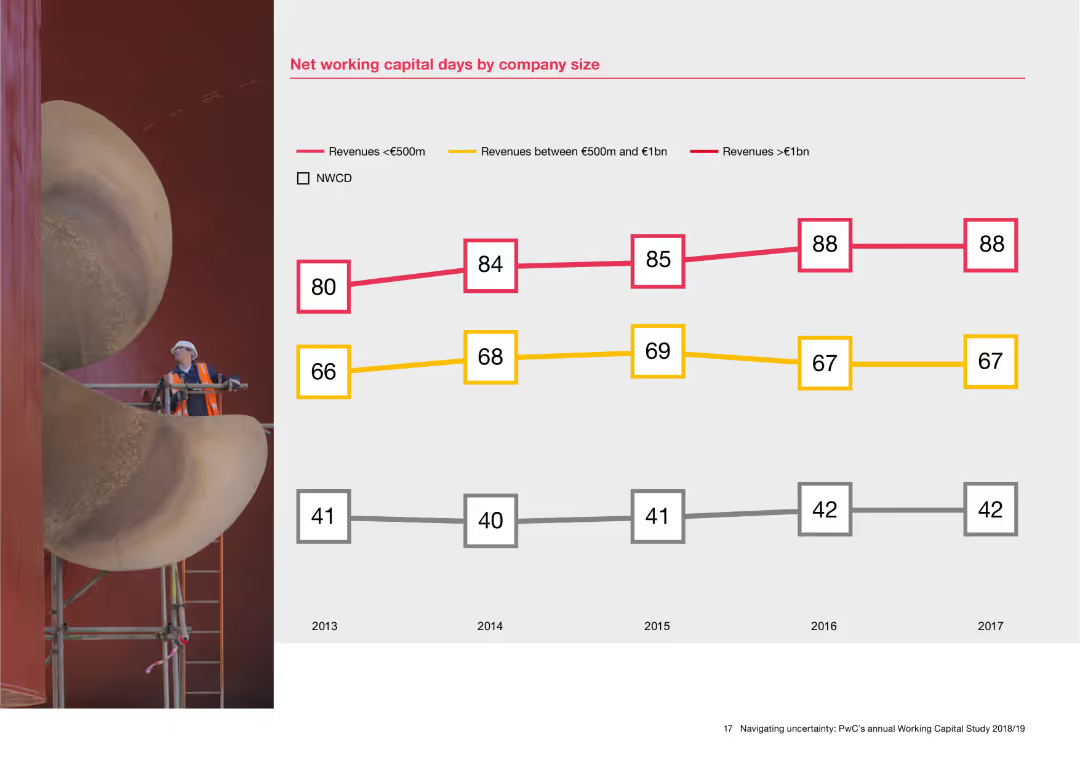
The slide features a line chart with data points showing net working capital days for companies of different sizes from 2013 to 2017. Three lines represent companies with revenues less than €500m, between €500m and €1bn, and greater than €1bn. A background image of an industrial worker is on the left.
Financial Performance
Financial Services
This slide analyzes net working capital days based on company size, presenting data over five years. The line chart helps in understanding how companies with different revenue sizes manage their working capital, offering insights into financial performance and capital efficiency.
Net working capital, company size, financial performance, revenue, line chart, capital efficiency
Mixed Chart
PwC/Strategy&
Saved
The slide presents a diagram categorizing different carbon separation technologies. It uses a hierarchical structure with boxes and arrows, featuring both text and colored elements.
Technology and Digital Transformation
Energy & Utilities
The slide categorizes various CO₂ separation technologies, detailing methods like absorption, adsorption, membranes, liquid/supercritical CO₂, and novel technologies.
Carbon separation, absorption, adsorption, membranes, CO₂ technologies, energy, utilities, chemical processes
Diagram
Kearney
Saved
The slide compares FinTech category adoption rates in 2015 and 2017, featuring two sets of icon-based lists for different years, connected by an arrow.
Market Analysis and Trends
Financial Services
The slide highlights the shift in FinTech adoption from 2015 to 2017, showing increased adoption rates in categories like money transfer and insurance.
FinTech, services, players, adoption, trends
Table
EY
Saved
Contains bullet points and iconography. It features a high-level summary of Western Australia's LNG industry, economic contributions, and impact metrics like $220 billion added and 57,000 workers.
Industry Overview
Energy & Utilities
Highlights Western Australia's significant role in the LNG industry, mentioning major projects, economic contributions, and employment impact over the last decade.
LNG, Economic Impact, Western Australia, Energy Industry, Employment, Major Projects, Investment, Tax Revenue
Header Horizontal
EY
Saved
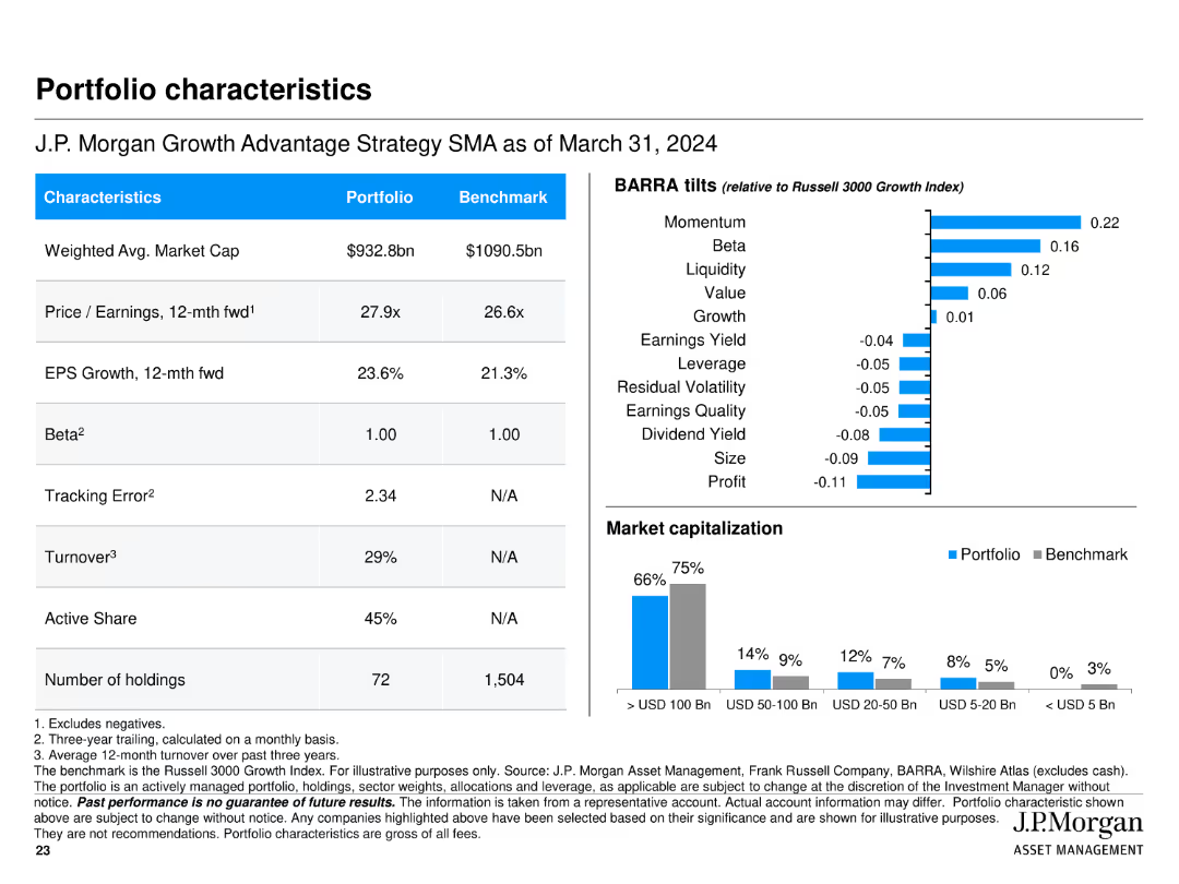
Features multiple tables and bar charts presenting portfolio characteristics such as market cap, P/E ratio, EPS growth, BARRA tilts, and market capitalization breakdown.
Financial Performance
Financial Services
Summarizes key characteristics of J.P. Morgan Growth Advantage Strategy, including market cap, P/E ratio, and EPS growth, along with comparisons to the benchmark.
portfolio, characteristics, market cap, P/E ratio, EPS growth, bar chart, table
Multiple Chart
JP Morgan
Saved
Text with a quote and a map of Europe, highlighting the reliability and speed of Ipsos surveys. Three numbered points describing the benefits of knowledge panel expansion.
Product and Service Analysis
Professional Services
Describes the expansion of Ipsos' knowledge panels and their benefits, including brand recognition, market revenue gains, and EU market presence. Emphasizes the reliability of data.
Knowledge Panels, Expansion, Reliability, EU Market, Surveys
Boxed
IPSOS
Saved
Dual bar chart groups: “Top 10” cities and “Megacities”, with rankings and text commentary.
Market Analysis and Trends
Government & Public Sector
Compares the sustainability scores of major global cities, highlighting that megacities score significantly lower due to imbalance in environmental, social, and economic dimensions.
megacities, sustainability, urban planning, global cities, environmental index
Mixed Chart
Roland Berger
Saved
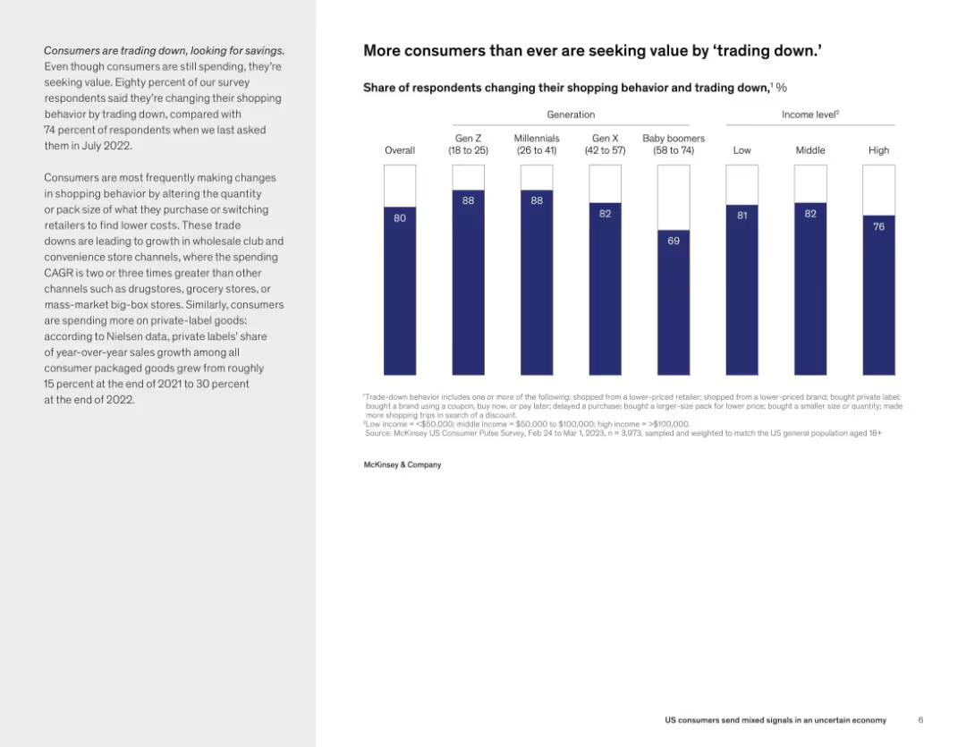
Text on left and bar chart on right showing percentage of respondents changing behavior by generation and income level.
Customer and Market Segmentation
Consumer Goods
80% of respondents report altering their shopping habits to save money—primarily by switching brands or buying smaller packs. Gen Z and millennials lead this trend, indicating a wide adoption of cost-saving behaviors across demographics.
trade down, consumer behavior, savings, Gen Z, income level, shopping trends, private label
Mixed Chart
McKinsey
Saved
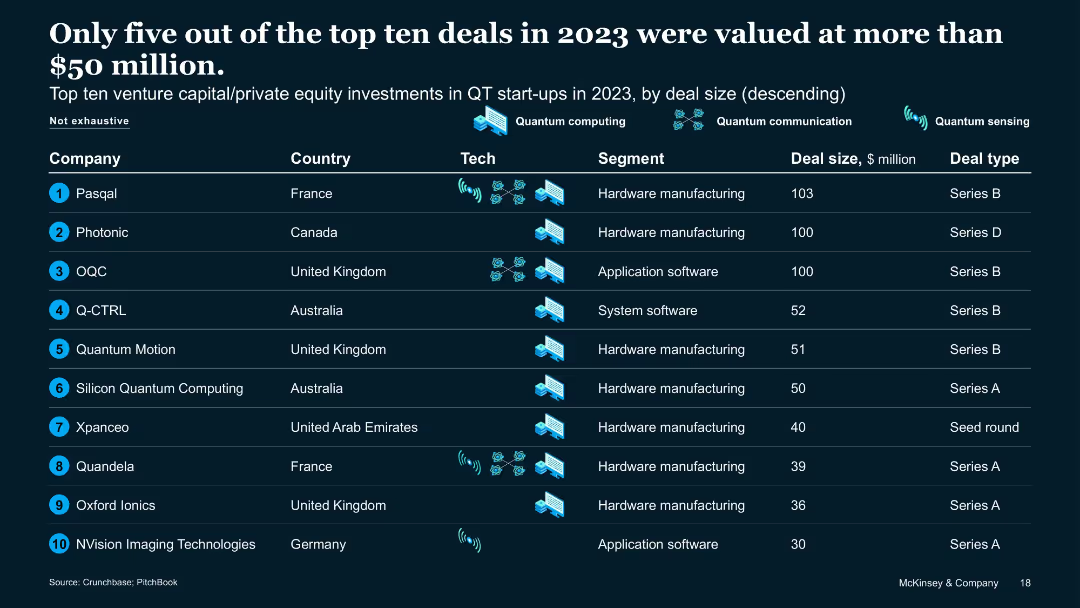
Tabular format with rankings by deal size, country, tech, and funding type
Financial Performance
Artificial Intelligence
Lists top ten QT VC/PE deals in 2023. Only five exceeded $50M. Includes information on country, segment, and deal type. Highlights QT investment concentration in QC hardware and software across France, UK, Australia, and Germany.
VC funding, QT deals, top startups, 2023 investments, hardware focus
Table
McKinsey
Saved
The slide contains column charts showing the progression of Equifax's Vitality Index over several years, emphasizing new product introductions and their impact on the index.
Performance Metrics and KPIs
Financial Services
This slide presents the performance of Equifax in terms of its Vitality Index, highlighting the success of new product introductions and their impact on company performance and strategic direction.
Vitality Index, performance, product introductions, Equifax
Mixed Chart
Barclays
Saved
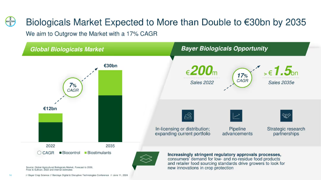
Dual-bar growth chart on the left and opportunity callouts on the right; clean layout with dark green and grey accents.
Market Analysis and Trends
Agriculture & Food Production
Illustrates the projected growth of the global biologicals market from €12bn in 2022 to €30bn in 2035, highlighting Bayer’s 17% CAGR goal and strategies like partnerships and pipeline advancements.
biologicals, CAGR, Bayer, 2035 forecast, market growth, biocontrol, biostimulants, partnerships, pipeline
Mixed Chart
Barclays
Saved
Features column charts comparing the purchase intent for used cars pre-COVID-19 and during subsequent months.
Market Analysis and Trends
Transportation & Logistics
Examines the resilience of used car markets in the US and Asia compared to weaker performance in Germany and France.
used cars, market analysis, US, Asia, Europe
Multiple Chart
McKinsey
Saved
Previous
Next
If nothing, comes up, please save your slides first
Create a FREE account to continue browsing
Receive Instant Access to 1,000+ slides from companies like McKinsey, Google, and Goldman Sachs
First Name
Last Name
Email
Password
I agree to all
Terms & Privacy Policy
Thank you! Your submission has been received!
Oops! Something went wrong while submitting the form.
Have an account?
Sign in
Column Chart
Heatmap
Chevron
Org Chart
Infographic
Callouts
Timeline
List
Graphic
Picture
Process Flow
Diagram
Paragraph
Map
Table
Framework
Subtitle
Takeaway Box
Icon
Other Chart
Radar Chart
Waterfall Chart
Mekko Chart
Pie Chart
Scatter Plot
Line Chart
Bar chart
Bullet points