Create a FREE Account
Instant access to 1,000+ real slides from top companies like McKinsey, BCG, Goldman Sachs, Google and many more!
First Name
Last Name
Email
Password
I agree to all
Terms & Privacy Policy
Thank you! Your submission has been received!
Oops! Something went wrong while submitting the form.
Have an account?
Sign in
Library
Templates
Courses
Pricing
My Account
My Slides
My Templates
✦ AI
AI Prompt Library
AI Search
Sign in
Start Here
Logout
My Saved Slides
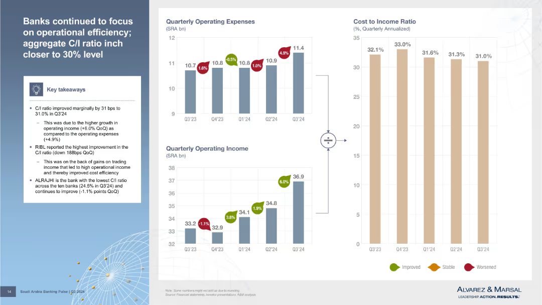
Three bar charts (Operating Expenses, Operating Income, Cost-to-Income Ratio) with callouts and a textbox of key takeaways on the left. Visual style is clean with color-coded indicators (green/red/yellow) for improvement, stability, or worsening metrics.
Performance Metrics and KPIs
Financial Services
The slide shows a marginal improvement in the cost-to-income (C/I) ratio driven by higher income growth over expenses. RIBL had the best improvement, while ALRAJHI maintained the lowest C/I ratio. The visual aids illustrate these financial efficiency trends across Q3’24.
cost-to-income ratio, operating income, operating expenses, bank efficiency, Q3 2024
Multiple Chart
Alvarez & Marsal
Saved
Features a central image of a human figure overlaid with technology icons, detailed labels for "Think", "Feel", "Do", "Learn".
Technology and Digital Transformation
Professional Services
Discusses how various technologies enhance professional skills in areas like cognition, communication, and empathy, specifically in the context of professional services.
professional services, technology, human capabilities, cognition, communication
Diagram
Accenture
Saved
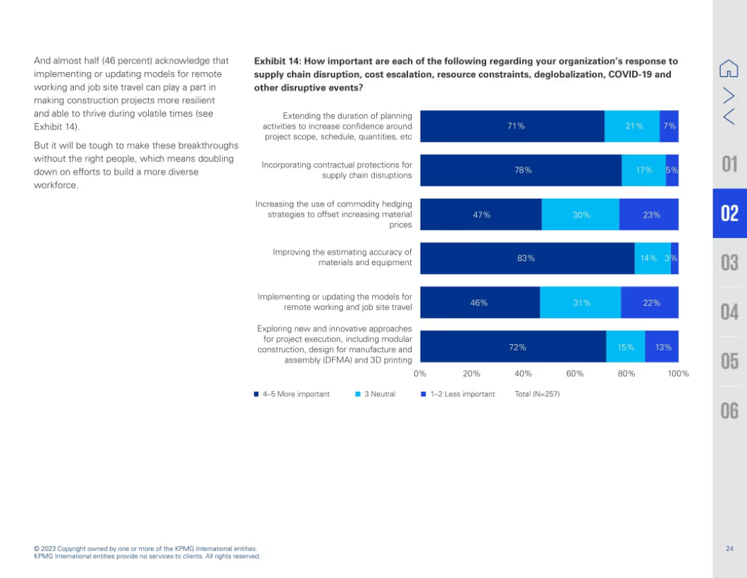
Identical in layout and content to slide 17723, with Exhibit 14 focused on risk mitigation importance measures via horizontal bar charts.
Risk Assessment and Management
Real Estate & Construction
Duplicate of slide 17723. Reinforces the importance of risk mitigation strategies such as estimating accuracy, modular execution, and remote work models. Emphasizes growing need for innovation in response to pandemic-related and geopolitical disruptions.
risk mitigation, estimating, modular construction, DFMA, supply chain, job travel, innovation, resilience
Mixed Chart
KPMG
Saved
A timeline depicting the evolution of SP trading from 2000 to 2019, with key milestones and strategic shifts indicated.
Strategic Planning
Financial Services
The slide outlines the historical development of SP trading, focusing on the consolidation, capital usage optimization, and partnership expansions.
SP trading, timeline, strategic planning, capital optimization, partnership expansion
Linear Flow
Credit Suisse
Saved
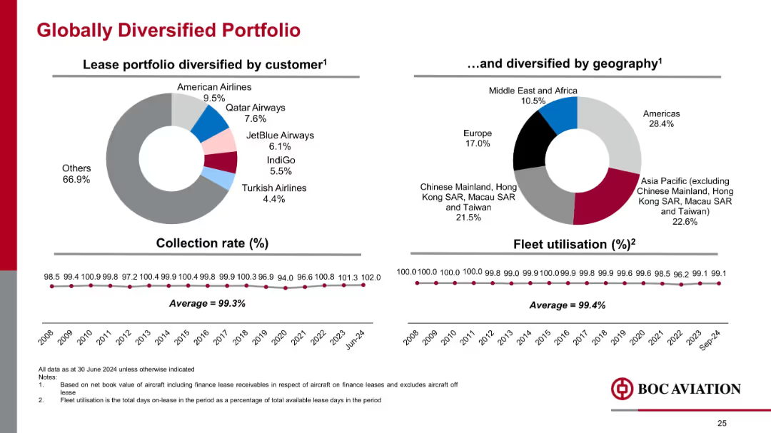
Side-by-side pie charts showing customer and geographic distribution; timeline graphs beneath; minimalist layout
Risk Assessment and Management
Financial Services
Emphasizes portfolio diversification across customers and regions. Shows a strong collection rate (99.3%) and high fleet utilization (99.4%), indicating low credit risk and operational reliability across markets.
customer mix, geography, utilization, collection rate, diversification, aviation portfolio, risk management
Multiple Chart
Goldman Sachs
Saved
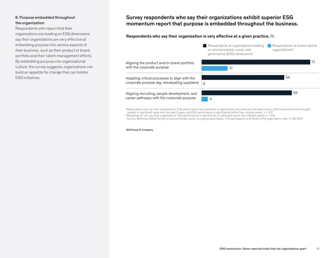
Text on the left and bar chart on the right showing effectiveness in aligning purpose with corporate structure across top vs. bottom ESG performers.
Organizational Structure and Change
Professional Services
Organizations with strong ESG performance embed purpose into operations—aligning product portfolios, critical processes, and talent systems with ESG principles. The chart shows a stark difference in implementation effectiveness between leading and lagging firms.
corporate purpose, ESG integration, business alignment, sustainability strategy, organizational behavior, talent pathways
Mixed Chart
McKinsey
Saved
The slide combines a comprehensive narrative on community development with a pie chart on the left side displaying funding allocation. There is also an image depicting urban housing, tying back to the slide's theme of community support and development.
Financial Performance
Financial Services
The slide highlights JPMorgan Chase's commitment to community development, focusing on the allocation of funds to support home ownership and affordable housing. The urban housing image conveys the practical impact of these investments. Typically, this slide would be used to illustrate the company's efforts in enhancing community living standards and its role in societal development.
community development, funding, home ownership, affordable housing, urban living, JPMorgan Chase
Mixed Chart
JP Morgan
Saved
Three line charts showing trends over years in digitalization, network capacity, and spend on network modernization.
Technology and Digital Transformation
Telecommunications
Visualizes the growth in digitalization and network capacity alongside increased spending on network modernization over time.
digitalization, network capacity, investment trends, technology growth, network modernization, data transmission
Mixed Chart
Accenture
Saved
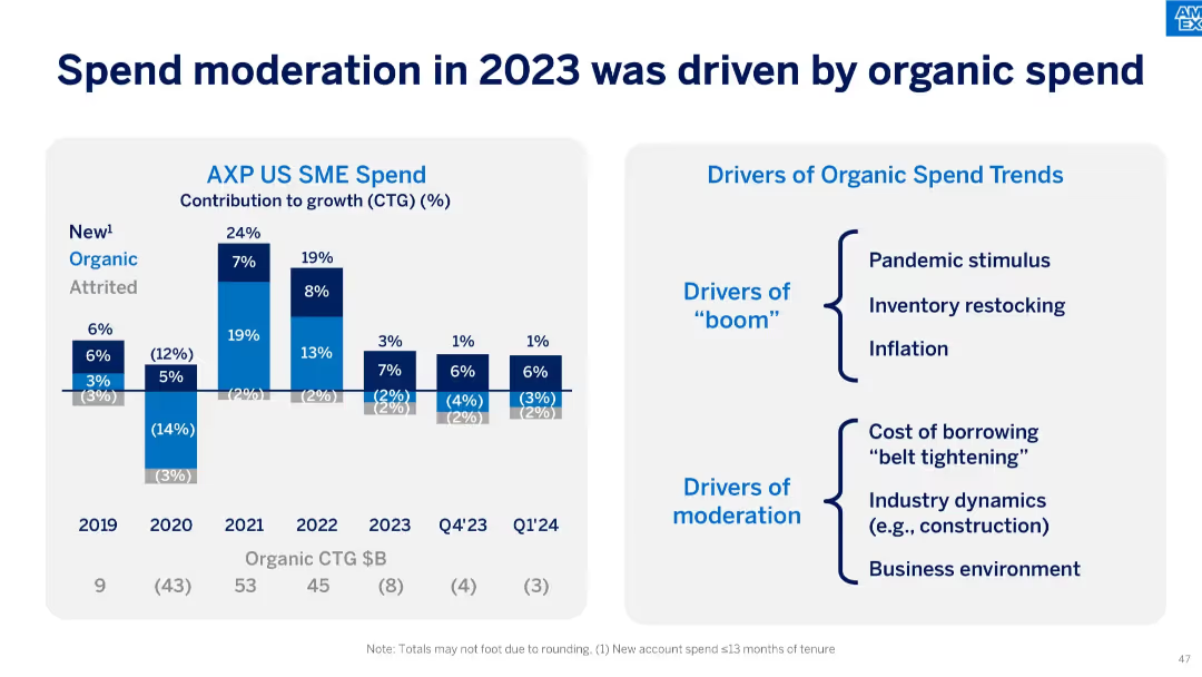
Left side features stacked bar charts showing different spend contributors (New, Organic, Attrited) from 2019 to Q1'24; right side lists "Drivers of Organic Spend Trends" divided into boom and moderation factors.
Operational Efficiency
Financial Services
The slide analyzes drivers of spend patterns in 2023, indicating moderation largely came from organic spend. Factors like cost of borrowing and business conditions contrast earlier drivers like stimulus and inflation.
SME, spend drivers, organic spend, moderation, stimulus, inflation, borrowing cost, CTG, pandemic recovery
Mixed Chart
McKinsey
Saved
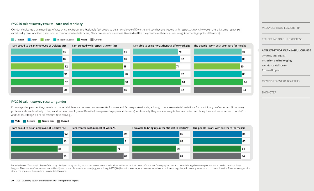
Column charts show survey results by race, ethnicity, and gender, covering aspects of employee experience at Deloitte.
Human Resources and Talent Management
Professional Services
Analyzes survey data on employee satisfaction, highlighting differences in experiences among diverse groups.
talent survey, employee experience, Deloitte
Multiple Chart
Deloitte
Saved
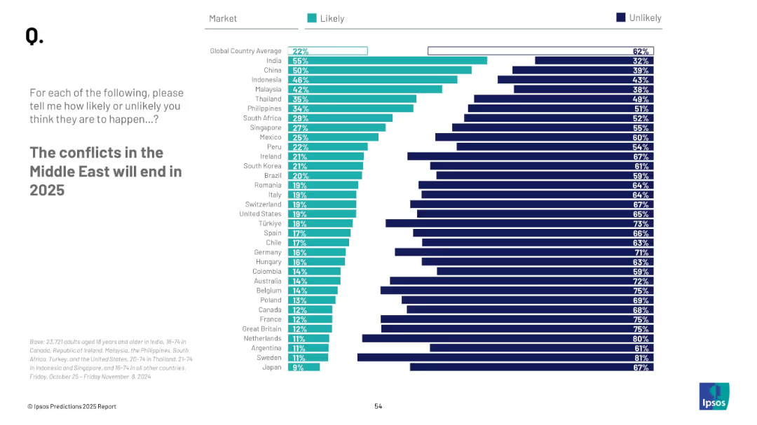
Consistent visual format with horizontal bars and national ranking; clean and symmetrical chart layout
Strategic Planning
Government & Public Sector
The slide evaluates expectations regarding peace in the Middle East by 2025. It aggregates perceptions from various countries, showing likelihood percentages and identifying major shifts in sentiment compared to the previous year.
Middle East, conflict resolution, peace prediction, 2025, survey, perception, geopolitics, regional conflict
Mixed Chart
IPSOS
Saved
Contains text blocks and minimalistic design elements, focusing on interviews and statistical data.
Investment Analysis
Financial Services
Provides insights into near-term investment opportunities in Southeast Asia through sector screening and interviews with investors.
near-term opportunities, SEA, investment screening, investor interviews, sectors
Header Horizontal
Bain
Saved
This slide contains column chart depicting 'Net Revenues by Segment' for different quarters, alongside a table comparing financial metrics like net earnings and EPS for Q1 2023 against previous periods.
Financial Performance
Financial Services
A comprehensive financial review of Q1 2023, showing performance metrics across various business segments and overall company profitability. It serves to present trends and results to stakeholders for strategic and investment decisions.
Net Revenue, Financial Metrics, Earnings, EPS, ROE, Segment Analysis, Profitability, Quarter Comparison, Banking, Asset Management
Mixed Chart
Goldman Sachs
Saved
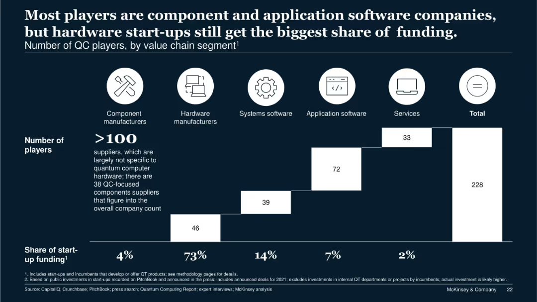
Stacked bar chart segmented by company type; icons for categories above the chart; funding share noted below.
Competitive Landscape
Technology & Software
This slide segments 228 quantum computing companies by value chain role. Although hardware manufacturers represent only a fraction of players, they receive 73% of total startup funding. It illustrates market imbalance and the dominant capital flow toward hardware.
value chain, QC players, startup funding, hardware, components, services
Single Chart
McKinsey
Saved
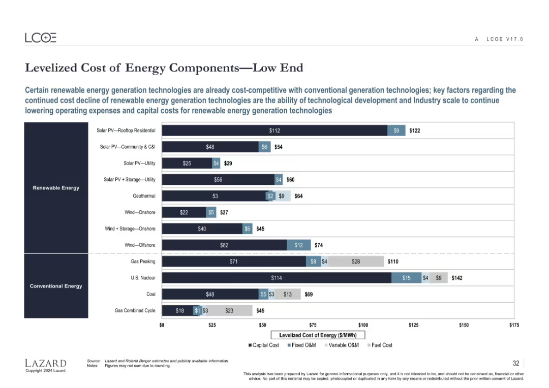
Horizontal bar chart decomposing LCOE for various renewable and conventional energy types at the low-cost end.
Performance Metrics and KPIs
Energy & Utilities
Shows the capital and operating cost breakdowns for renewable and conventional energy technologies at the low end of the cost spectrum. Highlights how some renewables are now cost-competitive or cheaper than fossil-based power generation.
LCOE, capital cost, fixed O&M, variable O&M, fuel cost, renewable energy, cost structure
Single Chart
Roland Berger
Saved
Comprehensive tables and lists showing the status of PPP projects in the Philippines by status, sector, and area, with a professional and organized layout.
Operational Efficiency
Government & Public Sector
Provides an overview of public-private partnership projects in the Philippines, detailing their stages, sectors, and geographic distribution.
PPP, projects, Philippines, public-private, government, sectors, distribution
Table
Deloitte
Saved
Column chart comparing alignment over time with insights on factors influencing alignment in different sectors.
Strategic Planning
Professional Services
Highlights improvements in alignment between marketing and finance, discussing implications for strategic and financial planning.
alignment, marketing, finance, strategic planning, sector influence
Mixed Chart
Deloitte
Saved
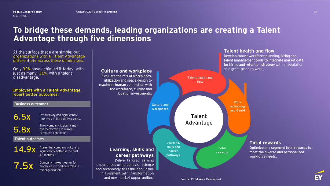
Left block of stats and outcomes; right side features a circular infographic with five dimensions of Talent Advantage: culture, learning, rewards, health, and tech.
Human Resources and Talent Management
Professional Services
Describes how leading companies build a Talent Advantage across five dimensions to address workforce challenges. Includes stats on performance outcomes for talent-advantaged firms and emphasizes the strategic value of culture, learning pathways, reward systems, technology, and workforce planning to stay competitive.
Talent Advantage, workforce strategy, learning, rewards, culture, technology, retention
Vertical Flow
EY
Saved
Diagram plotting the likelihood and impact of selected technological innovations in health and medicine by 2050, such as the end of cancer, bionic eyes, and gene editing.
Technology and Digital Transformation
Healthcare & Pharmaceuticals
The slide highlights the potential for technological innovations to advance medical progress and improve human health by 2050. It plots various medical breakthroughs in terms of their likelihood and impact, emphasizing the transformative effects these innovations could have on eradicating diseases and enhancing the quality of life.
Medical Progress, Health Innovations, 2050
Mixed Chart
Roland Berger
Saved
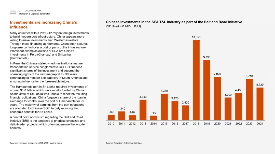
Left column with narrative, right with bar chart of Chinese investments in SEA T&L industry (2010–2024).
Investment Analysis
Transportation & Logistics
This slide emphasizes China’s Belt and Road investments in global port infrastructure. It highlights examples in Peru and Sri Lanka where Chinese funding secured long-term control. A bar chart shows sharp increases in SEA investment, peaking in 2018.
China, Belt and Road, SEA, port infrastructure, foreign investment, Hambantota, Chancay, COSCO
Mixed Chart
PwC/Strategy&
Saved
The slide has a two-column format comparing supportive and opposing views on clean-energy trends. Each column contains bullet points and an icon at the top. The design is straightforward with a blue and black color scheme that provides a professional and clear presentation of information.
Strategic Planning
Energy & Utilities
This slide presents contrasting perspectives on the viability and future of clean-energy technologies. It's structured for strategic planning sessions, offering a platform for debate on the sustainability of traditional renewables, the feasibility of 100% renewable energy adoption, and the growth potential in clean tech markets. This is aimed at stakeholders who are formulating long-term strategies and considering the varying opinions and data points in the clean-energy discourse.
clean energy, renewables, debate, sustainability, technology viability, market growth, strategic planning, renewable adoption, contrasting views, business opportunities
Header Horizontal
McKinsey
Saved
This slide presents a three-pillar plan with icons and text in a horizontal layout. Each pillar has a different icon—chart, gear, and mobile phone—representing operating performance, capital allocation, and digitalisation respectively. The slide is visually simple, with a grey and blue color palette and uses the Santander logo at the top. The slide footer includes a confidentiality notice and a slide number.
Strategic Planning
Financial Services
The slide outlines Santander's strategic approach for growth, focusing on operational efficiency, optimal capital distribution, and accelerating digital transformation. This would be relevant in strategic planning meetings or stakeholder briefings to discuss future directions and priorities.
Operating Performance, Capital Allocation, Digitalisation, Santander, Strategic Growth, Profitability, Banking Strategy, Financial Services
Pillar
Morgan Stanley
Saved
This slide features multiple column charts comparing the Total Incident Frequency (TIF) and Total Recordable Incident Frequency (TRIF) of Seadrill against industry benchmarks over several years. The graphs are color-coded to differentiate between TIF, TRIF, and a benchmark, providing a clear visual distinction. The design is clean, with minimal text to allow focus on the trends shown by the graphs. Annotations highlight significant data points and trends.
Operational Efficiency
Energy & Utilities
The slide demonstrates Seadrill's commitment to safety and efficiency, showing a downward trend in incident rates compared to industry standards. It is likely used in safety briefings, regulatory reviews, or investor meetings to underscore Seadrill's strong safety record and operational excellence. The line graphs serve to reassure stakeholders of the company’s adherence to high safety standards and its effectiveness in minimizing operational risks, which is crucial for maintaining trust and fulfilling regulatory requirements.
safety, operational efficiency, Seadrill, line graphs, incident rates, industry benchmarks, safety standards, regulatory compliance, stakeholder reassurance, trust
Multiple Chart
Barclays
Saved
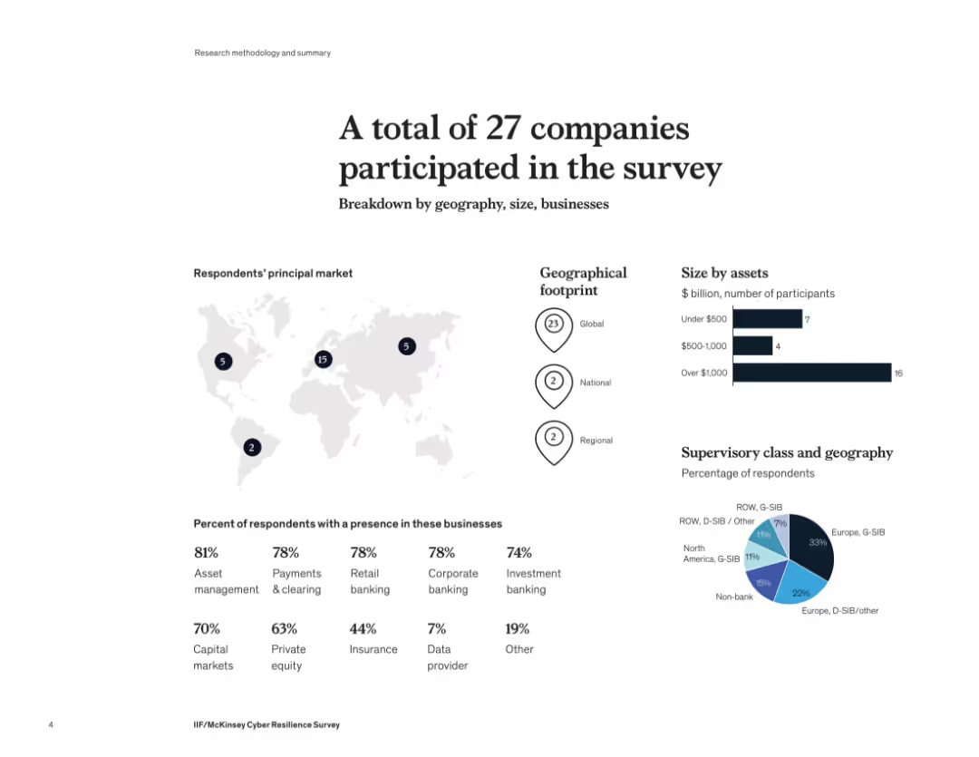
Infographic layout with maps, bar charts, and pie charts showing company distribution by geography, size, and business sector. Clean and visually segmented layout with dark blue icons and map markers.
Industry Overview
Financial Services
This slide summarizes participant demographics in a McKinsey cyber resilience survey. The 27 companies surveyed span global to regional operations, mostly with over $1B in assets. Key sectors represented include asset management, retail banking, investment banking, and private equity. A geographic breakdown highlights strong European participation.
cyber resilience, financial services, global footprint, asset size, banking, survey demographics
Multiple Chart
McKinsey
Saved
Presents bar charts comparing the powertrain prices for PC, LCV, and HDT across H2 ICE, FCEV, and BEV technologies, highlighting key cost components.
Financial Performance
Transportation & Logistics
Compares the competitiveness of different powertrain technologies (H2 ICE, FCEV, BEV) in heavy-duty transport, focusing on cost efficiency and battery requirements.
powertrain, price comparison, H2 ICE, FCEV, BEV, cost components, competitiveness, HDT, battery requirements, transport
Multiple Chart
Roland Berger
Saved
Previous
Next
If nothing, comes up, please save your slides first
Create a FREE account to continue browsing
Receive Instant Access to 1,000+ slides from companies like McKinsey, Google, and Goldman Sachs
First Name
Last Name
Email
Password
I agree to all
Terms & Privacy Policy
Thank you! Your submission has been received!
Oops! Something went wrong while submitting the form.
Have an account?
Sign in
Column Chart
Heatmap
Chevron
Org Chart
Infographic
Callouts
Timeline
List
Graphic
Picture
Process Flow
Diagram
Paragraph
Map
Table
Framework
Subtitle
Takeaway Box
Icon
Other Chart
Radar Chart
Waterfall Chart
Mekko Chart
Pie Chart
Scatter Plot
Line Chart
Bar chart
Bullet points