Create a FREE Account
Instant access to 1,000+ real slides from top companies like McKinsey, BCG, Goldman Sachs, Google and many more!
First Name
Last Name
Email
Password
I agree to all
Terms & Privacy Policy
Thank you! Your submission has been received!
Oops! Something went wrong while submitting the form.
Have an account?
Sign in
Library
Templates
Courses
Pricing
My Account
My Slides
My Templates
✦ AI
AI Prompt Library
AI Search
Sign in
Start Here
Logout
My Saved Slides
This slide has a balanced mix of text and imagery, displaying a minimalist layout with key focus areas and targets in bullet points alongside a South Korean flag.
Strategic Planning
Energy & Utilities
Outlines South Korea's hydrogen strategy, focusing on long-term targets and industry partnerships, aimed at establishing South Korea as a leader in the hydrogen fuel cell market by 2040.
South Korea, Hydrogen, Strategy, Industrial, Growth
Mixed Chart
McKinsey
Saved
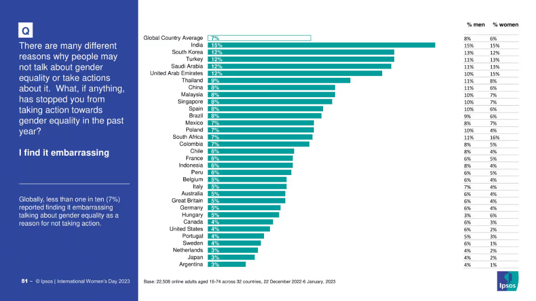
Bar chart ranking countries by % who cited embarrassment as a barrier; right-hand table with male/female split; explanatory text on the left.
Human Resources and Talent Management
Government & Public Sector
This chart shows the percentage of people who find discussing gender equality embarrassing. India leads with 15%, global average is 7%. Both male and female perceptions are displayed, highlighting cultural differences in stigma.
embarrassment, gender equality, stigma, survey, perceptions, Ipsos, global opinion
Mixed Chart
IPSOS
Saved
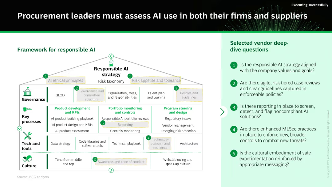
Organizational diagram showing “Responsible AI strategy” structure with layers: governance, key processes, tech/tools, and culture. Sidebar lists 5 vendor assessment questions.
Regulatory and Compliance
Technology & Software
This slide introduces a framework for implementing responsible AI strategies in procurement. It details governance structures, product development standards, monitoring controls, and cultural guidelines, and provides a checklist of questions for evaluating suppliers’ AI ethics and compliance.
responsible AI, governance, compliance, vendor assessment, KPIs, controls, AI ethics
Boxed
BCG
Saved
A column chart with blue bars dominates this slide, representing the private funding value across different years, against a background of minimal text.
Investment Analysis
Financial Services
Highlighting the resilience of deal values amidst a decrease in deal activity, this slide suggests a dynamic investment landscape with a focus on high-profile investments.
private funding, deal value, investments, year-on-year, column chart, resilience
Single Chart
Bain
Saved
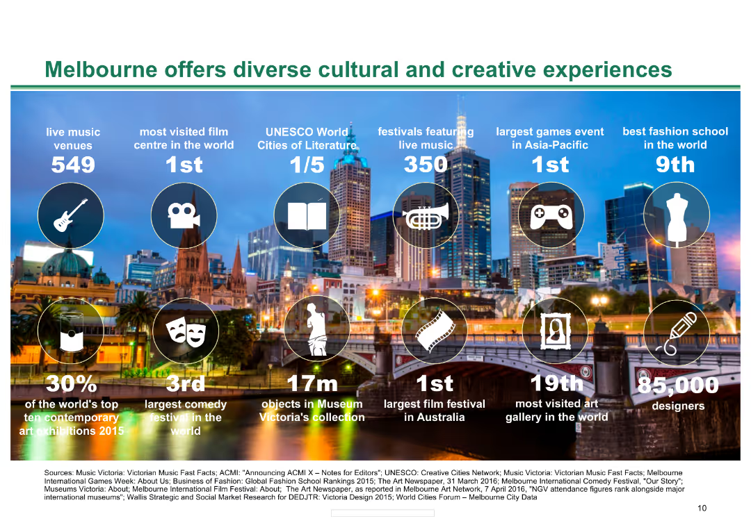
Background image of Melbourne skyline with icons and statistics about Melbourne's cultural and creative offerings, including music venues, film centres, and festivals.
Market Analysis and Trends
Hospitality & Tourism
The slide presents key statistics about Melbourne's cultural and creative experiences, highlighting the city's strengths in various cultural sectors and its international rankings.
Melbourne, cultural, creative, music, film, festivals, experiences, tourism, hospitality, rankings
Pillar
BCG
Saved
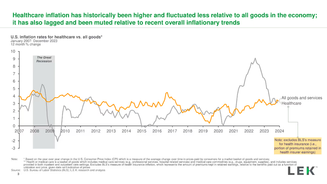
A line chart comparing U.S. inflation rates for healthcare and all goods from 2007 to 2023, highlighting key events and trends with clear lines and labels.
Market Analysis and Trends
Healthcare & Pharmaceuticals
The slide illustrates the historical inflation rates for healthcare versus all goods, showing how healthcare inflation has been higher and more stable over time.
inflation, healthcare, trends, comparison, U.S.
Single Chart
LEK
Saved
The slide features a column chart illustrating the number of disclosed education deals in Africa from 2004-2018. The chart shows significant growth, with detailed annotations about the largest deals and their values. The right side lists major transactions, including target companies and bidders.
Investment Analysis
Education & Training
This slide examines investment activity in the African education sector, highlighting a 24X growth in disclosed deals from 2004-2018. It provides a detailed look at the largest transactions, showcasing major bidders and their target companies, indicating significant investment interest in education.
investment, education, Africa, deals, growth
Mixed Chart
LEK
Saved
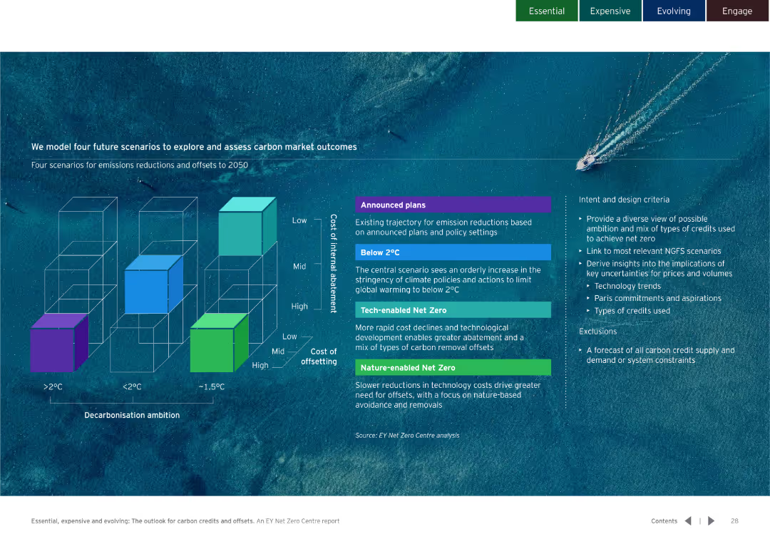
Three-dimensional block diagram comparing different decarbonisation scenarios and strategies. Clear color-coded sections for easy understanding.
Strategic Planning
Environmental Services & Sustainability
Models four scenarios for carbon market outcomes up to 2050. Details the potential impacts and design criteria for each scenario.
carbon market, future scenarios, decarbonisation
Diagram
EY
Saved
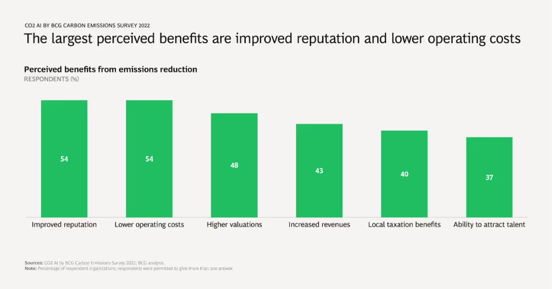
A column chart showing percentages of respondents citing various benefits from emissions reduction, including improved reputation, lower operating costs, higher valuations, increased revenues, local taxation benefits, and talent attraction.
Market Analysis and Trends
Environmental Services & Sustainability
Identifies and quantifies the primary benefits companies perceive from reducing emissions, emphasizing reputational and financial gains. Useful for advocating emissions reduction strategies to stakeholders.
benefits, emissions reduction, reputation, operating costs, survey results
Single Chart
BCG
Saved
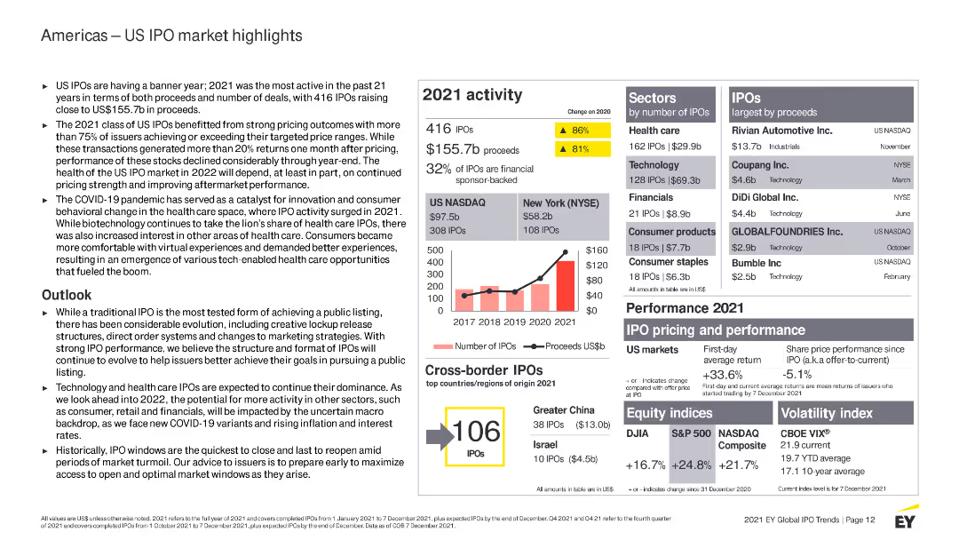
Features multiple column charts, bullet points, and highlighted statistics. Color-coded elements distinguish between different datasets.
Market Analysis and Trends
Financial Services
Provides detailed information on the US IPO market in 2021, including sector performance, market outlook, and cross-border IPO activity.
US IPO, financial services, 2021 activity, market analysis, trends, sectors, performance, cross-border IPOs, outlook, health care
Mixed Chart
EY
Saved
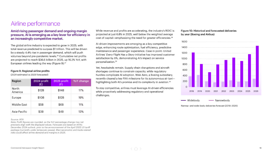
Split layout with left-side text and table showing regional airline profits, right side includes a bar chart of aircraft deliveries by type (2018–2026). Purple color palette.
Financial Performance
Industrial & Manufacturing
Highlights projected industry growth to $1 trillion by 2025, led by rising passenger demand and AI-driven efficiencies. Includes regional airline profit forecasts and delivery trends by aircraft type. AI’s role in improving customer satisfaction and cost efficiency is emphasized.
airline profits, AI, aerospace, passenger demand, aircraft deliveries, United Airlines, predictive maintenance, financial performance
Mixed Chart
Accenture
Saved
Features two line graphs showing year-over-year industrial production growth in the U.S. and EU. The slide uses red and blue lines against a light green background for clarity.
Operational Efficiency
Industrial & Manufacturing
Discusses recent trends in manufacturing and industrial production in the U.S. and EU, highlighting changes in growth rates. This slide is beneficial for understanding sectoral health and economic conditions.
Manufacturing, Industrial Production, US, EU, Growth Rates
Single Chart
Deutsche Bank
Saved
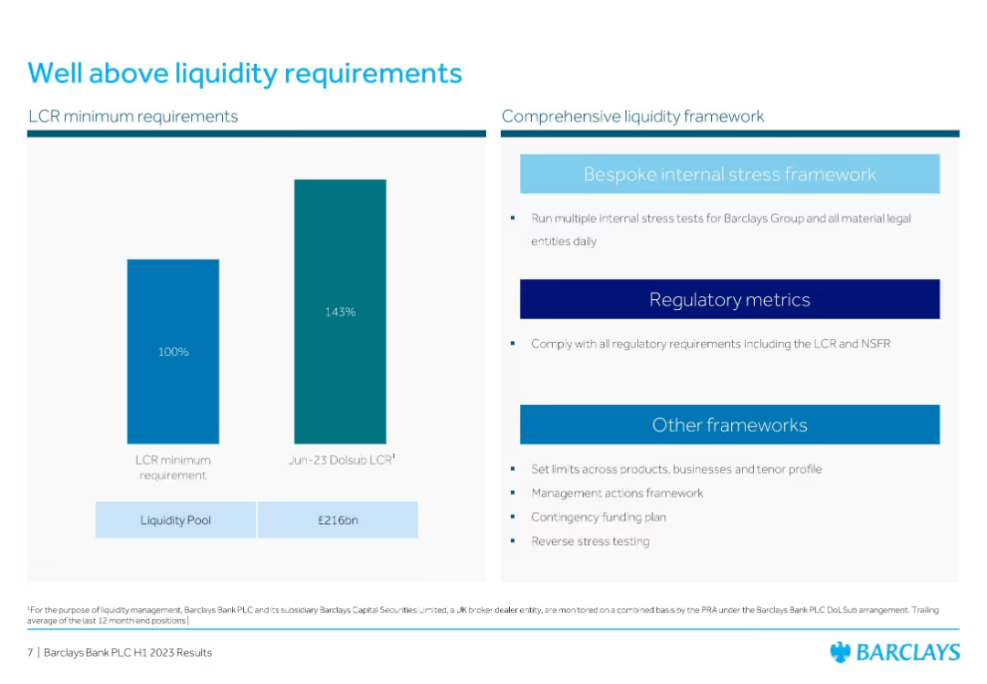
Two-bar comparison chart (LCR min vs. Barclays) and bullet list of liquidity frameworks
Risk Assessment and Management
Financial Services
Highlights Barclays' liquidity coverage ratio of 143% against a 100% requirement, supported by a £216bn liquidity pool. Also outlines the bank's internal and regulatory frameworks to manage liquidity risks.
Liquidity, LCR, Stress Testing, Barclays, Risk Management, Financial Compliance, Resilience
Mixed Chart
Barclays
Saved
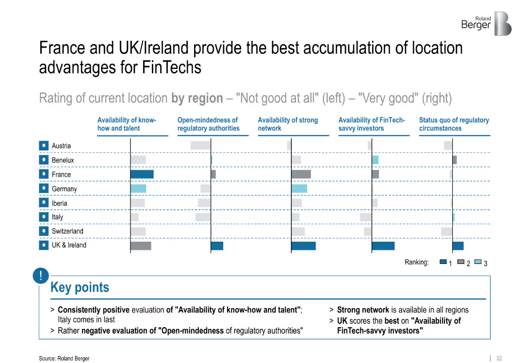
Comparative bar matrix showing location ratings across European regions; color-coded rankings (1–3); summary points highlighted below
Market Analysis and Trends
Financial Services
The slide benchmarks European regions based on FinTech-relevant criteria like talent, regulatory openness, and investor access. UK & Ireland and France rank highest across most factors. Italy scores poorly, particularly on regulatory openness.
FinTech, location analysis, regulatory openness, talent, investors, regional comparison, network
Mixed Chart
Roland Berger
Saved
Column charts displaying changes in fleet size, age, and lease terms over seven years.
Investment Analysis
Transportation & Logistics
Evaluates growth and operational metrics of Aircastle’s fleet, including investments and age of aircraft.
fleet, growth, investment, aircraft, age, lease terms, operational metrics
Multiple Chart
Deutsche Bank
Saved
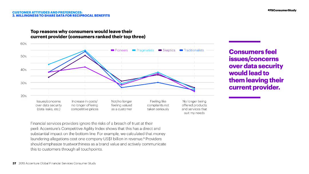
Line chart comparing reasons for leaving a provider among different customer segments.
Risk Assessment and Management
Financial Services
The slide outlines the top reasons consumers would leave their current financial service provider, with data security concerns being the most significant across all segments.
Consumer behavior, Data security, Financial services, Reasons for leaving, Customer retention
Mixed Chart
Accenture
Saved
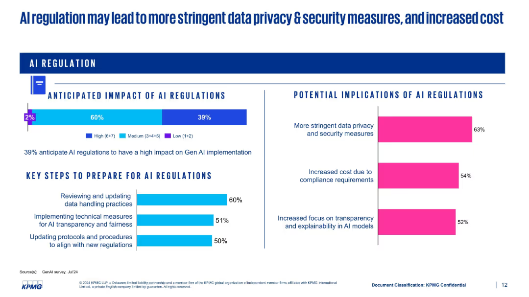
Split-panel layout showing regulatory impact, implications, and preparation steps using bar charts
Regulatory and Compliance
Artificial Intelligence
This slide discusses the anticipated impact of AI regulations. 39% expect high impact, with implications such as stricter data privacy measures and higher compliance costs. It also lists preparation strategies like updating protocols and implementing transparency measures.
AI regulation, compliance, data privacy, cost, preparation, transparency
Multiple Chart
KPMG
Saved
Contains bar charts comparing cost management maturity levels across different regions including the Nordics.
Risk Assessment and Management
Professional Services
Explores the maturity levels of cost management practices globally, emphasizing that Nordic regions report lower maturity compared to the global average, and discusses potential areas for improvement.
Cost Management, Maturity Levels, Nordic, Global Comparison, Improvement
Mixed Chart
Deloitte
Saved
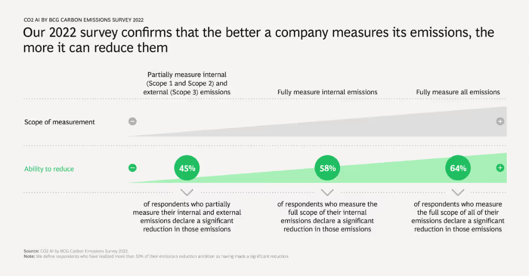
A column chart showing the correlation between the scope of emissions measurement and the ability to reduce emissions. It includes percentages of respondents who measure emissions to varying extents and their reported emission reductions.
Operational Efficiency
Environmental Services & Sustainability
Demonstrates that companies which comprehensively measure their emissions tend to achieve more significant reductions. Highlights the importance of thorough emissions tracking in achieving meaningful environmental impact.
emissions measurement, reduction, operational efficiency, scope, survey results
Table
BCG
Saved
The slide features a series of pie charts and circular graphics depicting consumer preferences for drone delivery, voice-automated ordering systems, and kitchen automation.
Market Analysis and Trends
Hospitality & Tourism
This slide explores consumer attitudes towards automation technologies in restaurants, showing a high acceptance and interest in innovations like drone delivery and voice-automated systems.
Automation technology, consumer preferences, drone delivery, voice-automated systems, kitchen automation
Multiple Chart
Deloitte
Saved
A slide with dual charts contrasting public market and tech performance with U.S. venture investment, accompanied by a second chart on key inflation indicators and treasury interest rates. Each chart uses different colored lines for comparison and has annotations for additional context.
Market Analysis and Trends
Technology & Software
This slide analyzes the trend of public market rallies driven by technology companies contrasted against a drop in venture investments. It also provides a secondary focus on inflation and interest rates, aiming to discuss the financial climate and its effects on investment strategies. It can be used to guide discussions on economic trends and investment decisions, especially in technology-driven markets.
Public Markets, Technology, Venture Investment, Inflation, Interest Rates, Economic Trends
Multiple Chart
JP Morgan
Saved
Features comparative column charts and statistics on consumer activity changes, with clear visual elements to distinguish between the data points, emphasizing shifts in behavior and concerns.
Customer and Market Segmentation
Consumer Goods
Analyzes the evolving consumer behaviors in response to the COVID-19 pandemic, focusing on the increase in activities despite concerns, and the role of vaccination in enabling safer gatherings.
Consumer Behavior, COVID-19, Vaccination, Activities
Mixed Chart
BCG
Saved
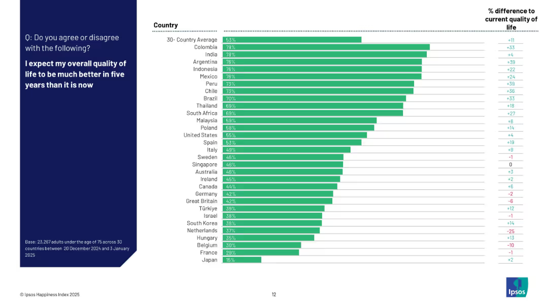
Vertical bar chart with countries ranked by optimism about future quality of life; includes side column with percentage difference from current life assessment.
Market Analysis and Trends
Professional Services
The slide ranks countries based on optimism regarding future quality of life. Colombia, India, and Argentina are the most optimistic, with Japan ranking lowest. It also shows the percentage point difference compared to their current quality of life, highlighting shifts in sentiment.
optimism, future quality of life, Ipsos, expectation, country sentiment, 2025, outlook, survey, global confidence
Mixed Chart
IPSOS
Saved
The slide is divided into three sections, each with a header, a descriptive text block, and an accompanying image. It features images of offshore platforms and vessels, emphasizing Seatruim’s capabilities.
Operational Efficiency
Energy & Utilities
Showcases Seatruim’s achievements and capabilities in offshore platform design and construction, emphasizing their market leadership and commitment to quality and innovation. Suitable for discussions on company accomplishments and industry standing.
Offshore Platforms, FPSOs, Leadership, Achievements
Header Vertical
Morgan Stanley
Saved
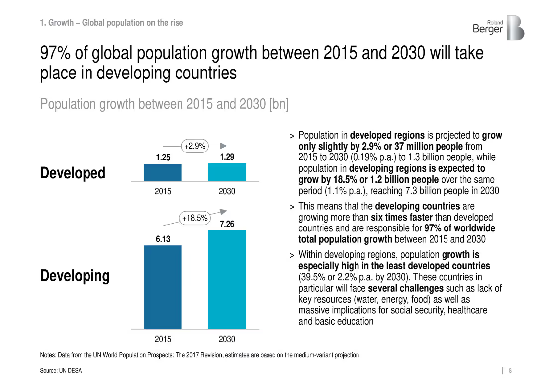
Bar chart and text comparison of developed vs. developing population growth from 2015 to 2030.
Market Analysis and Trends
Government & Public Sector
Projects that nearly all global population growth through 2030 will occur in developing countries, emphasizing the need for infrastructure and services in those regions.
population growth, developing countries, demographics, infrastructure
Mixed Chart
Roland Berger
Saved
Previous
Next
If nothing, comes up, please save your slides first
Create a FREE account to continue browsing
Receive Instant Access to 1,000+ slides from companies like McKinsey, Google, and Goldman Sachs
First Name
Last Name
Email
Password
I agree to all
Terms & Privacy Policy
Thank you! Your submission has been received!
Oops! Something went wrong while submitting the form.
Have an account?
Sign in
Column Chart
Heatmap
Chevron
Org Chart
Infographic
Callouts
Timeline
List
Graphic
Picture
Process Flow
Diagram
Paragraph
Map
Table
Framework
Subtitle
Takeaway Box
Icon
Other Chart
Radar Chart
Waterfall Chart
Mekko Chart
Pie Chart
Scatter Plot
Line Chart
Bar chart
Bullet points