Create a FREE Account
Instant access to 1,000+ real slides from top companies like McKinsey, BCG, Goldman Sachs, Google and many more!
First Name
Last Name
Email
Password
I agree to all
Terms & Privacy Policy
Thank you! Your submission has been received!
Oops! Something went wrong while submitting the form.
Have an account?
Sign in
Library
Templates
Courses
Pricing
My Account
My Slides
My Templates
✦ AI
AI Prompt Library
AI Search
Sign in
Start Here
Logout
My Saved Slides
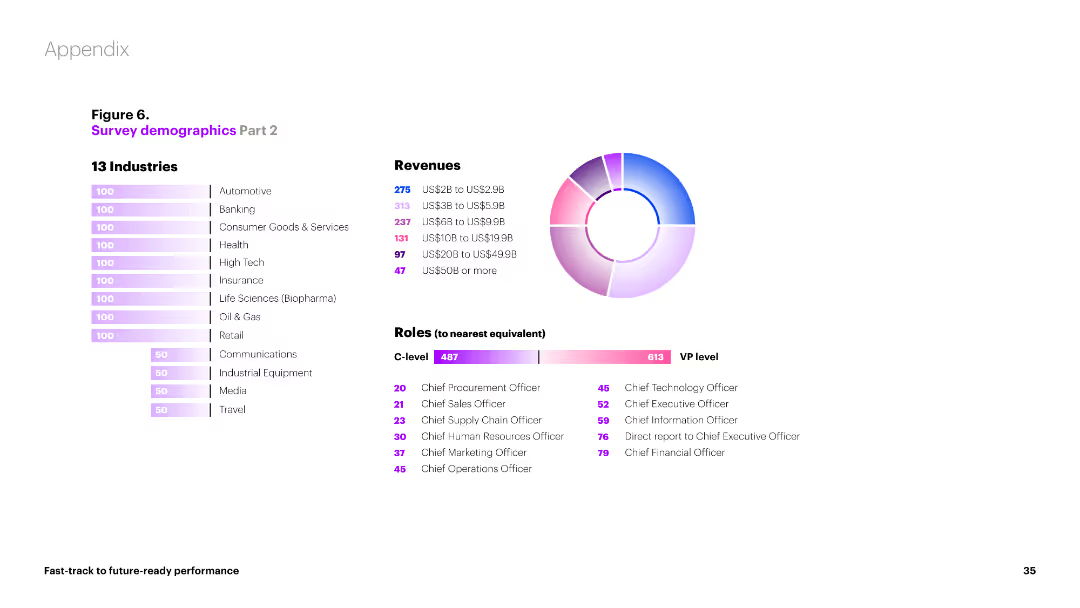
Bar charts and a pie chart showing the distribution of survey participants by industry, revenue, and roles. Different colors and sections indicate various categories.
Market Analysis and Trends
Professional Services
This slide provides a breakdown of survey participants by industry, revenue brackets, and roles. It includes visual data on the number of participants from different sectors and their respective revenues.
demographics, industry, revenue, roles, participants
Multiple Chart
Accenture
Saved
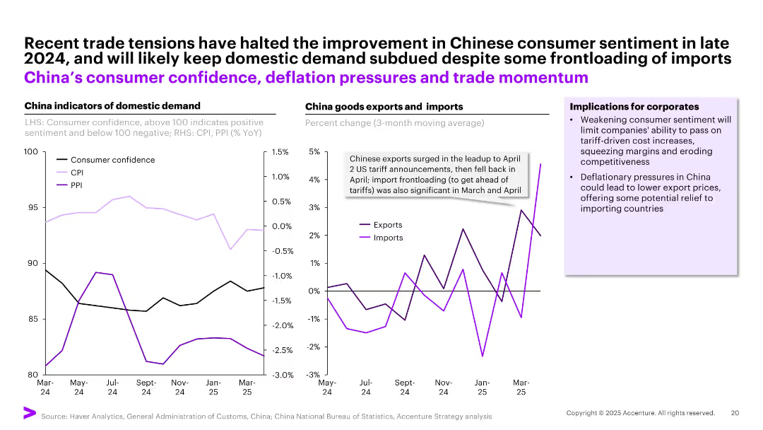
Dual line chart layout comparing domestic indicators (left) with trade flows (right); includes annotations and business implications in side box.
Market Analysis and Trends
Industrial & Manufacturing
The slide illustrates declining consumer confidence and persistent deflation in China, alongside trade fluctuations triggered by US tariffs. Corporates are advised to expect reduced pricing power in China and potential cost relief through lower export prices.
China economy, consumer sentiment, deflation, tariffs, trade, imports, exports
Multiple Chart
Accenture
Saved
The content slide includes a photo of a person gardening, accompanied by three line graphs showing employment rate scenarios for Africa, India, and Southeast Asia. The visual layout is clear, with the photo providing contextual background.
Human Resources and Talent Management
Professional Services
This slide focuses on the employment rate changes in Africa, India, and Southeast Asia due to the green transition. It highlights the role of green jobs in maintaining employment levels and stresses the importance of supporting the labor market transition to avoid social unsustainability and labor shortages.
Employment, Africa, India, Southeast Asia, Green Jobs
Multiple Chart
EY
Saved
Column chart comparing conversion rates of online channels with and without genAI enabled contact centers. Shows significant improvement with genAI integration.
Sales and Business Development
Financial Services
Demonstrates how genAI enabled customer centers significantly increase sales performance by improving conversion rates for online loan applications.
genAI, customer center, sales, conversion rates, online channel
Multiple Chart
Kearney
Saved
This slide presents three separate graphs on crop, livestock, and dairy production, using a blue and gray color scheme. It gives an overview of the US agriculture industry's financial output in these sectors.
Investment Analysis
Agriculture & Food Production
A financial breakdown of the US agriculture industry, highlighting the production value of crops, livestock, and dairy, and their respective growth figures over time.
agriculture, US industry, financial data, crops, livestock, dairy, production value
Multiple Chart
EY
Saved
A circular diagram categorizes companies into four sectors: pure-play fintechs, established financial services players, consumer tech platforms, and established consumer players, with examples for each. The slide layout is complex, featuring a network of interactions between different categories of players.
Competitive Landscape
Financial Services
This slide outlines the competitive landscape in the financial services industry in 2019, showing various market players from established banks to new tech entrants and their interrelations, emphasizing the diverse ecosystem within the digital financial services space.
competitive, landscape, financial services, fintechs, tech platforms, market players, 2019
Diagram
Bain
Saved
The slide features a detailed case study on the stakeholders and regulations in the energy-from-waste sector in the UK, including a value chain diagram, production cost analysis, and key regulations and policies.
Client Case Studies
Energy & Utilities
This slide examines the stakeholders and regulatory environment of the energy-from-waste sector in the UK, highlighting the value chain, production costs, and key regulations that support and govern waste-to-energy initiatives.
energy from waste, UK, case study, stakeholders, regulations, value chain, production cost, policy
Mixed Chart
Kearney
Saved
Slide contains multiple bar charts showing importance of various factors for investment in underwriting capabilities. Colors differentiate the significance of factors such as improving quality and reducing expenses.
Investment Analysis
Financial Services
This slide discusses key factors influencing company investment decisions in underwriting capabilities, including improving underwriting quality and business ease for customers.
underwriting, investment, quality, expenses, business ease, customers
Single Chart
Accenture
Saved
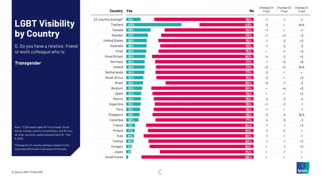
Bar chart showing % who know someone transgender; ranked by country with yes/no breakdown.
Market Analysis and Trends
Government & Public Sector
This slide assesses how many respondents know a transgender person, broken down by country. Thailand shows the highest visibility; South Korea and Japan the lowest. Change data is also displayed.
transgender, visibility, country ranking, social awareness, Ipsos survey
Mixed Chart
IPSOS
Saved
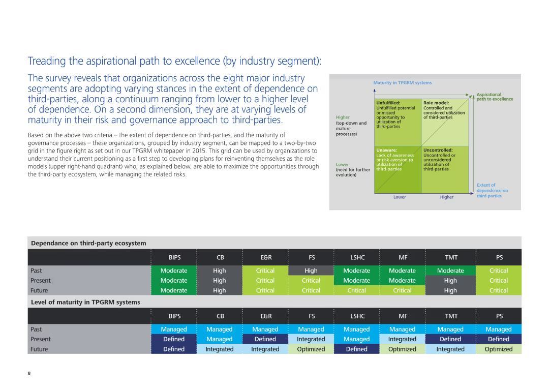
The slide includes a text description of organizational stances on third-party dependence and governance maturity, accompanied by a grid and charts illustrating these aspects across different industry segments.
Strategic Planning
Professional Services
This slide examines how organizations in various industry segments are adopting different stances on third-party dependence and governance. It maps these stances on a grid and provides insights into current and future trends in third-party risk and governance maturity.
third-party dependence, governance, industry segments, strategic planning, professional services, risk management, maturity levels
Table
Deloitte
Saved
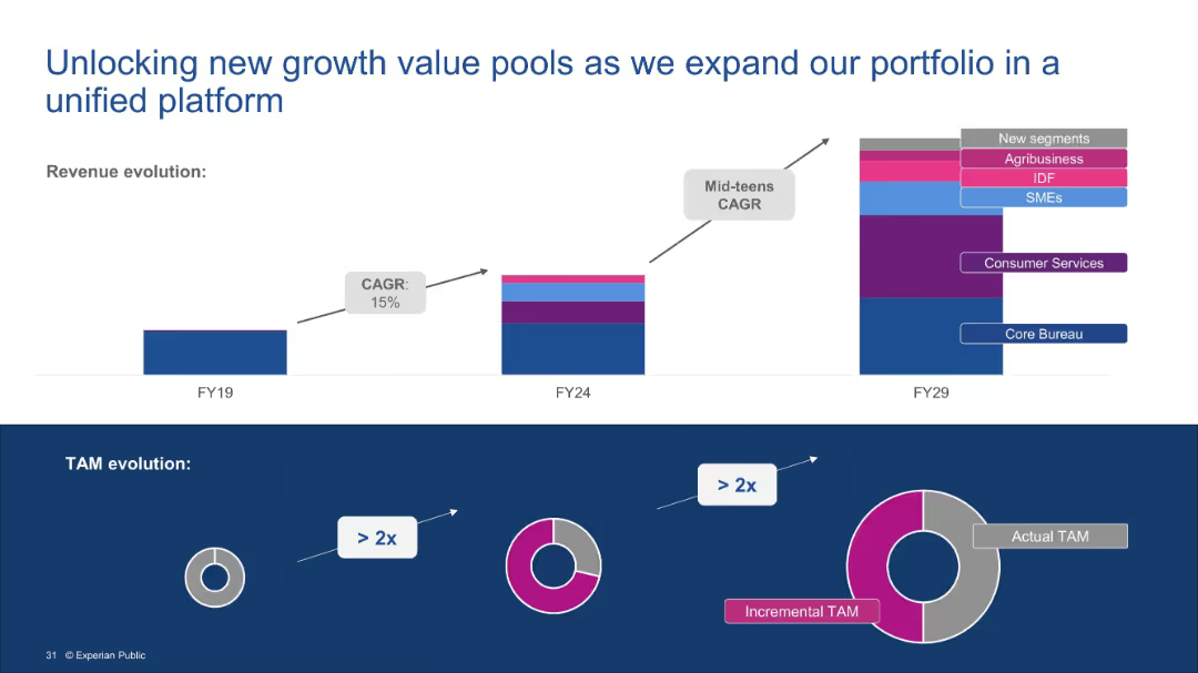
Split into two visual sections. Top: stacked bar chart showing revenue evolution across fiscal years. Bottom: three-part TAM evolution diagram indicating growth potential.
Financial Performance
Financial Services
This slide illustrates how Experian’s expanding service portfolio—from Core Bureau to new segments like agribusiness and SMEs—drives revenue growth. It highlights a projected CAGR and demonstrates how incremental TAM more than doubles the original market opportunity.
Revenue growth, TAM, New segments, Core Bureau, Agribusiness, SMEs, Portfolio expansion, CAGR
Multiple Chart
Barclays
Saved
A horizontal bar chart listing factors negatively affecting HR function, highlighting the top three factors.
Strategic Planning
Professional Services
Slide illustrates major barriers in HR function performance, useful in HR management discussions for identifying critical areas of focus.
HR, barriers, management, performance, top three
Single Chart
PwC/Strategy&
Saved
Four quadrant charts covering Total, Venture, M&A, and PE activity in EMEA; blue and purple elements with declining trend lines
Financial Performance
Financial Services
EMEA fintech deal value in H1 2021 nearly matches all of 2020. Charts show moderate decreases in deal count but increasing deal value across all investment types, especially in venture capital. The region shows robust activity despite fewer deals, suggesting larger individual transactions.
EMEA, fintech investment, PE, VC, M&A, deal value, 2021 trends, H1 comparison
Multiple Chart
KPMG
Saved
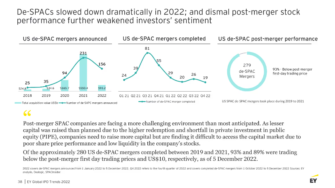
The slide shows multiple line charts illustrating the number of de-SPAC mergers announced and completed, as well as their post-merger performance from 2018 to 2022.
Market Analysis and Trends
Financial Services
Analyzes the decline in de-SPAC activity and the poor post-merger performance, highlighting challenges in the SPAC market.
de-SPAC, mergers, performance, market analysis
Multiple Chart
EY
Saved
Slide displays two 2D scatter plots comparing 'Leaders' and 'Laggards' in strategic investments across various business areas. Color-coded dots represent different strategies such as M&A, digital capabilities, and ESG practices.
Competitive Landscape
Retail & E-commerce
This slide illustrates the strategic investment differences between industry leaders and laggards in areas like digital expansion and sustainability, emphasizing the gap in competitive strategy.
investment, strategy, digital, sustainability, leaders, laggards, competitive, business, ESG, M&A
Multiple Chart
Deloitte
Saved
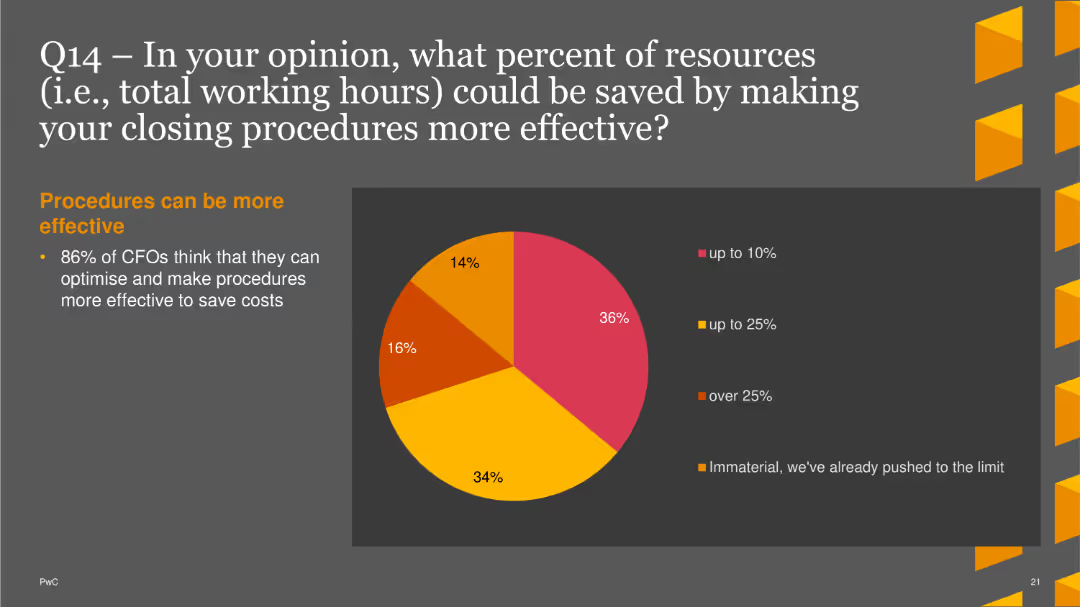
Four pie charts showing the current percentage of time spent on different tasks. Each chart is labeled with a task and its corresponding percentage
Operational Efficiency
Financial Services
This slide asks about current time allocation for tasks like data processing, analysis, forecasting, and decision-making within finance departments.
time allocation, data processing, analysis, forecasting, decision-making
Single Chart
PwC/Strategy&
Saved
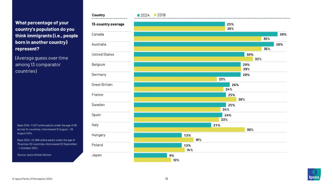
Dual bar chart (2024 vs 2018) showing perception trends in 13 countries; green and yellow bars distinguish years.
Market Analysis and Trends
Government & Public Sector
This trend slide compares changes over time in public perception of immigrant populations across 13 countries from 2018 to 2024. It shows whether the average guess has risen or fallen, revealing persistent overestimation in most cases.
trend analysis, immigration perception, longitudinal data, public opinion trends, overestimation, Ipsos data, perception change
Mixed Chart
IPSOS
Saved
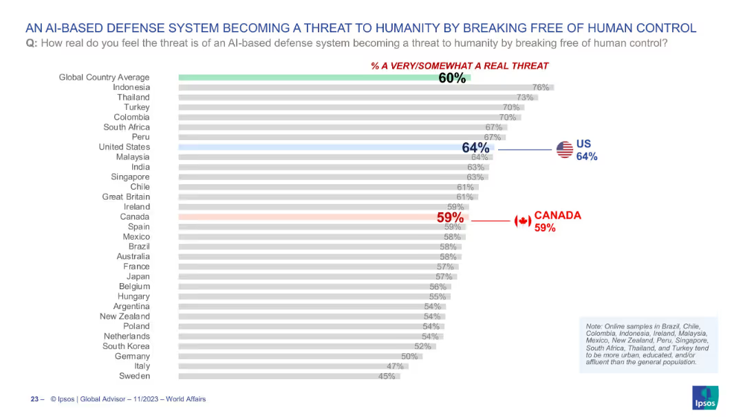
Horizontal bar chart depicting global views on AI-based defense systems becoming uncontrollable; highlights Canada and the US.
Risk Assessment and Management
Artificial Intelligence
This chart illustrates global concern over AI-based defense systems potentially becoming a threat to humanity by escaping human control. With the global average at 60%, the US and Canada register 64% and 59% respectively, reflecting moderate anxiety over emerging AI risks in military contexts.
AI threat, defense systems, artificial intelligence, control risk, public perception, survey, technology, Ipsos
Single Chart
IPSOS
Saved
Features pie charts showing percentages of online shopping and the influence of customer reviews, accompanied by a descriptive example.
Customer and Market Segmentation
Technology & Software
Discusses the shopping habits and preferences of young, digitally-savvy consumers, focusing on the importance of online reviews and the overall customer experience.
online shopping, consumer preferences, digital natives, customer reviews, e-commerce strategies, market insights, customer experience, engagement strategies
Multiple Chart
Accenture
Saved
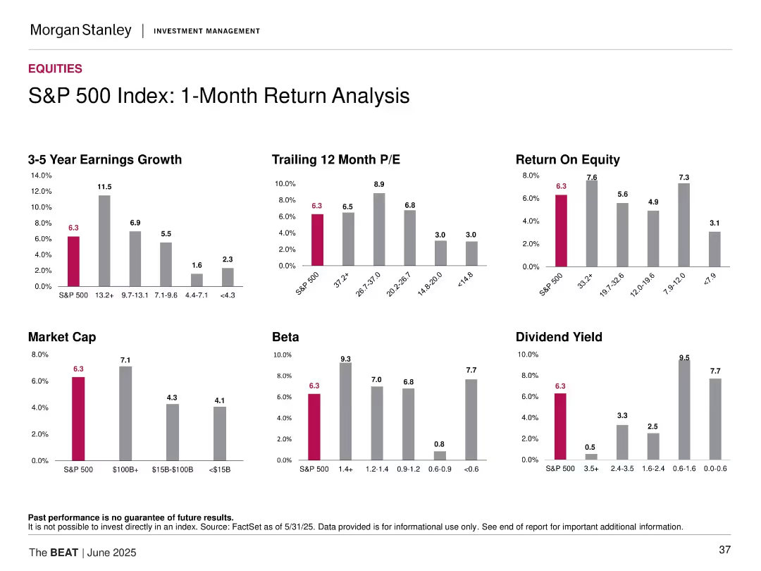
Grid of bar charts showing various metrics like ROE, P/E, dividend yield, earnings growth across different market cap and beta groups.
Performance Metrics and KPIs
Financial Services
This slide breaks down 1-month return data for the S&P 500 based on factors such as beta, market cap, and valuation. It compares the S&P 500's return against various cohorts and attributes performance to key financial metrics. Each subplot visualizes a different performance driver.
1-month return, S&P 500, financial metrics, ROE, dividend yield, beta, market cap, comparative analysis
Multiple Chart
Morgan Stanley
Saved
This slide contains a column chart and bar chart showing the growth of the European EO downstream market with detailed annotations. The layout is dense with textual information complementing the charts.
Market Analysis and Trends
Environmental Services & Sustainability
Focuses on the growth of the European Earth Observation downstream market, showing revenue forecasts and comparing different segments’ sales. It’s valuable for understanding regional market dynamics and growth potentials.
European market, growth forecast, revenue, market segments, Earth Observation
Multiple Chart
PwC/Strategy&
Saved
Features a column chart comparing gender distribution across different ranking scales for applications.
Strategic Planning
Professional Services
Analyzes gender distribution by application rank, showing differences in the proportion of female to male applicants across ranking categories.
gender, distribution, ranking, applications, analysis
Single Chart
Accenture
Saved
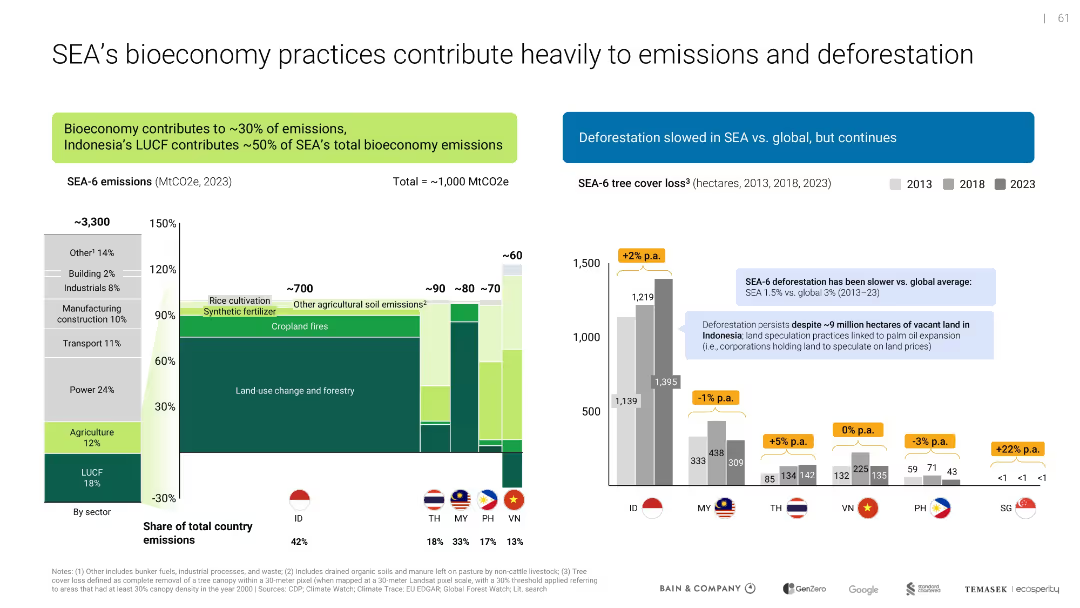
Side-by-side bar charts; one shows sector emissions breakdown, the other tracks deforestation trends by country
Risk Assessment and Management
Environmental Services & Sustainability
Analyzes emissions sources in SEA's bioeconomy, particularly land use change and agriculture. Deforestation data shows varied progress across countries, with Indonesia as a major contributor.
emissions, deforestation, LUCF, agriculture, SEA, sustainability, climate impact
Multiple Chart
Bain
Saved
The slide is divided into six sections, each with a circular chart showing performance metrics in areas like strategy, ESG guidelines, environmental impact, stakeholders, employee wellbeing, and governance. Each chart is color-coded and labeled with percentages.
Performance Metrics and KPIs
Environmental Services & Sustainability
This slide presents performance metrics for Croatian companies in various ESG-related segments, highlighting their strengths in strategy and business planning, stakeholder impact, and areas needing improvement. It uses circular charts to visually represent performance percentages.
Croatian, ESG, performance, metrics, strategy
Multiple Chart
Kearney
Saved
Features a divided column chart and a stacked bar chart with legends and percentages. The layout is clear, directing focus to the composition changes over time.
Risk Assessment and Management
Financial Services
Focuses on liquidity levels and high-quality liquid assets (HQLA), useful in discussions about financial stability and risk management.
liquidity, HQLA, stability, financial management
Single Chart
JP Morgan
Saved
Previous
Next
If nothing, comes up, please save your slides first
Create a FREE account to continue browsing
Receive Instant Access to 1,000+ slides from companies like McKinsey, Google, and Goldman Sachs
First Name
Last Name
Email
Password
I agree to all
Terms & Privacy Policy
Thank you! Your submission has been received!
Oops! Something went wrong while submitting the form.
Have an account?
Sign in
Column Chart
Heatmap
Chevron
Org Chart
Infographic
Callouts
Timeline
List
Graphic
Picture
Process Flow
Diagram
Paragraph
Map
Table
Framework
Subtitle
Takeaway Box
Icon
Other Chart
Radar Chart
Waterfall Chart
Mekko Chart
Pie Chart
Scatter Plot
Line Chart
Bar chart
Bullet points