Create a FREE Account
Instant access to 1,000+ real slides from top companies like McKinsey, BCG, Goldman Sachs, Google and many more!
First Name
Last Name
Email
Password
I agree to all
Terms & Privacy Policy
Thank you! Your submission has been received!
Oops! Something went wrong while submitting the form.
Have an account?
Sign in
Library
Templates
Courses
Pricing
My Account
My Slides
My Templates
✦ AI
AI Prompt Library
AI Search
Sign in
Start Here
Logout
My Saved Slides
This slide features arrows ranking five spending priorities in descending order, with annotations on budget allocation percentages and specific focus areas like old age grants.
Regulatory and Compliance
Government & Public Sector
Outlines the government's top financial priorities and the strategic allocation of funds to these areas.
Financial priorities, budget allocation, strategic planning
Linear Flow
PwC/Strategy&
Saved
Bar chart compares the prevalence of CDO roles by digital maturity of the organization.
Organizational Structure and Change
Technology & Software
Examines the trend of appointing Chief Digital Officers in companies at different stages of digital maturity.
CDO, digital transformation, digital maturity, leadership roles, organizational change
Multiple Chart
BCG
Saved
Presents a line graph tracking the increase in social media hashtags for home hobbies, supported by a prominent quote.
Market Analysis and Trends
Retail & E-commerce
Analyzes the stabilization of market interests in home-based hobbies, indicating a sustained engagement in these activities beyond the immediate reaction to global events.
Home hobbies, Market stabilization, Social media trends, Hashtags increase, Engagement continuity, Line graph, Market interests
Multiple Chart
Accenture
Saved
A comprehensive infographic detailing survey results on cyber-attacks, incident response, vulnerability management, and external engagement activities in the UK.
Risk Assessment and Management
Technology & Software
The slide provides an overview of the findings from the 2022 Cyber Security Breaches Survey, focusing on attack types, responses, and management.
infographic, cyber-attacks, survey, incident response, vulnerability, UK
Mixed Chart
IPSOS
Saved
The slide contains a line chart showing DEX to CEX spot trade volume (%) and a column chart showing DEX volume in billions. It has a clear blue and white color scheme with icons representing key points on the right side, which include self-custody of funds, lower barrier for issuers, regulations, and investor access.
Market Analysis and Trends
Financial Services
The slide discusses the growing market share of DEXs compared to CEXs, highlighting benefits like self-custody of funds, lower entry barriers for issuers, less stringent regulations, and increased investor access, supported by trade volume data.
DEX, CEX, market share, self-custody, regulations, investor access, trade volume
Mixed Chart
EY
Saved
Features a three-part diagram in shades of purple, each part highlighting a different social impact goal (access to finance, save money, reduce debt).
Operational Efficiency
Financial Services
This slide presents Experian's mission to leverage its platform to provide social benefits, detailing goals to improve financial access, save money for consumers, and reduce debt among US consumers.
social good, financial access, consumer savings, debt reduction, Experian
Pillar
Barclays
Saved
Slide displays multiple information blocks about specific financial products and services focused on environmental sustainability, accompanied by icons and bullet points detailing each initiative.
Investment Analysis
Financial Services
Explores Barclays' expansion into green financing through specialized teams and products, highlighting major projects and initiatives like Green Home Mortgages and the Energy Transition Group.
green finance, sustainability, investment opportunities, energy transition, financial services, environmental initiatives
Mixed Chart
Barclays
Saved
Horizontal stacked bar chart of countries showing belief that their country is in decline; includes historical agreement percentages by year.
Market Analysis and Trends
Government & Public Sector
Ranks countries by belief in national decline; South Africa, Netherlands, and Sweden top the list. Year-over-year data from 2016 to 2023 shows dynamic shifts.
country trends, decline sentiment, Ipsos, longitudinal, public opinion, country comparison
Mixed Chart
IPSOS
Saved
Bar chart by generational cohort (Gen Z, Millennials, Gen X, Boomers) showing percentages for each discriminatory scenario. Consistent visual design with previous slide.
Risk Assessment and Management
Government & Public Sector
This slide compares experiences of gender discrimination across age groups. Gen Z reports the highest levels of witnessing sexist comments and other behaviors, while Boomers report the least. The chart emphasizes generational differences in social awareness and experience.
age cohorts, gender bias, workplace equity, generational comparison, harassment, discrimination trends
Mixed Chart
IPSOS
Saved
Consists of a mixture of infographics including icons and a small bar graph. Green and black are the primary colors used, enhancing the readability and focus on the statistics.
Financial Performance
Education & Training
Analyzes the social return on investment from the National Community Hubs Program, breaking down benefits into engagement, early childhood, English proficiency, and vocational pathways. The slide quantifies benefits in monetary terms and describes impact on community services.
social return, community hubs, investment, education, employment
Pillar
Deloitte
Saved
A column chart displays the spread analysis for various financial instruments, with high, low, and median values. Each category is color-coded.
Financial Performance
Financial Services
The slide analyzes spread data for different financial instruments over time, providing insights into current and historical spreads in basis points.
Spread Analysis, Financial Instruments, Basis Points, Historical Data
Mixed Chart
Morgan Stanley
Saved
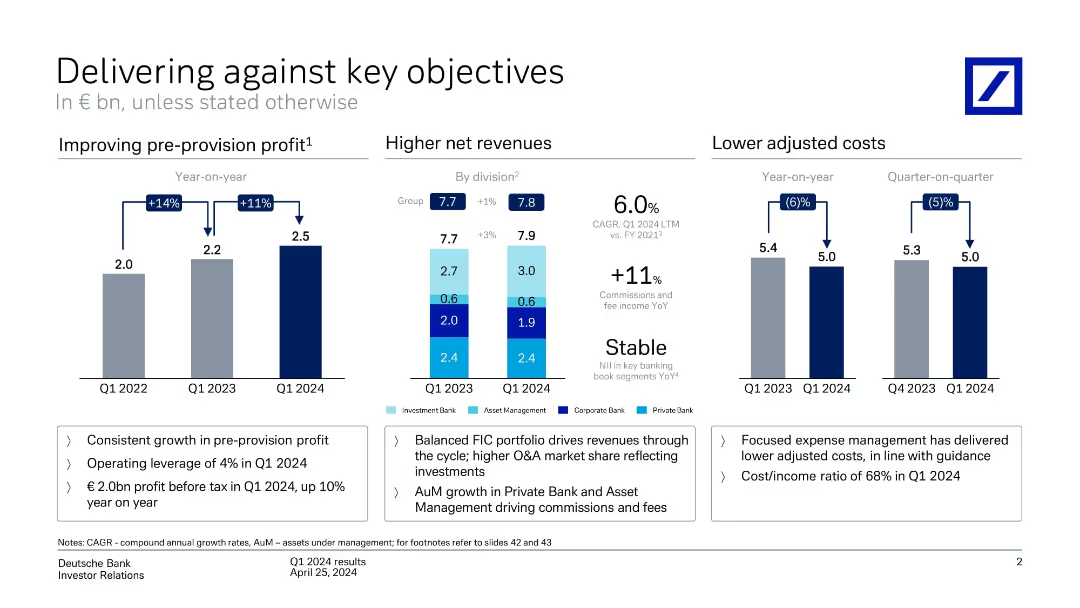
Three-part layout: bar charts for pre-provision profit, net revenue by division, and adjusted costs. Color-coded by segment with highlights below.
Performance Metrics and KPIs
Financial Services
Shows year-on-year improvement in pre-provision profit (+11%), stable revenue (+1%), and decreased costs (-6%). Emphasizes operating leverage, cost/income ratio, and revenue growth from balanced business model.
revenue, costs, profit, KPIs, business units, growth
Multiple Chart
Deutsche Bank
Saved
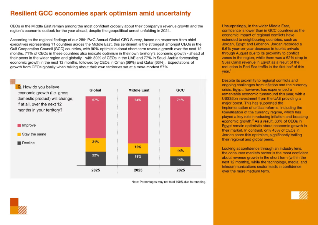
Mixed layout with left-side chart comparing optimism levels (global vs GCC), and right-side narrative text with orange highlights. Regionally themed.
Market Analysis and Trends
Professional Services
This slide highlights optimism among GCC CEOs about short-term revenue and economic growth despite geopolitical uncertainty. It contrasts GCC confidence levels with global and regional peers and discusses positive investor sentiment in Egypt versus lower confidence in Jordan.
GCC economies, optimism, economic growth, Middle East, CEO confidence, regional outlook
Mixed Chart
PwC/Strategy&
Saved
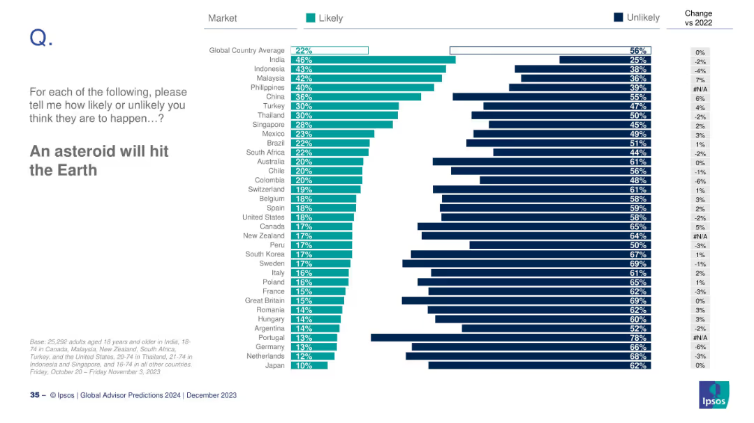
Bar chart ranked by countries on perceived asteroid impact risk; includes changes vs 2022.
Risk Assessment and Management
Government & Public Sector
The slide explores global public belief in the likelihood of an asteroid striking Earth. India shows the highest concern, while Japan shows the least. The global average is 22%, with minimal change since 2022.
asteroid, risk, global disaster, Ipsos, public belief, 2024 prediction
Mixed Chart
IPSOS
Saved
Slide includes lists and icons under headings "PROGRESS" and "WORKSTREAMS", detailing steps in a 3-year transformation plan.
Operational Efficiency
Consumer Goods
Explains the operational transformation roadmap with anticipated benefits like margin enhancement and support of financial targets.
transformation, operational efficiency, margin enhancement, financial targets, roadmap, icons
Boxed
Barclays
Saved
The slide features bar charts detailing different levers in controlling and finance, with a focus on activity levels and trends.
Financial Performance
Financial Services
Discusses key levers in controlling and finance, emphasizing efficiency improvements in back-office services and cost optimizations.
Controlling, Finance, Efficiency, Back-office, Trends
Single Chart
Roland Berger
Saved
Dominated by graphical data, this slide displays two main charts: the Eurozone real GDP forecast and the Eurocoin index, represented by bars and dots respectively. Text is limited, providing only sources and brief descriptions. The color palette includes shades of blue, black, and white. The slide design is clear, with each chart labeled and axis demarcated, promoting easy data interpretation.
Market Analysis and Trends
Financial Services
The slide illustrates IMF's economic forecasts and the Eurozone Eurocoin index, comparing them against other projections and historical data. It's typically used in economic or financial presentations to analyze trends, guide investment decisions, or provide economic forecasts.
IMF, GDP forecast, Eurozone, Eurocoin index, economic indicators
Multiple Chart
McKinsey
Saved
The slide outlines team, category, and supplier excellence pillars with icons and a diagram of Kearney's House of Purchasing and SupplySM.
Human Resources and Talent Management
Professional Services
It describes the pillars for sustained procurement performance, highlighting the roles of team excellence, category excellence, and supplier excellence.
Team excellence, category excellence, supplier excellence, procurement, performance, talent
Diagram
Kearney
Saved
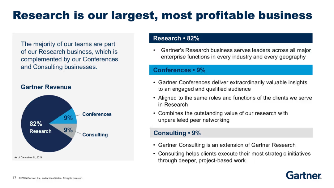
Pie chart with 82% research, 9% consulting, 9% conferences; text-heavy right section explains each revenue segment.
Organizational Structure and Change
Technology & Software
The slide emphasizes that Gartner's revenue is primarily driven by research services. It also explains the contributions of its conference and consulting segments, showcasing their complementary role to the research business.
revenue split, research, consulting, conferences, Gartner, business mix
Mixed Chart
Gartner
Saved
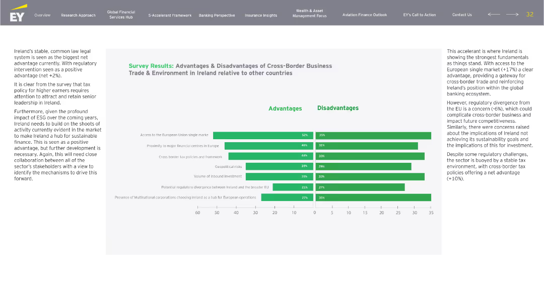
Side-by-side bar chart analysis with descriptive paragraph to the left and horizontal bar charts in green to the right. Advantages and disadvantages split, same categories reused from earlier.
Market Analysis and Trends
Financial Services
Expands on the earlier trade slide with more granular survey data. Reinforces Ireland’s edge in EU access and global HQ proximity, but flags regulatory divergence and sustainability gaps as concerns. Presents stakeholders’ feedback for future policy alignment.
cross-border, EU, trade, sustainability, regulation, investment
Mixed Chart
EY
Saved
The slide features a donut chart, a column chart, and a scale graphic. The left side shows the remote work preference index, and the right side explains the scoring.
Human Resources and Talent Management
Professional Services
Introduces the Remote Work Preference Index, quantifying employee preferences for remote work models and highlighting key statistics and scoring methodology.
remote work, preference index, survey, scoring, employee preferences
Mixed Chart
EY
Saved
Contains a mixture of images and text, with highlighted numerical targets and progress indicators in bold fonts, set against a background image of solar panels, which implies a green investment focus.
Corporate Finance and Valuation
Financial Services
Highlights a financial firm’s goals and progress in sustainable and inclusive economic practices, ideal for investor relations or sustainability reporting.
Sustainable Development, Green Goals, Community, Racial Equity, Investment
Mixed Chart
JP Morgan
Saved
The slide features multiple column charts with percentages indicating new car purchase intent and changes in mobility mode.
Market Analysis and Trends
Transportation & Logistics
Analyzes the impact of COVID-19 on consumer behaviors related to car buying, aftermarket services, and mobility preferences.
COVID-19, car purchase, mobility, consumer behavior, market analysis
Multiple Chart
McKinsey
Saved
Black background with blue text boxes and white headers displaying statistics about the COVID-19 spread.
Market Analysis and Trends
Healthcare & Pharmaceuticals
Shows the acceleration of the global spread of COVID-19, including statistics on cases, deaths, and countries affected as of a specific date.
global spread, statistics, COVID-19, cases, deaths
Table
McKinsey
Saved
This slide shows the distribution of food loss across different stages of the agricultural value chain in Nigeria, using column charts to highlight the significant economic impact of these losses.
Strategic Planning
Agriculture & Food Production
The slide details the economic toll of food loss in Nigeria, mapping the journey of food from production to retail and illustrating how losses at each stage contribute to a substantial reduction in GDP. It emphasizes the need for strategic interventions in the agricultural sector.
Food Loss, GDP, Agriculture, Nigeria, Economic Impact
Mixed Chart
BCG
Saved
Previous
Next
If nothing, comes up, please save your slides first
Create a FREE account to continue browsing
Receive Instant Access to 1,000+ slides from companies like McKinsey, Google, and Goldman Sachs
First Name
Last Name
Email
Password
I agree to all
Terms & Privacy Policy
Thank you! Your submission has been received!
Oops! Something went wrong while submitting the form.
Have an account?
Sign in
Column Chart
Heatmap
Chevron
Org Chart
Infographic
Callouts
Timeline
List
Graphic
Picture
Process Flow
Diagram
Paragraph
Map
Table
Framework
Subtitle
Takeaway Box
Icon
Other Chart
Radar Chart
Waterfall Chart
Mekko Chart
Pie Chart
Scatter Plot
Line Chart
Bar chart
Bullet points