Create a FREE Account
Instant access to 1,000+ real slides from top companies like McKinsey, BCG, Goldman Sachs, Google and many more!
First Name
Last Name
Email
Password
I agree to all
Terms & Privacy Policy
Thank you! Your submission has been received!
Oops! Something went wrong while submitting the form.
Have an account?
Sign in
Library
Templates
Courses
Pricing
My Account
My Slides
My Templates
✦ AI
AI Prompt Library
AI Search
Sign in
Start Here
Logout
My Saved Slides
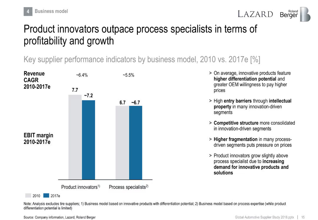
Side-by-side bar chart comparing product innovators vs. process specialists in EBIT margin and revenue CAGR.
Strategic Planning
Industrial & Manufacturing
Differentiates performance between product and process-focused suppliers. Product innovators lead in profitability due to differentiation and IP, while process specialists face fragmentation and pricing pressure.
product innovation, differentiation, process specialist, EBIT margin, growth, IP
Mixed Chart
Roland Berger
Saved
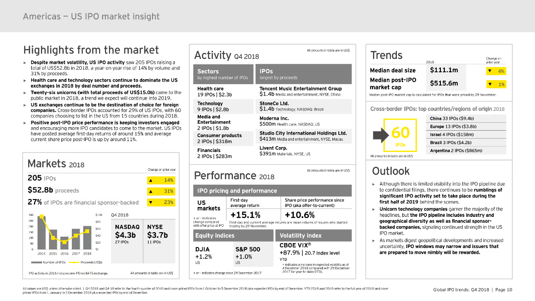
The slide contains multiple sections with various charts and graphs, including column charts, data tables, and infographic elements. Key areas include highlights, markets, activity, performance, trends, and outlook. The layout is dense, presenting a comprehensive overview of the US IPO market in 2018.
Market Analysis and Trends
Financial Services
Provides an in-depth analysis of the US IPO market in 2018, highlighting market volatility, activity, performance, and trends. It includes detailed statistics and predictions for future trends, making it suitable for financial analysis and strategic planning.
IPO, US market, trends, performance, 2018, financial analysis
Mixed Chart
EY
Saved
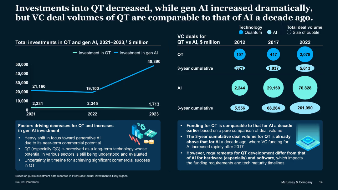
Dual-axis line and bubble charts with infographics and supporting analysis
Strategic Planning
Artificial Intelligence
Contrasts declining QT investment with surging Gen AI investment, highlighting a shift in investor focus. Shows QT VC deal volume today is similar to AI a decade ago. Notes differences in funding patterns due to maturity and hardware/software needs.
Gen AI, venture capital, QT deal volume, investment trend, deal history
Single Chart
McKinsey
Saved
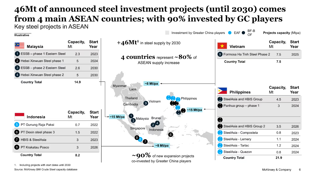
The slide includes a map highlighting key steel projects in ASEAN countries, with accompanying tables listing project capacities and start years.
Investment Analysis
Industrial & Manufacturing
This slide details 46Mt of announced steel investment projects in ASEAN countries, with specific projects listed by country, showing capacities and start years, emphasizing Chinese investment.
steel investment, ASEAN, projects, capacity, Chinese investment
Graphic
McKinsey
Saved
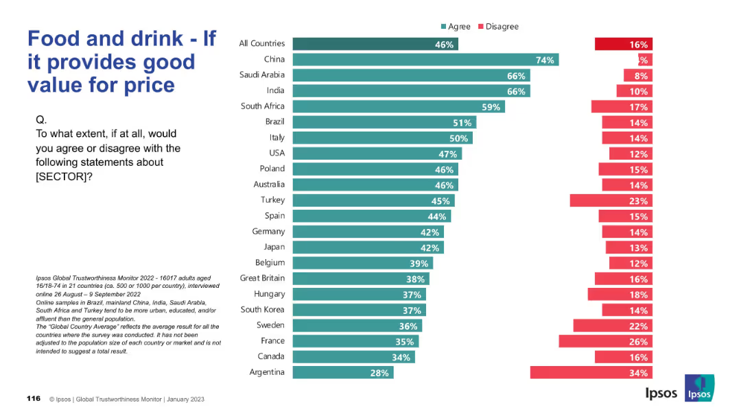
Bar chart split by countries showing agreement/disagreement on whether the sector delivers good value.
Pricing Strategies
Consumer Goods
This chart presents public opinion on whether the food and drink sector offers good value for money. China, Saudi Arabia, and India lead in agreement, indicating strong consumer satisfaction in pricing.
value for price, pricing, consumer satisfaction, Ipsos, food and drink, international survey, affordability, global opinions
Mixed Chart
IPSOS
Saved
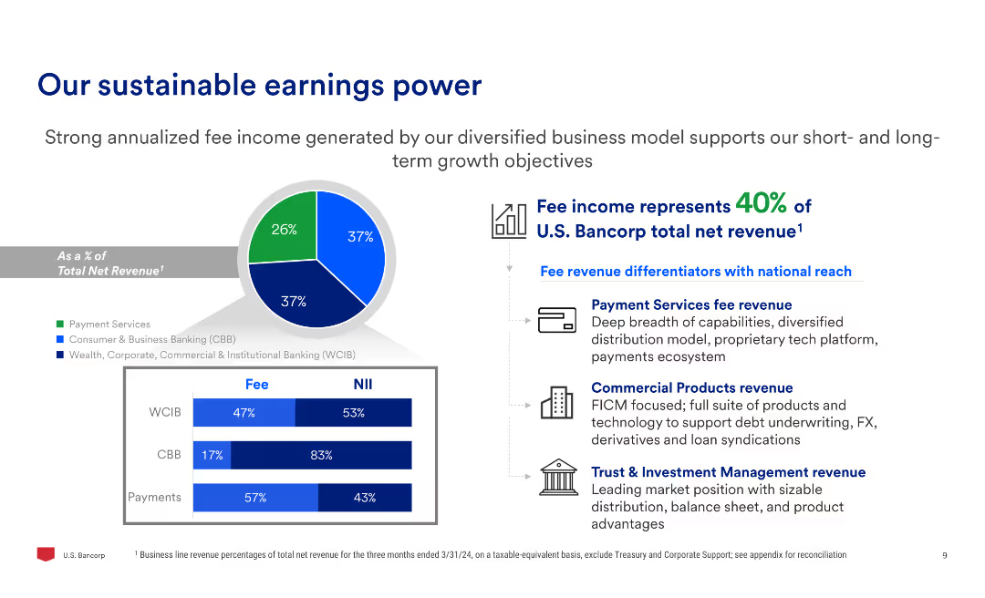
Includes a pie chart showing fee income composition and three bar charts detailing fee and net interest income (NII) breakdowns across three segments: WCIB, CBB, and Payments.
Financial Performance
Financial Services
Emphasizes the strength of U.S. Bancorp's diversified fee income, showing the percentage of total net revenue derived from different business segments, and outlines key revenue differentiators.
earnings, power, fee income, revenue, WCIB, CBB, payments, net interest income
Multiple Chart
Barclays
Saved
This slide presents multiple column charts and tables detailing loans by segment and type, with a key highlights section on the right. The design is moderate, with clear visual divisions between sections.
Financial Performance
Financial Services
Provides a breakdown of loans and net interest income across business segments. Typically used in risk assessments, financial analysis, and investor briefings to illustrate credit distribution and interest income dynamics.
Loans, Net Interest Income, Global Banking, Asset Management
Multiple Chart
Goldman Sachs
Saved
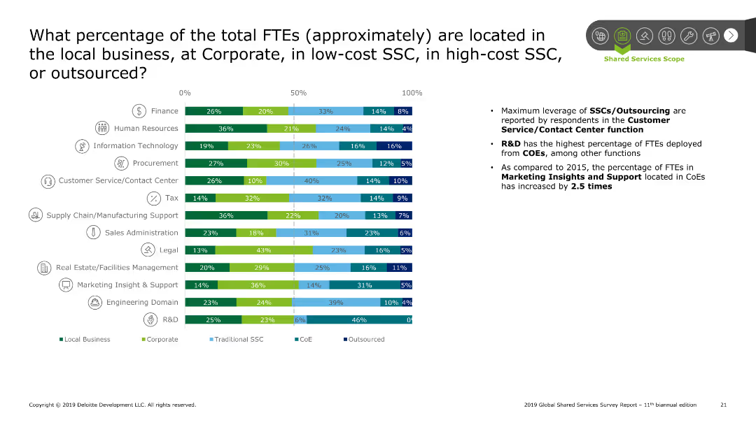
Bar chart showing the percentage of FTEs located across different settings (local, corporate, SSC, CoE, outsourced) for various functions. Summary points on the right discuss trends and findings.
Performance Metrics and KPIs
Professional Services
The slide analyzes the percentage of FTEs distributed across local business, corporate, SSCs, and outsourcing. The bar chart breaks down this data by function, highlighting significant leverage of SSCs/outsourcing in customer service and R&D. Summary points discuss the increase in FTEs located in CoEs compared to 2015.
SSC, FTE location, corporate, local, outsourcing
Mixed Chart
Deloitte
Saved
Displays a column chart showing payments revenue growth and a list detailing leadership positions and growth statistics.
Financial Performance
Financial Services
Highlights record growth in the payments sector and the firm’s leadership across various performance metrics.
Payments Revenue, Growth, Leadership, Market Share, Digital Banking, Transaction Value
Mixed Chart
JP Morgan
Saved
The slide includes two column charts comparing the application of BEV, GH2, and LH2 technologies across various segments for Vision 2030 and 2040. Comments section highlights key insights.
Market Analysis and Trends
Energy & Utilities
Discusses the expected dominance of BEV and Gaseous H2 in zero-emission technology over the next decade and limited application of Liquid H2.
BEV, GH2, LH2, zero-emission, Vision 2030, Vision 2040, application, comparison, market trends
Table
Roland Berger
Saved
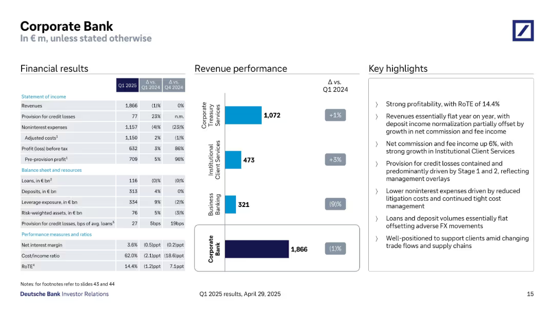
Three-column layout: financial results table (left), bar chart revenue performance (middle), and bullet-point highlights (right).
Financial Performance
Financial Services
Presents Q1 2025 results for the Corporate Bank, including revenue (€1.87B), costs, profit before tax (€632M), and segment performance. Highlights stable revenues, cost control, and strong profitability with a RoTE of 14.4%.
revenues, corporate bank, profitability, RoTE, deposit volumes, commission income, credit loss, Q1 2025
Mixed Chart
Deutsche Bank
Saved
The slide is structured into three main sections—financial, strategic, and operational highlights—with each section using bullet points for clarity. The design is visually straightforward with a consistent color theme of various shades of green, and includes Quilter's logo at the bottom. Each section is clearly labeled and provides concise information on the company's performance and strategic moves.
Financial Performance
Financial Services
The slide summarizes Quilter's performance in the first half of 2019, including financial results, strategic investments, and operational progress, and is suited for executive summaries or shareholder updates.
Quilter, H1 2019, Financial Performance, Strategic Investments, Operational Efficiency, Capital Ratio, Dividend, Business Focus, Optimization Progress
Table
Morgan Stanley
Saved
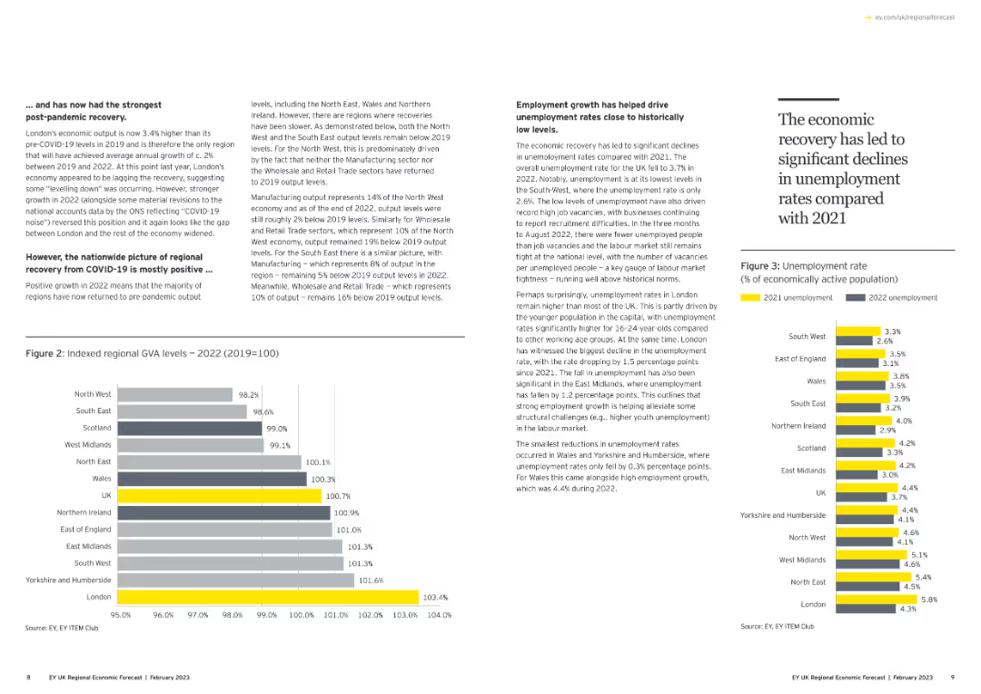
Contains a column chart showing indexed regional GVA levels and another column chart showing unemployment rates. Text discusses economic recovery trends.
Market Analysis and Trends
Government & Public Sector
Analyzes regional GVA levels post-COVID-19 and the employment growth that has helped drive down unemployment rates to historically low levels.
GVA, unemployment, economic recovery, regional analysis, column chart
Multiple Chart
EY
Saved
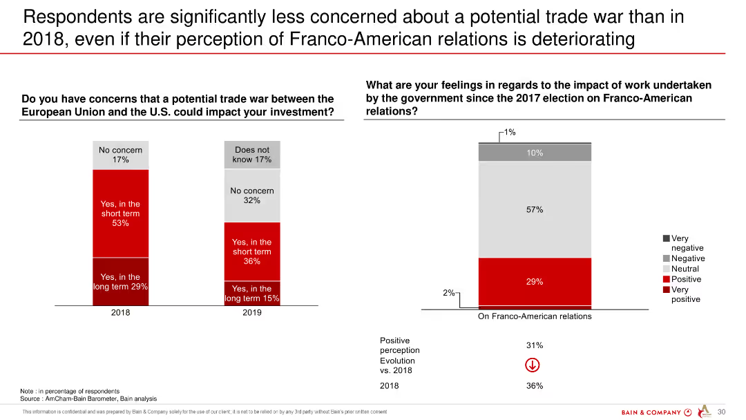
The slide displays two column charts. The left chart compares concerns about a trade war in 2018 and 2019, while the right chart shows respondents' feelings about Franco-American relations over the same period.
Market Analysis and Trends
Government & Public Sector
The slide shows a decrease in concerns about a trade war between the EU and the US from 2018 to 2019, despite worsening perceptions of Franco-American relations.
trade war, Franco-American relations, perceptions, EU, US, survey, comparison
Multiple Chart
Bain
Saved
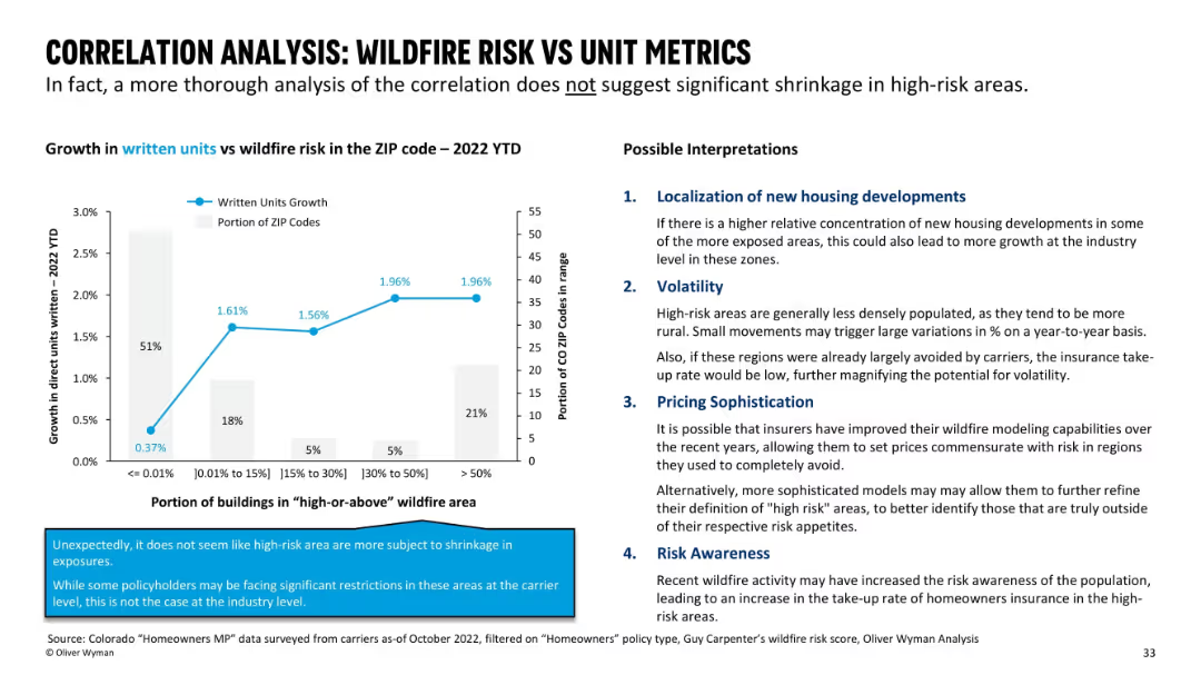
Split-slide format with a line graph on the left and a bulleted interpretation section on the right; blue and grey color palette with bolded headers and emphasized data points.
Risk Assessment and Management
Financial Services
The slide analyzes how wildfire risk correlates with written insurance unit growth by ZIP code for 2022. It reveals that there is no significant shrinkage in high-risk zones, and outlines four possible interpretations: new housing development, volatility, pricing sophistication, and risk awareness.
wildfire, risk, insurance, unit growth, ZIP code, volatility, pricing, awareness, correlation, interpretation
Mixed Chart
Oliver Wyman
Saved
Features two vertical column charts displaying issuances and redemptions from 2023-2027+, alongside a list of recent funding activities.
Investment Analysis
Financial Services
Analyzes UBS Group AG's capital market activities, including bond issuances and redemptions, funding plans, and strategies for future issuances.
UBS, bonds, issuances, redemptions, funding, capital markets, investment, diversification, maturity
Mixed Chart
UBS
Saved
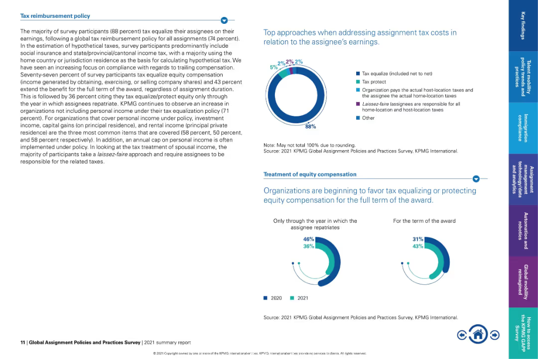
Left-heavy text panel with explanatory text; right side contains donut charts and dual-year bar charts.
Regulatory and Compliance
Financial Services
Describes how organizations manage tax reimbursement for assignees, showing 88% use tax equalization. Discusses equity compensation treatment trends and highlights a shift towards full-term protection of awards rather than just through repatriation.
tax equalization, equity compensation, global assignments, tax policy, compliance, KPMG, expat tax treatment
Multiple Chart
KPMG
Saved
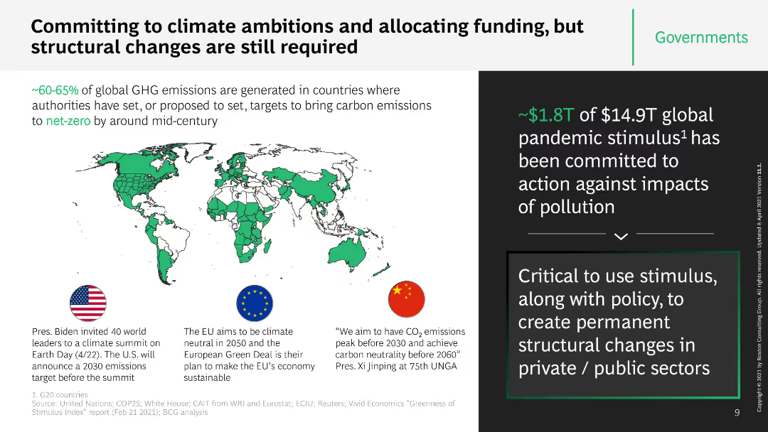
This slide features a world map highlighting countries with climate ambitions, alongside key statistics and text boxes with information on funding commitments. It uses icons and a structured layout to separate different pieces of information.
Strategic Planning
Government & Public Sector
The slide discusses global efforts and commitments to climate ambitions, emphasizing the importance of structural changes and funding allocations. It includes specific examples from the US, EU, and China, and mentions the $1.8T pandemic stimulus.
climate ambitions, funding, global efforts, structural changes, stimulus
Boxed
BCG
Saved
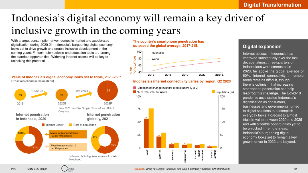
The slide contains text, a column chart showing smartphone penetration, pie charts on internet penetration, and a map. The layout is visually dense with multiple data points but remains well-structured for readability.
Market Analysis and Trends
Telecommunications
This slide highlights the growth of Indonesia's digital economy, emphasizing increased internet connectivity and smartphone usage. It discusses potential economic impacts and future opportunities in digital expansion.
Digital Economy, Indonesia, Growth, Internet, Smartphone
Multiple Chart
PwC/Strategy&
Saved
The slide includes a line chart showing the growth of blockchain project volume over several years, with a breakdown of services offered in a box on the right.
Market Analysis and Trends
Technology & Software
This slide illustrates the growth in blockchain project volume, emphasizing a steady increase over time, though not at the high rate of the previous fiscal year, with services like development and advisory.
blockchain, project volume, growth trends, development services, advisory services
Single Chart
EY
Saved
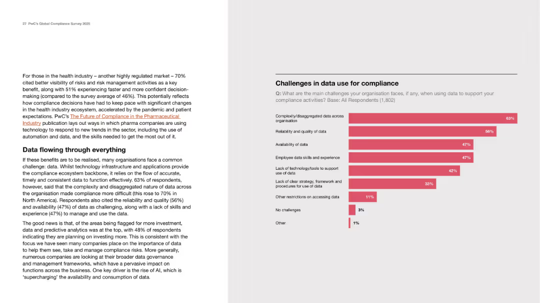
Two-column layout with explanatory text on left and horizontal bar chart on right showing survey data.
Risk Assessment and Management
Healthcare & Pharmaceuticals
The slide highlights the challenges organizations face in using data for compliance, particularly in highly regulated sectors like healthcare. It discusses fragmented data, poor data quality, lack of tools, and skills gaps. A bar chart quantifies the top challenges reported by 1,802 respondents, with data complexity and quality being most cited.
data challenges, compliance, healthcare, risk, skills, infrastructure
Mixed Chart
PwC/Strategy&
Saved
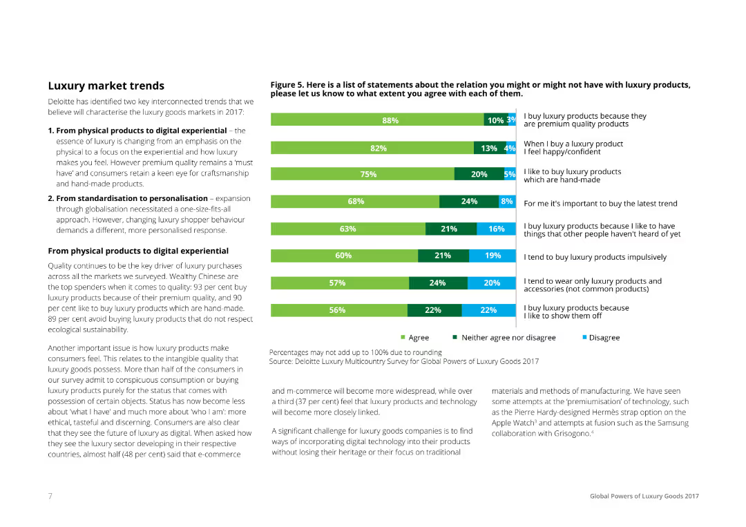
A mix of text and a horizontal bar chart, listing statements about luxury products and consumer agreements. Bars are segmented to show percentages of agreement, neutrality, and disagreement, color-coded in green, gray, and blue respectively.
Market Analysis and Trends
Consumer Goods
The slide discusses luxury market trends identified by Deloitte, focusing on the shift from physical products to digital experiences and from standardization to personalization. It includes consumer survey data on various luxury product statements.
Luxury, Market, Trends, Consumer, Survey
Mixed Chart
Deloitte
Saved
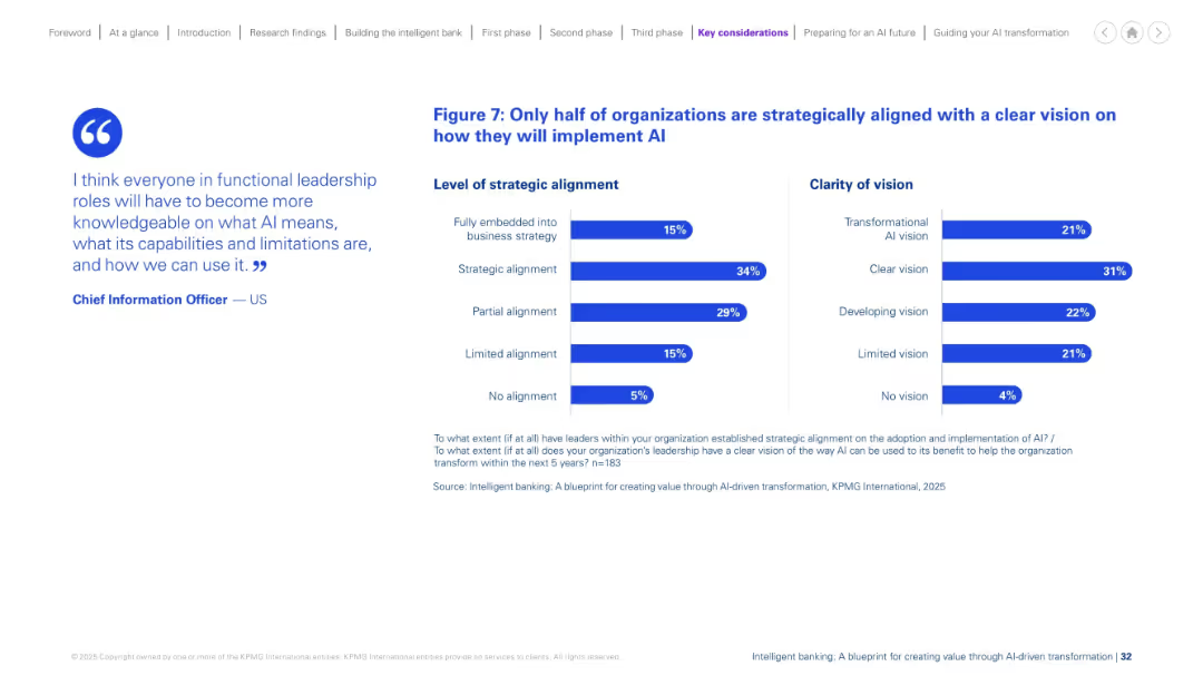
Split-layout slide with a quote on the left and two horizontal bar charts on the right, each showing survey percentages.
Strategic Planning
Financial Services
This slide presents findings on AI strategy alignment and vision clarity in organizations. Only 15% are fully embedded into strategy, and only 31% have a clear vision. It emphasizes gaps in strategic alignment and AI foresight.
AI implementation, strategic alignment, clarity, transformation, survey, statistics, business strategy, vision, leadership, organizational change
Mixed Chart
KPMG
Saved
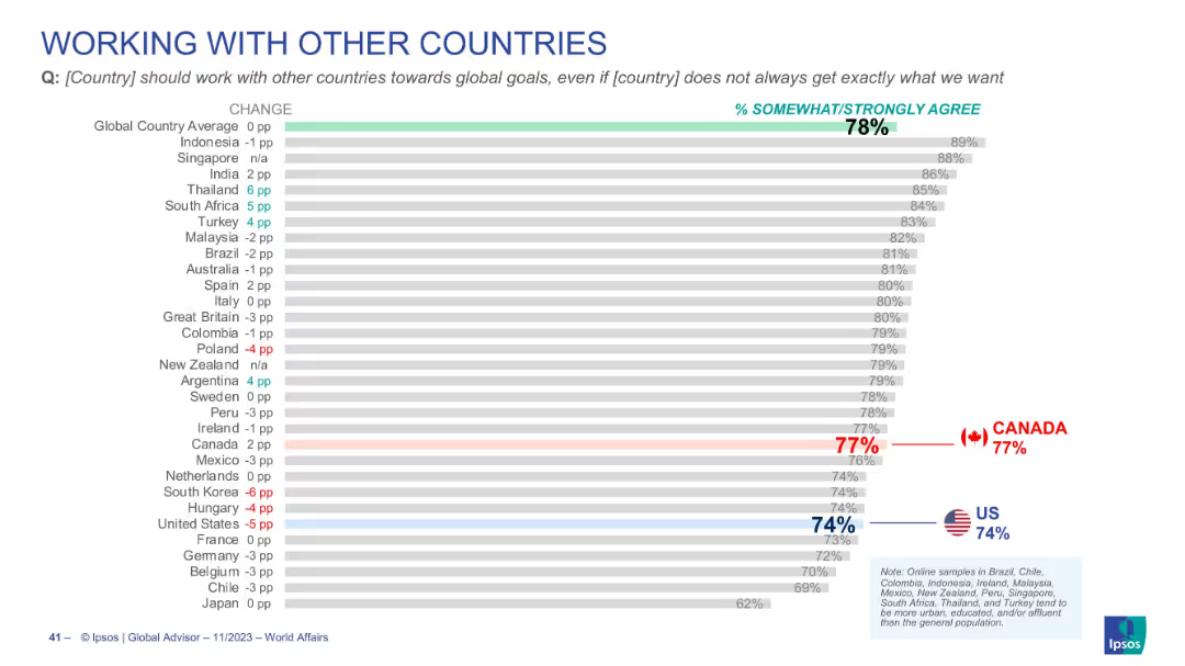
Bar chart visualizing agreement on global cooperation, global average is 78%, Canada 77%, U.S. 74%
Strategic Planning
Government & Public Sector
Highlights citizen agreement with global cooperation even at the cost of not always achieving national objectives. Emphasizes internationalism, with Canada and the U.S. near the global average.
international cooperation, diplomacy, global goals, foreign policy, Canada, US, Ipsos
Single Chart
IPSOS
Saved
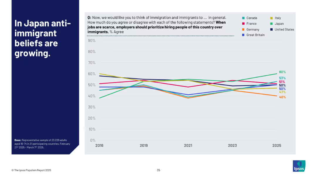
Line chart showing % agreement over time (2016–2025) by country; countries are color-coded; bold title on left in blue block
Market Analysis and Trends
Government & Public Sector
This slide highlights the increasing percentage of people in Japan who believe locals should be prioritized over immigrants during job shortages. It compares this belief across G7 countries from 2016 to 2025, showing Japan's notable upward trend while others remain steady or decline.
anti-immigrant, Japan, G7 countries, job scarcity, trends, Ipsos, belief tracking, nationalism, workforce, timeline analysis
Mixed Chart
IPSOS
Saved
Previous
Next
If nothing, comes up, please save your slides first
Create a FREE account to continue browsing
Receive Instant Access to 1,000+ slides from companies like McKinsey, Google, and Goldman Sachs
First Name
Last Name
Email
Password
I agree to all
Terms & Privacy Policy
Thank you! Your submission has been received!
Oops! Something went wrong while submitting the form.
Have an account?
Sign in
Column Chart
Heatmap
Chevron
Org Chart
Infographic
Callouts
Timeline
List
Graphic
Picture
Process Flow
Diagram
Paragraph
Map
Table
Framework
Subtitle
Takeaway Box
Icon
Other Chart
Radar Chart
Waterfall Chart
Mekko Chart
Pie Chart
Scatter Plot
Line Chart
Bar chart
Bullet points