Create a FREE Account
Instant access to 1,000+ real slides from top companies like McKinsey, BCG, Goldman Sachs, Google and many more!
First Name
Last Name
Email
Password
I agree to all
Terms & Privacy Policy
Thank you! Your submission has been received!
Oops! Something went wrong while submitting the form.
Have an account?
Sign in
Library
Templates
Courses
Pricing
My Account
My Slides
My Templates
✦ AI
AI Prompt Library
AI Search
Sign in
Start Here
Logout
My Saved Slides
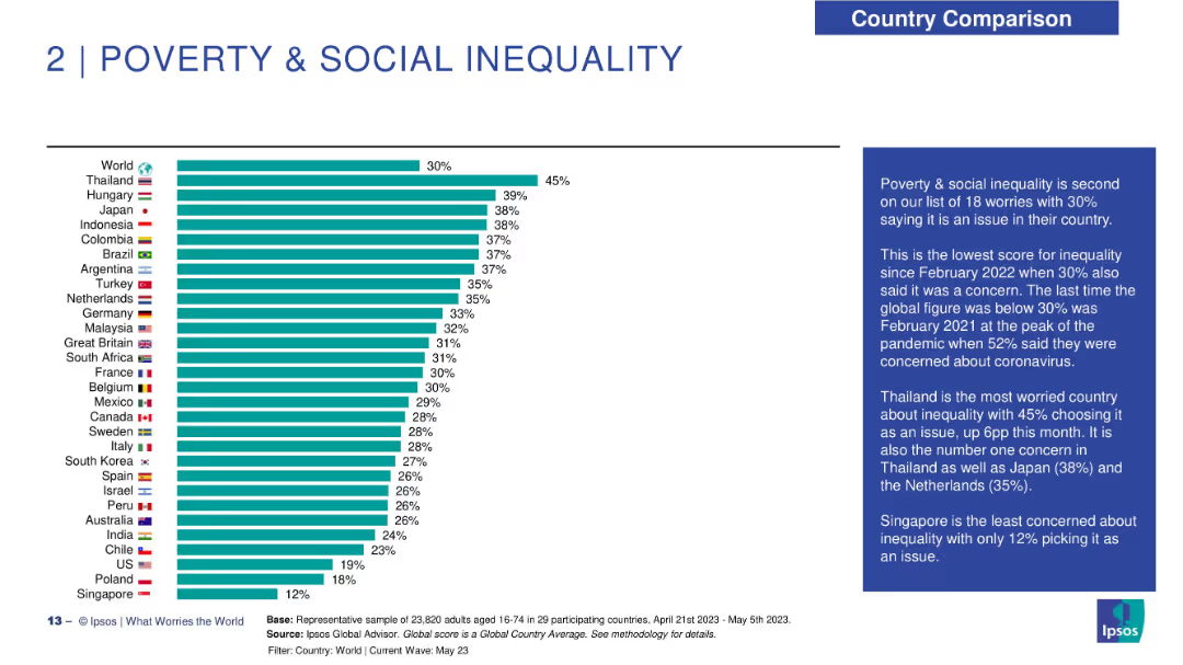
Horizontal bar chart on the left showing percentage of people concerned about poverty and inequality across countries. Flags and country names on left; bars extend right with percentages. Right panel has a narrative box in dark blue. Clear, minimalist design.
Market Analysis and Trends
Government & Public Sector
The slide highlights concern levels around poverty and social inequality globally. Thailand ranks highest (45%), while Singapore is the least concerned (12%). The global average concern is 30%, tied with February 2022 as the lowest recent level. The slide provides insights into public perception trends and highlights countries where inequality is the top concern.
poverty, social inequality, concern levels, Ipsos, survey results, global sentiment, economic disparity, regional comparison, public perception, inequality trend
Mixed Chart
IPSOS
Saved
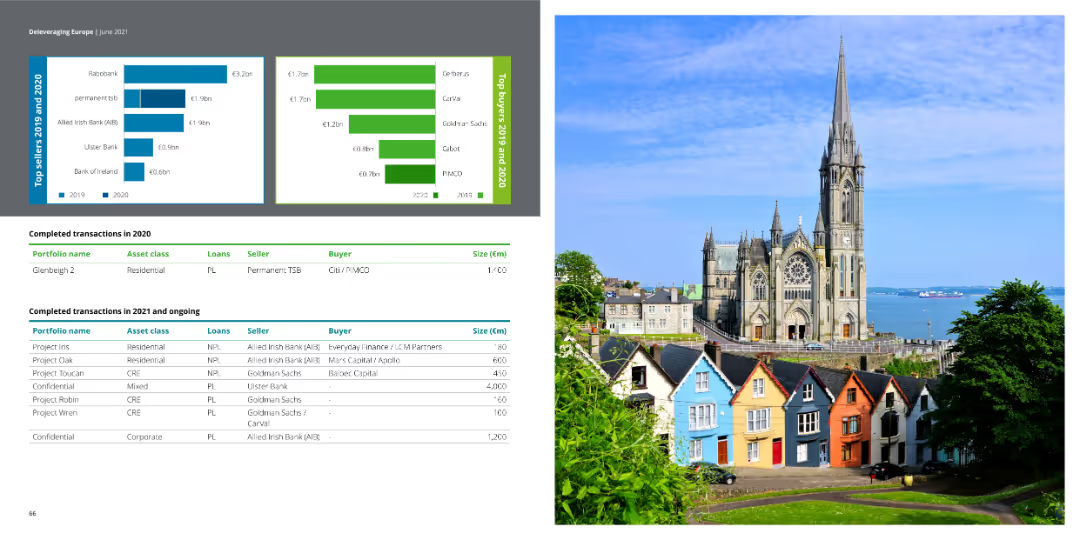
The slide contains column charts showing top sellers and buyers in 2019 and 2020. It also includes two tables of transaction data.
Financial Performance
Financial Services
This slide details completed transactions in 2020 and ongoing ones in 2021, showing top sellers and buyers with financial details.
transactions, financial services, column chart, sellers, buyers
Multiple Chart
Deloitte
Saved
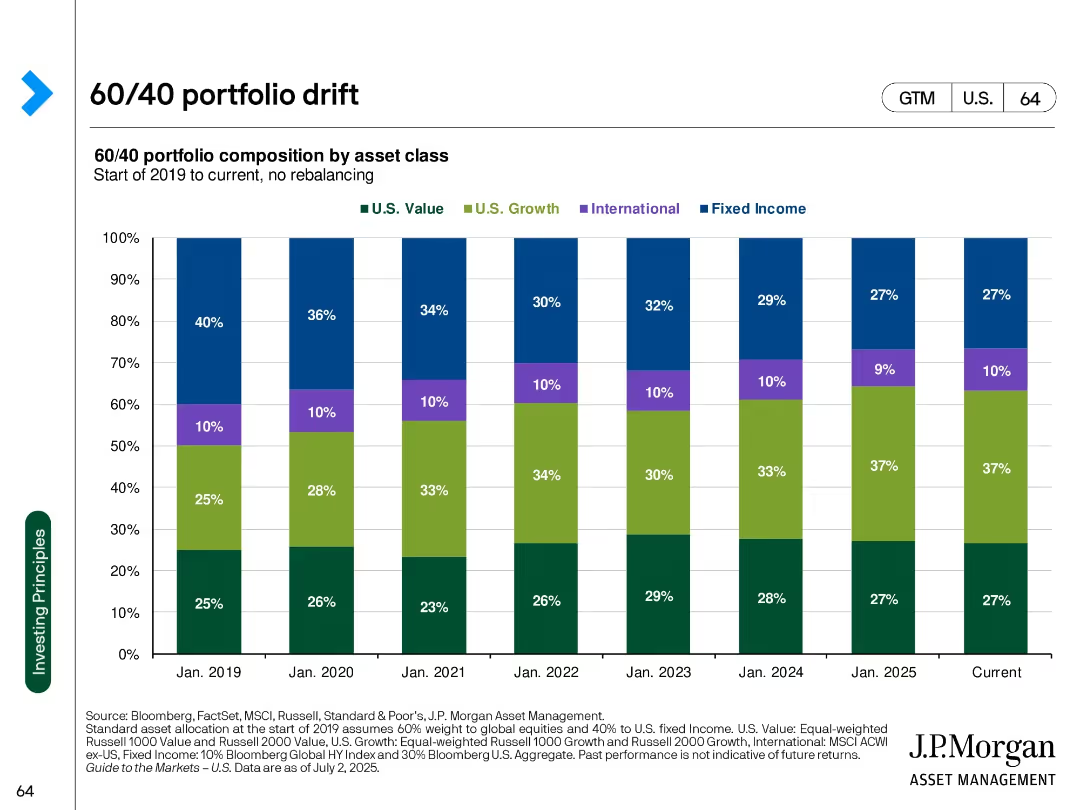
Stacked bar chart over time showing evolving composition of a 60/40 portfolio without rebalancing
Strategic Planning
Financial Services
Visualizes how a 60/40 portfolio's asset composition has shifted from 2019 to 2025 due to market movements without rebalancing. Highlights growth of U.S. Growth equity share.
asset drift, 60/40 portfolio, rebalancing, portfolio composition, U.S. growth, fixed income, equity allocation
Single Chart
JP Morgan
Saved
The slide has three sections detailing growth, margin expansion, and free cash flow, with icons and bullet points highlighting key financial metrics and strategies.
Investment Analysis
Financial Services
It explains why investors value Gartner, focusing on growth, margin expansion, and free cash flow as key financial performance indicators and investment attractions.
Gartner, investors, growth, margin expansion, free cash flow, financial performance
Pillar
Gartner
Saved
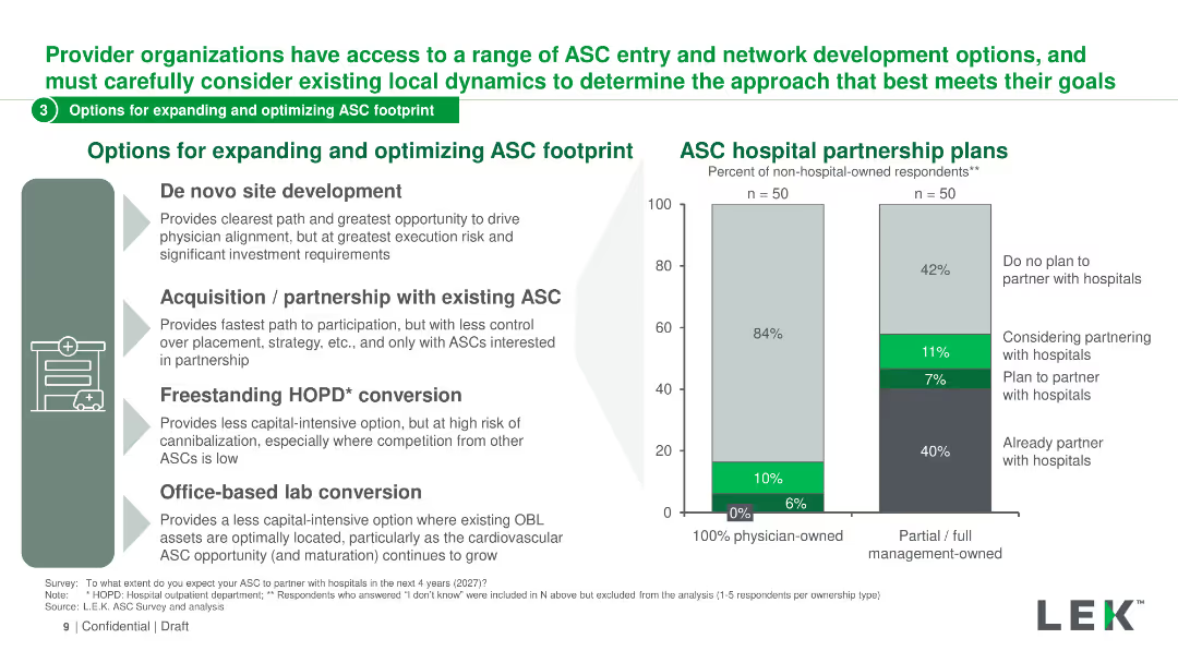
The slide features a mix of text and a column chart. The left side lists four options with icons, and the right side shows a column chart of ASC hospital partnership plans.
Strategic Planning
Healthcare & Pharmaceuticals
The slide discusses various options for expanding and optimizing the ASC footprint, including site development, partnerships, conversions, and lab conversions.
ASC, hospital, partnership, optimization, strategy
Mixed Chart
LEK
Saved
The slide includes line charts comparing AAA muni-to-treasury yield ratios and credit quality spreads vs. AAA for different rating categories (AA, A, BBB).
Market Analysis and Trends
Financial Services
The slide offers insights into municipal bonds, focusing on yield ratios and credit spreads. Useful for evaluating municipal bond investments.
municipal bonds, yield ratios, credit quality, spreads, AAA, financial analysis
Multiple Chart
Morgan Stanley
Saved
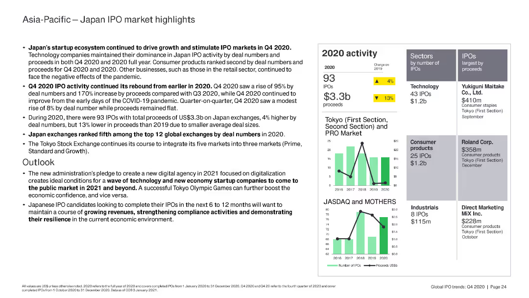
The slide includes multiple sections with text, bullet points, and a right-side panel featuring a column chart comparing Tokyo and JASDAQ/MOTHERS IPO activity from 2016 to 2020. It also has data points on the number of IPOs and proceeds.
Market Analysis and Trends
Financial Services
Discusses Japan's IPO market in Q4 2020, highlighting growth driven by the startup ecosystem, the rebound of IPO activity, and Japan's global ranking. Forecasts technology and digital economy trends for 2021.
IPO, Japan, market, trends, technology, digital economy, startups, Q4 2020, financial services, Asia-Pacific
Multiple Chart
EY
Saved
Slide with text blocks and a central circular graphic illustrating integration of sustainability, technology, and market shifts. Uses a blue and white color scheme with icons.
Strategic Planning
Financial Services
Discusses the strategic focus of the bank on sustainability, technological integration, and adapting to market shifts to ensure growth and stability, aiming to enhance shareholder value and customer relationships.
strategic planning, sustainability, technology, market adaptation, growth strategies
Framework
Deutsche Bank
Saved
Images depicting industry applications of immersive tech, with short text descriptions underneath.
Technology and Digital Transformation
Technology & Software
Insights on how immersive reality could change operations within various industries, focusing on specific applications like AR for operational safety.
Immersive reality, industry operations, AR, VR, applications
Pillar
McKinsey
Saved
The slide features two pie charts and a column chart showing the growth of digital consumers in the Philippines.
Market Analysis and Trends
Technology & Software
Captures the Philippines' notable increase in digital consumers who are likely to continue using internet services post-COVID-19.
Digital consumers, Philippines, Growth, Internet services, COVID-19, Usage trends, Continuity
Multiple Chart
Bain
Saved
This slide features a column chart depicting the sum of CO2 capture capacity (in Mtpa) by region and status (operational, in development, completed, cancelled).
Market Analysis and Trends
Energy & Utilities
Discusses the CO2 capture capacities of CCUS projects by region, with a focus on OECD countries. Highlights future capacity projections and current capacities.
CO2 capture, capacity, OECD, CCUS, regional capacity, development, operational, trends, future projections
Mixed Chart
Kearney
Saved
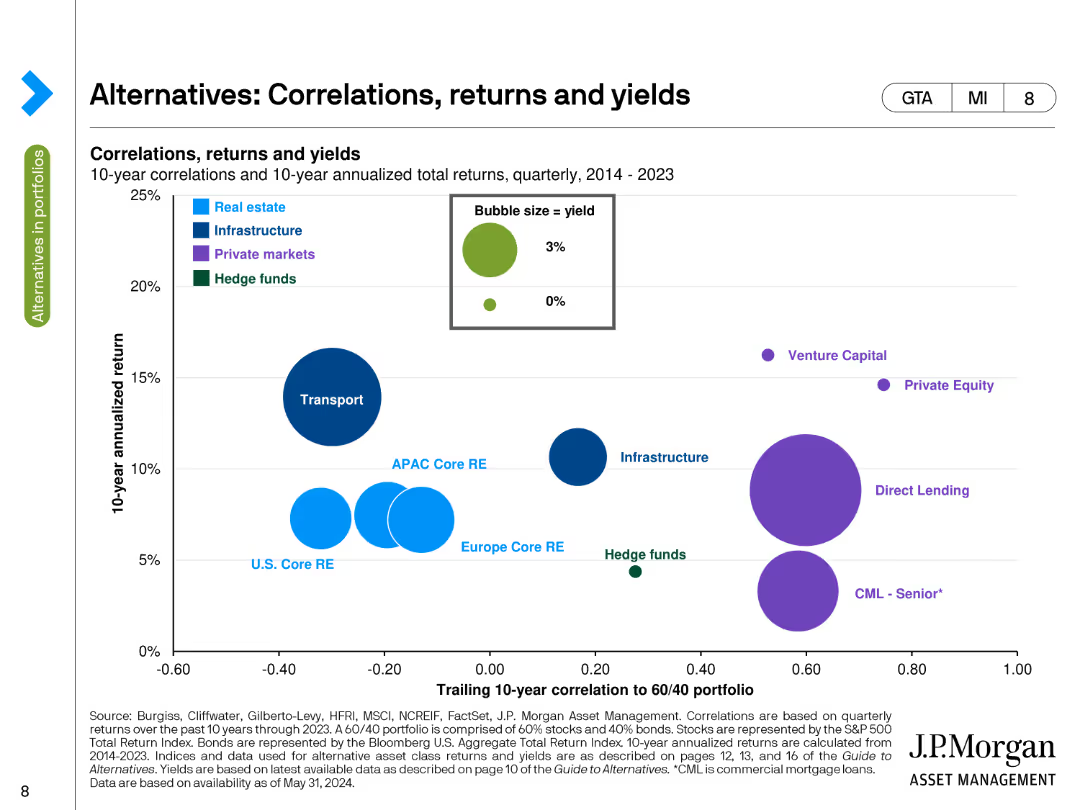
This slide contains a bubble chart showing 10-year correlations and annualized total returns for various asset classes, with bubble size representing yield. The chart uses multiple colors to distinguish between different asset types, such as real estate, infrastructure, and private markets.
Market Analysis and Trends
Financial Services
The slide presents a correlation analysis of alternative assets like real estate, infrastructure, and private markets against a 60/40 portfolio over a 10-year period. It highlights the relationship between return and risk for these asset classes.
Correlation, Returns, Yields, Alternatives, Asset Classes
Single Chart
JP Morgan
Saved
The slide features bar charts showing risks and opportunities percentages. Text boxes detail risks and opportunities, and a summary box highlights key takeaways.
Market Analysis and Trends
Technology & Software
It shows the survey results on digitalization risks and opportunities, emphasizing the need for corporate functions to reposition to exploit new technologies as enablers.
Digitalization, risks, opportunities, survey, functions, technology, enablers
Multiple Chart
Roland Berger
Saved
Contains three pie charts and descriptive texts with a minimalistic blue and black design. Visual elements are used to emphasize the data points, highlighting various aspects of transformation shortcomings.
Operational Efficiency
Professional Services
Explores reasons transformations don’t fully succeed by discussing goals, delivery pace, and sustainability. Could be used in management meetings to discuss improvement areas.
transformation, success, goals, pace, sustainability, management, strategy, pie charts, professional services
Pillar
McKinsey
Saved
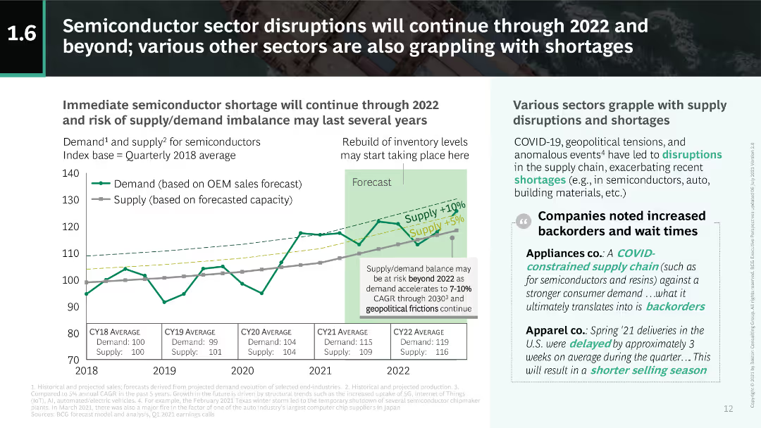
This slide includes a dual-axis line chart showing demand and supply indices for semiconductors from 2018 to 2022. Text on the right discusses broader sector impacts due to disruptions.
Risk Assessment and Management
Technology & Software
The slide details the ongoing semiconductor shortages and their impact across various sectors, emphasizing the supply-demand imbalance and its long-term implications.
semiconductors, supply-demand, shortages, disruptions, 2022
Mixed Chart
BCG
Saved
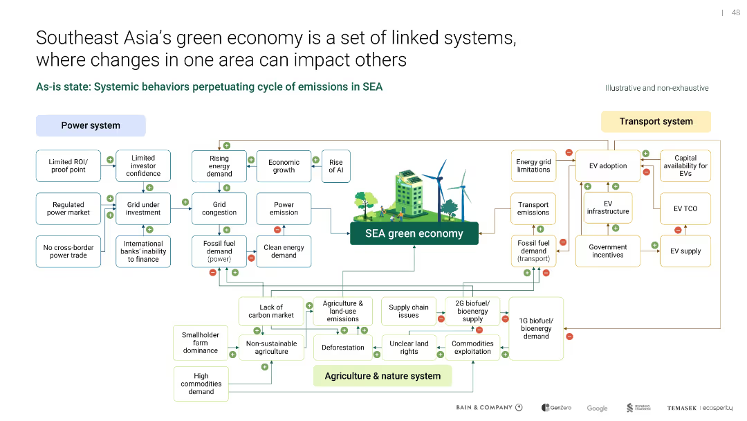
Complex systems map with interlinked categories (power, transport, agriculture) surrounding central “green economy”
Operational Efficiency
Environmental Services & Sustainability
A systems diagram illustrates how power, transport, and agriculture interact to shape SEA’s green economy. It identifies bottlenecks, demand pressures, and feedback loops that hinder decarbonization and sustainability progress.
systems thinking, SEA, emissions, green economy, agriculture, transport
Uncategorized
Bain
Saved
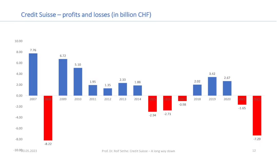
Bar chart showing annual profits and losses from 2007–2022; red bars for losses and blue for profits; financial axis in CHF.
Financial Performance
Financial Services
This chart tracks Credit Suisse’s profitability over 15 years, illustrating sharp fluctuations and sustained losses in recent years. It provides context for the bank’s financial instability and contributes to understanding its acquisition by UBS.
profits, losses, Credit Suisse, annual results, financial performance, CHF, long-term trend, UBS acquisition
Single Chart
Credit Suisse
Saved
The slide presents a combination of column charts and pie charts that forecast CO2 capture and utilization by different industries for the years 2030, 2050, and 2070. Detailed legends and color-coding aid comprehension.
Strategic Planning
Energy & Utilities
This slide forecasts the development of CCUS technologies across multiple industries over the coming decades, indicating a significant increase in CO2 capture and the predominance of storage solutions.
CCUS, CO2 capture, industry forecast, storage solutions, emission reductions
Multiple Chart
Kearney
Saved
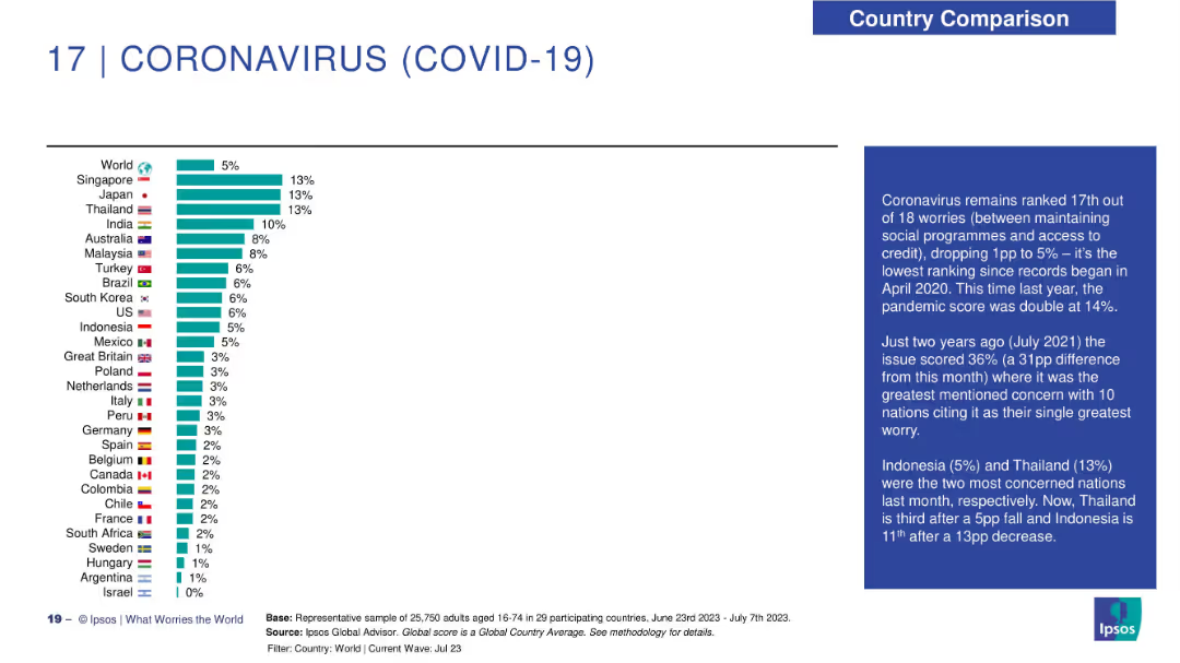
Horizontal bar chart showing concern over COVID-19 in different countries; includes descriptive analysis on right.
Risk Assessment and Management
Healthcare & Pharmaceuticals
COVID-19 has fallen to 17th place in global worries. Singapore, Japan, and Thailand show the highest current concern levels. The slide provides a timeline-based context comparing pandemic-related anxiety over the years.
trust trends, professional reputation, longitudinal data, Ipsos, social trust, governance, credibility evolution
Mixed Chart
IPSOS
Saved
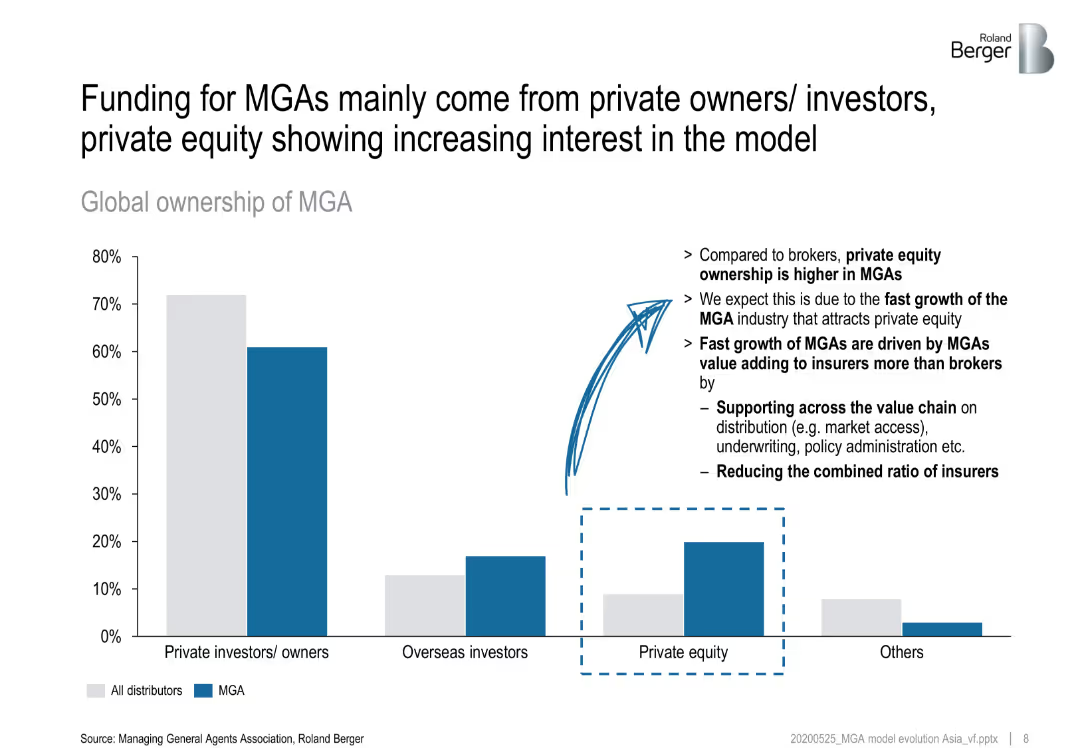
Bar chart and pie chart showing the key factors MGAs consider when partnering with insurers and the importance of technology in these relationships.
Strategic Planning
Financial Services
Highlights the key factors MGAs look for in insurer partnerships, such as market reputation and claims record, and the role of technology in enhancing these relationships.
MGAs, insurers, partnerships, key factors, technology
Mixed Chart
Roland Berger
Saved
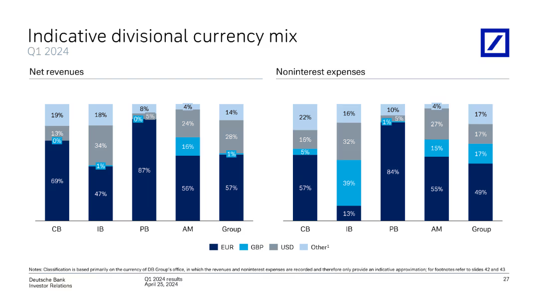
This slide contains two column charts, one for net revenues and the other for noninterest expenses, divided by currency mix (EUR, GBP, USD, Other) and business divisions (CB, IB, PB, AM, Group).
Market Analysis and Trends
Financial Services
The slide provides an analysis of Deutsche Bank's divisional currency mix for Q1 2024, showing net revenues and noninterest expenses by currency and business division. It highlights the distribution and significance of different currencies.
currency mix, net revenues, noninterest expenses, business divisions, Deutsche Bank, Q1 2024, analysis
Multiple Chart
Deutsche Bank
Saved
Column chart and stacked bar charts showing where EV owners primarily charge their vehicles (at home, office, street) across APAC, EMEA, and North America. The slide uses icons and percentages to display data.
Market Analysis and Trends
Transportation & Logistics
This slide details the primary charging locations for EV owners, highlighting regional preferences for charging at home, at the office, or on the street.
charging preferences, primary location, EV owners, regional differences, home charging
Multiple Chart
PwC/Strategy&
Saved
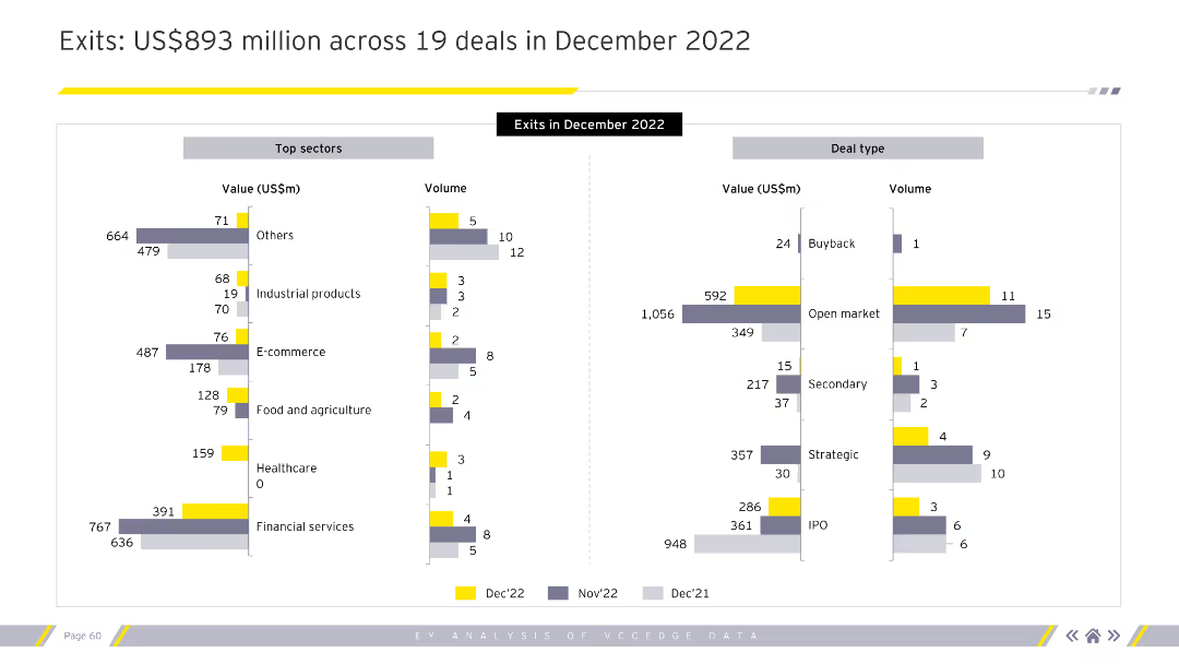
The slide features two bar charts. The left chart shows top sectors by value and volume. The right chart shows deal types by value and volume.
Market Analysis and Trends
Financial Services
This slide provides a detailed breakdown of exits in December 2022 by sector and deal type.
exits, December 2022, top sectors, deal types, value, volume, financial services
Multiple Chart
EY
Saved
A list detailing NFT use cases across industries like Digital Art, Sports, Music, Real Estate, Gaming, and Finance. Each has icons and descriptions.
Industry Overview
Media & Entertainment
Outlines various NFT applications across multiple sectors, emphasizing the breadth of NFT adoption and its impact on different industries. Essential for industry overview presentations on NFTs.
NFTs, Use Cases, Digital Art, Sports, Music, Real Estate, Gaming, Finance
Table
McKinsey
Saved
Column chart depicting changes in CET1 capital from 2Q22 to 3Q22. Visuals include net profit, repurchase, dividend, currency effects, and others.
Financial Performance
Financial Services
Shows the progression of CET1 capital across different periods, highlighting the contributions and deductions leading to the final 3Q22 figure.
CET1, capital, net profit, dividend, currency
Single Chart
UBS
Saved
Previous
Next
If nothing, comes up, please save your slides first
Create a FREE account to continue browsing
Receive Instant Access to 1,000+ slides from companies like McKinsey, Google, and Goldman Sachs
First Name
Last Name
Email
Password
I agree to all
Terms & Privacy Policy
Thank you! Your submission has been received!
Oops! Something went wrong while submitting the form.
Have an account?
Sign in
Column Chart
Heatmap
Chevron
Org Chart
Infographic
Callouts
Timeline
List
Graphic
Picture
Process Flow
Diagram
Paragraph
Map
Table
Framework
Subtitle
Takeaway Box
Icon
Other Chart
Radar Chart
Waterfall Chart
Mekko Chart
Pie Chart
Scatter Plot
Line Chart
Bar chart
Bullet points