Create a FREE Account
Instant access to 1,000+ real slides from top companies like McKinsey, BCG, Goldman Sachs, Google and many more!
First Name
Last Name
Email
Password
I agree to all
Terms & Privacy Policy
Thank you! Your submission has been received!
Oops! Something went wrong while submitting the form.
Have an account?
Sign in
Library
Templates
Courses
Pricing
My Account
My Slides
My Templates
✦ AI
AI Prompt Library
AI Search
Sign in
Start Here
Logout
My Saved Slides
The slide has a dark background, a yellow text box for the quote, and a question followed by four circular charts with percentages showing consumer preparedness for tech care.
Technology and Digital Transformation
Healthcare & Pharmaceuticals
This slide discusses Canadian consumers' openness to personalized medicine, genetic testing, and non-urgent care in retail locations, using wearables, and sensors.
Technology-enhanced care, personalized medicine, genetic testing, wearables, Canada
Mixed Chart
EY
Saved
The slide features a column chart comparing the median willingness to pay for connected car services among consumers in Germany, the US, and China, with detailed pricing points for maximum, optimal, and minimum prices.
Market Analysis and Trends
Consumer Goods
This slide explores the willingness of consumers in Germany, the US, and China to pay for connected car services, showing variations in median price points and consumer expectations in each country.
willingness to pay, connected services, consumer analysis, Germany, US, China, pricing, column chart
Mixed Chart
PwC/Strategy&
Saved
Several column charts are used to demonstrate current trends and forecasts in digital financial services, with a focus on payments and investments.
Risk Assessment and Management
Financial Services
It offers a forward-looking analysis of digital financial services, predicting sustained growth and highlighting lending and remittance as key areas.
digital services, growth forecast, lending, remittance, investment trends, financial analysis
Multiple Chart
Bain
Saved
The slide displays a geographical map showing various data points with different color codes and markers. It features a dark background with highlighted routes and areas, showing service ticket locations and statuses.
Operational Efficiency
Energy & Utilities
This slide demonstrates an embedded geographical map for monitoring and managing service tickets within the utility sector, providing real-time data on locations and statuses.
Geographical, Map, Service Tickets, Locations, Monitoring
Graphic
EY
Saved
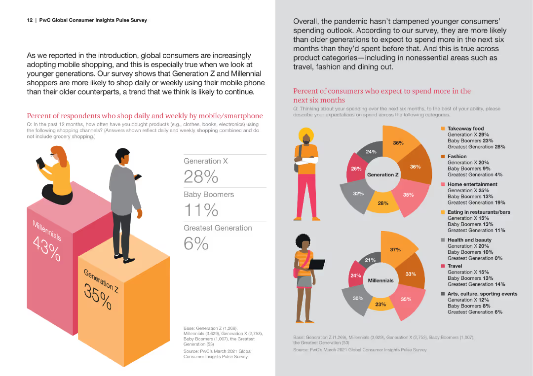
This slide contains text blocks, a large percentage bar chart, and icons representing different generations. The layout is colorful with a clear division of sections.
Market Analysis and Trends
Retail & E-commerce
It provides insights into shopping habits of different generations, particularly focusing on mobile shopping and future spending expectations, segmented by generations.
Generational Analysis, Mobile Shopping, Spending Habits, Market Segmentation, Consumer Insights
Multiple Chart
PwC/Strategy&
Saved
Includes a column chart depicting workforce trends over recent years, accompanied by quotes from sector leaders.
Human Resources and Talent Management
Professional Services
Discusses the stability and growth projections of workforces across industries, aiding HR planning and workforce development strategies.
Workforce Stability, Sector Growth, Temporary Workers, HR Planning
Mixed Chart
Bain
Saved
Graphs, data matrix, and a strong purple and white color theme.
Strategic Planning
Technology & Software
The slide emphasizes the executive focus on digitizing supply chains for transforming business models. It shows a prioritization matrix with different digital transformation aspects rated on importance. Ideal for discussing strategic planning and digital transformation initiatives in the technology industry, where the priority is to enhance supply chain operations through digital advancements.
Digitization, Supply Chain, C-Suite, Transformation, Business Models, Technology, Strategic Planning, Digital Advancements, Operations, Priority
Table
Accenture
Saved
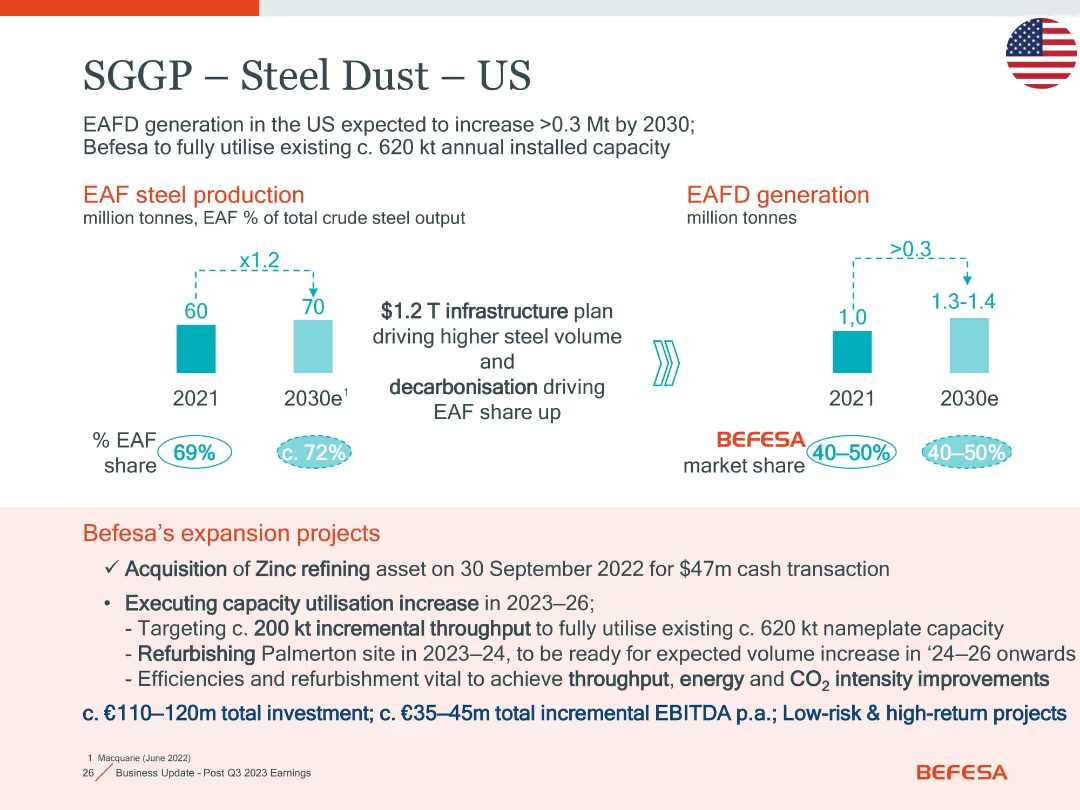
Two bar charts for EAF production and EAFD generation; bottom section lists Befesa’s US expansion actions and investment details.
Strategic Planning
Industrial & Manufacturing
Focuses on EAFD growth and market share in the US through 2030. It outlines Befesa’s strategic projects, including zinc refining and Palmerton refurbishment, with low-risk high-return investments (€110–120m) aimed at capacity and efficiency improvement.
EAFD, expansion, zinc refining, Palmerton, CO2, throughput, investment
Mixed Chart
Goldman Sachs
Saved
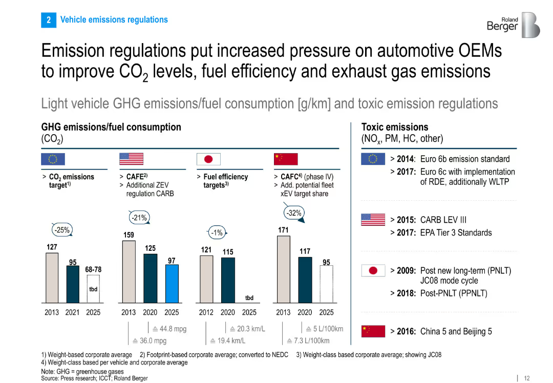
Multi-country comparison of fuel consumption and GHG emissions targets. Bar charts and policy milestones included.
Regulatory and Compliance
Industrial & Manufacturing
The slide compares regulatory approaches to CO₂ and toxic emissions across major automotive markets. It shows declining emission targets through 2025 and outlines key policy milestones in the EU, US, Japan, and China.
emissions, CO₂ targets, regulatory pressure, GHG, automotive policy, fuel efficiency
Multiple Chart
Roland Berger
Saved
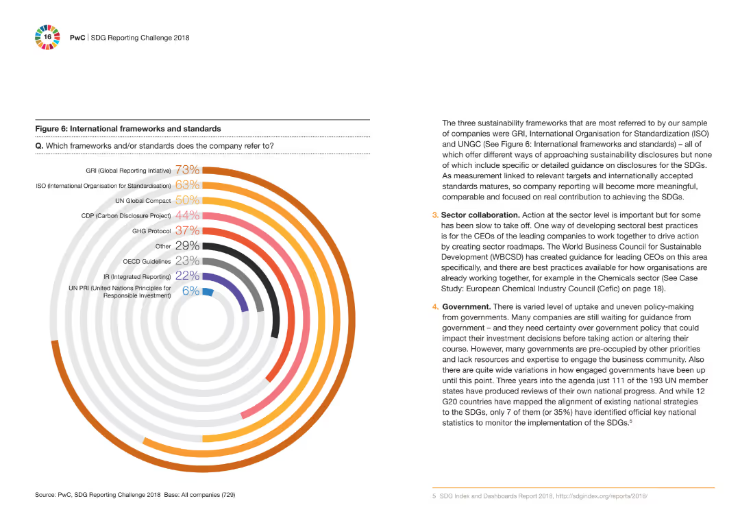
A circular bar chart displaying the percentage of companies referring to different international frameworks and standards. Accompanying text explains the importance of these frameworks in sustainability reporting.
Regulatory and Compliance
Financial Services
The slide showcases the international frameworks and standards most referred to by companies for sustainability reporting, with a circular bar chart highlighting the key standards like GRI, ISO, and UNGC.
frameworks, standards, sustainability, reporting, companies
Mixed Chart
PwC/Strategy&
Saved
Features a vertical three-step list labeled from 1 to 3 with corresponding icons and short descriptions, all color-coded in shades of green and blue.
Strategic Planning
Professional Services
Describes the three crucial strategies for successful business integration, focusing on continuity, delivery of synergies, and transformation beyond the deal.
success, planning, business, integration, continuity, synergies, transformation
Vertical Flow
Deloitte
Saved
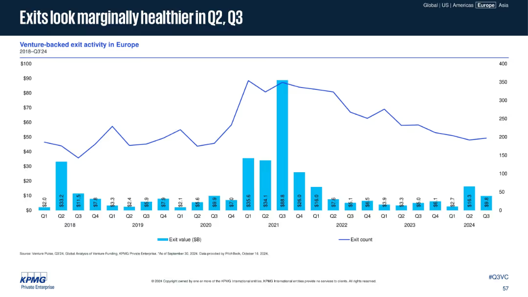
Bar and line chart depicting exit values and exit count per quarter (2018–2024)
Financial Performance
Financial Services
The slide presents exit activity trends in Europe, showing a modest recovery in Q2 and Q3 2024. Despite a general downtrend since 2021, select quarters show improved exit values, indicating potential recovery in M&A or IPO markets.
exits, venture-backed, exit value, M&A, IPO, Q3 2024
Single Chart
KPMG
Saved
Column chart showing carbon emissions reduction goals; text on the left
Strategic Planning
Environmental Services & Sustainability
Discusses EY's sustainability goals and achievements, including carbon neutrality and net-zero targets
Sustainability, carbon, EY, goals, emissions
Mixed Chart
EY
Saved
This slide uses a flow chart with dotted and solid lines to connect various committees and operational elements. Icons and color coding categorize the ESG components like governance and environment.
Strategic Planning
Industrial & Manufacturing
The slide conveys how Michelin embeds ESG awareness and oversight within its governance, outlining the roles of different committees and operational groups. It is likely used to demonstrate the company's commitment to ESG principles.
ESG, Governance, Committees, Operations, Ethics, Environment
Diagram
Morgan Stanley
Saved
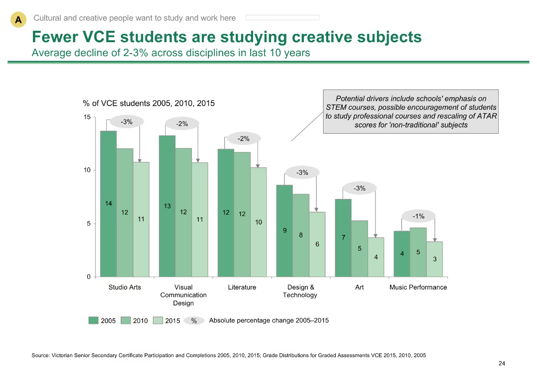
Column chart showing decline in VCE students studying creative subjects over 10 years
Market Analysis and Trends
Education & Training
Shows decline in creative subject participation among VCE students, indicating trends in education preferences
VCE students, creative subjects, education trends, participation decline, Melbourne education
Single Chart
BCG
Saved
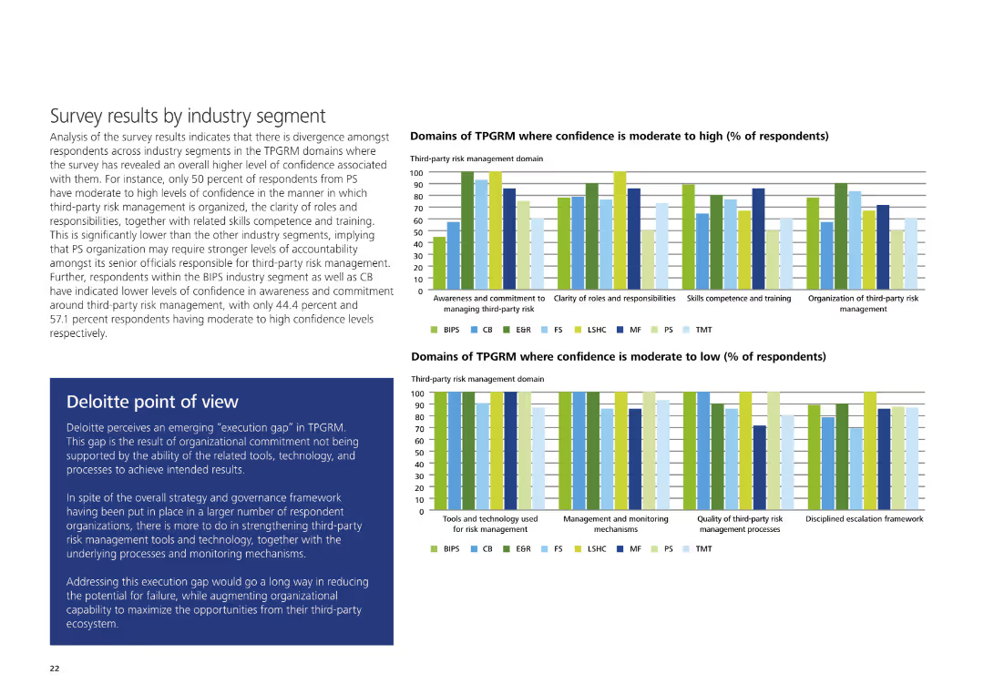
The slide contains two sets of column charts comparing domains of TPGRM with moderate to high and moderate to low confidence levels, alongside Deloitte's POV.
Risk Assessment and Management
Professional Services
It shows survey results indicating confidence levels in various TPGRM domains across industries and includes Deloitte's perspective on closing the execution gap in third-party risk management.
TPGRM, confidence levels, third-party risk management, execution gap, Deloitte, survey
Multiple Chart
Deloitte
Saved
The slide displays three column charts. The first illustrates a significant increase in global private bank client advisor joiners. The second shows a dramatic increase in training hours per new hire. The third exhibits a sharp rise in client asset flows from new hires. Each chart has a key takeaway indicated by an upward arrow and a multiplier.
Human Resources and Talent Management
Financial Services
It focuses on the investment in human capital, showcasing the hiring and training of financial advisors and their contribution to client asset flows. Ideal for discussions on talent acquisition strategies or HR analytics.
hiring, advisors, training, human resources, talent acquisition
Multiple Chart
JP Morgan
Saved
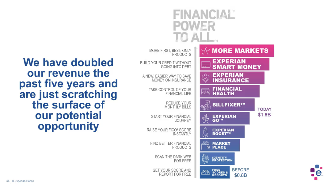
Split layout: left side features bold blue text message; right side has a vertical product ladder with gradient-colored boxes representing different services, indicating revenue growth over time.
Strategic Planning
Financial Services
This slide highlights Experian’s revenue doubling over five years, attributing growth to a diversified range of financial products and tools. It presents a visual stack of offerings, progressing from foundational services like free scores to advanced tools like insurance and bill management. The chart shows revenue growth from $0.8B to $1.5B.
revenue growth, product expansion, financial services, Experian, credit tools, insurance, fintech, market potential, financial journey, digital services
Single Chart
Barclays
Saved
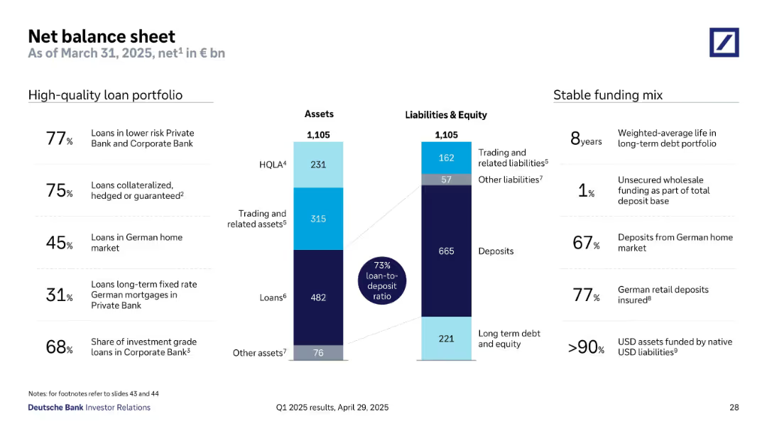
Two-column layout with central bar graph showing balance sheet breakdown of assets and liabilities. Key stats and metrics listed on the sides, using percentage and bn euro values. Blue shades for asset classes and dark blue for key ratios.
Financial Performance
Financial Services
The slide outlines Deutsche Bank’s net balance sheet as of March 31, 2025, highlighting a 73% loan-to-deposit ratio. It details a high-quality loan portfolio and a stable funding mix, with key metrics such as 77% of loans in lower-risk sectors and 67% of deposits from the German home market. The bar chart visually represents asset and liability structures.
balance sheet, loans, deposits, HQLA, funding mix, liabilities, assets
Mixed Chart
Deutsche Bank
Saved
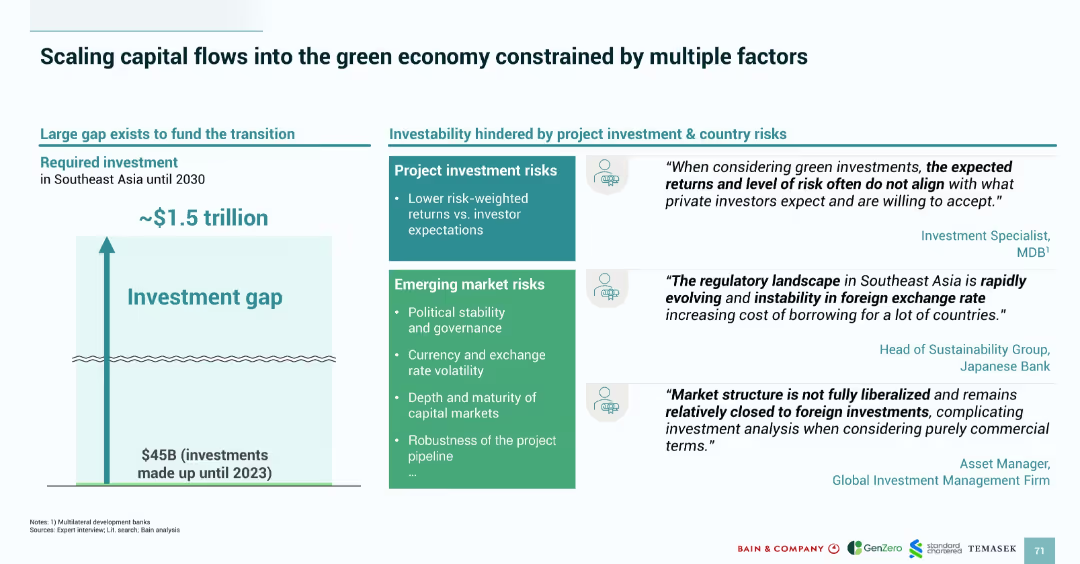
Split layout with a vertical bar graphic on the left showing a $1.5T investment gap and boxes on the right outlining project and market risks. Includes quotes from finance experts.
Investment Analysis
Financial Services
The slide addresses the investment gap (~$1.5T) required to fund Southeast Asia’s green transition and outlines risks that hinder investability—namely lower returns, political instability, currency volatility, and regulatory uncertainty. Expert quotes support the data, emphasizing challenges in attracting private sector finance due to perceived high risk.
green economy, investment gap, Southeast Asia, project risk, market risk, finance, regulation, currency, political stability
Mixed Chart
Bain
Saved
The slide features various bar graphs and pie charts detailing respondents' familiarity with different emerging technologies and their roles within organizations.
Technology and Digital Transformation
Technology & Software
The slide provides a profile of respondents' familiarity with emerging technologies, detailing the levels of familiarity, roles, and generations of respondents.
emerging tech, respondent profile, technology adoption, digital transformation, tech familiarity
Multiple Chart
EY
Saved
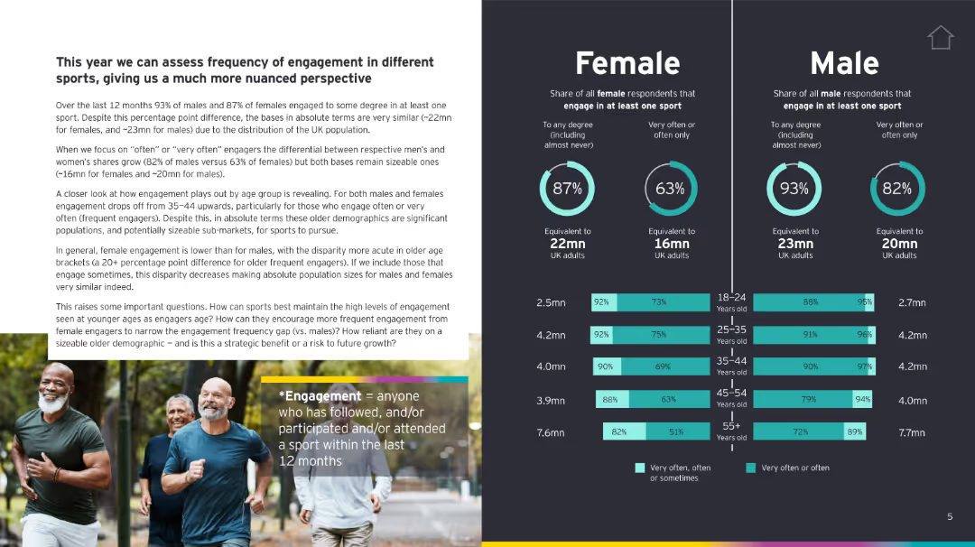
Two-column layout: Left has text narrative and images; right has infographics comparing male and female engagement by age and frequency.
Customer and Market Segmentation
Media & Entertainment
The slide analyzes sports engagement frequency among UK adults, segmented by gender and age, revealing key insights into behavior differences and potential areas for sports market growth.
sports engagement, gender analysis, UK adults, age segmentation, frequency, demographics
Multiple Chart
EY
Saved
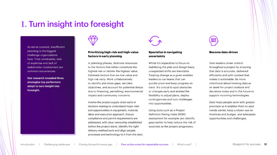
Three-column layout with icons and bold section titles, explaining strategies like data-driven planning and early risk identification.
Strategic Planning
Real Estate & Construction
Elaborates on the first action area from the previous slide: turning insight into foresight. It breaks down how organizations can improve planning through prioritizing risks, navigating uncertainty, and becoming data-driven.
foresight, early planning, risk mitigation, data-driven, uncertainty
Pillar
Accenture
Saved
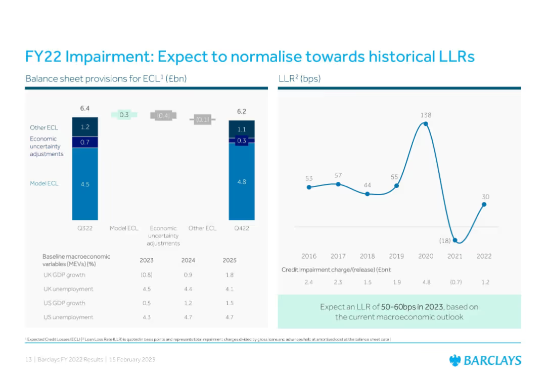
Dual-panel layout: Left uses stacked bar charts for provisions and adjustments; right displays a line graph of historical loan loss rates (LLR) from 2016 to 2022 with expected 2023 range highlighted.
Risk Assessment and Management
Financial Services
Describes expected credit loss (ECL) provisions and historical LLR trends, indicating a normalization toward historical rates. The slide provides macroeconomic assumptions and Barclays’ projections for 2023 based on a cautious economic outlook.
impairment, credit losses, LLR, macroeconomic outlook, FY22, FY23 forecast, provisions, economic assumptions
Multiple Chart
Barclays
Saved
Diagram of three interlocking circles labeled as 'The Orange World', 'The Green World', and 'The Blue World', with adjacent text descriptions.
Industry Overview
Professional Services
Showcasing three possible future scenarios of work culture: 'The Orange World' focusing on flexibility, 'The Green World' on social responsibility, and 'The Blue World' on big corporation dominance. Suited for discussions on corporate culture.
work culture, future scenarios, social responsibility, corporate dominance, flexibility, collectivism, individualism
Framework
PwC/Strategy&
Saved
Previous
Next
If nothing, comes up, please save your slides first
Create a FREE account to continue browsing
Receive Instant Access to 1,000+ slides from companies like McKinsey, Google, and Goldman Sachs
First Name
Last Name
Email
Password
I agree to all
Terms & Privacy Policy
Thank you! Your submission has been received!
Oops! Something went wrong while submitting the form.
Have an account?
Sign in
Column Chart
Heatmap
Chevron
Org Chart
Infographic
Callouts
Timeline
List
Graphic
Picture
Process Flow
Diagram
Paragraph
Map
Table
Framework
Subtitle
Takeaway Box
Icon
Other Chart
Radar Chart
Waterfall Chart
Mekko Chart
Pie Chart
Scatter Plot
Line Chart
Bar chart
Bullet points