Create a FREE Account
Instant access to 1,000+ real slides from top companies like McKinsey, BCG, Goldman Sachs, Google and many more!
First Name
Last Name
Email
Password
I agree to all
Terms & Privacy Policy
Thank you! Your submission has been received!
Oops! Something went wrong while submitting the form.
Have an account?
Sign in
Library
Templates
Courses
Pricing
My Account
My Slides
My Templates
✦ AI
AI Prompt Library
AI Search
Sign in
Start Here
Logout
My Saved Slides
The slide features a pie chart and a bar graph depicting the likelihood of employees seeking new employment within the next 12 months, segmented by age group. The design is straightforward with a clear visual hierarchy that directs attention to the key data points.
Human Resources and Talent Management
Professional Services
This slide presents data from a global workforce survey, highlighting the ongoing trend of the Great Resignation and its impact on employee retention across different age groups. It's particularly relevant for human resources discussions on strategies to improve employee retention and engagement.
Great Resignation, Employee Retention, Workforce, Age Groups, Survey Data, Pie Chart
Multiple Chart
PwC/Strategy&
Saved
The slide features a circle divided into transition and adaptation plan sectors and three-dimensional columns representing scopes of CO2 emissions.
Strategic Planning
Industrial & Manufacturing
This slide outlines Michelin's climate strategy with a focus on transitioning towards net-zero emissions by 2050, including the adaptation plan and emissions scope.
Climate Strategy, Net-Zero Emissions, Transition Plan, Adaptation Plan, Michelin, Sustainability, CO2 Emissions, 2050 Target, Corporate Strategy, Decarbonization
Framework
Morgan Stanley
Saved
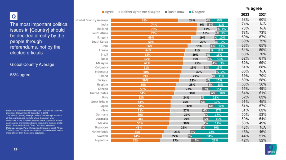
Slide presents bar chart and trend data on agreement with citizen-led decision-making via referendums; left panel contains title and global average.
Regulatory and Compliance
Government & Public Sector
This slide reveals a 58% global average agreeing that political decisions should be made directly by the people rather than elected officials. It illustrates global democratic participation attitudes, with India and Thailand expressing especially strong support for referendums. This trend supports a rise in interest toward direct democracy mechanisms over representative systems.
referendums, democracy, political reform, public decision, governance, Ipsos, civic engagement
Mixed Chart
IPSOS
Saved
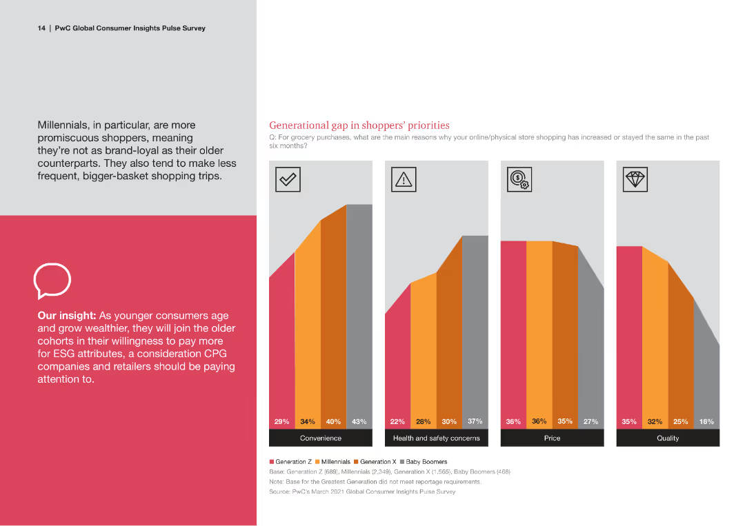
A mixed chart with colored bars representing different generations' priorities in shopping. Text blocks provide detailed insights and there is an iconography for quick understanding.
Market Analysis and Trends
Consumer Goods
The slide analyzes generational gaps in shopping priorities, focusing on aspects like convenience, health, safety, price, and quality, with a focus on ESG factors.
Shopping Priorities, Generational Analysis, ESG, Convenience, Health and Safety
Multiple Chart
PwC/Strategy&
Saved
Three line charts display LatAm y/y CPI, interest rate, and y/y wage growth from 2015-2025F for Brazil, Mexico, and Chile. Text provides detailed explanations.
Market Analysis and Trends
Financial Services
Focuses on inflation trends in Latin America, the impact of monetary policies, and forecasts for future economic conditions.
Inflation, Latin America, CPI, Interest Rate, Wage Growth
Multiple Chart
EY
Saved
The slide features two line charts with time-series data from 2007 to 2023. The charts depict the JPMorgan Global Purchasing Managers’ Index for Manufacturing and Services. The visual elements are placed on a white background with a top header in blue containing the slide title and source information.
Market Analysis and Trends
Industrial & Manufacturing
This slide presents the stability of the global manufacturing sector and the visible expansion in services as of July, with a detailed analysis of the JPMorgan Global PMI. It could be used to discuss market trends and economic outlooks.
PMI, Manufacturing, Services, Economic Outlook, Stability, Expansion, JPMorgan, Index, Global Sector, July
Mixed Chart
McKinsey
Saved
The slide includes circular diagrams and bar charts analyzing the adoption of self-service technologies in different regions. It has a clean, modern look using blue and green tones.
Technology and Digital Transformation
Telecommunications
Discusses the increasing role and impact of self-service options in enhancing customer satisfaction and operational efficiency. Particularly relevant for sectors focusing on digital solutions and customer autonomy, such as technology and professional services.
self-service, technology adoption, customer satisfaction, operational efficiency, digital solutions
Multiple Chart
Deloitte
Saved
This slide showcases a series of column charts depicting the 2020 performance of global luxury markets such as personal luxury goods, cars, and hospitality. The layout includes a detailed year-over-year growth comparison.
Market Analysis and Trends
Consumer Goods
An in-depth review of the global luxury markets in 2020, highlighting significant contractions across various sectors such as personal goods, hospitality, and automotive due to the pandemic. It quantifies the impact in each category, offering a stark visualization of the downturn compared to 2019.
luxury markets, 2020 review, market contraction, pandemic impact, sector analysis
Single Chart
Bain
Saved
Two pie charts illustrating Canadians' knowledge of interest rates, showing the correct response rates and comparisons between 2023 and 2022.
Human Resources and Talent Management
Financial Services
This slide assesses the understanding of interest rates among Canadians, showing the percentage of correct answers and comparing data from 2023 to 2022.
Interest, rate, knowledge, Canadians, 2023, 2022
Multiple Chart
IPSOS
Saved
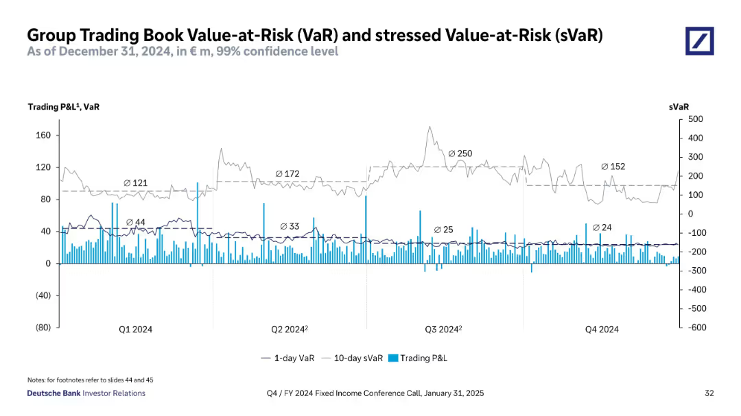
Time series line and bar chart showing 1-day VaR, 10-day stressed VaR (sVaR), and daily P&L over 2024.
Risk Assessment and Management
Financial Services
Visualizes Deutsche Bank’s trading risk profile with 1-day VaR and 10-day sVaR trends, alongside daily trading P&L. Shows quarterly average risk metrics, highlighting volatility and peak values (e.g., Q3 sVaR = 250).
VaR, sVaR, risk, trading, P&L, volatility, confidence interval, exposure
Single Chart
Deutsche Bank
Saved
Contains three circular graphs illustrating financial benefits of AI in banking, showing improvements in productivity, revenue growth, and return on equity.
Financial Performance
Financial Services
Details projected financial benefits for banks adopting AI, emphasizing significant gains in productivity, revenue growth, and return on equity, suitable for financial strategy discussions.
AI adoption, financial projections, banking, productivity, revenue growth
Pillar
Accenture
Saved
The slide features two side-by-side graphs: one for Henry Hub and the other for UK NBP gas prices. Each graph shows the price estimates from banks, brokers, and consultants. The background image depicts a gas facility. Text explains trends.
Market Analysis and Trends
Energy & Utilities
This slide forecasts gas prices for Henry Hub and UK NBP, comparing bank, broker, and consultant estimates. It discusses the price trends and provides average price forecasts for 2026, highlighting the wide range of estimates due to market dynamics.
Henry Hub, UK NBP, gas prices, forecasts, bank/broker, consultants
Multiple Chart
EY
Saved
A flow diagram illustrating the semiconductor value chain from design to final product, including stages like manufacturing and assembly. Each stage is visually separated and described.
Technology and Digital Transformation
Technology & Software
This slide provides an overview of the semiconductor value chain, detailing each step from design through manufacturing and assembly to the final product, highlighting opportunities in each stage.
Semiconductor, value chain, manufacturing, design, assembly
Diagram
Deloitte
Saved
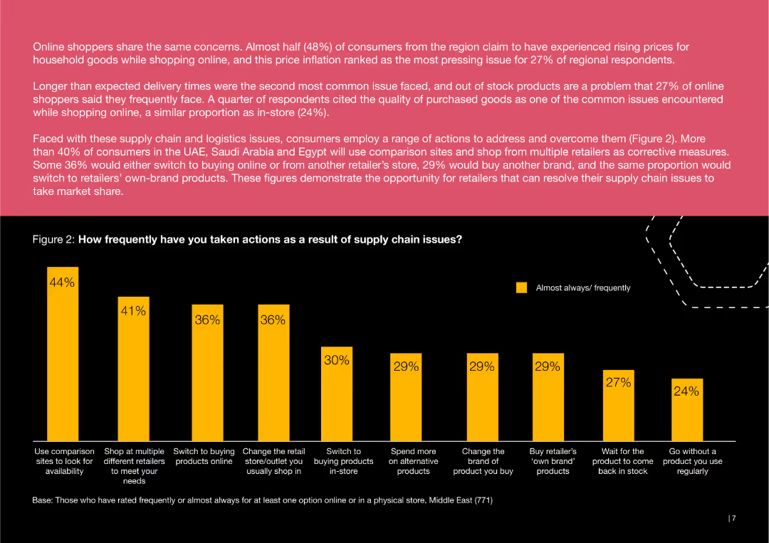
This slide includes a bar chart showing the frequency of various consumer actions taken in response to supply chain issues. Actions like using comparison sites, shopping at multiple retailers, and switching to online purchases are depicted.
Risk Assessment and Management
Consumer Goods
The slide analyzes how consumers have responded to supply chain challenges, highlighting actions such as using comparison sites, shopping at different retailers, and switching to online shopping.
consumer, supply chain, actions, comparison, retailers, online, response, shopping
Mixed Chart
PwC/Strategy&
Saved
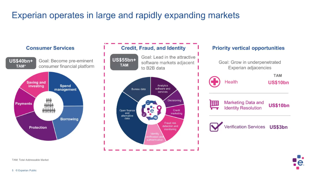
Three circular infographic panels showing market segmentation and TAM values in a colorful layout
Market Analysis and Trends
Technology & Software
This slide outlines Experian’s market opportunities across Consumer Services and Credit, Fraud, and Identity sectors, with total addressable market values and goals. Priority verticals like health and verification services are also highlighted.
TAM, Experian, consumer services, fraud, identity, verticals, strategy
Mixed Chart
Barclays
Saved
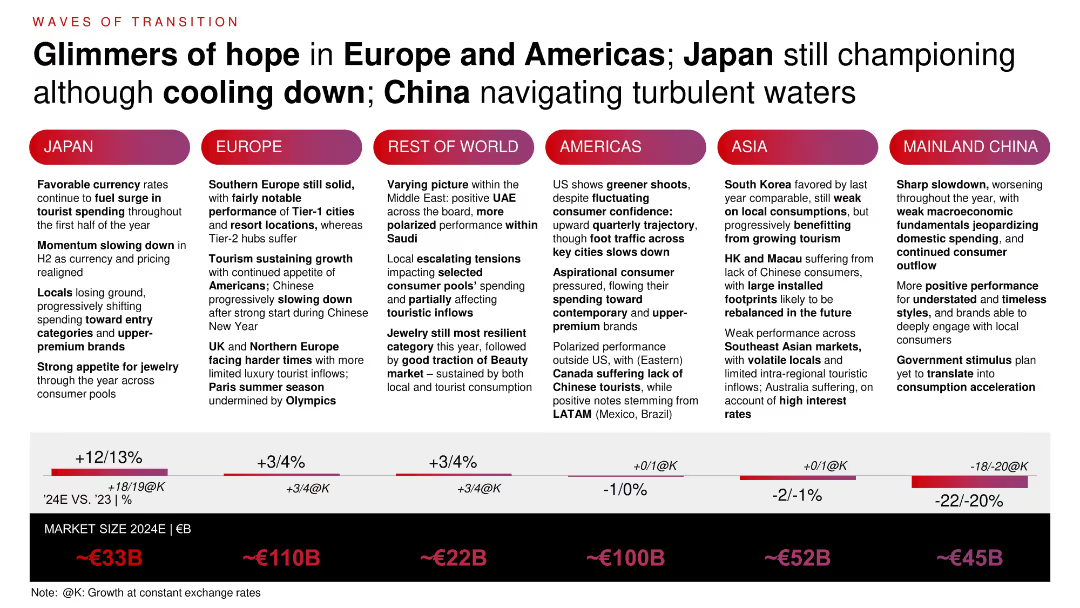
Multi-column layout showing six regions with qualitative commentary on consumer trends and local market shifts. Regional bar graph at the bottom comparing 2024E size and YoY growth.
Market Analysis and Trends
Consumer Goods
Examines regional transitions within the luxury market. Japan shows resilience due to favorable FX and tourism. Europe sustains momentum. China faces macroeconomic headwinds. Middle East shows polarization. Insights emphasize regional differentiation in demand, pricing effects, and tourist inflows.
regional outlook, luxury consumption, FX impact, tourism, China, Europe, Japan
Mixed Chart
Bain
Saved
Slide displays a bar chart listing top investors in Manchester tech companies, with counts of equity deals from 2011–2020, alongside descriptive text.
Investment Analysis
Technology & Software
Reviews major tech investors in Manchester, showing the number of deals each investor has completed, indicating a strong investment landscape.
Manchester, investors, tech companies, equity deals, investment trends, Mercia Asset Management, Growth Company Angels, Northern Powerhouse, business funding
Mixed Chart
Barclays
Saved
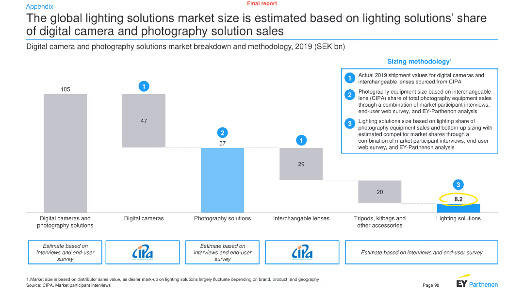
This slide features a column chart and text to illustrate the market size of lighting solutions in relation to digital cameras and photography solutions, along with sizing methodology.
Market Analysis and Trends
Technology & Software
It estimates the global market size of lighting solutions based on their share of digital camera and photography solution sales, providing a detailed breakdown and methodology.
Lighting solutions, market size, digital cameras, photography, global market, sizing methodology, technology, analysis, trends
Mixed Chart
EY
Saved
The slide includes a horizontal bar chart showing agreement and disagreement percentages on various financial attitudes, with detailed text descriptions. White background, minimalistic design.
Market Analysis and Trends
Financial Services
This slide highlights shifts in Canadian investors' financial priorities due to the pandemic, including a focus on saving, debt repayment, and extended work years for retirement savings.
financial attitudes, saving, debt repayment, retirement, COVID-19
Mixed Chart
IPSOS
Saved
The slide features a circular diagram categorizing competition by sectors and specialties, with Ipsos at the center.
Competitive Landscape
Professional Services
The slide provides an overview of the competitive landscape, illustrating how Ipsos competes across various sectors and specialties.
Competition, Sectors, Specialties, Ipsos, Market Research
Diagram
IPSOS
Saved
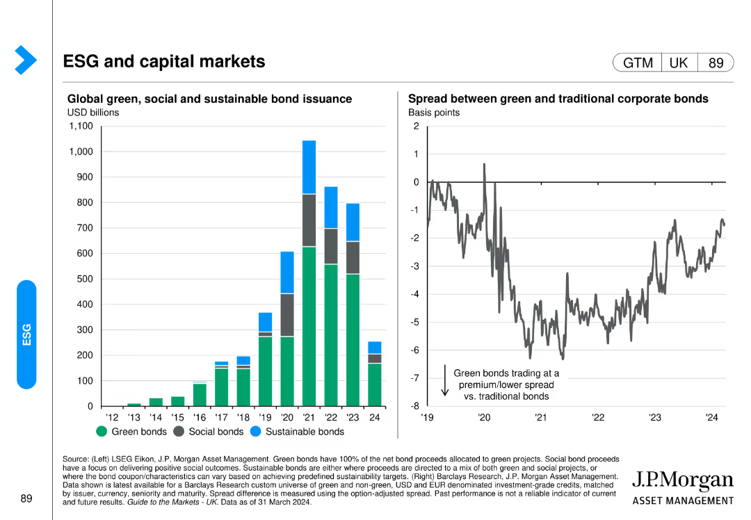
This slide has a column chart showing global green, social, and sustainable bond issuance and a line chart comparing the spread between green and traditional corporate bonds.
Investment Analysis
Financial Services
It focuses on the growth and comparative performance of ESG-related bonds in the capital markets, highlighting the financial aspects of sustainability in investment portfolios.
ESG bonds, capital markets, green bonds, sustainable investment, financial services, bond issuance, J.P. Morgan, investment analysis, market trends, social bonds
Multiple Chart
JP Morgan
Saved
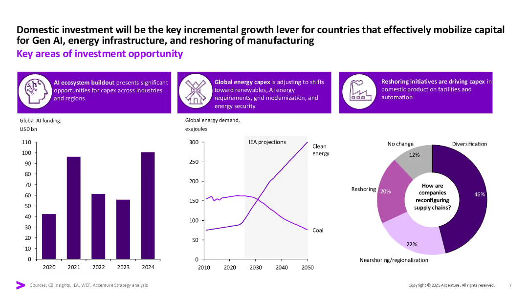
Three-part layout with icon-based headers, three data visualizations (bar chart, line graph, pie chart). Strong purple highlights and white space separate sections clearly.
Strategic Planning
Financial Services
Identifies domestic investment drivers such as GenAI, energy capex, and reshoring. Uses data visualizations to support claims around AI funding, clean energy demand, and supply chain diversification strategies.
GenAI, reshoring, clean energy, capex, investment, supply chains, diversification
Multiple Chart
Accenture
Saved
Column chart detailing the proportion of fiscal variance attributed to different factors like disasters and engineering, with a deep dive expected on these issues. The layout is clean with a distinct color coding.
Regulatory and Compliance
Government & Public Sector
Examines the causes of fiscal variance in NCDOT's budget, focusing on disasters and management issues. Useful for detailed fiscal analysis and strategy discussions in government finance.
fiscal analysis, disasters, engineering, management, government
Mixed Chart
McKinsey
Saved
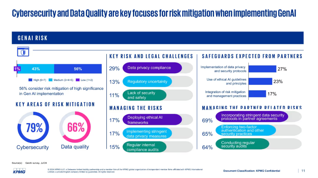
Multi-section layout with bars, pie charts, and bullet points covering risk challenges and mitigation efforts
Risk Assessment and Management
Artificial Intelligence
This slide presents various dimensions of GenAI risk mitigation. Cybersecurity (79%) and data quality (66%) are leading focus areas. It also shows expectations from partners and strategies for managing both legal and partner-related risks.
cybersecurity, data quality, compliance, mitigation, KPMG, GenAI risks
Multiple Chart
KPMG
Saved
This slide includes a horizontal bar chart showing preferred channels for purchasing new cars, alongside a column chart comparing preferences across different generations.
Market Analysis and Trends
Transportation & Logistics
It analyzes consumer preferences for purchasing new cars, emphasizing the importance of dealerships and showrooms, and compares generational differences in buying preferences.
purchasing channels, car buyers, generational differences, dealerships, showrooms
Multiple Chart
EY
Saved
Previous
Next
If nothing, comes up, please save your slides first
Create a FREE account to continue browsing
Receive Instant Access to 1,000+ slides from companies like McKinsey, Google, and Goldman Sachs
First Name
Last Name
Email
Password
I agree to all
Terms & Privacy Policy
Thank you! Your submission has been received!
Oops! Something went wrong while submitting the form.
Have an account?
Sign in
Column Chart
Heatmap
Chevron
Org Chart
Infographic
Callouts
Timeline
List
Graphic
Picture
Process Flow
Diagram
Paragraph
Map
Table
Framework
Subtitle
Takeaway Box
Icon
Other Chart
Radar Chart
Waterfall Chart
Mekko Chart
Pie Chart
Scatter Plot
Line Chart
Bar chart
Bullet points