Create a FREE Account
Instant access to 1,000+ real slides from top companies like McKinsey, BCG, Goldman Sachs, Google and many more!
First Name
Last Name
Email
Password
I agree to all
Terms & Privacy Policy
Thank you! Your submission has been received!
Oops! Something went wrong while submitting the form.
Have an account?
Sign in
Library
Templates
Courses
Pricing
My Account
My Slides
My Templates
✦ AI
AI Prompt Library
AI Search
Sign in
Start Here
Logout
My Saved Slides
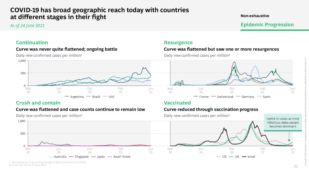
Multiple line charts comparing daily new COVID-19 cases per million across different countries, grouped by stages of epidemic progression.
Market Analysis and Trends
Healthcare & Pharmaceuticals
Compares the stages of COVID-19 progression across various countries, categorizing them into continuation, resurgence, crush and contain, and vaccinated.
geographic reach, stages, countries, progression
Multiple Chart
BCG
Saved
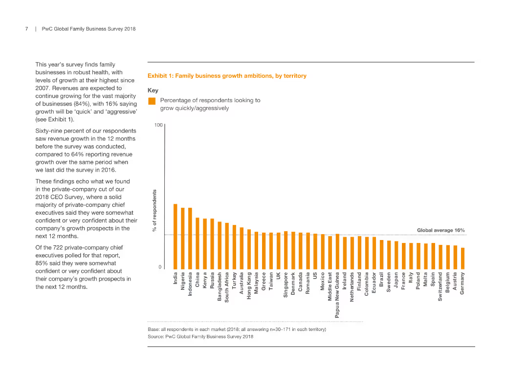
A column chart representing the percentage of respondents from various territories looking to grow quickly/aggressively, alongside a text description of growth trends and comparisons with previous years.
Market Analysis and Trends
Professional Services
This slide illustrates growth ambitions of family businesses across territories, highlighting high growth expectations and comparing them with previous survey results, reflecting confidence levels and future plans of respondents in different regions.
Family Business, Growth, Market Analysis, Territory
Mixed Chart
PwC/Strategy&
Saved
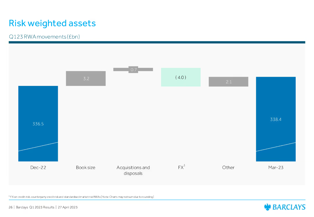
The slide features a column chart detailing Q123 RWA movements in billion euros from December 2022 to March 2023. Each section of the chart is labeled with specific changes due to various factors like book size and FX.
Risk Assessment and Management
Financial Services
This slide explains the changes in risk-weighted assets over the first quarter of 2023, highlighting factors like acquisitions, disposals, and other elements that influence the RWA.
RWA, risk management, financial metrics, Q123, FX
Single Chart
Barclays
Saved
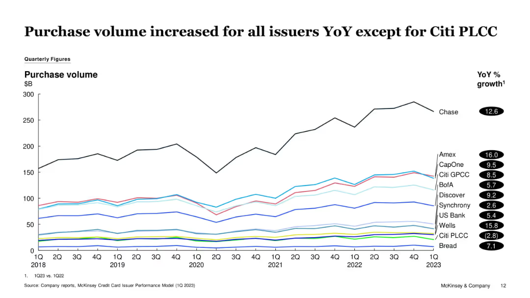
Line graph showing quarterly purchase volumes from 2018 to 1Q23. Different colored lines represent various issuers. YoY % growth is listed on the right.
Financial Performance
Financial Services
The slide tracks changes in credit card purchase volume over time, noting that all issuers except Citi PLCC experienced YoY growth. Chase and Amex show significant upward trends, while Citi PLCC declines slightly.
Purchase Volume, Credit Cards, Issuers, Amex, Citi PLCC, Chase, Trends
Single Chart
McKinsey
Saved
A slide that creatively integrates textual content with imagery, highlighting the company's purpose and core values, alongside an inspiring action shot of an employee.
Strategic Planning
Professional Services
Communicates the company's core values and purpose, linking their aspirations to tangible actions and societal impact.
Purpose, Values, Integrity, Service, Innovation
Text Only
Booz Allen Hamilton
Saved
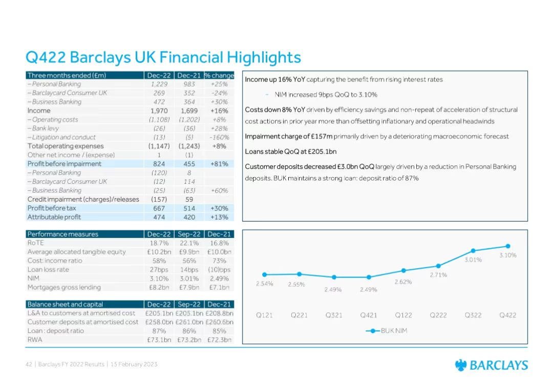
Text-heavy slide with two data tables, a boxed text summary, and a line chart; blue and white corporate design
Financial Performance
Financial Services
This slide provides Barclays UK’s Q4 2022 financial summary, comparing YoY and QoQ figures for income, costs, impairments, profit before tax, and other metrics. It includes insights on income growth, cost reduction, credit impairment, and deposits.
Barclays, financials, Q4 results, profit, impairments, deposits, banking
Mixed Chart
Barclays
Saved
Features column charts depicting barriers to cost program success and lessons learned from such programs in the Nordics.
Operational Efficiency
Professional Services
Analyzes key barriers to the success of cost programs in Nordic countries and the lessons learned, highlighting management challenges and the underestimation of technology improvements.
Barriers, Lessons Learned, Nordic, Management Challenges, Technology
Multiple Chart
Deloitte
Saved
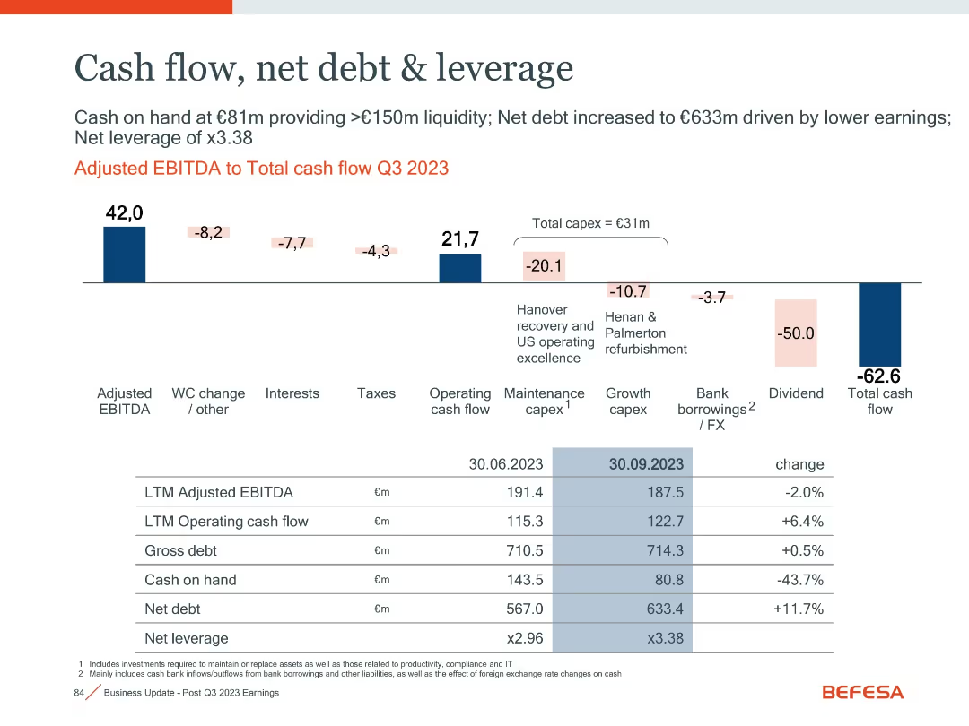
Horizontal waterfall chart and detailed financial metrics table
Financial Performance
Financial Services
The slide illustrates cash flow movement in Q3 2023, highlighting major components like capex, dividend payouts, and leverage metrics, with changes over time.
Cash Flow, Leverage, Net Debt, Capex, Dividend, EBITDA
Mixed Chart
Goldman Sachs
Saved
This slide contains pie charts showing the high percentage of HR leaders and employees who agree that companies should offer the best benefits and need to improve support, maintaining a consistent sentiment over three years.
Human Resources and Talent Management
Financial Services
Reflects the strong agreement among HR leaders and employees about the need for improved employer support and benefits, crucial for strategic HR planning.
HR Agreement, Employee Benefits, Employer Support, Pie Charts, Strategic Planning
Single Chart
Goldman Sachs
Saved
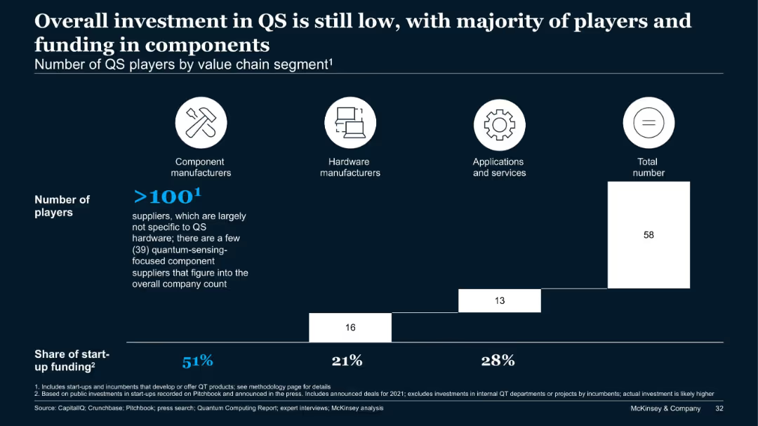
Bar chart of QS players by segment with funding share, segmented into components, hardware, and applications.
Financial Performance
Technology & Software
Most QS players focus on component manufacturing, which also captures over 50% of start-up funding. Hardware and application segments follow distantly. The slide suggests that while QS is gaining attention, it still lags in investment relative to other quantum technology areas.
QS, investment, components, hardware, applications, quantum sensing, funding
Single Chart
McKinsey
Saved
This slide contains column charts showing potential future revenue increases from digital marketing, contrasting current and potential impacts. The layout is clear with direct comparisons highlighted.
Financial Performance
Media & Entertainment
Discusses the revenue impact of digital marketing on brands at different maturity levels, suggesting that more mature brands anticipate higher revenue increases. This slide is crucial for financial planning and strategic decision-making in digital marketing investments.
digital marketing, revenue impact, maturity levels, financial planning, strategic decision-making, column chart, revenue increases, investment planning
Multiple Chart
BCG
Saved
Column charts display recurring net fee income, net interest income, and transaction-based income.
Financial Performance
Financial Services
Discusses growth in all revenue lines for Global Wealth Management, highlighting fee and interest incomes.
wealth management, revenue growth, fee income, interest income, transaction income
Multiple Chart
UBS
Saved
Circular icons and percentages illustrate the financial sentiments of households, comparing spending, earnings, and savings trends across different countries.
Market Analysis and Trends
Consumer Goods
Provides a snapshot of consumer financial health, emphasizing the increased spending and decreased saving trends among households. Useful for analyzing consumer behavior and economic conditions.
consumer, financial health, spending, savings, trends
Multiple Chart
BCG
Saved
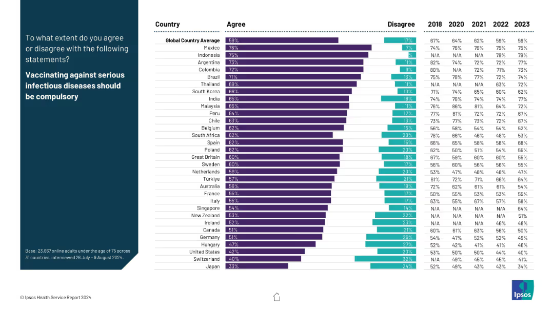
Split layout; left side has a blue panel with white text, right side displays a horizontal bar chart showing country-level agreement/disagreement percentages and year-on-year trends from 2018–2023.
Market Analysis and Trends
Healthcare & Pharmaceuticals
This slide presents global survey data on public opinion regarding mandatory vaccination against serious infectious diseases. It shows a country-wise breakdown of agreement levels and compares results across years (2018–2023), highlighting trends and public health sentiment.
vaccination, compulsory, public opinion, global health, trend, agreement, infectious diseases, Ipsos, survey, healthcare
Mixed Chart
IPSOS
Saved
A column chart with percentages representing the impact of skill availability on organizational growth, accompanied by a significant quote on talent management.
Human Resources and Talent Management
Financial Services
This slide discusses the impact of skill gaps on innovation and costs, pertinent in HR presentations and discussions about talent management and organizational growth challenges.
Skills Gap, Innovation, Talent Management, Organizational Growth, HR, Costs, Impact
Mixed Chart
PwC/Strategy&
Saved
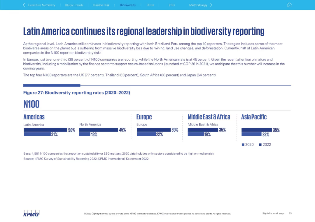
Top: narrative summary; Bottom: bar chart showing 2020–2022 biodiversity reporting by region. Clean design with five global regions.
Risk Assessment and Management
Environmental Services & Sustainability
This slide reveals regional trends in biodiversity reporting, with Latin America leading, particularly due to Brazil and Peru. Europe and Asia Pacific show moderate increases, while North America and the Middle East & Africa still lag.
biodiversity, Latin America, regional reporting, ESG, environment
Mixed Chart
KPMG
Saved
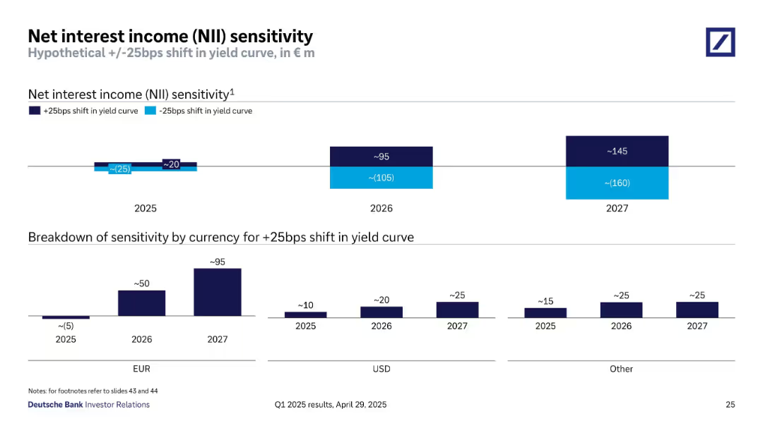
Horizontal bar and column charts show projected NII impact by year and currency with +/-25bps yield curve shifts.
Risk Assessment and Management
Financial Services
Analyzes how a 25bps change in yield curves would affect NII from 2025 to 2027. Also includes breakdown by currency (EUR, USD, Other). Highlights highest sensitivity in 2027 and provides insight into interest rate risk.
NII sensitivity, interest rates, yield curve, EUR, USD, risk management, projections
Multiple Chart
Deutsche Bank
Saved
Slide features two column charts showing Copernicus economic impact with gradients of blue, and a list of key Copernicus products highlighted with icons.
Market Analysis and Trends
Environmental Services & Sustainability
Highlights economic impacts and key products of Copernicus for urban monitoring, focusing on data usage for city models and satellite imagery applications.
Copernicus, economic, urban, satellite, data monitoring, city modeling, environmental impact
Mixed Chart
PwC/Strategy&
Saved
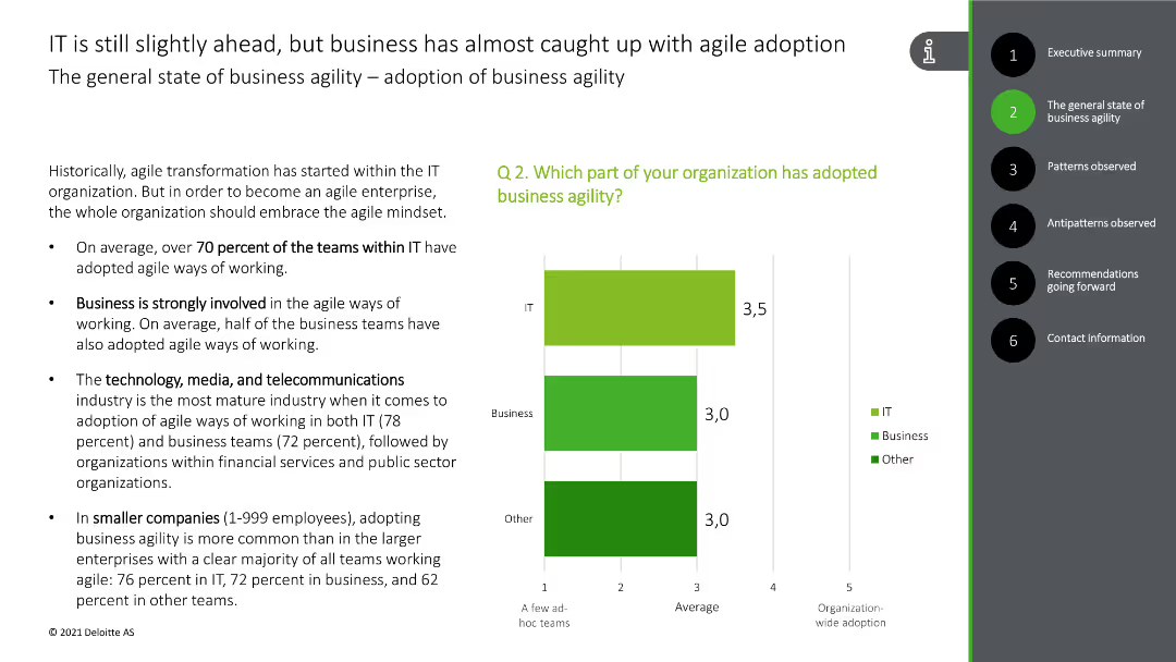
The slide includes bullet points discussing the adoption of agile practices in IT and business, along with a bar chart showing the percentage of teams adopting agile methods.
Strategic Planning
Professional Services
The slide discusses the adoption of business agility across different sectors, highlighting the percentage of IT and business teams using agile methods, and the industries most advanced in this practice.
business agility, agile adoption, IT, business, industries
Mixed Chart
Deloitte
Saved
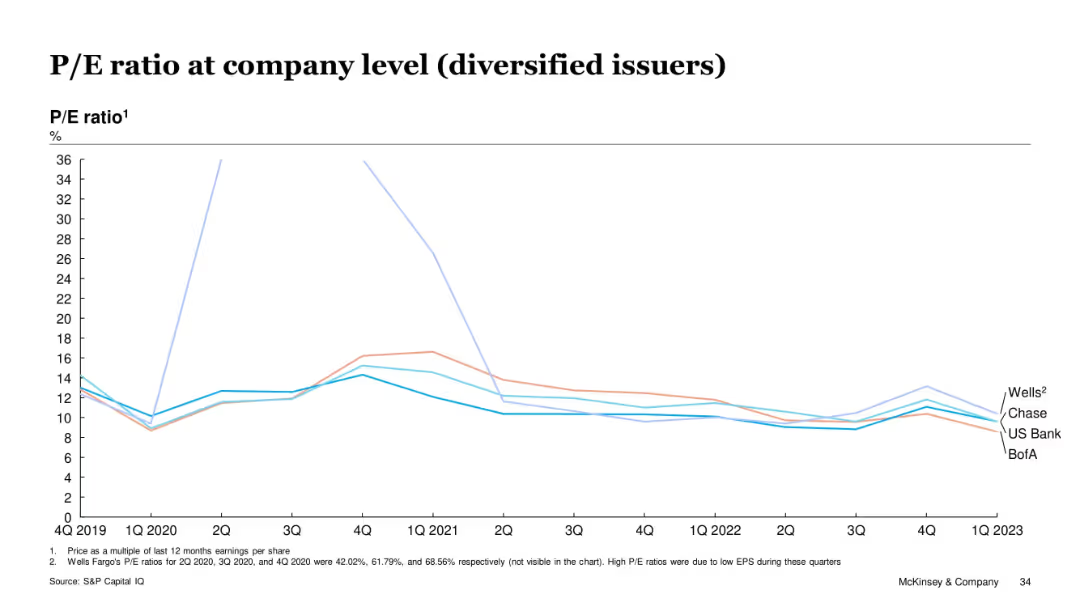
Line chart showing P/E ratios for Wells, Chase, US Bank, and BofA over time
Investment Analysis
Financial Services
Diversified issuers had fluctuating but generally declining P/E ratios from 2019 to 2023. Wells showed anomalies in 2020 due to low EPS. By Q1 2023, all issuers converged around 10–12x range. The slide illustrates reduced market enthusiasm for diversified card lenders post-COVID.
P/E, diversified issuers, stock performance, EPS, valuation, Wells Fargo, McKinsey
Single Chart
McKinsey
Saved
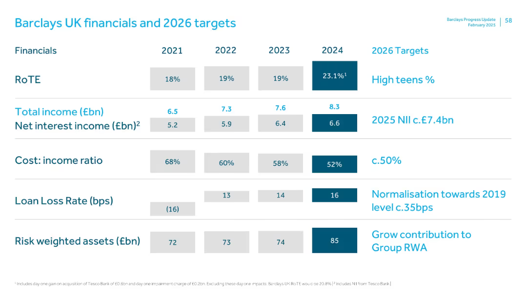
Table format comparing 2021–2024 historical data and 2026 forward targets for KPIs like RoTE, income, cost ratio, and loan loss rates.
Financial Performance
Financial Services
Shows historical and forecasted financials for Barclays UK, including a spike in RoTE (23.1% in 2024), cost ratio improvements, and RWA growth. Lays out performance targets including £7.4bn NII for 2025 and ~50% CIR by 2026.
Barclays UK, financial targets, RoTE, NII, CIR, loan loss, income forecast
Single Chart
Barclays
Saved
Contains column charts showing the percentage of population in urban areas from 2020 to 2050 across continents, with color distinctions and clear labeling.
Market Analysis and Trends
Government & Public Sector
Predicts significant urban population increases by 2050, emphasizing urban planning needs.
urbanization, population growth, planning, 2050, global
Multiple Chart
Roland Berger
Saved
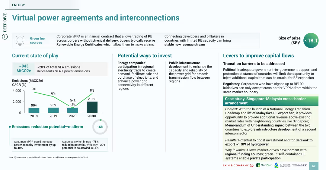
Includes emissions chart, bullet-pointed content blocks, and case study highlighting cross-border collaboration. Designed with a clean, organized layout using teal and white space.
Market Analysis and Trends
Energy & Utilities
Describes the role of virtual power purchase agreements (vPPAs) in facilitating renewable energy adoption through cross-border deals. Emissions reduction potential is estimated at 6%. Investment suggestions include regional electricity trade participation and public infrastructure development. The Singapore-Malaysia cross-border agreement is highlighted as a model for grid-linked expansion.
vPPA, interconnection, cross-border, RE, emissions, SEA, grid, Singapore, Malaysia
Multiple Chart
Bain
Saved
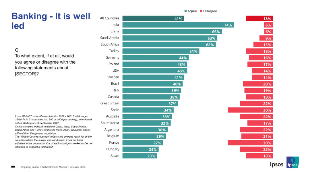
Horizontal bar chart ranking 21 countries by percentage of agreement/disagreement. Title on top-left, Ipsos branding on bottom-right, and survey description in small text at the bottom.
Performance Metrics and KPIs
Financial Services
This slide presents global survey data on perceptions of leadership quality within the banking sector. It compares agreement levels across countries, highlighting which populations view the sector as well-led.
banking, leadership, survey, Ipsos, global comparison, trust, country ranking, public opinion
Mixed Chart
IPSOS
Saved
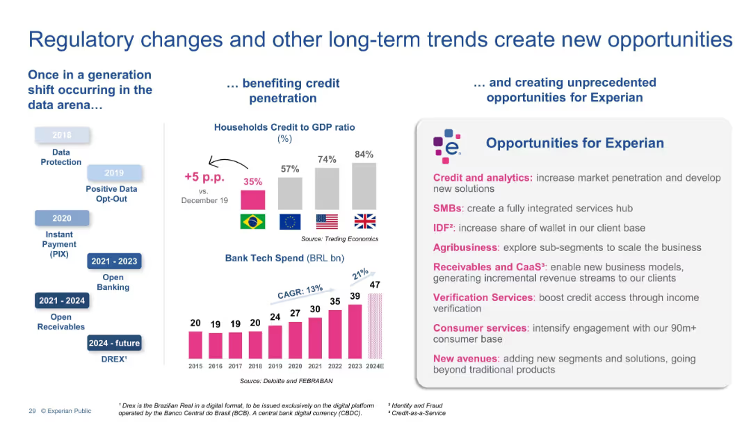
Three-column layout with timelines, bar charts, and opportunity boxes. Left column shows historical regulatory changes, center presents credit-to-GDP comparisons and bank tech spend, and right highlights opportunities for Experian.
Strategic Planning
Financial Services
This slide highlights how regulatory shifts (e.g., PIX, Open Banking) and global credit penetration trends are driving opportunities for Experian. It outlines specific growth areas including credit analytics, SMBs, agribusiness, and verification services, positioning Experian to benefit from evolving financial infrastructure.
Regulatory trends, Credit penetration, Experian, Fintech, Open Banking, Bank tech spend, Opportunities, Credit analytics, SMB, Agribusiness
Multiple Chart
Barclays
Saved
Previous
Next
If nothing, comes up, please save your slides first
Create a FREE account to continue browsing
Receive Instant Access to 1,000+ slides from companies like McKinsey, Google, and Goldman Sachs
First Name
Last Name
Email
Password
I agree to all
Terms & Privacy Policy
Thank you! Your submission has been received!
Oops! Something went wrong while submitting the form.
Have an account?
Sign in
Column Chart
Heatmap
Chevron
Org Chart
Infographic
Callouts
Timeline
List
Graphic
Picture
Process Flow
Diagram
Paragraph
Map
Table
Framework
Subtitle
Takeaway Box
Icon
Other Chart
Radar Chart
Waterfall Chart
Mekko Chart
Pie Chart
Scatter Plot
Line Chart
Bar chart
Bullet points