Create a FREE Account
Instant access to 1,000+ real slides from top companies like McKinsey, BCG, Goldman Sachs, Google and many more!
First Name
Last Name
Email
Password
I agree to all
Terms & Privacy Policy
Thank you! Your submission has been received!
Oops! Something went wrong while submitting the form.
Have an account?
Sign in
Library
Templates
Courses
Pricing
My Account
My Slides
My Templates
✦ AI
AI Prompt Library
AI Search
Sign in
Start Here
Logout
My Saved Slides
Contains line chart, donut chart, and images. Uses blue tones with clear visuals.
Strategic Planning
Financial Services
Highlights GDP growth in South American Andean countries and the geographical profit breakdown.
South America, GDP, growth, profit
Multiple Chart
Morgan Stanley
Saved
This slide summarizes multiple applications for batteries and knowledge gaps using icons and bulleted lists.
Technology and Digital Transformation
Government & Public Sector
Suggests a strategic approach for a specialist battery institute in Australia, focusing on multiple applications and supporting innovation through intellectual property collaboration.
battery institute, innovation, Australia, industrial scale, intellectual property, collaboration, multiple applications, strategy
Vertical Flow
Accenture
Saved
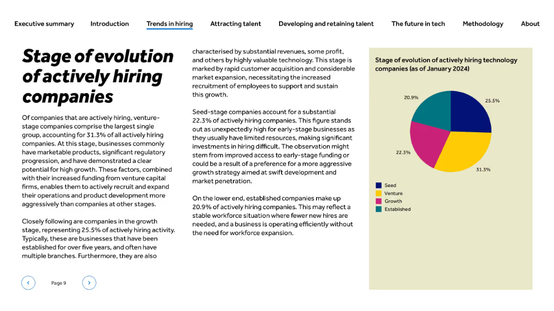
Left-aligned text; pie chart on right on beige background with color-coded legend for business stages
Strategic Planning
Technology & Software
The slide categorizes actively hiring tech firms by their growth stage. Venture-stage companies represent the largest share at 31.3%, followed by growth (25.5%), seed (22.3%), and established (20.9%). The content explains why venture-stage companies lead and notes the implications of early-stage firms actively recruiting despite resource limitations.
venture-stage, startup, seed, established companies, hiring stages, tech company evolution, recruitment phase, market penetration
Mixed Chart
Barclays
Saved
A structured slide with four columns listing key business areas and metrics on the left and future investment leverage and propositions on the right.
Operational Efficiency
Financial Services
Discusses strategies to extend leadership in banking and commerce, with insights on market share and investment focus.
business growth, leadership strategy, market share, investments, financial services, commerce expansion
Table
JP Morgan
Saved
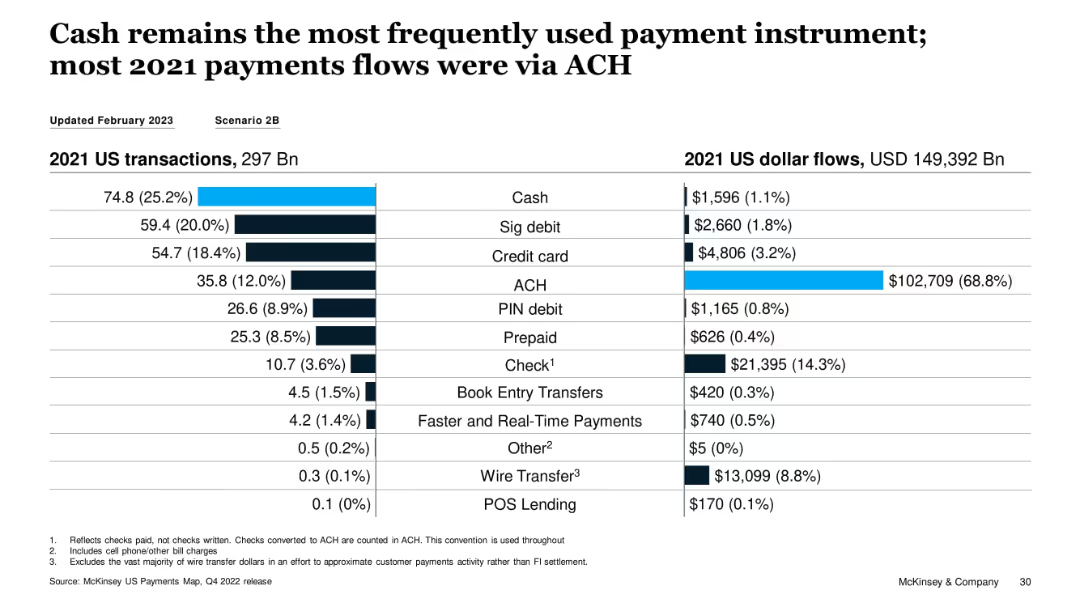
Split bar and table visualization of 2021 transaction volume vs. USD flows by instrument
Performance Metrics and KPIs
Financial Services
The slide highlights that while cash was the most used payment method by volume in 2021, ACH dominated in dollar flows, accounting for 68.8% of total value. This illustrates a divergence between transaction count and transaction value across instruments.
cash usage, ACH, transaction volume, dollar flows, payment instruments, 2021 data
Single Chart
McKinsey
Saved
The slide contains a column chart comparing IT spending in various technologies (e.g., AI, Blockchain, Cloud) across APAC, Europe, and North America, measured in billions.
Market Analysis and Trends
Technology & Software
It provides a comparison of IT spending across regions and technologies, highlighting areas where Europe lags or leads, and stressing the need for increased investment.
IT Spending, Europe, Technology, Investment, Comparison
Mixed Chart
Accenture
Saved
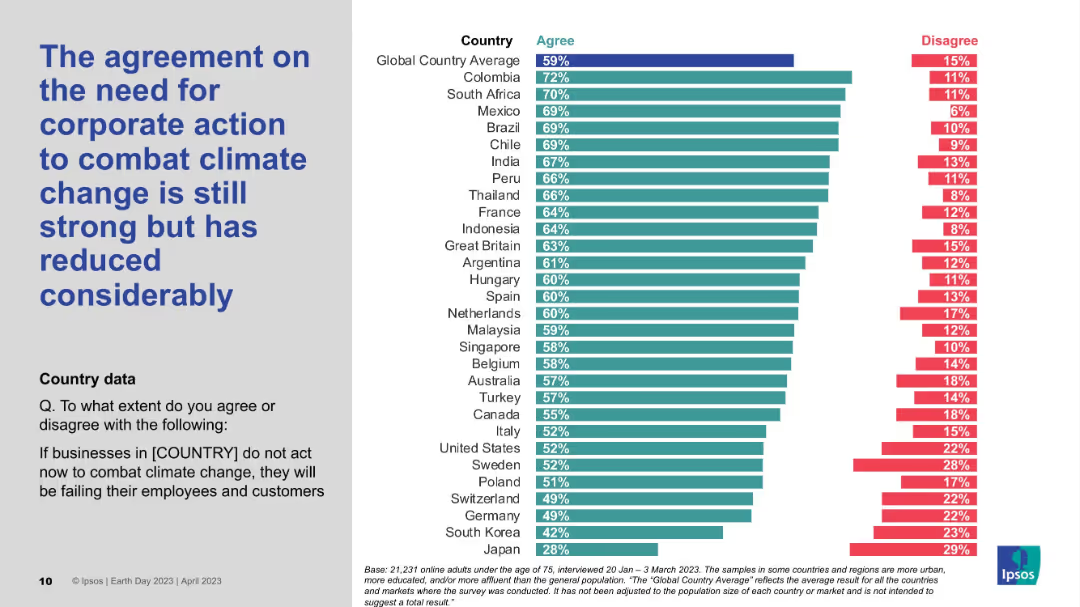
Similar layout as Slide 19444; ranked bar chart; countries arranged by agreement levels; corporate action focus.
Risk Assessment and Management
Environmental Services & Sustainability
This slide focuses on how strongly citizens believe businesses must take action on climate change. While agreement is still significant, it has dropped notably from previous years. Colombia, South Africa, and Mexico show the highest concern.
Corporate responsibility, Climate action, Public opinion, Ipsos, Survey decline
Mixed Chart
IPSOS
Saved
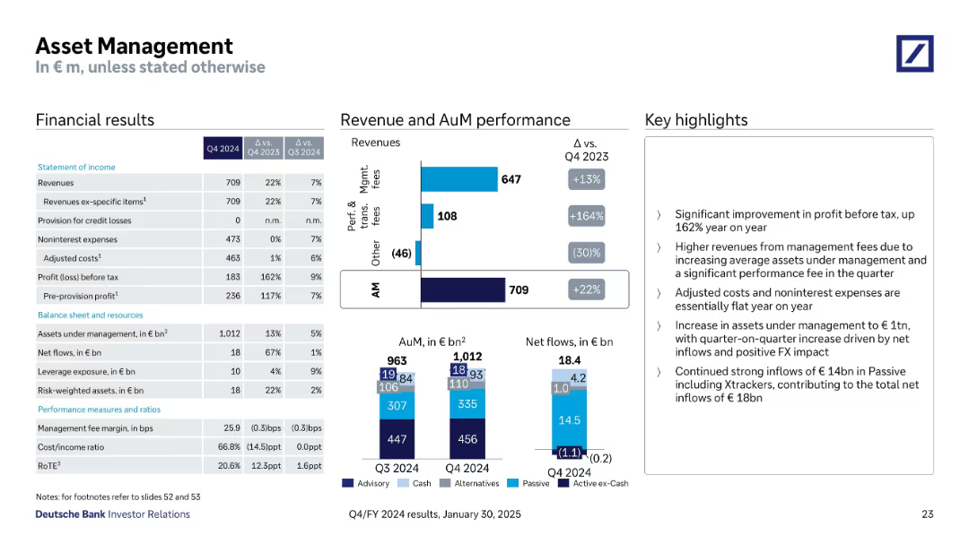
Structured with financial tables, stacked bar charts for AuM & net flows, and performance highlights
Financial Performance
Financial Services
The Asset Management division reported a 22% YoY increase in revenue, driven by strong net inflows and higher management and performance fees. Assets under management reached €1,012bn with inflows of €18.4bn. Adjusted costs remained flat, and profit before tax rose by 162% YoY.
Asset Management, AuM, Net Flows, Fees, Profit, Expenses, Inflows
Multiple Chart
Deutsche Bank
Saved
Checkmarks adjacent to key strategic and financial criteria, presented in a clean, bulleted format.
Investment Analysis
Financial Services
Criteria for assessing new growth opportunities, useful for strategic decision-making or investment opportunity analysis.
Growth, Strategy, Financial Stability, Investment, Evaluation, Criteria
Table
Goldman Sachs
Saved
Contains bar graphs showing the levelized cost of energy for solar, onshore and offshore wind, and nuclear power with and without tax credits, illustrating significant cost reductions due to fiscal incentives.
Market Analysis and Trends
Energy & Utilities
Examines how full application of tax credits could reduce the costs associated with generating energy from various renewable sources, emphasizing the financial benefits of government incentives.
renewable energy, cost reduction, tax credits, solar, wind, nuclear
Single Chart
BCG
Saved
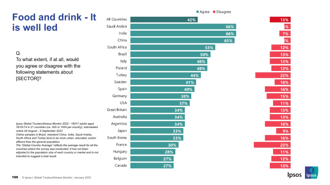
Consistent bar chart format; evaluates perceived leadership quality in the food and drink industry.
Performance Metrics and KPIs
Consumer Goods
Compares countries on how well they believe the food and drink sector is led. Emerging markets again rank highest in confidence, while Western countries show more skepticism. Leadership perception impacts brand and sector trust.
leadership, food industry, public opinion, Ipsos, global trust, consumer goods
Mixed Chart
IPSOS
Saved
Depicts multiple bar charts showing the increase in online adoption across various retail categories, with a particular focus on groceries.
Market Analysis and Trends
Retail & E-commerce
Details the significant increase in online retail adoption in Southeast Asia, with an emphasis on the rapid rise of online grocery shopping.
Online adoption, retail categories, Southeast Asia, groceries, bar chart
Multiple Chart
Bain
Saved
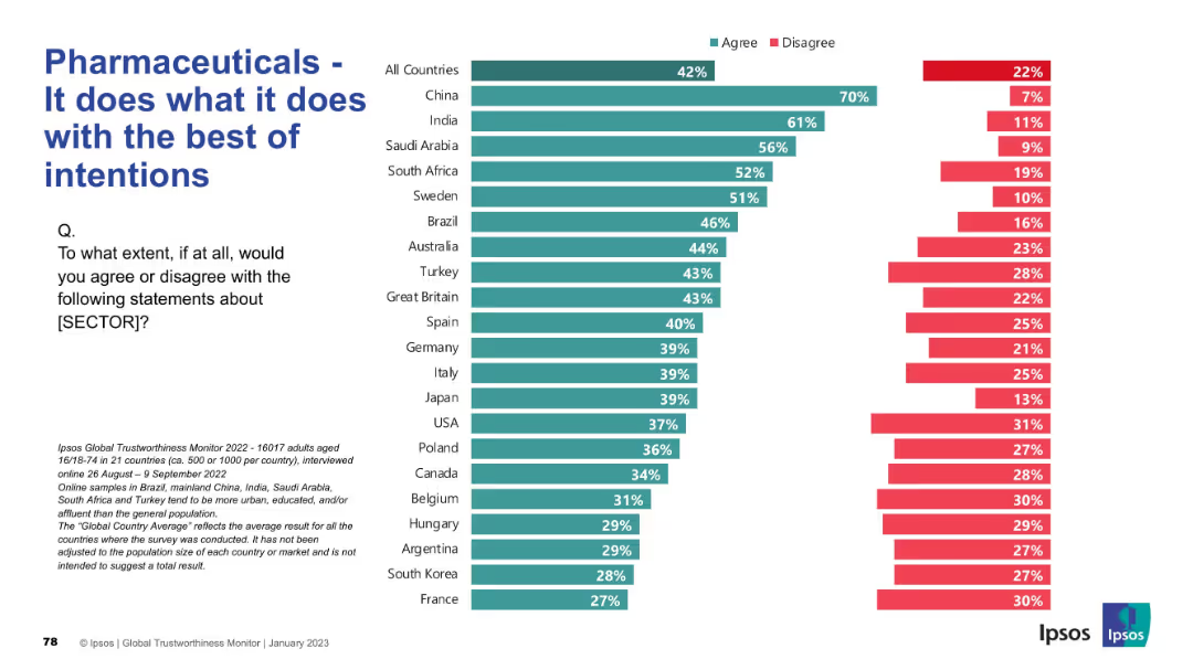
Bar chart ranked by country showing agreement/disagreement levels. Left panel has question and explanation; right has agreement levels in teal and disagreement in red.
Market Analysis and Trends
Healthcare & Pharmaceuticals
This slide evaluates whether people believe the pharmaceutical sector acts with good intentions. Agreement is highest in China and India, but falls significantly in countries like France and South Korea. Distrust appears prevalent in many Western countries.
intentions, public opinion, trust, ethics, pharmaceuticals, Ipsos, sector image, survey, reputation, healthcare
Mixed Chart
IPSOS
Saved
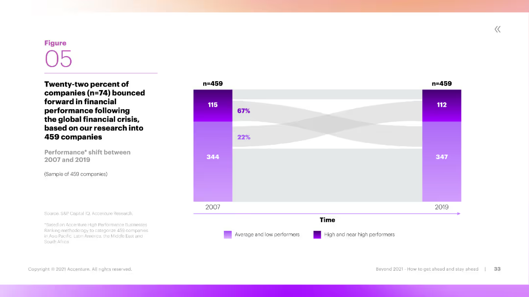
This slide includes a Sankey diagram showing the performance shift of companies between 2007 and 2019. The diagram is color-coded to differentiate between average, low, and high performers, with clear labels and flow directions.
Performance Metrics and KPIs
Financial Services
The slide illustrates the performance shift of companies over time, showing how many transitioned from low or average performance to high performance between 2007 and 2019. It provides insights into long-term financial performance trends.
Performance, Shift, Companies, Long-Term, Trends
Mixed Chart
Accenture
Saved
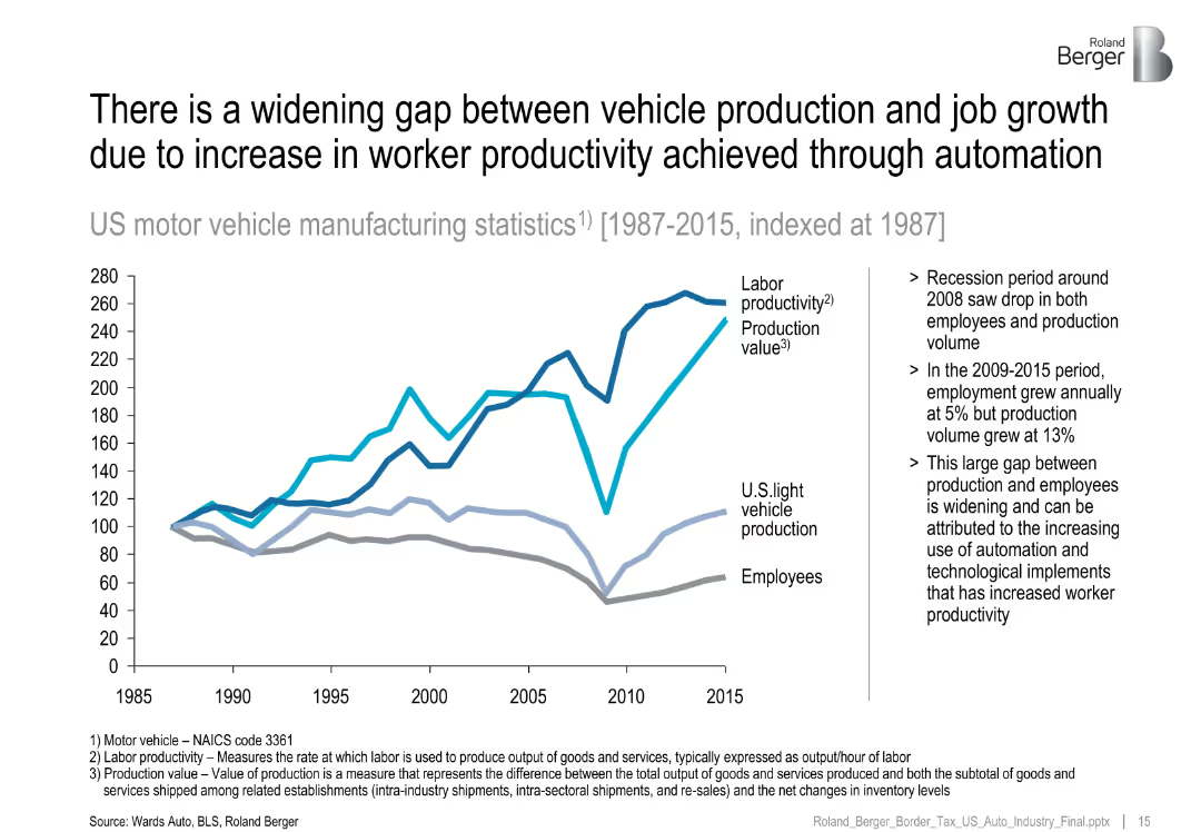
Line chart (1987–2015) comparing labor productivity, production value, and employment.
Human Resources and Talent Management
Industrial & Manufacturing
Illustrates how rising productivity and automation have decoupled vehicle production from employment growth, especially after the 2008 recession.
labor productivity, automation, job gap, vehicle manufacturing, employment
Mixed Chart
Roland Berger
Saved
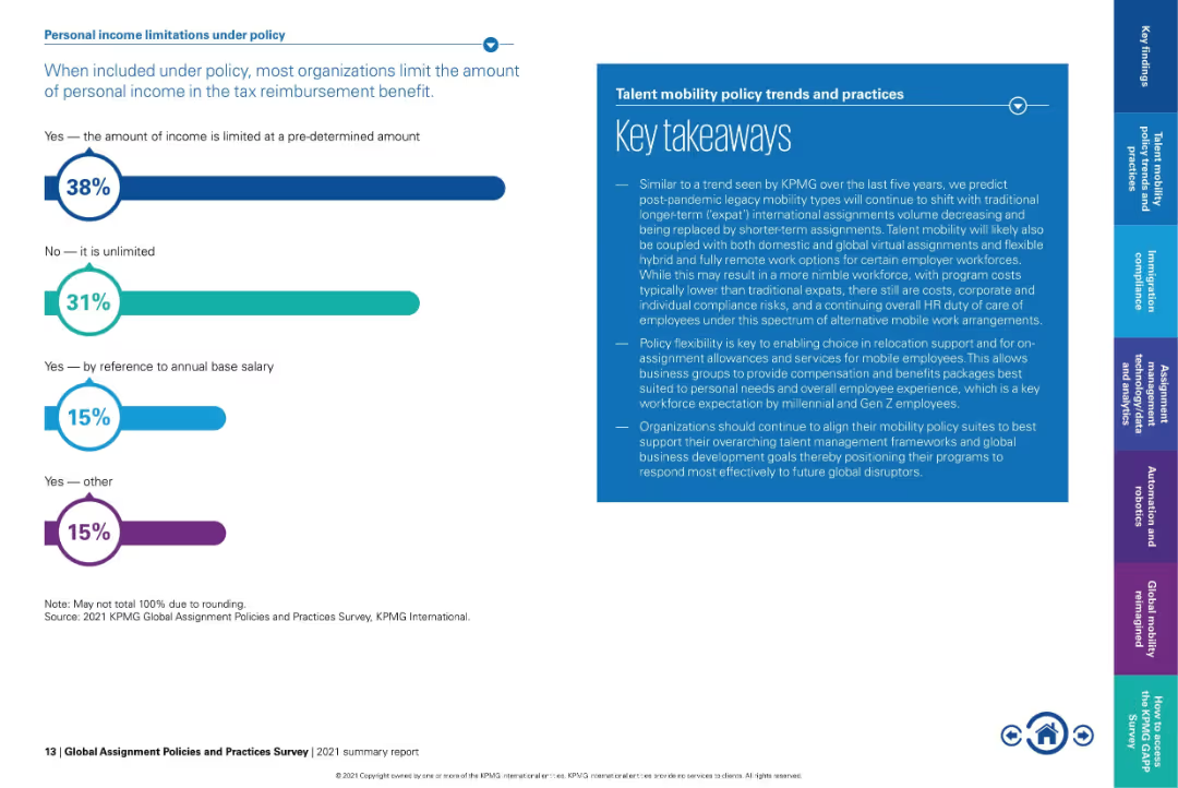
Bar graph on left and text-heavy takeaway box on right in blue.
Regulatory and Compliance
Financial Services
Explains how organizations limit personal income within tax reimbursement policies. 38% impose a predefined cap, while 31% allow unlimited inclusion. Also provides key takeaways on policy flexibility and how mobility policies are evolving post-pandemic.
tax reimbursement, income limitations, expat benefits, flexible mobility, policy caps, compensation policy
Mixed Chart
KPMG
Saved
Features a table listing financial figures and a textual explanation section. The design is clean with alternating shading for rows to enhance readability. The color scheme is consistent with the company's branding.
Financial Performance
Financial Services
Reviews key financial drivers over different time periods, useful for in-depth financial analysis and performance reviews. It assesses the contributions from different sectors to the overall financial results.
Income Statement, Financial Drivers, Net Operating Income, Banking, Asset Management
Table
Goldman Sachs
Saved
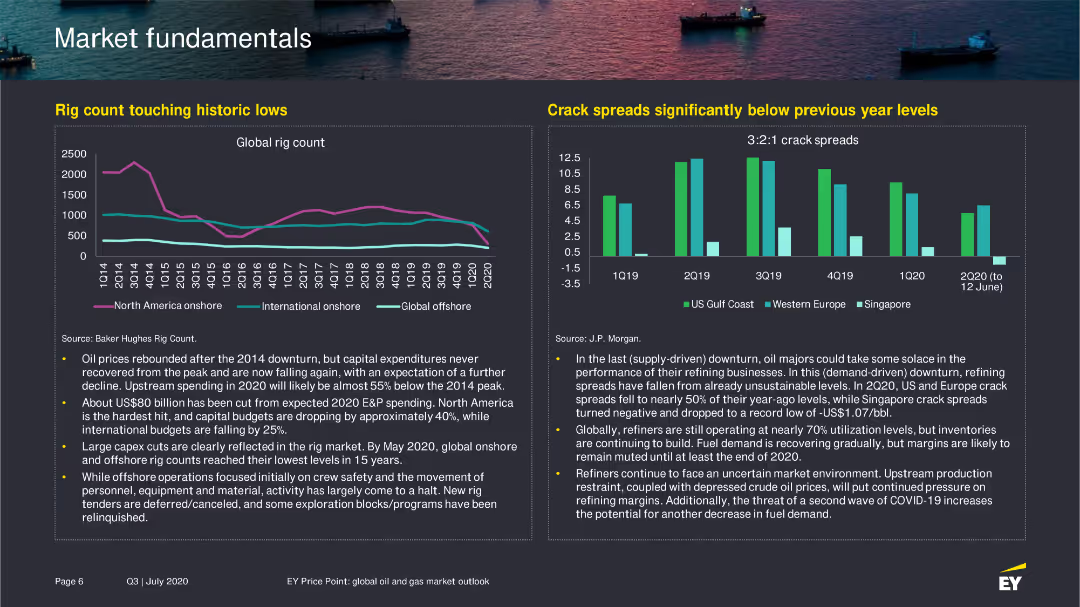
The slide includes a line chart showing the global rig count from Q1 2014 to Q2 2020 and a bar chart comparing crack spreads in different regions from 2019 to 2020.
Market Analysis and Trends
Energy & Utilities
Details the decline in global rig count and the low crack spreads, discussing the implications for the oil and gas industry.
rig count, oil industry, crack spreads, 2020
Multiple Chart
EY
Saved
Contains a horizontal bar graph showing the correlation between organizational health and shareholder return, displayed in a simple and clear manner.
Operational Efficiency
Professional Services
Analyzes how varying levels of organizational health affect shareholder returns over time, making it suitable for financial analysis presentations or stakeholder meetings.
organizational health, performance, shareholder return, bar graph, financial analysis, professional services
Single Chart
McKinsey
Saved
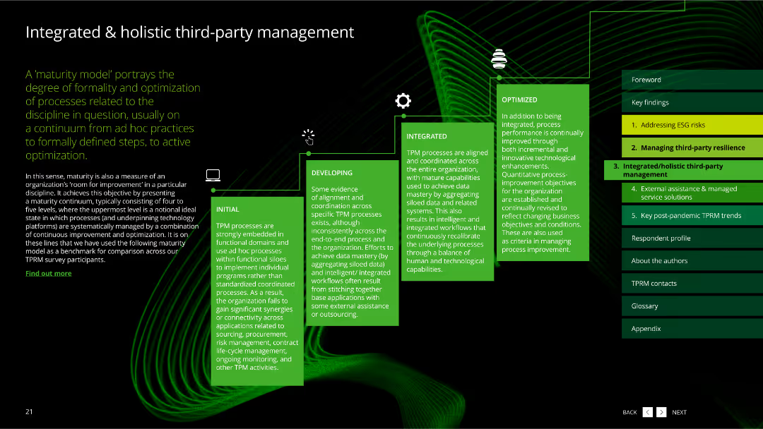
The slide features a dark background with a green wavy line pattern. It includes a flowchart with five green boxes describing the stages of third-party management maturity.
Risk Assessment and Management
Professional Services
The slide explains a maturity model for third-party management, portraying the degree of formality and optimization of processes from initial to optimized stages.
maturity model, third-party management, stages, process optimization, professional services
Linear Flow
Deloitte
Saved
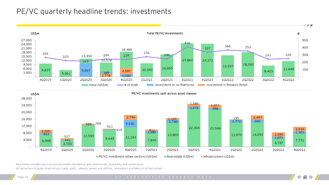
The slide includes two column charts displaying quarterly PE/VC investments by value and by deal segments. The charts use various colors to differentiate between the segments and quarters.
Market Analysis and Trends
Financial Services
This slide analyzes quarterly trends in private equity and venture capital investments, highlighting investment values and deal segments. Useful for understanding quarterly investment patterns.
Quarterly trends, PE/VC, investments, segments
Multiple Chart
EY
Saved
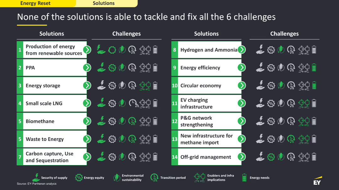
The slide includes a comparative layout with a table listing solutions on the left and the challenges they address on the right. It uses icons and color coding to show which solutions tackle which challenges, providing a clear visual comparison. The layout is detailed and structured to facilitate easy comparison.
Strategic Planning
Energy & Utilities
The slide compares various energy solutions and their effectiveness in addressing six key challenges. It uses a tabular format to show which solutions are capable of tackling specific challenges, illustrating the need for a multifaceted approach to overcome the energy sector's issues.
energy solutions, challenges, comparison, strategic
Table
EY
Saved
This slide uses a bar graph and segmented bars in a purple and grey color scheme to compare essential tasks and enriching activities' relative importance and projected annual growth.
Market Analysis and Trends
Technology & Software
It displays the perceived importance of various online activities over the nbn network, highlighting a trend towards more time spent on enriching activities like gaming and virtual reality.
online activities, nbn network, importance, growth trends, enriching activities, essentials, gaming, virtual reality
Multiple Chart
Accenture
Saved
Timeline showing upcoming sustainability regulations and directives from 2023 to 2024.
Regulatory and Compliance
Consumer Goods
Outlines the increasing regulatory pressures on brands to accelerate sustainability efforts, detailing key regulations.
Regulatory, Sustainability, Compliance, Brands, Pressure
Vertical Flow
Kearney
Saved
Diagram slide with interconnected elements illustrating stakeholders in the IdREN network. Icons and labels represent entities like government, business, and academia, with arrows showing interactions. A list details the benefits and operational model.
Strategic Planning
Education & Training
Provides an overview of the IdREN project aimed at improving connectivity within Indonesia's education and research sectors. Discusses the collaborative model involving various stakeholders and the potential to expand network coverage to more educational institutions.
IdREN, connectivity, education, research, stakeholders, network coverage
Framework
BCG
Saved
Previous
Next
If nothing, comes up, please save your slides first
Create a FREE account to continue browsing
Receive Instant Access to 1,000+ slides from companies like McKinsey, Google, and Goldman Sachs
First Name
Last Name
Email
Password
I agree to all
Terms & Privacy Policy
Thank you! Your submission has been received!
Oops! Something went wrong while submitting the form.
Have an account?
Sign in
Column Chart
Heatmap
Chevron
Org Chart
Infographic
Callouts
Timeline
List
Graphic
Picture
Process Flow
Diagram
Paragraph
Map
Table
Framework
Subtitle
Takeaway Box
Icon
Other Chart
Radar Chart
Waterfall Chart
Mekko Chart
Pie Chart
Scatter Plot
Line Chart
Bar chart
Bullet points