Create a FREE Account
Instant access to 1,000+ real slides from top companies like McKinsey, BCG, Goldman Sachs, Google and many more!
First Name
Last Name
Email
Password
I agree to all
Terms & Privacy Policy
Thank you! Your submission has been received!
Oops! Something went wrong while submitting the form.
Have an account?
Sign in
Library
Templates
Courses
Pricing
My Account
My Slides
My Templates
✦ AI
AI Prompt Library
AI Search
Sign in
Start Here
Logout
My Saved Slides
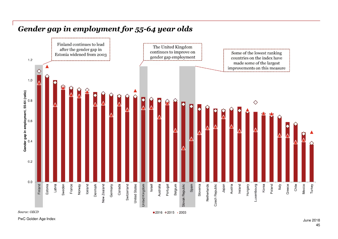
Column chart showing gender gap in employment (ratio) for 55-64 year olds across various countries, with three years' data compared.
Market Analysis and Trends
Professional Services
The slide analyzes the gender gap in employment for older adults across different countries over three periods (2003, 2015, 2016).
gender gap, employment, 55-64, OECD, trend
Single Chart
PwC/Strategy&
Saved
This slide presents column charts showing the percentage of schools affected by various challenges impacting ICT teaching time. It includes quotes from the Federal Ministry of Education, Nigeria, and the Universal Basic Education Commission, highlighting the severity of irregular power supply in Nigeria.
Strategic Planning
Education & Training
This slide depicts the significant challenge of irregular power supply on ICT education in Nigerian public schools. It presents data and authoritative quotes to highlight the urgency of the issue and its impact on the effectiveness of ICT teaching, advocating for infrastructural improvements in the power supply.
ICT, Education, Nigeria, Power Supply, Challenges
Mixed Chart
BCG
Saved
Features bar charts comparing top origin and destination countries for international migrants.
Market Analysis and Trends
Government & Public Sector
Provides an overview of major migration corridors, focusing on India and the US.
migration, India, US, corridors, global
Multiple Chart
Roland Berger
Saved
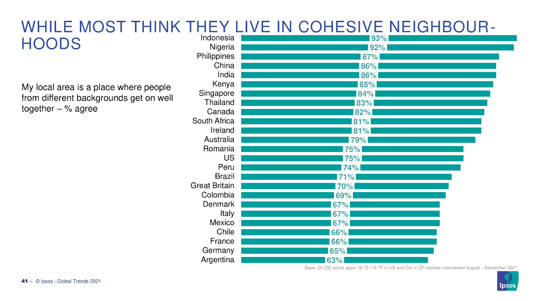
A bar chart with horizontal bars depicting the percentage of people who agree that their local area is cohesive, across various countries.
Market Analysis and Trends
Government & Public Sector
The slide shows global survey results on the perception of neighborhood cohesiveness, presenting data from multiple countries and highlighting high agreement percentages.
neighborhood, cohesiveness, global, survey, perceptions
Single Chart
IPSOS
Saved
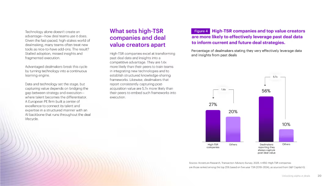
Two bar charts comparing high-TSR vs. others in data usage effectiveness. Light gradient background with supportive text and statistical insights.
Investment Analysis
Financial Services
Highlights how high-TSR companies and consistent value creators excel at utilizing past deal data to inform future strategies, creating a competitive edge through structured knowledge application.
past deal data, TSR, insights, performance, execution
Mixed Chart
Accenture
Saved
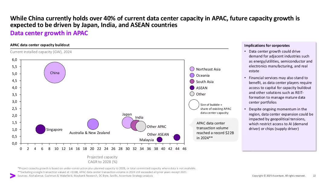
Bubble chart plotting capacity vs CAGR for APAC nations. Color-coded regions and a note on transaction volume record. Implications box on right.
Market Analysis and Trends
Technology & Software
The slide shows regional trends in APAC data center growth, with China currently leading but India, Japan, and ASEAN expected to drive future expansion. It discusses geopolitical and financial considerations for corporates in tech and real estate.
data center, APAC, capacity, CAGR, China, India, ASEAN, growth
Mixed Chart
Accenture
Saved
This slide features a four-part breakdown of adaptability metrics, each with an icon and description. There is a balance between text and visual elements, with green highlights for emphasis.
Technology and Digital Transformation
Professional Services
Presents four new metrics developed to assist Adaptable Organizational Network Analysis (AONA) in the professional services sector, highlighting how organizations can measure and improve their adaptability.
AONA, adaptability, metrics, innovation, organization, professional services
Pillar
Deloitte
Saved
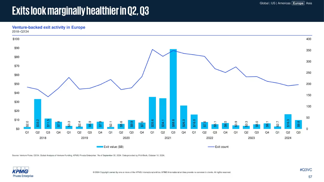
Bar and line chart depicting exit values and exit count per quarter (2018–2024)
Financial Performance
Financial Services
The slide presents exit activity trends in Europe, showing a modest recovery in Q2 and Q3 2024. Despite a general downtrend since 2021, select quarters show improved exit values, indicating potential recovery in M&A or IPO markets.
exits, venture-backed, exit value, M&A, IPO, Q3 2024
Single Chart
KPMG
Saved
Horizontal timeline showing four key phases of Morgan Stanley's evolution from 2009 with corresponding milestones and strategies.
Strategic Planning
Financial Services
Chronicles Morgan Stanley's evolution through four strategic phases, from building scale to deepening client relationships.
Evolution, Morgan Stanley, strategic phases, building scale, technology, channel expansion, client relationships
Linear Flow
Goldman Sachs
Saved
Slide features bar graphs comparing GMV of Thailand’s internet economy from 2019 to 2025, highlighted by growth rates. Sparse text.
Industry Overview
Technology & Software
Predicts the growth of Thailand’s internet economy despite challenges, with an estimated value reaching $57B by 2025.
Internet Economy, Thailand, Growth, Projection, Pandemic, Political, GMV, 2025
Single Chart
Bain
Saved
Column chart with a radar chart overlay showing indicators like income per client, income per employee, and cost-to-income ratio. Indicators are displayed for 2018, 2021, and 2023.
Financial Performance
Financial Services
Highlights the significant growth in income and profitability for European retail banks in 2023 compared to previous years.
income, profitability, retail banking, Europe, radar
Single Chart
Kearney
Saved
A series of comparative charts analyzing the profit potential for different OEM archetypes across various BEV market scenarios. Uses a green-to-red gradient to indicate performance.
Investment Analysis
Transportation & Logistics
Discusses the profit potential for European and American OEMs in the BEV market under different electrification scenarios, highlighting the risks and opportunities associated with each market condition.
BEV, OEM, profits, market scenarios, electrification
Table
BCG
Saved
This slide uses a timeline format with a multi-colored wave graph showing the progression of COVID-19 through phases labeled "Flatten," "Fight," and "Future." It describes anticipated actions in each phase, like social distancing and vaccine development, aimed at controlling the pandemic's impact.
Strategic Planning
Healthcare & Pharmaceuticals
Analyzes the expected phases of COVID-19 recovery focusing on different strategic responses from government and healthcare systems to mitigate the pandemic's impact. Highlights the importance of coordinated responses in limiting cases and supporting economic recovery.
COVID-19, recovery, healthcare, government, pandemic, phases, vaccine
Linear Flow
BCG
Saved
The slide presents a horizontal bar chart listing various investment products owned by respondents.
Market Analysis and Trends
Financial Services
The slide details the ownership distribution of various investment products such as mutual funds, stocks, and bonds.
Investment, Products, Ownership, Mutual Funds, Stocks
Single Chart
IPSOS
Saved
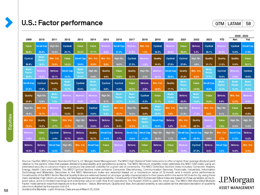
The slide showcases a matrix chart detailing the performance of various factors such as Value, Growth, Quality, etc., from 2009 to 2023.
Financial Performance
Financial Services
This slide provides a comprehensive overview of the annual performance of different investment factors, offering a historical perspective on factor performance.
factor performance, Value, Growth, Quality, annual
Table
JP Morgan
Saved
Multiple column charts showing M&A activities with Russian involvement by sector and deal type.
Mergers and Acquisitions
Transportation & Logistics
Focuses on Russian involvement in global M&A activities, especially in the transportation and logistics sectors.
M&A, Russia, Transportation, Logistics, Global, Activities, Involvement, Sector
Multiple Chart
PwC/Strategy&
Saved
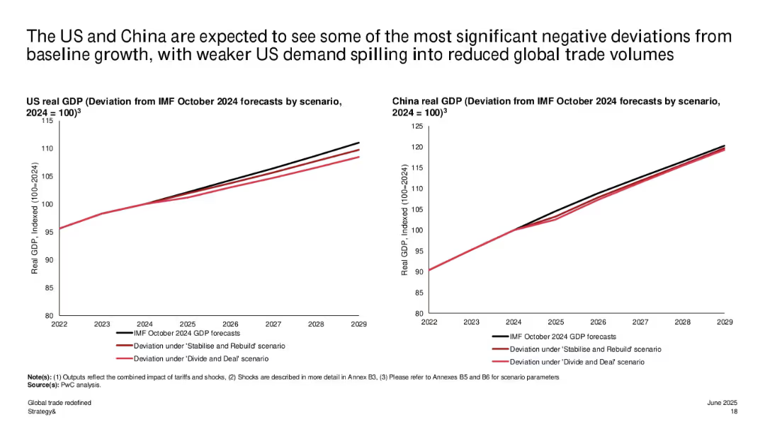
Dual line graphs tracking US and China GDP projections (indexed from 2024); colored lines compare forecast scenarios against IMF baseline.
Financial Performance
Government & Public Sector
This slide illustrates forecasted GDP paths for the US and China under different trade scenarios. Both countries are projected to fall below IMF baseline expectations, with greater deviation under "Divide and Deal", implying weaker demand and trade volume.
GDP forecast, US-China, trade volume, IMF projections, deviation, real GDP, trade disruption, economic modeling
Multiple Chart
PwC/Strategy&
Saved
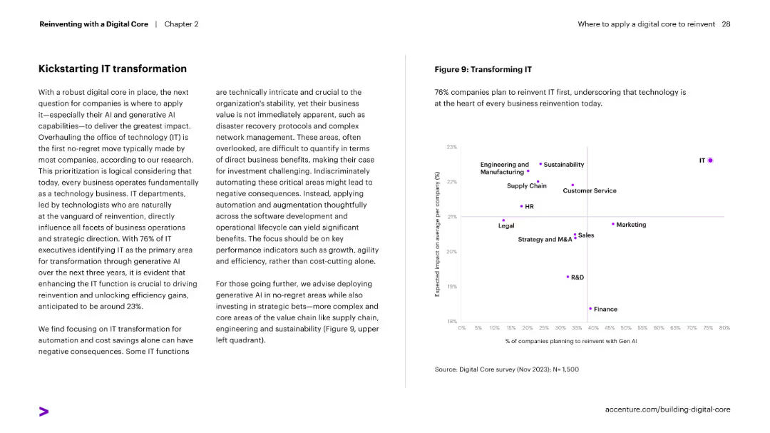
Two-column layout: text on left explains IT transformation priority; right features scatterplot of functions showing expected impact vs. GenAI reinvention planning.
Strategic Planning
Technology & Software
Argues for prioritizing IT transformation in digital reinvention strategies. Shows that companies expect the highest impact from reinventing IT with GenAI, followed by functions like supply chain and sustainability.
IT transformation, GenAI, strategy, scatterplot, business reinvention, impact
Mixed Chart
Accenture
Saved
The slide displays a comparison of Type I to IV H2 tanks, detailing materials, pressure levels, prices, and targeted applications. Visuals include detailed diagrams of each tank type.
Technology and Digital Transformation
Industrial & Manufacturing
Provides a comprehensive overview of different H2 storage tanks, their expected technology readiness by 2030, and specific use cases for mobility and infrastructure.
H2 storage, Type I, Type II, Type III, Type IV, technology readiness, market study, application, pressure levels
Table
Roland Berger
Saved
Slide with four bar charts and accompanying text blocks highlighting talent presence in various industries in Italy, colored distinctly for each sector.
Human Resources and Talent Management
Technology & Software
Discusses talent distribution across different sectors, emphasizing on the gaps and how companies might bridge these to match top-performing companies.
talent management, HR, technology, analytics, digital marketing
Multiple Chart
Bain
Saved
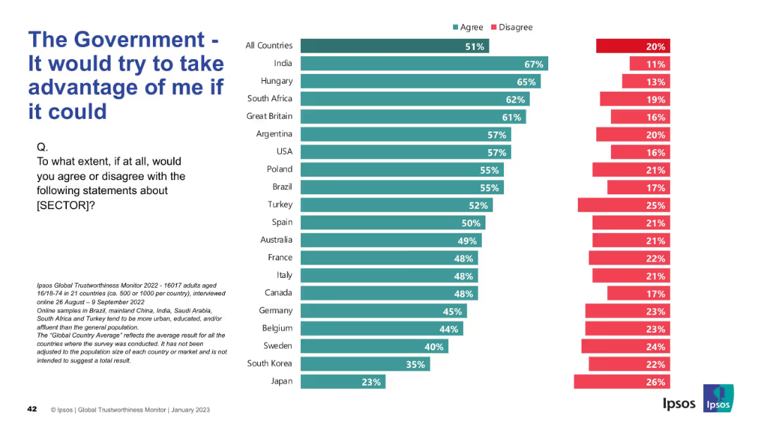
Inverted sentiment slide—agreement here indicates distrust; green bar for agree dominates
Risk Assessment and Management
Government & Public Sector
The slide shows distrust toward government, measuring belief that governments would exploit people if possible. Agreement is highest globally in this negative sentiment.
distrust, exploitation, government behavior, public perception, Ipsos, skepticism, sentiment, international
Mixed Chart
IPSOS
Saved
The slide has a white background with a column chart on the right side. The left side contains text discussing the importance of integrating security in cloud operations.
Technology and Digital Transformation
Technology & Software
This slide emphasizes the significance of embedding security in cloud operations for better business outcomes and the high percentage of cyber champions prioritizing cloud security.
Cloud security, business outcomes, cybersecurity, cloud operations, champions, integration, security, digital transformation, alignment
Mixed Chart
Accenture
Saved
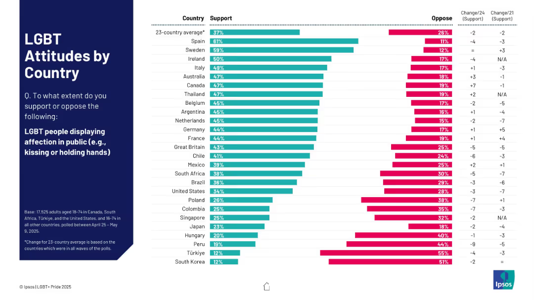
Similar to 19718 but focused on support for LGBT people displaying affection in public. Countries ranked by support with trend columns.
Market Analysis and Trends
Government & Public Sector
Compares support for public LGBT affection across 23 countries. Spain and Sweden lead; UK ranks mid-range. Notable opposition in South Korea and Türkiye. Trend data shows shifting attitudes since 2021.
LGBT, public affection, country comparison, trend analysis, Ipsos
Mixed Chart
IPSOS
Saved
The slide contains a column chart showing the percentage of organizations with formal DEI hiring goals. The layout is moderately dense with text and visual elements.
Human Resources and Talent Management
Professional Services
Discusses the prevalence of formal DEI hiring goals within organizations and their public announcements.
DEI, hiring goals, formal goals, public announcements, organizations
Mixed Chart
Accenture
Saved
The slide uses multiple infographics, including bar graphs and pie charts, to present data on global sustainability efforts.
Industry Overview
Environmental Services & Sustainability
This slide presents a summary of global sustainability efforts, highlighting progress and areas needing improvement. It is useful for discussions on policy development and evaluation of ongoing environmental efforts.
sustainability, global, progress, infographic, environmental
Table
McKinsey
Saved
Previous
Next
If nothing, comes up, please save your slides first
Create a FREE account to continue browsing
Receive Instant Access to 1,000+ slides from companies like McKinsey, Google, and Goldman Sachs
First Name
Last Name
Email
Password
I agree to all
Terms & Privacy Policy
Thank you! Your submission has been received!
Oops! Something went wrong while submitting the form.
Have an account?
Sign in
Column Chart
Heatmap
Chevron
Org Chart
Infographic
Callouts
Timeline
List
Graphic
Picture
Process Flow
Diagram
Paragraph
Map
Table
Framework
Subtitle
Takeaway Box
Icon
Other Chart
Radar Chart
Waterfall Chart
Mekko Chart
Pie Chart
Scatter Plot
Line Chart
Bar chart
Bullet points