Create a FREE Account
Instant access to 1,000+ real slides from top companies like McKinsey, BCG, Goldman Sachs, Google and many more!
First Name
Last Name
Email
Password
I agree to all
Terms & Privacy Policy
Thank you! Your submission has been received!
Oops! Something went wrong while submitting the form.
Have an account?
Sign in
Library
Templates
Courses
Pricing
My Account
My Slides
My Templates
✦ AI
AI Prompt Library
AI Search
Sign in
Start Here
Logout
My Saved Slides
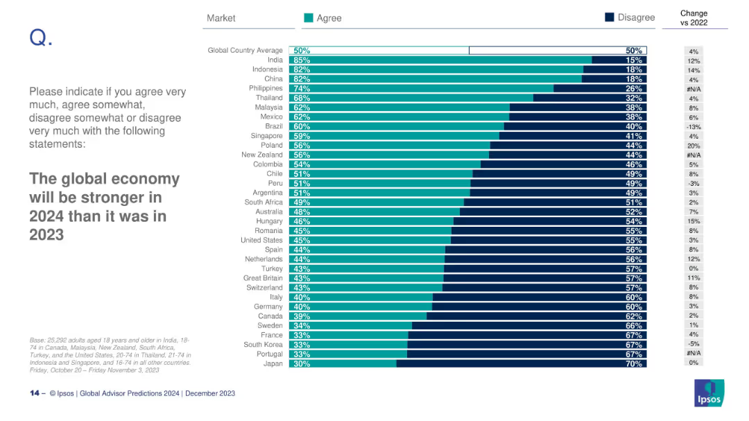
Bar chart by country measuring belief in economic improvement; includes % changes.
Financial Performance
Professional Services
This slide measures belief in a stronger global economy in 2024. India (85%) and Indonesia (82%) are most optimistic; Japan (30%) and Portugal (33%) are least.
economic outlook, 2024, global economy, confidence, Ipsos, predictions
Mixed Chart
IPSOS
Saved
Flowchart depicting the traditional procurement technology flow, labeled from strategic planning to operational procurement.
Operational Efficiency
Professional Services
Illustrates a comprehensive flowchart of the procurement process, detailing stages from strategic planning to compliance management.
procurement, process, flowchart, operational, strategic
Linear Flow
Kearney
Saved
The slide uses vertical bar charts to compare the top five concerns deterring EV adoption over three years (2021, 2022, 2023), each with different colors.
Market Analysis and Trends
Transportation & Logistics
This slide identifies the main concerns preventing consumers from buying EVs, such as lack of charging stations, limited range, and high purchase costs, across different years.
EV concerns, charging stations, purchase cost, range anxiety, consumer deterrents
Multiple Chart
EY
Saved
This slide features a bar chart displaying the incremental cost to firm intermittent renewable resources across different regions, alongside the levelized cost of energy for gas peaking and combined cycle.
Risk Assessment and Management
Energy & Utilities
The slide examines the cost of firming intermittent renewable energy sources, comparing it with conventional gas peaking and combined cycle plants to highlight the challenges of integrating renewables.
Intermittency, Firming Cost, Renewable Energy, Comparison, Gas Peaking
Mixed Chart
Roland Berger
Saved
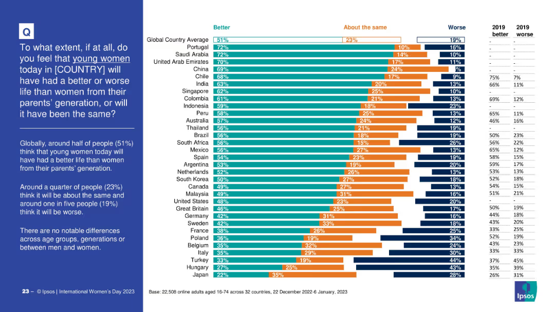
Bar chart comparing public opinion across countries on whether young women today will have a better, worse, or similar life to women from their parents’ generation. Includes three-part segmented bars per country and a data table for 2019 comparison. Left-aligned question and summary in blue box.
Market Analysis and Trends
Government & Public Sector
This slide presents global data on perceptions of how life outcomes for young women today compare to those of previous generations. It highlights that 51% globally think women’s lives will be better, with variations across countries. Historical comparison data from 2019 is included.
gender equality, generational trends, global survey, perception, young women, life improvement, societal progress, public opinion, Ipsos
Mixed Chart
IPSOS
Saved
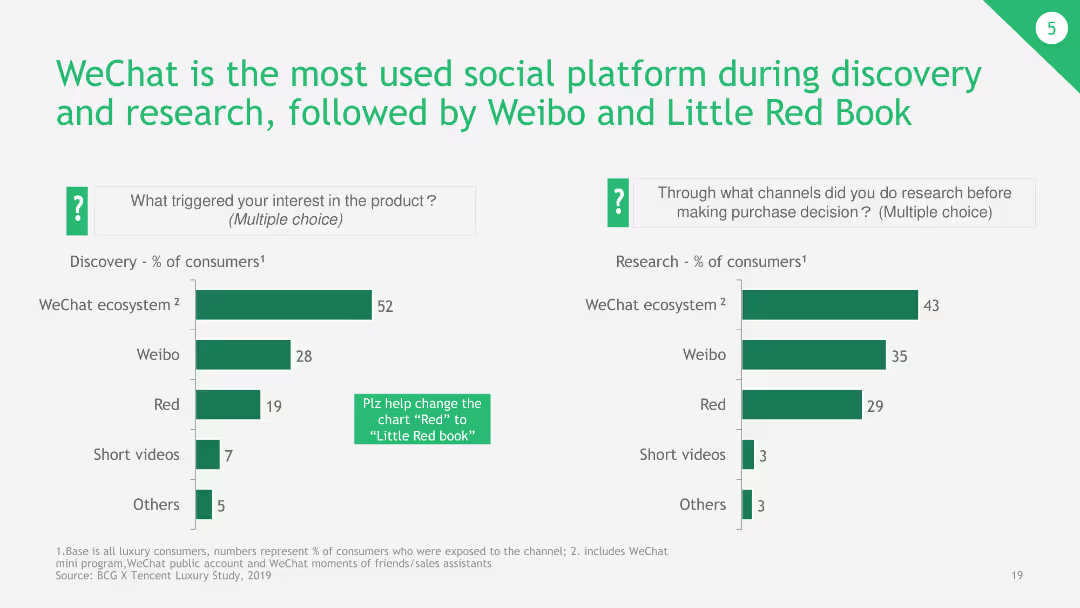
The slide contains bar charts showing percentages of consumers using various social platforms for discovery and research. It also has explanatory notes on usage.
Market Analysis and Trends
Telecommunications
The slide explains the dominance of WeChat as the primary social platform for consumer discovery and research, with comparative data on Weibo and Little Red Book, showing their respective user engagement rates.
WeChat, social platform, discovery, research, Weibo, Little Red Book
Multiple Chart
BCG
Saved
Slide with a comparison chart showing the purchase decisions in the fitness industry related to initial consideration, active evaluation, and loyalty. It compares fitness with other industries like airlines, hotels, and streaming entertainment.
Competitive Landscape
Healthcare & Pharmaceuticals
Highlights the importance of brand consideration and loyalty in the fitness industry, showing how fitness ranks among other industries in consumer purchase decisions. Useful for strategic planning in marketing and customer loyalty enhancement within the fitness sector.
Fitness industry, consumer loyalty, purchase decisions, competitive analysis, brand strategy
Mixed Chart
McKinsey
Saved
The slide is a content slide with a blend of text and a column chart. It features a background image of buses with an overlay text box. The right side has a column chart with four sectors listed vertically.
Market Analysis and Trends
Government & Public Sector
The slide discusses the role of governments in supporting technological innovation to achieve net-zero targets. It emphasizes the balance between regulation and investment and highlights major carbon emitters in 2050, advocating for the adoption of breakthrough technologies to aid decarbonization efforts.
Technology, Government, Net-zero, Decarbonization, Emissions
Mixed Chart
EY
Saved
This slide features a title at the top, three circles in increasing size representing data points for years 2021, 2025, and 2030 to the left, and a list of bulleted points to the right. The circles use a muted color palette and are labeled with monetary figures, denoting the SEA internet economy GMV. The slide background is white.
Market Analysis and Trends
Technology & Software
The slide predicts the growth of the SEA internet economy, reaching $1T GMV by 2030. It highlights the role of e-commerce, online grocery, and transport & food sectors in this growth. This slide could be used to illustrate potential areas for investment and development in the SEA region, focusing on the digital economy's expansive growth.
Digital Economy, SEA, GMV, Growth, E-commerce, Online Grocery, Transport & Food, 2030, Investment, Development
Single Chart
Bain
Saved
The slide contains two column charts. The first chart shows corporate cash as a percentage of current assets by sector. The second chart shows research & development and capital expenditure by sector.
Financial Performance
Financial Services
This slide details cash and capital expenditure in the United States by sector, focusing on corporate cash holdings and investment in research & development. It is used for financial performance analysis and strategic planning.
United States, cash, capital expenditure, sector, research & development, financial performance
Multiple Chart
JP Morgan
Saved
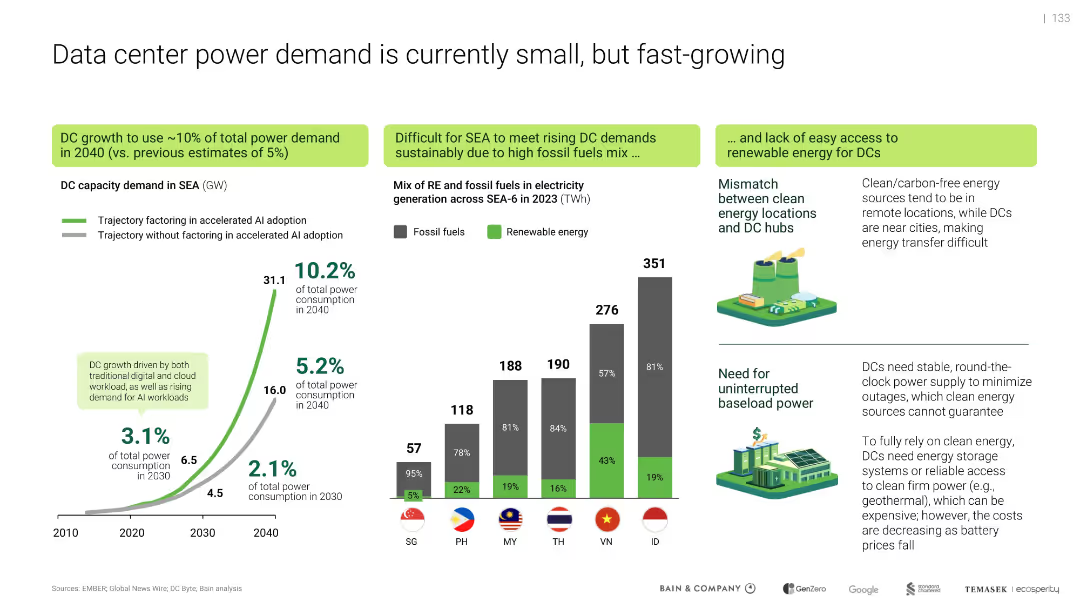
Multi-section layout with graphs, illustrations, and color-coded callouts
Strategic Planning
Technology & Software
Projects that data center energy demand in SEA could reach 10% of total power use by 2040, driven by AI. Emphasizes mismatch between renewable sources and data center locations, and the need for uninterrupted power. Highlights current reliance on fossil fuels and challenges of clean energy integration.
AI, power demand, renewable energy, fossil fuels, data center growth, energy mismatch, SEA-6, baseload power
Multiple Chart
Bain
Saved
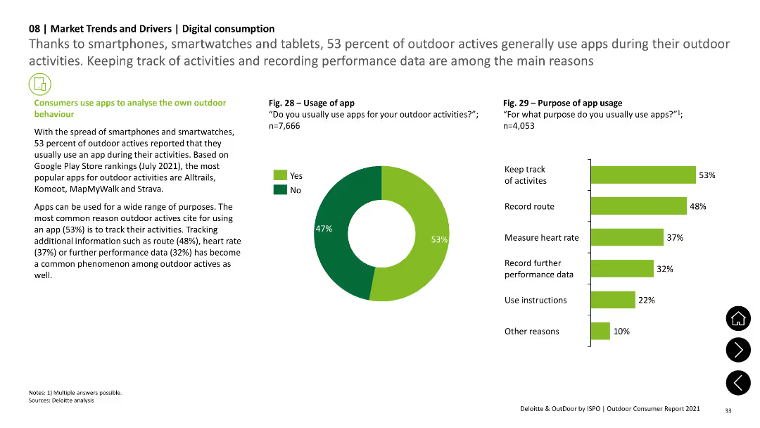
The slide features a pie chart showing app usage during outdoor activities and a column chart detailing the purposes of app usage, such as tracking activities and recording performance data. Text sections add context.
Technology and Digital Transformation
Technology & Software
The slide examines the use of apps by outdoor enthusiasts, highlighting the main purposes for app usage, including tracking activities, recording routes, and measuring heart rates, based on survey data.
app usage, digital tools, outdoor activities, tracking, performance data
Multiple Chart
Deloitte
Saved
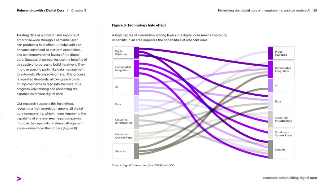
Sankey diagram on right visually showing correlation flows between different digital core components. Text on left explains the halo effect of improving one area benefitting others.
Technology and Digital Transformation
Technology & Software
Explains how enhancing one area of a digital core (e.g., AI or integration) strengthens other components. The high interconnectivity across the core's layers is represented visually in a Sankey diagram.
halo effect, digital core, integration, AI, correlation, transformation, platform improvement
Diagram
Accenture
Saved
This slide features a four-step circular process diagram at the left and a three-part list on the right. The background is white, with the header and footer in dark blue. A page number is at the bottom right.
Financial Performance
Financial Services
The slide outlines a comprehensive framework for bond processes, including opportunity identification, investment tagging, and internal review. It also describes the broader integration of project selection, asset tracking, and reporting within the company's sustainability framework. It's ideal for explaining the systematic approach to stakeholders or potential investors and highlighting the organization's transparency and accountability in sustainable finance.
Bonds, Finance, Sustainability, Reporting, Investment, Framework, Process, Guidelines, Auditing
Linear Flow
Goldman Sachs
Saved
The slide shows a matrix-like table categorizing asset flows across different financial products and regions from 2013 to Q1 2023. It uses green and red dots to indicate increases or decreases in assets, respectively.
Financial Performance
Financial Services
It analyzes JPMorgan Chase's client asset flows over time, showcasing the performance across different sectors and regions. This slide is used for financial performance reviews and strategic planning.
JPMC, asset flows, financial analysis, product performance, regional analysis, strategic planning, client assets.
Single Chart
JP Morgan
Saved
Circular layout representing a continuous process cycle.
Technology and Digital Transformation
Professional Services
Highlights Deloitte's approach to addressing workforce challenges with a three-part process: imagine, compose, activate.
Workforce, Solutions, Imagine, Compose, Activate
Diagram
Deloitte
Saved
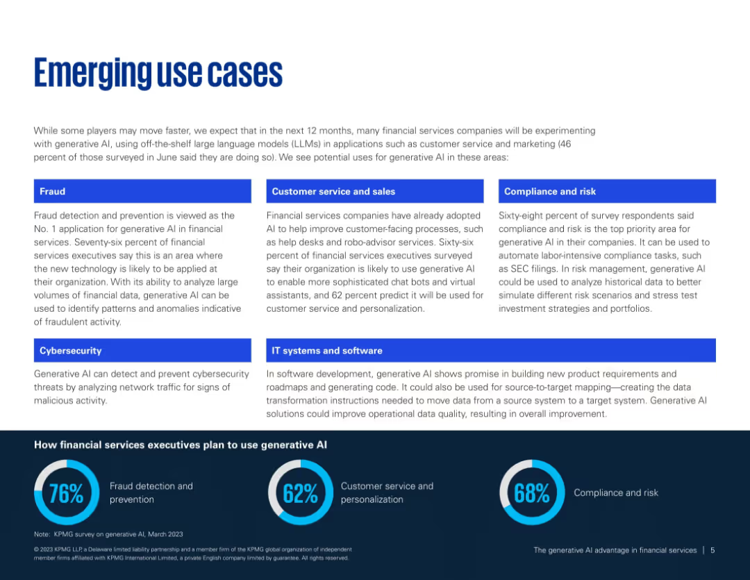
Two-column layout with blue category labels and short paragraphs per use case; footer shows usage statistics.
Product and Service Analysis
Financial Services
Outlines key generative AI use cases in financial services such as fraud detection, customer service, compliance, and IT systems. Supports findings with survey data on AI implementation intentions and perceived value areas.
AI use cases, fraud detection, compliance, customer service, IT transformation, financial tech
Mixed Chart
KPMG
Saved
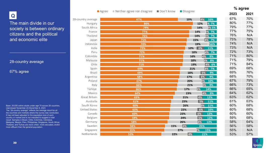
Chart-driven layout emphasizing agreement levels; similar structure to other slides.
Market Analysis and Trends
Government & Public Sector
Highlights societal polarization, with 67% average agreement that a main societal divide exists between ordinary people and elites. Top countries include Hungary, South Africa, and France, signaling global concern over inequality and power.
societal divide, elite vs citizens, polarization, survey, inequality, governance
Mixed Chart
IPSOS
Saved
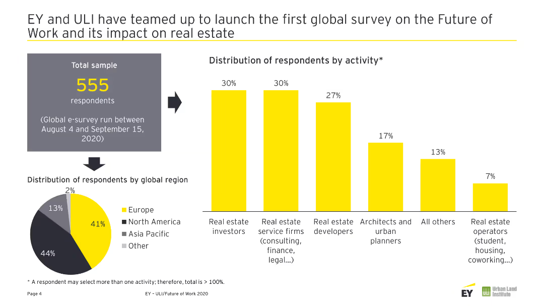
A pie chart showing the global distribution of respondents and a column chart showing respondents' activities.
Market Analysis and Trends
Real Estate & Construction
This slide presents the global distribution and activity breakdown of respondents in a survey on the future of work and its impact on real estate.
Future of Work, Real Estate, Survey, Respondents, Global Distribution
Multiple Chart
EY
Saved
Includes a bar chart comparing current and future human-machine working hours, and a pie chart showing reskilling needs of employees.
Operational Efficiency
Financial Services
Highlights the need for reskilling employees in the insurance industry due to shifts in labor between humans and machines, emphasizing digitization and automation impacts.
Reskilling needs, Human-machine working hours, Insurance industry, Digitization, Automation
Multiple Chart
EY
Saved
Two large numeric points on the right, a simple text box on the left, and a bright purple background. The design is clean and segmented with bold text for easy reading.
Strategic Planning
Telecommunications
This slide serves as an introduction, highlighting the key values and essentialities of the nbn™ network, setting the stage for the discussion to follow.
nbn network, introduction, essential tasks, enriching activities, presentation, connectivity, digital value, network importance
Agenda
Accenture
Saved
Features a dual-axis line chart comparing accelerator attendance and equity investment in Manchester, with textual analysis of trends.
Market Analysis and Trends
Technology & Software
Analyzes the impact of accelerators on Manchester's tech sector, noting a correlation between accelerator activity and equity investment, with predictions for post-2020 recovery.
Manchester, accelerators, investment, equity trends, pandemic impact, business startups, local economy, government support, future outlook
Mixed Chart
Barclays
Saved
This slide features a column chart comparing current and prospective retirement ages across various countries, with color coding for easier differentiation between the data. The layout is clear with readable fonts and distinct colors for each country.
Market Analysis and Trends
Government & Public Sector
The slide analyzes retirement age trends to suggest necessary policy adaptations in light of changing demographics.
retirement, policy, demographics, OECD, trends
Mixed Chart
Roland Berger
Saved
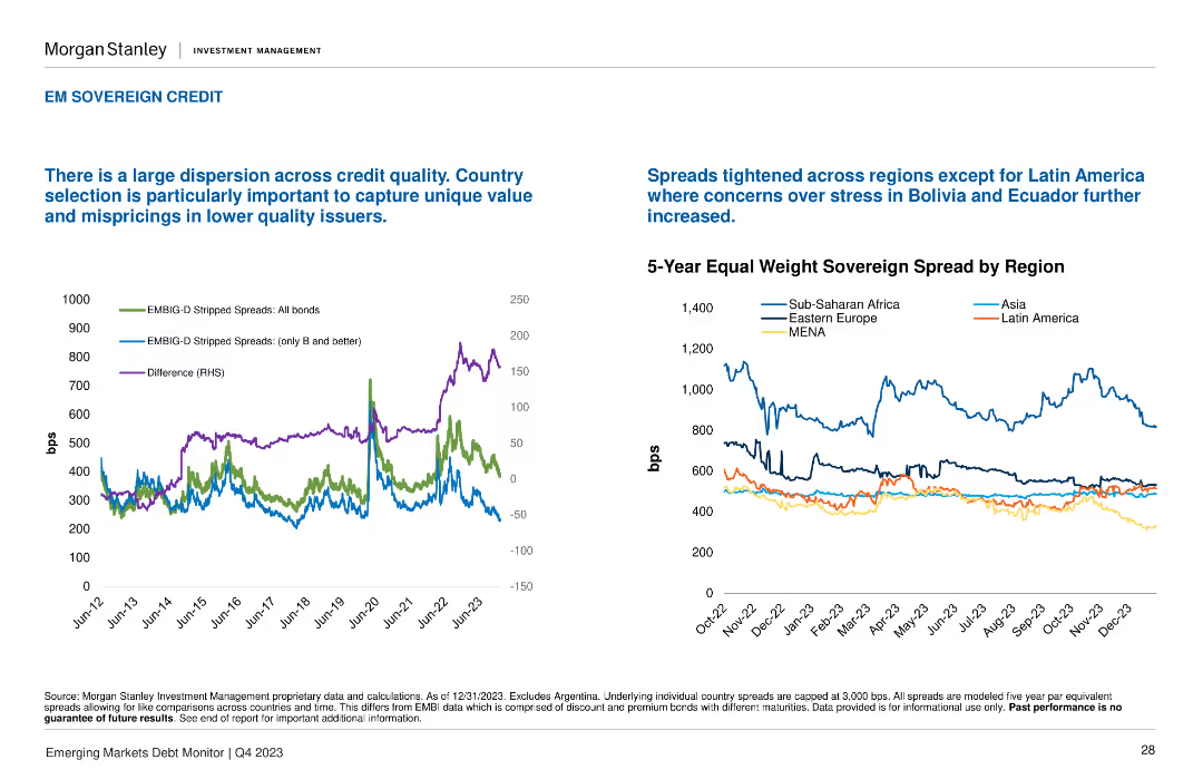
This slide includes two line charts: one showing the EMBIG-D stripped spreads and the other showing the 5-Year Equal Weight Sovereign Spread by Region.
Market Analysis and Trends
Financial Services
It discusses the dispersion across credit quality and the tightening spreads in most regions, except for Latin America. Important for regional credit risk analysis.
credit quality, regional analysis, spreads, EMBIG-D, sovereign
Multiple Chart
Morgan Stanley
Saved
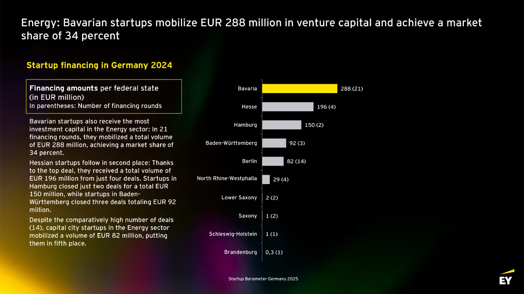
Same layout as prior slide, but shows investment by federal state with Bavaria in yellow as market leader; bar chart on right, text and table on left.
Investment Analysis
Energy & Utilities
Focuses on geographic distribution of energy startup funding in Germany. Bavaria leads with EUR 288M from 21 rounds. Hesse, Hamburg, and Baden-Württemberg follow. Despite more deals, Berlin raised less capital.
Bavaria, energy startups, Germany, state comparison, venture capital, 2024, market share
Mixed Chart
EY
Saved
Previous
Next
If nothing, comes up, please save your slides first
Create a FREE account to continue browsing
Receive Instant Access to 1,000+ slides from companies like McKinsey, Google, and Goldman Sachs
First Name
Last Name
Email
Password
I agree to all
Terms & Privacy Policy
Thank you! Your submission has been received!
Oops! Something went wrong while submitting the form.
Have an account?
Sign in
Column Chart
Heatmap
Chevron
Org Chart
Infographic
Callouts
Timeline
List
Graphic
Picture
Process Flow
Diagram
Paragraph
Map
Table
Framework
Subtitle
Takeaway Box
Icon
Other Chart
Radar Chart
Waterfall Chart
Mekko Chart
Pie Chart
Scatter Plot
Line Chart
Bar chart
Bullet points