Create a FREE Account
Instant access to 1,000+ real slides from top companies like McKinsey, BCG, Goldman Sachs, Google and many more!
First Name
Last Name
Email
Password
I agree to all
Terms & Privacy Policy
Thank you! Your submission has been received!
Oops! Something went wrong while submitting the form.
Have an account?
Sign in
Library
Templates
Courses
Pricing
My Account
My Slides
My Templates
✦ AI
AI Prompt Library
AI Search
Sign in
Start Here
Logout
My Saved Slides
This slide displays a series of bar graphs illustrating the potential increase in tax credit bonuses for renewable investments, categorized by conditions like domestic content and community impact.
Market Analysis and Trends
Energy & Utilities
Details the tax credit structure for renewable energy investments under new legislative acts, focusing on how bonuses can enhance base incentives. Useful for discussions on fiscal incentives and their impact on clean energy investments.
renewable energy, tax credits, investment cost, fiscal policy
Mixed Chart
BCG
Saved
The slide includes column charts showing adjusted net margin, gross margin, net revenues, pre-tax income, and average assets under management for wealth management and Swiss bank segments across several quarters.
Financial Performance
Financial Services
This slide provides a detailed look at net and gross margins, revenues, pre-tax income, and assets under management for wealth management and Swiss bank segments. It is used to evaluate financial performance and efficiency.
Net margin, gross margin, revenues, pre-tax income, assets, wealth management, Swiss bank, quarterly performance, financial efficiency
Multiple Chart
Credit Suisse
Saved
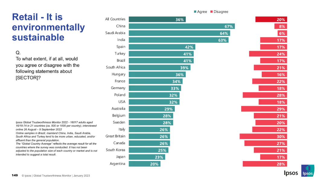
Agreement/disagreement by country with emphasis on sustainability claims; color-coded bars.
Market Analysis and Trends
Retail & E-commerce
Evaluates perceptions of the retail sector’s environmental responsibility. China, Saudi Arabia, and India show highest agreement; many Western nations are skeptical.
sustainability, environment, perception, Ipsos, retail, countries, green practices
Mixed Chart
IPSOS
Saved
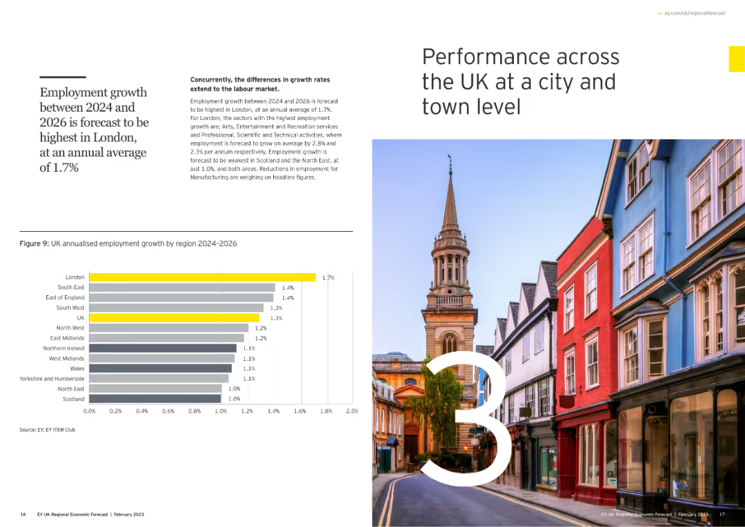
Includes a large number "3" with an image of a cityscape, and a column chart showing annualized employment growth by region for 2024-2026.
Market Analysis and Trends
Government & Public Sector
Examines city and town level performance across the UK, forecasting employment growth from 2024 to 2026, with a focus on regional disparities.
city performance, UK, employment growth, regions, column chart
Mixed Chart
EY
Saved
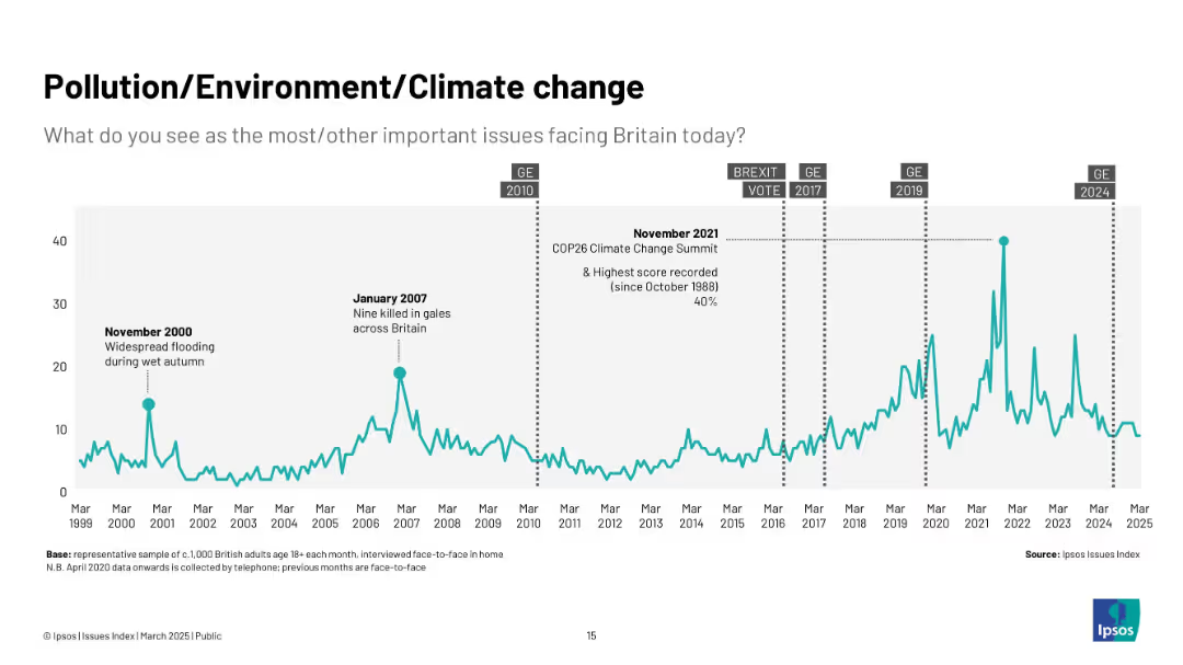
Teal line graph from 1999 to 2025 with key climate and weather-related events annotated.
Market Analysis and Trends
Environmental Services & Sustainability
This slide shows how concern over environmental issues has grown, especially during significant events like COP26 and flooding. The highest concern is noted in late 2021.
climate change, pollution, environment, COP26, UK public concern, sustainability, flooding, green issues, Ipsos
Single Chart
IPSOS
Saved
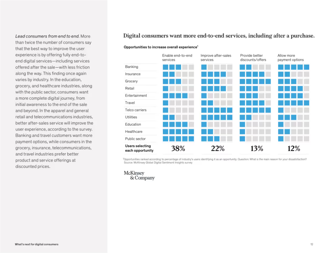
Grid matrix showing percentages selecting improvement areas like end-to-end services, after-sales, and discounts. Light-blue color coding.
Customer and Market Segmentation
Technology & Software
Consumers demand seamless digital journeys that cover post-purchase experiences. The top priority across most industries is enabling end-to-end services, followed by better after-sales support and payment options.
end-to-end, digital journey, post-purchase, after-sales, discounts, payment, consumer demand, frictionless
Mixed Chart
McKinsey
Saved
The slide features a column chart comparing the frequency of mental health visits among different generations.
Market Analysis and Trends
Healthcare & Pharmaceuticals
This slide presents data on how often different generations seek mental health support, highlighting generational differences in mental health care engagement.
Mental health, generational differences, survey, healthcare, mental health visits
Mixed Chart
IPSOS
Saved
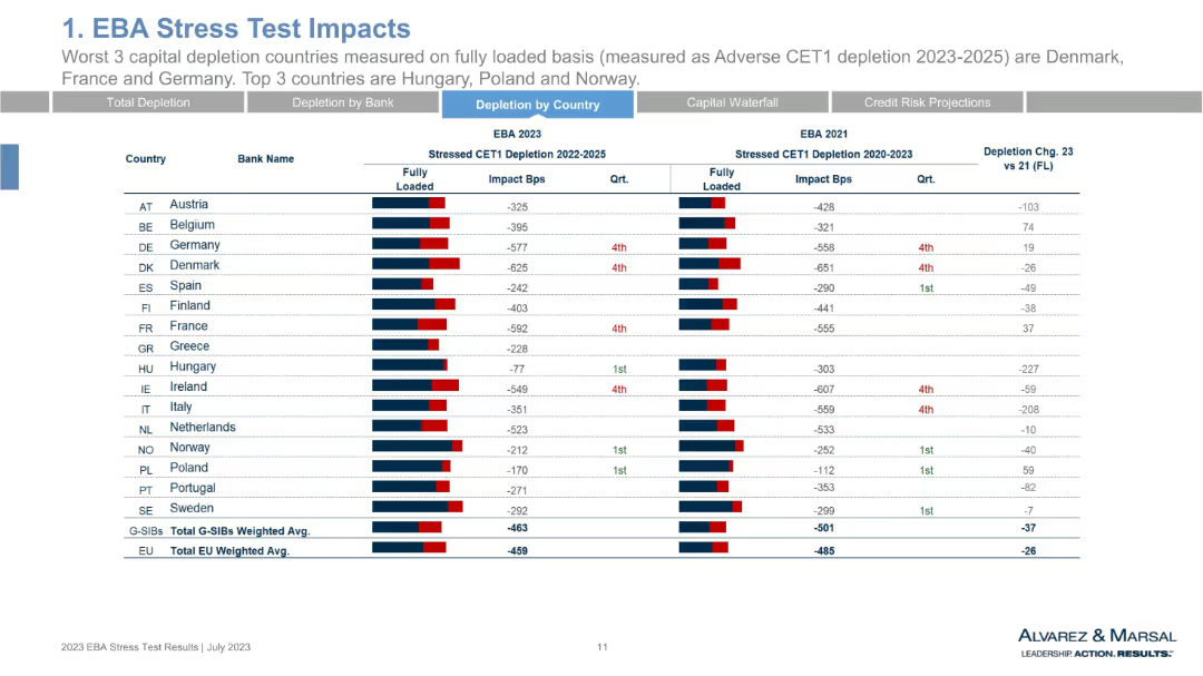
Data table by country rather than bank. Lists average CET1 depletion by nation. Includes 2023 vs. 2021 comparisons and rankings. Uses red/blue bar visuals.
Risk Assessment and Management
Financial Services
This slide aggregates CET1 stress test results at the national level. Denmark, France, and Germany show the worst capital depletion, while Hungary, Poland, and Norway perform best. The visual emphasizes geographical disparities in resilience and risk tolerance among EU member countries.
CET1 by country, stress test 2023, Denmark, Germany, Hungary, national averages, depletion
Single Chart
Alvarez & Marsal
Saved
Left side shows a column chart with percentages, right side has a bar chart and text
Risk Assessment and Management
Financial Services
Strategies for mitigating risks with generative AI, focusing on data guidelines and human roles
risk mitigation, strategies, data guidelines, AI risks
Multiple Chart
Gartner
Saved
An image showing a diamond-shaped diagram with four core areas of Goldman Sachs, flanked by a sidebar detailing a partnership with Spotify, illustrating a case study approach.
Strategic Planning
Financial Services
This slide represents the integrated approach of Goldman Sachs, displaying its main operational divisions and highlighting a collaboration with Spotify. It details the multifaceted partnership encompassing investment, advisory, and wealth management, thus exemplifying the strategic relationships and comprehensive services the firm offers to its clients.
Integration, Operational Divisions, Spotify, Case Study, Investment, Advisory, Wealth Management
Text Only
Goldman Sachs
Saved
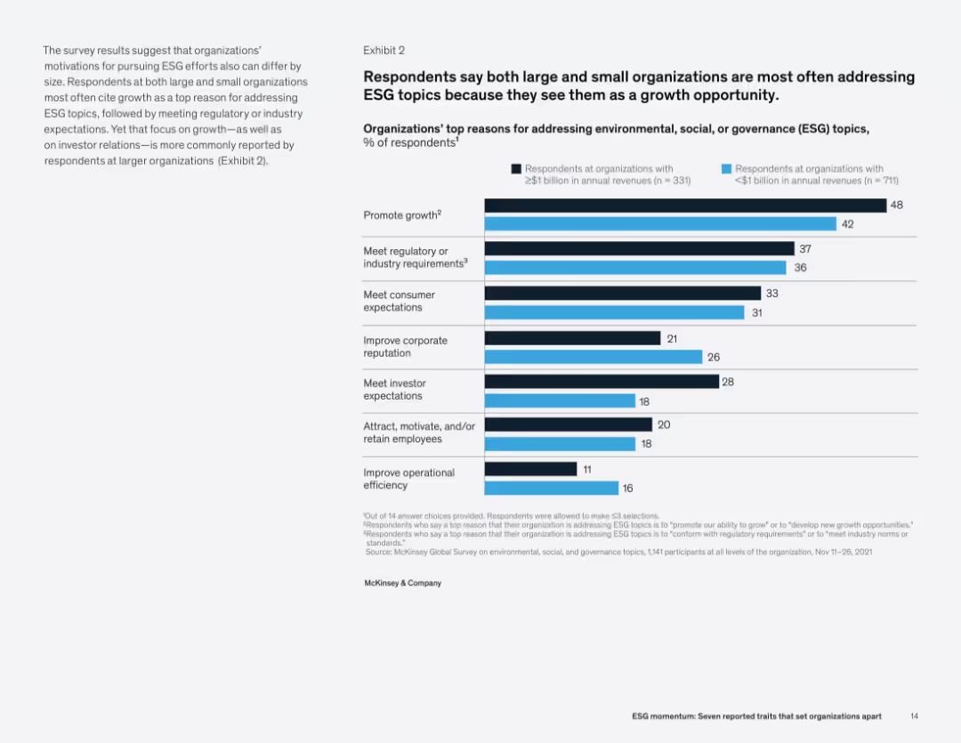
Right-side bar chart compares reasons for ESG focus by company size. Left column contains supporting narrative and analysis.
Strategic Planning
Professional Services
The primary reason organizations pursue ESG topics is to promote growth, followed by compliance and meeting stakeholder expectations. Larger firms more frequently cite investor relations and reputation management as key drivers compared to smaller firms.
ESG motivation, growth, regulation, consumer expectations, corporate reputation, investor expectations, survey
Mixed Chart
McKinsey
Saved
Two line charts comparing the percentage change in air passenger traffic and air freight from 2008 to 2019. Lines are color-coded red and blue on a green gradient background.
Market Analysis and Trends
Transportation & Logistics
Slide compares growth in global air passenger traffic, which remains positive, against air freight which fluctuates and is impacted negatively by trade issues.
air passenger, air freight, transportation, growth, trade
Single Chart
Deutsche Bank
Saved
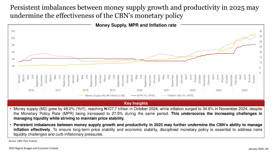
Dual-axis line chart tracking money supply (M2), inflation, and MPR from 2016 to October 2024.
Risk Assessment and Management
Government & Public Sector
With money supply increasing by 48.2% YoY and inflation rising to 34.6%, the slide highlights challenges in Nigeria’s monetary policy. It emphasizes the need for disciplined liquidity control to curb inflation and ensure macroeconomic stability.
money supply, inflation, MPR, liquidity, monetary policy, Nigeria, CBN
Mixed Chart
PwC/Strategy&
Saved
The slide shows three pie charts representing the geographical, sectoral, and client distribution of Ipsos's business.
Strategic Planning
Professional Services
The slide highlights Ipsos's balanced and diversified business approach, with detailed breakdowns of geographies, sectors, and client bases.
Balanced, Diversified, Business, Geographies, Sectors
Multiple Chart
IPSOS
Saved
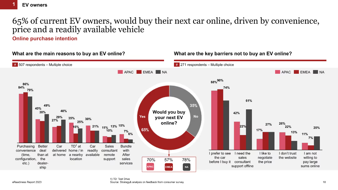
Comparative column charts showing the main reasons for buying an EV online and key barriers preventing online purchases, alongside a purchase intention pie chart.
Market Analysis and Trends
Transportation & Logistics
Investigates the motivations and deterrents for EV owners regarding online car purchases, revealing a high inclination towards online buying for convenience.
online purchase, motivations, barriers, EV owners, survey
Multiple Chart
PwC/Strategy&
Saved
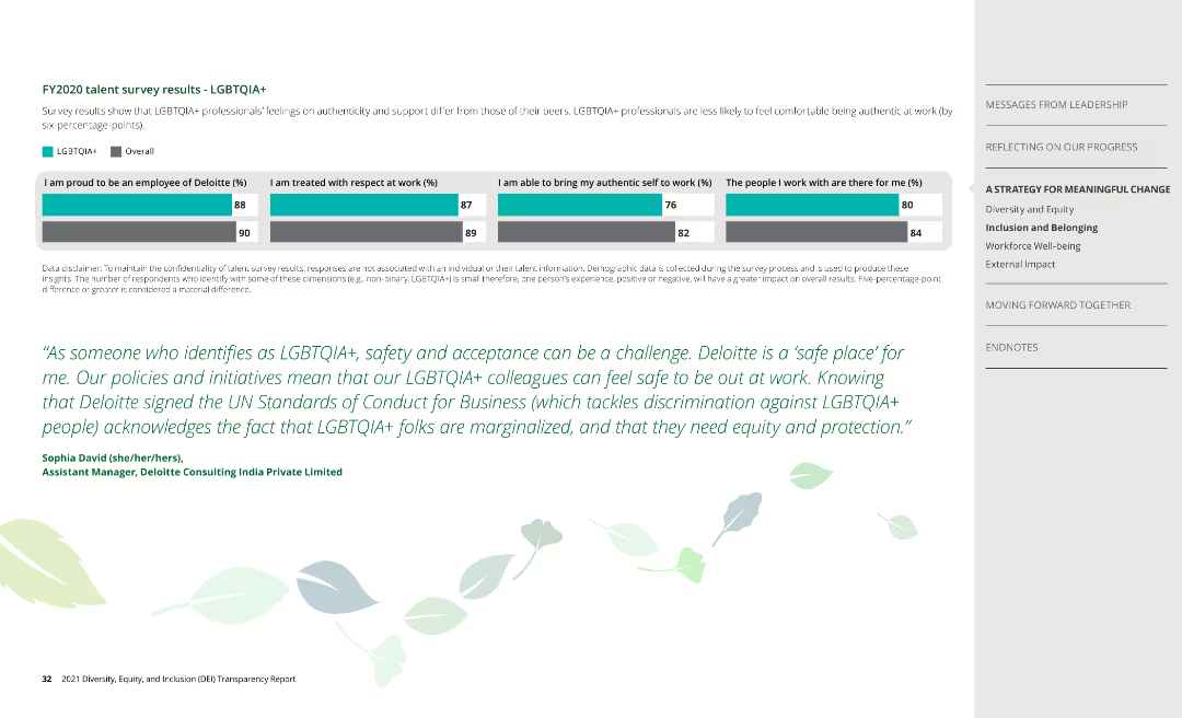
This slide contains a series of horizontal bar charts comparing responses between LGBTQIA+ employees and the overall employee population at Deloitte on various aspects like pride in the company, respect at work, authenticity, and support.
Human Resources and Talent Management
Professional Services
The slide presents survey results showing differences in feelings of authenticity and support at work between LGBTQIA+ professionals and their peers at Deloitte, highlighting a testimonial and the company's commitment to LGBTQIA+ inclusivity.
LGBTQIA+, survey, Deloitte, inclusion, authenticity, support, testimonial, commitment
Mixed Chart
Deloitte
Saved
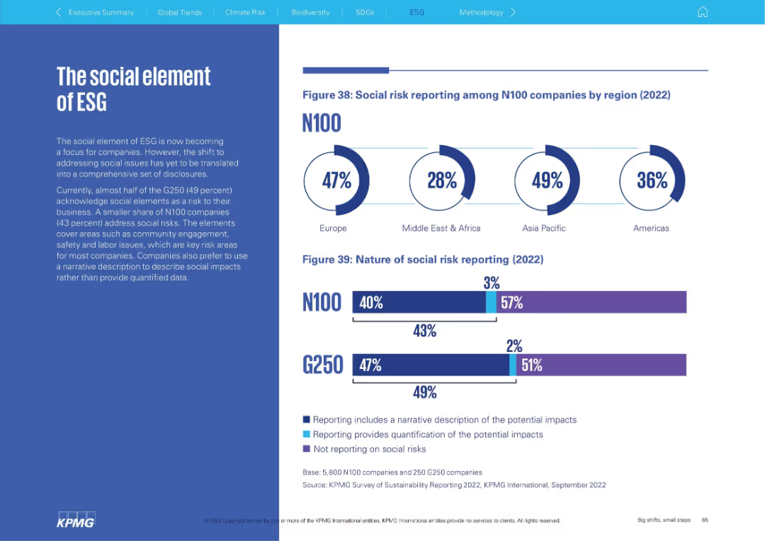
Layout with paragraph on the left, doughnut charts and bars on the right depicting regional social risk reporting and disclosure styles.
Risk Assessment and Management
Professional Services
This slide focuses on social elements of ESG, revealing that most companies describe social risks narratively rather than quantitatively. It presents regional statistics and a comparison of N100 vs. G250 disclosure methods.
social risk, ESG, community engagement, labor issues, reporting type, regional differences, narrative disclosure, G250, N100
Multiple Chart
KPMG
Saved
The slide consists of a complex flowchart detailing various business areas and their interconnections. It is text-heavy, with specific color coding to highlight different departments like Investment Banking, Commercial Banking, and Payments. There are icons representing collaboration and client engagement.
Financial Performance
Financial Services
Discusses strategic partnerships within a financial services firm, highlighting how payments are integral to the firm's success and contribute to cross-divisional collaborations. It illustrates a unified approach to client lifecycle engagement, fostering growth and international expansion.
strategic partnership, financial services, client engagement, collaboration
Boxed
JP Morgan
Saved
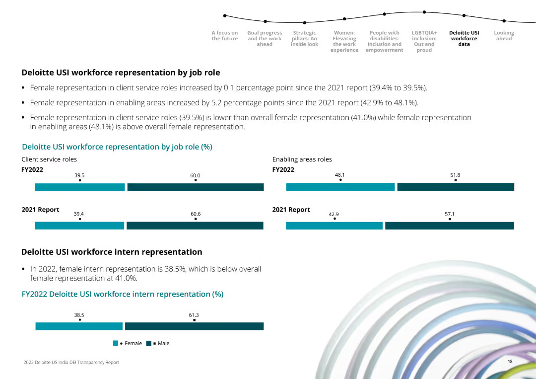
Horizontal bar charts comparing male and female workforce representation in client service and enabling roles for FY2022 and 2021.
Human Resources and Talent Management
Professional Services
It shows the percentage of female and male employees in different job roles and highlights changes in representation from the previous year.
workforce, job roles, gender, Deloitte, comparison, FY2022, FY2021, bar chart
Multiple Chart
Deloitte
Saved
This slide shows a combination of text, a pie chart, and a column chart. The pie chart represents the split of new and long-term podcast listeners, while the column chart shows frequency and number of podcasts listened to.
Market Analysis and Trends
Media & Entertainment
The slide discusses the growth in podcast listenership and spending. It shows that half of daily podcast listeners started in the past two years and that they now spend significant time listening to podcasts, indicating a growing market.
Podcast growth, listener engagement, spending trends, Nielsen study, podcast market, new listeners, long-term listeners, daily listening habits, podcast revenue
Multiple Chart
Nielsen
Saved
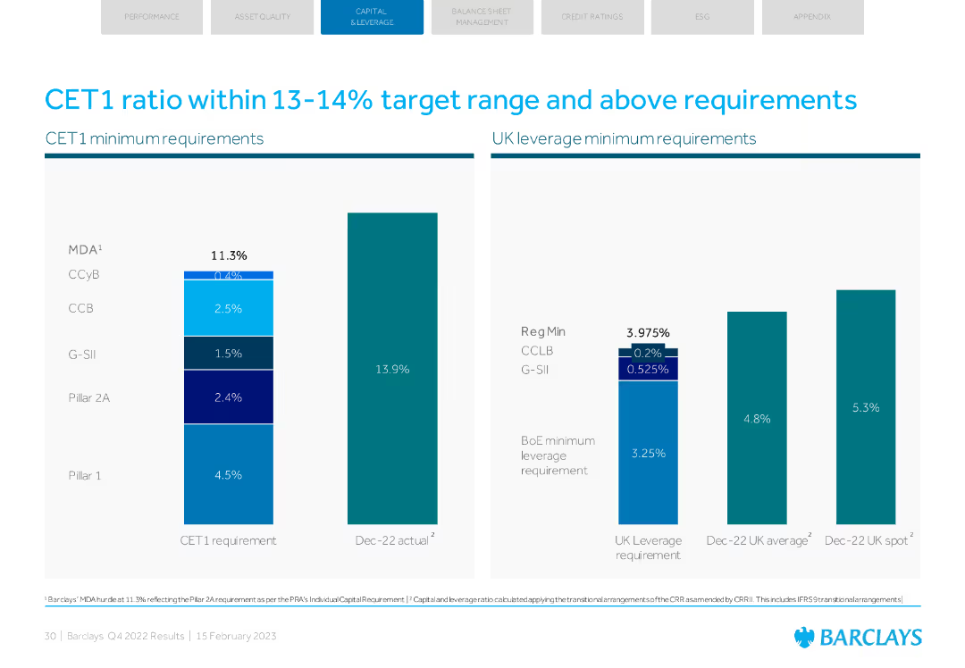
Column charts showing CET1 ratio requirements and UK leverage minimum requirements.
Regulatory and Compliance
Financial Services
Highlights Barclays' CET1 ratio within target range and above regulatory requirements, with leverage metrics.
CET1 ratio, regulatory requirements, leverage, compliance, target range
Multiple Chart
Barclays
Saved
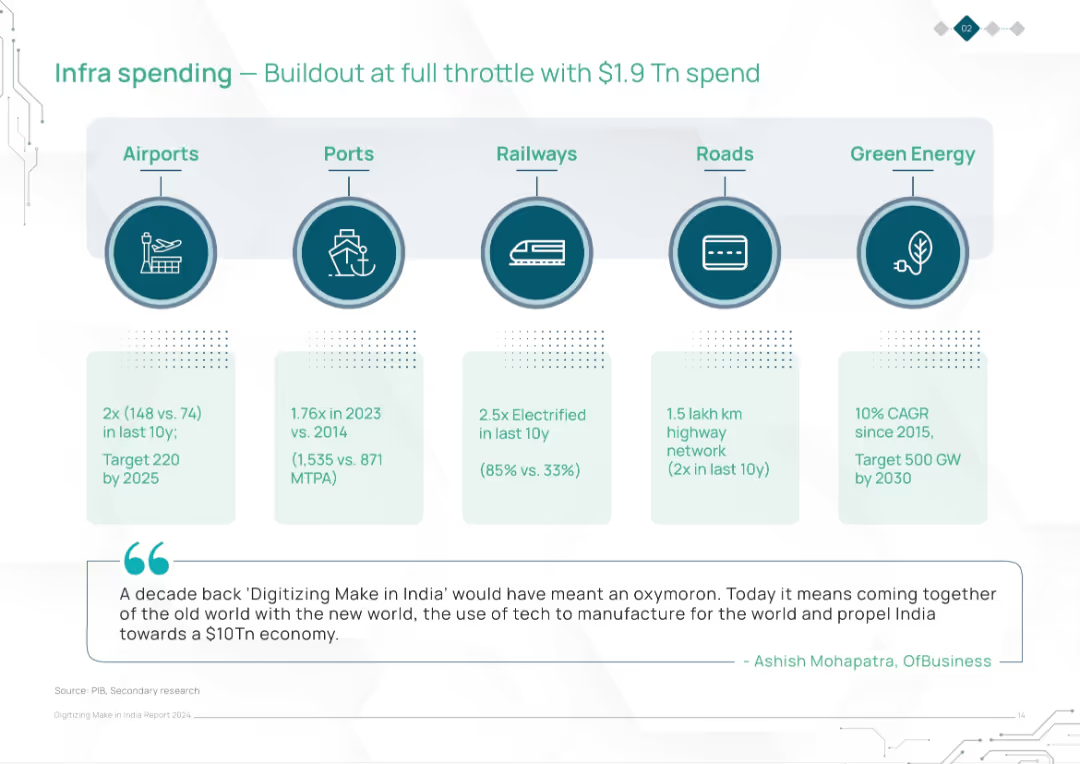
Horizontal layout with five infrastructure categories (Airports, Ports, Railways, Roads, Green Energy) shown with icons and corresponding statistics beneath. Includes a quote at the bottom.
Strategic Planning
Government & Public Sector
The slide highlights India’s significant infrastructure investments totaling $1.9 trillion across key sectors like airports, ports, railways, roads, and green energy, citing impressive growth figures and future targets. It underscores the synergy between technology and infrastructure for economic transformation.
infrastructure, investment, airports, ports, railways, roads, green energy, India, economic growth, development
Pillar
BCG
Saved
The slide features a bar chart and pie charts displaying cost structures and impact potential for an automotive supplier's typical P/L.
Financial Performance
Industrial & Manufacturing
Examines the cost structure of an automotive supplier, highlighting the significant share of COGS and the easier impact on SG&A in the short and medium term.
COGS, SG&A, automotive, costs, impact, P/L, financial performance, bar chart, pie chart
Single Chart
EY
Saved
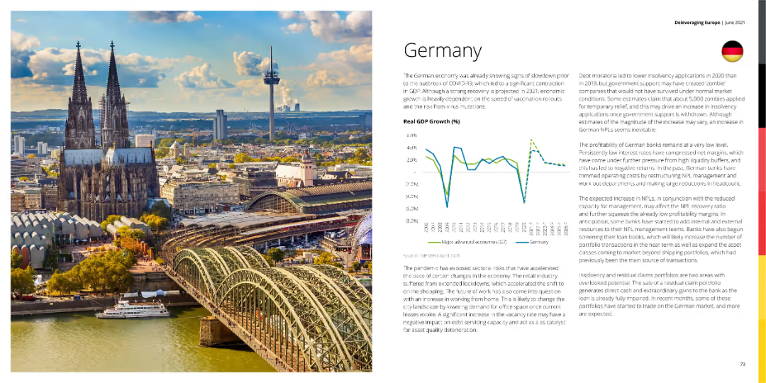
A photo of Cologne Cathedral with a graph showing Germany's GDP growth and a detailed text explanation.
Market Analysis and Trends
Financial Services
This slide discusses the economic conditions in Germany, highlighting GDP growth trends and the impact of COVID-19 on the economy.
Germany, GDP growth, economy, financial services, market analysis
Mixed Chart
Deloitte
Saved
Three bar graphs showing revenue changes for AmeriHealth, NH Healthy Families, and Well Sense over different fiscal years. Dense layout with tables.
Financial Performance
Healthcare & Pharmaceuticals
Analysis of revenue changes across health plans, highlighting the impact of performance incentives on health plan revenues and profit opportunities.
Revenue, Health Plan, Performance, Incentives, Fiscal Year
Multiple Chart
Alvarez & Marsal
Saved
Previous
Next
If nothing, comes up, please save your slides first
Create a FREE account to continue browsing
Receive Instant Access to 1,000+ slides from companies like McKinsey, Google, and Goldman Sachs
First Name
Last Name
Email
Password
I agree to all
Terms & Privacy Policy
Thank you! Your submission has been received!
Oops! Something went wrong while submitting the form.
Have an account?
Sign in
Column Chart
Heatmap
Chevron
Org Chart
Infographic
Callouts
Timeline
List
Graphic
Picture
Process Flow
Diagram
Paragraph
Map
Table
Framework
Subtitle
Takeaway Box
Icon
Other Chart
Radar Chart
Waterfall Chart
Mekko Chart
Pie Chart
Scatter Plot
Line Chart
Bar chart
Bullet points