Create a FREE Account
Instant access to 1,000+ real slides from top companies like McKinsey, BCG, Goldman Sachs, Google and many more!
First Name
Last Name
Email
Password
I agree to all
Terms & Privacy Policy
Thank you! Your submission has been received!
Oops! Something went wrong while submitting the form.
Have an account?
Sign in
Library
Templates
Courses
Pricing
My Account
My Slides
My Templates
✦ AI
AI Prompt Library
AI Search
Sign in
Start Here
Logout
My Saved Slides
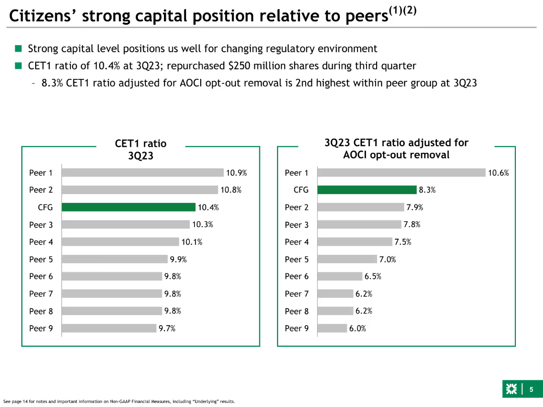
Left side features a bar chart comparing CET1 ratios of Citizens and peers. Right side adjusts CET1 ratios for AOCI opt-out removal, showing comparative financial positions.
Competitive Landscape
Financial Services
Compares Citizens' CET1 capital ratios to peers, both standard and adjusted for AOCI opt-out removal, highlighting strong capital positioning within the industry.
capital, position, Citizens, peers, CET1, comparative, AOCI, financial, ratios
Multiple Chart
Goldman Sachs
Saved
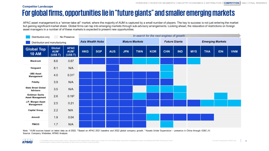
Grid matrix of global firms’ presence across markets. Coded by type of presence.
Competitive Landscape
Financial Services
Analyzes how major global asset managers are distributed across mature, future giant, and emerging APAC markets. Emphasizes the strategic opportunities in markets like India, Vietnam, and Indonesia due to rising AUM and reduced restrictions.
global firms, APAC, asset managers, emerging markets, competition
Single Chart
KPMG
Saved
Features one large bar chart split into multiple segments showing different types of support provided by employers to their employees in handling diverse views and social issues at the workplace.
Organizational Structure and Change
Government & Public Sector
Focuses on the kind of support organizations provide to their employees to manage diversity of views and discusses the relatively low percentage of active company efforts in facilitating these discussions, which implies a need for more structured support systems within organizations.
employer support, diversity management, organizational support, social issues
Single Chart
PwC/Strategy&
Saved
Bar chart showing the share of consumers by age who describe themselves as addicted to social media in 2019, and a column chart showing the average daily time spent on social media from 2012 to 2021.
Market Analysis and Trends
Media & Entertainment
The slide highlights the impact of social media addiction, particularly among younger age groups. It presents data on the percentage of users addicted to social media by age and the increasing amount of time spent on social media daily, raising concerns about the negative societal effects of pervasive social media use.
Social Media, Addiction, Time Spent, Age Groups
Multiple Chart
Roland Berger
Saved
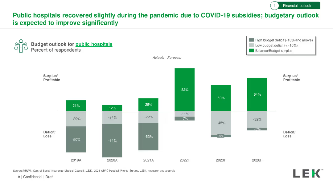
Bar chart showing budget outlook for public hospitals from 2019 to 2026, with actuals and forecasts. Includes surplus/deficit percentages.
Financial Performance
Healthcare & Pharmaceuticals
Analysis of the financial recovery of public hospitals during the pandemic, with an optimistic budget outlook forecasted through 2026.
Public Hospitals, Budget Outlook, COVID-19, Financial Recovery, Forecast
Single Chart
LEK
Saved
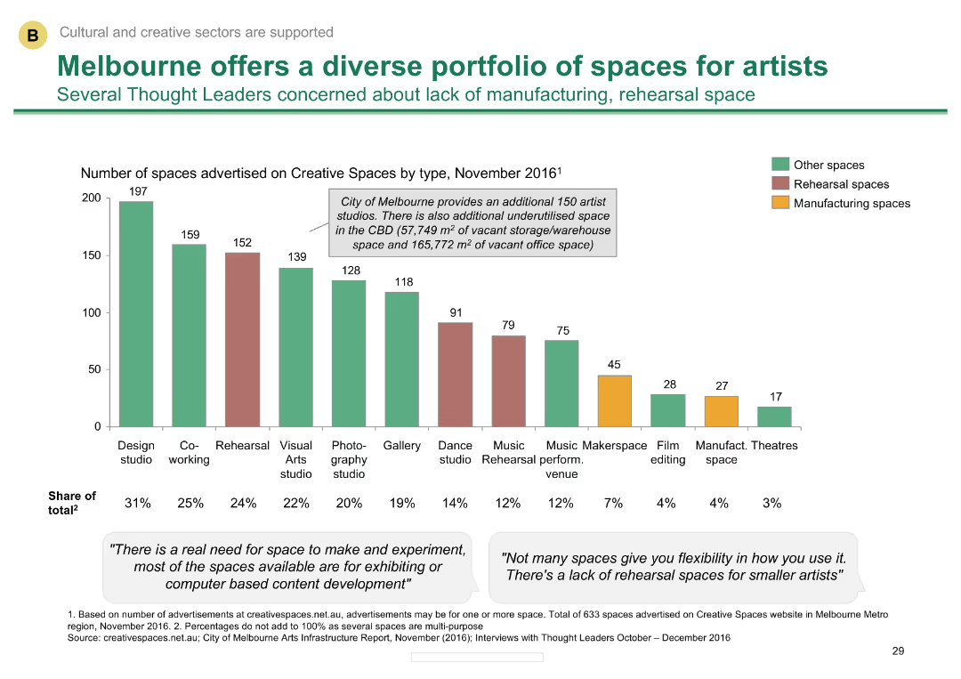
Column chart showing the number of creative spaces by type in Melbourne
Market Analysis and Trends
Media & Entertainment
Outlines the variety of creative spaces available in Melbourne, indicating a lack of manufacturing and rehearsal spaces.
Creative spaces, Melbourne, artist studios, space types, availability
Mixed Chart
BCG
Saved
This slide features a three-step horizontal process diagram with accompanying text. Icons indicate a 2x, 3x, and >5x increase, respectively. The layout is balanced and clean.
Financial Performance
Financial Services
The slide presents a comparative analysis of early financial results in 2021 versus 2019, showcasing gains in three strategic areas: Gaining Access, Building Trust, and Supporting Migration to Advice.
Financial results, Comparative analysis, Trust, Access, Advice
Linear Flow
Goldman Sachs
Saved
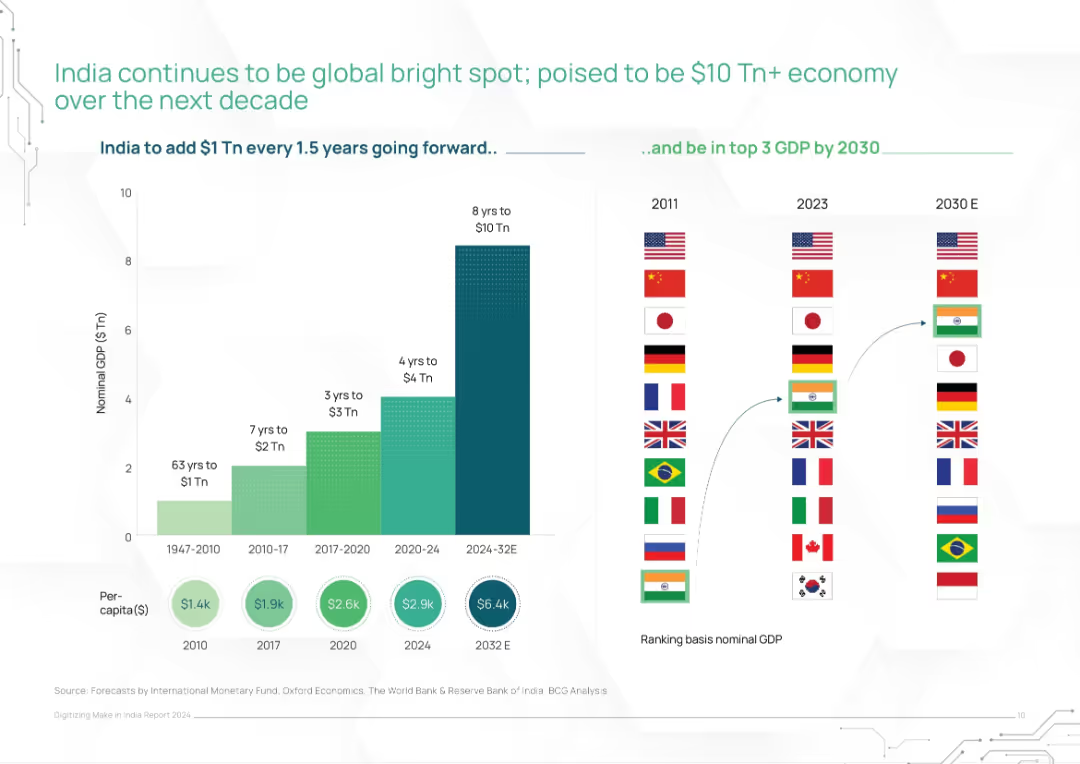
Dual-panel layout: left stacked bar of GDP timeline, right rank shifts of countries by GDP (2011–2030E)
Market Analysis and Trends
Financial Services
This slide charts India's rapid GDP growth trajectory and its expected rise to the top 3 global economies by 2030. It visually compares historical and projected GDP levels, showing acceleration from $1T in 63 years to an expected $10T in 8 years. Includes global ranking comparisons.
India GDP, economic growth, global ranking, nominal GDP, IMF forecast, growth projection, $10 trillion economy
Mixed Chart
BCG
Saved
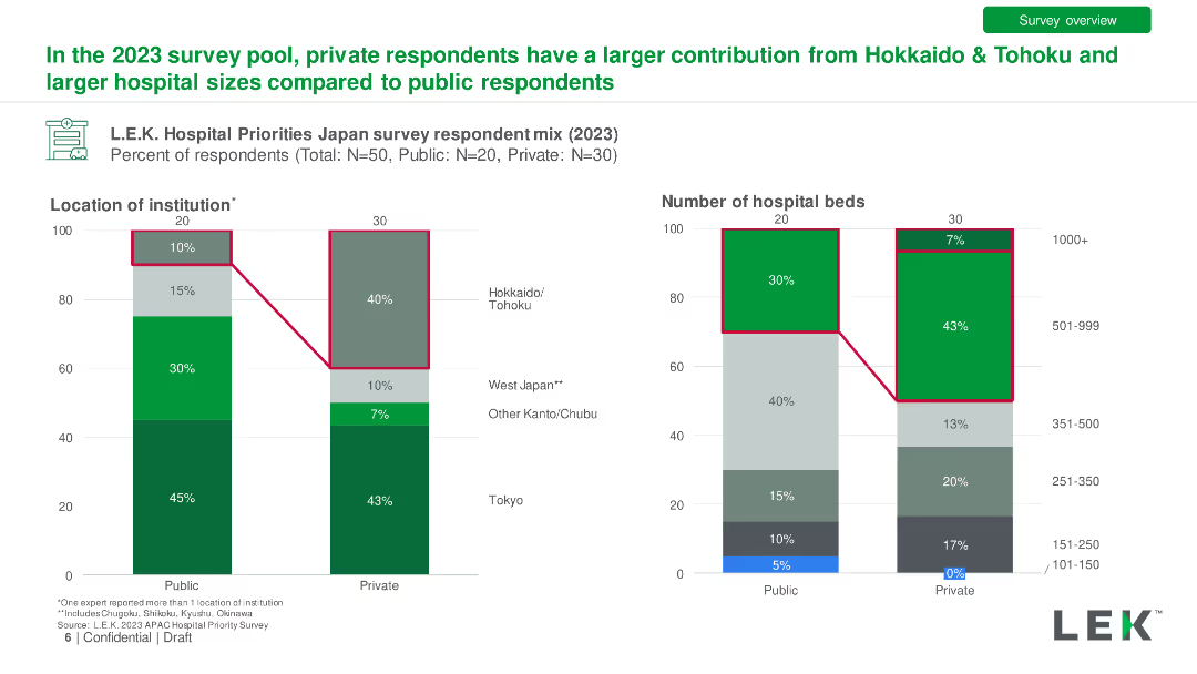
Bar charts comparing private vs. public hospital respondent mix by location and hospital size in 2023. Detailed with percentage differences.
Market Analysis and Trends
Healthcare & Pharmaceuticals
Comparison of survey responses from public and private hospitals, showing differences in regional representation and hospital sizes.
Private Hospitals, Public Hospitals, Respondents, Comparison, Location
Multiple Chart
LEK
Saved
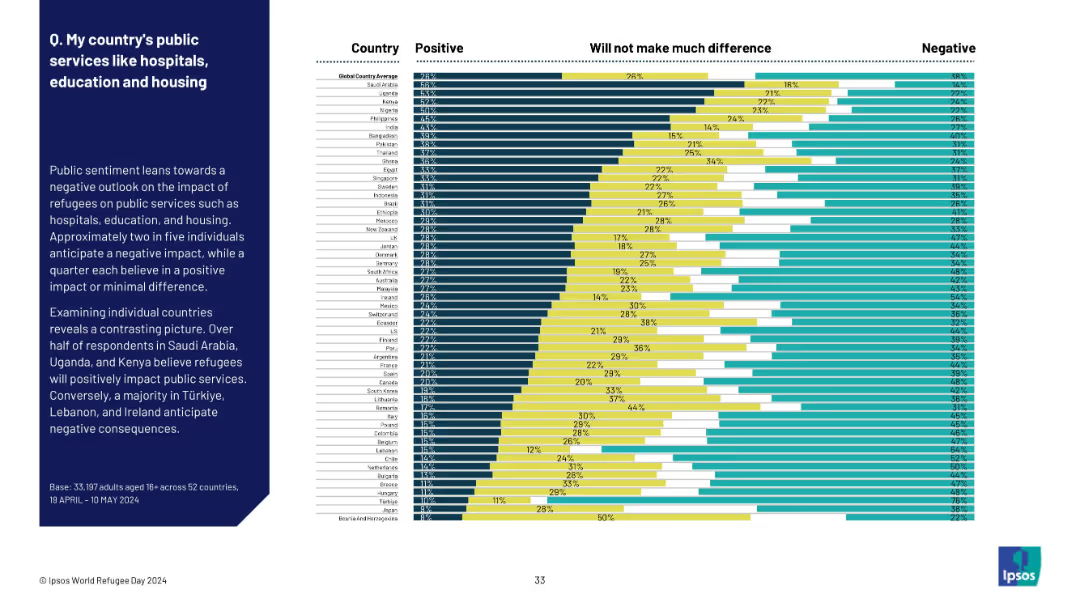
Horizontal bar chart categorized by perception, grouped by country; sidebar with summary.
Market Analysis and Trends
Government & Public Sector
This slide presents global perspectives on refugees’ effect on public services. The sentiment leans negative, but countries like Saudi Arabia and Kenya are optimistic. Contrasts are shown clearly between optimistic and pessimistic regions.
refugees, public services, healthcare, housing, education, sentiment, opinion, global perception, Ipsos, national infrastructure
Mixed Chart
IPSOS
Saved
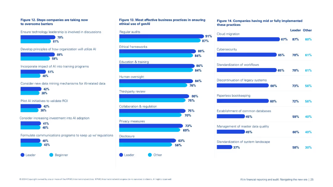
Three-pane layout: left shows Figure 12 on overcoming barriers, center Figure 13 on ethical genAI practices, right Figure 14 on implementation practices.
Strategic Planning
Financial Services
Consolidates steps organizations are taking to advance AI integration: leadership involvement, ethical safeguards, pilot testing, and implementation of best practices in data and system management.
AI strategy, ethics, genAI, leadership, implementation, training, data governance
Multiple Chart
KPMG
Saved
Multi-bar chart illustrating jobs lost and gained from automation by adoption scenarios. Color-coded for clarity.
Strategic Planning
Industrial & Manufacturing
Evaluates job loss and creation in New Zealand due to varying levels of automation adoption, important for workforce planning.
Jobs, Automation, New Zealand, Impact, Forecast
Multiple Chart
McKinsey
Saved
A circular diagram slide depicting various digital solutions for end-to-end SME services with corresponding icons for each service category.
Technology and Digital Transformation
Financial Services
The slide showcases the ecosystem of digital solutions for SME services, suggesting a holistic approach to SME management. It's useful for understanding how digital services are becoming integrated to serve the end-to-end needs of small and medium enterprises.
SME Services, Digital Solutions, Ecosystem, Integration, Management
Diagram
Kearney
Saved
This slide contains three graphs with a legend. The left graph has a vertical axis representing percentages and a horizontal axis showing years. The middle and right graphs have similar axes but represent different metrics. All three use blue tones and lines of varying styles for distinction.
Market Analysis and Trends
Energy & Utilities
The slide projects the growth of sustainable fuels, hydrogen, and CCUS across different future scenarios. It emphasizes the significant increase after 2030 and shows comparisons in global hydrogen demand and global CCUS uptake by scenario.
Sustainable Fuels, Hydrogen, CCUS, Energy Transition, Global Demand, 2050, Scenarios, Decarbonization, Growth Projections
Multiple Chart
McKinsey
Saved
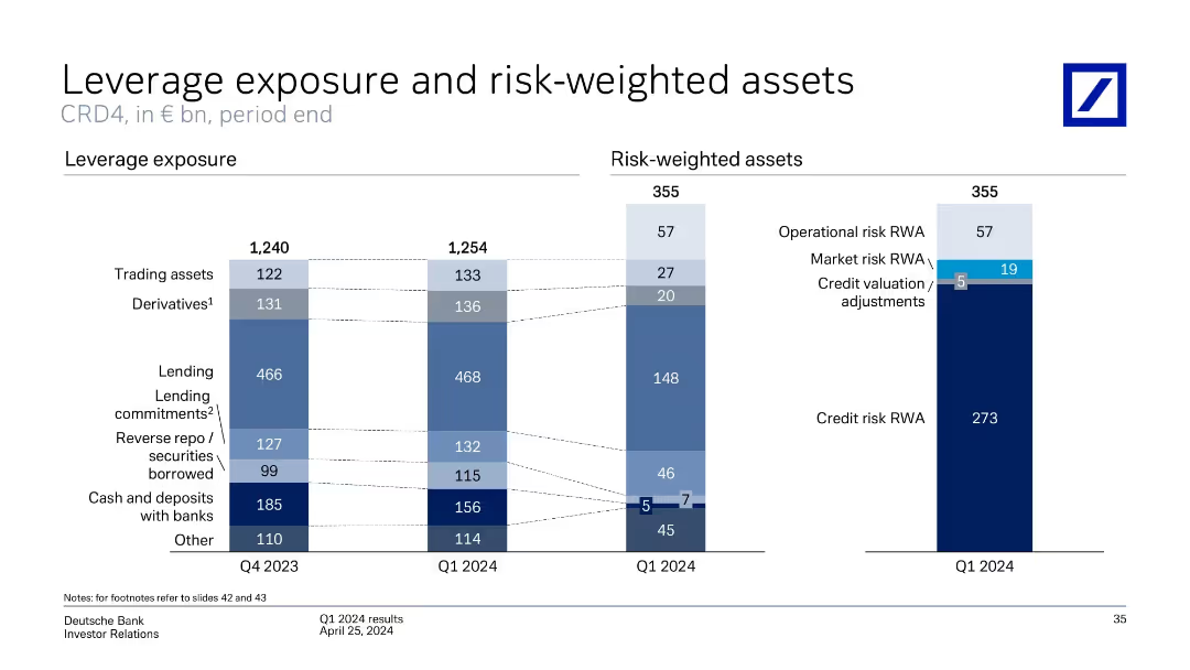
Dual column charts: left for leverage exposure components over two quarters, right for Q1 2024 risk-weighted asset categories.
Regulatory and Compliance
Financial Services
The slide analyzes leverage exposure changes from Q4 2023 to Q1 2024 and breaks down Q1 2024 risk-weighted assets (RWAs). Lending and derivative assets are the largest leverage contributors. Credit risk dominates RWAs, followed by operational and market risks.
leverage exposure, RWA, credit risk, derivatives, CRD4, Deutsche Bank
Multiple Chart
Deutsche Bank
Saved
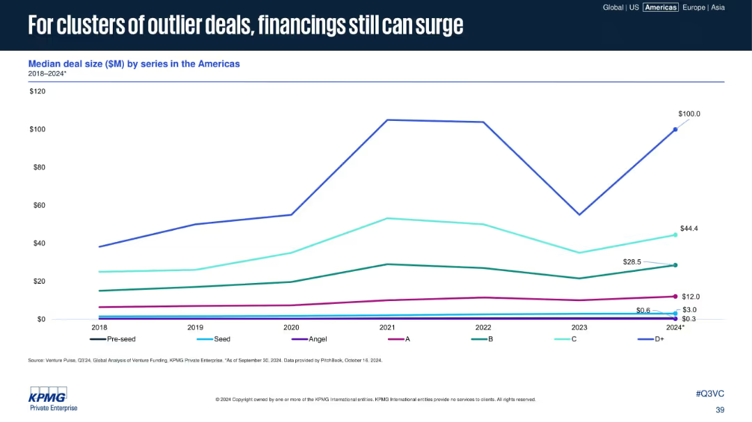
Line graph showing median deal size by series, with sharp peaks in D+ rounds.
Market Analysis and Trends
Financial Services
This visualization of deal size by funding series highlights volatility, particularly for late-stage (D+) deals. While early stages remain flat, occasional spikes in later rounds suggest that large outlier financings continue to influence the market.
deal size, D+ rounds, outliers, VC series, funding trends, volatility, late stage, median size, Americas
Single Chart
KPMG
Saved
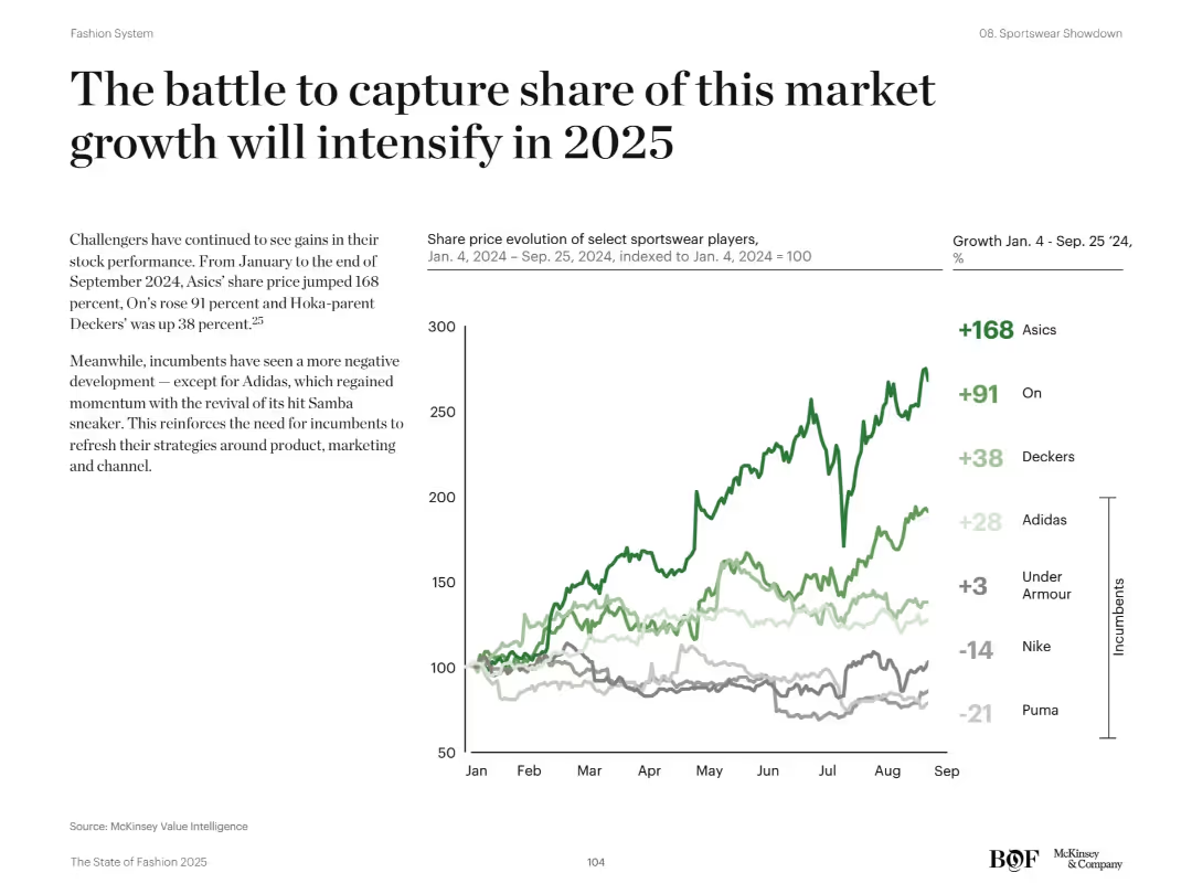
Left text section with commentary; right-hand line chart showing share price growth of key sportswear players
Competitive Landscape
Consumer Goods
The slide focuses on the rising share prices of challenger sportswear brands like Asics, On, and Deckers in 2024, contrasting with weaker performance from incumbents such as Nike and Puma. The chart tracks indexed share prices from January to September 2024. The narrative emphasizes the need for incumbents to revamp strategies to stay competitive.
share price, growth, Asics, On, Deckers, Nike, incumbents, 2025, stock performance
Mixed Chart
McKinsey
Saved
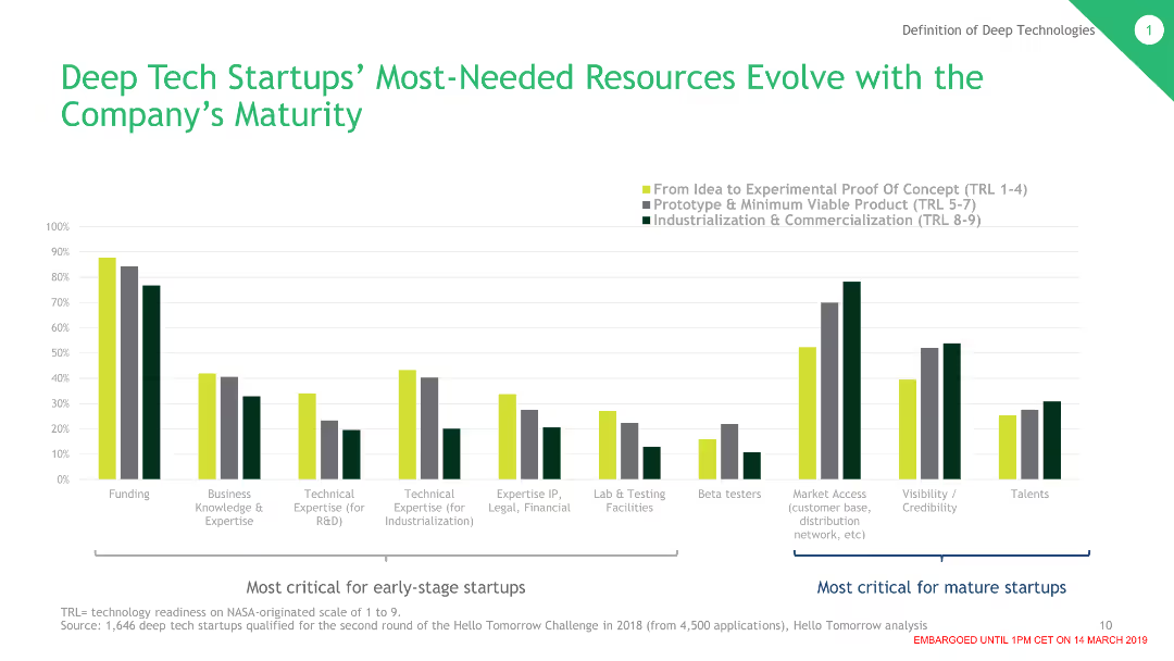
The slide shows a column chart indicating the most-needed resources for deep tech startups at different stages of maturity. Categories are color-coded and the chart shows varying needs from idea to experimental proof to commercialization.
Market Analysis and Trends
Technology & Software
This slide outlines the evolving resource needs for deep tech startups as they mature. It breaks down critical resources required at different stages, from initial idea and experimental proof to prototype and commercialization.
Deep Tech, Startups, Resources, Maturity, Funding, Expertise, Commercialization
Single Chart
BCG
Saved
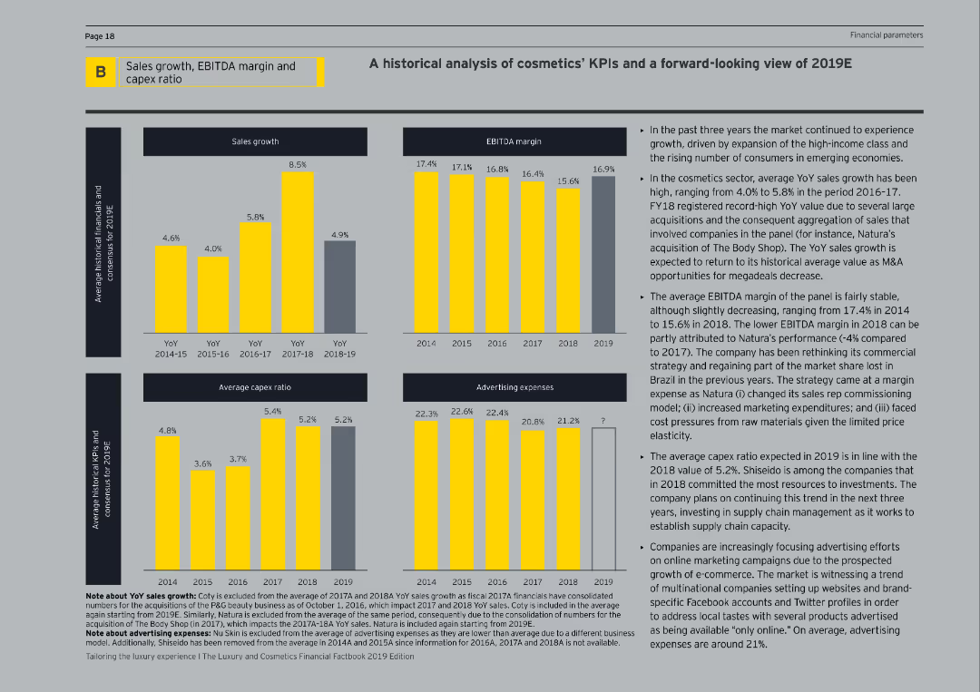
The slide includes multiple column charts detailing sales growth, EBITDA margin, average capex ratio, and advertising expenses over several years. The text description is on the right, explaining the trends and providing future expectations.
Market Analysis and Trends
Consumer Goods
This slide offers a historical analysis of key performance indicators (KPIs) in the cosmetics sector, focusing on sales growth, EBITDA margin, capex ratio, and advertising expenses. It also provides a forward-looking view for 2019, highlighting market drivers and expected performance.
Cosmetics, KPIs, Sales Growth, EBITDA, Capex
Multiple Chart
EY
Saved
A scatter plot matrix in the center, qualitative color coding for activity types, and headers at the top with explanatory notes.
Product and Service Analysis
Technology & Software
The slide maps out user enjoyment against time spent on various nbn™ network activities, highlighting entertainment as a key area.
enjoyment, activities, nbn network, user engagement, entertainment, online habits, scatter plot, user data
Single Chart
Accenture
Saved
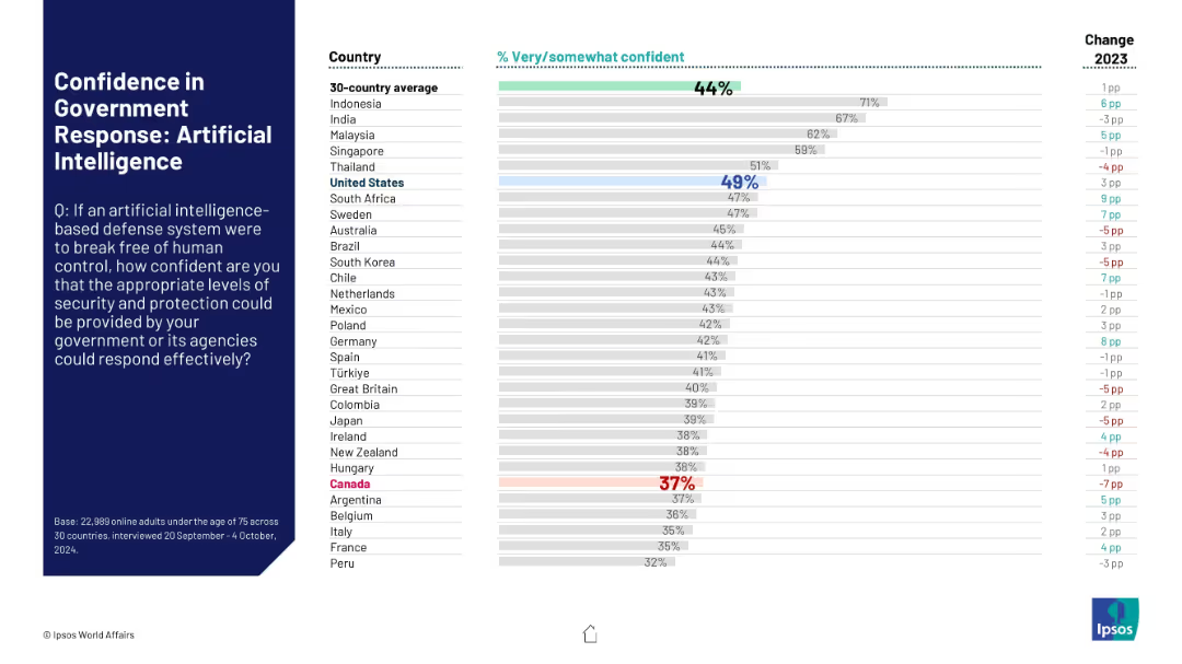
Structured identically to previous slides. Focuses on AI systems becoming threats. Bars highlight levels of trust in national response systems, Canada among the lowest.
Risk Assessment and Management
Artificial Intelligence
Public confidence in the ability of governments to contain AI-based defense systems that malfunction or rebel is depicted. Most countries score below 50%, reflecting global uncertainty on AI risk management.
AI safety, government trust, artificial intelligence, rogue systems, public concern, risk management
Mixed Chart
IPSOS
Saved
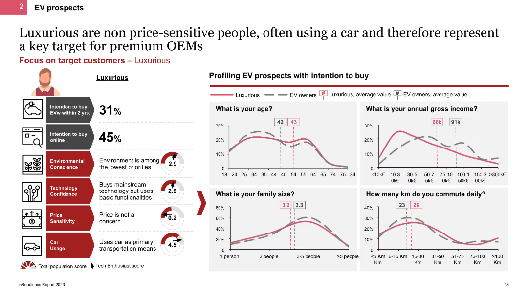
The slide profiles Luxurious personas using line charts and icons, showing demographic details like age, income, and family size. It highlights their high car usage and low price sensitivity, with charts comparing their characteristics to other EV owners.
Customer and Market Segmentation
Transportation & Logistics
This slide describes Luxurious personas, emphasizing their high income, frequent car usage, and lack of price sensitivity. It provides demographic comparisons and insights into their EV purchase behaviors and preferences.
EV prospects, Luxurious, line charts, demographics, high income
Multiple Chart
PwC/Strategy&
Saved
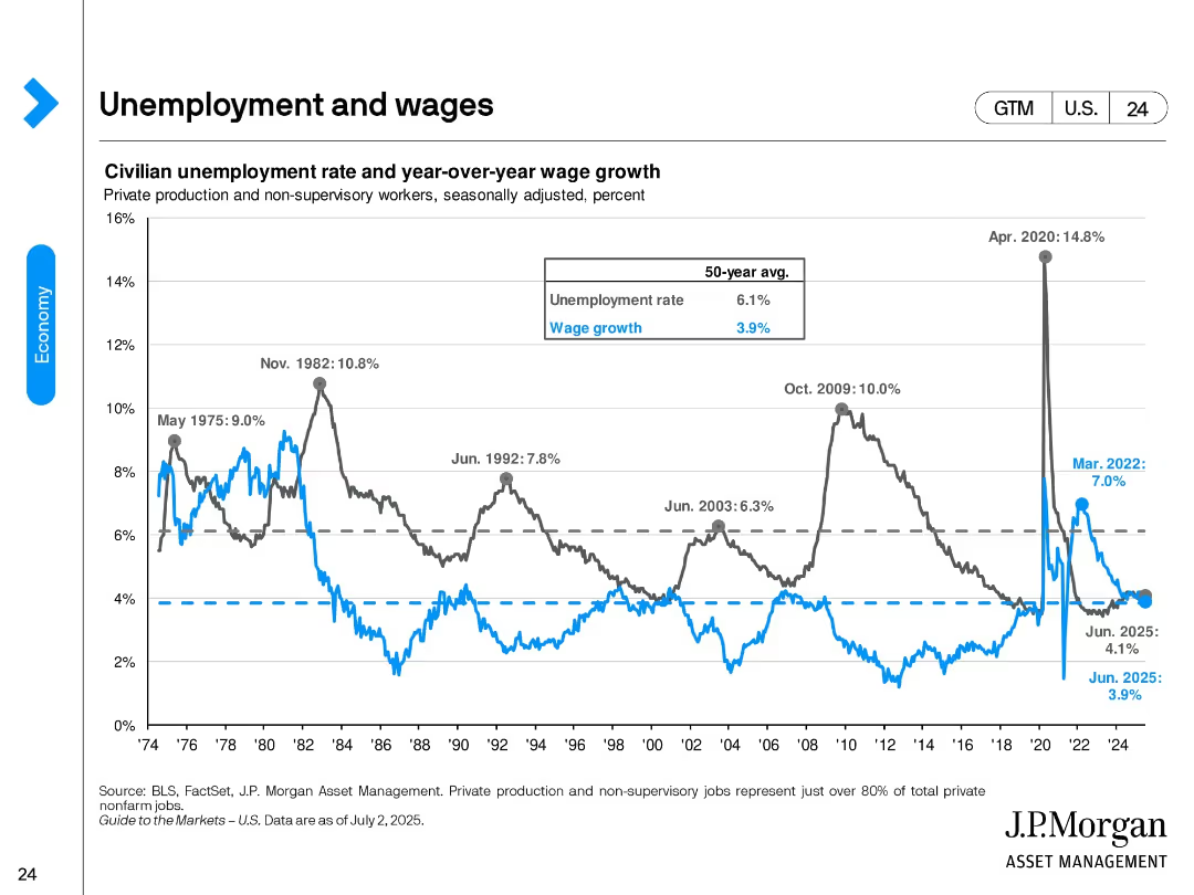
Dual-axis line chart tracking unemployment rate and wage growth since 1974. Historical peaks and the 50-year average are annotated. The chart ends in June 2025, showing recent trends stabilizing.
Performance Metrics and KPIs
Financial Services
This slide contrasts the historical and recent dynamics of unemployment and wage growth. It highlights key peaks like the 2020 COVID spike and notes June 2025 values: 4.1% unemployment and 3.9% wage growth, near long-term averages.
unemployment, wage growth, labor market, historical trends, 2025, recession indicators, labor cost
Single Chart
JP Morgan
Saved
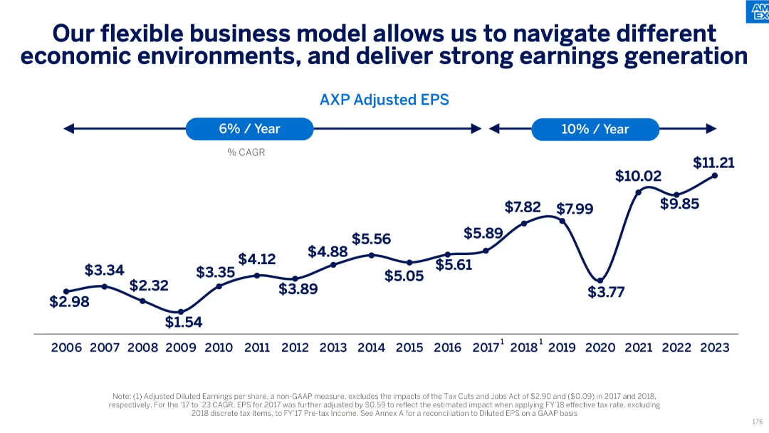
Line graph of adjusted EPS from 2006–2023 with CAGR annotations; economic cycle inflection points noted
Strategic Planning
Financial Services
Traces steady adjusted EPS growth over nearly two decades, highlighting business model flexibility and earnings consistency across economic cycles. Marks acceleration in earnings CAGR in the most recent years.
earnings growth, adjusted EPS, economic cycles, business model, CAGR, financial performance
Single Chart
McKinsey
Saved
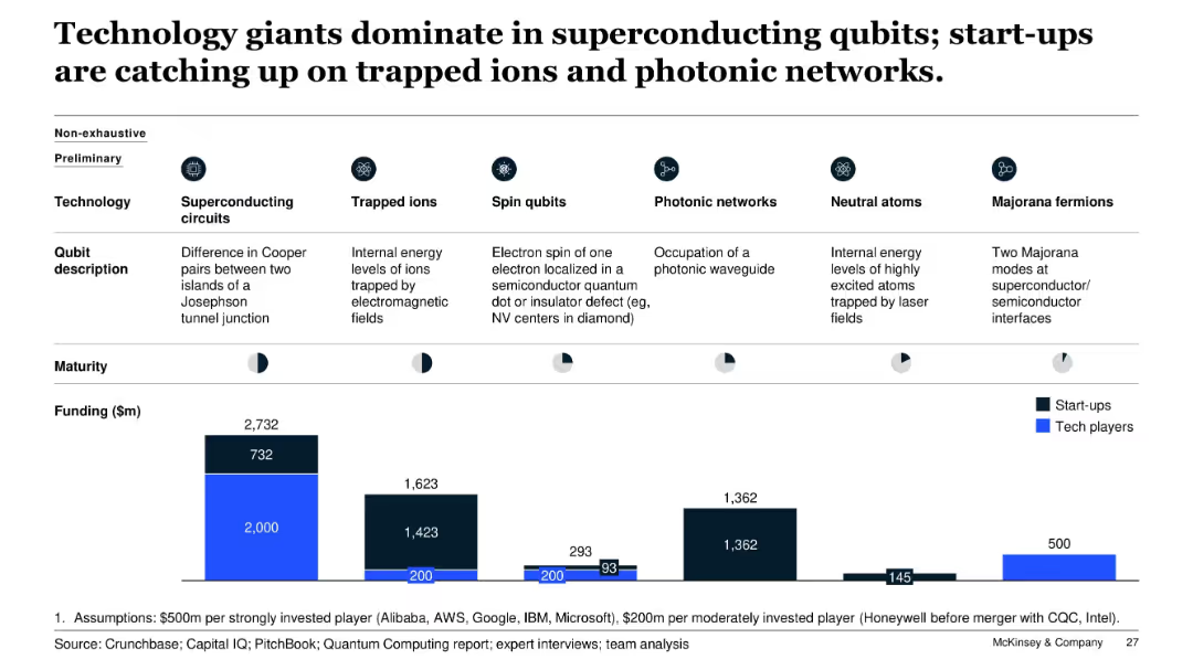
Comparative bar chart with icons and segments showing six types of qubit technologies, including funding levels and tech/start-up maturity; clean layout with icons and dark/light color coding.
Investment Analysis
Artificial Intelligence
The slide compares six quantum qubit technologies, highlighting the dominance of tech giants in superconducting circuits and start-up activity in photonic networks and trapped ions. Funding amounts and company maturity stages are visualized to show relative investment and technology adoption trends.
qubits, funding, start-ups, tech players, superconducting, photonic, trapped ions, investment, quantum computing
Multiple Chart
McKinsey
Saved
Previous
Next
If nothing, comes up, please save your slides first
Create a FREE account to continue browsing
Receive Instant Access to 1,000+ slides from companies like McKinsey, Google, and Goldman Sachs
First Name
Last Name
Email
Password
I agree to all
Terms & Privacy Policy
Thank you! Your submission has been received!
Oops! Something went wrong while submitting the form.
Have an account?
Sign in
Column Chart
Heatmap
Chevron
Org Chart
Infographic
Callouts
Timeline
List
Graphic
Picture
Process Flow
Diagram
Paragraph
Map
Table
Framework
Subtitle
Takeaway Box
Icon
Other Chart
Radar Chart
Waterfall Chart
Mekko Chart
Pie Chart
Scatter Plot
Line Chart
Bar chart
Bullet points