Create a FREE Account
Instant access to 1,000+ real slides from top companies like McKinsey, BCG, Goldman Sachs, Google and many more!
First Name
Last Name
Email
Password
I agree to all
Terms & Privacy Policy
Thank you! Your submission has been received!
Oops! Something went wrong while submitting the form.
Have an account?
Sign in
Library
Templates
Courses
Pricing
My Account
My Slides
My Templates
✦ AI
AI Prompt Library
AI Search
Sign in
Start Here
Logout
My Saved Slides
This slide features a dark background with a header, body text, and a column chart showing three percentage indicators. Each indicator is accompanied by descriptive text explaining consumer openness to virtual primary care consultations versus in-person consultations.
Technology and Digital Transformation
Healthcare & Pharmaceuticals
The slide discusses the openness of US consumers to switch to virtual primary care consultations, despite a general preference for in-person consultations. It highlights the percentage of consumers willing to consider virtual consultations.
healthcare, virtual care, primary care, US, consultations
Mixed Chart
EY
Saved
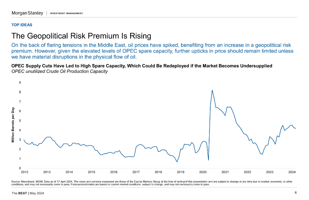
Contains a line chart showing OPEC's unused crude oil production capacity over time, with a focus on geopolitical risk.
Risk Assessment and Management
Energy & Utilities
This slide analyzes the rise in geopolitical risk premiums, illustrated by OPEC's spare crude oil production capacity, and discusses the implications for oil prices.
geopolitical risk, OPEC, crude oil, production capacity, oil prices
Mixed Chart
Morgan Stanley
Saved
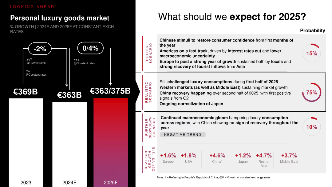
Vertical bar chart projecting 2025 scenarios with arrows and probability indicators (realistic, better, worse). Accompanied by scenario descriptions and macro trends.
Market Analysis and Trends
Consumer Goods
Outlines three potential scenarios for personal luxury goods market growth in 2025, with a realistic scenario (75% probability) expecting recovery led by China, Western markets, and Japan. Charts suggest flat to moderate growth (€363–375B). Also includes economic growth rates across regions to support expectations.
2025 forecast, luxury market, scenario planning, China recovery, global consumption trends
Multiple Chart
Bain
Saved
The slide includes a pie chart detailing a breakdown by property type and a line chart showing the net charge-off rate over time, comparing commercial banking to peer average. It also features text sections with bullet points.
Risk Assessment and Management
Financial Services
Analysis of credit risk management, with focus on performance, asset class strength, and exposure.
Risk, credit, performance, exposure, CRE, asset, lending, quality, portfolio, discipline
Multiple Chart
JP Morgan
Saved
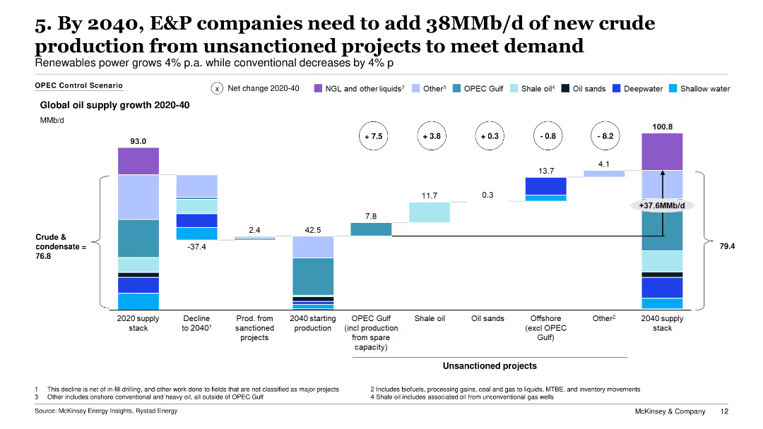
The slide features a stacked bar chart showing global oil supply growth from 2020 to 2040, including sanctioned and unsanctioned projects.
Operational Efficiency
Energy & Utilities
It highlights the need for significant new crude oil production from unsanctioned projects to meet demand by 2040, outlining sources like OPEC, shale oil, and oil sands.
oil production, unsanctioned projects, demand, supply growth, E&P companies
Single Chart
McKinsey
Saved
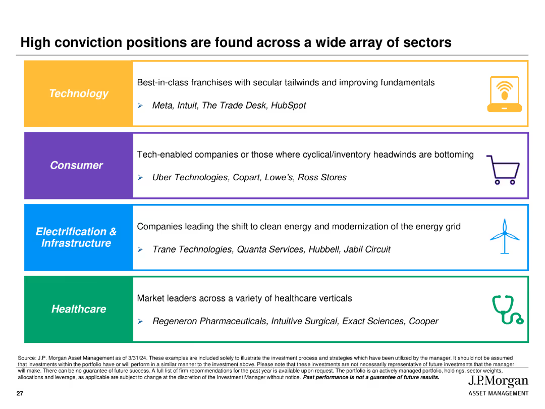
Utilizes colored sections with icons and text to highlight high conviction positions in Technology, Consumer, Electrification & Infrastructure, and Healthcare sectors.
Investment Analysis
Financial Services
Identifies and highlights key high conviction investment positions across various sectors, providing examples of companies within each sector.
high conviction, positions, sectors, technology, consumer, infrastructure, healthcare
Table
JP Morgan
Saved
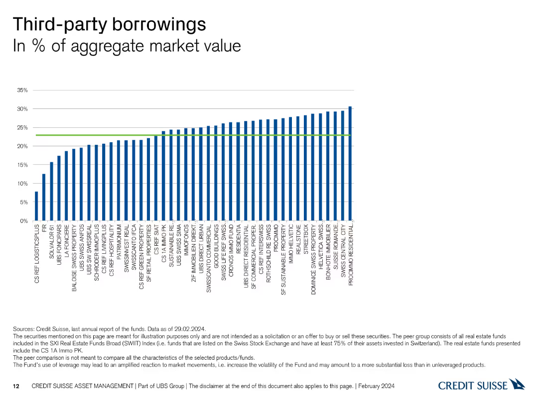
This slide contains a column chart showing the percentage of third-party borrowings in the aggregate market value for various entities.
Financial Performance
Financial Services
It presents the level of third-party borrowings as a percentage of the aggregate market value, useful for assessing financial leverage and risk among entities.
borrowings, aggregate market value, financial leverage, third-party, entities
Single Chart
Credit Suisse
Saved
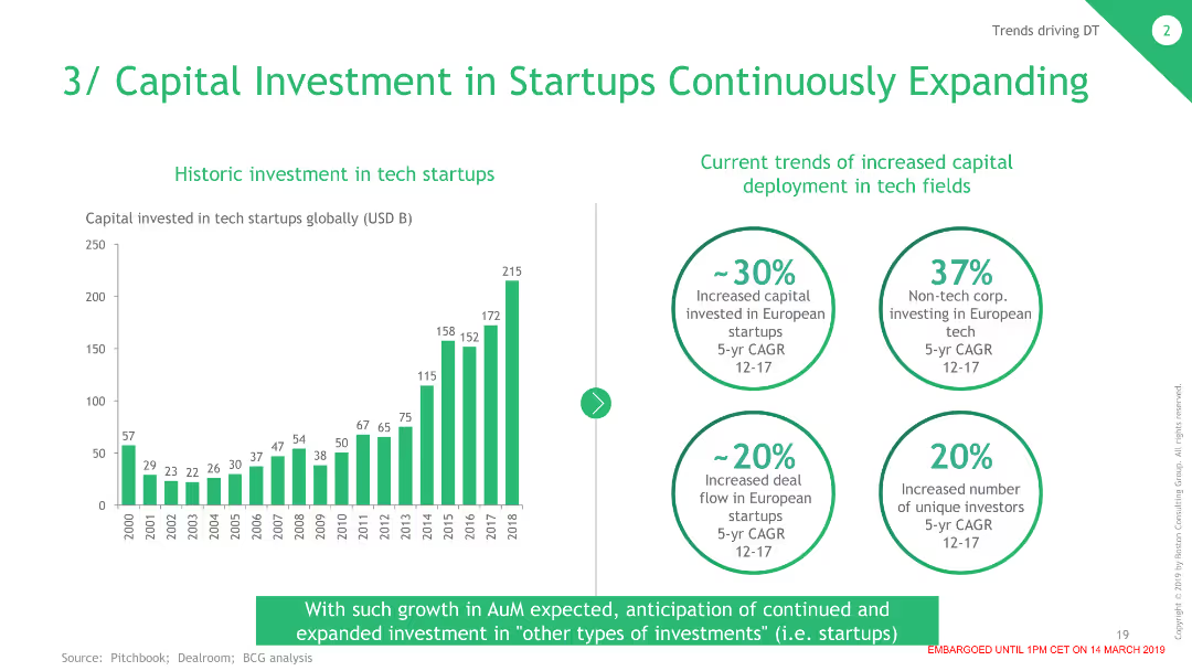
The slide contains a column chart on the left showing historic investments in tech startups and four circular data points on the right summarizing current trends in capital investment.
Investment Analysis
Financial Services
This slide shows the growth in capital investment in tech startups over time and highlights significant trends in increased investment and deal flow in European startups.
Investment, Startups, Capital, Trends, Financial
Mixed Chart
BCG
Saved
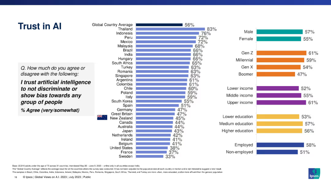
Bar chart comparing country and demographic trust levels in AI being unbiased.
Risk Assessment and Management
Artificial Intelligence
Shows percentage of respondents who trust AI not to discriminate. Data segmented by countries and demographics with a global average baseline.
trust, discrimination, bias, AI ethics, global survey, demographic trust, Ipsos
Multiple Chart
IPSOS
Saved
Series of column charts illustrating the EBIT trends of luxury goods brands through different economic phases from 2000 to 2017.
Financial Performance
Consumer Goods
Provides an analysis of how operating profits for luxury brands have evolved through various market conditions, emphasizing their resilience and profitability.
Profits, Luxury Goods, Financial Analysis
Single Chart
Bain
Saved
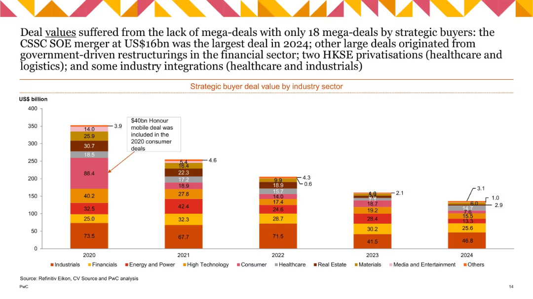
Stacked vertical bars representing deal values in US$ billion by sector from 2020–2024; fewer high-value deals in recent years; emphasis on top deals.
Investment Analysis
Financial Services
Illustrates M&A deal value per industry. The absence of mega-deals brought total values down in 2024. The largest was a $16bn CSSC SOE merger. Notable restructuring seen in financials, and key privatizations occurred in healthcare/logistics.
deal value, sectors, mega-deals, SOEs, privatizations, 2024
Single Chart
PwC/Strategy&
Saved
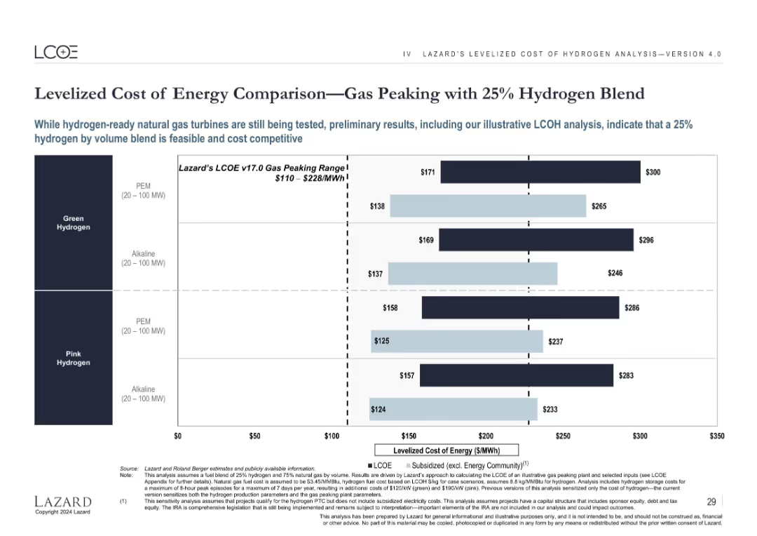
Bar chart comparing blended hydrogen LCOE with historical gas peaking ranges, showing cost competitiveness.
Strategic Planning
Energy & Utilities
Demonstrates the feasibility and cost competitiveness of blending 25% hydrogen with natural gas for peaking power plants. Compares four configurations of green and pink hydrogen sources and places them in context with Lazard’s historical gas peaking LCOE range.
hydrogen blend, gas peaking, energy cost, LCOE, PEM, alkaline, green hydrogen, pink
Single Chart
Roland Berger
Saved
This slide has a text-heavy format with five sections, each including a header, percentage, description, and associated icon, with a footnote at the bottom.
Market Analysis and Trends
Technology & Software
Details the systemic changes driving the growth of ecommerce in SEA, focusing on demographics, internet infrastructure, GDP growth, payment ecosystems, and retail infrastructure, indicating substantial opportunities for market expansion.
Systemic changes, ecommerce growth, SEA, demographics, internet infrastructure
Header Vertical
Bain
Saved
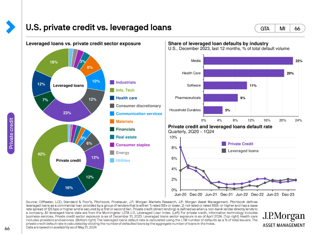
This slide features two pie charts and one line chart. The pie charts compare sector exposure between leveraged loans and private credit. The line chart shows the share of leveraged loan defaults by industry from December 2023 to 2024.
Investment Analysis
Financial Services
The slide compares the sector exposures of leveraged loans and private credit, and analyzes the default rates by industry, providing a comprehensive view of risk and sector distribution in private credit markets.
private credit, leveraged loans, sector exposure, defaults, investment
Multiple Chart
JP Morgan
Saved
The slide features two horizontal bar charts comparing stress levels before and during COVID-19, and a pie chart showing stress shift percentages. Clean white background.
Risk Assessment and Management
Financial Services
This slide presents data on Canadian investors' stress levels regarding their investments, comparing pre-pandemic and current levels, and detailing changes in stress perception.
stress levels, investments, COVID-19, comparison, Canadian investors
Multiple Chart
IPSOS
Saved
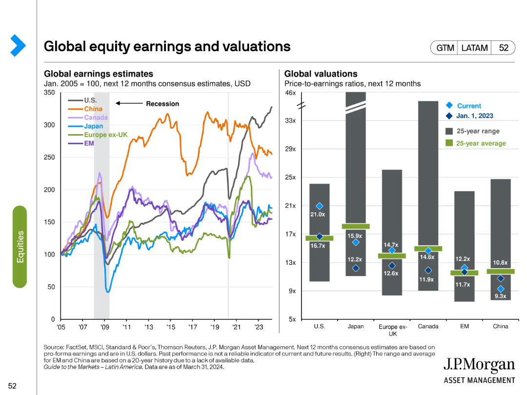
This slide includes a line chart for global earnings estimates and a bar chart for global valuations. Different colors represent various regions and time periods, highlighting trends and comparisons.
Financial Performance
Financial Services
It provides a comparison of earnings estimates and valuation metrics across global equity markets, helping to identify trends and potential investment opportunities based on relative valuations.
Global equities, earnings estimates, valuations, comparative analysis, trends
Multiple Chart
JP Morgan
Saved
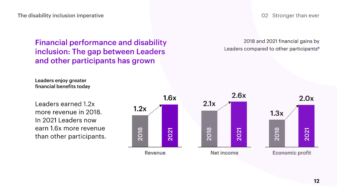
The slide features column charts comparing the financial gains of Disability Inclusion Leaders to other participants in 2018 and 2021, with commentary on the increasing gap.
Human Resources and Talent Management
Professional Services
The slide discusses the growing financial benefits for Disability Inclusion Leaders, showing higher revenue, net income, and economic profit over time compared to other participants.
disability inclusion, financial performance, revenue growth, comparison, leaders
Multiple Chart
Accenture
Saved
Horizontal bar chart showing the growth of internet users aged 18+ and digitally active users from 2020 to 2030 with CAGR rates.
Market Analysis and Trends
Media & Entertainment
This slide highlights the expected growth of digitally active users in India, projecting that 85% of internet users will be digitally active by 2030.
internet, users, growth, digital, CAGR
Multiple Chart
BCG
Saved
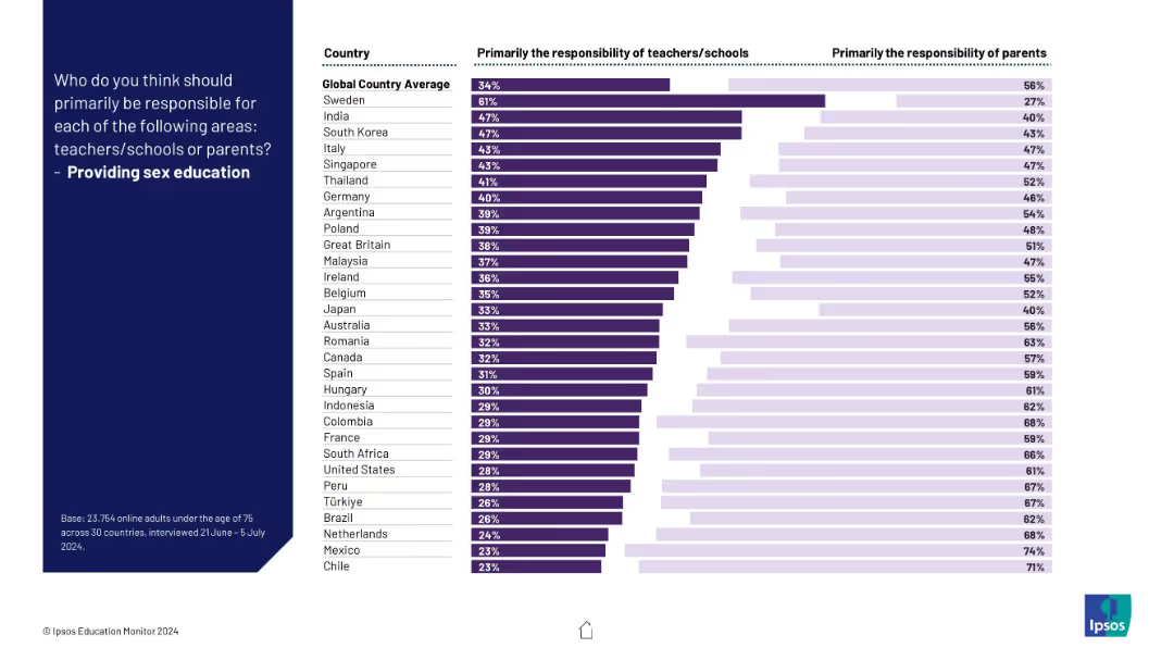
Horizontal dual-colored bar graph showing teacher vs parent responsibility levels by country.
Regulatory and Compliance
Education & Training
This slide details perspectives on who should provide sex education—teachers or parents. The data reflects cultural and national differences in this sensitive area.
sex education, responsibility, compliance, parents, schools, culture, regulation, education, global survey, Ipsos
Mixed Chart
IPSOS
Saved
This slide uses a scatter plot to compare various global cities on scales of density and city structure, categorizing them as monocentric or polycentric.
Risk Assessment and Management
Transportation & Logistics
Analyzes how the urban structure and density of different cities influence their vulnerability to transportation-related threats.
urban planning, transportation, city, density, threat level, global, analysis, risk management
Mixed Chart
BCG
Saved
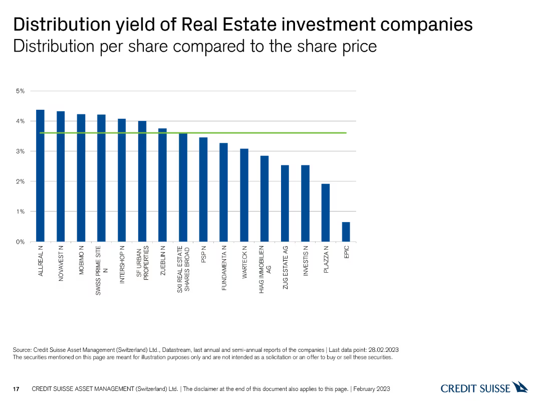
This slide displays a column chart showing the distribution yield per share for Swiss real estate investment companies, with vertical bars representing yield percentages and a green reference line.
Financial Performance
Real Estate & Construction
The slide presents the distribution yields of real estate investment companies, comparing their returns. It is used for evaluating income potential and investment performance.
Real estate, distribution yield, investment companies, returns, comparison
Single Chart
Credit Suisse
Saved
Various bar charts showing percentages of different demographics (gender, race, ethnicity) among investment professionals and partners, correlated with the presence of diversity strategies.
Risk Assessment and Management
Financial Services
This slide correlates diversity and inclusion strategies with the demographics of investment professionals and partners. It provides insights into the effectiveness of diversity strategies in the financial sector.
diversity, inclusion, gender, race, ethnicity
Multiple Chart
Deloitte
Saved
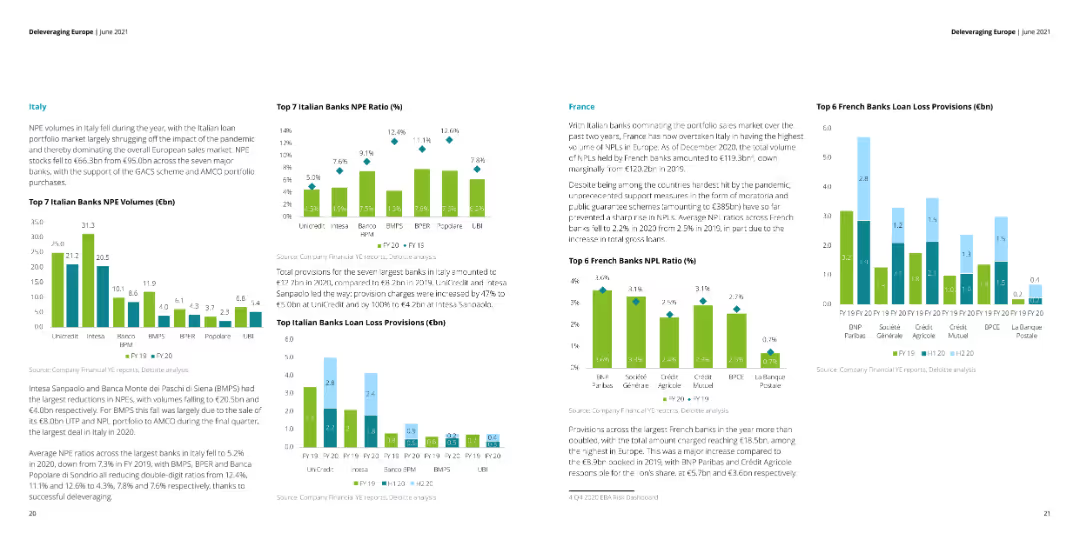
The slide features multiple column charts showing NPE volumes, NPE ratios, and loan loss provisions for top banks in Italy and France. Text sections provide detailed explanations of the charts.
Financial Performance
Financial Services
This slide analyzes the NPE volumes, NPE ratios, and loan loss provisions for the top banks in Italy and France. It discusses the impact of the pandemic and government support schemes on the financial metrics.
NPE volumes, NPE ratios, loan loss, Italy, France
Multiple Chart
Deloitte
Saved
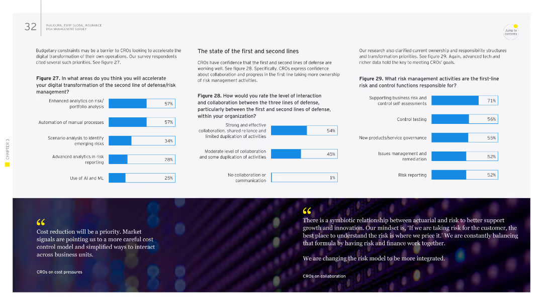
This slide includes several column charts depicting areas of improvement for risk management functions, focusing on analytics, automation, and collaboration between lines of defense.
Operational Efficiency
Financial Services
It discusses how CROs evaluate the interaction between the first and second lines of defense, with emphasis on analytics, automation, and collaboration in risk management activities. The slide helps in understanding the operational efficiency of risk management practices.
risk management, first line, second line, collaboration, automation, analytics
Multiple Chart
EY
Saved
The slide features a comprehensive risk profiling chart. It uses a grid layout to categorize aging debt into different risk groups. The right side contains column charts representing past due amounts and accounts past due in various colors.
Risk Assessment and Management
Energy & Utilities
The slide provides a detailed analysis of aging debt risk profiling for utility customers, categorizing them into five aging groups with associated risk levels and past due amounts.
Risk, Aging Debt, Profiling, Utility, Groups
Multiple Chart
EY
Saved
Previous
Next
If nothing, comes up, please save your slides first
Create a FREE account to continue browsing
Receive Instant Access to 1,000+ slides from companies like McKinsey, Google, and Goldman Sachs
First Name
Last Name
Email
Password
I agree to all
Terms & Privacy Policy
Thank you! Your submission has been received!
Oops! Something went wrong while submitting the form.
Have an account?
Sign in
Column Chart
Heatmap
Chevron
Org Chart
Infographic
Callouts
Timeline
List
Graphic
Picture
Process Flow
Diagram
Paragraph
Map
Table
Framework
Subtitle
Takeaway Box
Icon
Other Chart
Radar Chart
Waterfall Chart
Mekko Chart
Pie Chart
Scatter Plot
Line Chart
Bar chart
Bullet points