Create a FREE Account
Instant access to 1,000+ real slides from top companies like McKinsey, BCG, Goldman Sachs, Google and many more!
First Name
Last Name
Email
Password
I agree to all
Terms & Privacy Policy
Thank you! Your submission has been received!
Oops! Something went wrong while submitting the form.
Have an account?
Sign in
Library
Templates
Courses
Pricing
My Account
My Slides
My Templates
✦ AI
AI Prompt Library
AI Search
Sign in
Start Here
Logout
My Saved Slides
Two column charts showing growth in client relationships from 2020 to 2023 and drivers of client relationship growth on the right.
Sales and Business Development
Financial Services
Details the various sources and strategies Morgan Stanley uses to grow client relationships, showing historical growth and future projections.
Morgan Stanley, client relationships, growth, strategy, sources
Mixed Chart
Morgan Stanley
Saved
The slide includes a line graph showing the average five-year fixed contract mortgage rate trends.
Market Analysis and Trends
Real Estate & Construction
It explains how lower borrowing costs have made housing more affordable, showing the decline in mortgage rates.
Borrowing costs, affordability, mortgage rates, housing, decline, trends, line graph, financial impact, analysis
Single Chart
IPSOS
Saved
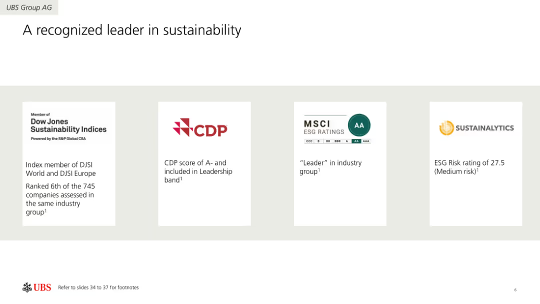
Four-column layout showcasing sustainability ratings and recognitions from different organizations like Dow Jones, CDP, MSCI, and Sustainalytics. Each column includes a logo and a brief description of the recognition.
Industry Overview
Environmental Services & Sustainability
Highlights UBS Group AG's achievements in sustainability, recognized by various rating agencies. Includes information on ratings, scores, and leadership positions in the sustainability sector.
Sustainability, Ratings, Recognition, Environment, Leadership, Achievements
Pillar
UBS
Saved
Contains line and column charts showing the Net Interest Margin (NIM) development for Corporate and Private Banks. Includes data points over multiple quarters.
Financial Performance
Financial Services
Details trends in Net Interest Margin for Deutsche Bank's Corporate and Private Banking sectors, analyzing shifts in financial management strategies and market conditions.
NIM, banking, interest rates, financial analysis, trends
Multiple Chart
Deutsche Bank
Saved
This slide contains two column charts with a text box on the side explaining the targets and capital deployment strategies.
Corporate Finance and Valuation
Financial Services
Discusses capital ratio targets and allocation strategies, aimed at financial strategists and investors.
capital targets, CET1 ratio, capital allocation, dividends
Mixed Chart
JP Morgan
Saved
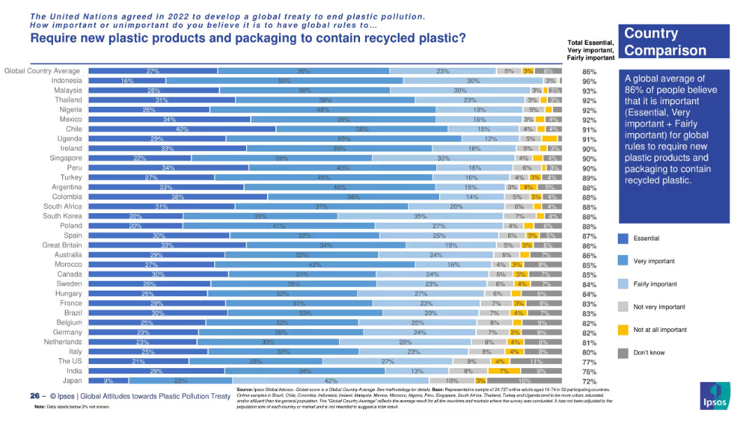
Vertical bar chart with country-level comparison. Bars are segmented by importance level using color gradients. Sidebar summarizes global average opinion and highlights key insights.
Market Analysis and Trends
Environmental Services & Sustainability
This slide displays a country-wise comparison of public support for requiring recycled plastic in new products. It highlights that a global average of 86% consider it important. Countries like Indonesia, Malaysia, and Nigeria show the strongest support for this regulation.
recycled plastic, packaging, consumer views, plastic regulation, sustainability, global treaty, Ipsos survey, country comparison, environmental concern
Mixed Chart
IPSOS
Saved
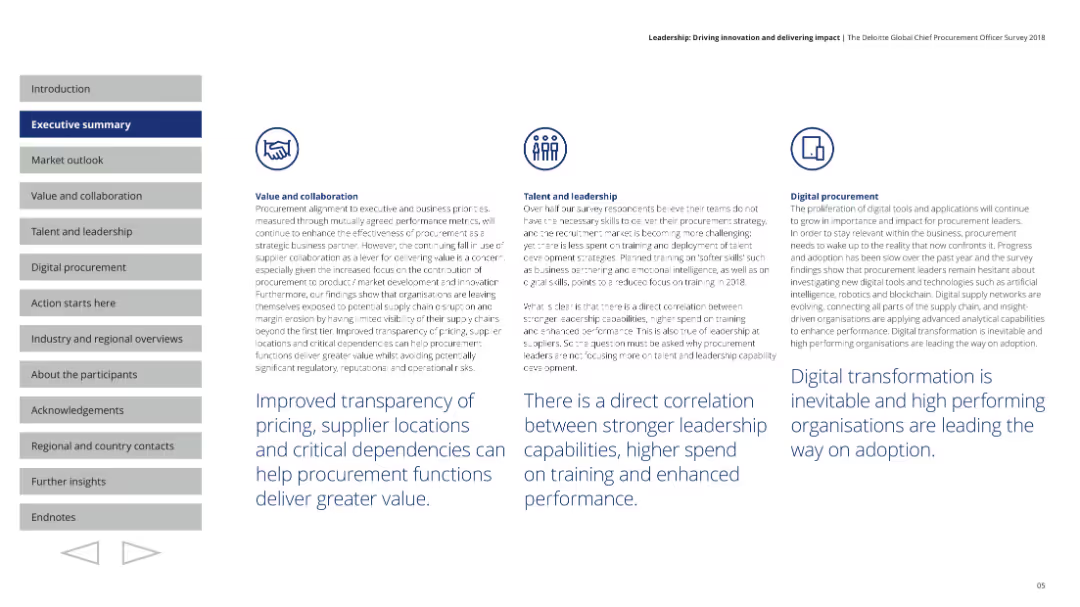
Includes circular charts showing prioritization of business strategies and a narrative on the global economic outlook.
Market Analysis and Trends
Professional Services
Provides an overview of the economic outlook for 2018, focusing on key business strategies and priorities among procurement leaders.
market outlook, business strategies, economic trends, procurement
Pillar
Deloitte
Saved
Text-heavy, detailing the benefits of integrating different GBS functions across a unified platform and a column chart
Operational Efficiency
Professional Services
Discusses cross-functional improvements, data integrity, and reduced handoffs in GBS operations.
cross-functional, GBS, improvements, data integrity, efficiency
Mixed Chart
Deloitte
Saved
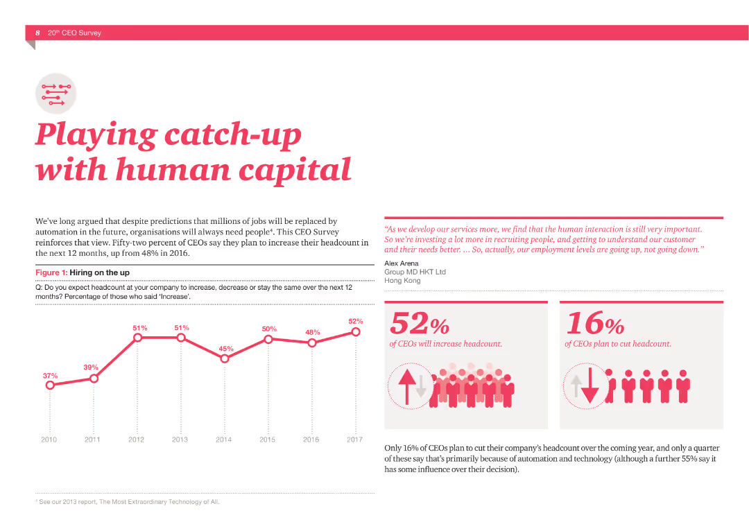
A column chart showing hiring trends from 2010 to 2017, and two statistics: 52% of CEOs plan to increase headcount, 16% plan to cut headcount. Includes a quote about the importance of human interaction.
Human Resources and Talent Management
Professional Services
The slide presents data from a CEO survey about hiring plans and the importance of human capital in the age of automation, supported by visual data and quotes.
Human capital, Hiring, CEOs, Headcount, Automation, Survey, Talent, Interaction, Recruitment, Employment
Multiple Chart
PwC/Strategy&
Saved
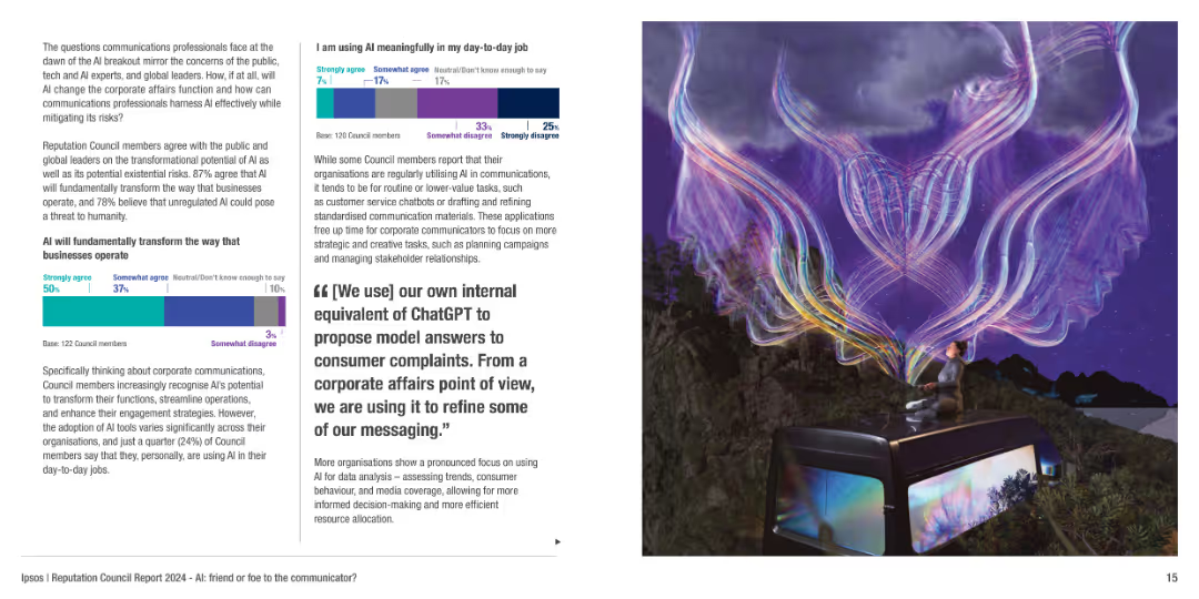
The slide includes a mixture of text, column charts, and a visually striking image depicting AI's impact on communication.
Technology and Digital Transformation
Technology & Software
Discusses the transformative potential of AI in corporate communications, its risks, and how organizations are adapting AI tools for efficiency and engagement.
AI, communication, technology impact, digital transformation, risks
Multiple Chart
IPSOS
Saved
Features two donut charts and a gauge chart. Each donut chart is segmented with various responses about employee awareness of career paths, colored distinctly for clarity. The gauge chart highlights a percentage.
Human Resources and Talent Management
Professional Services
Analyzes the level of employee awareness regarding career progression within the company, illustrated through clear visual charts. Suitable for internal reviews or strategic HR planning.
career paths, employee awareness, HR, charts
Multiple Chart
PwC/Strategy&
Saved
The slide features multiple column charts on a dark background, focusing on technology-enhanced healthcare preferences, with white and yellow text.
Technology and Digital Transformation
Healthcare & Pharmaceuticals
It highlights consumer readiness for personalized medicine, genetic testing, and wearable technology in healthcare.
technology, personalized care, genetic testing, survey, Germany
Mixed Chart
EY
Saved
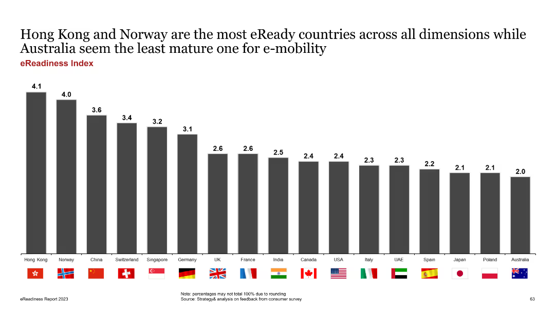
The slide features a column chart ranking countries by their eReadiness score. Each country is represented by a bar with its flag, and scores are listed above the bars.
Market Analysis and Trends
Transportation & Logistics
The slide ranks countries based on their overall eReadiness, highlighting Hong Kong and Norway as leaders and Australia as the least mature market. It aims to compare global EV market readiness.
eReadiness, country ranking, global comparison, EV market, scores
Single Chart
PwC/Strategy&
Saved
The slide includes a list of bullet points and two side-by-side data tables comparing financial statistics from two different periods. It's well-structured with a focus on financial data presentation.
Financial Performance
Financial Services
This slide's content offers a detailed view of the company's financial position, showcasing improvements and dividends. It's used for discussing financial health and strategies with stakeholders.
balance sheet, financials, dividends, net cash, assets, liabilities, mining
Table
Morgan Stanley
Saved
This slide contains a pie chart detailing portfolio by industry and a line graph illustrating net charge-off performance, accompanied by text boxes.
Risk Assessment and Management
Financial Services
The slide presents a portfolio summary, market commentary, and performance metrics for commercial and industrial (C&I) lending, discussing risk management and credit performance.
Risk Discipline, C&I Lending, Portfolio, Market Commentary, Performance, Credit Quality
Multiple Chart
JP Morgan
Saved
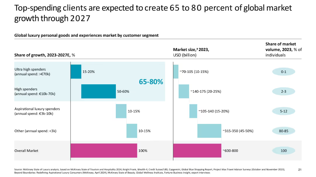
Bar chart comparing segments by growth share, market size, and population volume
Customer and Market Segmentation
Consumer Goods
Analyzes the global luxury market by spending segments, showing ultra-high and high spenders to drive 65–80% of growth through 2027, despite making up a very small share of the population.
luxury consumers, segmentation, ultra-high spenders, market growth, income tiers, 2027 forecast, share of wallet
Multiple Chart
McKinsey
Saved
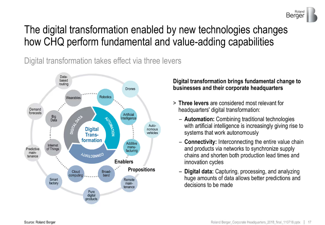
Circular infographic divided into three levers—Automation, Connectivity, Digital Data; surrounding icons represent technologies
Technology and Digital Transformation
Technology & Software
This slide explains the three levers of digital transformation—Automation, Connectivity, and Digital Data—that reshape CHQ functions. It highlights enabling technologies like AI, IoT, and cloud computing as drivers of efficiency, decision-making, and interconnectivity.
digital transformation, automation, connectivity, data, AI, IoT, CHQ
Diagram
Roland Berger
Saved
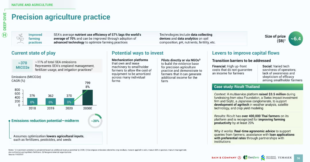
Features a similar design style: title banner, bullet-point sections, bar chart for emissions, and a boxed case study. Uses consistent fonts and icons with green highlights for visual continuity.
Technology and Digital Transformation
Agriculture & Food Production
Highlights the inefficiencies in SEA's current agricultural nutrient usage (57%) and promotes the use of data-driven precision farming to optimize practices. Investment avenues include tech-enabled mechanization platforms and NGO-led pilots. The slide identifies barriers like cost and tech savviness. Ricult Thailand is cited as a successful example leveraging tech to boost productivity by over 20%.
precision agriculture, nutrient use, farming, emissions, Ricult, SEA, agritech, data
Multiple Chart
Bain
Saved
Comprising of bar charts and textual sections, this slide visually presents Barclays' capabilities and achievements in the US partner card market. It highlights their growth in partner card receivables and reasons partners choose Barclays, like track record and partnership focus.
Market Analysis and Trends
Financial Services
This slide discusses Barclays' strategic advantages in the US partner card market, showcasing their growth in partner card receivables and reasons why partners opt for Barclays, emphasizing their specialized capabilities.
growth, partner market, receivables, partnership focus, integration
Mixed Chart
Barclays
Saved
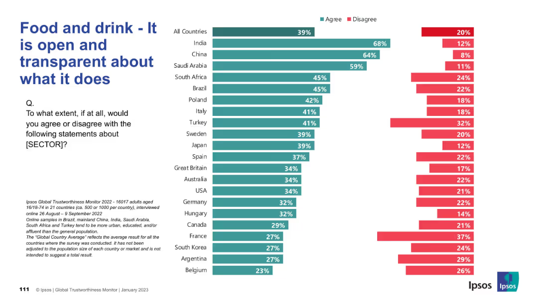
Same format as previous: horizontal bar chart; agree/disagree split by country, left-side question text.
Market Analysis and Trends
Consumer Goods
The slide presents survey results on whether people believe the food and drink sector is open and transparent. Countries are listed with corresponding agreement and disagreement levels. High transparency perception is concentrated in India and China.
transparency, openness, food industry, survey, global data, consumer trust, Ipsos, public opinion, chart, comparison
Mixed Chart
IPSOS
Saved
Includes column charts showing past and projected expenses, with a legend explaining different categories of expenses. The design is clean with the use of colors to differentiate data.
Operational Efficiency
Financial Services
It presents J.P.Morgan's firmwide expenses over time with projections, indicating areas of investment and expected declines in growth rate.
Expenses, Projections, Investment, Efficiency, Growth Rate, Financial Services, J.P.Morgan
Mixed Chart
JP Morgan
Saved
The slide has a clean and organized design with column chart and table sections. It contrasts financial results across quarters, showing trends and changes in revenue, earnings, and profitability metrics. The use of blue hues emphasizes the financial data points.
Financial Performance
Financial Services
This slide provides an overview of financial results, comparing quarter-on-quarter and year-to-date performances. It is designed for investors or management to gauge the financial health and performance trends of the company, with a focus on revenues and earnings.
financial results, net revenues, earnings, year-to-date, overview
Mixed Chart
Goldman Sachs
Saved
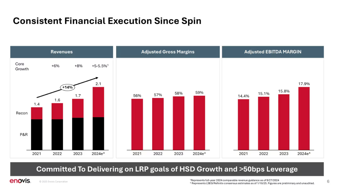
Three bar charts aligned horizontally: Revenue, Gross Margin, EBITDA Margin. Clear data visualization.
Financial Performance
Healthcare & Pharmaceuticals
Highlights Enovis’s financial performance since its spin-off, showing revenue growth, improving gross margins, and expanding EBITDA margins from 2021 to projected 2024. Emphasizes alignment with long-range planning (LRP) goals.
revenue growth, margins, EBITDA, core growth, performance, spin-off, long-range planning
Mixed Chart
JP Morgan
Saved
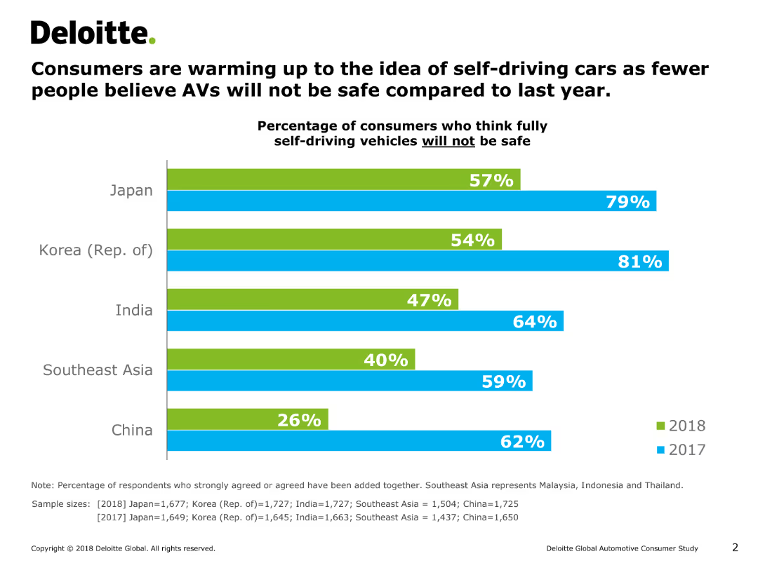
This slide features a column chart comparing the percentage of consumers in different countries who think fully self-driving vehicles are not safe between two years.
Market Analysis and Trends
Transportation & Logistics
It analyzes the change in consumer perception regarding the safety of self-driving cars across several countries over two years, showing a trend of increased acceptance.
self-driving, cars, safety, perception, trends
Single Chart
Deloitte
Saved
A bar chart showing potential reach of the TV screen by source for different age groups, with a focus on AVOD reach and its incremental gain.
Market Analysis and Trends
Media & Entertainment
The slide highlights that AVOD content has the greatest reach potential among younger viewers, showing significant incremental gains in audience reach.
AVOD, reach, potential, younger viewers, incremental gain
Multiple Chart
Nielsen
Saved
Previous
Next
If nothing, comes up, please save your slides first
Create a FREE account to continue browsing
Receive Instant Access to 1,000+ slides from companies like McKinsey, Google, and Goldman Sachs
First Name
Last Name
Email
Password
I agree to all
Terms & Privacy Policy
Thank you! Your submission has been received!
Oops! Something went wrong while submitting the form.
Have an account?
Sign in
Column Chart
Heatmap
Chevron
Org Chart
Infographic
Callouts
Timeline
List
Graphic
Picture
Process Flow
Diagram
Paragraph
Map
Table
Framework
Subtitle
Takeaway Box
Icon
Other Chart
Radar Chart
Waterfall Chart
Mekko Chart
Pie Chart
Scatter Plot
Line Chart
Bar chart
Bullet points