Create a FREE Account
Instant access to 1,000+ real slides from top companies like McKinsey, BCG, Goldman Sachs, Google and many more!
First Name
Last Name
Email
Password
I agree to all
Terms & Privacy Policy
Thank you! Your submission has been received!
Oops! Something went wrong while submitting the form.
Have an account?
Sign in
Library
Templates
Courses
Pricing
My Account
My Slides
My Templates
✦ AI
AI Prompt Library
AI Search
Sign in
Start Here
Logout
My Saved Slides
Column charts illustrate CET1 ratio development and risk-weighted assets progression. Bullets summarize key changes and impacts on the CET1 ratio.
Financial Performance
Financial Services
Highlights improvement in CET1 ratio to 14.1% due to capital raises and reductions in risk-weighted assets, providing a stable capital base.
CET1 ratio, risk-weighted assets, capital raises, financial stability, banking metrics
Multiple Chart
Credit Suisse
Saved
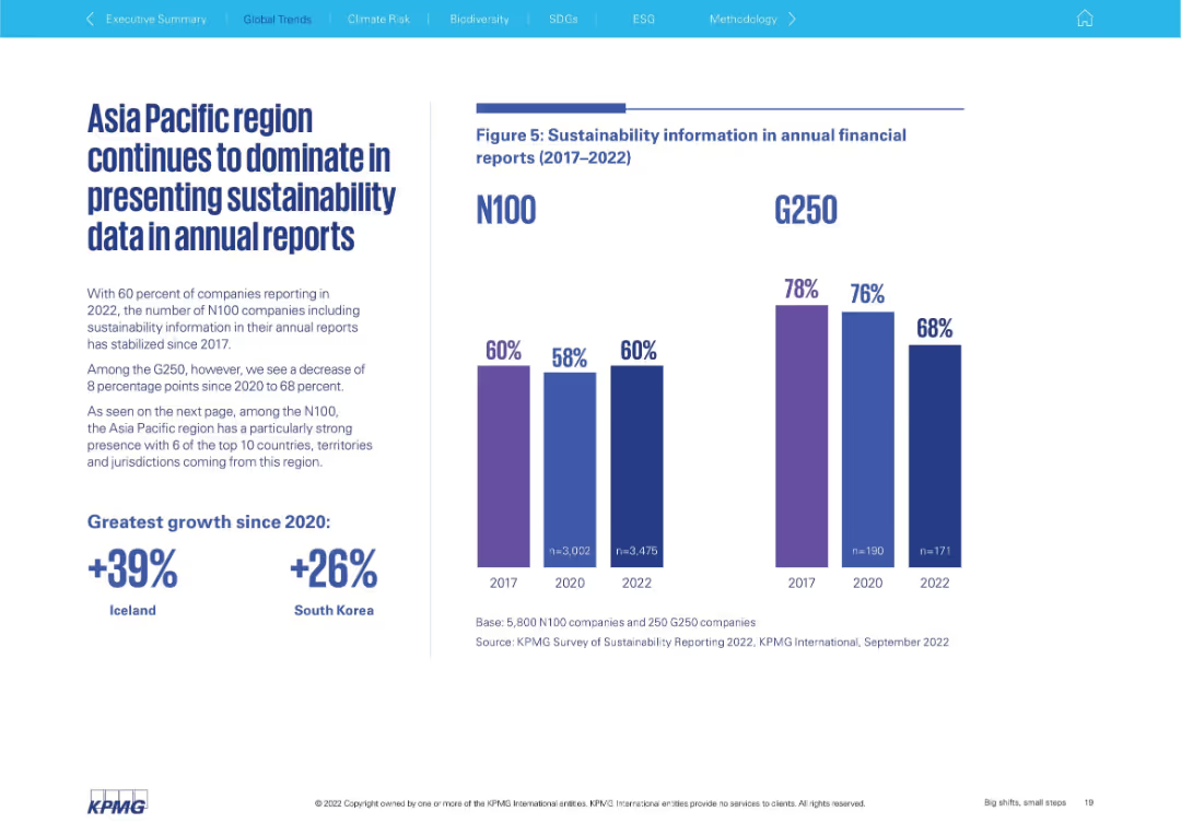
Left-aligned text block with bold statistics; right side features dual vertical bar charts comparing N100 and G250 (2017–2022)
Performance Metrics and KPIs
Professional Services
This slide focuses on the inclusion of sustainability data in annual financial reports. It contrasts N100 and G250 trends, showing a plateau for N100 and a decline for G250. The Asia Pacific region is highlighted as dominant in data presentation.
annual reporting, N100, G250, sustainability data, Asia Pacific, transparency, trend analysis
Mixed Chart
KPMG
Saved
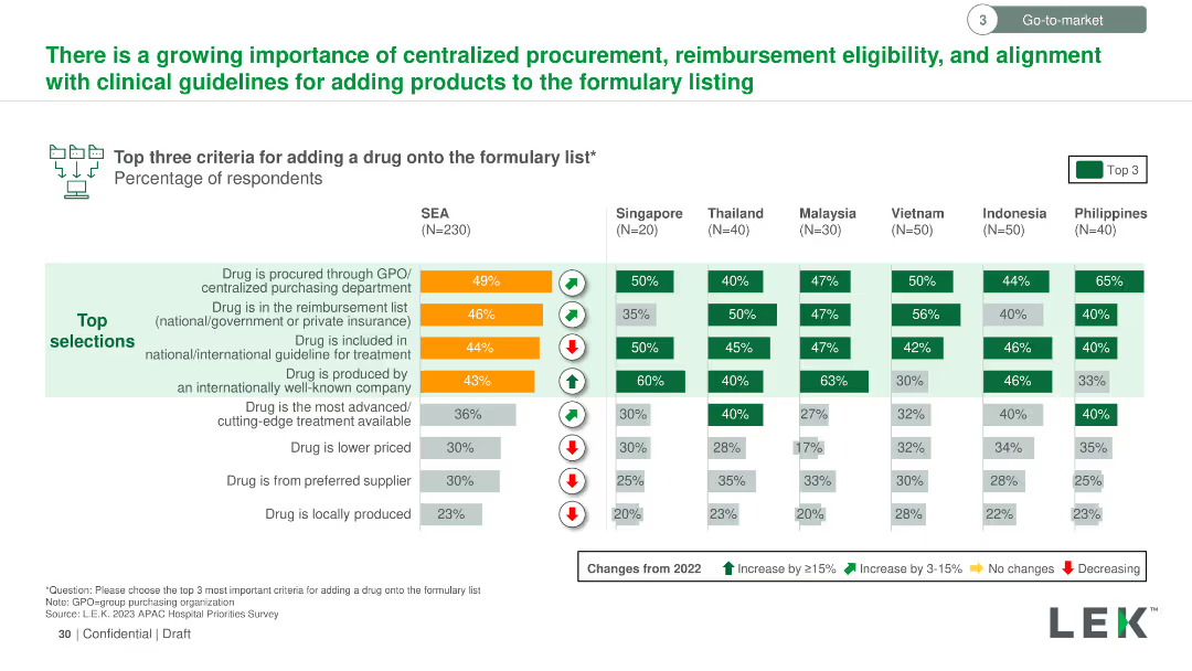
Vertical column chart showing the top three criteria for adding a drug to the formulary list across SEA countries. Criteria are color-coded and ranked by importance.
Regulatory and Compliance
Healthcare & Pharmaceuticals
Details the most important criteria for adding drugs to formulary lists in SEA, such as procurement through GPO, reimbursement status, and inclusion in treatment guidelines, with regional variations in importance.
formulary list, drug addition, criteria, GPO, reimbursement, treatment guidelines, SEA
Multiple Chart
LEK
Saved
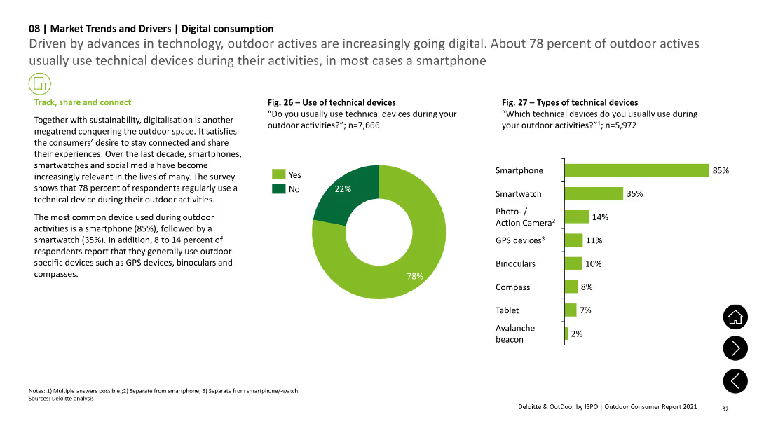
The slide includes a pie chart showing the use of technical devices during outdoor activities and a column chart illustrating the types of devices used, such as smartphones and smartwatches. Text sections provide additional context.
Technology and Digital Transformation
Technology & Software
The slide explores the increasing use of digital devices like smartphones and smartwatches by outdoor enthusiasts, supported by survey data on the prevalence and types of devices used.
digital consumption, technology, smartphones, smartwatches, survey data
Multiple Chart
Deloitte
Saved
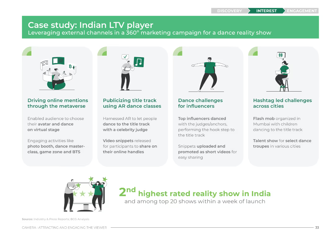
The slide features four columns with icons and brief descriptions for each aspect of the marketing campaign. The design uses green and white colors with icons representing the metaverse, AR dance classes, dance challenges, and hashtag challenges.
Client Case Studies
Media & Entertainment
This slide outlines a case study of an Indian LTV player's marketing campaign. It details the use of metaverse, AR dance classes, influencer dance challenges, and hashtag challenges to drive engagement and mentions the show's high rating and popularity.
case study, LTV, marketing campaign, metaverse, AR dance, influencers, hashtag challenges, engagement
Pillar
BCG
Saved
Slide includes a column chart and a circular diagram detailing global and country-specific data on internally displaced people due to conflict or disasters, supplemented with textual analysis and icons.
Market Analysis and Trends
Government & Public Sector
This slide discusses trends in internal displacement driven by conflict and disasters, providing data to understand regional and global scales of the issue and to support humanitarian and policy responses.
displacement, conflict, disaster, data, global, regional, humanitarian, policy, statistics
Multiple Chart
Roland Berger
Saved
Basic visual complexity, contrasting textual information with a relatable image.
Strategic Planning
Professional Services
Discusses the need for businesses to adapt to changes and disruptions, hinting at strategies for maintaining competitiveness and relevance.
business strategy, adaptability, global trends, disruptions
Mixed Chart
Bain
Saved
Features detailed table by sector (like apparel, food) showing sales changes in multiple countries.
Strategic Planning
Retail & E-commerce
Provides a deep dive into how retail subsectors are recovering across different regions, focusing on year-over-year sales data.
retail, sales, comparison, recovery
Table
BCG
Saved
A mix of column chart and comprehensive text boxes, depicting various financial metrics.
Operational Efficiency
Financial Services
Overview of company expenses including compensation, transaction, and technology costs with a year-over-year comparison.
Expenses, Operational, Efficiency, Bar Chart, Financial Results, Compensation, Technology, Tax Rate, Comparison
Mixed Chart
Goldman Sachs
Saved
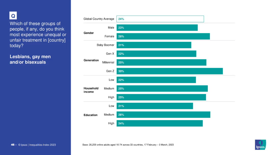
Horizontal bar chart segmented by gender, generation, income, and education on white background
Market Analysis and Trends
Government & Public Sector
The slide shows demographic breakdowns of global responses to unfair treatment of LGB individuals, categorized by gender, generation, household income, and education. Gen Z and females reported the highest perception of inequality.
demographics, inequality, LGB, Ipsos, Gen Z, gender, education, income, survey, 2023
Mixed Chart
IPSOS
Saved
This slide consists of a column chart and a flow diagram. The chart shows a decrease in advisor loans from 2017 to 2020, marked with a downward arrow and percentage. The diagram depicts a talent development program with timelines for training and roles, using arrows and a dashed line.
Strategic Planning
Financial Services
The slide compares advisor recruitment costs and the reallocation of those funds into advisor development. It suggests a strategic shift in investing more in talent development rather than recruitment, aligning with long-term growth and operational efficiency.
Cost saving, talent development, advisor recruitment, investment strategy, training program, operational efficiency, long-term growth, financial planning, human resources, strategic shift
Multiple Chart
Morgan Stanley
Saved
The slide displays a circular diagram in two shades, dividing key business areas, and text blocks on the right, all on a dark background.
Strategic Planning
Financial Services
It emphasizes strategic business priorities such as maximizing wallet share and scaling platform solutions for profitability.
Strategy, Profitability, Growth, Management, Wallet Share, Financing, Platform
Framework
Goldman Sachs
Saved
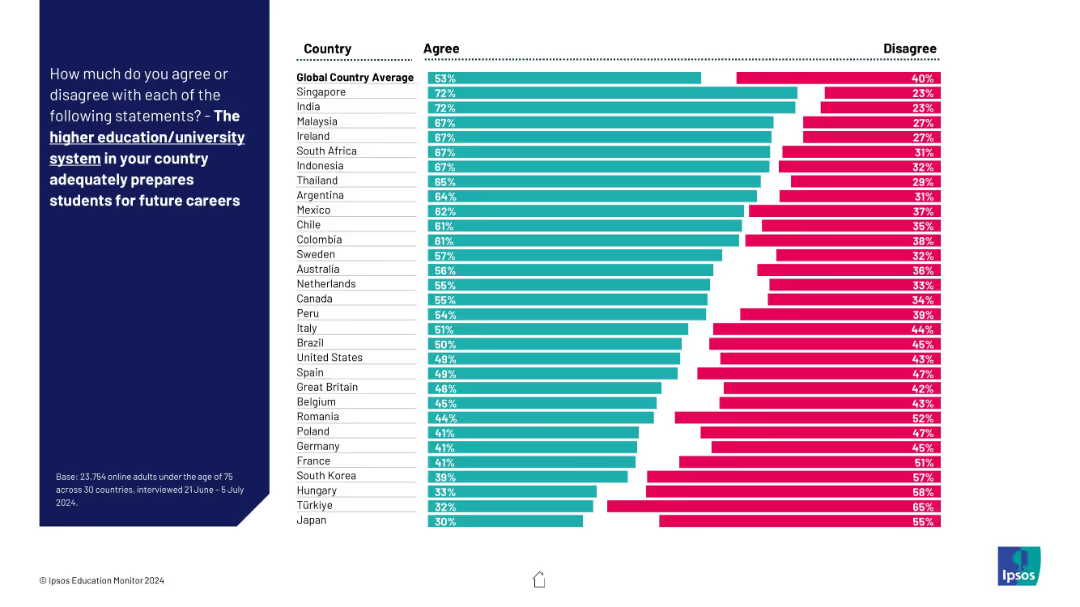
Ranked horizontal bar chart by country showing agree/disagree percentages. Global average benchmarked at top. Countries arranged highest to lowest in agreement.
Market Analysis and Trends
Education & Training
The chart ranks 30 countries by agreement levels on how well their higher education systems prepare students for careers. Singapore and India rank highest, while Hungary and Japan rank lowest.
global ranking, higher education, country comparison, future careers, university preparation
Mixed Chart
IPSOS
Saved
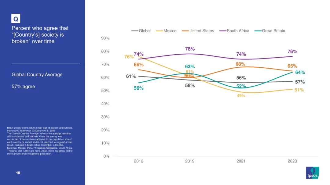
White background with line chart tracking agreement over time that “[Country]'s society is broken” for 5 countries plus global average; blue info box on left.
Market Analysis and Trends
Government & Public Sector
Tracks longitudinal data from 2016–2023 on societal dissatisfaction in select countries, noting highest levels in South Africa and consistent upward trend in Great Britain.
broken society, dissatisfaction, Ipsos, trend analysis, longitudinal data, South Africa, perception
Mixed Chart
IPSOS
Saved
Slide shows a series of column charts illustrating the decrease in fire incidents and associated financial losses in a market post-solar adoption, supplemented with a small text box for additional data.
Risk Assessment and Management
Energy & Utilities
Highlights the decrease in fire incidents at Sabon Gari Market following solar energy adoption, emphasizing the financial benefits from reduced damages and operational interruptions.
solar, market, fire, reduction, safety
Mixed Chart
BCG
Saved
This slide contains four pie charts displaying loan portfolio characteristics and a section titled 'High Quality Private Education Loan Portfolio' with a descriptive text box.
Financial Performance
Financial Services
The slide presents characteristics of a private education loan portfolio, highlighting credit quality and payment types. It's useful for investors and analysts assessing loan portfolio health and risk profile.
Loan Portfolio, Education, Financial Quality, FICO Scores, Interest Rates, Payment Types, Credit
Multiple Chart
Morgan Stanley
Saved
Column chart and stacked bar charts showing where EV owners primarily charge their vehicles (at home, office, street) across APAC, EMEA, and North America. The slide uses icons and percentages to display data.
Market Analysis and Trends
Transportation & Logistics
This slide details the primary charging locations for EV owners, highlighting regional preferences for charging at home, at the office, or on the street.
charging preferences, primary location, EV owners, regional differences, home charging
Multiple Chart
PwC/Strategy&
Saved
The slide is text-heavy with quotes and detailed analysis, alongside bar charts showing survey results on AI's risks in corporate communications.
Risk Assessment and Management
Technology & Software
Analyzes the potential risks associated with AI in corporate communications, highlighting issues like misinformation and loss of human touch in messages.
AI risks, corporate communications, survey results, risk management, misinformation
Mixed Chart
IPSOS
Saved
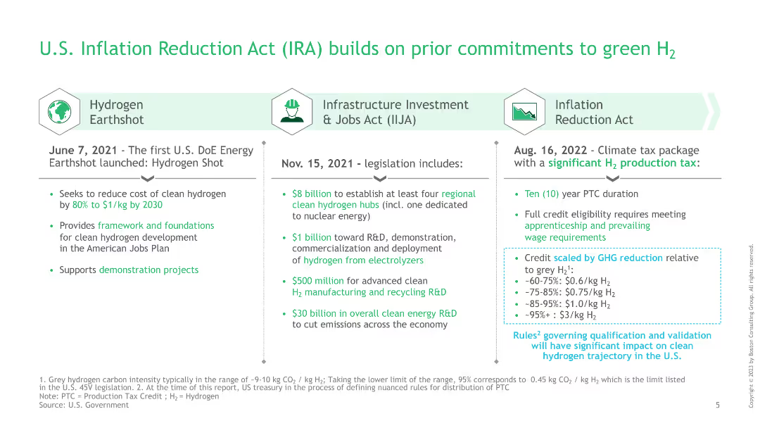
The slide is structured into three columns, each detailing different legislation acts and their contributions to green hydrogen initiatives, with bullet points.
Regulatory and Compliance
Government & Public Sector
This slide details the commitments of the U.S. government to green hydrogen through various acts, including the Hydrogen Earthshot, Infrastructure Investment and Jobs Act, and the Inflation Reduction Act, highlighting financial and policy support.
IRA, green hydrogen, legislation, infrastructure investment, Inflation Reduction Act
Table
BCG
Saved
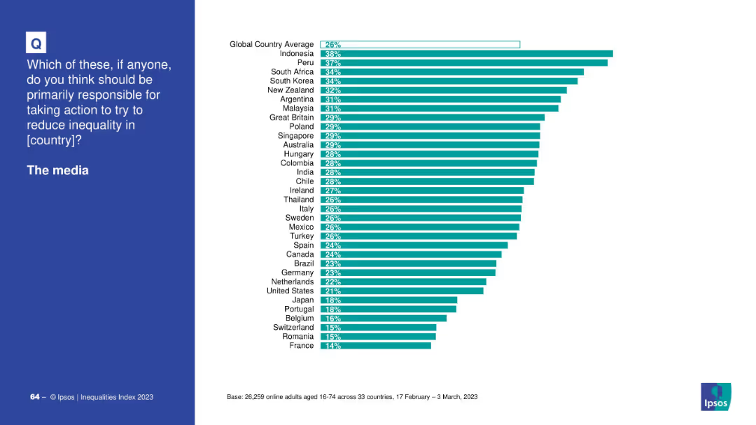
Country-based bar chart showing who thinks the media should reduce inequality.
Market Analysis and Trends
Media & Entertainment
This bar chart shows opinions across countries on whether media should be responsible for reducing inequality. Indonesia and Peru show the highest support; France and Romania the lowest.
media, inequality, responsibility, countries, Ipsos, global opinion, bar chart, public perception
Mixed Chart
IPSOS
Saved
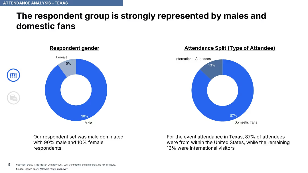
Two donut charts showing respondent gender and type (domestic vs international); text summaries
Customer and Market Segmentation
Media & Entertainment
Attendance in Texas was heavily male-dominated (90%) and largely domestic (87%). Provides demographic insight into event attendees.
attendance, demographics, Texas, ICC, domestic fans, male audience, gender split, survey, Nielsen, international attendees
Single Chart
Nielsen
Saved
A column chart shows predicted expenses for 2023 with additional annotations on integration costs and considerations from FDIC. The layout is straightforward with clear divisions between sections.
Financial Performance
Financial Services
The slide outlines JPMorgan Chase's expense projections for 2023, excluding costs related to First Republic. It includes a detailed analysis of various business units and factors that might impact these expenses, like FDIC assessments and labor inflation.
Expense Outlook, FDIC, First Republic, Financial Analysis, JPMorgan Chase
Mixed Chart
JP Morgan
Saved
Features a mix of column charts and a line graph comparing loan and lease originations, revenues, net charge-offs, and macroeconomic factors affecting the auto finance industry.
Financial Performance
Financial Services
Illustrates the company’s position as a top auto finance lender focused on risk-adjusted returns, detailing originations, revenues, and net charge-offs, alongside recent macroeconomic challenges.
Auto Finance, Lender Ranking, Risk Management, Macroeconomics, Revenue, Originations
Multiple Chart
JP Morgan
Saved
This slide contains text-heavy content divided into sections with subheadings and bullet points. A circular infographic on the right highlights key statistics.
Market Analysis and Trends
Financial Services
The executive summary provides an overview of foreign direct investment in Greece, including performance metrics, investment trends, and economic risks.
FDI, Greece, investment, summary, economic risks
Multiple Chart
EY
Saved
The slide features a single, prominent column chart showing growth from 2015 to 2020 with future projections to 2025 for Vietnam's Internet economy, including percentage growth rates.
Market Analysis and Trends
Financial Services
It illustrates the growth of Vietnam's Internet e-Conomy Gross Merchandise Value (GMV), highlighting past performance and future expectations with a Compound Annual Growth Rate (CAGR) analysis.
Internet Economy, Vietnam, Growth, Projections, GMV
Single Chart
Bain
Saved
Previous
Next
If nothing, comes up, please save your slides first
Create a FREE account to continue browsing
Receive Instant Access to 1,000+ slides from companies like McKinsey, Google, and Goldman Sachs
First Name
Last Name
Email
Password
I agree to all
Terms & Privacy Policy
Thank you! Your submission has been received!
Oops! Something went wrong while submitting the form.
Have an account?
Sign in
Column Chart
Heatmap
Chevron
Org Chart
Infographic
Callouts
Timeline
List
Graphic
Picture
Process Flow
Diagram
Paragraph
Map
Table
Framework
Subtitle
Takeaway Box
Icon
Other Chart
Radar Chart
Waterfall Chart
Mekko Chart
Pie Chart
Scatter Plot
Line Chart
Bar chart
Bullet points