Create a FREE Account
Instant access to 1,000+ real slides from top companies like McKinsey, BCG, Goldman Sachs, Google and many more!
First Name
Last Name
Email
Password
I agree to all
Terms & Privacy Policy
Thank you! Your submission has been received!
Oops! Something went wrong while submitting the form.
Have an account?
Sign in
Library
Templates
Courses
Pricing
My Account
My Slides
My Templates
✦ AI
AI Prompt Library
AI Search
Sign in
Start Here
Logout
My Saved Slides
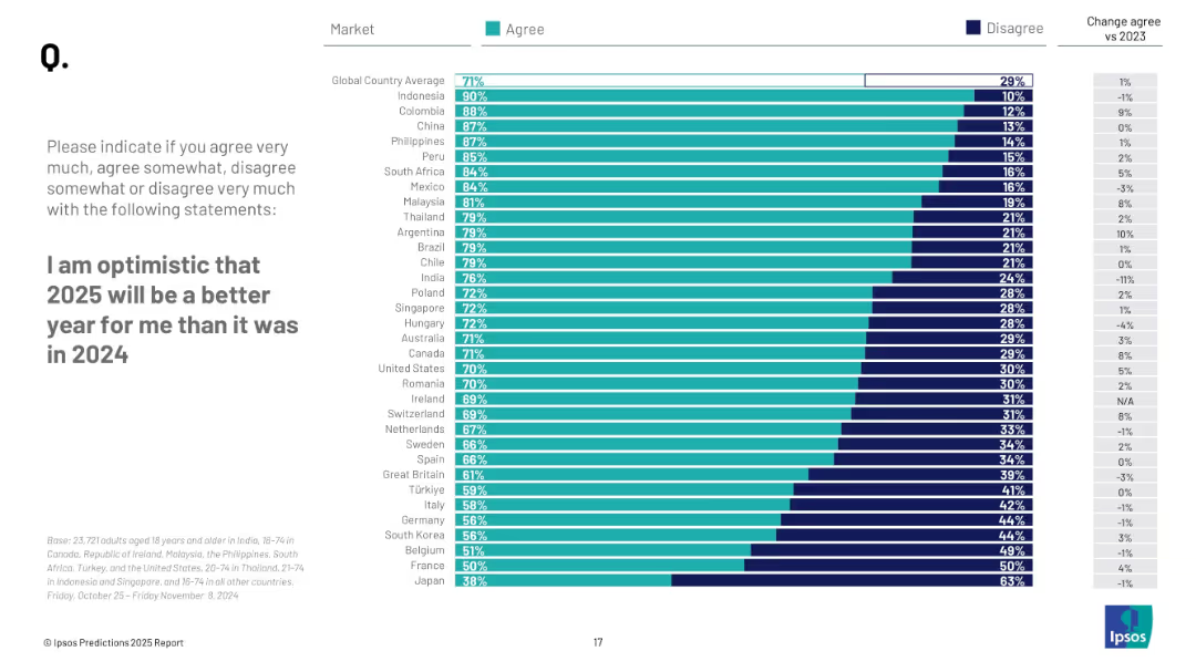
Bar chart comparing country-level agreement vs disagreement on personal optimism for 2025; right-aligned bar with % values; side column with change from 2023.
Market Analysis and Trends
Professional Services
This slide presents survey results on personal optimism for 2025 across countries, comparing how many people agree or disagree that 2025 will be better for them than 2024, and changes from previous year.
optimism, global attitudes, personal outlook, country comparison, 2025, Ipsos, bar chart, sentiment, improvement, survey results
Mixed Chart
IPSOS
Saved
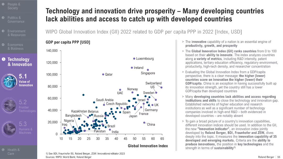
Scatterplot comparing GDP per capita vs. Global Innovation Index; developed and developing countries marked; explanatory text to the right
Market Analysis and Trends
Technology & Software
This slide explores the correlation between innovation and GDP per capita, identifying how many developing countries lag due to limited access to R&D infrastructure and education. It also introduces a new innovation index.
innovation, GDP per capita, R&D, Global Innovation Index, developing countries, productivity, skills, tech access
Mixed Chart
Roland Berger
Saved
A green and white slide detailing Ford's contribution to US GDP, including manufacturing and multiplier effects.
Financial Performance
Transportation & Logistics
Captures the overarching economic contribution of Ford to the US GDP, with a focus on manufacturing, sales, and associated multiplier effects from employee spending.
Ford, US GDP, economic contribution, manufacturing, multiplier effects, vehicle sales, after-sales service, community impact
Single Chart
BCG
Saved
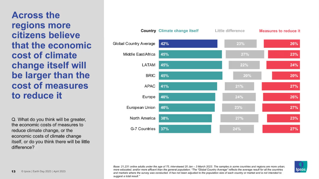
Regional-level horizontal bar chart with three categories: climate change, little difference, and reduction cost; grey and blue.
Market Analysis and Trends
Environmental Services & Sustainability
The slide analyzes regional sentiment on whether the economic impact of climate change is greater than the cost of addressing it. In all major regions except Japan, more respondents see climate change itself as costlier. Global average aligns with this perception at 42%.
Economic cost, Climate change, Regional comparison, Public perception, Ipsos
Mixed Chart
IPSOS
Saved
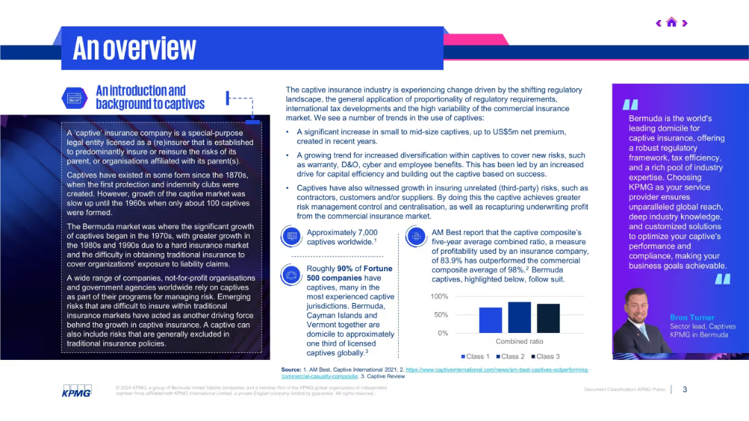
Two-column layout; left side defines captives and history; right side explains market shifts and trends in bullet form.
Industry Overview
Financial Services
The slide introduces the captive insurance market, noting increased adoption due to regulatory changes, cost control, and risk management benefits. It mentions Bermuda’s prominence and growth in third-party risk insurance and diversification within captive structures.
captive insurance, regulation, Bermuda, risk management, diversification
Mixed Chart
KPMG
Saved
The slide presents a series of column charts comparing the average hours spent online per day for personal use in six Southeast Asian countries, across three time phases labeled before, during, and after.
Market Analysis and Trends
Technology & Software
This slide shows the trends in internet usage in Southeast Asia, highlighting an increase with the Philippines showing the most significant rise. It's useful for analyzing digital engagement and behavior changes.
internet usage, Southeast Asia, Philippines, column chart, before, during, after, personal use, trend
Single Chart
Bain
Saved
Simple agenda slide with a dark background, listing the main topics covered in the presentation with numbered points.
Strategic Planning
Professional Services
This slide serves as the index for the presentation, listing topics like nearshoring, opportunities from friendshoring, and challenges faced by the region.
Index, agenda, topics, nearshoring, challenges
Graphic
Deloitte
Saved
Timeline diagram comparing wireless communication networks (1G to 6G) across selected KPIs. List of use cases benefiting from 6G technology on the right.
Technology and Digital Transformation
Technology & Software
The slide explores the advancements in wireless communication technologies from 1G to 6G, highlighting the improvements in KPIs like peak data rate and latency. It lists potential use cases for 6G, emphasizing its role in supporting data-hungry applications and enabling fundamental innovations.
6G, Wireless Communication, Innovation, KPIs
Mixed Chart
Roland Berger
Saved
This slide showcases a series of column charts illustrating potential reductions in income inequality by 2030 through different levels of retraining for excess workers. Each scenario shows the impact on the Gini coefficient under varying degrees of workforce retraining.
Human Resources and Talent Management
Education & Training
Explores strategies for mitigating income inequality induced by automation through workforce retraining programs. It quantifies the effectiveness of these interventions by displaying potential improvements in income distribution across multiple retraining scenarios, providing a clear policy directive on the benefits of investing in comprehensive educational and training initiatives to prepare the workforce for a changing economic landscape.
income inequality, retraining, Gini coefficient, policies
Single Chart
McKinsey
Saved
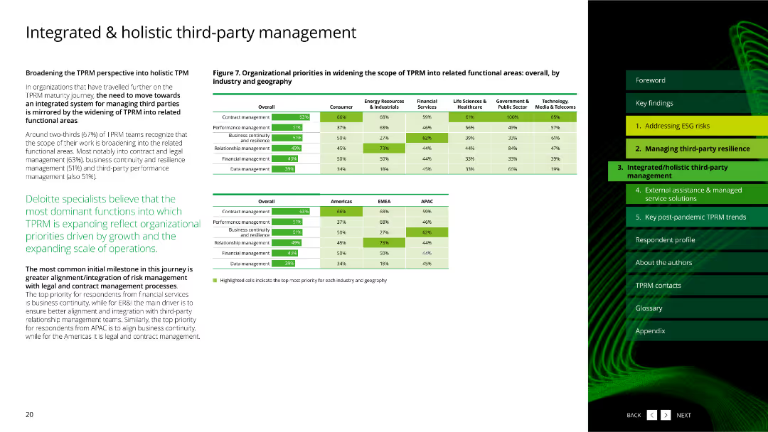
The slide features a column chart showing data distribution and statistics about third-party risk management practices.
Risk Assessment and Management
Professional Services
This slide presents data on third-party risk management practices and their distribution across various parameters.
third-party, risk management, data distribution, statistics
Multiple Chart
Deloitte
Saved
Features a pie chart with multiple segments in various shades of blue and green. Text is organized into two columns, providing detailed explanations of survey findings and their implications.
Human Resources and Talent Management
Professional Services
Explores preferred office space arrangements among respondents. Highlights preferences for open-plan spaces, private offices, and designated desks.
employment models, office space, preferences, open-plan, private offices, designated desks
Mixed Chart
Deloitte
Saved
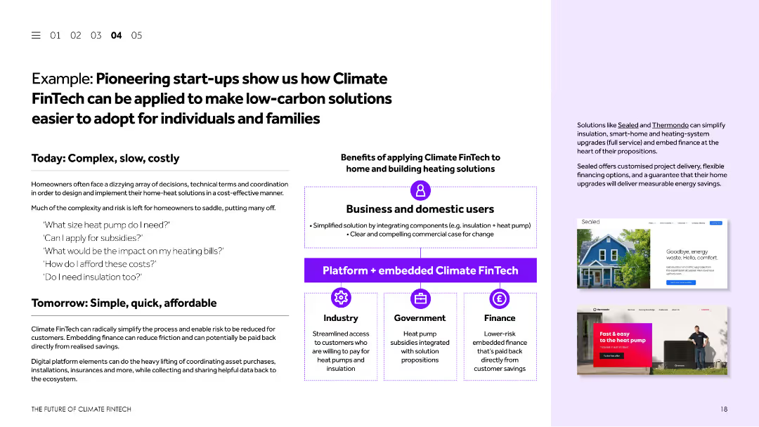
This slide uses a combination of text and images to present a case study. It discusses how Climate FinTech can simplify the adoption of low-carbon solutions for individuals and families. Visual elements include screenshots of relevant websites and a diagram explaining the process.
Client Case Studies
Financial Services
The slide presents a case study showcasing how Climate FinTech can make low-carbon solutions more accessible for individuals and families. It highlights examples of pioneering start-ups, their solutions, and the benefits of applying Climate FinTech to home and building heating solutions.
Climate FinTech, case study, low-carbon solutions, start-ups, home heating
Boxed
Barclays
Saved
A structured diagram categorizes the bank's divisions into five focused areas with additional descriptive text.
Organizational Structure and Change
Financial Services
This slide outlines the bank’s divisional reorganization into five focused areas, aimed at streamlining operations and enhancing efficiency.
restructuring, divisions, organizational, business model, efficiency
Diagram
Barclays
Saved
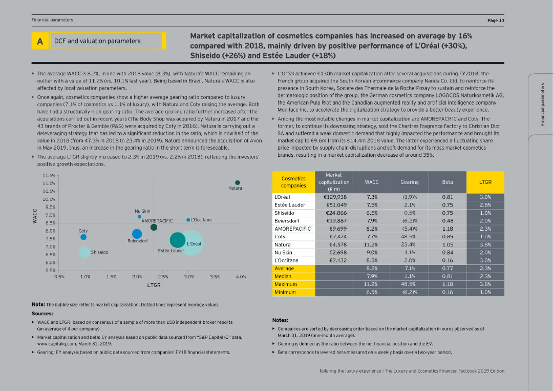
This slide includes tables and bubble charts showing the market capitalization, WACC, gearing, beta, and LTGR of cosmetics companies.
Financial Performance
Consumer Goods
The slide provides financial data on cosmetics companies, analyzing market capitalization, cost of capital, and gearing ratios, with a focus on recent performance and growth expectations.
Valuation parameters, cosmetics companies, financial metrics, market capitalization, WACC
Mixed Chart
EY
Saved
The slide includes a column chart and text blocks. It details oil and gas net lending exposures by geography, division, rating, and segment.
Risk Assessment and Management
Financial Services
This slide analyzes the oil and gas exposure, showing a reduction in exposure and the distribution across different segments, used for managing and assessing financial risks in the energy sector.
Oil, Gas, Exposure, Risk, Lending
Mixed Chart
UBS
Saved
The slide includes two vertical column charts comparing CET1 capital ratio and leverage ratio for 3Q23 against requirements.
Financial Performance
Financial Services
This slide provides an overview of capital and leverage ratios, focusing on CET1 capital ratio and regulatory requirements.
capital ratios, leverage ratios, CET1, regulatory requirements, financial performance
Multiple Chart
UBS
Saved
The slide uses vertical bar charts to compare top five motivators for respondents to buy an EV across three different years (2021, 2022, 2023). Each year's motivators are color-coded.
Market Analysis and Trends
Transportation & Logistics
This slide highlights the key motivators for potential EV buyers, showing how priorities like environmental concerns, high fuel prices, and penalties on ICE vehicles have shifted over time.
EV motivators, fuel prices, environmental concerns, ICE penalties, buyer priorities
Multiple Chart
EY
Saved
This slide employs a flow chart to delineate the complex interrelations between various factors that influence food prices, such as demography, economic growth, and climate change. Each factor is connected by arrows indicating its impact on food supply and demand, and ultimately on prices. The chart is organized with clear labels and a central question mark symbolizing the uncertainty in future food price predictions.
Market Analysis and Trends
Financial Services
This slide outlines the multifaceted drivers influencing future food prices, integrating economic, demographic, and environmental factors. It portrays the complexity of predicting food prices due to these interdependencies, highlighting the critical need for comprehensive market analysis.
food prices, economic factors, demographic changes, supply and demand, climate impact, market predictions, uncertainty, trade policies, production costs, financial markets
Diagram
Roland Berger
Saved
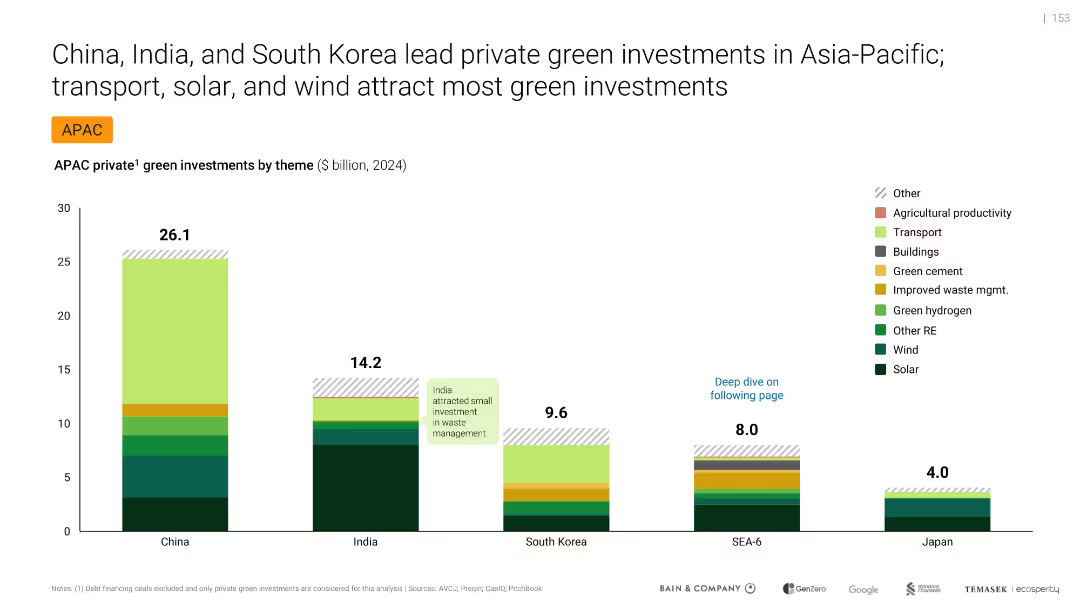
Bar chart comparing green investments by country and theme, labeled and color-coded
Investment Analysis
Environmental Services & Sustainability
Compares private green investments in APAC by theme and country for 2024. China leads with $26.1B, followed by India and South Korea. Main investment themes include solar, wind, and transport. Highlights regional differences and India’s underinvestment in waste management.
green investments, APAC, solar, wind, transport, China, India, South Korea, private capital
Single Chart
Bain
Saved
A tripartite slide with a central graphic of people connecting, flanked by two side panels of text and individual graphics illustrating topics. Dominant colors are blue and white, with text highlighted in black and teal.
Risk Assessment and Management
Technology & Software
Discusses cost-effectiveness, governance, and cyber risks as unresolved challenges in space tech. Useful for risk assessment in tech presentations.
space technology, cost-effectiveness, governance, cyber risks, scalability
Pillar
McKinsey
Saved
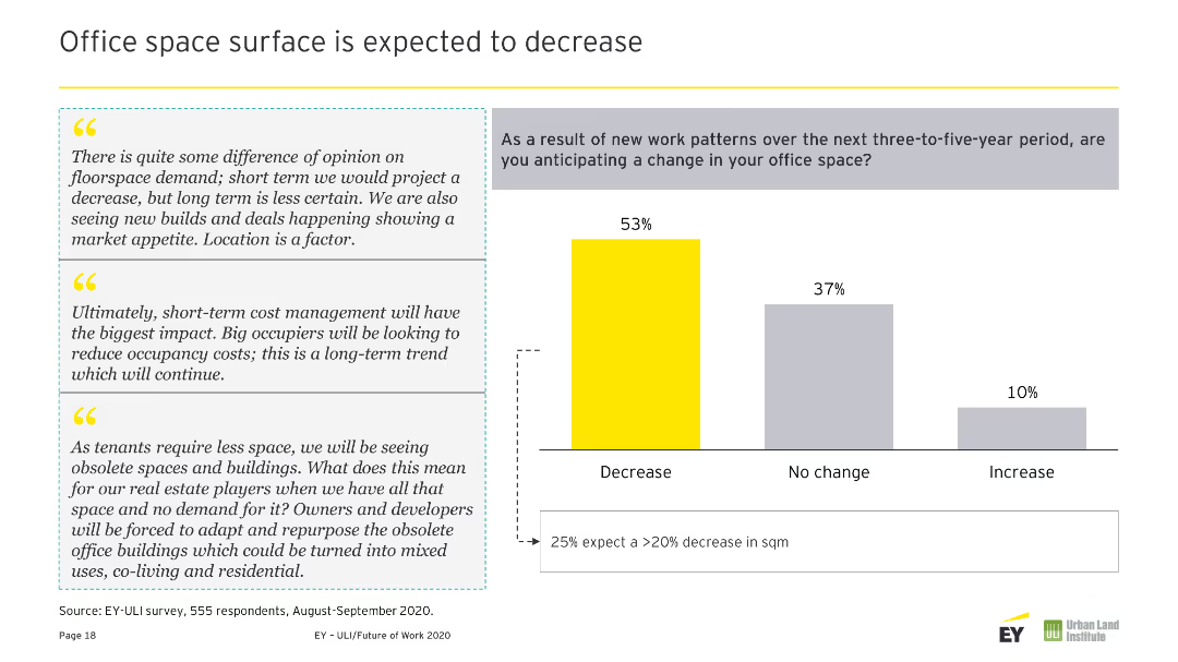
Column chart displaying changes expected in workspaces over the next three-to-five years. Contains three text quotes on the right in gray boxes. Colors used are yellow and gray.
Operational Efficiency
Real Estate & Construction
Predicts safer, healthier buildings with more collaboration spaces, advanced amenities, and services due to technological advancements and health-focused design.
Buildings, Safer, Healthier, Collaboration, Amenities, Services, Workspace, Changes, Future, Predictions
Mixed Chart
EY
Saved
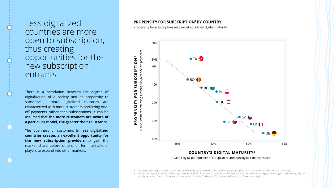
The slide contains a scatter plot showing the correlation between countries' digital maturity and their propensity for subscriptions. It includes a descriptive text box on the implications of this correlation.
Market Analysis and Trends
Consumer Goods
The slide analyzes how digital maturity impacts the likelihood of customers subscribing, with more digitalized countries showing less propensity for subscriptions. It highlights opportunities for new market entrants.
digital maturity, subscriptions, market analysis, country comparison, customer behavior, ecommerce, retail
Mixed Chart
Deloitte
Saved
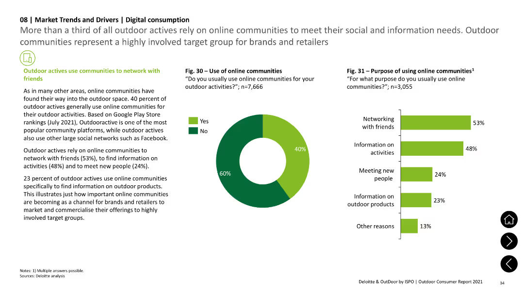
The slide includes a pie chart showing the use of online communities and a column chart detailing the purposes, such as networking with friends and finding information on activities. Text sections provide context.
Technology and Digital Transformation
Technology & Software
The slide discusses the role of online communities in outdoor activities, with survey data indicating the purposes for using these platforms, such as networking, finding information, and meeting new people.
online communities, social networking, outdoor activities, survey data, digital consumption
Multiple Chart
Deloitte
Saved
Continuation of the previous slide, with value levers on the left and impact potential within 1 year on the right.
Technology and Digital Transformation
Technology & Software
Discusses the impact of industrializing ML across all industries by detailing specific value levers and expected impact within a year.
ML, impact, value, performance, risk, productivity
Header Vertical
McKinsey
Saved
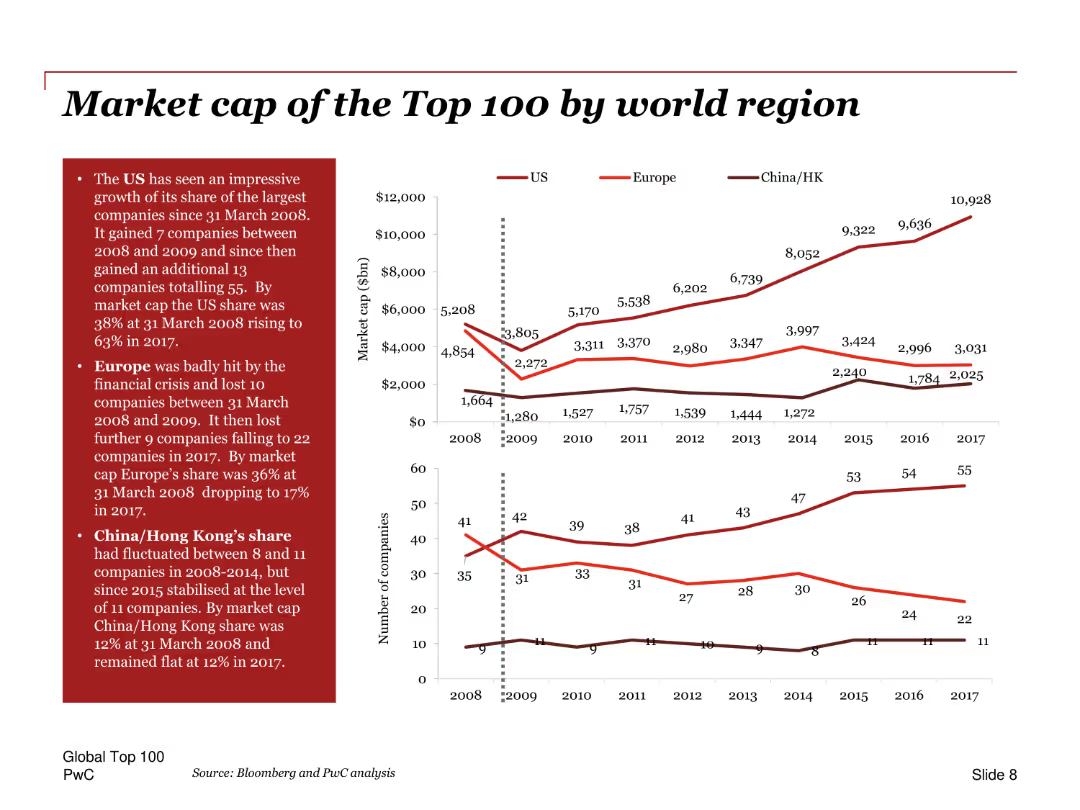
Line charts showing the market cap of top 100 companies by region over time, with annotations and comparison of the US, Europe, and China/Hong Kong.
Market Analysis and Trends
Financial Services
Analyzes the market capitalization of the top 100 companies by region, highlighting the growth in the US share, the impact of the financial crisis on Europe, and trends in China/Hong Kong.
Market cap, top 100, regions, US, Europe, China, financial crisis, growth, trends, comparison
Multiple Chart
PwC/Strategy&
Saved
Previous
Next
If nothing, comes up, please save your slides first
Create a FREE account to continue browsing
Receive Instant Access to 1,000+ slides from companies like McKinsey, Google, and Goldman Sachs
First Name
Last Name
Email
Password
I agree to all
Terms & Privacy Policy
Thank you! Your submission has been received!
Oops! Something went wrong while submitting the form.
Have an account?
Sign in
Column Chart
Heatmap
Chevron
Org Chart
Infographic
Callouts
Timeline
List
Graphic
Picture
Process Flow
Diagram
Paragraph
Map
Table
Framework
Subtitle
Takeaway Box
Icon
Other Chart
Radar Chart
Waterfall Chart
Mekko Chart
Pie Chart
Scatter Plot
Line Chart
Bar chart
Bullet points