Create a FREE Account
Instant access to 1,000+ real slides from top companies like McKinsey, BCG, Goldman Sachs, Google and many more!
First Name
Last Name
Email
Password
I agree to all
Terms & Privacy Policy
Thank you! Your submission has been received!
Oops! Something went wrong while submitting the form.
Have an account?
Sign in
Library
Templates
Courses
Pricing
My Account
My Slides
My Templates
✦ AI
AI Prompt Library
AI Search
Sign in
Start Here
Logout
My Saved Slides
Featuring a series of column charts, the slide depicts the return on tangible equity over the years and distribution amounts.
Financial Performance
Financial Services
Highlights the growth in return on tangible equity over recent years and the increased capital distributions to shareholders.
RoTE, distributions, growth, equity, shareholders
Multiple Chart
Barclays
Saved
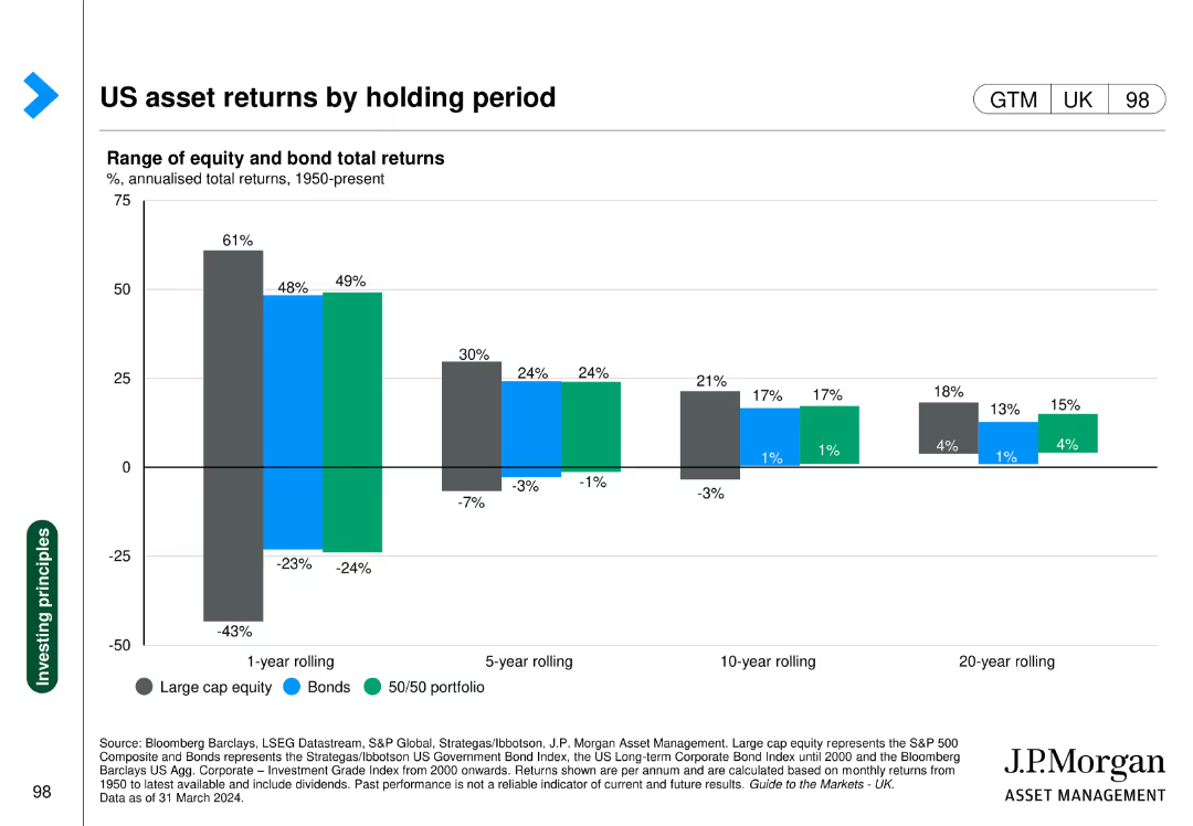
Column chart comparing returns of large cap equity, bonds, and 50/50 portfolios over different holding periods.
Investment Analysis
Financial Services
Highlights the returns of different assets over varying holding periods, emphasizing the importance of investment duration.
Asset returns, holding period, equity, bonds, portfolio
Single Chart
JP Morgan
Saved
Four numbered sections with text boxes outlining benefits such as brand recognition, resilience, understanding society, and methodological rigor.
Strategic Planning
Professional Services
Explains the benefits of Ipsos' public affairs service line, focusing on brand recognition, resilience to market shocks, understanding of society, and high methodological standards.
Public Affairs, Benefits, Brand Recognition, Society, Resilience
Linear Flow
IPSOS
Saved
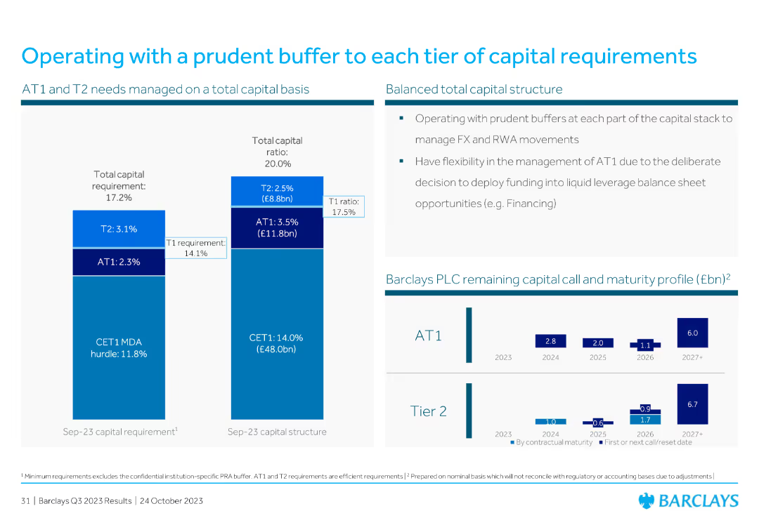
Includes vertical bar charts detailing AT1 and T2 needs, total capital structure, and capital call/maturity profile. The layout is detailed yet clear, focusing on capital management.
Financial Performance
Financial Services
The slide outlines the capital structure, detailing AT1 and T2 requirements, and highlights the bank's strategy to manage FX and RWA movements, ensuring prudent financial management.
capital structure, AT1, T2, capital management, FX, RWA, financial management, maturity profile
Multiple Chart
Barclays
Saved
Red line and bar graph against a white background, showing China's cases per day and total reported cases, with key event markers.
Risk Assessment and Management
Healthcare & Pharmaceuticals
Outlines China's response to COVID-19 with lockdowns and testing, highlighting the timeline of cases and government actions.
China, lockdowns, testing, COVID-19, government response
Single Chart
McKinsey
Saved
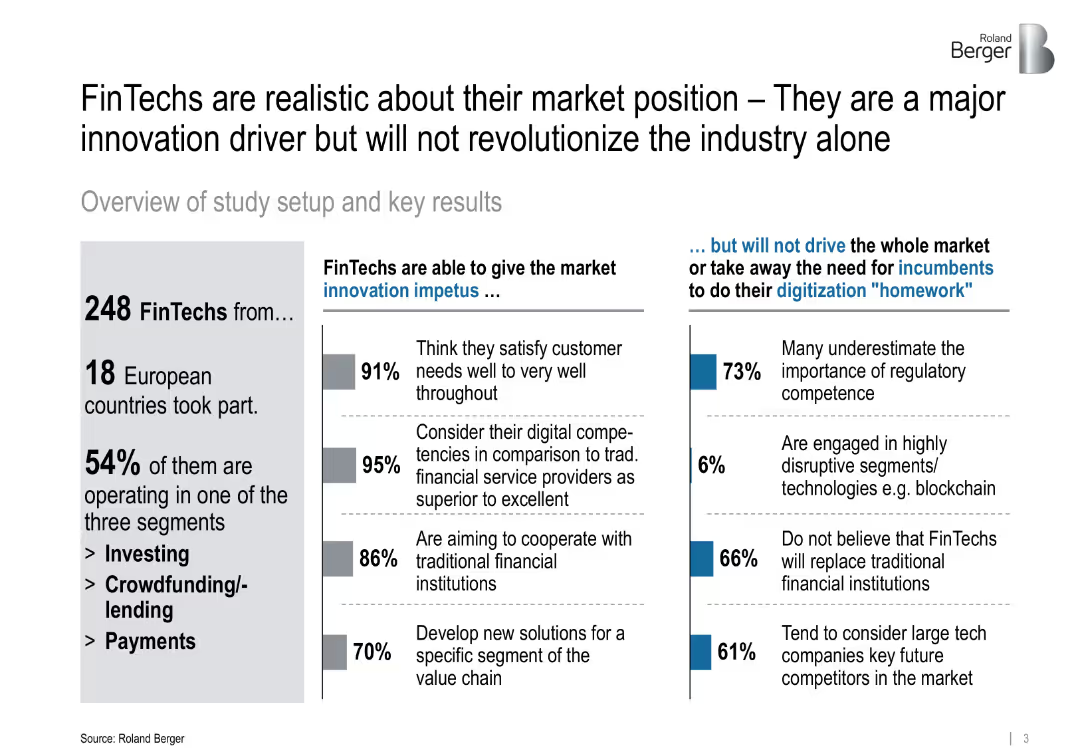
Split-panel layout with statistics, bullet points, and colored bars; simple visual style with balanced white space
Market Analysis and Trends
Financial Services
Highlights the realistic self-assessment of FinTechs in Europe, noting that while they are innovation drivers, they are not expected to revolutionize the market alone. The slide shares percentages on customer satisfaction, cooperation with traditional banks, and regulatory gaps.
FinTech, innovation, regulation, digitalization, cooperation, market drivers, blockchain, technology
Mixed Chart
Roland Berger
Saved
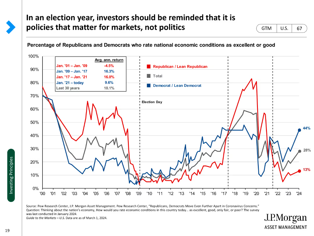
A line chart showing the percentage of Republicans and Democrats rating economic conditions as excellent or good over time.
Market Analysis and Trends
Financial Services
Examines the relationship between political sentiment and economic perceptions during election years.
Election year, investors, policies, economic conditions, sentiment, political, analysis, trends, perceptions
Single Chart
JP Morgan
Saved
This slide features an abstract design with bright lines connecting various aircraft, reflecting a network or system. The image occupies the entire slide, with a red title bar at the top for contrast.
Strategic Planning
Government & Public Sector
The visual suggests strategic connections within the defense network, suitable for presentations focusing on strategic planning within the defense sector or for illustrating integrated defense systems.
Strategy, Defense, Aircraft, System, Network, Integration
Text Only
PwC/Strategy&
Saved
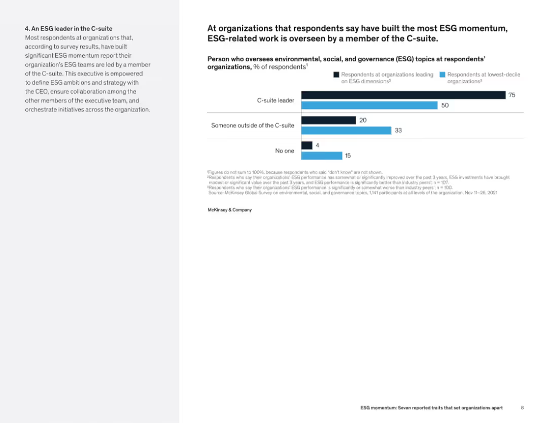
Left-aligned text alongside a horizontal bar chart showing who manages ESG at leading vs. lagging organizations.
Organizational Structure and Change
Professional Services
This slide indicates that C-suite leadership is a hallmark of high-performing ESG organizations. 75% of such firms have ESG led by C-level executives, compared to just 50% of bottom performers. The data suggests that senior oversight enhances ESG outcomes.
ESG governance, executive leadership, C-suite, organizational structure, ESG performance, oversight roles
Mixed Chart
McKinsey
Saved
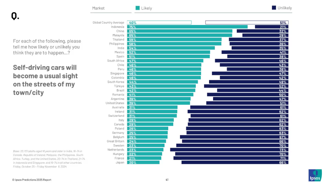
Horizontal bar chart; similar design as previous slide; country ranking with percentages, “Likely” vs “Unlikely”
Technology and Digital Transformation
Transportation & Logistics
This slide visualizes global sentiment on the mainstream emergence of self-driving cars. Indonesia, China, and Malaysia lead in optimism, with 40% global average expecting it likely.
autonomous vehicles, transportation, public opinion, technology, self-driving cars, urban planning, mobility, innovation, survey
Mixed Chart
IPSOS
Saved
A world map highlights key locations with markers. An inset magnifies the Singapore region, showing more detail with labeled yard locations.
Strategic Planning
Energy & Utilities
The slide demonstrates Seatruim's global presence, highlighting its worldwide yards and the strategic position of Singapore in the company's operations. It could be used to emphasize the company's expansive global operations and strategic locations.
Global, Operations, Reach, Yards, Singapore
Graphic
Morgan Stanley
Saved
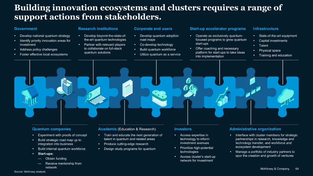
Puzzle piece metaphor visual linking different stakeholder groups; icons and vertical segments describe roles of various players.
Technology and Digital Transformation
Artificial Intelligence
Describes stakeholder roles—government, academia, industry, investors, infrastructure—in building innovation ecosystems for quantum tech. Emphasizes coordinated contributions to support development and commercialization.
Stakeholders, quantum clusters, infrastructure, investment, academia
Uncategorized
McKinsey
Saved
Detailed organizational structure diagram showing the hierarchy and relationship between UBS Group AG and its subsidiaries. Simple color scheme and layout for clarity.
Organizational Structure and Change
Financial Services
Shows the merger plan of Credit Suisse AG into UBS AG in 2024, detailing the structure and entities involved as of 30 September 2023.
UBS, Group Structure, Credit Suisse, Merger, Subsidiaries
Diagram
UBS
Saved
Displays a column chart on efficiency ratio and comprehensive tables listing various expense categories with associated financial data.
Operational Efficiency
Financial Services
The slide offers a detailed breakdown of expenses, highlighting changes over time and efficiency ratios. It can be used to discuss operational expenses, budget planning, and financial strategy adjustments based on the illustrated data.
Expenses, Operational, Efficiency Ratio, Compensation, Technology, Clearing, Market Development, Tax Rate, Financial Results, Litigation Provision
Mixed Chart
Goldman Sachs
Saved
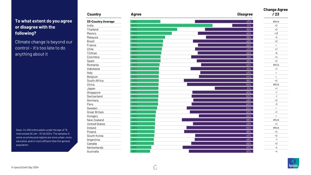
Horizontal bar chart of agreement by country on climate fatalism. Standard chart layout with bars, ranks, and text left-aligned.
Risk Assessment and Management
Environmental Services & Sustainability
This slide shows the level of climate fatalism—whether people think it's too late to stop climate change. Country responses range from resignation to optimism.
climate fatalism, urgency, climate control, belief systems, Ipsos, pessimism, public attitude
Mixed Chart
IPSOS
Saved
Two charts: a column chart comparing long-term profitable vs a bar chart showing low-growth companies across industries; a heatmap comparing industry strengths.
Industry Overview
Professional Services
Analyzes long-term profitable growth in various industries, demonstrating different resilience and performance metrics.
Profitable growth, industry comparison, resilience, performance metrics, heatmap
Multiple Chart
Accenture
Saved
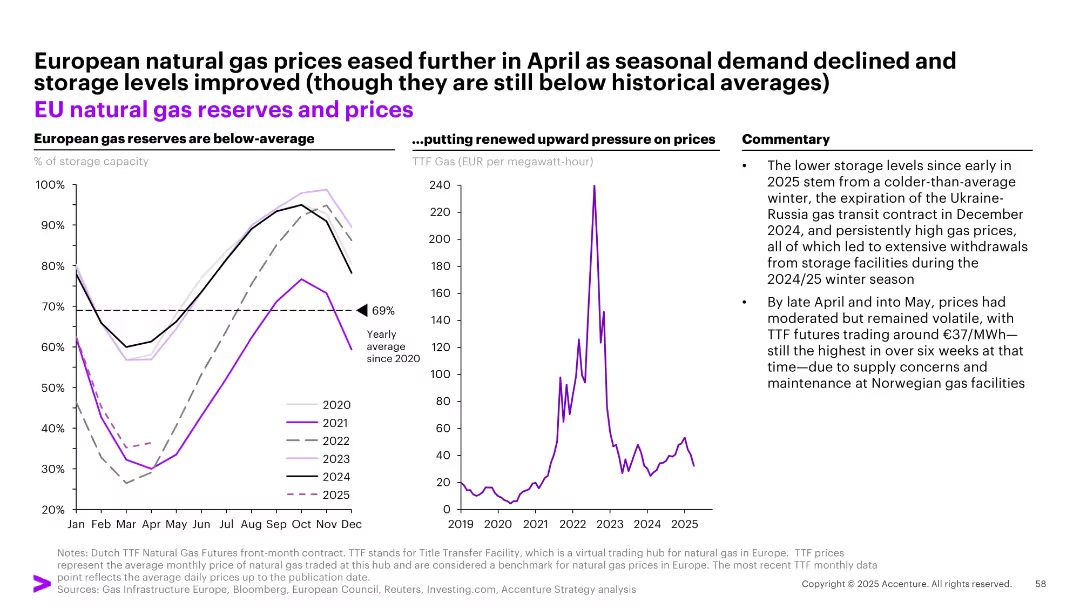
Split into three sections: left panel shows EU gas storage levels, middle panel shows gas prices (TTF), right panel has commentary.
Market Analysis and Trends
Energy & Utilities
Analyzes low EU gas reserves and price movements from 2020–2025. Points to cold winters, transit contract expirations, and storage withdrawals as key contributors. Despite easing in May, prices remain volatile due to supply concerns.
EU, natural gas, reserves, energy, TTF, storage, Ukraine-Russia, volatility, price pressure, winter
Multiple Chart
Accenture
Saved
The slide features a mix of text on the left and a column chart on the right. The column chart illustrates different sectors and their plans to partner with creators.
Strategic Planning
Professional Services
The slide discusses the trend of creative collaboration beyond the traditional organization structure, highlighting sectors that are planning to partner more with creators, with a supporting column chart showing sector-wise data.
Collaboration, CMOs, sectors, creative partnerships, trend
Mixed Chart
Deloitte
Saved
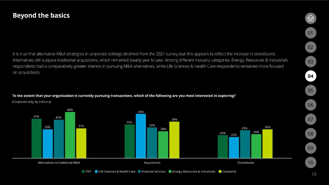
The slide has a column chart comparing interest in different M&A transaction types across various industries.
Market Analysis and Trends
Financial Services
Reflects the interest in alternative M&A strategies by different industry categories compared to 2021.
industry trends, M&A, corporate, acquisitions, divestitures
Single Chart
Deloitte
Saved
Comprised of bullet-pointed information on green energy investment and icons representing partnerships, this slide details the activities of the Green Investment Group with visual emphasis on key figures.
Regulatory and Compliance
Financial Services
Showcases the scale of green energy investments and partnerships of the Green Investment Group. It emphasizes the group's commitment to the green transition, serving as a reference for sustainability-focused discussions.
Green Energy, Investment, Partnerships, Sustainability, Transition
Pillar
Morgan Stanley
Saved
Infographic with forecasted US hydrogen demand across various sectors, accompanied by a description of hydrogen types and their applications in the power sector.
Market Analysis and Trends
Energy & Utilities
The slide discusses the forecasted demand for hydrogen in the US, breaking down usage by sector and explaining different types of hydrogen and their power sector applications.
Hydrogen, Demand forecast, Economy, Power sector, Applications
Mixed Chart
Roland Berger
Saved
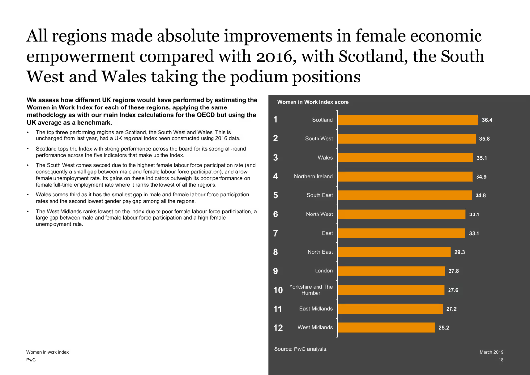
Features a text on the left with a column chart on the right showing Women in Work Index scores for different UK regions. The slide is visually balanced with clear regional comparisons.
Market Analysis and Trends
Government & Public Sector
Assesses the performance of different UK regions on the Women in Work Index, highlighting the top-performing regions like Scotland, the South West, and Wales, and discussing the factors contributing to their scores.
UK regions, Women in Work Index, economic empowerment, regional analysis
Mixed Chart
PwC/Strategy&
Saved
Slide features tables comparing capital deployment across corporates, PE/VC, infrastructure funds, and others. Uses color coding and icons.
Market Analysis and Trends
Environmental Services & Sustainability
Analyzes investment in the green economy by different investor types, focusing on sectors like solar/wind and mobility.
investment, green economy, solar energy, capital flow, market analysis
Table
Bain
Saved
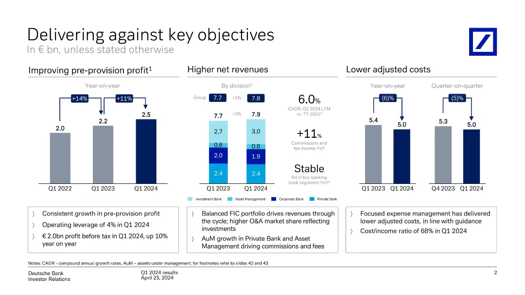
Three-part layout: bar charts for pre-provision profit, net revenue by division, and adjusted costs. Color-coded by segment with highlights below.
Performance Metrics and KPIs
Financial Services
Shows year-on-year improvement in pre-provision profit (+11%), stable revenue (+1%), and decreased costs (-6%). Emphasizes operating leverage, cost/income ratio, and revenue growth from balanced business model.
revenue, costs, profit, KPIs, business units, growth
Multiple Chart
Deutsche Bank
Saved
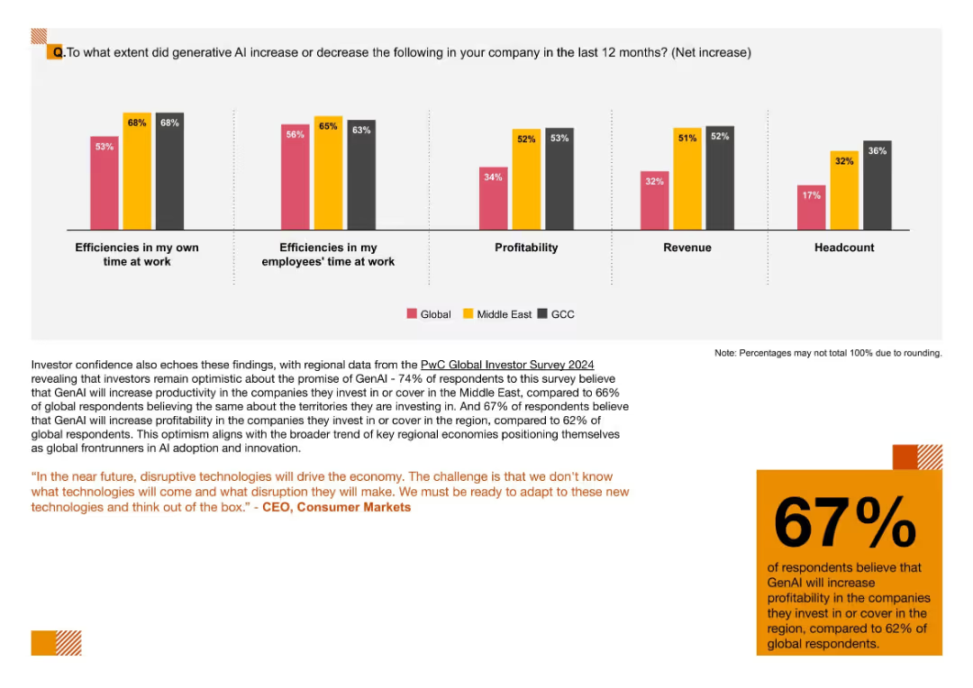
Five-category bar chart comparing impacts of GenAI on efficiency, profitability, revenue, and headcount by region
Performance Metrics and KPIs
Artificial Intelligence
This slide tracks measurable outcomes of GenAI adoption, including improved work efficiencies, profitability, and revenue. GCC firms report the highest gains in headcount, reflecting strong AI integration.
Efficiency, GenAI Impact, Headcount, Productivity, KPIs, AI Metrics, Regional Comparison
Mixed Chart
PwC/Strategy&
Saved
Previous
Next
If nothing, comes up, please save your slides first
Create a FREE account to continue browsing
Receive Instant Access to 1,000+ slides from companies like McKinsey, Google, and Goldman Sachs
First Name
Last Name
Email
Password
I agree to all
Terms & Privacy Policy
Thank you! Your submission has been received!
Oops! Something went wrong while submitting the form.
Have an account?
Sign in
Column Chart
Heatmap
Chevron
Org Chart
Infographic
Callouts
Timeline
List
Graphic
Picture
Process Flow
Diagram
Paragraph
Map
Table
Framework
Subtitle
Takeaway Box
Icon
Other Chart
Radar Chart
Waterfall Chart
Mekko Chart
Pie Chart
Scatter Plot
Line Chart
Bar chart
Bullet points