Create a FREE Account
Instant access to 1,000+ real slides from top companies like McKinsey, BCG, Goldman Sachs, Google and many more!
First Name
Last Name
Email
Password
I agree to all
Terms & Privacy Policy
Thank you! Your submission has been received!
Oops! Something went wrong while submitting the form.
Have an account?
Sign in
Library
Templates
Courses
Pricing
My Account
My Slides
My Templates
✦ AI
AI Prompt Library
AI Search
Sign in
Start Here
Logout
My Saved Slides
Stacked bar chart showing methods of communicating AI ethics to workforce.
Regulatory and Compliance
Technology & Software
Discusses how companies communicate AI ethics to their employees, including workshops, internal specialists, and ethical reporting methods.
AI ethics, communication, workshops, internal specialists, ethical reporting
Mixed Chart
Deloitte
Saved
The slide shows bar and column charts for S&P 500 EPS growth and profit margins, with clear segmentations and color coding.
Financial Performance
Financial Services
It projects positive earnings growth for the S&P 500 in the upcoming year, breaking down the factors contributing to this outlook.
S&P 500, earnings growth, profit margins, financial projections, EPS
Multiple Chart
JP Morgan
Saved
Features column charts using grayscale and red color schemes to highlight different investment needs and areas like energy and waste management.
Investment Analysis
Environmental Services & Sustainability
Analyzes the financial requirements for Southeast Asia to close the emissions gap by 2030, focusing on energy, industry, and infrastructure investments.
investment, decarbonization, SEA, 2030, energy, infrastructure, waste management
Multiple Chart
Bain
Saved
Two-column charts depicting the U.S. real GDP year-over-year changes and S&P 500 Price Index calendar year returns from 1947 to 2022.
Market Analysis and Trends
Financial Services
This slide shows the relationship between U.S. government configurations and the economy, highlighting real GDP changes and S&P 500 returns under different political scenarios.
GDP, S&P 500, stock market, government, economy
Multiple Chart
JP Morgan
Saved
Image of two people discussing while looking at a tablet. Column chart illustrating the biggest challenges related to operational resilience.
Risk Assessment and Management
Financial Services
This slide outlines the biggest challenges related to operational resilience, such as managing third-party cyber risks, identifying critical people and processes, and preventing cyber attacks. It emphasizes the importance of third-party risks and the need for comprehensive strategies to address these challenges.
third-party, cyber risks, operational resilience, challenges, strategies
Mixed Chart
EY
Saved
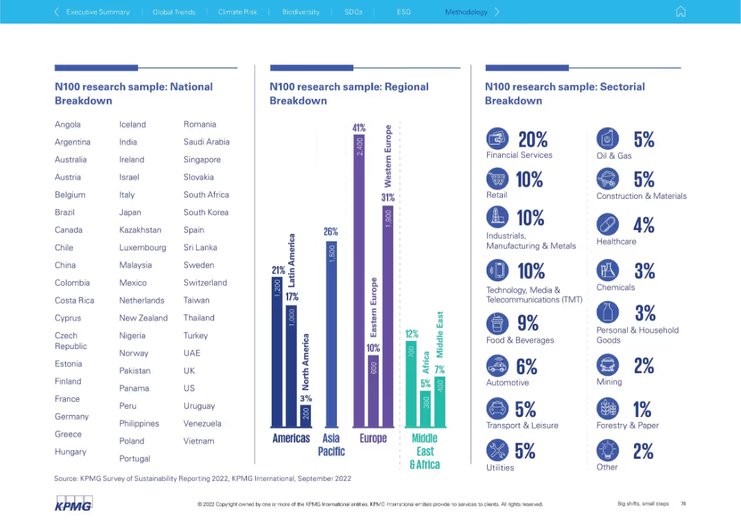
Triple-column layout with country list, regional chart, and industry breakdown using bars and icons.
Industry Overview
Professional Services
This slide shows the composition of the N100 research sample by country, region, and sector. It emphasizes where most data was collected and which industries were most represented (e.g., Financial Services 20%).
N100 sample, country list, regional breakdown, sector data, industry representation, financial services, research demographics
Mixed Chart
KPMG
Saved
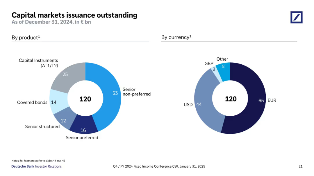
Two donut charts show issuance volume by product type and currency. Each chart uses distinct, muted colors to differentiate categories. Simple, clean layout with centered total value (€120bn).
Corporate Finance and Valuation
Financial Services
This slide presents Deutsche Bank's €120bn in outstanding capital market issuances as of December 2024. The product chart highlights that senior non-preferred instruments dominate, followed by AT1/T2 and covered bonds. The currency distribution shows that EUR and USD are the main issuance currencies, making up 91% of total issuance.
capital markets, issuance, EUR, USD, senior non-preferred, AT1, T2, covered bonds, Deutsche Bank
Single Chart
Deutsche Bank
Saved
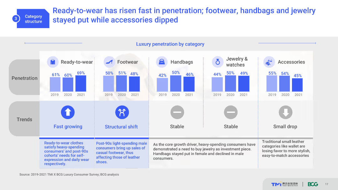
The slide features multiple column charts showing luxury penetration by category from 2019 to 2021. It includes icons for each category and trend indicators. The visual complexity is moderate, with well-organized data and clear labels.
Market Analysis and Trends
Consumer Goods
This slide presents the growth trends of various luxury categories such as ready-to-wear, footwear, handbags, and accessories. It shows the percentage penetration over three years, indicating market shifts and consumer preferences.
luxury market, category penetration, trends, consumer preferences, growth
Multiple Chart
BCG
Saved
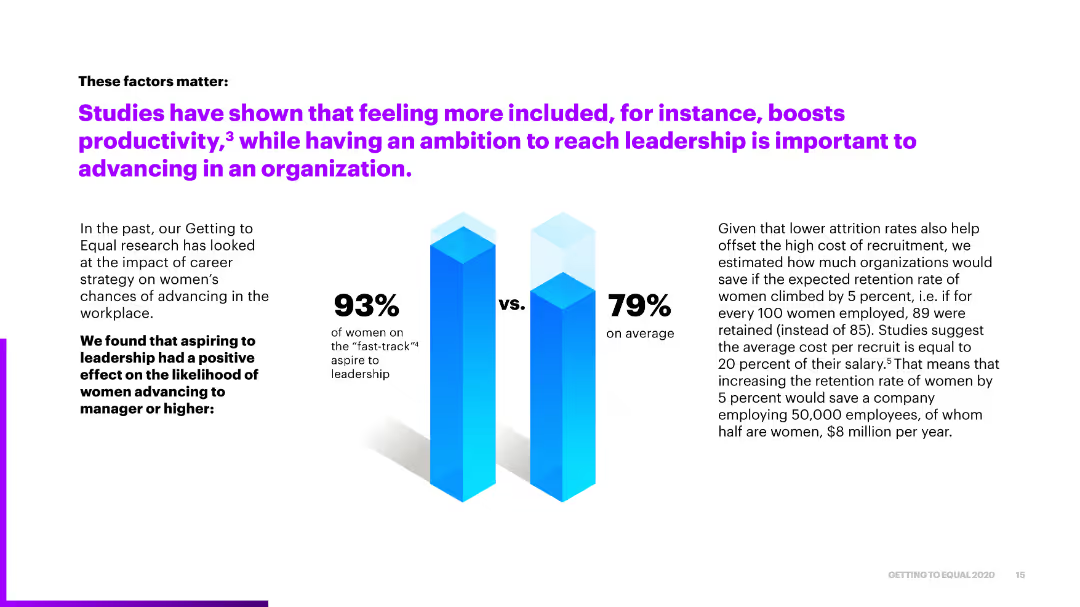
The slide features a column chart comparing the aspirations of women on the "fast-track" to leadership against the average, with text explaining the economic benefits of reducing attrition rates.
Market Analysis and Trends
Professional Services
It emphasizes the importance of feeling included and aspiring to leadership for productivity and advancement, showing how increasing women's retention rates can lead to significant cost savings.
inclusion, leadership ambition, retention, productivity, cost savings
Mixed Chart
Accenture
Saved
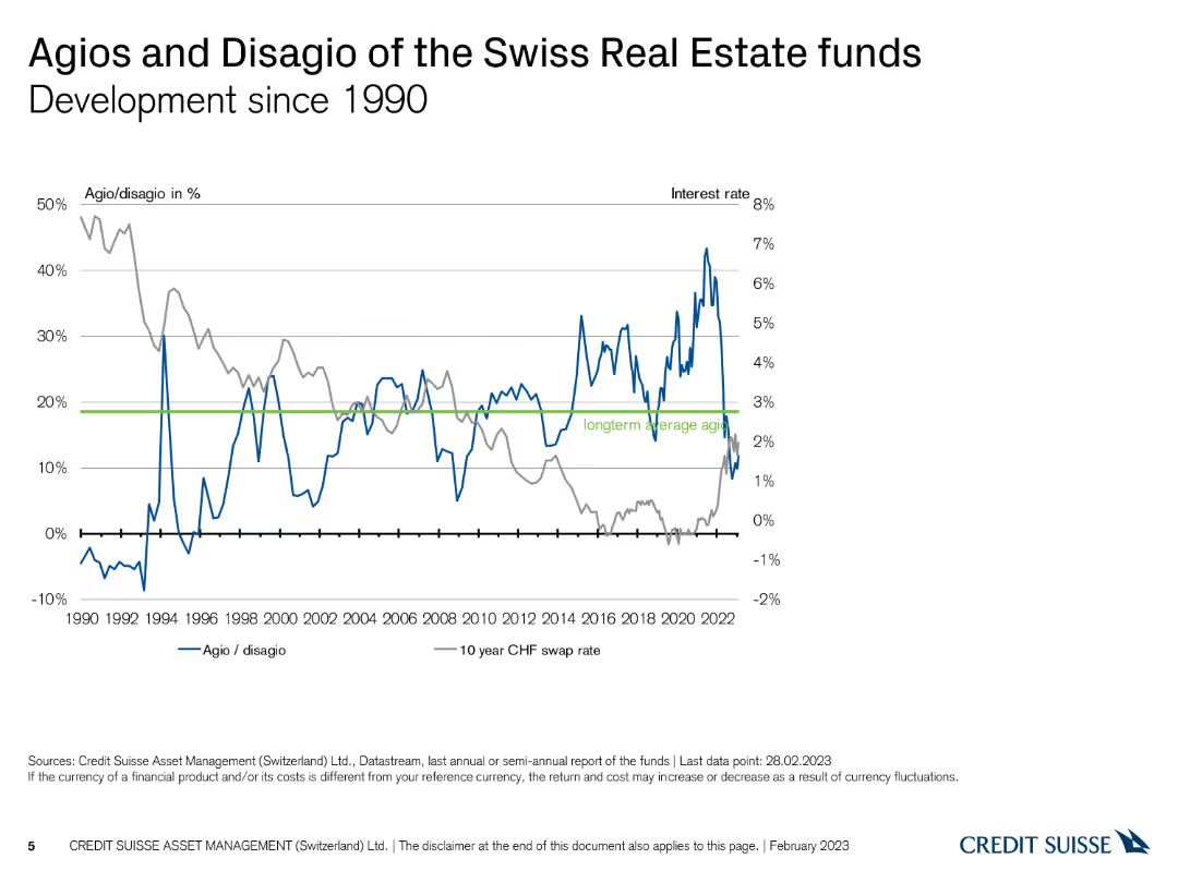
The slide presents a line chart depicting the development of agios/disagios and interest rates since 1990.
Financial Performance
Real Estate & Construction
This slide illustrates the historical development of agios/disagios and long-term interest rates for Swiss real estate funds since 1990.
Swiss real estate, agio, disagio, historical trends, line chart
Single Chart
Credit Suisse
Saved
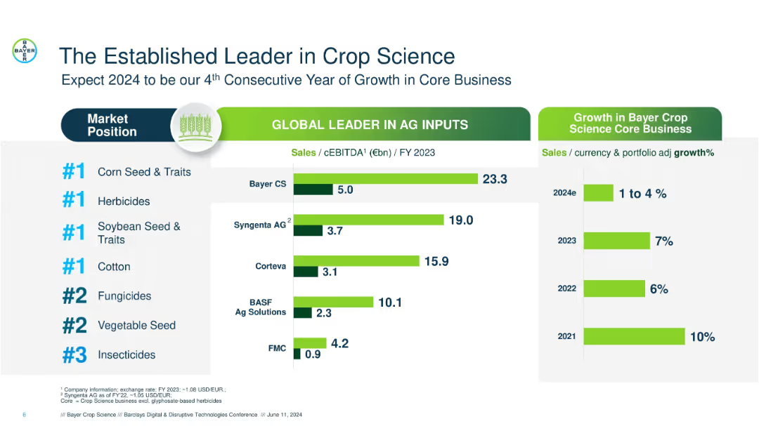
Bar and ranking chart format with green-highlighted bars; left-aligned text, central charts, and minimal icons.
Competitive Landscape
Agriculture & Food Production
Displays Bayer Crop Science’s #1 positions in various crop science segments, compares competitors’ sales and cEBITDA, and shows past and projected growth rates, reinforcing leadership and market confidence.
crop science, market leader, Bayer, Syngenta, growth rate, sales, herbicides, seeds, EBITDA, competitors
Multiple Chart
Barclays
Saved
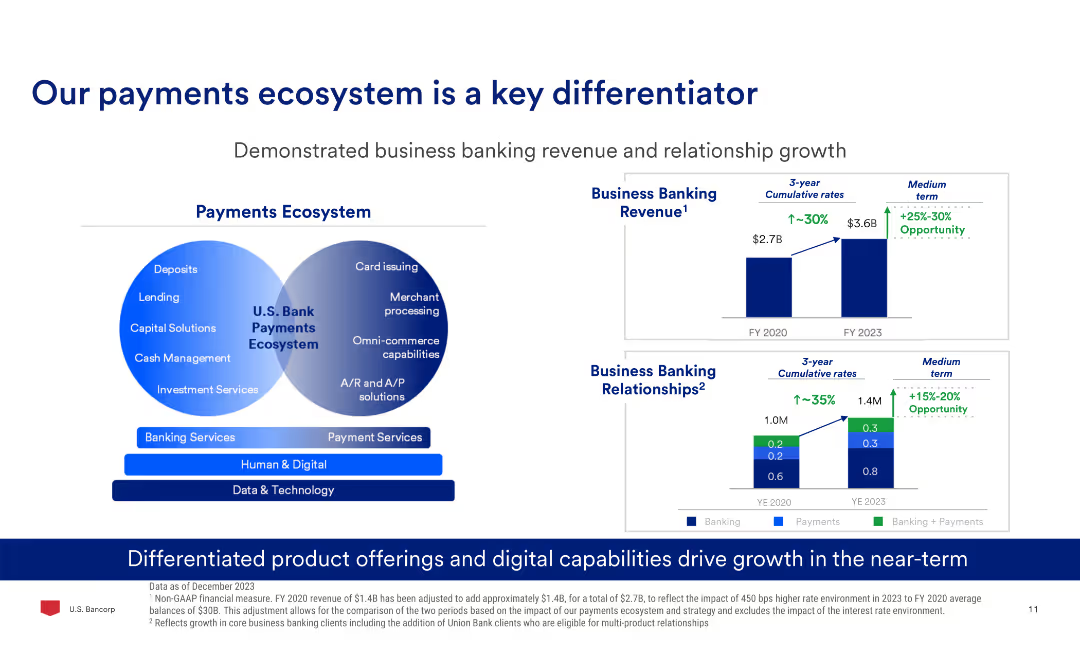
The slide has a Venn diagram comparing banking and payment services, two column charts showing business banking revenue and relationships growth, and text explaining product offerings.
Market Analysis and Trends
Financial Services
The slide demonstrates the growth in business banking revenue and relationships, highlighting the differentiated product offerings and digital capabilities driving this growth.
Payments, Banking, Revenue, Growth, Digital, Ecosystem
Multiple Chart
Barclays
Saved
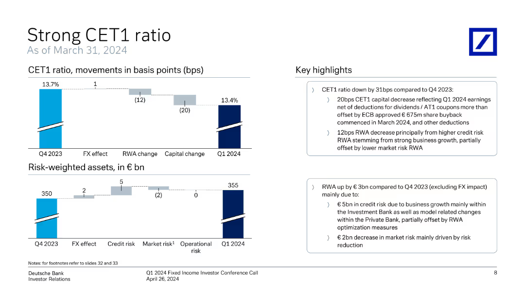
The slide includes vertical column charts displaying CET1 ratio movements and risk-weighted assets over time, accompanied by key highlights.
Financial Performance
Financial Services
The slide highlights Deutsche Bank's CET1 ratio and risk-weighted asset trends, showing changes and factors affecting these metrics from Q4 2023 to Q1 2024.
CET1 ratio, risk-weighted assets, financial metrics, Deutsche Bank, Q1 2024, investor relations, capital adequacy, regulatory requirements, financial health
Multiple Chart
Deutsche Bank
Saved
Combines column charts and tables to show the number and proceeds of IPOs across EMEIA regions, with a focus on cross-border activity.
Market Analysis and Trends
Financial Services
The slide presents an overview of IPO performance in EMEIA, detailing cross-border activity and performance metrics.
EMEIA, IPOs, cross-border, performance, metrics
Multiple Chart
EY
Saved
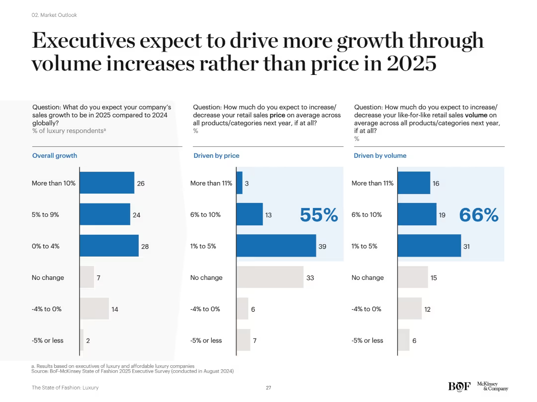
Three-column layout with bar charts: overall growth (left), price-driven (center), and volume-driven (right). Each section features labeled bar graphs with blue and gray colors, numerical values, and percentage indicators. Clear use of white space and segmented analysis.
Market Analysis and Trends
Consumer Goods
This slide presents insights from luxury executives indicating that most anticipate 2025 sales growth to come from increased volume rather than price hikes. Charts show expectations for growth in overall sales, price, and volume, highlighting a strategic pivot in growth drivers.
sales growth, volume strategy, pricing, luxury market, forecasts, 2025, bar chart, executive survey, product categories
Single Chart
McKinsey
Saved
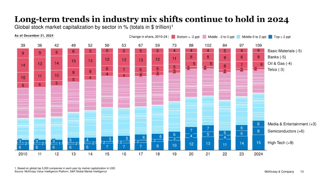
Stacked bar chart showing global market cap by industry sector over time (2010–2024), color-coded by performance tiers.
Market Analysis and Trends
Financial Services
This slide illustrates the evolution of industry market capitalization shares over 15 years. It shows a rise in tech-related sectors and a decline in traditional sectors like banks and oil & gas.
Market Capitalization, Sector Shifts, Long-Term Trends, Tech Growth, Declining Sectors, Equity Markets, Global Trends
Single Chart
McKinsey
Saved
The slide features a timeline of events and a map showing the Metro Manila Subway Project's phases. It includes photos and brief descriptions of key milestones.
Strategic Planning
Transportation & Logistics
Timeline of the Metro Manila Subway Project's development from initial inspections to meetings concerning construction phases.
subway, Philippines, timeline, construction, milestones
Vertical Flow
Deloitte
Saved
Features a line chart comparing the growth indices of GDP, exports, and FDI from 2015 to 2030, with annotations on forecasted trends. The chart is supported by bullet-pointed annotations for clarity.
Market Analysis and Trends
Financial Services
Slide predicts growth trends in GDP, exports, and FDI up to 2030, emphasizing the ongoing increase despite controversies in globalization. Useful for financial forecasting and economic strategy meetings.
GDP, exports, FDI, forecasts, globalization
Multiple Chart
Roland Berger
Saved
The slide presents a scatter plot and column chart showing the variation in Australian road freight costs with distance, with annotations highlighting key findings.
Market Analysis and Trends
Transportation & Logistics
The slide analyzes the variation in road freight costs across different distances and regions in Australia, noting that costs decrease with distance but are highest in South Australia and Victoria.
Road freight costs, Australia, distance, cost variation, transportation, logistics, scatter plot, market analysis, freight efficiency
Multiple Chart
LEK
Saved
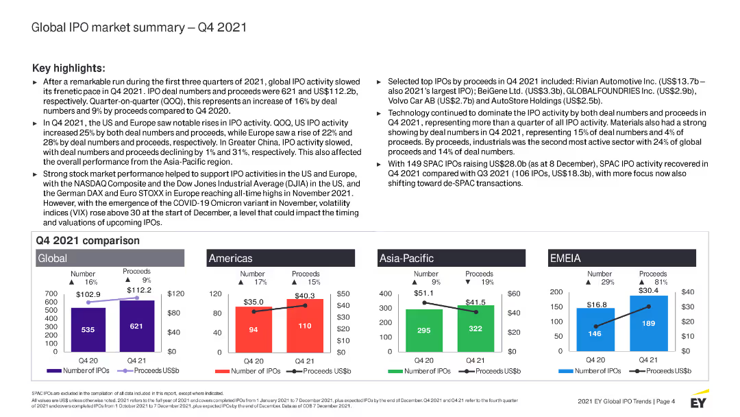
The slide includes a column chart comparing global, Americas, Asia-Pacific, and EMEIA IPO activity in Q4 2021. It also has text sections highlighting key trends and top IPOs by proceeds.
Market Analysis and Trends
Financial Services
Provides a summary of global IPO activity in Q4 2021, comparing regions and highlighting key trends. Discusses notable IPOs and sector performance, including technology and industrial sectors.
IPO, global, Q4 2021, market summary, trends, financial services, technology, industrial
Multiple Chart
EY
Saved
Contains matrix-style charts showing the usage of Purchasing Chessboard® levers among leaders and typical companies.
Market Analysis and Trends
Professional Services
Compares the systematic use of Purchasing Chessboard® levers between leading companies and typical firms, highlighting differences.
Purchasing Chessboard, levers, market analysis, trends, procurement, leaders, companies, comparison, matrix charts
Multiple Chart
Kearney
Saved
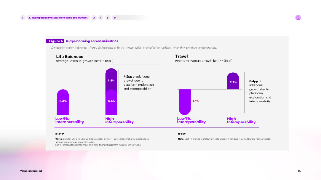
The slide features a column chart comparing average revenue growth across industries (Life Sciences, Travel) based on interoperability. High interoperability is shown in purple, while low/no interoperability is shown in a lighter shade.
Market Analysis and Trends
Technology & Software
Highlights how interoperability impacts revenue growth in different industries. The chart compares life sciences and travel sectors, showing significant growth advantages for companies with high interoperability.
interoperability, industry comparison, revenue, growth, life sciences
Multiple Chart
Accenture
Saved
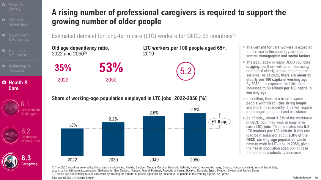
Bar charts on caregiver ratios and employment trends; summary stats and annotations; OECD focus
Human Resources and Talent Management
Healthcare & Pharmaceuticals
The slide analyzes the growing need for long-term care (LTC) workers across OECD countries. It forecasts an increase in the old-age dependency ratio and a slight rise in the share of the working population in LTC jobs. The data stresses the urgency for workforce expansion to meet the rising demand for elderly care.
Long-Term Care, Elderly, Workforce, OECD, Health Jobs, Dependency Ratio
Mixed Chart
Roland Berger
Saved
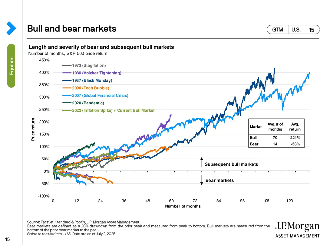
Line chart tracking the S&P 500’s performance in various historical bull and bear markets. Color-coded by major economic events.
Strategic Planning
Financial Services
The slide shows the price return trajectories of the S&P 500 in different market cycles including stagflation, tech bubble, GFC, and pandemic. It contrasts the length and return of bear vs. bull markets, with bull markets averaging 70 months and 221% return. The current bull market (since 2022) is included.
bull markets, bear markets, S&P 500, historical returns, market cycles, investment strategy, macroeconomic events, recovery
Single Chart
JP Morgan
Saved
The slide includes circular diagrams and bar charts analyzing the adoption of self-service technologies in different regions. It has a clean, modern look using blue and green tones.
Technology and Digital Transformation
Telecommunications
Discusses the increasing role and impact of self-service options in enhancing customer satisfaction and operational efficiency. Particularly relevant for sectors focusing on digital solutions and customer autonomy, such as technology and professional services.
self-service, technology adoption, customer satisfaction, operational efficiency, digital solutions
Multiple Chart
Deloitte
Saved
Previous
Next
If nothing, comes up, please save your slides first
Create a FREE account to continue browsing
Receive Instant Access to 1,000+ slides from companies like McKinsey, Google, and Goldman Sachs
First Name
Last Name
Email
Password
I agree to all
Terms & Privacy Policy
Thank you! Your submission has been received!
Oops! Something went wrong while submitting the form.
Have an account?
Sign in
Column Chart
Heatmap
Chevron
Org Chart
Infographic
Callouts
Timeline
List
Graphic
Picture
Process Flow
Diagram
Paragraph
Map
Table
Framework
Subtitle
Takeaway Box
Icon
Other Chart
Radar Chart
Waterfall Chart
Mekko Chart
Pie Chart
Scatter Plot
Line Chart
Bar chart
Bullet points