Create a FREE Account
Instant access to 1,000+ real slides from top companies like McKinsey, BCG, Goldman Sachs, Google and many more!
First Name
Last Name
Email
Password
I agree to all
Terms & Privacy Policy
Thank you! Your submission has been received!
Oops! Something went wrong while submitting the form.
Have an account?
Sign in
Library
Templates
Courses
Pricing
My Account
My Slides
My Templates
✦ AI
AI Prompt Library
AI Search
Sign in
Start Here
Logout
My Saved Slides
Displays a bar chart showing the percentage of international migrants in different regions over time.
Strategic Planning
Professional Services
Discusses the impact of globalization on international migration, emphasizing its significance in socio-political debates and policies.
globalization, migration, international, socio-political impact, migration trends
Mixed Chart
Roland Berger
Saved
Two pie charts showing GDP and market capitalization percentages by country.
Market Analysis and Trends
Financial Services
Illustrates US dominance in global equity market allocations, useful for investment strategies.
Equity Allocation, GDP, Market Capitalization, US Dominance, Pie Charts, Morgan Stanley, Market Monitor
Multiple Chart
Morgan Stanley
Saved
The slide contains two column charts illustrating the increase in levelized cost of energy production for coal and natural gas power plants with various CO2 capture rates.
Market Analysis and Trends
Energy & Utilities
The slide details how applying CCUS to power plants increases the levelized cost of production, with moderate impacts from higher capture rates. The left chart shows cost increases for coal, and the right for natural gas, highlighting the additional cost burden at different capture rates.
CCUS, power plants, production cost, CO2
Multiple Chart
Kearney
Saved
Slide with a table and line charts showing non-GAAP P&L figures, revenue, cost of services, contribution, and adjusted EBITDA over four quarters.
Financial Performance
Professional Services
This slide presents Gartner's non-GAAP profit and loss statement, including revenue, costs, and adjusted EBITDA, with accompanying quarterly trends.
Non-GAAP, P&L, revenue, EBITDA, Gartner
Multiple Chart
Gartner
Saved
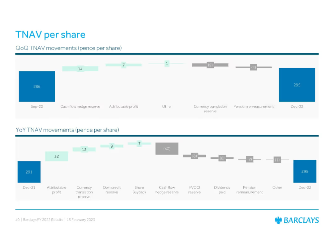
Two waterfall charts showing quarter-over-quarter and year-over-year tangible net asset value (TNAV) per share movements, with annotated drivers like profit, reserves, dividends, and pensions.
Financial Performance
Financial Services
This slide displays changes in Barclays’ tangible net asset value (TNAV) per share for Q4 and FY22. It highlights contributing factors such as attributable profit, cash flow hedge reserve, FX effects, and pension remeasurements, ending with a final TNAV of 295p in Dec-22.
TNAV, profit, reserves, share buyback, dividends, FX impact
Multiple Chart
Barclays
Saved
Features line charts comparing mobility and spending trends in states that reopened early versus late during the pandemic.
Risk Assessment and Management
Transportation & Logistics
Highlights the impact of early versus late reopening on state mobility and spending, suggesting greater variability in spending with earlier reopening schedules.
Reopening, Mobility, Spending, COVID-19, Variability
Multiple Chart
McKinsey
Saved
This slide lists four key points with corresponding icons, emphasizing shifts in global battery policy.
Market Analysis and Trends
Government & Public Sector
Summarizes global shifts in battery industries and their implications for Australian policy, highlighting strategic responses.
policy shifts, battery industry, Australia, global trends
Pillar
Accenture
Saved
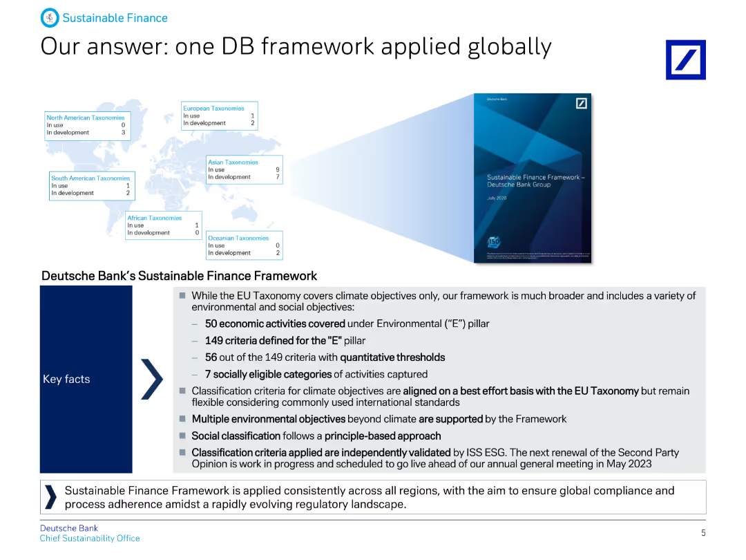
The slide includes text boxes and a map, describing Deutsche Bank's Sustainable Finance Framework and its alignment with global standards and objectives.
Strategic Planning
Financial Services
It explains Deutsche Bank's comprehensive Sustainable Finance Framework, covering economic activities and criteria for environmental and social pillars, applied globally.
Finance, framework, global, sustainability, strategy, criteria, objectives, banking, alignment, ESG
Graphic
Deutsche Bank
Saved
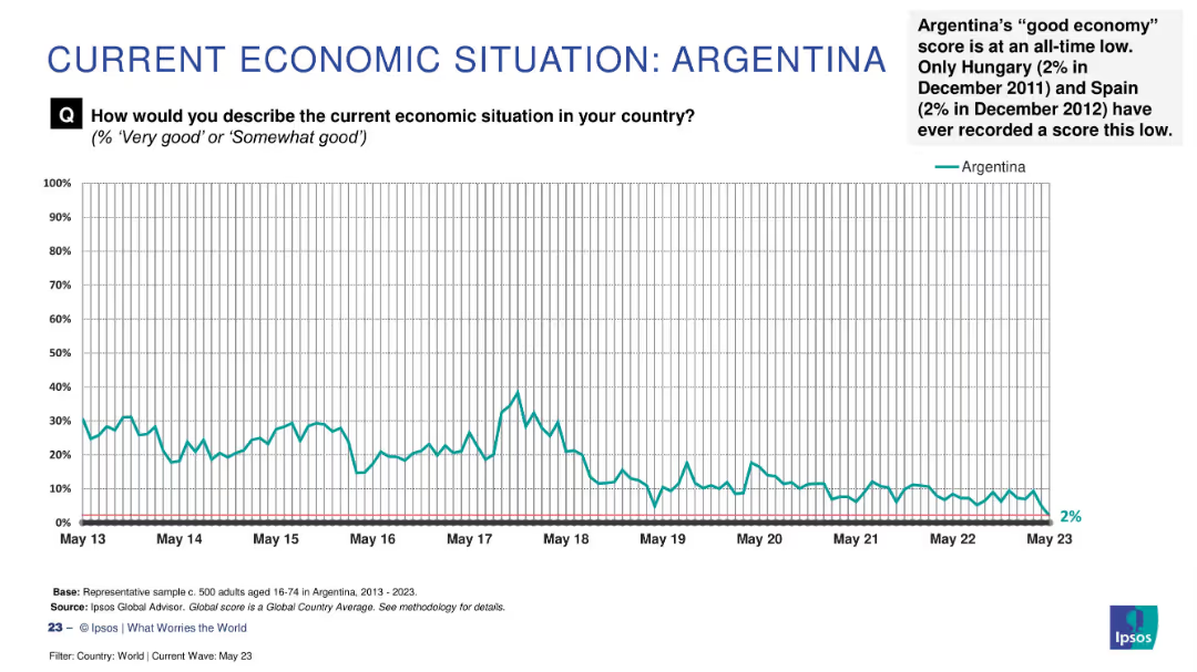
Line graph tracking Argentina’s economic sentiment over time (2013–2023); includes explanatory text in top right.
Strategic Planning
Financial Services
This historical chart shows Argentina’s declining public perception of its economy, reaching an all-time low of 2% in May 2023. The graph displays consistent long-term pessimism with brief periods of improvement. Text highlights how this ties for lowest global record alongside Hungary and Spain.
Argentina, economic crisis, sentiment trend, historical data, public opinion, Ipsos, lowest score, economic outlook
Single Chart
IPSOS
Saved
Contains two column charts: one showing GVA growth in UK regions for 2023 and another showing GVA growth by sector.
Market Analysis and Trends
Government & Public Sector
Discusses the expected recession in 2023, detailing forecasted declines in GVA growth across UK regions and sectors, driven by consumer spending declines.
recession, 2023, GVA growth, UK regions, sectors, column chart
Multiple Chart
EY
Saved
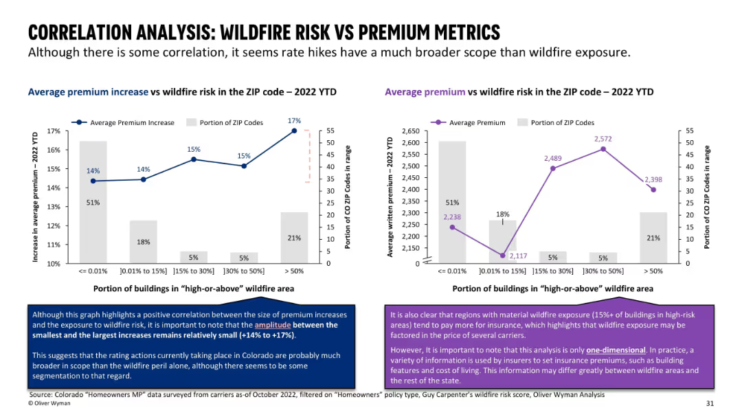
Dual chart layout with bar + line overlays; each chart relates premium data to wildfire exposure level.
Pricing Strategies
Financial Services
Explores correlation between wildfire exposure and premium levels across ZIP codes. Shows that although there is a trend, the difference in premiums across wildfire risk levels is relatively small, indicating that other factors are at play.
correlation, wildfire exposure, premiums, insurance pricing, ZIP codes
Multiple Chart
Oliver Wyman
Saved
Includes pie charts and a column chart showcasing types of real estate and financial risk assessments. Detailed annotations aid in understanding.
Investment Analysis
Real Estate & Construction
Further analysis of the CRE investment risks and modifications for loan recovery, important for strategic real estate management.
CRE, investment risks, loan management, real estate, strategic planning
Multiple Chart
Deutsche Bank
Saved
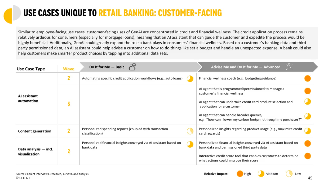
Split table showing customer-facing use cases mapped to waves and impact categories across functions.
Customer and Market Segmentation
Financial Services
Shows GenAI applications for guiding consumers in credit workflows and financial wellness. Includes personalized insights, automated assistance, and financial coaching, progressing from simple automation to fully autonomous AI agents.
credit workflow, customer-facing, personalization, insights, automation, financial coach
Mixed Chart
Oliver Wyman
Saved
Two sections with text and images, each section explaining diversity and inclusion and the platform & sharing economy.
Market Analysis and Trends
Consumer Goods
Explains trends in consumer diversity and inclusion, and the growing platform and sharing economy.
Consumerism, diversity, inclusion, platform economy, trends
Multiple Chart
Deloitte
Saved
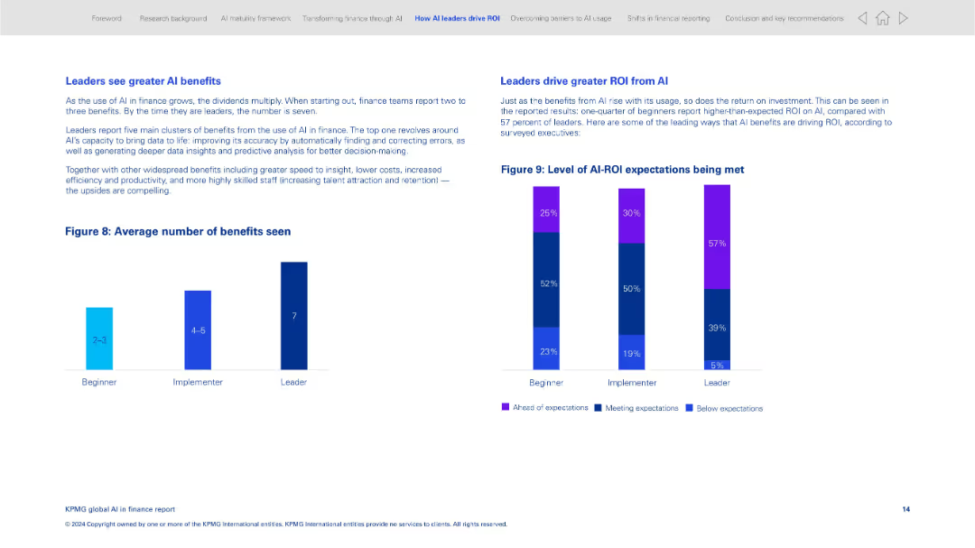
Side-by-side charts and text boxes; minimal layout with bar graph and stacked columns
Performance Metrics and KPIs
Financial Services
The slide compares the average number of benefits seen from AI across beginner, implementer, and leader organizations. It emphasizes how leaders derive greater ROI and more significant benefits from AI implementation, including faster insights and talent retention.
AI benefits, ROI, implementation stages, performance, insights, finance leaders, benchmarking
Multiple Chart
KPMG
Saved
Column charts analyzing revenue vs. expenditure.
Financial Performance
Financial Services
Compares annual financial figures, including revenue, expenditure, and budget deficits, with visual data representation to illustrate financial trends and fiscal health.
finance, analysis, revenue, expenditure, trends
Multiple Chart
PwC/Strategy&
Saved
Complex slide with bar graphs, a percentage breakdown, and color differentiation. There is text explaining the importance of non-financial targets and a legend detailing indexed scores.
Market Analysis and Trends
Professional Services
Presents comparative data on non-financial performance measures, valuable for strategic planning and assessing the impact of enterprise reinvention on sustainability and innovation.
Enterprise, Reinvention, Performance, Non-Financial, Sustainability, Innovation, Talent, Diversity
Multiple Chart
Accenture
Saved
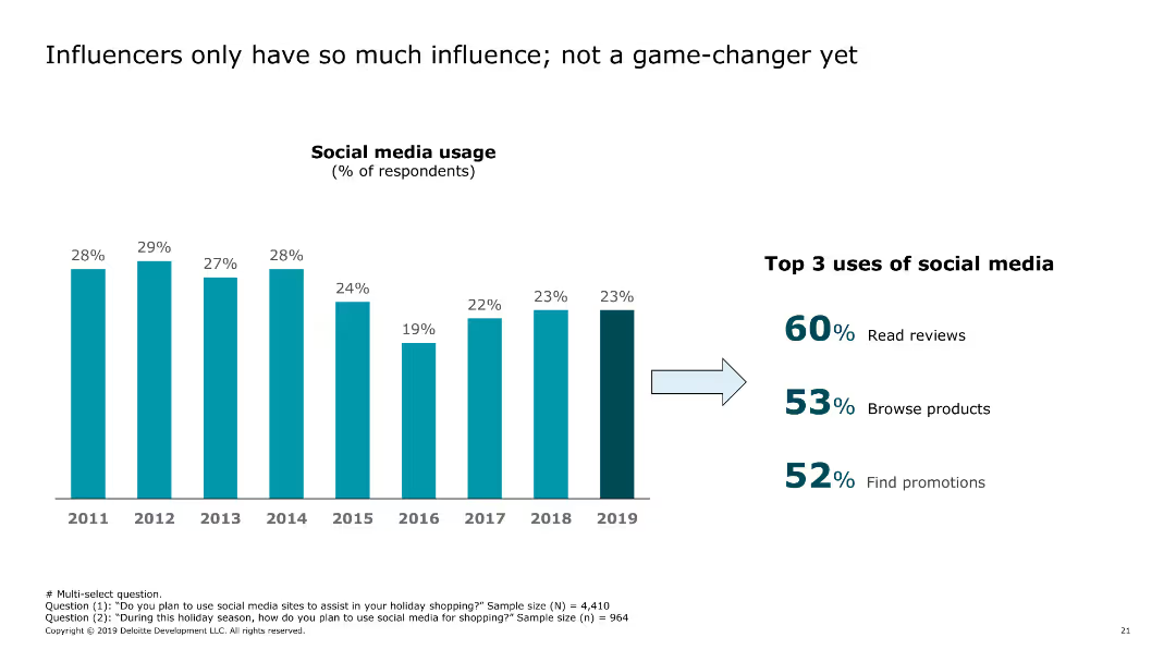
The slide includes a bar chart showing the percentage of respondents using social media for holiday shopping, with top uses listed beside the chart.
Market Analysis and Trends
Retail & E-commerce
The slide examines how consumers use social media during holiday shopping, focusing on reading reviews, browsing products, and finding promotions.
social media, holiday shopping, consumer behavior, retail, e-commerce, trends, 2019, social media usage, promotions, reviews
Single Chart
Deloitte
Saved
This slide uses three line charts with shaded areas to compare the projected impacts on real GDP in different regions of New York, including NYC, Greater Metro (excluding NYC), and the rest of NY State. Each region is highlighted in a different color.
Market Analysis and Trends
Financial Services
The slide analyzes the economic impact of the COVID-19 pandemic on different regions of New York, focusing on real GDP declines and recoveries. It highlights specific impacts and recovery timelines up to 2025.
economic impact, GDP, NYC, Greater Metro, NY State, pandemic, forecast, recovery, line chart
Multiple Chart
BCG
Saved
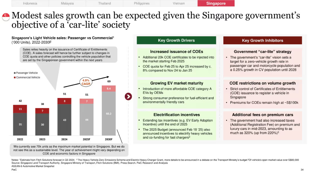
Split layout with PV/CV bar chart and CAGR noted, paired with policy-driven growth/inhibitor blocks
Market Analysis and Trends
Industrial & Manufacturing
Highlights Singapore’s capped vehicle sales due to COE (Certificate of Entitlement) restrictions and car-lite policy goals. EV-friendly incentives are improving affordability, but market growth is tightly regulated.
Singapore, COE system, car-lite strategy, vehicle quota, premium car taxes, policy-driven market
Mixed Chart
PwC/Strategy&
Saved
Slide with three column charts showing digital video revenues by device type (desktop vs. mobile) over three years. Red and black colors highlight differences.
Financial Performance
Media & Entertainment
Presents digital video revenue trends from 2018 to 2020, emphasizing the substantial growth in mobile video revenue as a percentage of total digital video earnings.
digital video, revenue, mobile, desktop, trend, 2018-2020
Single Chart
PwC/Strategy&
Saved
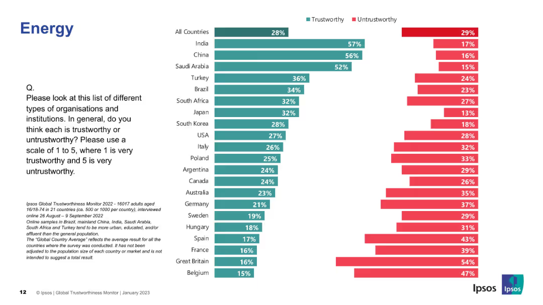
Similar bar chart layout to previous slide; green/red bars showing trust levels across countries.
Market Analysis and Trends
Energy & Utilities
This slide compares public trust in energy companies globally. India, China, and Saudi Arabia top the list for perceived trustworthiness.
energy, trust, perception, Ipsos, countries, bar chart, survey, utilities, data analysis, trustworthiness
Mixed Chart
IPSOS
Saved
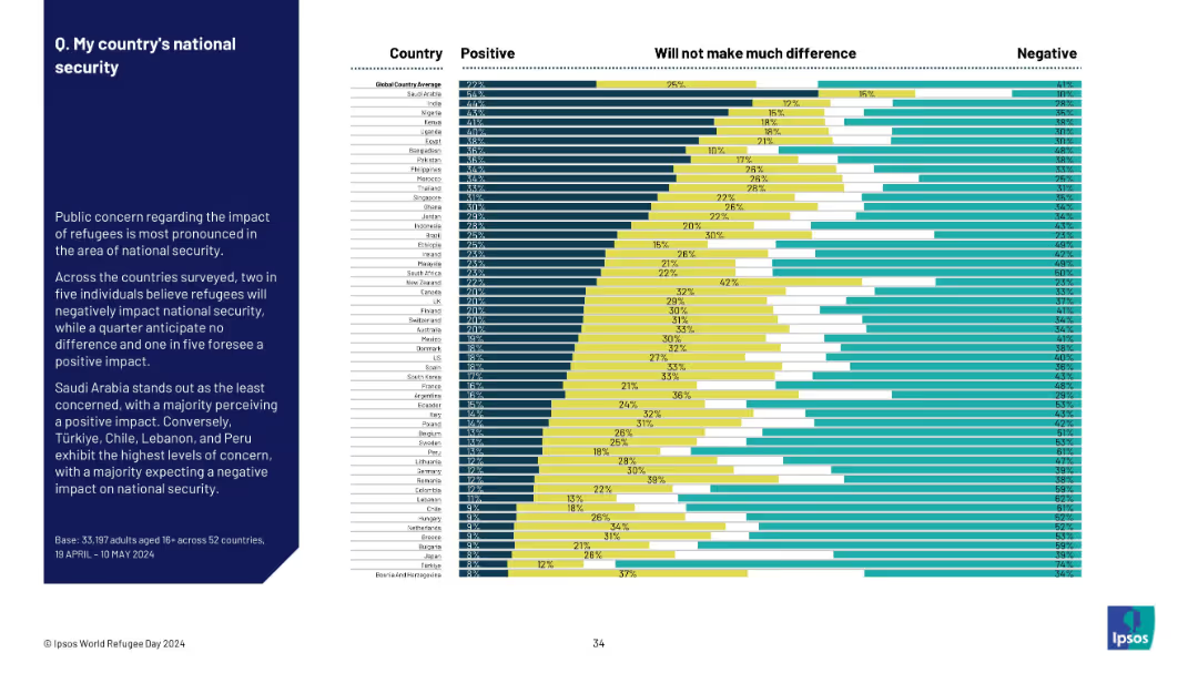
Horizontally segmented bar chart with opinion distributions; summary text on the left.
Risk Assessment and Management
Government & Public Sector
The slide explores how refugees are perceived in terms of national security. Two in five globally view the impact as negative. Saudi Arabia sees it positively, while Türkiye, Lebanon, and Chile express strong concerns.
refugees, national security, safety, perception, public sentiment, Ipsos survey, global opinion, threat, policy
Mixed Chart
IPSOS
Saved
Slide with textual content and icons, comparing objectives, strengths, and opportunities in two-column format. Uses iconography for visual emphasis on certain points.
Strategic Planning
Financial Services
Communicates strategies and objectives of a financial institution, illustrating the foundation of strengths and addressing opportunities.
strategies, objectives, banking, growth, opportunities, strengths, financial planning, market share, customer experience, innovation
Table
JP Morgan
Saved
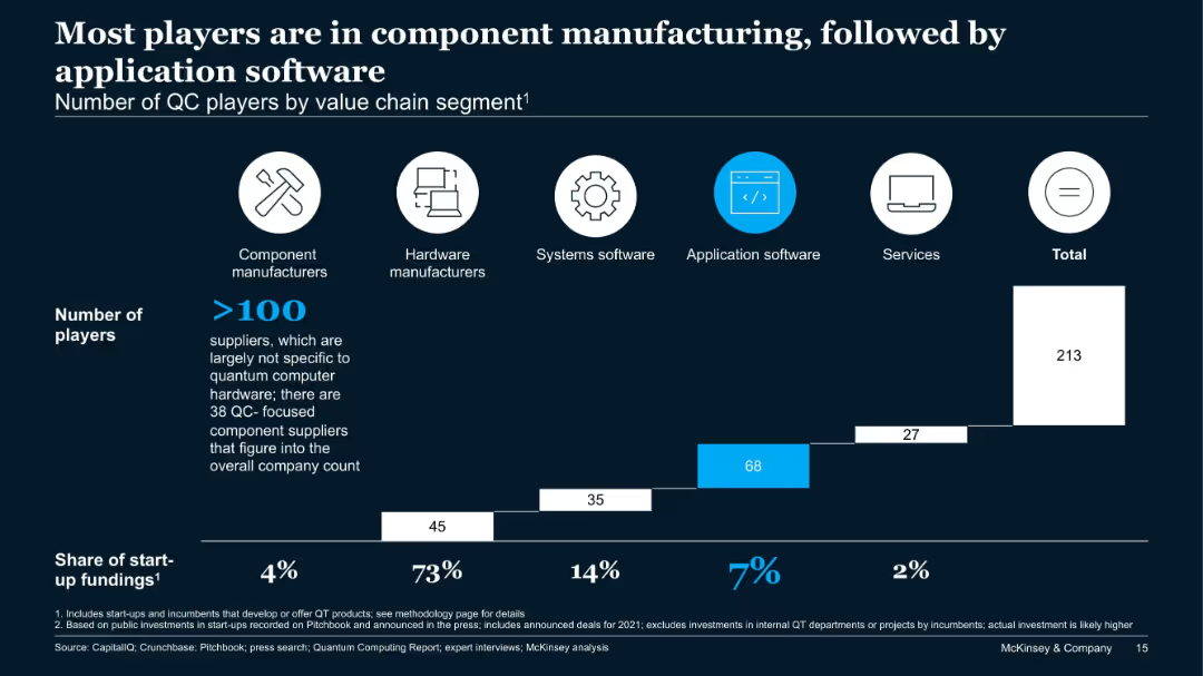
Bar chart showing number of players across five QC value chain segments and their share of start-up funding.
Product and Service Analysis
Technology & Software
This slide analyzes over 213 QC companies by value chain. Component manufacturers dominate in number, while application software sees the second-highest number of firms. However, hardware receives 73% of start-up funding, showing a funding-activity imbalance.
QC players, value chain, hardware, components, application software, start-up funding
Single Chart
McKinsey
Saved
Previous
Next
If nothing, comes up, please save your slides first
Create a FREE account to continue browsing
Receive Instant Access to 1,000+ slides from companies like McKinsey, Google, and Goldman Sachs
First Name
Last Name
Email
Password
I agree to all
Terms & Privacy Policy
Thank you! Your submission has been received!
Oops! Something went wrong while submitting the form.
Have an account?
Sign in
Column Chart
Heatmap
Chevron
Org Chart
Infographic
Callouts
Timeline
List
Graphic
Picture
Process Flow
Diagram
Paragraph
Map
Table
Framework
Subtitle
Takeaway Box
Icon
Other Chart
Radar Chart
Waterfall Chart
Mekko Chart
Pie Chart
Scatter Plot
Line Chart
Bar chart
Bullet points