Create a FREE Account
Instant access to 1,000+ real slides from top companies like McKinsey, BCG, Goldman Sachs, Google and many more!
First Name
Last Name
Email
Password
I agree to all
Terms & Privacy Policy
Thank you! Your submission has been received!
Oops! Something went wrong while submitting the form.
Have an account?
Sign in
Library
Templates
Courses
Pricing
My Account
My Slides
My Templates
✦ AI
AI Prompt Library
AI Search
Sign in
Start Here
Logout
My Saved Slides
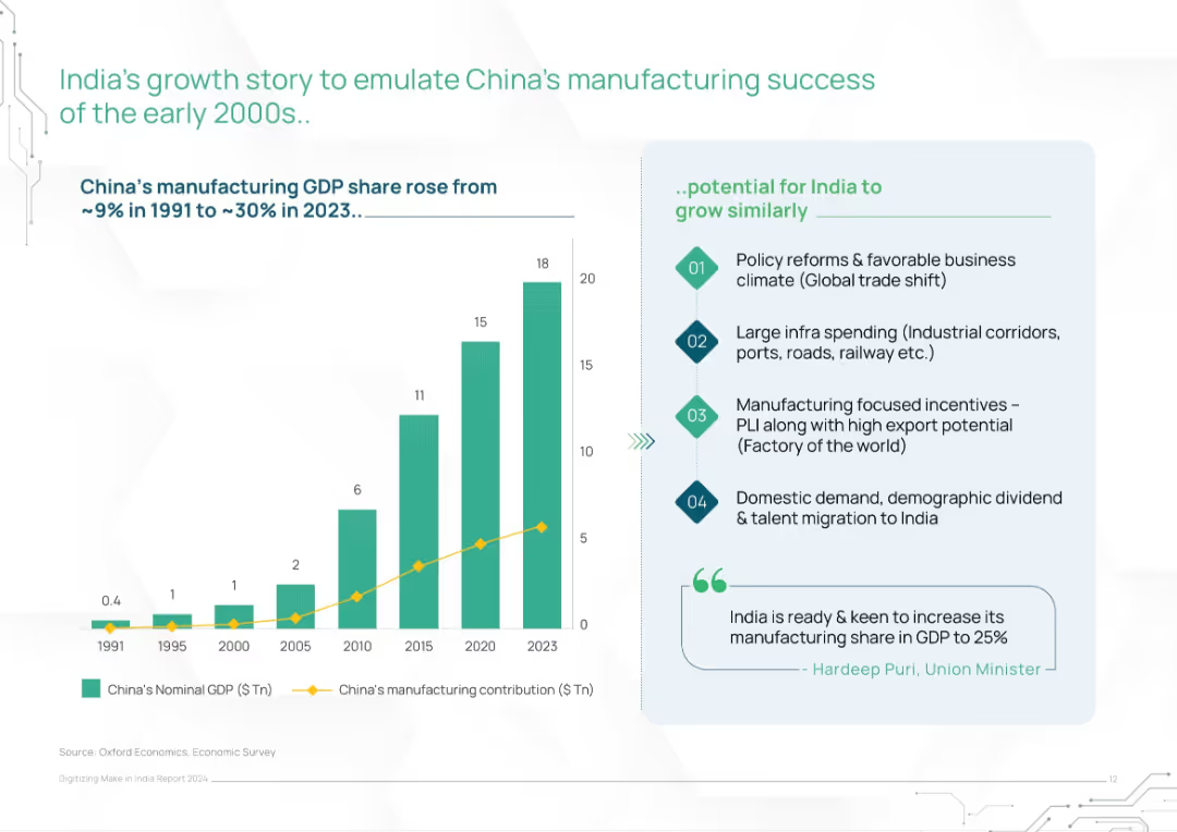
Left bar and line chart showing China’s GDP and manufacturing growth; right panel lists India’s policy and economic enablers
Strategic Planning
Industrial & Manufacturing
This slide draws parallels between China’s early 2000s manufacturing rise and India’s current opportunity. It outlines India’s potential to grow similarly via policy reforms, infrastructure investment, export incentives, and demographic trends, supported by charts and government commentary.
manufacturing growth, China comparison, India strategy, economic reform, industrial policy, infrastructure push, PLI
Mixed Chart
BCG
Saved
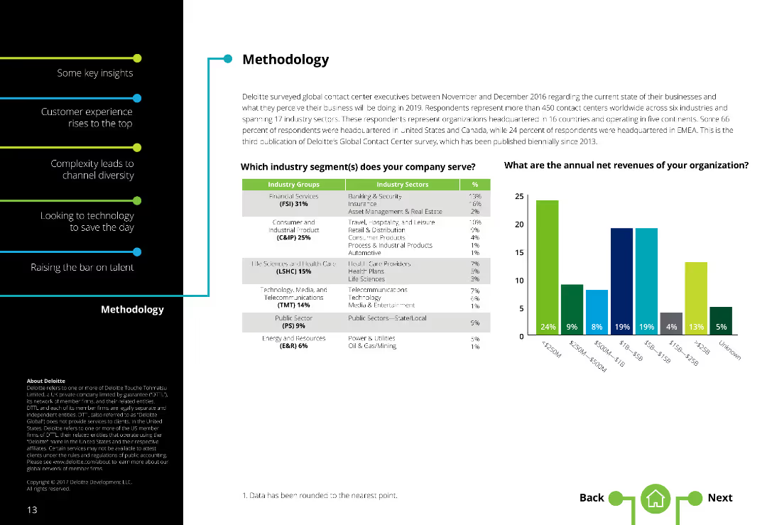
Two-column layout with text on the left and a table along with a column chart on the right. Text is moderately dense.
Market Analysis and Trends
Professional Services
Provides an overview of the survey methodology, including industry segments served and annual net revenues of respondent organizations.
Methodology, Survey, Industry segments, Contact centers, Annual revenues, Respondent demographics
Mixed Chart
Deloitte
Saved
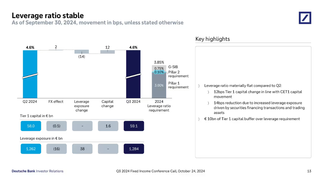
Bar chart showing leverage ratio movements and contributing factors. Includes figures for Tier 1 capital and exposure. Sidebar explains key developments.
Regulatory and Compliance
Financial Services
The leverage ratio remains stable at 4.6%, supported by capital increases and FX-neutral exposure growth. Tier 1 capital buffer is maintained above requirements, with exposure impacted by trading assets and securities financing.
leverage ratio, Tier 1 capital, exposure, securities financing, capital change, Q3 2024, regulatory ratio
Mixed Chart
Deutsche Bank
Saved
Features a column chart on the usage of stablecoins, including conversion to fiat currency and payments.
Market Analysis and Trends
Financial Services
The slide presents data on the usage of stablecoins among Canadians, highlighting top uses like converting to fiat currency, making payments, and earning yield, while also showing a significant portion who have never used them.
Stablecoins, usage, Canadians
Mixed Chart
IPSOS
Saved
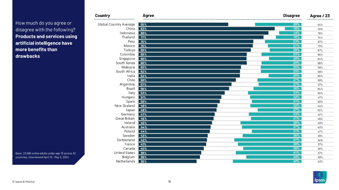
Bar chart format showing % “Agree” and “Disagree” by country with global averages; sorted in descending order of agreement.
Technology and Digital Transformation
Artificial Intelligence
The slide shows the percentage of respondents in each country who believe AI’s benefits outweigh its drawbacks. It reflects overall optimism or skepticism towards AI's societal value and utility.
AI benefits, technology value, opinion survey, Ipsos, optimism, tradeoffs, international data, AI perception, public confidence
Mixed Chart
IPSOS
Saved
Column charts show the development of the Tier 1 leverage ratio and changes in leverage exposure from 3Q22 to 4Q22.
Financial Performance
Financial Services
Describes the improvement in the Tier 1 leverage ratio due to capital raises and deleveraging, indicating strengthened financial leverage.
Tier 1 leverage, financial leverage, capital raises, deleveraging, banking metrics
Multiple Chart
Credit Suisse
Saved
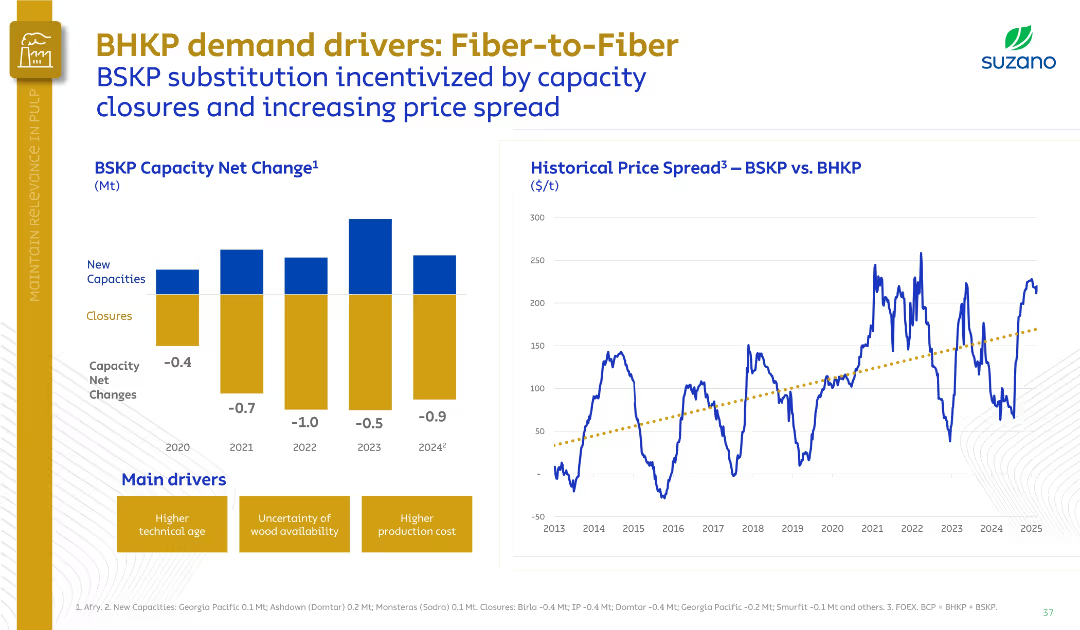
Split layout with a bar chart on the left (BSKP Capacity Net Change) and a line graph on the right (Historical Price Spread).
Market Analysis and Trends
Industrial & Manufacturing
This slide presents the declining net BSKP capacity from 2020 to 2024 due to closures and limited new capacities, alongside the rising BSKP vs. BHKP price spread. It highlights fiber substitution incentives and the main drivers behind this shift.
BSKP, BHKP, fiber substitution, capacity closures, price spread, pulp
Multiple Chart
Goldman Sachs
Saved
Features a flowchart with steps from identifying a partner to closing a deal, described through different stages. Uses blue and gray colors for background and text emphasis.
Strategic Planning
Professional Services
Describes the detailed process of a SPAC from the initial stages through to the finalization, akin to an IPO process. Emphasizes the steps and duration involved.
SPAC, process, flowchart, IPO, strategic planning, timeline, partnership
Linear Flow
PwC/Strategy&
Saved
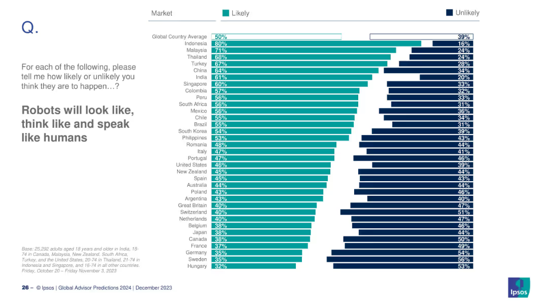
Bar chart ordered by belief in humanoid robots
Technology and Digital Transformation
Artificial Intelligence
The slide explores belief levels across countries about robots becoming more humanlike in appearance and behavior. It shows how this belief varies by market, with a global average and specific country ratings.
robots, AI, humanlike machines, belief, global sentiment
Mixed Chart
IPSOS
Saved
This slide includes a column chart showing global M&A activity by acquirer type and a bar chart presenting M&A multiples by sector, with clear data points and averages.
Mergers and Acquisitions
Financial Services
It offers insights into global mergers and acquisitions, detailing activity by acquirer type and multiples by sector to highlight industry trends and market behavior.
mergers, acquisitions, global, M&A, acquirer type, sector, multiples, trends, financial, data analysis
Multiple Chart
JP Morgan
Saved
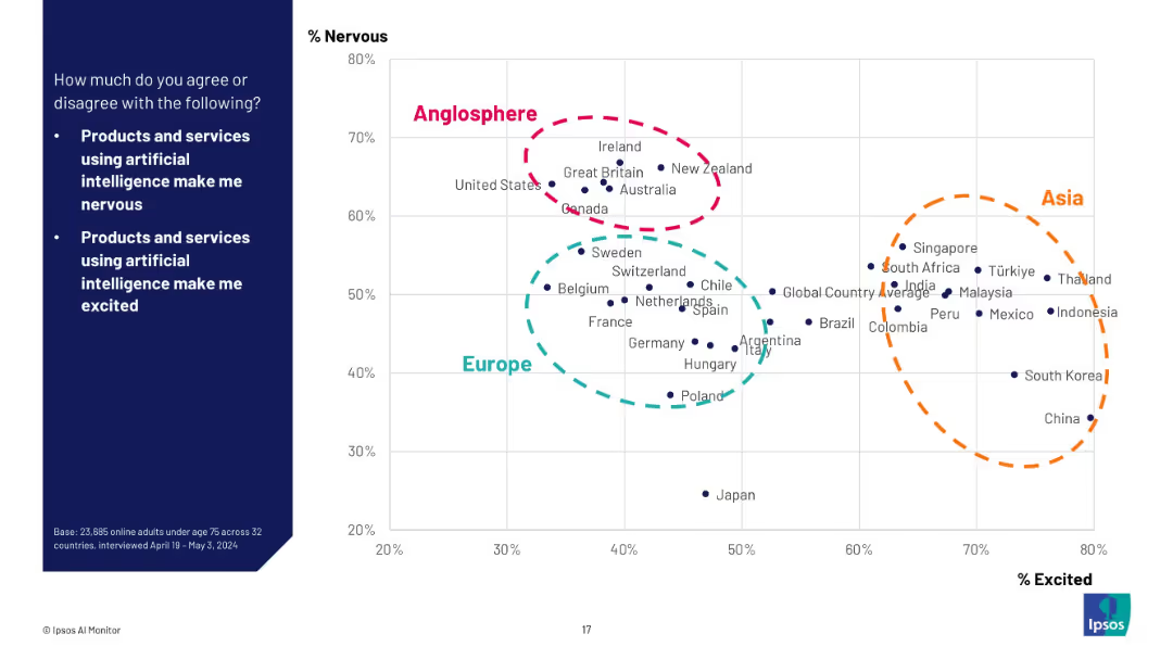
Scatterplot chart mapping countries by % Nervous (Y-axis) vs % Excited (X-axis); regions grouped (Anglosphere, Asia, Europe) using colored dashed circles.
Market Analysis and Trends
Artificial Intelligence
This visual plots countries’ attitudes toward AI on two dimensions—nervousness and excitement—highlighting regional clusters like Anglosphere, Asia, and Europe. It illustrates nuanced public opinion beyond binary agreement/disagreement.
scatterplot, sentiment mapping, AI perception, regional analysis, Ipsos, emotion, excitement vs fear, geopolitical comparison, global survey
Mixed Chart
IPSOS
Saved
The slide showcases a bar graph with strategies being adopted post-pandemic, ranging from enclosed to open workspaces. Darker bars indicate a greater number of spaces, lighter bars represent fewer spaces, and a yellow line signifies uncertainty.
Strategic Planning
Professional Services
Strategic workplace adaptations are outlined, suggesting a focus on collaboration and flexibility. The chart reflects corporate strategic planning in response to changing work patterns.
Work Models, Strategic Planning, Collaboration, Workplace Design, Pandemic Response
Single Chart
EY
Saved
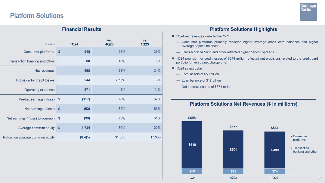
A table summarizing financial results for the Platform Solutions segment, including net revenues, operating expenses, and earnings, with bar charts.
Financial Performance
Financial Services
Reviews financial results for Platform Solutions, focusing on net revenues, credit losses, and net interest income.
platform solutions, financial results, net revenue, credit losses, operating expenses, bar chart
Mixed Chart
Goldman Sachs
Saved
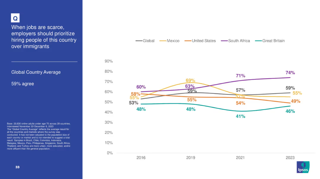
Chart and line graph format tracking sentiment trends over time across select countries; line plot includes global average trend.
Customer and Market Segmentation
Government & Public Sector
This slide reflects nationalist-leaning attitudes, with 59% globally agreeing that citizens should be prioritized over immigrants for jobs during scarcity. The trend line shows consistent support with South Africa peaking at 74% in 2023. The slide suggests growing concern over job competition and immigration policy sentiment.
immigration, jobs, hiring, nationalism, employment policy, survey, Ipsos, trends
Mixed Chart
IPSOS
Saved
Contains column charts showing car purchase intent across income levels in the US, Europe, and Asia.
Market Analysis and Trends
Transportation & Logistics
Analyzes how car purchase intentions among different income groups have aligned post-COVID-19.
income levels, car buying, market recovery, global trends
Multiple Chart
McKinsey
Saved
This slide has a bright and bold aesthetic with a large title, multiple sections with headers, and bullet-pointed lists. It highlights strategies for implementing coding in education curricula worldwide, starting from early education through advanced modules. The design includes national flags as icons and color-coded sections for clarity. The slide is visually engaging and informative.
Regulatory and Compliance
Education & Training
The slide compares various global strategies for integrating technology skills into education systems. It outlines efforts to start coding education early, make it mandatory, and introduce advanced tech modules. It includes specific country examples, providing a comprehensive overview of the progressive steps taken to prepare the next generation for a digital future.
Coding Education, Curriculum, Global Strategies, Mandatory Coding, Advanced Tech, Italy, Singapore, India, International Education, Digital Skills
Header Horizontal
Kearney
Saved
A line chart shows the CAC versus CO2 emissions from electricity generation by 2030 for various countries, comparing costs for grid, grid + wind, grid + solar, and blue hydrogen CAC setups.
Market Analysis and Trends
Energy & Utilities
The slide evaluates the cost-effectiveness of hydrogen from grid-powered electrolyzers for reducing emissions, noting the carbon footprint threshold for competitive cost.
CO2 emissions, CAC, grid, wind, solar, hydrogen, electrolyzer, cost-effectiveness
Mixed Chart
Kearney
Saved
The slide presents a column chart of CET1 capital and charts on risk-weighted assets and leverage ratio denominator.
Operational Efficiency
Financial Services
It illustrates significant reductions in financial resource consumption, showcasing CET1 capital and risk-weighted assets metrics.
financial resources, CET1 capital, risk-weighted assets, leverage, reductions
Multiple Chart
UBS
Saved
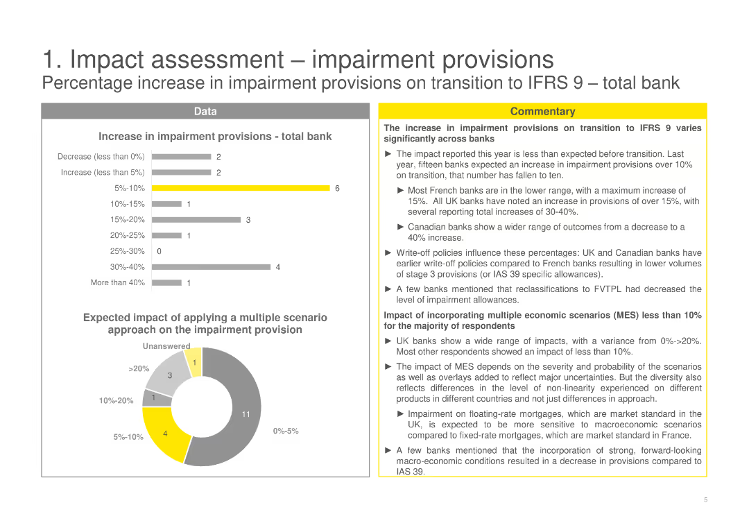
The slide displays a mix of bar and pie charts, along with commentary sections. Charts illustrate the percentage increase in impairment provisions.
Risk Assessment and Management
Financial Services
Analyzes the percentage increase in impairment provisions on transition to IFRS 9, varying significantly across banks.
impairment provisions, IFRS 9, risk management, transition, percentage increase, data, commentary
Multiple Chart
EY
Saved
Slide includes multiple bar charts detailing marketing budgets as percentages of overall budgets and revenues, segmented by various company attributes.
Financial Performance
Professional Services
Provides a detailed breakdown of how marketing budgets as percentages of overall budgets and revenues differ across company sizes and sectors.
marketing spend, industry comparison, budget analysis, revenue percentages, business analysis
Multiple Chart
Deloitte
Saved
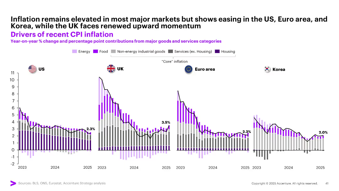
Four-panel comparative bar chart with overlaid trend lines; country flags as labels (US, UK, Euro area, Korea); stacked bars with colors
Market Analysis and Trends
Financial Services
This slide shows year-on-year CPI inflation across the US, UK, Euro area, and Korea from 2023 to 2025. It breaks down contributions to inflation by category (e.g., energy, food, services) and shows easing trends in most regions except the UK, which faces renewed inflationary pressures.
CPI, inflation, US, UK, Korea, Euro area, food, energy, services, core inflation
Multiple Chart
Accenture
Saved
A bar chart displays the percentage of investors' expectations for the duration of the shift from growth to value investing. Text boxes and a source citation are included.
Market Analysis and Trends
Financial Services
This slide visualizes investors' expectations for the shift from growth to value investing over various time periods. It is useful for analyzing investment trends and strategizing.
investors, expectations, growth, value, trends
Single Chart
BCG
Saved
Features bar charts showing performance metrics.
Performance Metrics and KPIs
Technology & Software
Evaluates how different sectors perceive the impact of marketing analytics on performance, with specific metrics highlighted.
Marketing, Analytics, Performance, Sectors, Metrics, Bar Charts, Evaluation, Impact, Sector Differences
Multiple Chart
Deloitte
Saved
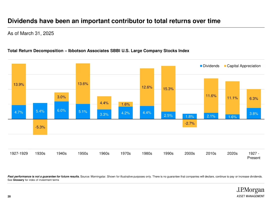
Bar chart decomposition of total return by dividends and capital appreciation by decade from 1927 to present; uses color-coded segments.
Market Analysis and Trends
Financial Services
Historical perspective on the contribution of dividends to total returns of U.S. large company stocks, showing that dividends have been a significant and steady source of return across many decades.
dividends, total return, capital appreciation, historical analysis, SBBI, stock market, returns, decade comparison
Single Chart
JP Morgan
Saved
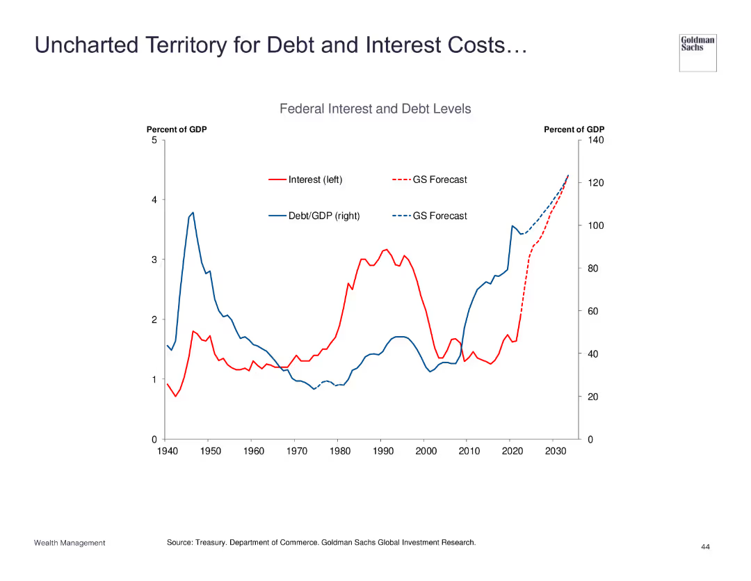
Line chart showing federal interest and debt levels as a percentage of GDP.
Risk Assessment and Management
Financial Services
Examines the rising federal interest and debt levels, forecasting significant future costs and implications for economic policy.
debt, interest, GDP, forecast, risk
Single Chart
Goldman Sachs
Saved
Previous
Next
If nothing, comes up, please save your slides first
Create a FREE account to continue browsing
Receive Instant Access to 1,000+ slides from companies like McKinsey, Google, and Goldman Sachs
First Name
Last Name
Email
Password
I agree to all
Terms & Privacy Policy
Thank you! Your submission has been received!
Oops! Something went wrong while submitting the form.
Have an account?
Sign in
Column Chart
Heatmap
Chevron
Org Chart
Infographic
Callouts
Timeline
List
Graphic
Picture
Process Flow
Diagram
Paragraph
Map
Table
Framework
Subtitle
Takeaway Box
Icon
Other Chart
Radar Chart
Waterfall Chart
Mekko Chart
Pie Chart
Scatter Plot
Line Chart
Bar chart
Bullet points