Create a FREE Account
Instant access to 1,000+ real slides from top companies like McKinsey, BCG, Goldman Sachs, Google and many more!
First Name
Last Name
Email
Password
I agree to all
Terms & Privacy Policy
Thank you! Your submission has been received!
Oops! Something went wrong while submitting the form.
Have an account?
Sign in
Library
Templates
Courses
Pricing
My Account
My Slides
My Templates
✦ AI
AI Prompt Library
AI Search
Sign in
Start Here
Logout
My Saved Slides
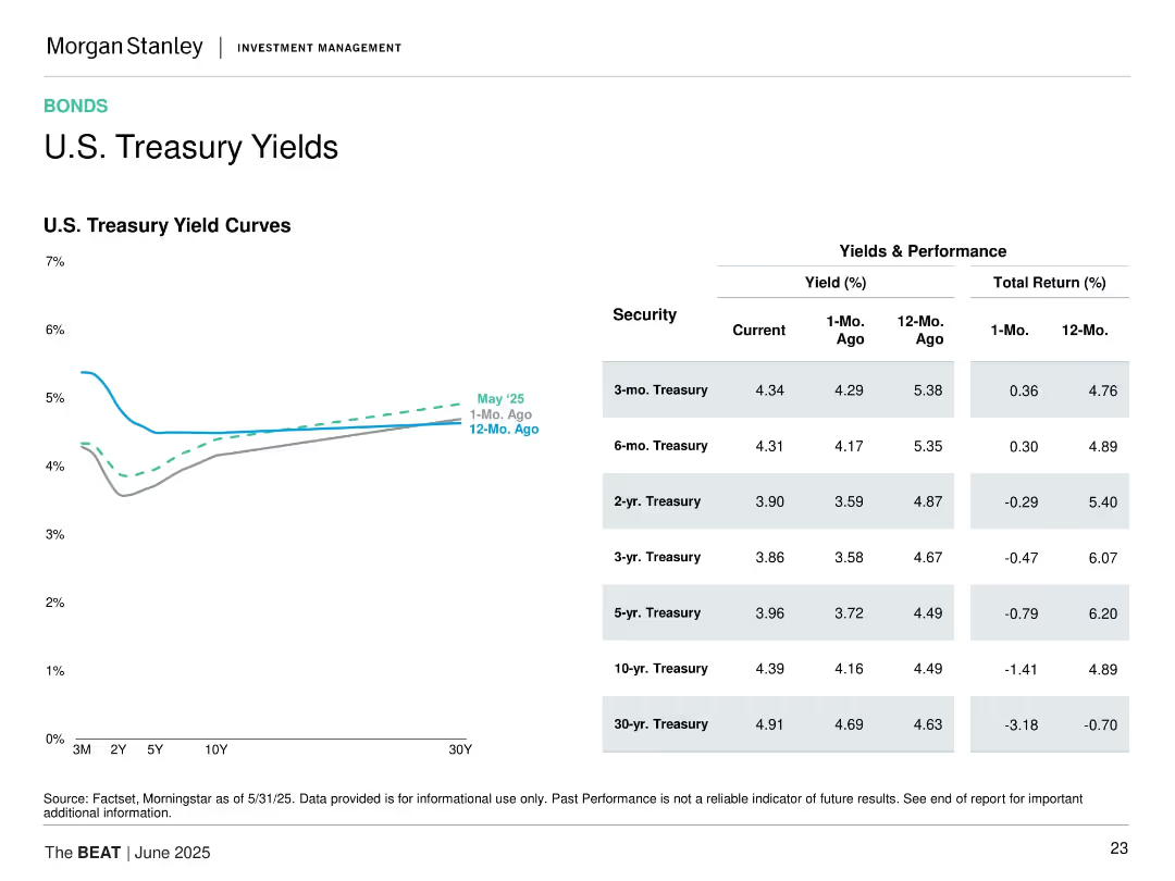
Left line chart showing yield curves; right table detailing yields and total returns for various maturities.
Financial Performance
Financial Services
Shows the current, 1-month, and 12-month U.S. Treasury yield curves and provides detailed yield and return data for bonds ranging from 3-month to 30-year.
U.S. Treasury, yield curve, fixed income, returns, bond maturities, 2025, performance, rates
Mixed Chart
Morgan Stanley
Saved
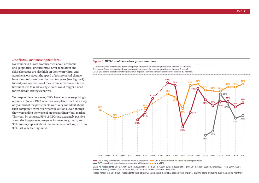
A mix of text and a line chart showing the change in CEOs' confidence over time regarding revenue growth and economic outlook.
Market Analysis and Trends
Professional Services
The slide tracks the historical confidence of CEOs in their company's revenue growth and the global economy, showing trends from 1998 to 2017.
CEO confidence, revenue growth, economic outlook, historical trends, market analysis
Mixed Chart
PwC/Strategy&
Saved
The slide features a column chart with vertical columns, two text blocks, and a diagram with a dotted line indicating the efficiency ratio. The layout is well-organized, and the color scheme is muted with blue highlights.
Financial Performance
Financial Services
The slide provides a detailed comparison of expenses and financial results, highlighting key areas such as compensation, transaction-based expenses, and efficiency ratio. It’s designed for financial analysis and might be used to illustrate fiscal responsibility or areas for cost reduction in a corporate finance context.
financial, expenses, efficiency, compensation, technology, professional fees, tax rate, Goldman Sachs
Mixed Chart
Goldman Sachs
Saved
This slide compares benefits and challenges in two lists side by side. The benefits for businesses and economies are on the left, while the challenges are categorized into social, economic, and other issues on the right.
Market Analysis and Trends
Technology & Software
Discusses the benefits and challenges of technological advances, such as faster innovation and issues like job displacement, framing a discussion on managing technological impact.
technology impact, innovation, social challenges, economic benefits, job displacement, comparative analysis
Boxed
McKinsey
Saved
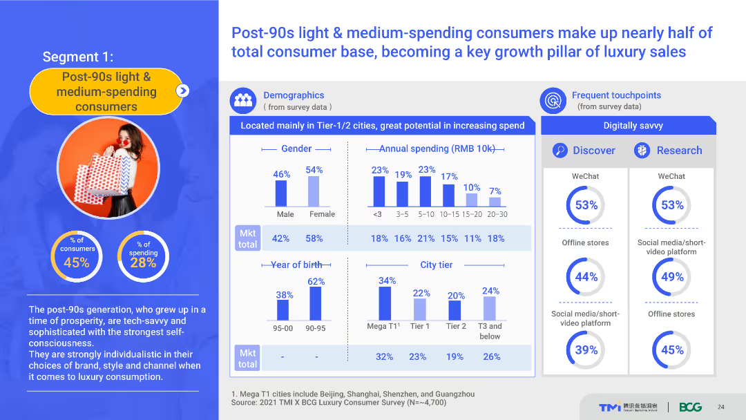
The slide uses a content layout with demographic charts, spending data, and touchpoint information. It details the demographics and spending behavior of post-90s light & medium-spending consumers, highlighting their role in luxury sales growth. The visual complexity is moderate, with well-organized sections.
Customer and Market Segmentation
Consumer Goods
This slide provides a detailed profile of post-90s light and medium-spending consumers, including demographics, spending habits, and preferred touchpoints. It emphasizes their importance in driving luxury sales growth.
post-90s consumers, demographics, spending behavior, luxury market, touchpoints
Multiple Chart
BCG
Saved
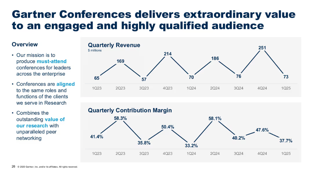
Line graphs of quarterly revenue and contribution margin; left section contains descriptive bullet points.
Product and Service Analysis
Technology & Software
This slide focuses on Gartner's conference business, showing fluctuating quarterly revenue and margins. It emphasizes how conferences align with client roles and add value through peer networking and research-based content.
conferences, Gartner, audience, networking, revenue, quarterly metrics
Multiple Chart
Gartner
Saved
The slide features bar charts detailing different levers in controlling and finance, with a focus on activity levels and trends.
Financial Performance
Financial Services
Discusses key levers in controlling and finance, emphasizing efficiency improvements in back-office services and cost optimizations.
Controlling, Finance, Efficiency, Back-office, Trends
Single Chart
Roland Berger
Saved
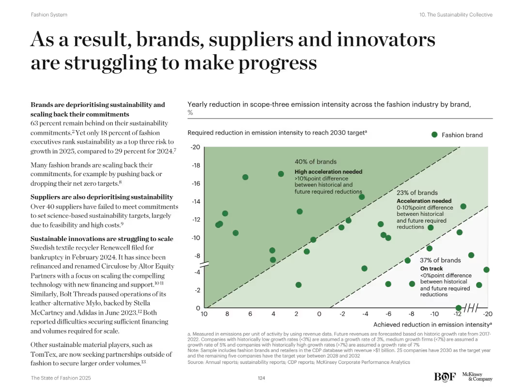
Left-aligned text and right-side scatterplot chart. Text outlines barriers to sustainability progress. The chart maps required vs. achieved emission intensity reductions.
Regulatory and Compliance
Retail & E-commerce
The slide emphasizes the fashion industry's lagging sustainability progress, with many brands deprioritizing climate goals. A scatterplot shows how most brands are far from achieving necessary reductions in emission intensity, revealing urgent gaps in alignment with 2030 targets.
Sustainability, emissions, supply chain, carbon targets, fashion brands, net zero, innovation, scope-three, ESG, green strategy
Mixed Chart
McKinsey
Saved
The slide visually represents investment strategies and efficiency measures through a sequence of connected column chart, indicating target metrics over time. The design is clean and effectively uses space to separate different focus areas.
Operational Efficiency
Financial Services
Highlights JPMorgan's operational strategies aimed at balancing cost management with strategic investments to foster growth.
efficiency, investment, operational improvement, location strategy, expense management, revenue growth
Mixed Chart
JP Morgan
Saved
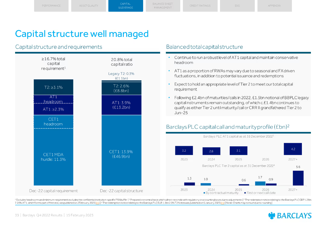
A detailed visual with column charts and text explaining capital structure and requirements, along with maturity profile.
Strategic Planning
Financial Services
Describes Barclays' capital structure, requirements, and balanced total capital structure. Includes maturity profiles and expectations for future capital requirements.
capital structure, requirements, maturity, total capital, planning
Multiple Chart
Barclays
Saved
A map of Southeast Asia highlighting six countries with respective population figures, set against a simple backdrop. It's visually straightforward with a focus on the geographical distribution.
Market Analysis and Trends
Technology & Software
A geographic and demographic overview of Southeast Asia, indicating the total population across six key countries and their relevance to the digital economy of the region.
Southeast Asia, Population, Countries, Digital Economy, Geography, Demographics
Uncategorized
Bain
Saved
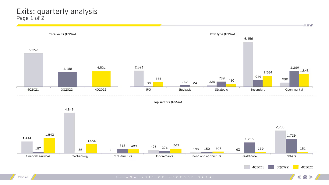
Displays column charts for total exits, exit types, and top sectors by exit value. Uses grey, purple, and yellow for color coding. Visual complexity is moderate.
Market Analysis and Trends
Financial Services
Provides a detailed analysis of quarterly exit trends, categorizing by exit type (IPO, buyback) and highlighting top sectors. Useful for market analysts and financial advisors.
exits, quarterly, analysis, sectors, financial
Multiple Chart
EY
Saved
The slide has a dark background with a highlighted yellow text box containing a quote. It includes a question and four circular charts with percentages showing responses.
Technology and Digital Transformation
Healthcare & Pharmaceuticals
The slide discusses Australian consumers' openness to personalized medicine, genetic testing, and non-urgent care in retail locations, using wearables, and sensors.
Technology-enhanced care, personalized medicine, genetic testing, wearables, Australia
Mixed Chart
EY
Saved
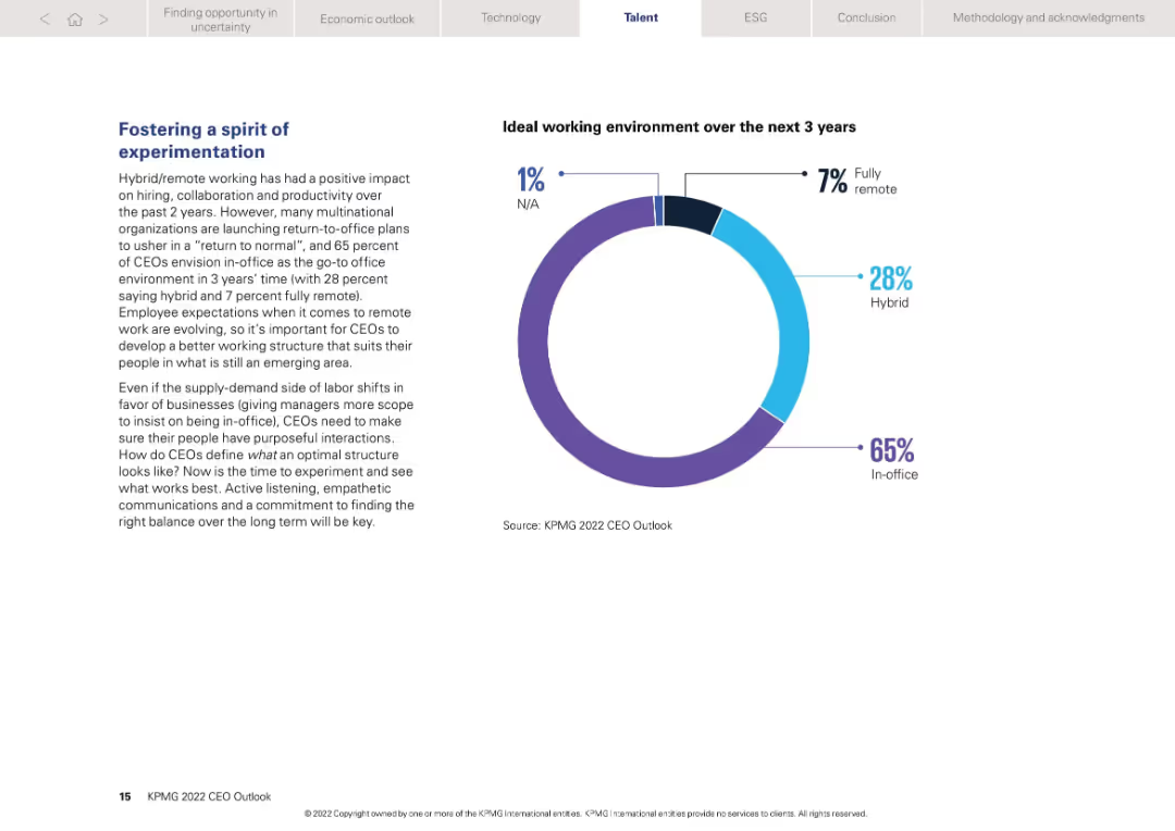
Left-aligned narrative with a donut chart on right showing preferred work models over 3 years
Human Resources and Talent Management
Professional Services
Discusses post-pandemic work structure evolution. 65% of CEOs expect return to in-office setup, while 28% favor hybrid. Only 7% foresee fully remote work. The slide promotes experimentation in leadership style and structure to suit future employee expectations.
Remote work, hybrid, in-office, employee structure, experimentation
Mixed Chart
KPMG
Saved
The slide features a line chart showing venture capital investments in T&L technology from 2016 to 2022H1 and a table listing selected venture capital deals in 2022. Text descriptions accompany these visual elements.
Investment Analysis
Transportation & Logistics
This slide presents an analysis of venture capital investment trends in technology within the Transport & Logistics industry, highlighting major investments and players in the market space.
venture capital, technology, investment, T&L, market trends, 2022, financial analysis, startup, funding series, innovation
Mixed Chart
PwC/Strategy&
Saved
The slide features two sections: one with a timeline comparing risk monitoring capabilities from 2007 to today, and the other with a line and dashed line graph depicting portfolio net charge-offs from 2016 to 2018. There are checkmarks and trend analyses.
Risk Assessment and Management
Financial Services
This slide illustrates the enhancement of risk monitoring over time and its positive effect on portfolio performance, specifically targeting financial experts or stakeholders interested in risk management strategies and their impact on financial growth.
risk management, portfolio, NCOs, growth, trend analysis, 2007, today, financial stability
Mixed Chart
JP Morgan
Saved
Contains a line chart comparing the revenue trends for traditional TV and OTT video in the Asia Pacific region, excluding Mainland China, from 2016 to 2025. The slide also features text discussing the impact of consumer behavior shifts and technological advancements on these media formats, particularly highlighting the influence of COVID-19 and 5G on market trends.
Market Analysis and Trends
Media & Entertainment
Offers a broader regional perspective on the growth of OTT video services compared to traditional TV, emphasizing the slow but steady increase in OTT revenues across the Asia Pacific region. This slide provides context for the larger shifts in media consumption patterns influenced by technological and societal changes.
OTT, traditional TV, Asia Pacific, revenue trends, growth, COVID-19, 5G, line chart
Mixed Chart
PwC/Strategy&
Saved
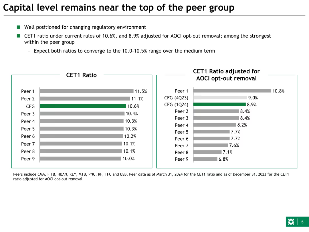
Column charts comparing CET1 Ratio with peers, including adjusted ratios for AOCI opt-out removal. The slide uses green and grey color schemes for differentiation.
Financial Performance
Financial Services
This slide compares the bank's CET1 ratio with its peers, showing it as one of the strongest within the group. It indicates regulatory positioning and capital strength.
capital, CET1, peer group, ratios, finance
Multiple Chart
Barclays
Saved
This slide contains a bar chart with horizontal bars comparing the actions taken by Millennials and Gen Z to protect the environment. The bars are color-coded to distinguish between the two groups. The slide also includes a block of text providing context and analysis.
Market Analysis and Trends
Environmental Services & Sustainability
The slide presents survey results showing the environmental actions taken by Millennials and Gen Z, with the text highlighting trends and impacts of these actions. It serves to inform stakeholders about generational differences in environmental responsibility and the influence of the pandemic on these behaviors.
Environment, Millennials, Gen Z, Sustainability, Survey
Mixed Chart
Deloitte
Saved
This slide features a column chart illustrating the development of ROE (Return on Equity) from 2019 to projected 2023E. The chart is complemented by bullet points summarizing factors affecting the ROE, such as operational efficiency, market activity, and policy rates. The design utilizes contrasting colors to differentiate between past performance and future estimates.
Financial Performance
Financial Services
Reviews the bank's financial performance focusing on ROE with historical data and future estimates. Highlights the influence of various business activities and market conditions on financial outcomes, projecting a positive trajectory in ROE due to operational and market strategies, as well as capital optimization initiatives in the banking sector.
ROE, financial performance, banking, market conditions, projections
Mixed Chart
Deutsche Bank
Saved
Displays a hierarchical pyramid diagram illustrating the House of Purchasing and Supply ManagementTM, with detailed categorizations.
Strategic Planning
Professional Services
Assesses internal effectiveness of client's procurement function through the AEP framework, covering various performance metrics.
procurement, assessment, excellence, AEP, internal effectiveness, pyramid diagram, House of Purchasing, performance metrics
Framework
Kearney
Saved
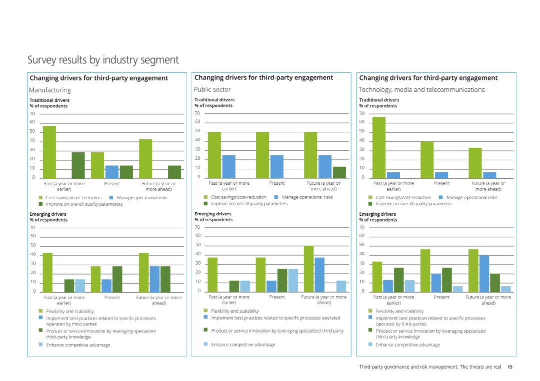
The slide contains three column charts illustrating the changing drivers for third-party engagement in Manufacturing, Public Sector, and Technology, Media & Telecom.
Market Analysis and Trends
Professional Services
It analyzes survey results segmented by industry, showing traditional and emerging drivers for third-party engagement across different industries.
Manufacturing, Public Sector, Technology, Media, Telecommunications, third-party engagement, survey results
Multiple Chart
Deloitte
Saved
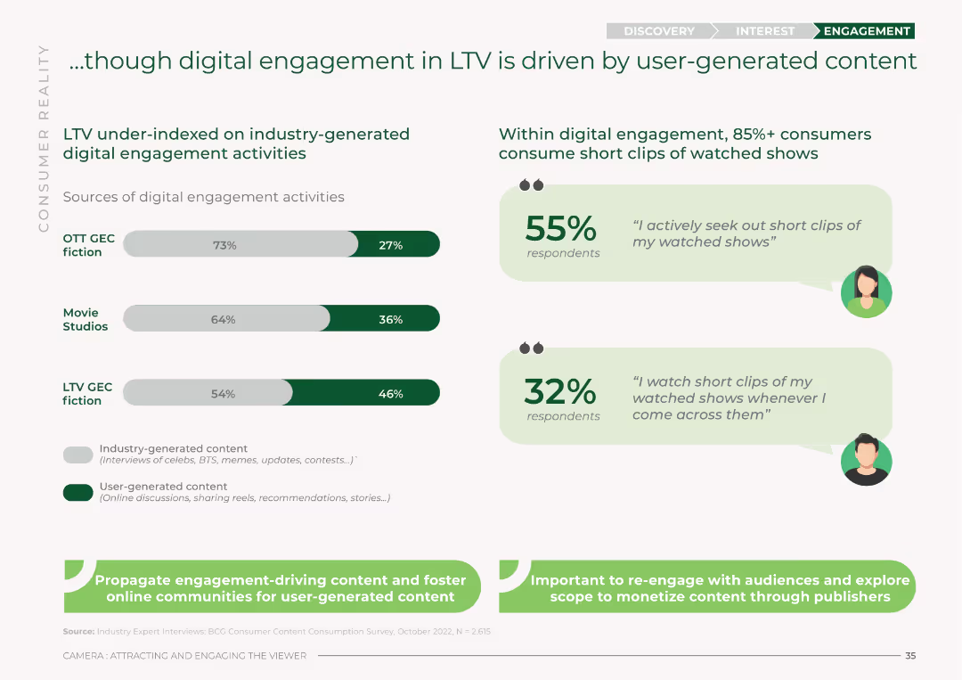
The slide features bar charts comparing industry-generated vs. user-generated digital engagement activities across OTT GEC fiction, Movie Studios, and LTV GEC fiction. It uses a green and white color scheme with percentages for each category.
Market Analysis and Trends
Media & Entertainment
This slide analyzes digital engagement in LTV, showing that user-generated content drives more engagement compared to industry-generated activities. It presents percentages for OTT GEC fiction, Movie Studios, and LTV GEC fiction.
digital engagement, LTV, user-generated content, industry-generated content, OTT, Movie Studios, engagement sources
Mixed Chart
BCG
Saved
Contains a series of bar charts displaying the impact of various factors on insurance underwriting over the next three years, differentiated by color for clarity.
Strategic Planning
Financial Services
Evaluates future factors affecting insurance underwriting, such as customer demands and new technologies, emphasizing their expected impact over the coming years.
underwriting, insurance, future impact, customer demands, new technologies
Mixed Chart
Accenture
Saved
Single-column layout with a bar chart showing fintech adoption rates across 20 markets. Uses flags and horizontal bars to represent adoption percentages for each country.
Market Analysis and Trends
Financial Services
Shows the progress of fintech adoption globally, highlighting the percentage of adoption in various countries, categorized by early adopters, early majority, and late majority.
fintech, adoption, global, markets, progress
Single Chart
EY
Saved
Previous
Next
If nothing, comes up, please save your slides first
Create a FREE account to continue browsing
Receive Instant Access to 1,000+ slides from companies like McKinsey, Google, and Goldman Sachs
First Name
Last Name
Email
Password
I agree to all
Terms & Privacy Policy
Thank you! Your submission has been received!
Oops! Something went wrong while submitting the form.
Have an account?
Sign in
Column Chart
Heatmap
Chevron
Org Chart
Infographic
Callouts
Timeline
List
Graphic
Picture
Process Flow
Diagram
Paragraph
Map
Table
Framework
Subtitle
Takeaway Box
Icon
Other Chart
Radar Chart
Waterfall Chart
Mekko Chart
Pie Chart
Scatter Plot
Line Chart
Bar chart
Bullet points