Create a FREE Account
Instant access to 1,000+ real slides from top companies like McKinsey, BCG, Goldman Sachs, Google and many more!
First Name
Last Name
Email
Password
I agree to all
Terms & Privacy Policy
Thank you! Your submission has been received!
Oops! Something went wrong while submitting the form.
Have an account?
Sign in
Library
Templates
Courses
Pricing
My Account
My Slides
My Templates
✦ AI
AI Prompt Library
AI Search
Sign in
Start Here
Logout
My Saved Slides
Features a column chart depicting management and other fee growth, with future targets, and breakdowns of fee sources.
Financial Performance
Financial Services
Targets financial professionals, displaying fee-based revenue trends and projections, emphasizing the firm’s strategy to increase earnings through diverse fee sources as they navigate market cycles.
revenue growth, fee-based, targets, financial strategy, market cycles
Single Chart
Goldman Sachs
Saved
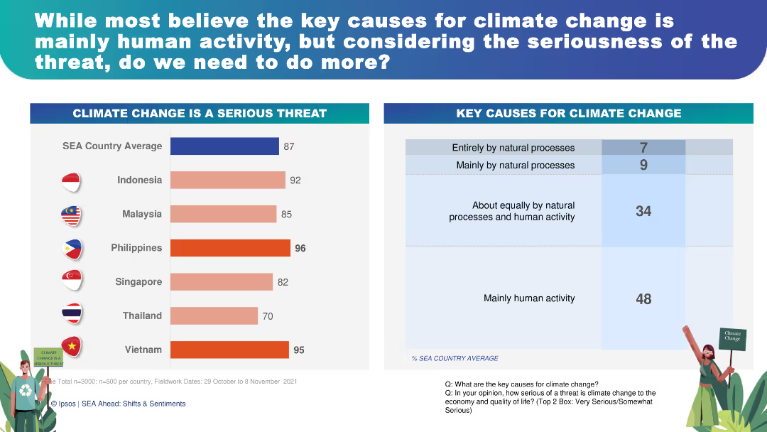
This slide features a combination of horizontal and vertical bar charts showing perceptions of climate change as a serious threat and its key causes. The charts are color-coded for easy interpretation, with accompanying text for clarity.
Risk Assessment and Management
Environmental Services & Sustainability
The slide presents survey results showing 87% of respondents consider climate change a serious threat, with 48% attributing it mainly to human activity. This can be used to discuss the urgency of climate action, public opinion on environmental issues, and strategies for risk management and mitigation.
climate change, public opinion, environmental risk, human activity, sustainability
Multiple Chart
IPSOS
Saved
The slide features a simple, dark background with a large, centered column chart showing underwriting revenues over several years.
Financial Performance
Financial Services
This slide presents a trend analysis of underwriting revenues in the Global Banking & Markets sector, using a column chart to show changes over time.
banking, markets, revenue, trend, underwriting
Single Chart
Goldman Sachs
Saved
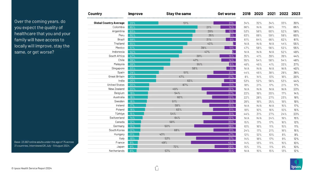
Stacked bar chart with three sentiment categories: Improve, Stay the Same, Get Worse; prompt on left.
Market Analysis and Trends
Healthcare & Pharmaceuticals
The chart illustrates expectations for future healthcare quality. Colombia and Argentina are most optimistic, while developed nations like Netherlands and France show pessimism or low optimism. It compares sentiment across time from 2018–2023.
future outlook, healthcare improvement, optimism, expectations, survey
Mixed Chart
IPSOS
Saved
The slide presents a mix of textual information and graphical data, including a column chart with color-coded categories and a side-by-side bar graph comparison. Layout is clear with distinct sections for text and graphics.
Operational Efficiency
Government & Public Sector
This slide analyzes the types of applications processed by the Appeal Division, their resolution methods, and the time taken to finalize these applications, emphasizing operational details and procedural efficiency.
appeal division, applications, finalization, judicial, efficiency
Multiple Chart
PwC/Strategy&
Saved
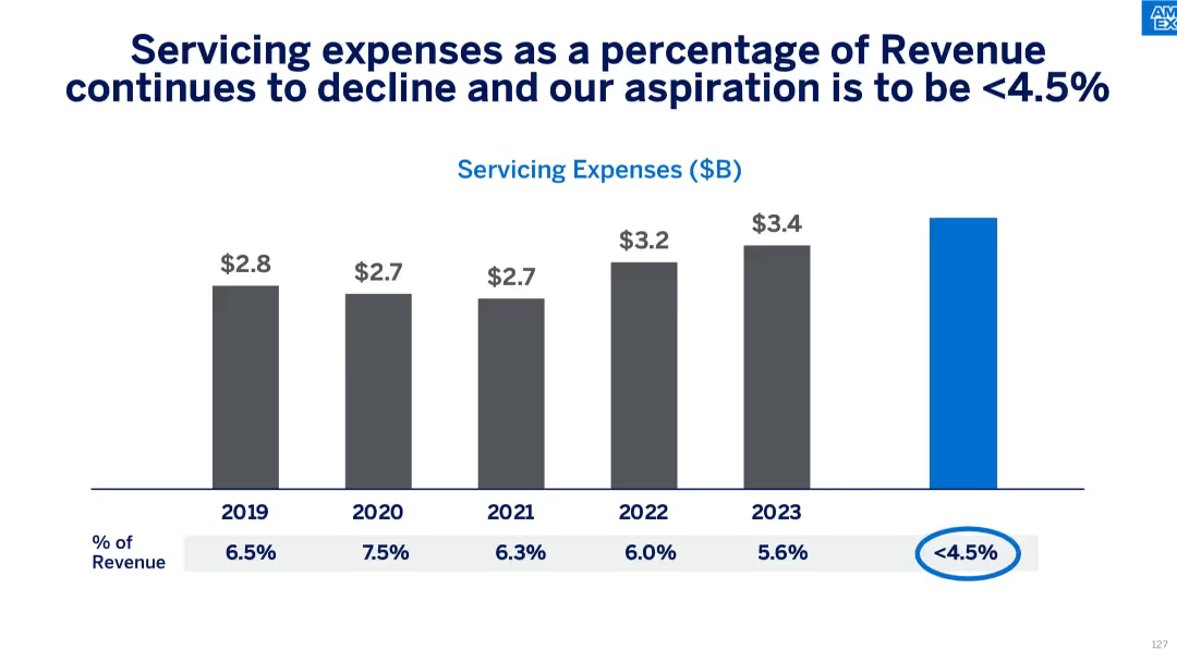
Gray vertical bar chart showing servicing costs and their percentage of revenue from 2019–2023 with future goal.
Operational Efficiency
Financial Services
The slide demonstrates a consistent decrease in servicing expenses as a percentage of revenue, with a goal of reaching under 4.5%. It supports Amex's efforts to improve operational cost efficiency and long-term financial planning.
servicing costs, efficiency, expense reduction, Amex targets, cost management, financial planning, operational strategy
Single Chart
McKinsey
Saved
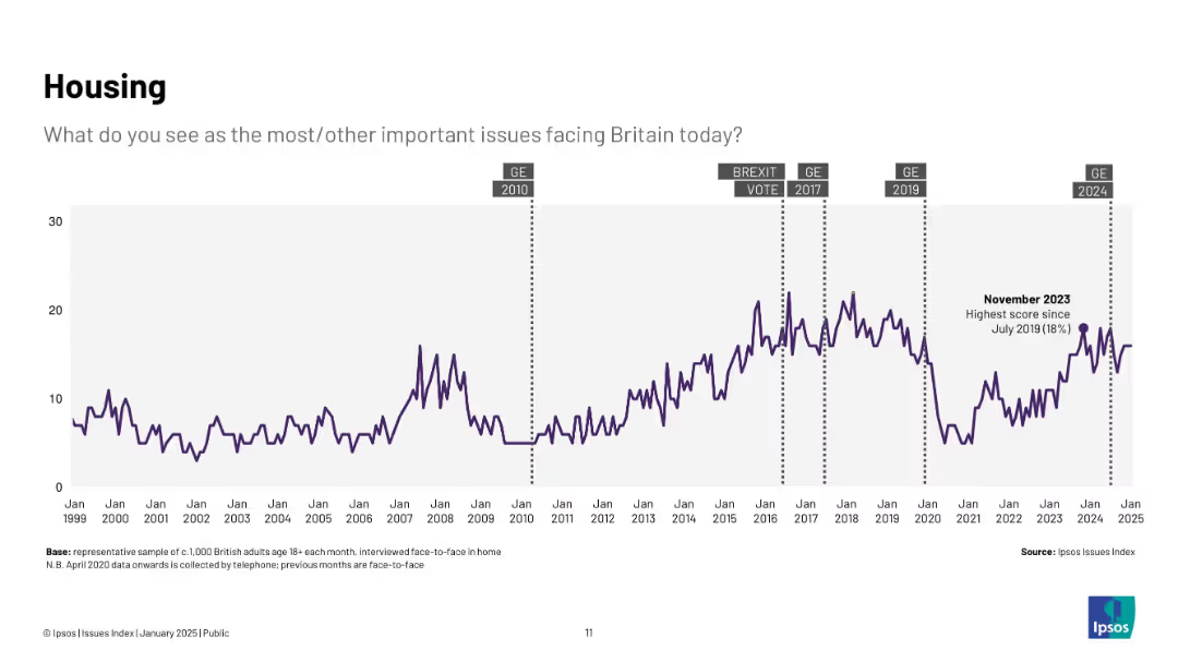
Longitudinal line graph from 1999–2025 with markers for political events (e.g., Brexit, general elections); one peak noted in Nov 2023 at 18%.
Market Analysis and Trends
Real Estate & Construction
Tracks public concern over housing issues across two decades, peaking during various political and economic shifts, with a notable spike in late 2023.
housing, affordability, UK, issues index, public opinion, trends, Brexit, elections
Single Chart
IPSOS
Saved
This slide has a text section and a bar chart. It visually represents the positive and negative impacts of political and social discussions at work as perceived by employees. The chart uses contrasting colors to differentiate between positive and negative impacts.
Organizational Structure and Change
Government & Public Sector
Explores the specific effects of discussions about political and social issues on employees' work environment, highlighting both the benefits, such as increased empathy and open-mindedness, and the drawbacks, like increased stress and isolation.
discussion impacts, workplace environment, empathy, stress
Single Chart
PwC/Strategy&
Saved
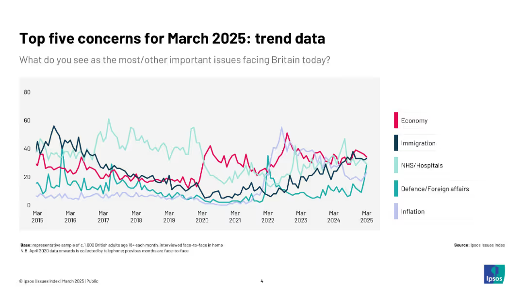
Line chart showing time-series data (2015–2025) for five top issues; each line color-coded by topic.
Market Analysis and Trends
Government & Public Sector
The slide tracks the changing importance of five key issues—economy, immigration, NHS, defence, and inflation—over the past decade. It visually emphasizes shifting public concern over time.
trends, top concerns, line chart, public opinion, decade, issues, Ipsos, UK
Single Chart
IPSOS
Saved
Text-heavy, focused on leveraging internal and external GBS services to enhance service quality and efficiency and colored pie charts
Strategic Planning
Professional Services
Describes strategic sourcing and the role of shared services in driving company-wide cost savings and service improvement.
strategic sourcing, GBS, services, cost savings, efficiency
Multiple Chart
Deloitte
Saved
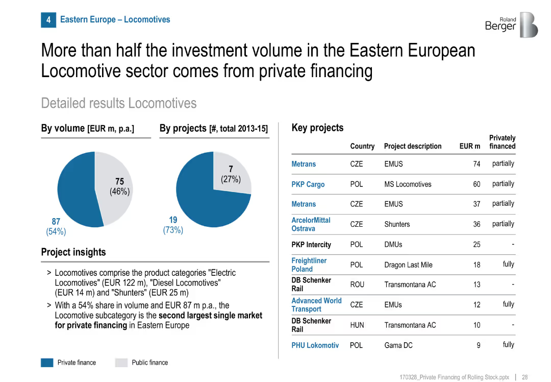
Pie charts show a 54% private finance share by volume, 27% by project count. Table with key projects and financing breakdown. Bullet-point insights on market subtypes.
Investment Analysis
Transportation & Logistics
Locomotives are the second-largest subcategory for private investment in Eastern Europe. Despite fewer private projects, they make up over half the investment volume.
locomotives, private finance, Eastern Europe, freight, investment, public-private mix, EMUs, shunters, MS locomotives
Mixed Chart
Roland Berger
Saved
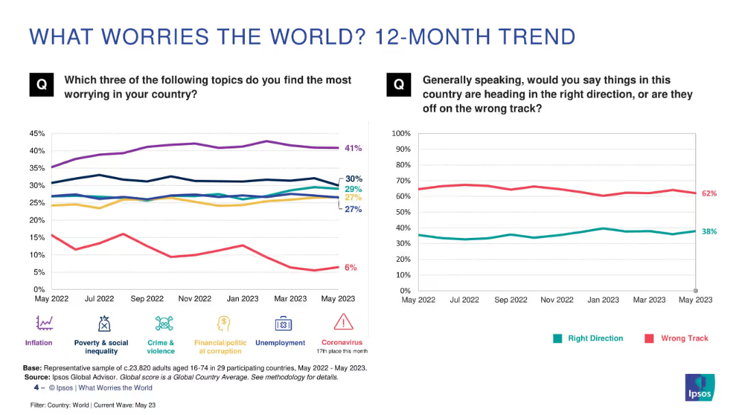
Two line charts comparing month-by-month concern levels and national sentiment trends over 12 months
Market Analysis and Trends
Professional Services
This slide tracks how public concerns and sentiment about national direction have changed over a year. Inflation shows a consistently high concern. The majority (62%) still feel their countries are on the wrong track, though the “right direction” metric has slightly improved over time.
trend, sentiment, inflation, inequality, year-over-year
Multiple Chart
IPSOS
Saved
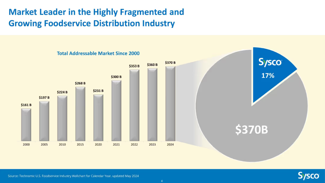
Bar chart (2000–2024) showing Total Addressable Market growth and pie chart for 2024 market share.
Market Analysis and Trends
Consumer Goods
This slide illustrates the expansion of the total addressable market for foodservice distribution in the U.S., which grew from $161B in 2000 to $370B in 2024. Sysco holds a 17% share of this growing market, highlighting its leadership.
foodservice, TAM, Sysco, market share, growth, bar chart, pie chart, distribution, industry size, leader
Multiple Chart
Barclays
Saved
Contains column charts detailing the adoption of diversity and inclusion practices by high-growth companies.
Strategic Planning
Professional Services
Evaluates the prevalence of DEI objectives in high-growth brands and their impact on corporate and social strategies.
DEI, marketing, high-growth, brands, diversity, inclusion, corporate strategy
Mixed Chart
Deloitte
Saved
Column chart (horizontal) showing the percentage breakdown of integration costs across various functional areas such as HR, IT, and Finance.
Financial Performance
Professional Services
Breaks down the integration costs by function, highlighting the proportion of expenses in HR, IT, and other areas, demonstrating cost distribution.
integration, costs, HR, IT, finance, cost breakdown, functional expenses
Single Chart
Deloitte
Saved
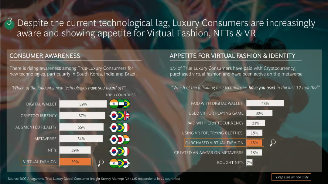
Dual-section layout: left side shows awareness stats with bar charts; right side displays usage stats for virtual fashion and identity with similar bar charts. Background includes a blurred virtual fashion image.
Customer and Market Segmentation
Consumer Goods
Shows growing awareness and usage of digital wallets, crypto, NFTs, AR/VR among luxury consumers, especially in South Korea, India, and Brazil. 1/5 have purchased virtual fashion or used crypto. Usage breakdown includes virtual payments, avatar creation, and VR try-ons.
luxury, NFTs, virtual fashion, consumer tech, awareness, usage trends, VR, crypto
Single Chart
BCG
Saved
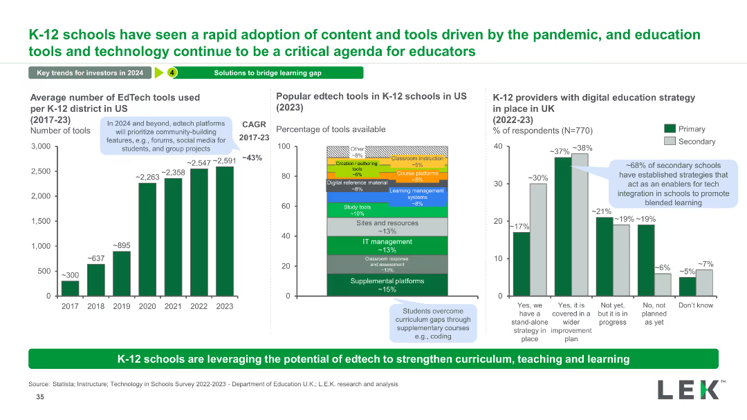
The slide has three charts: a column chart showing the average number of EdTech tools used from 2017 to 2023, a stacked bar chart of popular EdTech tools in 2023, and a column chart of UK schools with digital education strategies.
Technology and Digital Transformation
Education & Training
This slide highlights the rapid adoption of EdTech tools in K-12 schools, showing growth trends, popular tools, and digital strategies in UK schools.
EdTech, Tools, Adoption, K-12, Technology, Trends, Growth, Education, Digital, Strategy
Multiple Chart
LEK
Saved
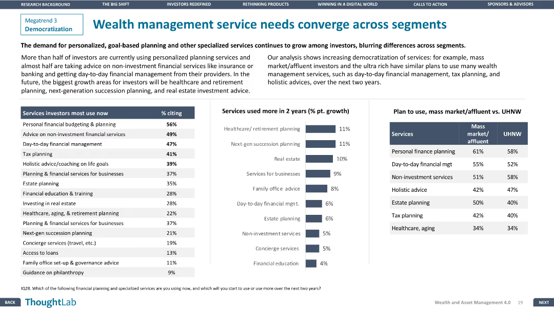
The slide features a column chart of services investors use now vs. in 2 years and a comparison table for mass market vs. UHNW plans.
Customer and Market Segmentation
Financial Services
The slide explores the convergence of wealth management services across different investor segments, highlighting growing demands for personalized services.
Wealth management, Service convergence, Financial Services, Segmentation, Personalized services
Mixed Chart
Deloitte
Saved
The slide is text-centric with a table format highlighting stages of the software development life cycle (SDLC) and corresponding technologies. Each technology is paired with a real-world company example, and the layout is direct with a clear delineation of information, utilizing minimal design elements for clarity.
Technology and Digital Transformation
Technology & Software
Highlighting successful industry applications of next-gen software development tools, this slide gives examples of companies like Decathlon and Atlassian leveraging technologies such as infrastructure-as-code and AI-based reviews. It serves as a practical insight into how these tools are applied in business contexts.
SDLC, Case Studies, Software Development, Infrastructure-as-Code, AI, Atlassian, Decathlon
Header Vertical
McKinsey
Saved
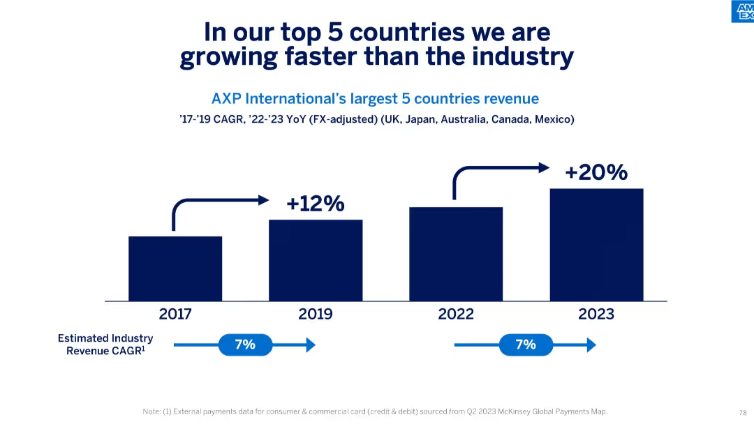
Simple stacked bar chart comparing growth percentages vs industry, 2017–2023.
Competitive Landscape
Financial Services
This slide compares AXP’s growth in its top 5 international markets (UK, Japan, Australia, Canada, Mexico) to the estimated industry CAGR of 7%, highlighting that AXP’s revenue grew significantly faster—20% in 2023 alone.
growth rate, top markets, international expansion, industry benchmark, CAGR, revenue, FX-adjusted, competitive edge
Single Chart
McKinsey
Saved
This slide presents column charts showing the growth of gaming revenues in Hong Kong and Singapore from 2020 to 2025, differentiating between traditional and social/casual gaming with red and grey bars. The slide layout is clear with annotations explaining shifts due to the pandemic.
Market Analysis and Trends
Media & Entertainment
Discusses the shifting dynamics of the gaming industry in Hong Kong and Singapore between 2020 and 2025, highlighting how pandemic-related changes affected traditional and social/casual gaming revenues. It points out Singapore's rise as a gaming hub due to policy support.
gaming industry, Hong Kong, Singapore, revenue trends, pandemic impact
Multiple Chart
PwC/Strategy&
Saved
The slide includes a bar chart showing various use cases for DCRs like data anonymization, privacy compliance, data cleaning, and transformation, with percentages for each.
Technology and Digital Transformation
Technology & Software
The slide explains the main use cases for data clean rooms (DCRs) among current users, emphasizing their role in addressing privacy concerns and audience activation.
DCR use cases, privacy, data anonymization, compliance
Single Chart
IPSOS
Saved
Includes a map of Australia showing different GDP uplifts in various regions, complemented by bar charts comparing the effects in remote, regional, and city areas.
Strategic Planning
Telecommunications
Analyzes geographical disparities in economic benefits from broadband speed increases, highlighting the greater impact on remote areas.
broadband access, regional development, economic disparity, GDP uplift, remote areas, strategic planning, risk management, public sector, telecommunications
Multiple Chart
Accenture
Saved
Contains multiple bar charts tracking the Purchasing Managers’ Index by country and month, color-coded by performance levels.
Operational Efficiency
Industrial & Manufacturing
This slide tracks manufacturing performance globally, useful for assessing economic health and recovery momentum in the industrial sector.
manufacturing, PMI, global industry, economic recovery, performance tracking
Multiple Chart
BCG
Saved
Features bullet points, bold headers, and a large pie chart illustrating market growth by 2030. Graphical elements are well-spaced and the slide is easy to read.
Market Analysis and Trends
Transportation & Logistics
Explores the growth potential in sustainable mobility due to regulatory changes and market electrification, stressing on the expected market evolution and Faurecia's strategic positioning to leverage these opportunities.
sustainability, mobility, market growth, electrification, regulations, 2030
Boxed
Deutsche Bank
Saved
Previous
Next
If nothing, comes up, please save your slides first
Create a FREE account to continue browsing
Receive Instant Access to 1,000+ slides from companies like McKinsey, Google, and Goldman Sachs
First Name
Last Name
Email
Password
I agree to all
Terms & Privacy Policy
Thank you! Your submission has been received!
Oops! Something went wrong while submitting the form.
Have an account?
Sign in
Column Chart
Heatmap
Chevron
Org Chart
Infographic
Callouts
Timeline
List
Graphic
Picture
Process Flow
Diagram
Paragraph
Map
Table
Framework
Subtitle
Takeaway Box
Icon
Other Chart
Radar Chart
Waterfall Chart
Mekko Chart
Pie Chart
Scatter Plot
Line Chart
Bar chart
Bullet points