Create a FREE Account
Instant access to 1,000+ real slides from top companies like McKinsey, BCG, Goldman Sachs, Google and many more!
First Name
Last Name
Email
Password
I agree to all
Terms & Privacy Policy
Thank you! Your submission has been received!
Oops! Something went wrong while submitting the form.
Have an account?
Sign in
Library
Templates
Courses
Pricing
My Account
My Slides
My Templates
✦ AI
AI Prompt Library
AI Search
Sign in
Start Here
Logout
My Saved Slides
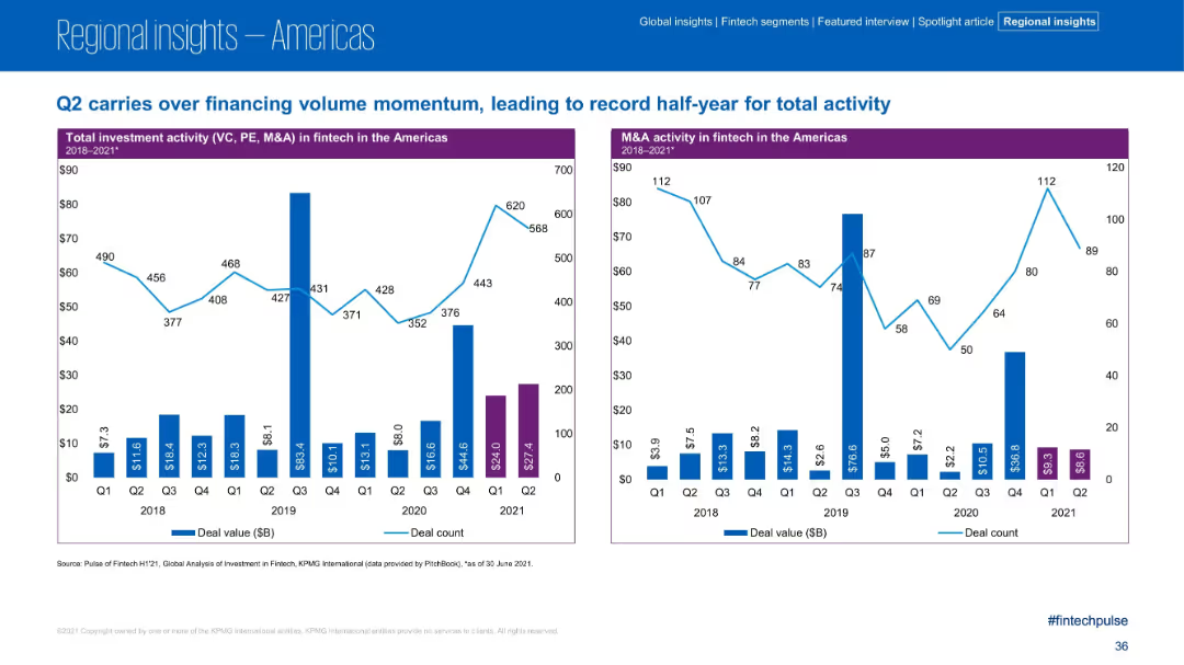
Dual bar charts showing investment and M&A activity quarterly from 2018 to 2021; purple bars for 2021 H1; clean timeline format
Financial Performance
Financial Services
Q2 2021 continues the upward trend in fintech investment and M&A activity, contributing to a record-setting first half. The charts track deal value and count quarterly, with Q2 2021 showing strong deal volume and sustained momentum across investment and M&A in the Americas.
Q2 2021, deal volume, investment trends, M&A activity, fintech, historical data, H1 record
Multiple Chart
KPMG
Saved
Features a timeline with overlapping circles and a balanced mix of colors to denote different phases from submission to decision, accompanied by minimal textual content.
Operational Efficiency
Professional Services
Details the annual review process for corporate reporting awards, highlighting critical timelines, staff involvement, and decision phases, ideal for understanding organizational workflows.
corporate reporting, review process, timelines, awards, decision making
Linear Flow
PwC/Strategy&
Saved
Presents a bar chart illustrating the change in global buyout value over years, with the latest year highlighted in red.
Investment Analysis
Financial Services
Discusses the significant drop in global buyout value in 2022, providing insights into the private equity market conditions.
Private Equity, Buyout Value, Market Analysis, 2022 Drop, Investment Trends, Bar Chart, Equity Market Conditions
Mixed Chart
Bain
Saved
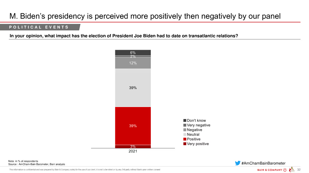
Column chart depicting perceptions of President Joe Biden's impact on transatlantic relations, with segmented responses indicating varying degrees of positivity and negativity.
Market Analysis and Trends
Government & Public Sector
Shows the impact of President Joe Biden's election on transatlantic relations, with a majority seeing it positively, as indicated by a survey of respondents.
Biden, transatlantic, relations, perceptions, survey
Single Chart
Bain
Saved
Includes diagrams and lists describing AI technology components and market growth predictions.
Technology and Digital Transformation
Technology & Software
Discusses the structural and capability growth within AI sectors, projecting significant market expansion through 2023.
AI Technology, Market Growth, 2023, Data Processing, Machine Learning, Predictive Analytics, Technology Expansion
Linear Flow
BCG
Saved
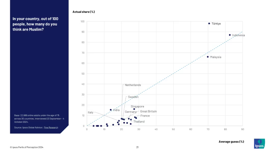
Scatter plot with actual % (Y-axis) vs perceived % (X-axis); notable overestimators annotated.
Market Analysis and Trends
Government & Public Sector
A scatter plot visualizing how countries estimate their Muslim populations compared to actual figures. It reveals a strong tendency for overestimation, especially in low-Muslim-population countries like France and Germany.
religion perception, scatter plot, Muslim population, demographic error, Ipsos study, data visualization, public misunderstanding
Mixed Chart
IPSOS
Saved
Features a column chart displaying percentages of brands in different maturity stages, using varying shades of green. The design is straightforward, highlighting key data points effectively.
Market Analysis and Trends
Media & Entertainment
Analyzes the digital marketing maturity of Asia Pacific brands, showing only 2% are at the 'Multi-moment' maturity stage. It provides insights into the distribution of digital marketing maturity among these brands, useful for benchmarking and strategic planning in marketing initiatives.
digital marketing, Asia Pacific, brand maturity, multi-moment, marketing analysis, strategic planning, benchmarking, maturity distribution, column chart
Single Chart
BCG
Saved
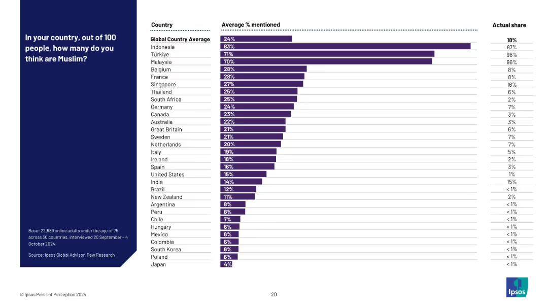
Bar chart listing countries with average perceived % Muslim and actual % side-by-side.
Market Analysis and Trends
Government & Public Sector
This slide displays the public perception of Muslim populations across different countries, comparing them with actual data. It highlights consistent overestimation, particularly in countries with small actual Muslim populations.
religious demographics, Muslim population, public misperception, belief vs fact, Ipsos survey, minority estimate, global religion stats
Mixed Chart
IPSOS
Saved
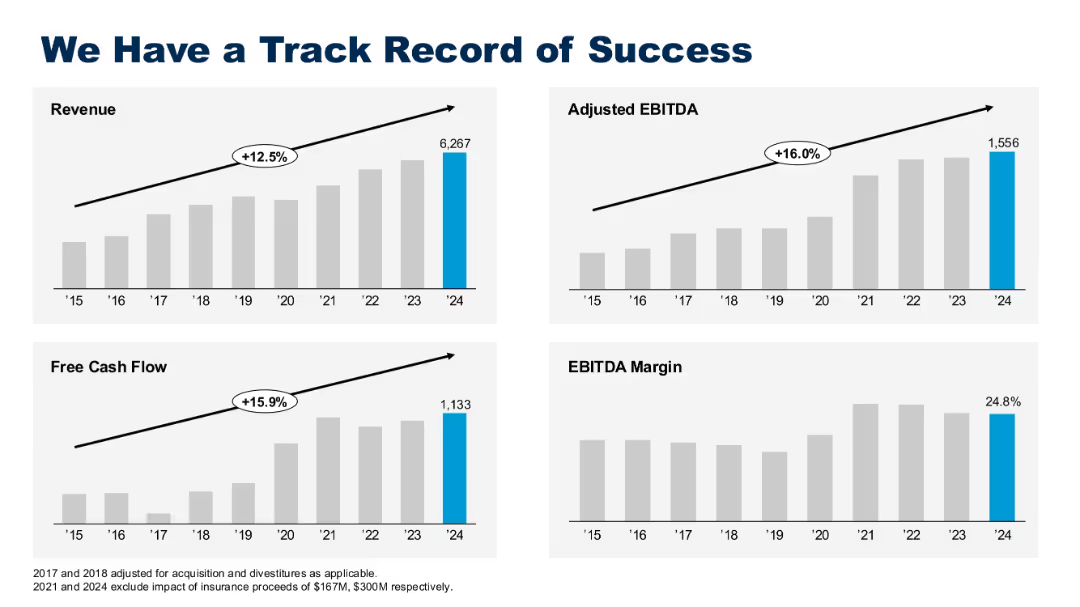
Four bar graphs for revenue, adjusted EBITDA, free cash flow, and EBITDA margin, with CAGR labels.
Financial Performance
Technology & Software
This slide showcases Gartner’s financial growth from 2015 to 2024, with double-digit CAGR in revenue, EBITDA, and free cash flow. It emphasizes operational stability and strong EBITDA margins nearing 25%.
revenue growth, EBITDA, cash flow, CAGR, success, financials, track record, margin, Gartner
Multiple Chart
Gartner
Saved
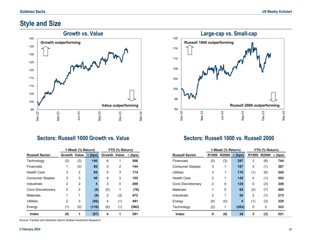
Dual line charts at the top for “Growth vs. Value” and “Large-cap vs. Small-cap.” Tables below show Russell sector performance by style (growth/value) and size (Russell 1000/2000) including 1-week and YTD % returns and basis point spreads.
Performance Metrics and KPIs
Financial Services
This slide analyzes style (growth vs. value) and size (large-cap vs. small-cap) performance. Growth stocks and large-caps are outperforming YTD. The lower tables quantify returns for various sectors by style and size exposure, offering a more nuanced performance assessment. It helps investors understand capital flow dynamics and market sentiment around size and value/growth preferences.
growth vs. value, large-cap, small-cap, Russell 1000, Russell 2000, sector returns, basis points, YTD performance, market style
Multiple Chart
Goldman Sachs
Saved
Comprises a single line chart depicting the trend of digital marketing budget increases over the past decade with annotations for key data points.
Market Analysis and Trends
Professional Services
This slide outlines the historical growth and future expectations for digital marketing budgets, highlighting a steady rise in investment.
digital marketing, budgets, growth, trends
Single Chart
Deloitte
Saved
A column chart compare the year-on-year growth of different luxury product categories like shoes, jewelry, and beauty products.
Market Analysis and Trends
Retail & E-commerce
Examines the specific categories driving growth in the luxury market in 2018, highlighting the success of accessories and beauty products.
market growth, luxury products, beauty industry, accessories, sales analysis
Mixed Chart
Bain
Saved
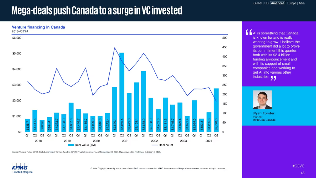
Bar and line graph of Canadian deal values and counts, with a text box quoting a KPMG partner.
Financial Performance
Financial Services
The chart shows quarterly Canadian VC deal activity, highlighting recent spikes due to mega-deals. A quote from a KPMG partner emphasizes Canada’s strategic investment in AI and the government's role in enabling ecosystem growth.
Canada, VC, mega-deals, AI, funding spike, government support, KPMG, deal value, ecosystem, investment
Mixed Chart
KPMG
Saved
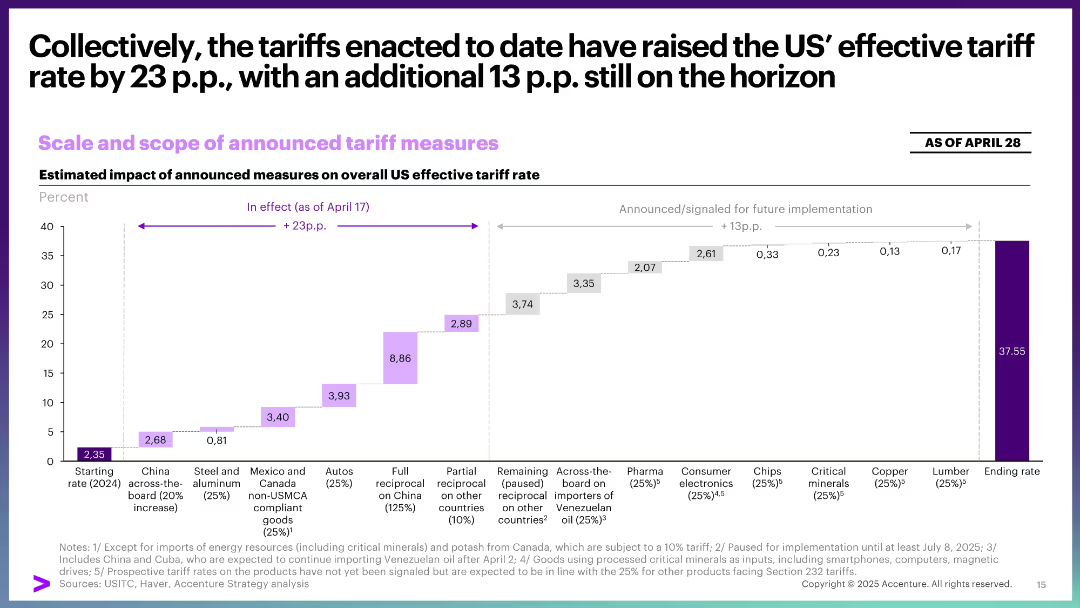
Waterfall chart illustrating cumulative increase in effective tariff rate from 2024 to 2025 across product categories.
Financial Performance
Government & Public Sector
This slide quantifies the cumulative impact of enacted and proposed tariffs, estimating a total increase of 36.9 percentage points in effective tariff rates. It breaks down contributions by category and timing.
effective tariff rate, US trade, waterfall chart, policy impact, pricing, implementation timeline
Single Chart
Accenture
Saved
The slide features a diagram and detailed table presenting the total potential of forestry residues for energy production by 2060, including theoretical, technical, and sustainable potentials, and various factors affecting its scalability and sustainability constraints.
Technology and Digital Transformation
Energy & Utilities
This slide provides a deep-dive into the potential of forestry residues as a feedstock for energy production, analyzing its total potential by 2060 and highlighting the scalability issues and sustainability constraints associated with its use.
forestry residues, feedstock, total potential, energy production, 2060, scalability, sustainability constraints
Mixed Chart
Kearney
Saved
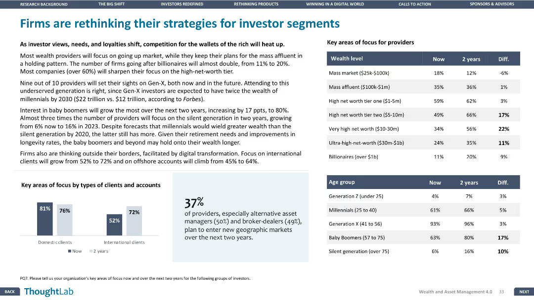
Column charts displaying key areas of focus for providers by wealth level and age group. Design is structured and clear, presenting comparative data effectively.
Strategic Planning
Financial Services
Discusses shifts in firm strategies for different investor segments, with data on focus areas for providers by wealth level and age group over the next two years.
strategies, investors, segments, focus, data
Mixed Chart
Deloitte
Saved
Slide contains column chart and data points representing financial performance metrics for FY23.
Financial Performance
Financial Services
Detailed annual financial performance review of FY23, focusing on key metrics such as RoTE, income, and costs, beneficial for financial analysis and shareholder reports.
financial, performance, RoTE, income, costs
Mixed Chart
Barclays
Saved
A scatter plot showing the relationship between system strength and revenue growth during the pandemic. Accompanied by a strategy recommendation text.
Strategic Planning
Technology & Software
This slide provides strategic recommendations based on system strength and IT budget allocation, illustrated by a scatter plot showing revenue growth trends.
Systems Strength, Revenue Growth, Strategy, Pandemic, Recommendations
Single Chart
Accenture
Saved
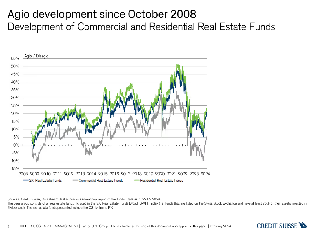
Line chart showing the development of commercial and residential real estate funds' agio/disagio since 2008.
Market Analysis and Trends
Real Estate & Construction
Illustrates the trends in agio/disagio for commercial and residential real estate funds post-2008 financial crisis.
real estate, agio, disagio, commercial, residential, 2008
Single Chart
Credit Suisse
Saved
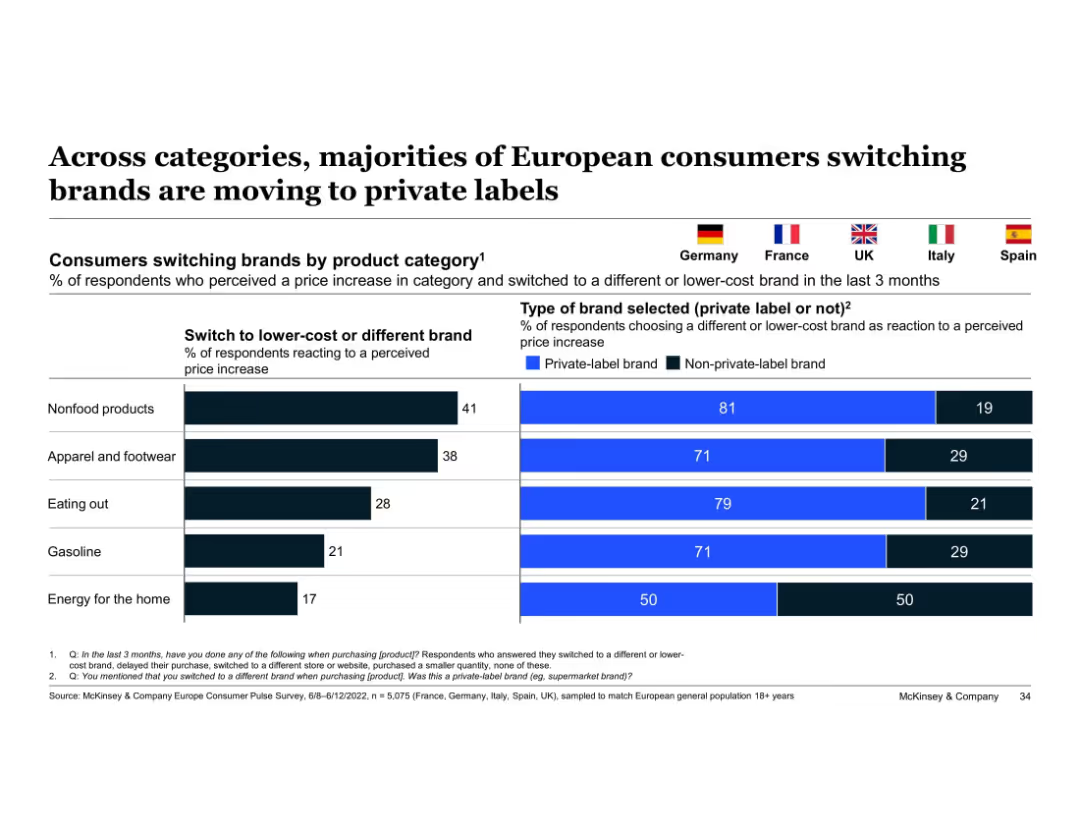
Split bar chart and horizontal bars; flags represent countries; uses blue and black color coding
Customer and Market Segmentation
Consumer Goods
Shows the percentage of consumers switching to lower-cost brands by category and highlights the share selecting private-label brands. Key insight: majority prefer private-label options in response to price increases across categories.
private-label, price sensitivity, brand switching, consumer behavior, categories, Europe, McKinsey, apparel, nonfood, eating out
Single Chart
McKinsey
Saved
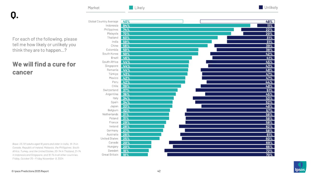
Horizontal bar chart; ranked likelihood by country; teal and navy color coding for likelihood and unlikelihood
Strategic Planning
Healthcare & Pharmaceuticals
This slide reflects global beliefs on the likelihood of a cancer cure. Indonesia and the Philippines are most hopeful, with an overall global likelihood of 40%.
healthcare, cancer, medical breakthrough, global opinion, research, hope, cure, innovation, prediction, Ipsos
Mixed Chart
IPSOS
Saved
Two line charts side by side. Left chart titled "US Credit Card Delinquency Rates" with lines representing "100 Largest Banks" and "Other Banks" from 1985-2023. Right chart titled "US Commercial Bank Interest Rates: Credit Card" showing a single line trend from 1985-2023.
Market Analysis and Trends
Financial Services
This slide presents a comparison of credit card delinquency rates among different banks over time, alongside the trend in commercial bank interest rates for credit cards. Intended for financial analysis and prediction of market behavior.
delinquency, interest rates, credit card, banks, trend
Multiple Chart
Morgan Stanley
Saved
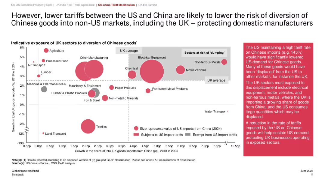
Bubble chart showing UK sectors exposed to Chinese import diversion; bubble size reflects import value; shaded zones highlight sectoral risk; annotation box explains implications.
Risk Assessment and Management
Government & Public Sector
This slide highlights how reduced US tariffs on Chinese imports lower the risk of goods being diverted into the UK market, mitigating the dumping risk for domestic manufacturers. Sectors like electrical equipment and motor vehicles are most exposed. Bubble sizes represent 2024 import values.
Chinese imports, sector exposure, dumping risk, UK manufacturing, tariff reduction, import diversion, bubble chart, global trade, domestic protection
Mixed Chart
PwC/Strategy&
Saved
The slide features a column chart showing various DeFi uses for crypto assets in 2022 and 2023, with percentage breakdowns for activities like yield earning.
Market Analysis and Trends
Financial Services
It explores how crypto owners engage in DeFi activities, such as yield earning and trading on decentralized exchanges, with comparative data from 2022 to 2023.
DeFi, crypto assets, 2023, 2022, yield earning, decentralized exchanges, trading, activities
Mixed Chart
IPSOS
Saved
The slide presents a process flow diagram showing stages of the information value chain.
Operational Efficiency
Professional Services
The slide explains Ipsos' involvement at all stages of the information value chain, from data collection to insights.
information value chain, data collection, insights, analytics, Ipsos
Diagram
IPSOS
Saved
Previous
Next
If nothing, comes up, please save your slides first
Create a FREE account to continue browsing
Receive Instant Access to 1,000+ slides from companies like McKinsey, Google, and Goldman Sachs
First Name
Last Name
Email
Password
I agree to all
Terms & Privacy Policy
Thank you! Your submission has been received!
Oops! Something went wrong while submitting the form.
Have an account?
Sign in
Column Chart
Heatmap
Chevron
Org Chart
Infographic
Callouts
Timeline
List
Graphic
Picture
Process Flow
Diagram
Paragraph
Map
Table
Framework
Subtitle
Takeaway Box
Icon
Other Chart
Radar Chart
Waterfall Chart
Mekko Chart
Pie Chart
Scatter Plot
Line Chart
Bar chart
Bullet points