Create a FREE Account
Instant access to 1,000+ real slides from top companies like McKinsey, BCG, Goldman Sachs, Google and many more!
First Name
Last Name
Email
Password
I agree to all
Terms & Privacy Policy
Thank you! Your submission has been received!
Oops! Something went wrong while submitting the form.
Have an account?
Sign in
Library
Templates
Courses
Pricing
My Account
My Slides
✦ AI
AI Prompt Library
AI Search
Sign in
Start Here
Logout
My Saved Slides
The slide presents a graph showing carbon abatement cost versus grid emissions for various business cases in different countries.
Market Analysis and Trends
Energy & Utilities
The slide evaluates the benefits and costs of electrolysis for different applications, emphasizing the impact of a country’s energy mix on its effectiveness.
electrolysis, energy mix, carbon abatement, benefits, country analysis
Single Chart
Kearney
Saved
A combined column chart and line chart depicting risk culture maturity across major industry groups, with detailed narrative text.
Risk Assessment and Management
Healthcare & Pharmaceuticals
Examines the maturity of risk culture across different industry sectors, highlighting those with mandatory training and strong compliance measures. Includes measurement of risk management maturity.
Risk culture, maturity, industry groups, healthcare, compliance, risk management, training, sectors, maturity measurement
Mixed Chart
PwC/Strategy&
Saved
Line charts showing US job opening rates and labor force participation rates from January 2006 to January 2024.
Operational Efficiency
Professional Services
Indicates balanced US labor market conditions with reduced churn and slower labor demand, suggesting gradual cooling of wage growth.
labor demand, job openings, labor force, participation rates, wage growth, line chart, market conditions, US, 2006-2024
Multiple Chart
EY
Saved
The slide shows a comparative bar chart indicating preferences for different ways to access connected services and media in cars among consumers in Germany, the US, and China.
Product and Service Analysis
Consumer Goods
This slide presents data on consumer preferences for accessing connected services and media in cars, highlighting a strong preference for smartphone mirroring over other methods in Germany, the US, and China.
smartphone mirroring, connected services, consumer preferences, Germany, US, China, bar chart
Multiple Chart
PwC/Strategy&
Saved
Presents column charts tracking revenue and productivity growth alongside strategic highlights about Serasa's market position in Brazil.
Market Analysis and Trends
Financial Services
Details the growth of the Serasa platform in Brazil, highlighting its financial success and strategic position within the market as a comprehensive consumer financial platform.
Serasa, Brazil, financial growth, market analysis, consumer finance
Multiple Chart
Barclays
Saved
The slide displays a stylized image of a sailing boat on blue waters with mountains in the background, under a bright yellow sun. The Vietnamese flag is visible on the boat, and a lighthouse stands on a green landmass. The graphical elements are simplistic, making it visually clear and uncluttered. The country name "Vietnam" is boldly placed.
Industry Overview
Hospitality & Tourism
The slide is a visual representation meant to showcase Vietnam, likely to be used in a context of discussing tourism, hospitality, or geographical overviews. The image conveys a sense of place and is likely to engage an audience with an interest in the region or in travel-related topics.
Vietnam, tourism, sailing, lighthouse, hospitality, travel, geography, image representation
Title
Bain
Saved
Flowchart-style diagram showing stakeholder interactions in the ecosystem with directional arrows, text boxes, and pain points highlighted in blue.
Operational Efficiency
Transportation & Logistics
The slide maps out interactions among key stakeholders in bike sharing—operators, customers, regulators, integrators, and IT providers—highlighting collaboration pain points like regulation, infrastructure, and data issues.
bike sharing, ecosystem, stakeholder roles, pain points, infrastructure, IT providers, mobility
Diagram
Roland Berger
Saved
Slide includes timelines and column charts detailing planned capital distributions over several years.
Strategic Planning
Financial Services
Outlines a multi-year plan for capital returns to shareholders, with specific targets set for 2024-2026.
capital, planning, 2026, returns, shareholders
Linear Flow
Barclays
Saved
This slide consists of four column charts contrasting average attendances for final order finalisation in FCoA and FCC, split into non-trial and trial attendances, annotated with percentage differences. The design is clear with red and yellow colors.
Regulatory and Compliance
Government & Public Sector
The slide analyzes court attendances per final order finalisation, revealing a stark contrast between trial and non-trial cases, and between FCoA and FCC, suggesting a double attendance requirement for FCoA litigants proceeding to trial.
court attendances, trial, non-trial, FCoA, FCC, final order finalisation
Mixed Chart
PwC/Strategy&
Saved
Features a line graph comparing trends in residential and nonresidential construction spending in the U.S. The slide is detailed with continuous data lines in different colors for distinction.
Market Analysis and Trends
Real Estate & Construction
Reviews trends in U.S. construction spending, highlighting the growth in residential and nonresidential sectors. This slide is useful for market analysis in real estate and construction sectors, offering insights into economic health and development opportunities.
Construction, Real Estate, US, Spending Trends, Growth Analysis
Single Chart
Deutsche Bank
Saved
This slide includes a line chart showing the advertised primary retail market prices for Dot-Com domains from 2012 to 2020. It uses different colors to differentiate between new domain registrations and renewals, with annotations explaining price trends.
Pricing Strategies
Telecommunications
The slide analyzes the advertised primary retail market prices for Dot-Com domains, noting that renewal prices have increased since 2017 while new domain prices have remained stable. It provides insights into pricing stability and recent trends.
Dot-Com domains, pricing, renewals, new registrations, price trends
Mixed Chart
BCG
Saved
Black-themed layout with two vertical bar comparisons and magnifying glass icon showing adjustment logic; simple structure.
Strategic Planning
Consumer Goods
Announces a ~2% adjustment to the 2023 market perimeter for personal luxury goods (€362B to €369B) based on inclusion of global insurgent and scaled-up regional brands.
market adjustment, perimeter, luxury goods, strategic planning, valuation, brands
Single Chart
Bain
Saved
Bar chart comparing Return on Equity (RoE) across banks for Q2 and Q3’24, including change annotations. Left-side summary box offers context.
Financial Performance
Financial Services
RoE improved to 17.4% QoQ due to higher net income. ALRAJHI and RIBL led gains, while SAB and ANB declined. Slide compares Q2 and Q3’24 to show where profitability improved or worsened. Visual indicators make changes across banks easy to interpret.
return on equity, profitability, ALRAJHI, RIBL, SAB, ANB, Q3 2024
Mixed Chart
Alvarez & Marsal
Saved
Horizontal bar chart ranking countries by agreement level with the statement. Green for agree, purple for disagree. Includes change from previous years.
Regulatory and Compliance
Environmental Services & Sustainability
This slide compares perceptions of government clarity on climate action plans. China, India, and Indonesia top agreement scores, while European countries show skepticism. Right-side column notes yearly change in agreement.
government climate plans, public perception, country ranking, Ipsos, sustainability, Earth Day, regulatory clarity, trend data
Mixed Chart
IPSOS
Saved
Line chart with CAGR data for regions and countries from 2012–2021
Market Analysis and Trends
Industrial & Manufacturing
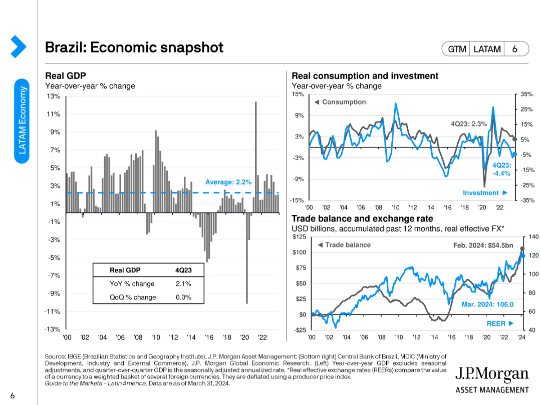
This macroeconomic slide analyzes real GDP growth trends, emphasizing strong historic and projected growth in India and China, and a recovery in Brazil impacting industrial demand.
GDP, macroeconomics, Brazil, India, China, growth, forecast, industry
Single Chart
Roland Berger
Saved
The slide includes text blocks with points about GCC countries' potential for CCUS, including geological storage capacity and government plans.
Strategic Planning
Energy & Utilities
Discusses the potential for CCUS in GCC countries, citing geological capacity, emission statistics, and governmental commitment to reducing CO2 emissions.
GCC, CCUS, potential, geological storage, government plans, CO2 emissions, strategic planning
Multiple Chart
Kearney
Saved
The slide features a combination of column charts and horizontal bar charts. It shows familiarity levels with crypto assets in 2023 and 2022, highlighting high and low familiarity percentages.
Market Analysis and Trends
Financial Services
This slide compares the familiarity of Canadians with crypto assets over two years, breaking down the familiarity into high, moderate, and low categories, with demographic insights.
familiarity, crypto assets, Canadians, demographics, comparison
Mixed Chart
IPSOS
Saved
Left half shows a trust driver chart for technology sector; right side features an image with bold text on changing perception of Silicon Valley culture.
Market Analysis and Trends
Technology & Software
This slide tracks how public trust drivers for technology companies have changed over time, focusing on aspects like leadership and responsibility. A narrative image emphasizes the fading glamour around Silicon Valley, suggesting a cultural shift in how tech companies are viewed.
technology sector, trust perception, Silicon Valley, corporate behavior, trend analysis, public trust, values
Mixed Chart
IPSOS
Saved
Bar graph of global true-luxury market split (personal vs. experiential), CAGR evolution shown in bubbles
Market Analysis and Trends
Consumer Goods
This slide showcases the rebound of the personal luxury market and the rise of experiential luxury. Growth metrics from 2014 to 2026 are visualized through a bar graph and CAGR bubbles, highlighting recovery from Covid and expected strong performance ahead.
luxury market, experiential, personal goods, CAGR, recovery, growth forecast, BCG, consumer behavior
Single Chart
BCG
Saved
Grid layout with categorized procurement domains and color-coded bars for use case types; minimalistic icons and headers.
Product and Service Analysis
Professional Services
This slide outlines 8 major areas in procurement where Generative AI can create value—ranging from spend intelligence to supplier performance and stakeholder communication—mapped under procurement functions like P2P and sourcing.
procurement, GenAI, sourcing, supplier management, spend analysis, RFP, negotiation
Linear Flow
McKinsey
Saved
This slide contains two vertical column charts. The left chart, 'Quarterly CLO Creation and Mutual Fund Flows', shows data in blue tones, with pattern differentiation for CLOs, Loan Funds, and the total. The right chart, 'Institutional Loan Volume Backing M&A', features dark and light blue bars representing different types of loans.
Investment Analysis
Financial Services
The left chart analyzes the trends in CLO creation versus mutual fund flows, suggesting an investment climate. The right chart details the volume of institutional loans supporting mergers and acquisitions, indicating market activity and investor sentiment.
CLO Creation, Mutual Fund Flows, Institutional Loans, M&A, LBO, PE-backed, Corporate, Investment Climate, Market Activity
Multiple Chart
Morgan Stanley
Saved
This slide contains multiple column charts across a timeline from 1996 to 2019, separated into phases labeled "Sortie du temple," "Democratization," "Crisis," and others.
Market Analysis and Trends
Consumer Goods
The slide presents a timeline of the luxury goods market growth from 1996 to 2019, highlighting various market phases and projecting growth. It is used to analyze market trends.
Luxury goods, Market growth, Crisis, Projection
Single Chart
Bain
Saved
The slide contains a column chart displaying total revenues in millions, with key financial metrics highlighted in side annotations.
Financial Performance
Financial Services
The slide shows a 15% increase in underlying revenues quarter-over-quarter, with detailed figures for cumulative PPA effects and integration items.
revenues, QoQ, PPA effects, financial performance, integration items
Mixed Chart
UBS
Saved
Bubble chart plotting 10-year return vs. correlation to 60/40 portfolio; bubbles sized by yield and grouped by asset class.
Investment Analysis
Financial Services
Evaluates alternative asset classes based on historical return, correlation with traditional portfolios, and yield. Highlights relative positioning of sectors like private equity, infrastructure, and hedge funds in risk/return space.
alternative investments, correlation, yield, return, private equity, hedge funds, infrastructure, bubble chart
Multiple Chart
JP Morgan
Saved
This slide contains column charts comparing the distribution of survey respondents across various industries from 2018 to 2020. It uses a color gradient to differentiate industries and provides percentage labels for clarity.
Market Analysis and Trends
Professional Services
Compares industry distribution of survey respondents in Europe from 2018 to 2020, showing shifts in participant demographics across sectors like technology, financial services, and consumer markets. Useful for understanding industry-specific trends in survey data.
survey data, industry distribution, Europe, 2018-2020
Multiple Chart
PwC/Strategy&
Saved
Previous
Next
If nothing, comes up, please save your slides first
Create a FREE account to continue browsing
Receive Instant Access to 1,000+ slides from companies like McKinsey, Google, and Goldman Sachs
First Name
Last Name
Email
Password
I agree to all
Terms & Privacy Policy
Thank you! Your submission has been received!
Oops! Something went wrong while submitting the form.
Have an account?
Sign in
Column Chart
Heatmap
Chevron
Org Chart
Infographic
Callouts
Timeline
List
Graphic
Picture
Process Flow
Diagram
Paragraph
Map
Table
Framework
Subtitle
Takeaway Box
Icon
Other Chart
Radar Chart
Waterfall Chart
Mekko Chart
Pie Chart
Scatter Plot
Line Chart
Bar chart
Bullet points