Create a FREE Account
Instant access to 1,000+ real slides from top companies like McKinsey, BCG, Goldman Sachs, Google and many more!
First Name
Last Name
Email
Password
I agree to all
Terms & Privacy Policy
Thank you! Your submission has been received!
Oops! Something went wrong while submitting the form.
Have an account?
Sign in
Library
Templates
Courses
Pricing
My Account
My Slides
My Templates
✦ AI
AI Prompt Library
AI Search
Sign in
Start Here
Logout
My Saved Slides
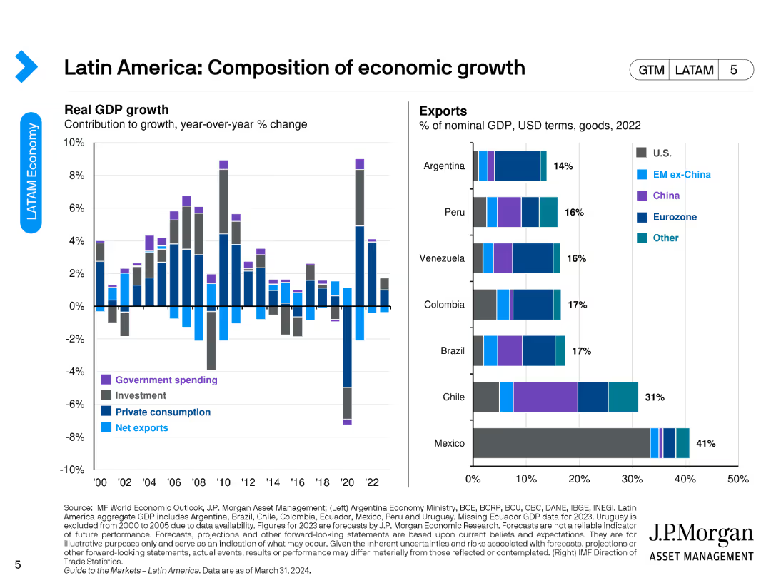
The slide contains a bar chart displaying the composition of GDP growth (government spending, investment, private consumption, net exports) and a stacked bar chart showing exports by country and region (U.S., EM ex-China, China, Eurozone, Other).
Market Analysis and Trends
Financial Services
This slide breaks down the components of GDP growth in Latin America, along with an analysis of export contributions by country and region.
GDP growth, Latin America, exports, economic composition, trade
Multiple Chart
JP Morgan
Saved
Two-column layout with bullet points on the left and a bar chart with icons and labels on the right; minimalistic design
Strategic Planning
Retail & E-commerce
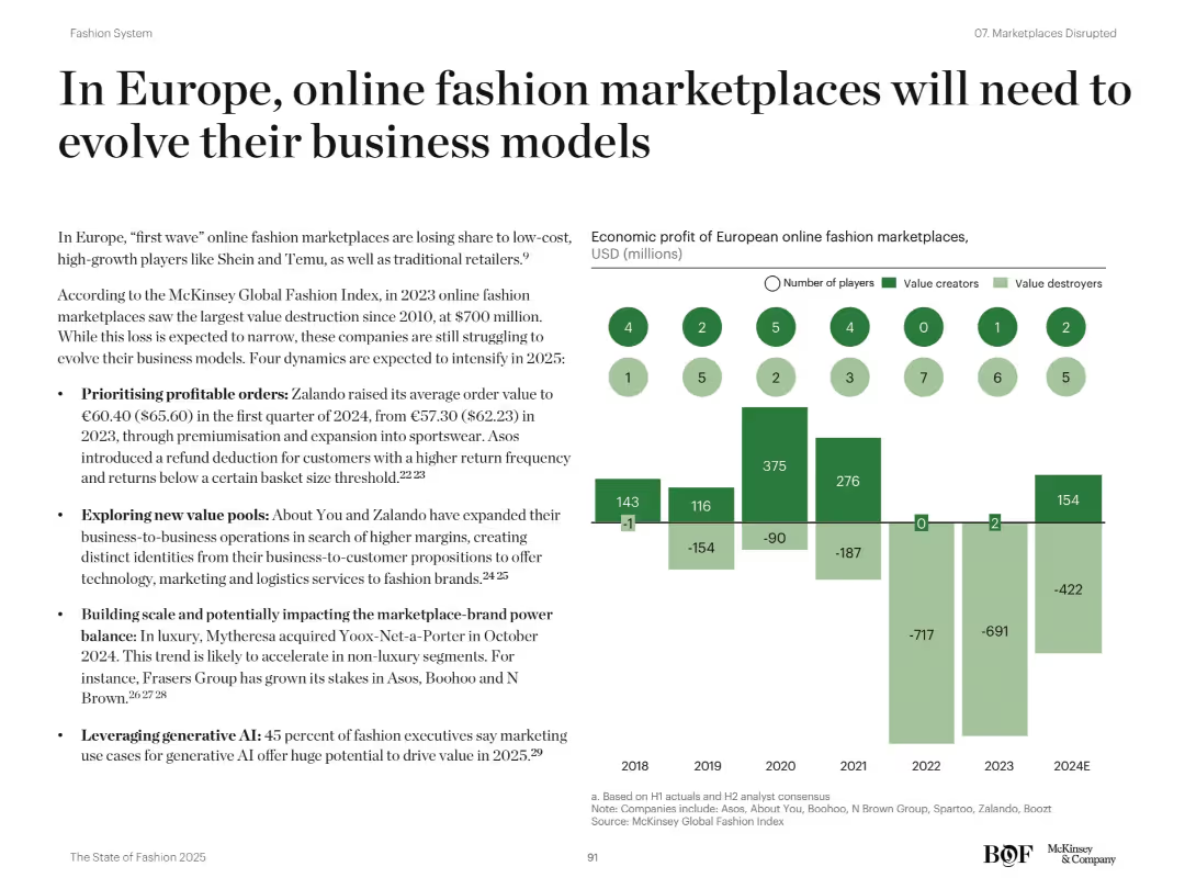
This slide outlines the pressure on European online fashion marketplaces to adapt amid declining profits and market share loss. It identifies four strategic focus areas: prioritizing profitable orders, exploring B2B opportunities, balancing marketplace-brand power, and leveraging generative AI. A bar chart tracks economic profit and number of players from 2018 to 2024E, showing a downward trend.
fashion, marketplaces, Zalando, profitability, AI, B2B, Europe, Shein, Temu, trends
Mixed Chart
McKinsey
Saved
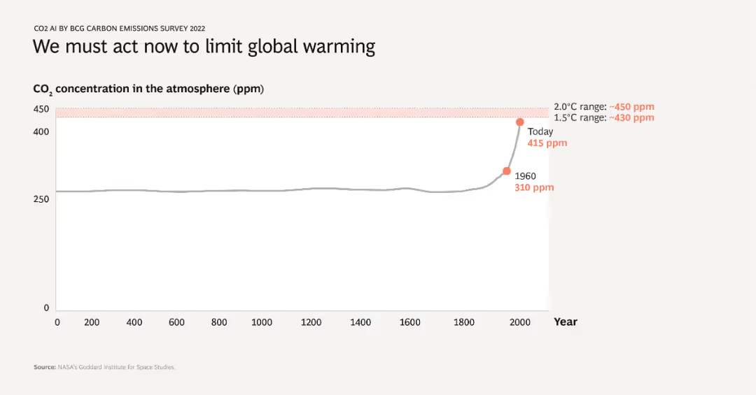
A line chart showing CO2 concentration in the atmosphere over time from year 0 to 2022. The chart highlights a significant increase in CO2 levels, especially after 1960, with today’s concentration at 415 ppm. The critical thresholds for 1.5°C and 2.0°C are also marked.
Market Analysis and Trends
Environmental Services & Sustainability
This slide emphasizes the urgent need to address global warming by illustrating the historical rise in atmospheric CO2 levels. It shows that current CO2 concentrations are dangerously high, surpassing thresholds that could limit global temperature increase.
CO2, global warming, climate change, historical data, critical thresholds
Single Chart
BCG
Saved
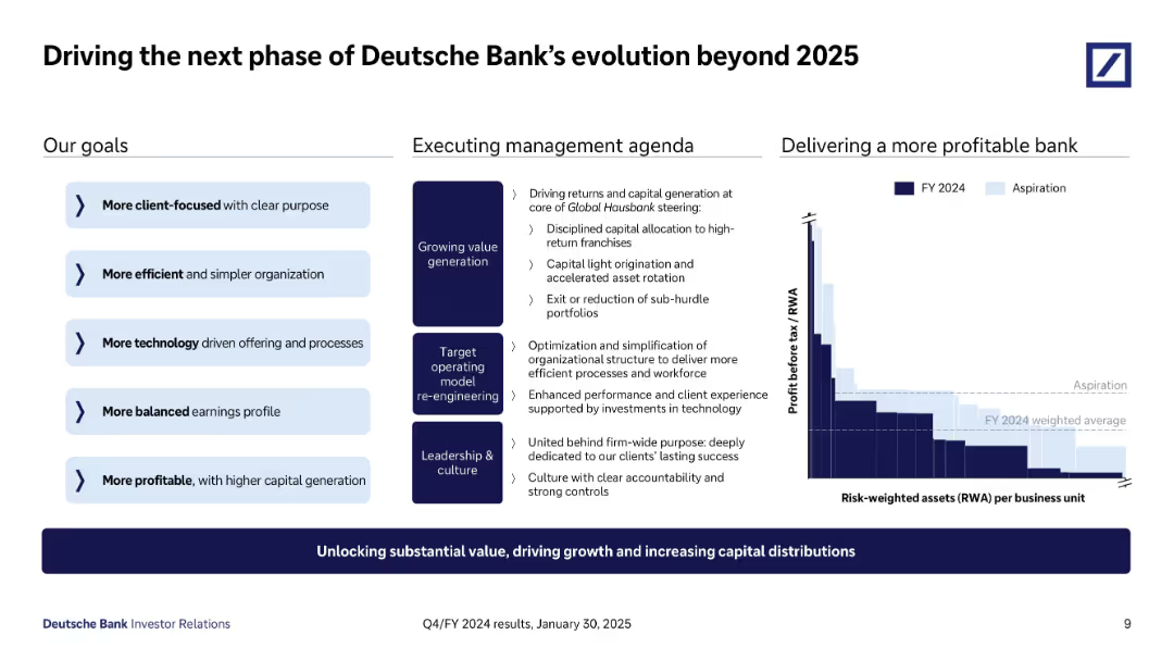
Three-column layout: strategic goals (left), execution agenda (center), and performance bar chart (right). Blue and dark blue thematic colors. Bullet points and shaded boxes structure the layout clearly.
Strategic Planning
Financial Services
Describes Deutsche Bank’s forward-looking goals post-2025, focusing on client-centricity, operational efficiency, technology adoption, and profitability. It outlines the management agenda and shows a bar chart of profitability per business unit compared to FY2024 targets.
profitability, strategy, banking, capital generation, goals, FY2024
Mixed Chart
Deutsche Bank
Saved
Pie chart depicting the proportion of respondents saving for retirement before COVID-19 and those who continued during the pandemic. Text at the top provides context.
Market Analysis and Trends
Financial Services
This slide outlines the savings behavior of Canadian investors for retirement before and during the COVID-19 pandemic. It shows the percentage of those who continued saving and highlights demographic variations in savings habits.
Retirement, Savings, COVID-19, Canadian, Pandemic
Multiple Chart
IPSOS
Saved
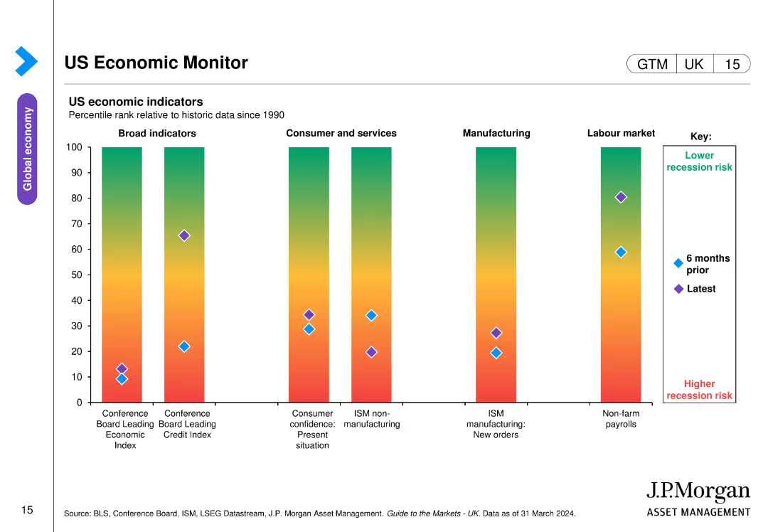
The slide shows a bar chart with percentile ranks of various US economic indicators (Broad indicators, Consumer and services, Manufacturing, Labour market) relative to historic data since 1990, with color-coded risk levels.
Market Analysis and Trends
Financial Services
This slide monitors key US economic indicators, helping assess recession risks and economic health, essential for making informed financial and investment decisions.
Economic indicators, recession risk, US economy, market analysis, risk assessment
Single Chart
JP Morgan
Saved
Features three pie charts detailing the growing familiarity with the metaverse, accompanied by a photograph of a woman using VR gear.
Market Analysis and Trends
Telecommunications
Discusses increasing public knowledge and interest in the metaverse, reflecting broader trends in technology engagement.
metaverse, technology adoption, VR, public knowledge, market trends
Multiple Chart
Deloitte
Saved
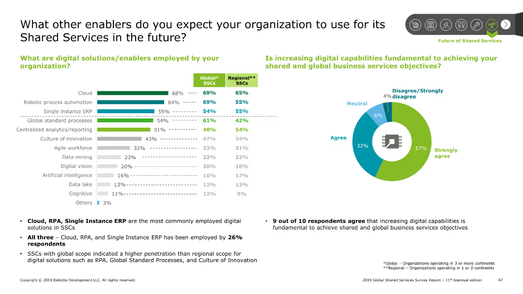
Features a bar chart on the left and a pie chart on the right, displaying digital solutions and their perceived importance.
Technology and Digital Transformation
Professional Services
Highlights the digital solutions used by organizations in Shared Services, like cloud and RPA, and the perceived importance of increasing digital capabilities.
enablers, digital, solutions, cloud, RPA, ERP, analytics, innovation, workforce
Multiple Chart
Deloitte
Saved
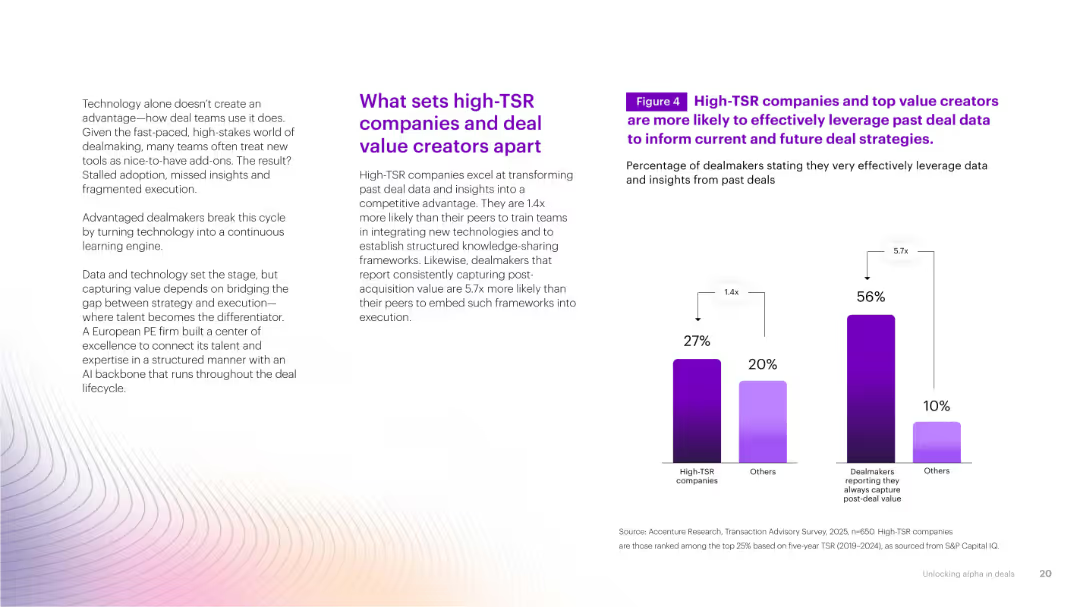
Two bar charts comparing high-TSR vs. others in data usage effectiveness. Light gradient background with supportive text and statistical insights.
Investment Analysis
Financial Services
Highlights how high-TSR companies and consistent value creators excel at utilizing past deal data to inform future strategies, creating a competitive edge through structured knowledge application.
past deal data, TSR, insights, performance, execution
Mixed Chart
Accenture
Saved
Features a combination of column charts and text, comparing IFRS and US GAAP credit loss expenses. The layout is moderately complex with detailed data comparisons.
Regulatory and Compliance
Financial Services
The slide compares credit loss expenses and allowances under IFRS and US GAAP, highlighting differences in financial impact, useful for compliance and financial reporting.
Credit, Loss, Comparison, IFRS, GAAP
Mixed Chart
UBS
Saved
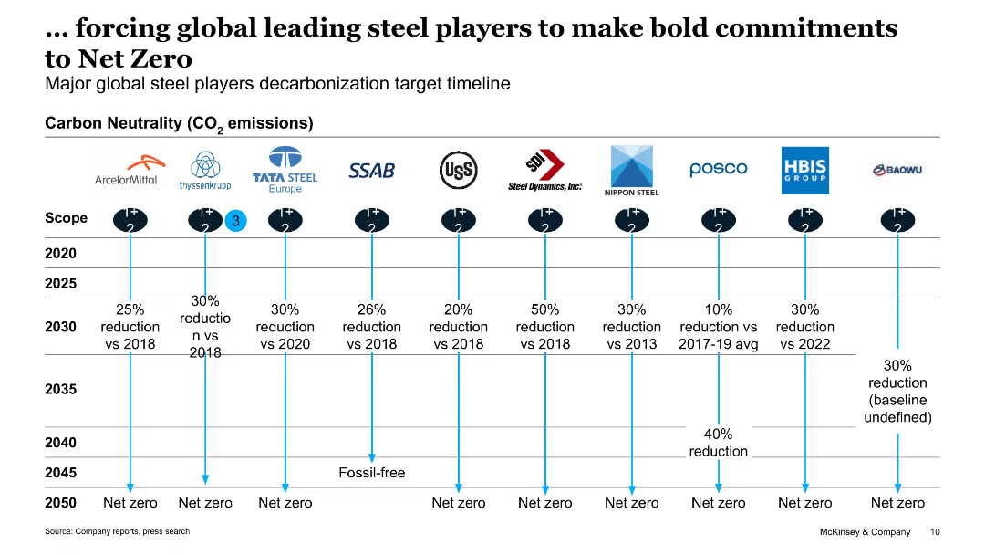
The slide contains a comparative timeline chart showing decarbonization targets for major global steel players, with reduction percentages and years to achieve net-zero emissions.
Strategic Planning
Industrial & Manufacturing
This slide outlines the decarbonization commitments of major global steel players, detailing their reduction targets and timelines towards achieving net-zero emissions by 2050.
steel players, decarbonization, net-zero, reduction targets, global commitments
Table
McKinsey
Saved
Features a timeline with three column charts at different time intervals, showcasing the growth in digitization. The background and charts use a minimal color palette for clarity.
Market Analysis and Trends
Technology & Software
Examines the increasing digital divide over time, with specific focus on leading sectors versus the rest of the US economy. It provides a clear, historical perspective on the progression of digitization.
digitization, digital divide, leading sectors, growth
Single Chart
McKinsey
Saved
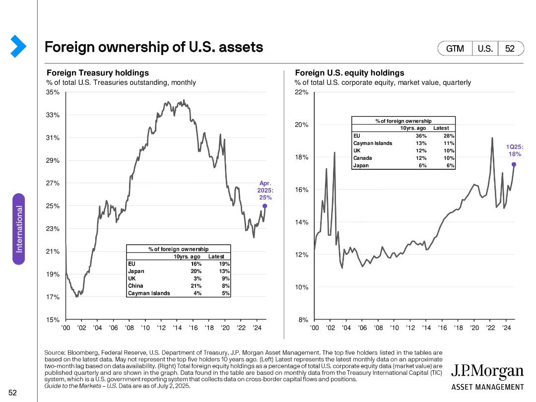
Two line charts with historical data: Left—foreign Treasury holdings; Right—foreign equity holdings in U.S. markets.
Investment Analysis
Financial Services
Shows trends in foreign investment in U.S. assets, tracking both Treasuries and equities over time. Also includes recent statistics on foreign ownership by region, providing insight into international capital flows.
foreign investment, U.S. equities, Treasuries, ownership trends, capital flows, international markets
Multiple Chart
JP Morgan
Saved
Slide displays a mix of text and column chart, explaining the market impact and Copernicus applications in forestry.
Market Analysis and Trends
Environmental Services & Sustainability
Describes the historical benefits of Earth Observation for forestry, detailing how it aids in management and contributes to economic growth.
Forestry, Earth Observation, Market Impact, Economic Growth, Management
Mixed Chart
PwC/Strategy&
Saved
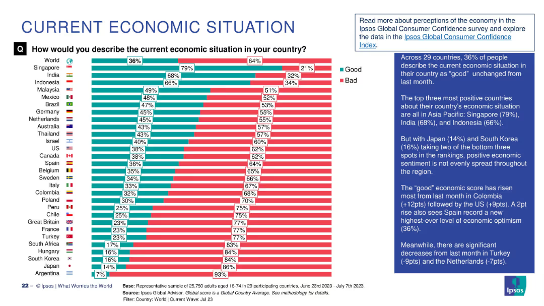
Bar chart comparing percentage of people in 29 countries describing the economy as "Good" vs "Bad", with annotations.
Market Analysis and Trends
Financial Services
This slide visualizes global public sentiment about the current economic situation, showing a 36% global average rating of "good". Singapore, India, and Indonesia lead in optimism, while Japan and Argentina have the lowest. Commentary highlights regional trends and month-over-month changes.
economic sentiment, global comparison, Ipsos, economic perception, survey, bar chart, economic optimism, Asia-Pacific, country ranking, economic trends
Mixed Chart
IPSOS
Saved
White background with a single purple column chart on talent confidence in NYC
Human Resources and Talent Management
Technology & Software
It shows the confidence levels of companies in securing tech skills from New York City's talent pool
Talent, NYC, Confidence, Tech Skills, Workforce
Multiple Chart
Accenture
Saved
A comprehensive slide with a tabulated performance analysis of various indices including coupon, yield, spread, and total returns.
Investment Analysis
Financial Services
The slide breaks down the performance of various financial indices, providing a granular look at coupons, yields, and total returns.
performance analysis, financial indices, coupon, yield, returns
Table
Morgan Stanley
Saved
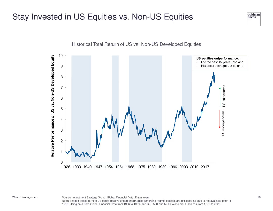
The slide features a line chart comparing the historical total return of US equities vs. non-US developed equities from 1926 to 2023. It shows periods of underperformance and outperformance with annotations for key trends.
Investment Analysis
Financial Services
This slide demonstrates the relative performance of US equities compared to non-US developed equities, emphasizing US equities' historical outperformance.
US equities, non-US equities, historical return, investment, performance comparison
Single Chart
Goldman Sachs
Saved
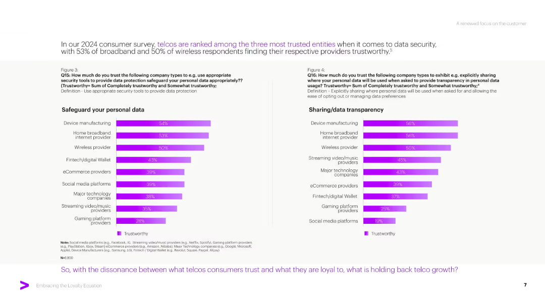
Dual bar charts on left and right comparing trust in various industries for data security and transparency. Survey-based.
Risk Assessment and Management
Telecommunications
The slide presents consumer trust ratings across sectors for safeguarding personal data and transparency. Telecoms rank high, particularly broadband providers, suggesting trust isn’t the core issue behind poor loyalty, opening the door for deeper customer engagement.
Data Security, Transparency, Trust, Telecom, Consumer Survey, Privacy, Broadband, Risk Management
Multiple Chart
Accenture
Saved
Features three column charts comparing the annual sales, revenue, and attrition rates between customers who redeem Ultimate Rewards® once, multiple times, or not at all. There's a clear focus on the benefits of engagement.
Client Case Studies
Financial Services
Analyzes the positive impact of the Ultimate Rewards® program on customer engagement, showing how redeemers contribute to higher sales and revenue and lower attrition rates.
customer engagement, rewards program, sales, revenue, attrition
Multiple Chart
JP Morgan
Saved
The slide features a bubble chart showing the importance of various factors in campaign performance, with audience targeting and ad creative being the most critical.
Market Analysis and Trends
Professional Services
This slide highlights the critical role of audience targeting in campaign performance, showing its significant impact compared to other factors like ad creative and data quality.
audience targeting, campaign performance, ad creative, data quality, marketing
Mixed Chart
Nielsen
Saved
Moderate complexity with three column charts representing funding in FinTech, HealthTech, and EdTech sectors, alongside descriptive text blocks.
Investment Analysis
Financial Services
Reviews the consistent increase in funding value for emerging sectors like FinTech, HealthTech, and EdTech, with specific mentions of significant deals and momentum.
Funding, FinTech, HealthTech, EdTech, growth
Mixed Chart
Bain
Saved
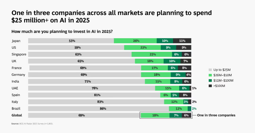
Bar chart layout with country comparisons. Various shades of green show different investment brackets; includes global average at bottom.
Market Analysis and Trends
Artificial Intelligence
Compares AI investment intentions across countries. 1 in 3 companies globally plan to invest over $25M in 2025, with regional variance in investment scale.
global AI spend, investment, 2025, countries, chart, BCG, $25M, analysis, survey, market planning
Single Chart
BCG
Saved
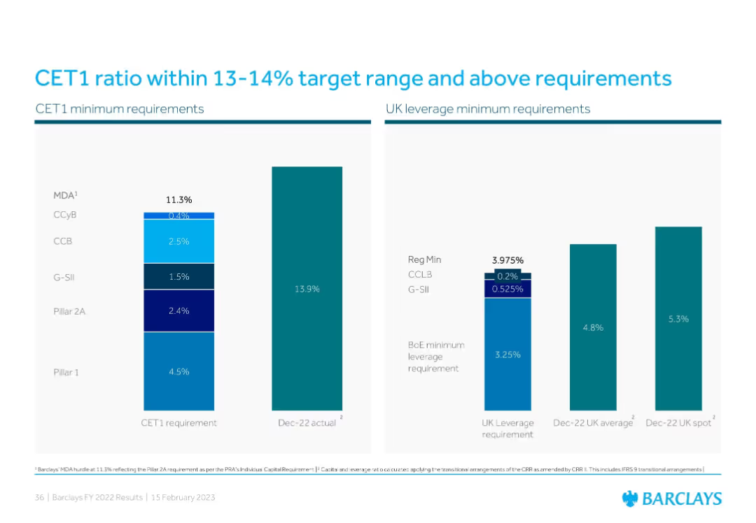
Dual bar charts illustrating CET1 minimum requirement components and actual CET1 ratio, alongside UK leverage ratio requirements and Barclays’ actuals.
Regulatory and Compliance
Financial Services
This slide compares Barclays' actual CET1 and UK leverage ratios against regulatory minimums. It demonstrates that the bank maintains sufficient capital and leverage buffers above the required thresholds, remaining in its 13–14% CET1 target range.
CET1, leverage ratio, capital requirements, regulation, Barclays
Multiple Chart
Barclays
Saved
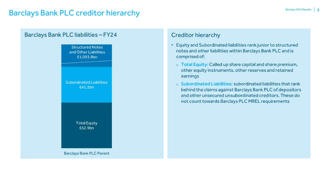
Split panel with a stacked bar chart showing FY24 liabilities and equity and a text explanation of creditor ranking and definitions.
Risk Assessment and Management
Financial Services
Outlines the liability structure of Barclays Bank PLC including £1,093.9bn in structured notes and other liabilities, £41.2bn subordinated liabilities, and £52.9bn equity. Describes the hierarchy of claims in the event of resolution.
creditor hierarchy, liabilities, equity, Barclays, subordinated debt, capital structure
Mixed Chart
Barclays
Saved
Previous
Next
If nothing, comes up, please save your slides first
Create a FREE account to continue browsing
Receive Instant Access to 1,000+ slides from companies like McKinsey, Google, and Goldman Sachs
First Name
Last Name
Email
Password
I agree to all
Terms & Privacy Policy
Thank you! Your submission has been received!
Oops! Something went wrong while submitting the form.
Have an account?
Sign in
Column Chart
Heatmap
Chevron
Org Chart
Infographic
Callouts
Timeline
List
Graphic
Picture
Process Flow
Diagram
Paragraph
Map
Table
Framework
Subtitle
Takeaway Box
Icon
Other Chart
Radar Chart
Waterfall Chart
Mekko Chart
Pie Chart
Scatter Plot
Line Chart
Bar chart
Bullet points