Create a FREE Account
Instant access to 1,000+ real slides from top companies like McKinsey, BCG, Goldman Sachs, Google and many more!
First Name
Last Name
Email
Password
I agree to all
Terms & Privacy Policy
Thank you! Your submission has been received!
Oops! Something went wrong while submitting the form.
Have an account?
Sign in
Library
Templates
Courses
Pricing
My Account
My Slides
My Templates
✦ AI
AI Prompt Library
AI Search
Sign in
Start Here
Logout
My Saved Slides
Two-column layout with a table on the left detailing equity and net debt and a column chart on the right showing gross debt maturity profile.
Financial Performance
Financial Services
Provides an overview of the balance sheet and liquidity position as of June 2023, including equity, net debt, gearing ratios, and liquidity with debt maturity projections.
balance sheet, liquidity, equity, debt, financials
Mixed Chart
IPSOS
Saved
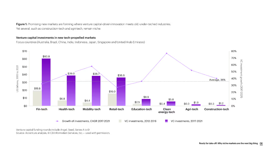
The slide features a column chart showing venture capital investments across various tech-propelled markets, with data segmented by investment growth periods.
Investment Analysis
Financial Services
The slide presents data on venture capital investments in various tech-propelled markets, highlighting significant growth areas and the focus countries for these investments.
venture capital, investments, tech markets, growth, financial services, column chart
Single Chart
Accenture
Saved
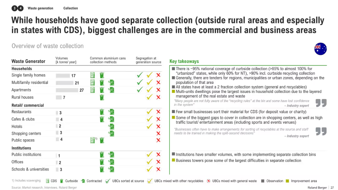
Matrix chart of waste generators vs. collection practices, with takeaway notes about systemic gaps in commercial recycling
Operational Efficiency
Environmental Services & Sustainability
The slide evaluates collection practices by waste generator type (households, commercial, institutional), revealing strong household coverage but poor segregation in businesses and institutions. It highlights pain points like awareness, infrastructure, and commercial participation.
waste collection, commercial waste, segregation, CDS, recycling gaps, business challenges, Australia
Mixed Chart
Roland Berger
Saved
This slide features a line chart comparing the cost of road freight per tonne-kilometre over various distances in Australia, the US, and France. Bullet points explain cost dynamics.
Market Analysis and Trends
Transportation & Logistics
It discusses the varying costs of road freight in Australia relative to the US and France, noting that Australia's costs are higher for short distances but become more competitive over longer distances.
road freight, cost, Australia, US, France, short haul, long haul
Mixed Chart
LEK
Saved
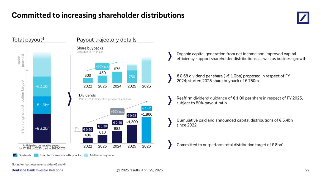
Split into payout charts (left) and detailed payout commentary (right).
Corporate Finance and Valuation
Financial Services
Outlines Deutsche Bank’s trajectory for shareholder distributions, including share buybacks and dividends from 2022–2026. Reaffirms FY 2025 dividend guidance of €1/share and plans to exceed €8B total payout. Highlights capital efficiency.
dividends, buybacks, capital return, shareholder distribution, payout, Deutsche Bank
Multiple Chart
Deutsche Bank
Saved
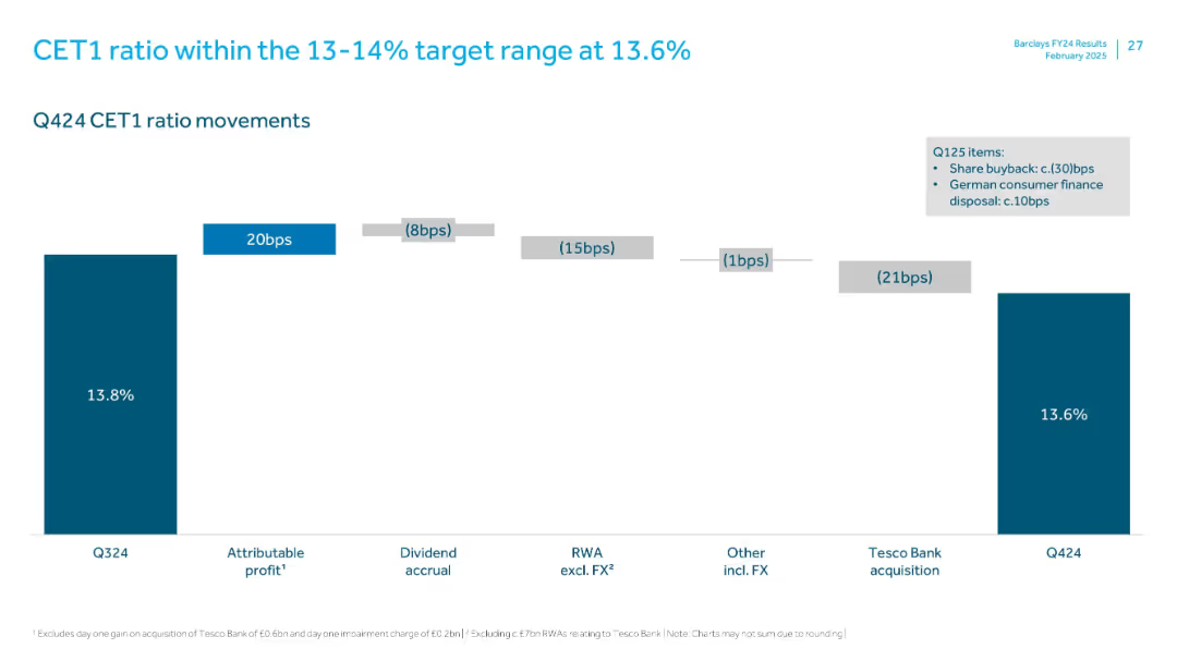
Waterfall chart showing stepwise changes from Q3 to Q4 2024 in CET1 ratio. Clean design with horizontal layout and annotations for each driver.
Regulatory and Compliance
Financial Services
This slide breaks down movements in the CET1 ratio from 13.8% to 13.6% in Q4 2024. Key impacts include attributable profit, dividend accrual, FX adjustments, and the Tesco Bank acquisition. Maintains regulatory capital target range.
CET1 ratio, capital adequacy, regulatory, profit, Tesco Bank, FX
Single Chart
Barclays
Saved
Slide with moderate visual complexity containing a blue color theme and icons for power storage, distribution, and an electric vehicle, alongside categorized text sections.
Operational Efficiency
Energy & Utilities
Covers aspects of power storage and distribution, including smart grids and electric vehicle charging infrastructure, crucial for the future of clean energy.
power storage, power distribution, smart grid, electric vehicle, clean energy, infrastructure, energy optimization, future
Header Horizontal
McKinsey
Saved
The slide presents a comparative analysis of priorities across various industries, with bar charts showing certainty levels for different priorities per industry.
Strategic Planning
Professional Services
It provides a summary of the key priorities in different industries, comparing the levels of certainty for each priority, offering a strategic planning overview.
Priorities, industries, comparative analysis, certainty, strategic planning, overview
Multiple Chart
Roland Berger
Saved
A bar chart depicting the perceived effectiveness of digital paid channels like email, search, and social media. Each bar is segmented by confidence levels among marketers, similar to the previous slide.
Market Analysis and Trends
Media & Entertainment
This slide provides insights into marketers' confidence in the effectiveness of various digital paid media channels. It includes data on channels like email, search, and social media, showing how marketers rate their effectiveness.
Digital, Media, Effectiveness, Channels, Confidence
Mixed Chart
Nielsen
Saved
Features a pie chart and icon indicators, illustrating the optimal allocation of a hypothetical 5% increase in media spend, with the majority allocated to TV.
Investment Analysis
Media & Entertainment
Suggests strategies for optimizing media spend over the next four years, focusing on the advantageous allocation to TV for maximizing ROI.
media spend, ROI, TV advertising, strategic allocation, future planning
Mixed Chart
Accenture
Saved
The slide includes text blocks with points about GCC countries' potential for CCUS, including geological storage capacity and government plans.
Strategic Planning
Energy & Utilities
Discusses the potential for CCUS in GCC countries, citing geological capacity, emission statistics, and governmental commitment to reducing CO2 emissions.
GCC, CCUS, potential, geological storage, government plans, CO2 emissions, strategic planning
Multiple Chart
Kearney
Saved
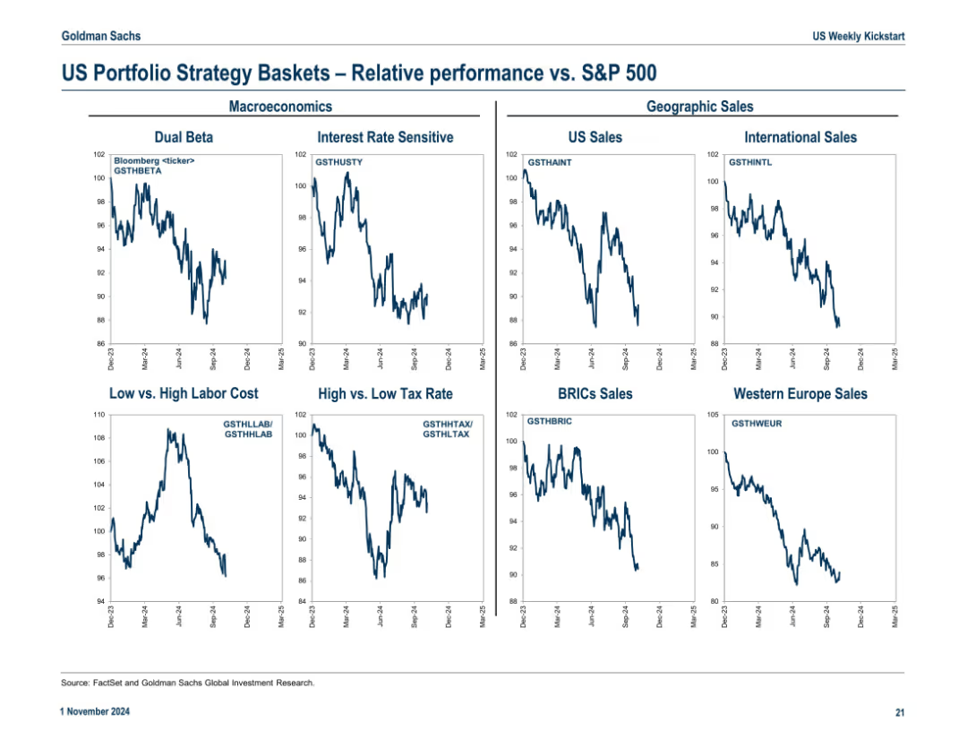
Nine-panel grid showing relative performance of macroeconomic and geographic strategy baskets vs. S&P 500
Market Analysis and Trends
Financial Services
Compares performance of strategy baskets (e.g., Dual Beta, BRICs Sales, Tax Themes) against the S&P 500, allowing investors to evaluate trends by macro or geographic exposure.
strategy themes, macroeconomics, BRICs, tax strategies, relative performance, portfolio positioning
Multiple Chart
Goldman Sachs
Saved
Slide displays icons and checklists outlining actions taken by leading organizations in climate response. Green tones dominate.
Strategic Planning
Environmental Services & Sustainability
Highlights key actions by leading companies in adapting to and mitigating climate change, emphasizing sustainable business practices.
climate leadership, sustainable practices, strategic planning, mitigation, adaptation, environmental sustainability
Pillar
Deloitte
Saved
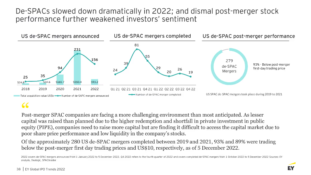
The slide shows multiple line charts illustrating the number of de-SPAC mergers announced and completed, as well as their post-merger performance from 2018 to 2022.
Market Analysis and Trends
Financial Services
Analyzes the decline in de-SPAC activity and the poor post-merger performance, highlighting challenges in the SPAC market.
de-SPAC, mergers, performance, market analysis
Multiple Chart
EY
Saved
A slide with a block of text on the left and an illustration of a person with a recycling symbol on their shirt on the right.
Industry Overview
Environmental Services & Sustainability
Discusses the positive impact of the pandemic on environmental awareness and actions taken by individuals to help the environment.
Environment, Action, Millennials, Gen Z, Pandemic, Optimism, Climate Change, Individual Impact
Mixed Chart
Deloitte
Saved
Vertical bar chart ranking countries by perception of climate leadership; includes past agreement trends; title on left side.
Strategic Planning
Government & Public Sector
Captures public perception of each country’s leadership in climate change action. India, Indonesia, and Malaysia lead in agreement; others trail. Shows shifts in perceived leadership over time.
climate leadership, perception, strategic positioning, Ipsos, country rankings, environment, trend data
Mixed Chart
IPSOS
Saved
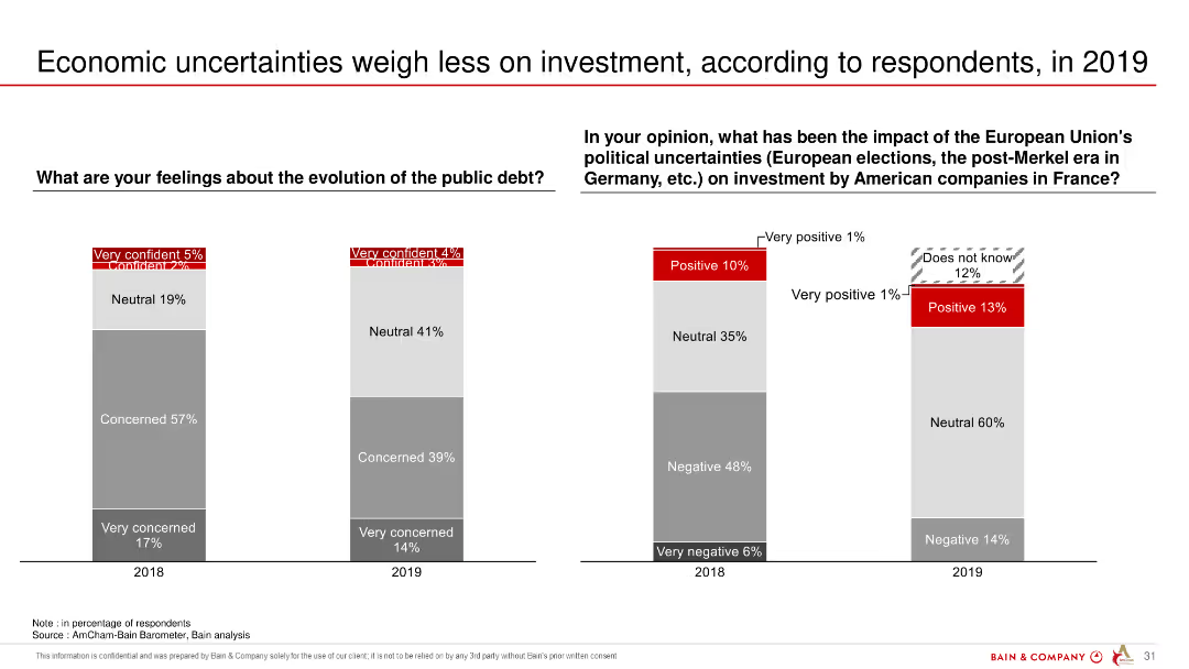
The slide includes two column charts comparing respondents' views on public debt and the impact of EU political uncertainties on American companies' investments in France, between 2018 and 2019.
Investment Analysis
Financial Services
The slide suggests that economic uncertainties, particularly public debt and political uncertainties in the EU, have lessened in their impact on investment decisions in 2019.
economic uncertainties, investment, public debt, EU, political uncertainties, survey
Multiple Chart
Bain
Saved
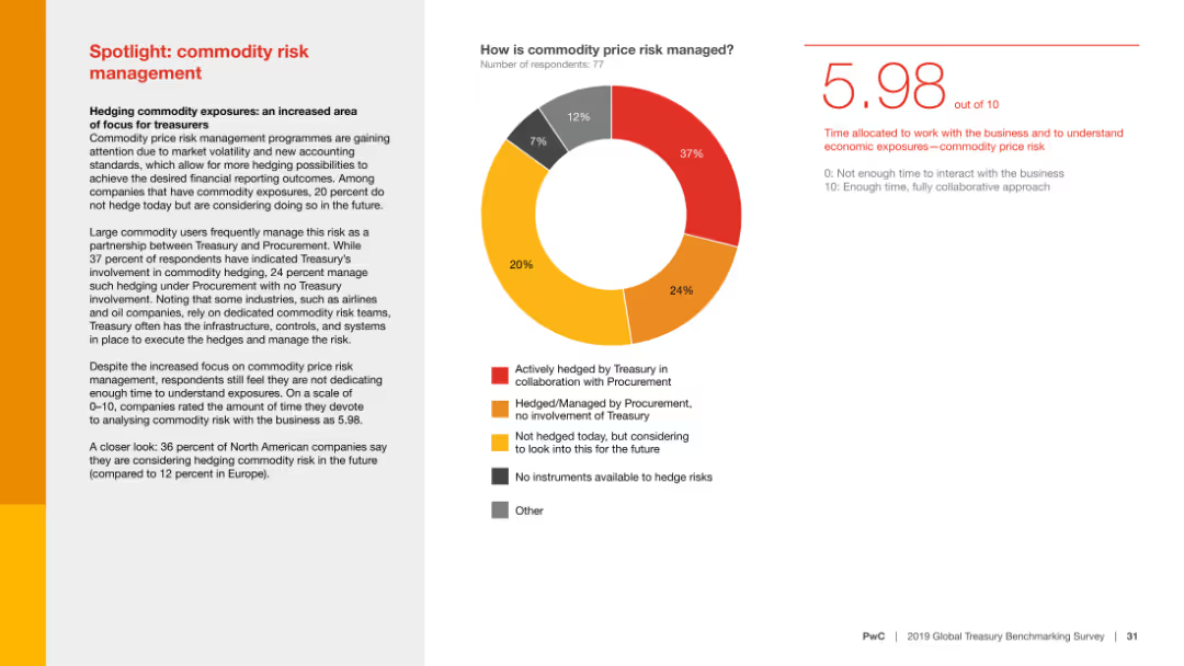
The slide features a pie chart depicting how commodity price risk is managed, accompanied by text discussing the importance of hedging commodity exposures and the level of involvement of Treasury in this process.
Risk Assessment and Management
Financial Services
This slide highlights the focus on commodity price risk management, showing how organizations manage these risks and the Treasury's role in this process, stressing the need for better risk understanding.
Commodity risk, risk management, Treasury, hedging, financial services, commodity exposures, procurement, risk understanding, survey, financial trends
Mixed Chart
PwC/Strategy&
Saved
Compares the weekly study hours before and after solar power adoption in Nigerian boarding schools, using column charts to visualize the data.
Strategic Planning
Education & Training
Highlights the effectiveness of solar power in increasing study hours at night, presenting data that shows enhanced educational outcomes and improved academic performance among students.
education, solar power, Nigeria, boarding schools, study hours, night studies, academic improvement
Mixed Chart
BCG
Saved
Column chart comparing percentages of those who believe taxes should be increased on businesses and individuals.
Regulatory and Compliance
Financial Services
Examines opinions on tax policy changes post-pandemic, focusing on who should bear increased tax burdens.
tax policy, pandemic, businesses, high-net worth individuals, tax increases
Mixed Chart
EY
Saved
Multiple line charts display Y/Y growth in four hydraulic markets: Industrial Machinery, Construction Equipment, Farm Machinery, Truck & Bus from 2012 to 2019.
Market Analysis and Trends
Industrial & Manufacturing
Analyzes yearly growth rates across several hydraulic markets, showing trends over time, useful for market analysis and understanding sector health.
hydraulics, industrial, construction, machinery, growth
Single Chart
Deutsche Bank
Saved
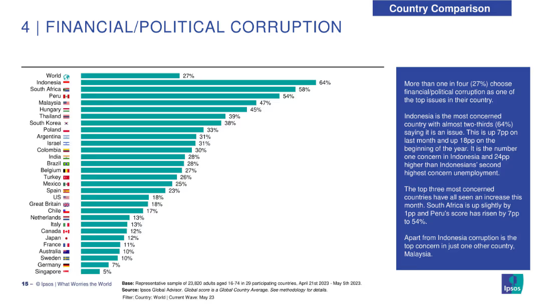
Horizontal bar chart with country flags and percentages on the left; explanatory text in a blue box on the right.
Market Analysis and Trends
Government & Public Sector
This slide highlights public perception of financial and political corruption across 29 countries. Indonesia ranks highest with 64% identifying it as a top issue. The global average is 27%. Commentary notes recent rises in concern in several countries including Peru and South Africa.
corruption, public perception, Ipsos, global survey, country comparison, Indonesia, South Africa, concern levels, political issues, May 2023
Mixed Chart
IPSOS
Saved
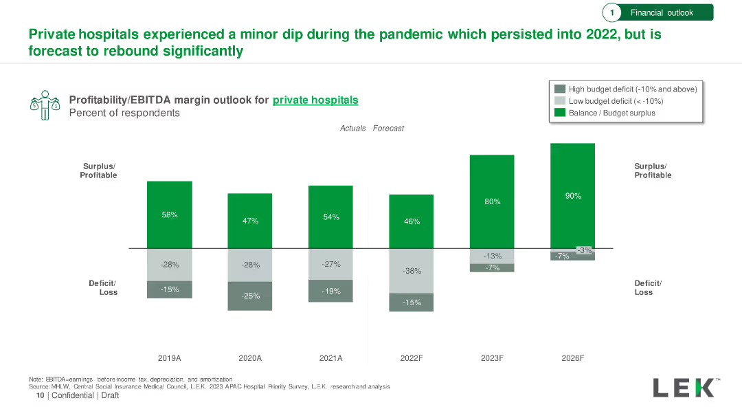
Bar chart showing profitability/EBITDA margin outlook for private hospitals from 2019 to 2026, with actuals and forecasts. Surplus/deficit percentages included.
Financial Performance
Healthcare & Pharmaceuticals
Analysis of private hospitals' financial performance during and after the pandemic, forecasting a significant rebound by 2026.
Private Hospitals, Profitability, EBITDA, Financial Forecast, Recovery
Single Chart
LEK
Saved
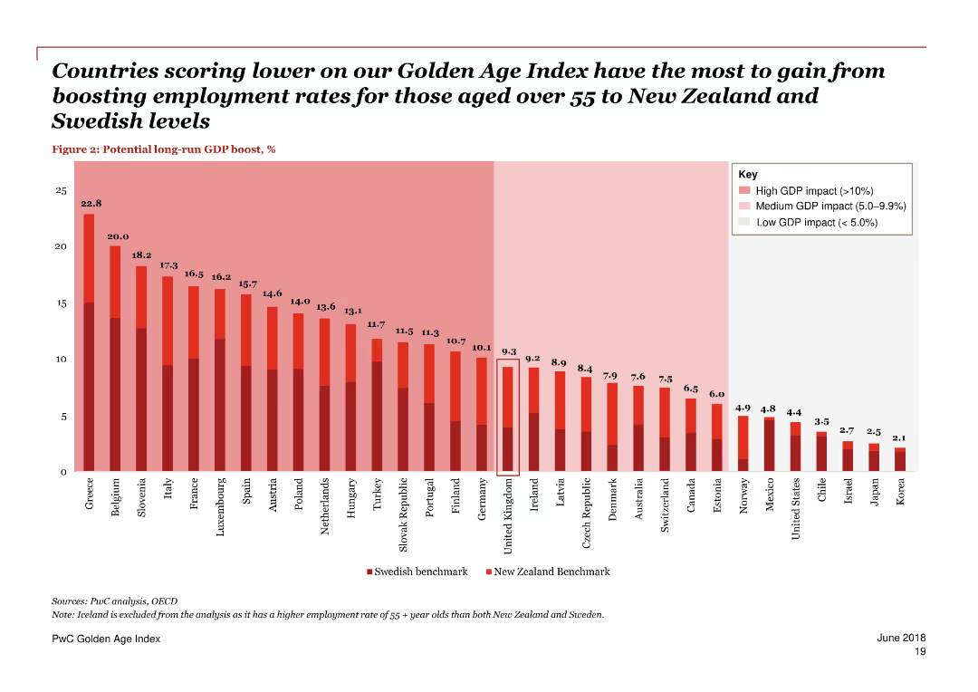
A column chart and text blocks, predominantly red and white color scheme.
Technology and Digital Transformation
Government & Public Sector
Discusses technological advances like automation and their impact on job prospects, highlighting the need for retraining and lifelong learning for older workers.
technology, automation, jobs, older workers, impact, retraining, lifelong learning, digital transformation, trends, future
Single Chart
PwC/Strategy&
Saved
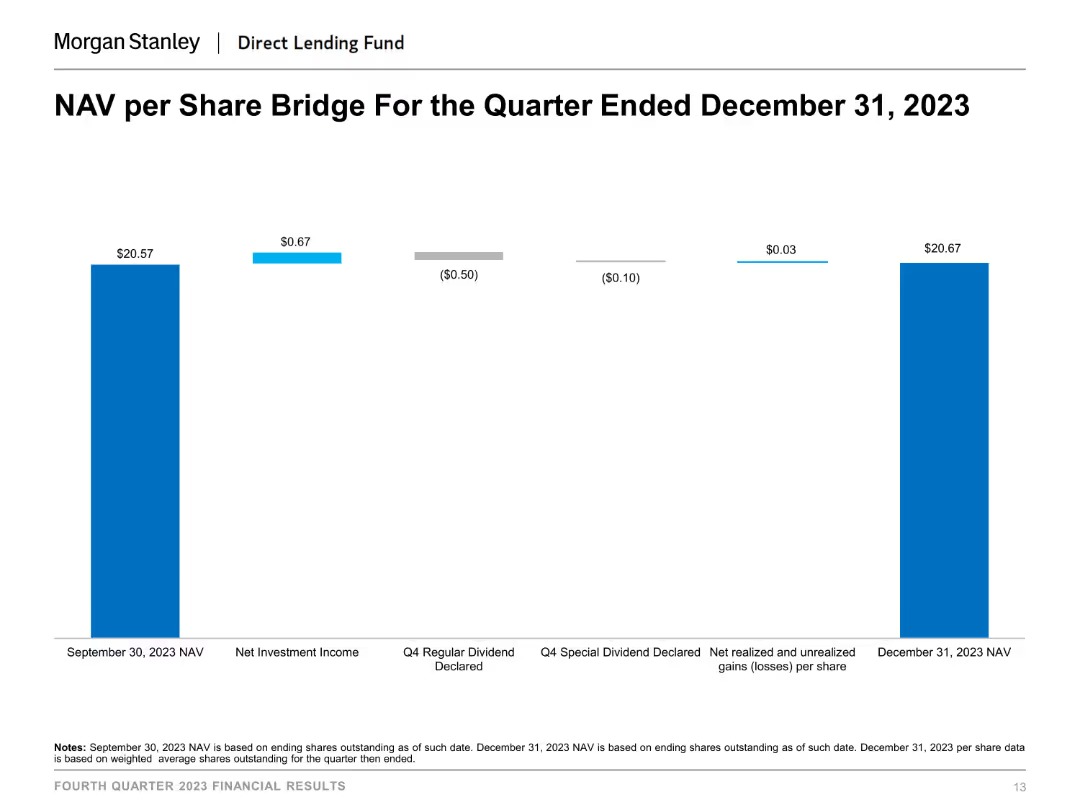
This slide shows a column chart illustrating the NAV per share bridge for the quarter ended December 31, 2023. The chart uses different colors to indicate various components affecting NAV, such as net investment income and dividends declared.
Financial Performance
Financial Services
The slide presents the changes in NAV per share over a quarter, breaking down the impact of different financial activities like net investment income and dividends declared, useful for understanding NAV fluctuations and financial performance.
NAV per share, financial performance, investment income, dividends, financial analysis, quarter-end NAV
Single Chart
Morgan Stanley
Saved
Previous
Next
If nothing, comes up, please save your slides first
Create a FREE account to continue browsing
Receive Instant Access to 1,000+ slides from companies like McKinsey, Google, and Goldman Sachs
First Name
Last Name
Email
Password
I agree to all
Terms & Privacy Policy
Thank you! Your submission has been received!
Oops! Something went wrong while submitting the form.
Have an account?
Sign in
Column Chart
Heatmap
Chevron
Org Chart
Infographic
Callouts
Timeline
List
Graphic
Picture
Process Flow
Diagram
Paragraph
Map
Table
Framework
Subtitle
Takeaway Box
Icon
Other Chart
Radar Chart
Waterfall Chart
Mekko Chart
Pie Chart
Scatter Plot
Line Chart
Bar chart
Bullet points