Create a FREE Account
Instant access to 1,000+ real slides from top companies like McKinsey, BCG, Goldman Sachs, Google and many more!
First Name
Last Name
Email
Password
I agree to all
Terms & Privacy Policy
Thank you! Your submission has been received!
Oops! Something went wrong while submitting the form.
Have an account?
Sign in
Library
Templates
Courses
Pricing
My Account
My Slides
My Templates
✦ AI
AI Prompt Library
AI Search
Sign in
Start Here
Logout
My Saved Slides
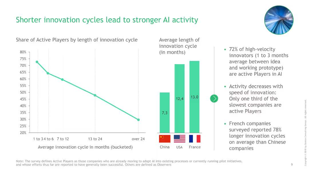
Line chart showing the relationship between innovation cycle length and AI activity levels, with additional bar charts comparing average cycle lengths across countries.
Technology and Digital Transformation
Technology & Software
This slide demonstrates how shorter innovation cycles contribute to stronger AI activity, supported by data comparing innovation cycles in China, USA, and France.
AI activity, innovation cycles, China, USA, France, technology, digital transformation, line chart, bar charts, comparison, data presentation
Multiple Chart
BCG
Saved
Before-and-after comparison with two columns contrasting past and current business models. Lists key aspects with numbers and uses blue color highlights.
Organizational Structure and Change
Financial Services
Explains the shift in Morgan Stanley's business model, highlighting increased scale, added channels, and expanded service models.
Business model, scale increase, service expansion, channels, Morgan Stanley, organizational change, evolution
Table
Goldman Sachs
Saved
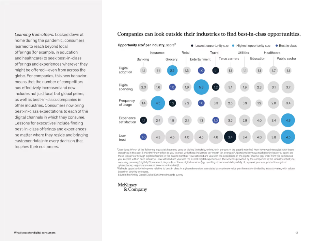
Bubble chart showing opportunity sizes by category (trust, satisfaction, usage) across industries. Colored by size and best-in-class value.
Competitive Landscape
Technology & Software
This slide highlights cross-industry benchmarking, showing that companies can identify best-in-class practices from other sectors to improve digital services. Bubbles represent areas like spending, adoption, and trust.
benchmarking, opportunity size, best-in-class, cross-industry, trust, spending, adoption, user expectations
Mixed Chart
McKinsey
Saved
Multiple small graphs displaying the effect of various government actions on COVID-19 case growth rates across different countries, using a day-by-day comparison.
Regulatory and Compliance
Government & Public Sector
Assesses the impact of measures like school closures and travel restrictions on the COVID-19 spread, useful for policymakers and public health officials.
COVID-19, government response, public health, measures, effectiveness, policy, case reduction, spread, actions
Multiple Chart
BCG
Saved
Features column charts and bullet points detailing marketing spend and performance metrics. It's well-structured with color-coding for easy distinction between categories.
Financial Performance
Financial Services
Details marketing spend and key performance metrics, which could be relevant in financial and marketing strategy sessions.
marketing, performance metrics, financial strategy, cash marketing spend
Multiple Chart
JP Morgan
Saved
The slide features two sections; the left side has a scatter plot titled 'Yield/Duration' with various investment types plotted. The right side shows a column chart titled '10-Year Correlation with U.S. Treasuries' indicating correlation values. The design is professional, with a color scheme of purple and blue, and the graphs are clearly labeled.
Risk Assessment and Management
Financial Services
The left graph compares the yield to duration of various loans and securities. The right bar chart displays the 10-year correlation of different investment types with U.S. Treasuries, providing insight into interest rate risk and investment strategy.
Yield, Duration, Rate Risk, Credit Exposure, Correlation, U.S. Treasuries, Investment, Floating-Rate Loan, High-Yield Corp, EM Sovereign
Multiple Chart
Morgan Stanley
Saved
Bar chart showing percentages of family offices lacking cybersecurity response plans, with explanatory text.
Risk Assessment and Management
Financial Services
Addresses the lack of cybersecurity response plans among APAC family offices, highlighting vulnerabilities and risks.
cybersecurity plans, APAC, family offices, response plans, vulnerabilities
Mixed Chart
EY
Saved
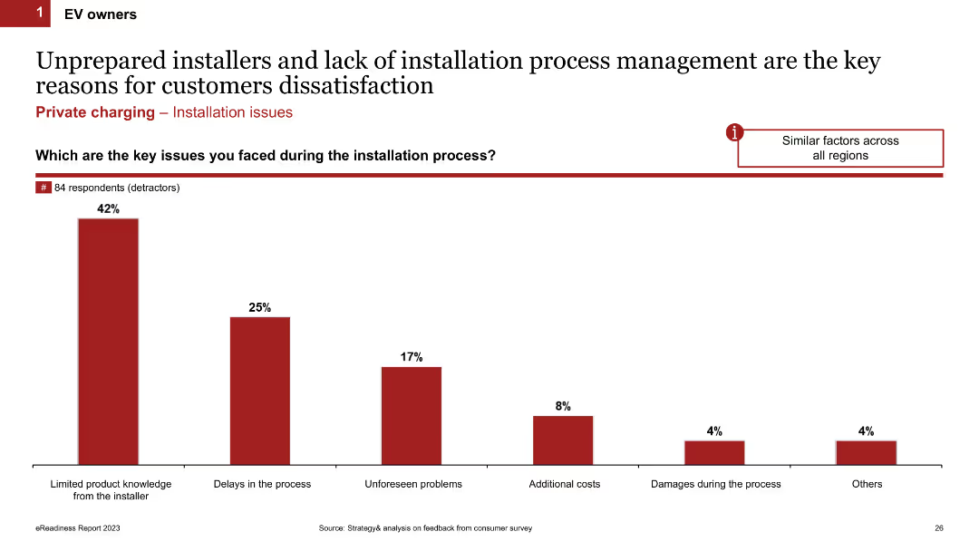
Column chart displaying key issues faced during the installation process. Factors include limited product knowledge, delays, unforeseen problems, additional costs, and damages. The slide uses red bars and percentages to present data.
Operational Efficiency
Transportation & Logistics
This slide identifies the main issues EV owners face during the charging installation process, highlighting problems like unprepared installers, delays, unforeseen issues, and additional costs.
installation issues, customer dissatisfaction, process management, EV owners, charging installation
Single Chart
PwC/Strategy&
Saved
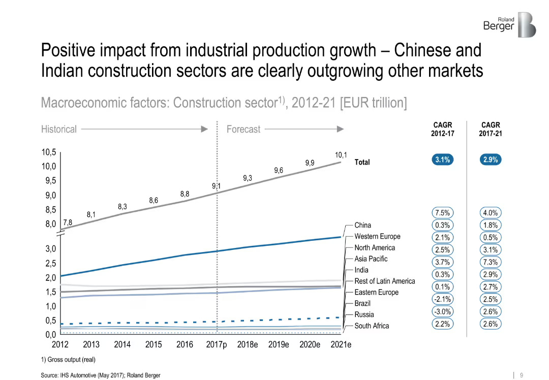
Line chart showing historical and forecasted construction sector output by region (2012–2021), with CAGR figures in side legends. Clean layout with subtle color coding and segmentation by region.
Market Analysis and Trends
Industrial & Manufacturing
The slide presents growth projections for the global construction sector, highlighting that China and India are significantly outpacing other regions. It includes CAGR data from 2012–2017 and forecasts for 2017–2021, showing clear segmentation by geographic region.
['construction', 'industrial production', 'growth forecast', 'China', 'India', 'CAGR', 'regional comparison', 'market trend']
Single Chart
Roland Berger
Saved
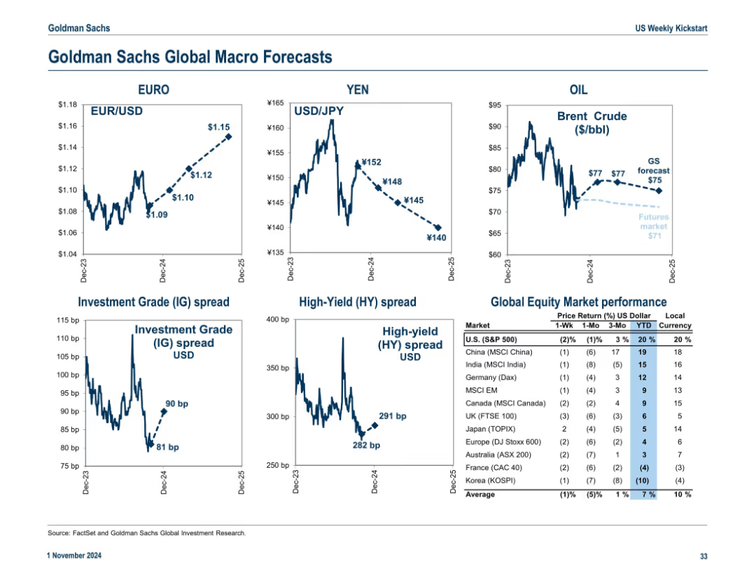
3x2 grid with forecasted exchange rates, spreads, and oil prices. Table on the right shows equity market performance across global indices. Trend arrows and dotted forecast lines included.
Strategic Planning
Financial Services
This macro forecast slide projects exchange rates (EUR/USD, USD/JPY), oil prices, and credit spreads. It also ranks global equity market performance, highlighting U.S. and international returns in both local and USD terms.
macro forecast, exchange rates, oil, IG/HY spreads, global equities, market return
Multiple Chart
Goldman Sachs
Saved
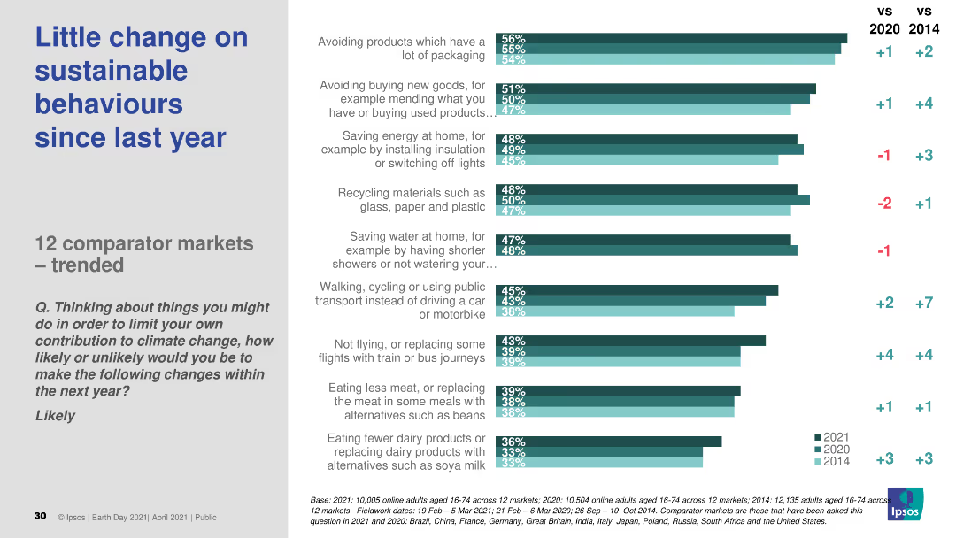
This slide contains a column chart comparing the likelihood of engaging in sustainable behaviors in 2021 versus previous years (2020 and 2014). The chart uses bars to show percentages for various actions and comparisons over the years.
Market Analysis and Trends
Environmental Services & Sustainability
The slide presents survey data on sustainable behaviors, comparing the likelihood of various actions in 2021 to those in 2020 and 2014, across 12 comparator markets.
sustainable behaviors, trends, survey, market comparison, years
Single Chart
IPSOS
Saved
The layout is text-focused with a section for bullet points on the left and a pie chart on the right that shows 'Outstanding Vanilla Debt and Preferred Shares Referencing USD LIBOR as of 1Q20'. The text addresses the firm’s strategy and commitments related to the LIBOR transition.
Regulatory and Compliance
Financial Services
Addresses the upcoming LIBOR transition, outlining the company's preparedness and strategic plans, which is critical for stakeholders monitoring regulatory shifts and risk exposure.
LIBOR transition, regulatory compliance, risk management, pie chart, financial strategy, debt management, preferred shares, corporate strategy, market adaptation, stakeholder assurance
Mixed Chart
Goldman Sachs
Saved
A combination of a bar chart and descriptive text detailing the results of a financial knowledge assessment among Canadians in 2023, compared to 2022.
Human Resources and Talent Management
Financial Services
This slide evaluates the financial knowledge of Canadians, showing average scores and detailed analysis of correct responses across multiple questions in 2023 and 2022.
Financial, knowledge, assessment, Canadians, 2023, 2022
Mixed Chart
IPSOS
Saved
Line chart showing the year-over-year growth of global personal luxury goods by channel from 2017 to 2023.
Strategic Planning
Consumer Goods
Examines the normalization of channel dynamics post-pandemic, focusing on retail, wholesale, and e-commerce.
Channel, Dynamics, Post-pandemic, Growth, Luxury
Mixed Chart
Kearney
Saved
Diagram showing crisis preparation options with a profit-time curve indicating different stages of crisis and corresponding actions like budget cuts and performance programs.
Risk Assessment and Management
Professional Services
The slide presents approaches to crisis preparation, suggesting strategic reassessment, performance programs, and restructuring as key methods to address potential crises.
crisis preparation, early warning, risk management, strategic planning, crisis stages
Diagram
Roland Berger
Saved
This slide is designed with bar charts and data comparisons, showing the usage of mental health resources between Gen Z and Millennials. It utilizes a clear, professional layout with distinct color coding to differentiate between the groups.
Market Analysis and Trends
Professional Services
Focuses on the underutilization of workplace mental health resources among Gen Z and Millennials, emphasizing the gap between offerings and actual usage.
mental health, Gen Z, Millennials, workplace support, resource gap, utilization
Multiple Chart
Deloitte
Saved
Column charts and pie charts showing private banking and asset management metrics, including AuM, PTI, and industry growth.
Strategic Planning
Financial Services
Presents IWM’s performance in wealth and asset management, highlighting industry growth, assets under management, and profitability.
Wealth management, asset management, IWM, AuM, PTI
Multiple Chart
Credit Suisse
Saved
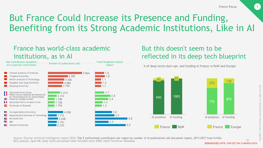
The slide contains two column charts and a list of top contributors by publications in AI, with France highlighted in green.
Market Analysis and Trends
Education & Training
Highlights the disparity between France's strong academic presence in AI and its limited deep tech funding compared to RoW and Europe.
AI, education, funding, deep tech, France
Multiple Chart
BCG
Saved
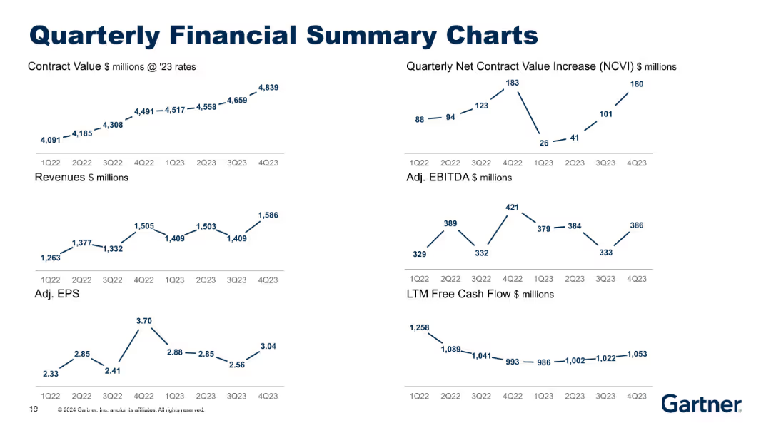
Six compact financial trend graphs (line charts) over two rows, focused on 2022–2023 period. Clear minimal text and blue line visuals on gray.
Financial Performance
Financial Services
Similar to Slide 18631 but covers an earlier timeframe (2022–2023). Displays trends in contract value, revenues, EBITDA, EPS, and cash flow. Offers historical baseline for comparison with newer data in other slides.
Contract Value, EPS, EBITDA, Historical Performance, Revenue
Multiple Chart
Gartner
Saved
Features a text block on the left and a horizontal bar chart on the right comparing the deployment of blockchain in advertising strategies between those prioritizing regulatory environments and others.
Regulatory and Compliance
Financial Services
The slide discusses the adoption of blockchain technology in advertising to address regulatory environments, with a horizontal bar chart illustrating the difference in deployment rates between companies prioritizing regulation and others.
Blockchain, advertising, regulatory, deployment, comparison
Mixed Chart
Deloitte
Saved
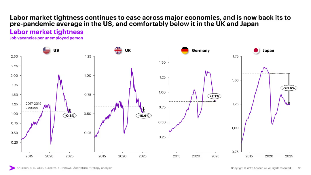
Four separate line graphs show job vacancies per unemployed person for US, UK, Germany, and Japan, benchmarked against pre-pandemic averages.
Human Resources and Talent Management
Professional Services
The slide tracks labor market tightness by measuring job vacancies per unemployed person. It reveals easing labor conditions across major economies, with Japan and UK notably below pre-pandemic levels, while Germany remains tighter.
labor market, job vacancies, unemployment, tightness, post-COVID, US, UK, Germany, Japan, workforce dynamics
Multiple Chart
Accenture
Saved
Three-column layout comparing AR/VR impact over time, with isometric graphics of AR and VR, and a maturity level bar.
Market Analysis and Trends
Technology & Software
Discusses AR and VR trends with a timeline from near to long-term impact, focusing on the transition from enterprise to consumer use and enhanced interaction in the real world.
AR, VR, trends, enterprise, consumer, interaction, timeline
Header Vertical
McKinsey
Saved
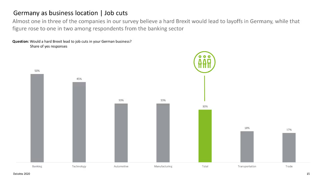
Bar chart displaying the likelihood of job cuts across various sectors due to Brexit, with color-coded bars.
Risk Assessment and Management
Financial Services
Analyzes the potential impact of a hard Brexit on job cuts in different sectors, highlighting banking and technology.
Germany, job cuts, Brexit, sectors, impact
Single Chart
Deloitte
Saved
Circle diagram and lists detailing a cost-saving program, showing major areas of expense reduction planned for the next year.
Operational Efficiency
Financial Services
Discusses strategies for significant cost reduction and operational simplification expected to save around $750 million.
cost reduction, operational efficiency, savings, strategy, diagram
Mixed Chart
Barclays
Saved
This slide includes a table with various metrics and two line charts showing contract value and quarterly net contract value increase.
Market Analysis and Trends
Technology & Software
It presents detailed research metrics, including contract value, net contract value increase, productivity, and client enterprises statistics.
Research, Metrics, Contract Value, Productivity, Client Enterprises, Net Increase
Multiple Chart
Gartner
Saved
Previous
Next
If nothing, comes up, please save your slides first
Create a FREE account to continue browsing
Receive Instant Access to 1,000+ slides from companies like McKinsey, Google, and Goldman Sachs
First Name
Last Name
Email
Password
I agree to all
Terms & Privacy Policy
Thank you! Your submission has been received!
Oops! Something went wrong while submitting the form.
Have an account?
Sign in
Column Chart
Heatmap
Chevron
Org Chart
Infographic
Callouts
Timeline
List
Graphic
Picture
Process Flow
Diagram
Paragraph
Map
Table
Framework
Subtitle
Takeaway Box
Icon
Other Chart
Radar Chart
Waterfall Chart
Mekko Chart
Pie Chart
Scatter Plot
Line Chart
Bar chart
Bullet points