Create a FREE Account
Instant access to 1,000+ real slides from top companies like McKinsey, BCG, Goldman Sachs, Google and many more!
First Name
Last Name
Email
Password
I agree to all
Terms & Privacy Policy
Thank you! Your submission has been received!
Oops! Something went wrong while submitting the form.
Have an account?
Sign in
Library
Templates
Courses
Pricing
My Account
My Slides
My Templates
✦ AI
AI Prompt Library
AI Search
Sign in
Start Here
Logout
My Saved Slides
This slide shows column charts comparing the preferred sales channels for car purchases (in-person, by phone, online) before and during COVID-19 in the US, Europe, and Asia.
Market Analysis and Trends
Transportation & Logistics
Analyzes trends in consumer preferences for car purchase channels, highlighting the shift towards digital platforms during the pandemic.
sales channels, digital transformation, car purchases, column chart, regional trends
Multiple Chart
McKinsey
Saved
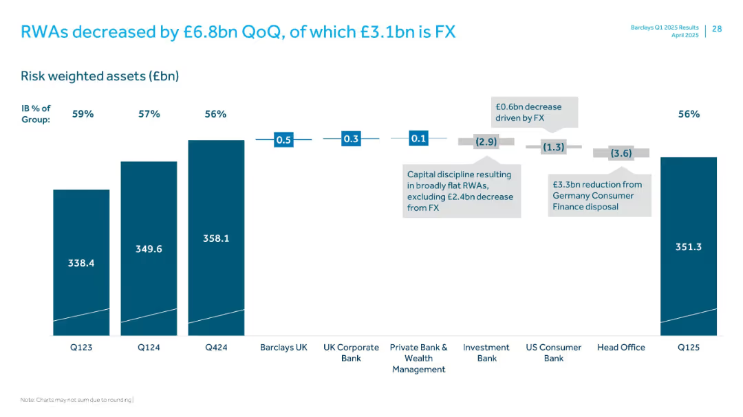
Vertical stacked bar chart with segments showing change in RWAs across divisions and FX effects
Performance Metrics and KPIs
Financial Services
Shows a £6.8bn quarter-over-quarter decrease in risk-weighted assets (RWAs), with detailed breakdowns by business units and impact from FX and the German consumer finance disposal.
RWAs, FX impact, Germany disposal, business units, Q125
Single Chart
Barclays
Saved
The slide features a detailed diagram of business models in industrial automation, showing different roles such as component suppliers, module manufacturers, and integrators across the value chain.
Strategic Planning
Industrial & Manufacturing
The slide explains various business models in industrial automation, highlighting the differences in growth and margin profiles across the value chain.
business models, industrial automation, value chain, component suppliers, module manufacturers, integrators
Table
LEK
Saved
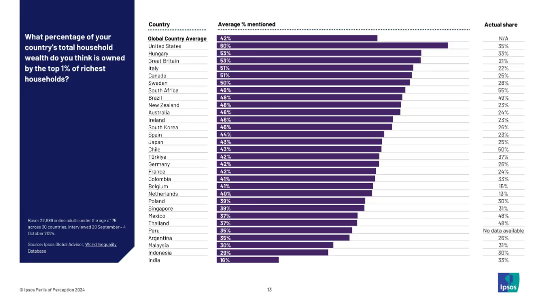
Bar chart with three columns: country, average % mentioned, and actual share; purple bars represent perceived values.
Market Analysis and Trends
Professional Services
This slide compares perceived versus actual estimates of wealth concentration among the top 1% richest households in various countries. It highlights a global trend of overestimating inequality, with perception gaps illustrated via a side-by-side format.
wealth perception, inequality, global survey, household wealth, top 1%, Ipsos, country comparison, data visualization, perception vs reality, public opinion
Mixed Chart
IPSOS
Saved
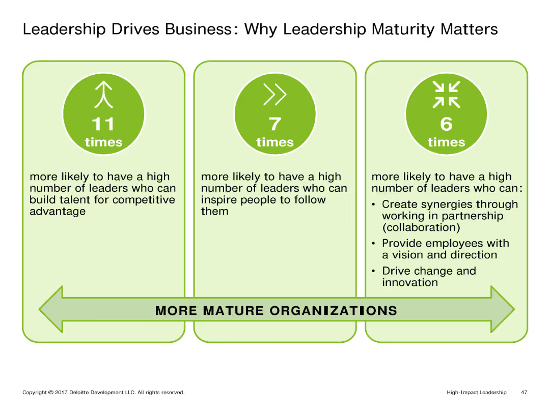
This slide includes three vertical columns with icons and text explaining the importance of leadership maturity. Each column is dedicated to a different aspect: building talent, inspiring followers, and driving innovation.
Market Analysis and Trends
Professional Services
The slide emphasizes the significant impact of leadership maturity on business success. It highlights how mature leaders are more likely to build competitive talent, inspire their teams, and drive innovation within their organizations.
Leadership, Business Success, Talent, Inspiration, Innovation
Pillar
Deloitte
Saved
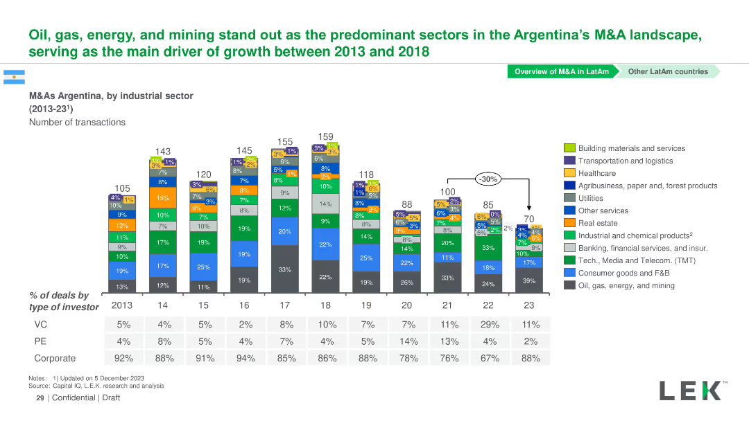
Column chart showing the number of M&A transactions by industrial sector in Argentina from 2013-2023. Sectors are color-coded and detailed in a legend.
Market Analysis and Trends
Financial Services
This slide focuses on M&A transactions in Argentina from 2013-2023, analyzing the leading sectors like oil, gas, and energy.
Argentina, M&A, Industrial Sectors, Transactions, Trends
Mixed Chart
LEK
Saved
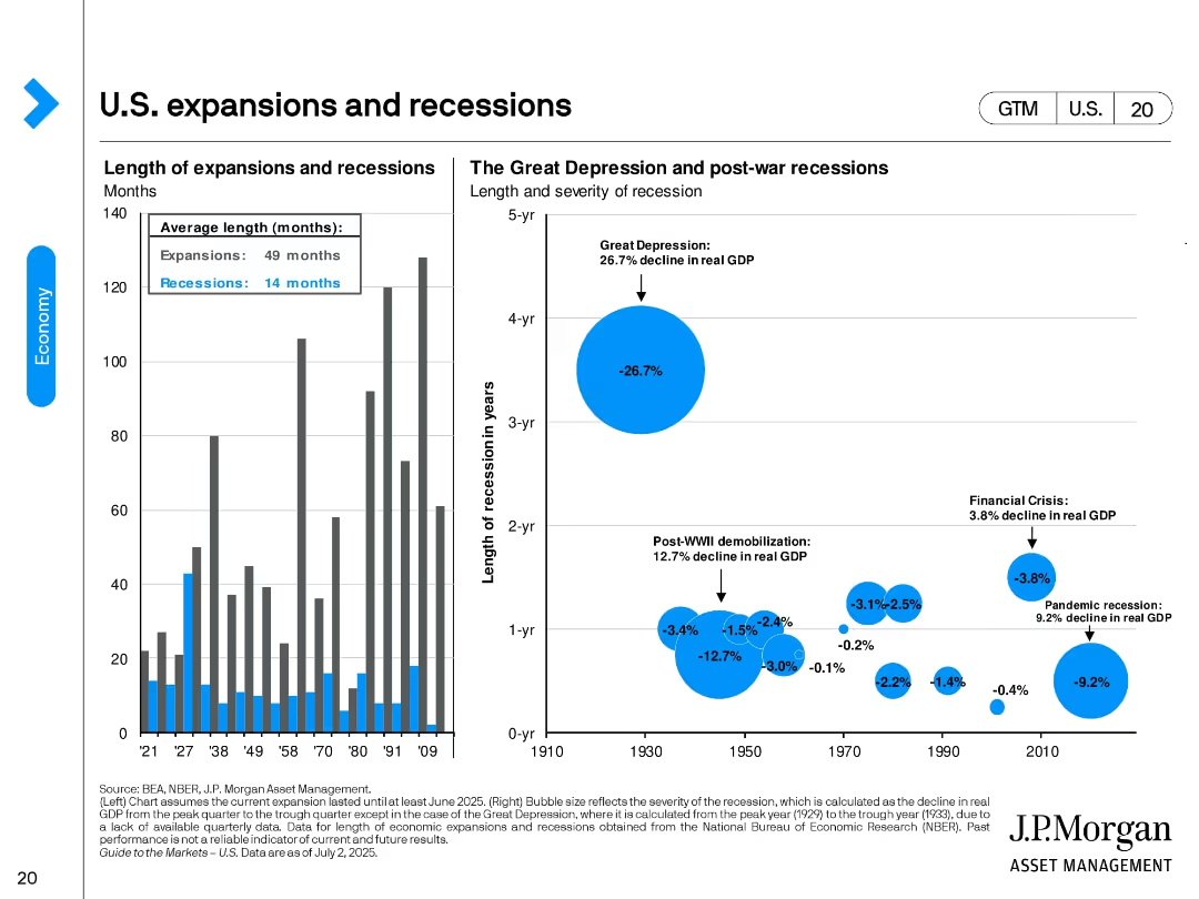
Two-panel design. Left: bar chart showing duration of U.S. expansions vs. recessions. Right: bubble chart comparing size and duration of major recessions by real GDP decline. Key events like the Great Depression are visually emphasized.
Industry Overview
Financial Services
This slide provides historical context on U.S. economic cycles, highlighting average durations (expansions: 49 months, recessions: 14 months). It visualizes the severity of downturns such as the Great Depression and the 2008 Financial Crisis.
expansions, recessions, GDP decline, Great Depression, historical economy, NBER, economic cycle, recovery duration
Multiple Chart
JP Morgan
Saved
Features a circular ecosystem diagram with different industry roles such as Upgrader and Recycler, connected by arrows to indicate workflow, accompanied by descriptive text.
Operational Efficiency
Transportation & Logistics
Highlights the necessity for collaboration in the maritime industry to optimize resource use and enhance sustainability through a circular economic model.
maritime, collaboration, circular economy, sustainability, optimization
Diagram
Accenture
Saved
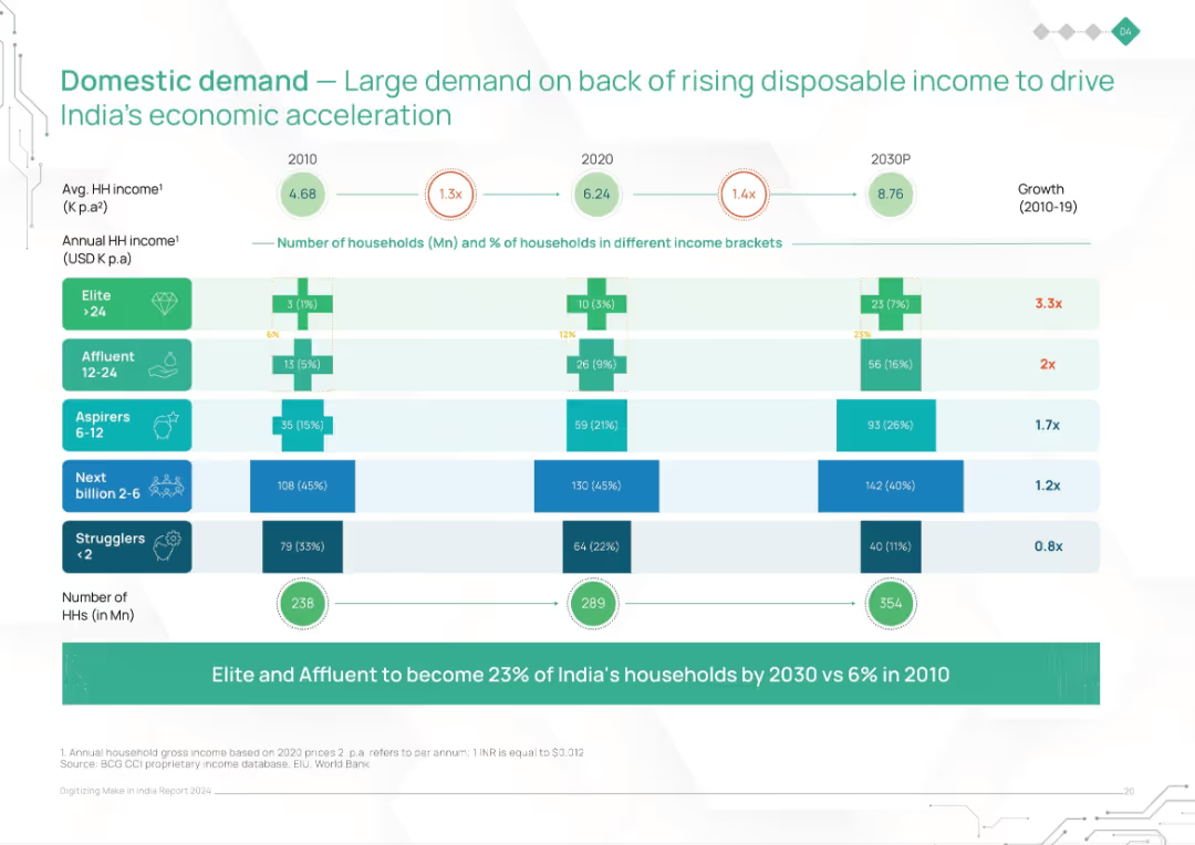
Stacked bar chart with income brackets across years (2010, 2020, 2030P). Shows household distribution and income growth.
Market Analysis and Trends
Consumer Goods
This slide illustrates the rise in Indian household incomes and changing income distribution, projecting a significant increase in affluent and elite households by 2030. It emphasizes rising domestic demand as a major driver of economic growth.
domestic demand, income growth, consumption, India households, income brackets, economic acceleration, rising affluence
Single Chart
BCG
Saved
Features a large pie chart and supporting text on workforce optimism regarding AI technologies. The design is clean, with green highlights that draw attention to key statistics, facilitating an easy understanding of the data.
Technology and Digital Transformation
Technology & Software
Discusses the positive impact of AI on workforce performance and job satisfaction, noting that 82% of respondents see a beneficial impact. This slide is pertinent for discussions on human resources strategies in tech industries.
AI, workforce optimization, job satisfaction, performance enhancement, human resources, tech industries, impact analysis
Mixed Chart
Deloitte
Saved
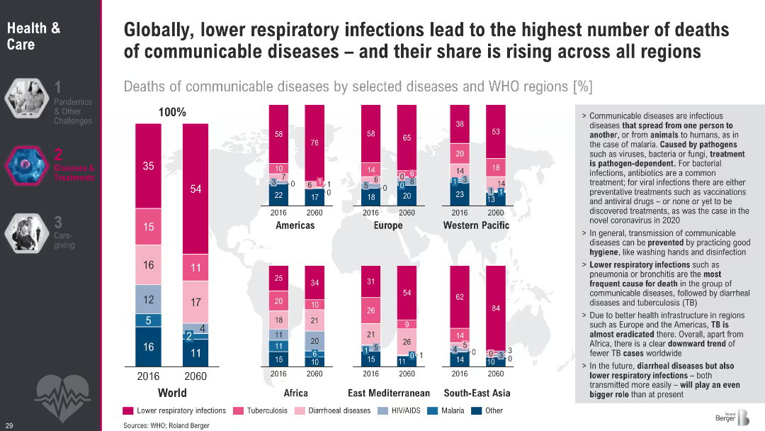
Stacked bar charts by region showing share of communicable disease deaths (2016 vs. 2060); color-coded by disease
Industry Overview
Healthcare & Pharmaceuticals
The slide shows that lower respiratory infections are the leading cause of communicable disease deaths globally. Despite progress in some areas, their share is expected to rise in most regions by 2060.
communicable diseases, respiratory infections, TB, WHO, global health, mortality trends, infection control, projections
Multiple Chart
Roland Berger
Saved
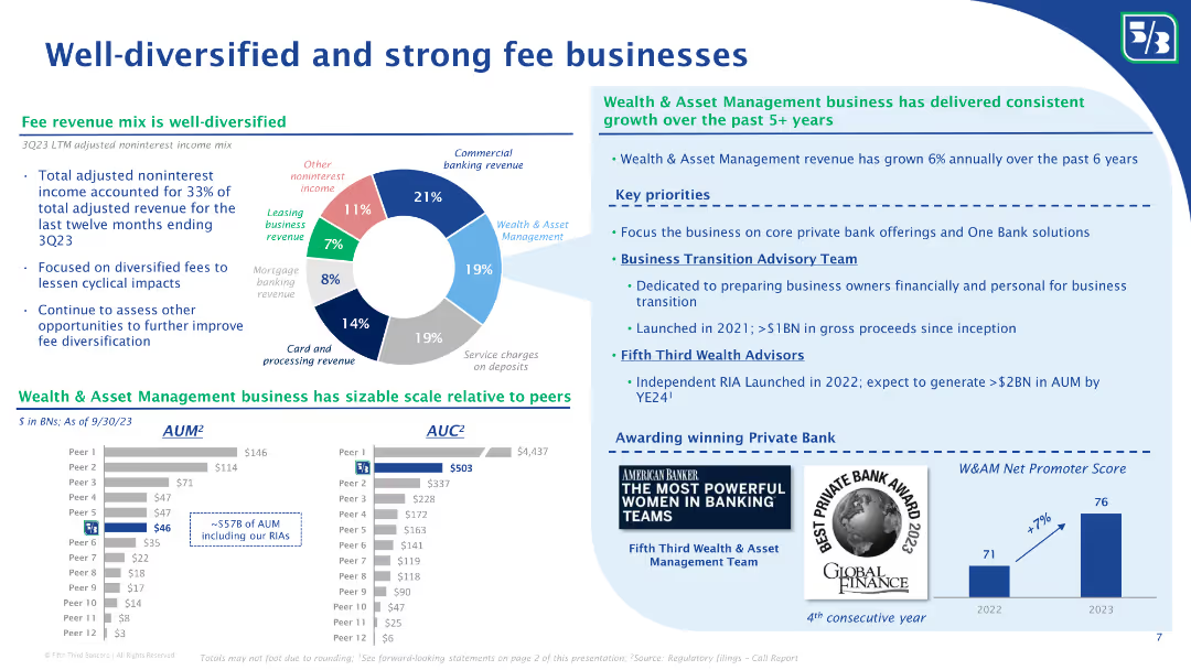
The slide features a pie chart showing the mix of noninterest income, and column charts comparing AUM and AUC with peers. Bullet points discuss the growth of the wealth and asset management business and key priorities for future growth.
Financial Performance
Financial Services
The slide highlights Fifth Third Bank’s diversified fee revenue streams, with a detailed breakdown of noninterest income sources. It showcases their wealth and asset management business growth, comparing AUM and AUC with peers, and outlines key priorities for future growth and client advisory services.
Fee businesses, noninterest income, diversified revenue, AUM, AUC, wealth management, asset management, revenue growth, client advisory, Fifth Third Bank
Multiple Chart
Goldman Sachs
Saved
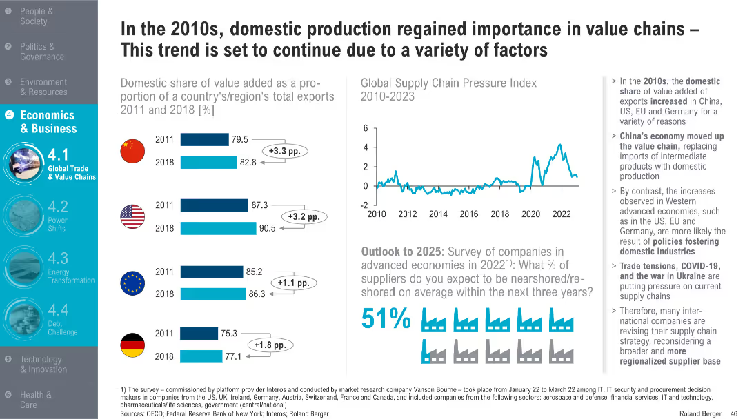
Dual-column layout with horizontal bar charts (left), line graph (top right), and infographic/statistical callouts (bottom right); clean design with icons and shaded highlights
Strategic Planning
Professional Services
This slide discusses the increasing importance of domestic value-added production in exports from 2011 to 2018 across key economies like China, the US, the EU, and Germany. It attributes this shift to structural policy choices, global events like COVID-19, and supply chain pressures. Survey data forecasts further reshoring through 2025.
domestic production, value chains, exports, reshoring, supply chain pressure, trade tensions, COVID-19, Ukraine war, China, EU
Multiple Chart
Roland Berger
Saved
This slide features a line chart with annotations for specific years and acquisitions, a sidebar with bullet points emphasizing revenue growth, and a company logo. The color scheme is blue, green, and black on a white background. The chart is the central visual element, with textual information in the sidebar presented in a clear, hierarchical layout with the use of bold fonts and contrasting colors.
Financial Performance
Industrial & Manufacturing
The slide illustrates the company's economic revenue growth over the years, highlighting significant acquisitions. The sidebar emphasizes a nine-fold increase in revenue since 2000, with equal contributions from organic growth and mergers and acquisitions. It appears to be used for showcasing the company's financial growth trajectory and strategic acquisitions to stakeholders or investors.
Growth, Acquisitions, Revenue, Organic, M&A, Economic, Line Chart, Annotations, Industrial, Strategic
Single Chart
Goldman Sachs
Saved
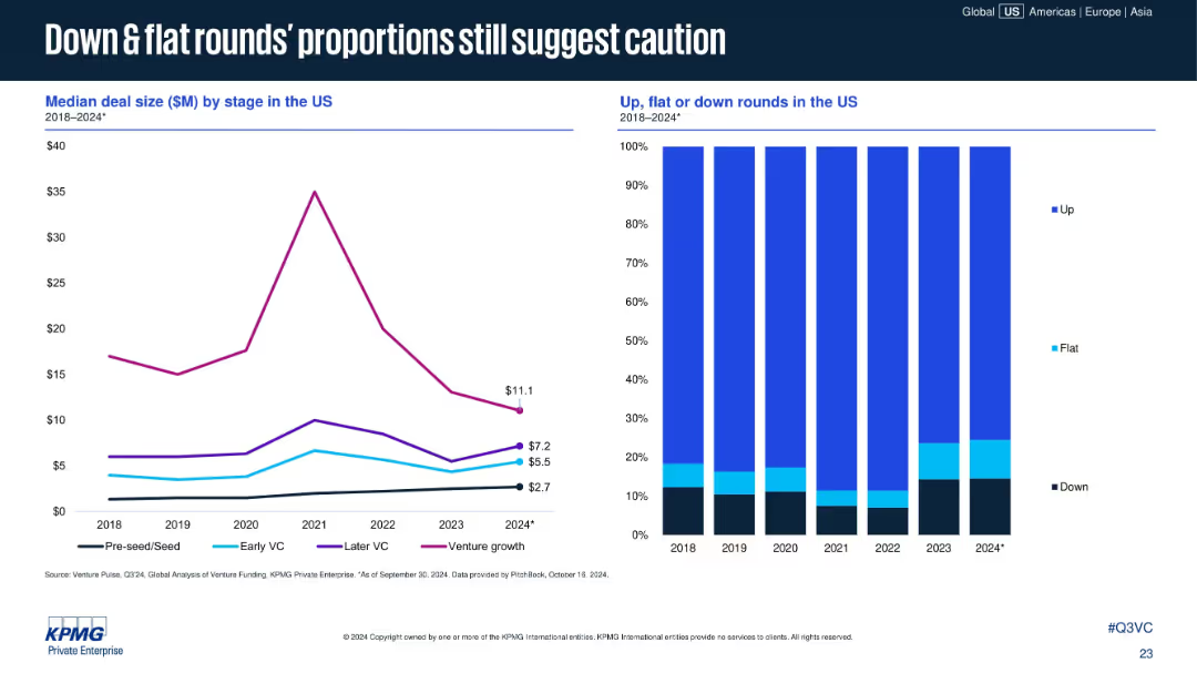
Dual chart layout; left line graph shows median deal size by stage, right stacked bar chart shows proportions of up, flat, and down rounds. Clean layout with legends.
Market Analysis and Trends
Financial Services
The slide highlights cautious investor sentiment in the U.S. VC market, showing median deal size by funding stage (2018–2024*) and the proportion of up, flat, and down rounds. Notably, venture growth deal sizes dropped while down and flat rounds increased.
VC funding, deal size, venture growth, down rounds, flat rounds, early VC, market caution, funding trends, investment stage, US market
Multiple Chart
KPMG
Saved
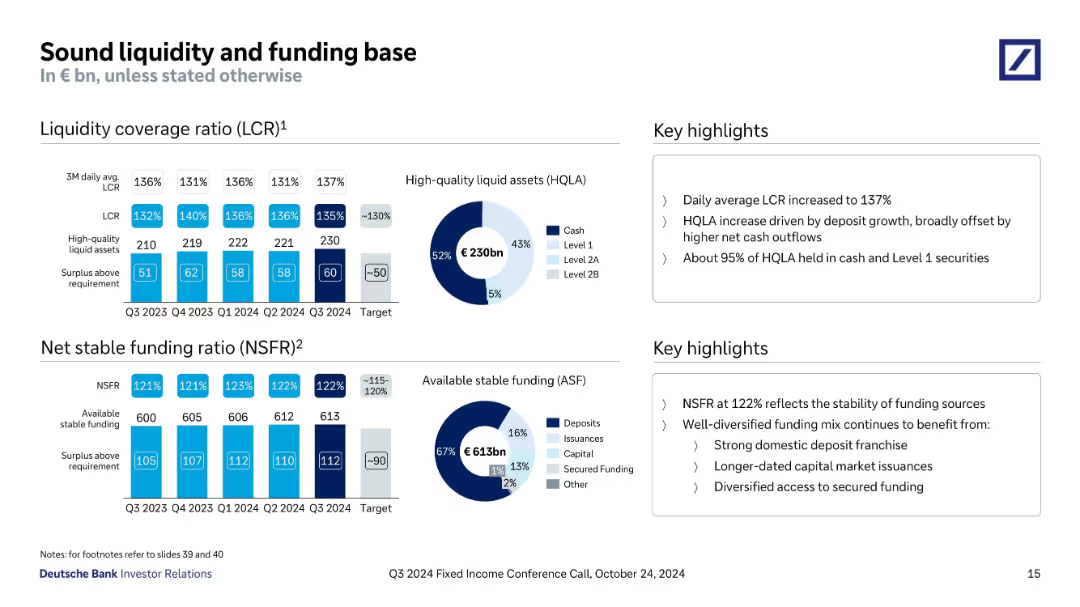
Dual sections with bar and donut charts showing liquidity coverage ratio (LCR), net stable funding ratio (NSFR), and breakdown of funding sources.
Risk Assessment and Management
Financial Services
The slide demonstrates robust liquidity and funding through LCR of 137% and NSFR of 122% in Q3 2024, supported by €230bn in HQLA and €613bn available stable funding. The bank emphasizes stability and diversified funding, with key metrics exceeding regulatory targets.
LCR, NSFR, liquidity, funding, HQLA, ASF, Deutsche Bank, Q3 2024, stability
Multiple Chart
Deutsche Bank
Saved
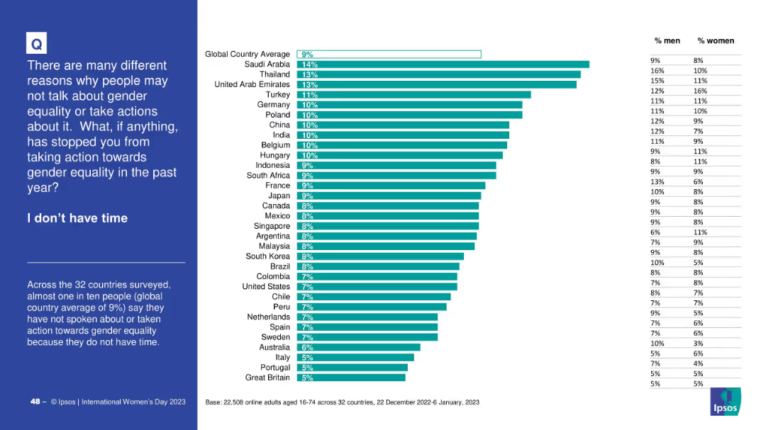
Horizontal bar graph with consistent design—country rankings, global average, gender splits; left-aligned blue panel describes the context and finding.
Operational Efficiency
Government & Public Sector
The slide presents data on people who did not take action for gender equality due to time constraints. The global average is 9%. Countries like Saudi Arabia and Thailand have higher percentages, and gender differences are also shown.
time constraints, gender action, survey, equality, barriers, Ipsos, country rankings
Mixed Chart
IPSOS
Saved
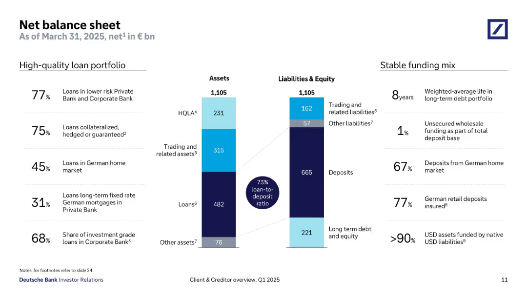
Dual column layout: asset vs liability distribution, supported by sidebar statistics on loan quality and funding.
Financial Performance
Financial Services
This balance sheet slide shows €1,105bn in total assets/liabilities, highlighting a 73% loan-to-deposit ratio. It emphasizes loan quality (77% in low-risk segments) and funding stability, with most deposits from the German market and minimal reliance on unsecured wholesale funding.
loan portfolio, balance sheet, funding mix, deposits, HQLA, asset quality, loan-to-deposit, liabilities
Mixed Chart
Deutsche Bank
Saved
Utilizes a combination of pie chart and line graph to display the spending on small businesses by Millennials and Gen Z. The design is streamlined, with a focus on clarity and ease of understanding the trends.
Market Analysis and Trends
Retail & E-commerce
Analyzes the significant contributions of Gen Z and Millennials to small business spending, emphasizing the importance of these demographics to local economies. Useful for economic analysis and strategic business planning.
Small Business, Spending Trends, Millennials, Gen Z
Multiple Chart
Accenture
Saved
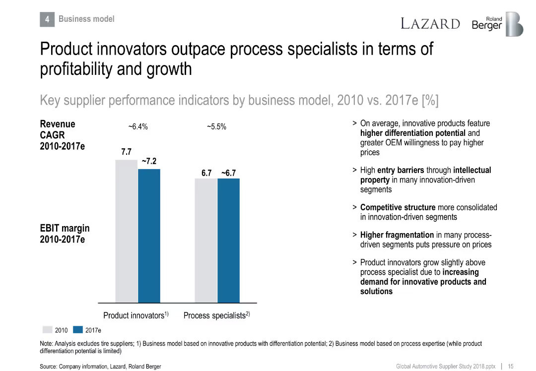
Side-by-side bar chart comparing product innovators vs. process specialists in EBIT margin and revenue CAGR.
Strategic Planning
Industrial & Manufacturing
Differentiates performance between product and process-focused suppliers. Product innovators lead in profitability due to differentiation and IP, while process specialists face fragmentation and pricing pressure.
product innovation, differentiation, process specialist, EBIT margin, growth, IP
Mixed Chart
Roland Berger
Saved
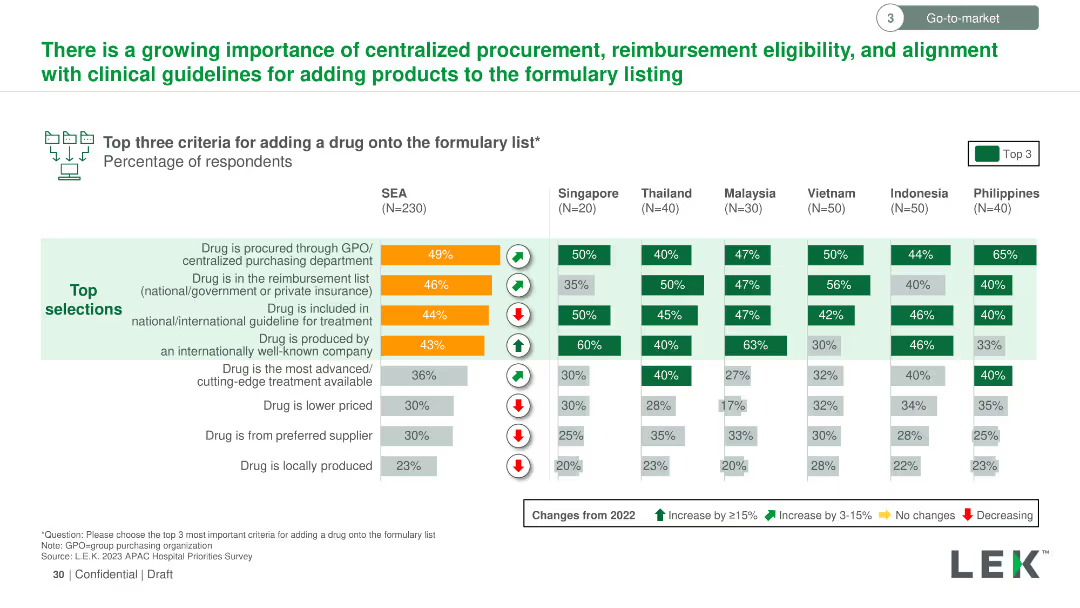
Vertical column chart showing the top three criteria for adding a drug to the formulary list across SEA countries. Criteria are color-coded and ranked by importance.
Regulatory and Compliance
Healthcare & Pharmaceuticals
Details the most important criteria for adding drugs to formulary lists in SEA, such as procurement through GPO, reimbursement status, and inclusion in treatment guidelines, with regional variations in importance.
formulary list, drug addition, criteria, GPO, reimbursement, treatment guidelines, SEA
Multiple Chart
LEK
Saved
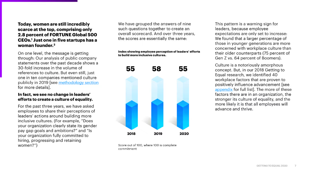
The slide features text on the left discussing the scarcity of women in leadership, with a bar chart on the right showing index scores on inclusivity efforts over three years.
Regulatory and Compliance
Government & Public Sector
The slide discusses the ongoing scarcity of women in top leadership positions and highlights the stagnant progress in leaders' efforts to build inclusive cultures over three years.
women, leadership, inclusivity, progress, analysis
Mixed Chart
Accenture
Saved
Bar chart showing investor motivations for tokenizing assets, with text detailing benefits and hurdles. Includes icons and text highlighting factors like transaction costs, liquidity, and regulatory hurdles.
Market Analysis and Trends
Financial Services
Describes the main drivers for investors to switch to tokenization, emphasizing benefits like lower transaction costs and increased liquidity, while also highlighting hurdles such as regulatory uncertainty and lack of trusted service providers.
tokenization, investors, liquidity, transaction costs, regulatory hurdles
Mixed Chart
EY
Saved
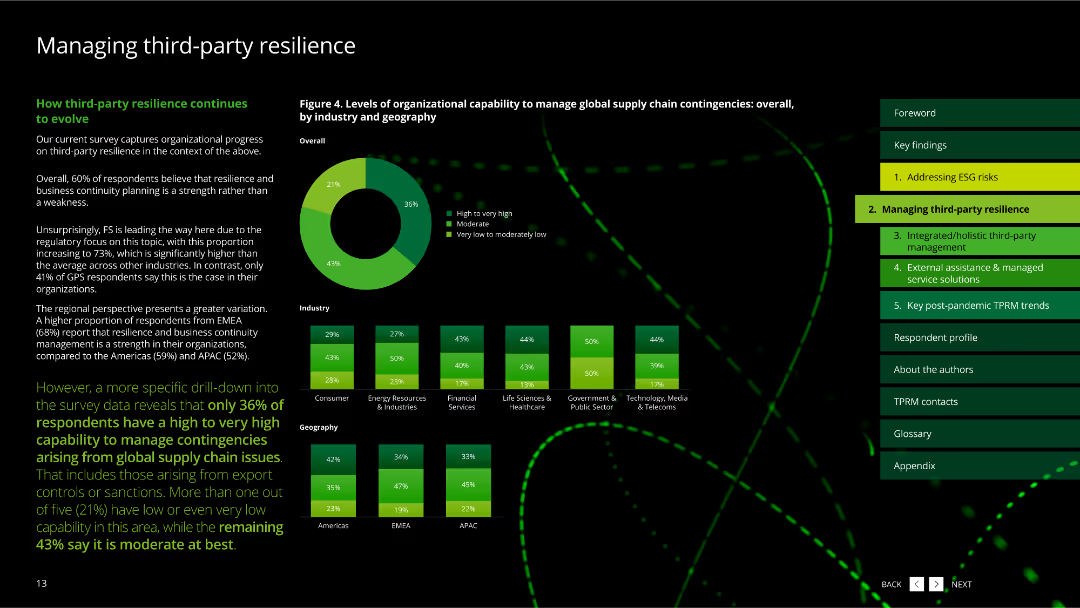
The slide features column charts about mechanisms for enhancing third-party resilience assurance.
Risk Assessment and Management
Technology & Software
This slide describes mechanisms that can enhance third-party resilience assurance, based on survey data.
third-party, resilience, assurance, mechanisms, survey
Multiple Chart
Deloitte
Saved
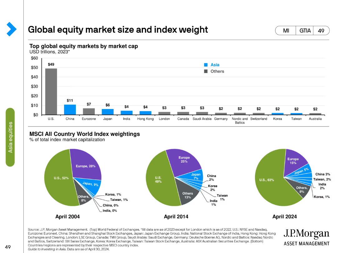
The slide contains a column chart showing the top global equity markets by market cap in 2023 and three pie charts comparing MSCI All Country World Index weightings in different years.
Market Analysis and Trends
Financial Services
Analyzes global equity market sizes by market cap and the weight of different countries in the MSCI All Country World Index from 2004, 2014, and projected for 2024.
equity market, market cap, MSCI, index weight, pie chart, column chart, global markets, financial analysis, historical data, projections
Multiple Chart
JP Morgan
Saved
Previous
Next
If nothing, comes up, please save your slides first
Create a FREE account to continue browsing
Receive Instant Access to 1,000+ slides from companies like McKinsey, Google, and Goldman Sachs
First Name
Last Name
Email
Password
I agree to all
Terms & Privacy Policy
Thank you! Your submission has been received!
Oops! Something went wrong while submitting the form.
Have an account?
Sign in
Column Chart
Heatmap
Chevron
Org Chart
Infographic
Callouts
Timeline
List
Graphic
Picture
Process Flow
Diagram
Paragraph
Map
Table
Framework
Subtitle
Takeaway Box
Icon
Other Chart
Radar Chart
Waterfall Chart
Mekko Chart
Pie Chart
Scatter Plot
Line Chart
Bar chart
Bullet points