Create a FREE Account
Instant access to 1,000+ real slides from top companies like McKinsey, BCG, Goldman Sachs, Google and many more!
First Name
Last Name
Email
Password
I agree to all
Terms & Privacy Policy
Thank you! Your submission has been received!
Oops! Something went wrong while submitting the form.
Have an account?
Sign in
Library
Templates
Courses
Pricing
My Account
My Slides
My Templates
✦ AI
AI Prompt Library
AI Search
Sign in
Start Here
Logout
My Saved Slides
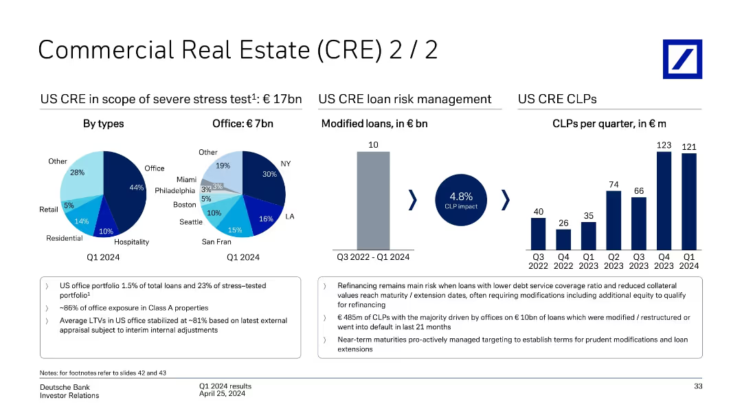
Series of pie and bar charts visualizing US CRE stress test exposure, modified loans, and CLPs over time; supported by key risk notes.
Risk Assessment and Management
Financial Services
Focuses on €17bn US CRE exposure under stress testing, dominated by office loans (44%). Regional breakdown of office loans and trend of cumulative loan loss provisions (CLPs) from Q3 2022–Q1 2024 are shown. Emphasis is placed on refinancing risk, Class A property exposure, and modification efforts.
US CRE, loan loss provisions, refinancing, CLP impact, Class A office, Deutsche Bank
Multiple Chart
Deutsche Bank
Saved
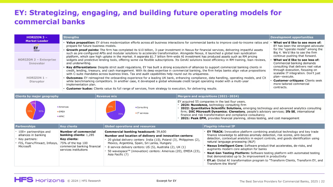
Dense information slide with multiple boxes: strengths, development, clients, revenue mix, operations, and M&A. Top section emphasizes positioning on HFS Horizon model.
Organizational Structure and Change
Financial Services
The slide positions EY as a top-tier digital transformation partner for commercial banks, citing strengths like value proposition, client kudos, and delivery footprint. It outlines EY’s investments, partnerships, and IP. Development suggestions include improving scalable IT and commercial customization. The slide supports EY’s leadership in financial services consulting.
EY, banking, modernization, Nexus, partnerships, M&A, GenAI, revenue mix
Mixed Chart
Accenture
Saved
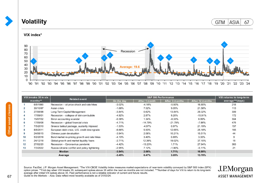
The slide presents a line chart of the VIX index over time with annotations for significant events and a table detailing VIX breaks.
Risk Assessment and Management
Financial Services
The slide provides an overview of market volatility, represented by the VIX index, and details significant events that caused volatility spikes.
VIX index, market volatility, significant events, risk management, financial analysis
Mixed Chart
JP Morgan
Saved
Column chart showing performance returns of the MS INVF Sustainable Asia Equity Fund over various periods.
Financial Performance
Financial Services
Displays fund performance for different time horizons, compared to a blended index, emphasizing past performance metrics.
Performance, returns, fund, equity, index
Mixed Chart
Morgan Stanley
Saved
Features a column chart detailing 'Copernicus economic impact (2018)' for air quality monitoring, alongside key products and a detailed text description of applications.
Regulatory and Compliance
Environmental Services & Sustainability
Discusses the applications and benefits of using Copernicus data for air quality monitoring, emphasizing the improvement in data quality and accessibility, and its impact on policy making and environmental compliance.
Air Quality, Monitoring, Copernicus
Mixed Chart
PwC/Strategy&
Saved
Balanced design with a 3D layered block diagram on the left and concise text on the right, using a muted color palette to focus attention on the data representation.
Technology and Digital Transformation
Energy & Utilities
This slide presents an overview of the "Global Energy Perspective 2022," highlighting its scope across segments, energy products, and countries. The accompanying diagram illustrates the report's multidimensional approach, covering a range of sectors from transport to hydrogen supply, emphasizing the depth and breadth of analysis contained within. The text succinctly conveys the report's comprehensiveness and the state-of-the-art tools and models used to project energy demand and trends across the globe.
Energy Systems, Global Analysis, Demand Outlook, Segmentation
Graphic
McKinsey
Saved
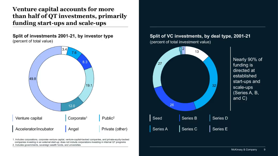
Two donut charts: one for investment split by investor type and one for deal stage (2001–2021). Includes a side note on Series A–C dominance.
Investment Analysis
Artificial Intelligence
The slide breaks down QT investment sources and deal stages, showing that venture capital dominates, and most funding goes to Series A through C. It emphasizes the ecosystem’s maturity level.
venture capital, QT investment, Series A-C, funding types, investor profile
Multiple Chart
McKinsey
Saved
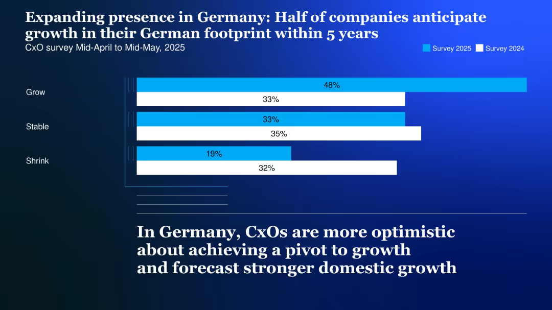
Horizontal bar chart comparing survey data from 2024 and 2025 with segmented blue bars on a dark gradient background
Market Analysis and Trends
Professional Services
The slide illustrates increasing optimism among CxOs regarding growth in Germany, with 48% forecasting expansion in their German footprint over the next 5 years.
Germany, CxO, growth, footprint, 2025, optimism, domestic market, survey, stable, shrink
Single Chart
McKinsey
Saved
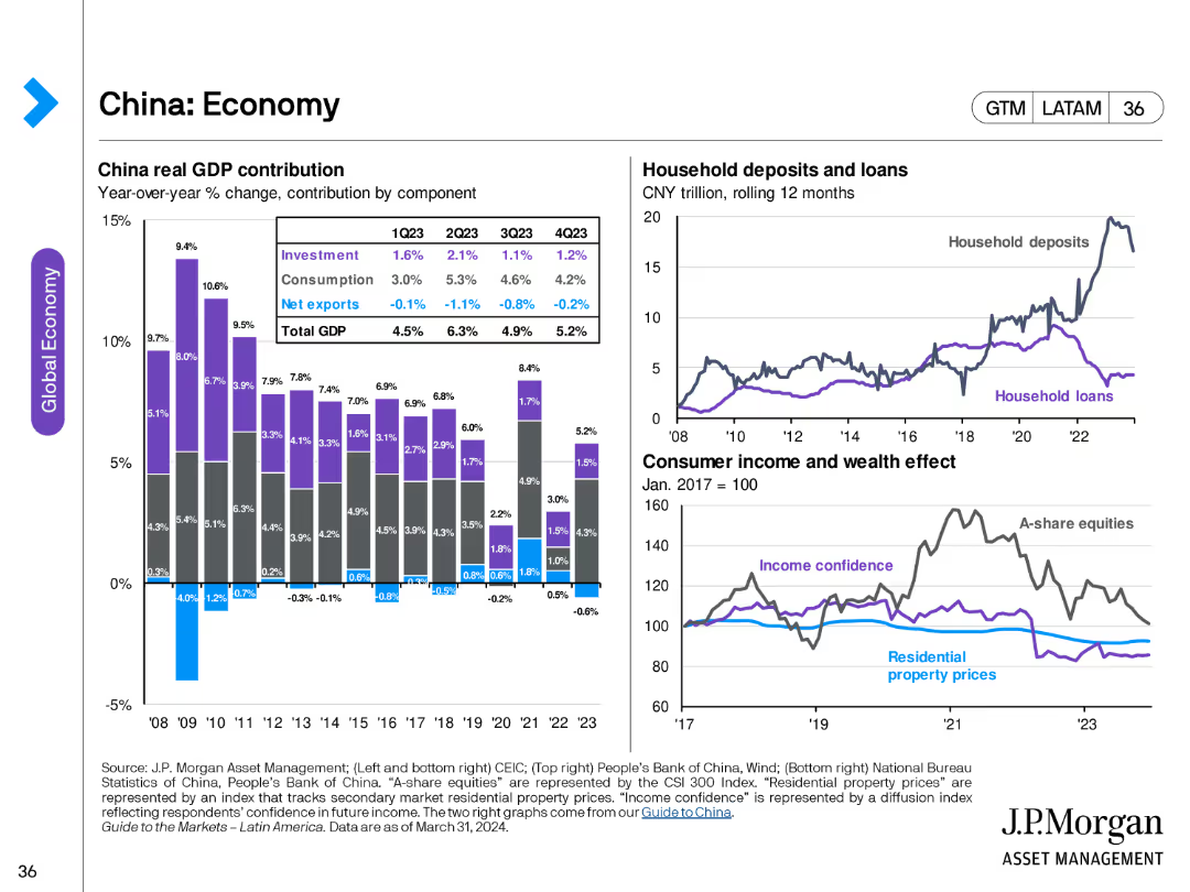
This slide includes stacked column charts showing China's real GDP contribution by component, and line charts displaying household deposits and loans, consumer income, and wealth effect.
Market Analysis and Trends
Financial Services
The slide analyzes China's economic components, including GDP contribution, household financial behavior, and consumer confidence, providing insights into economic health and trends in China.
China, economy, GDP, household deposits, household loans, consumer income, wealth effect, economic trends
Multiple Chart
JP Morgan
Saved
Two line graphs track unemployment rates and retail sales growth over time across different regions. The design uses contrasting colors to distinguish between the data series, making it easy to interpret.
Market Analysis and Trends
Financial Services
Analyzes trends in unemployment rates and retail sales growth, providing insights into economic health and consumer behavior. Useful for economic forecasting and strategic planning in various sectors.
Unemployment, Retail Sales, Economic Indicators, Consumer Behavior, Trends
Multiple Chart
Deutsche Bank
Saved
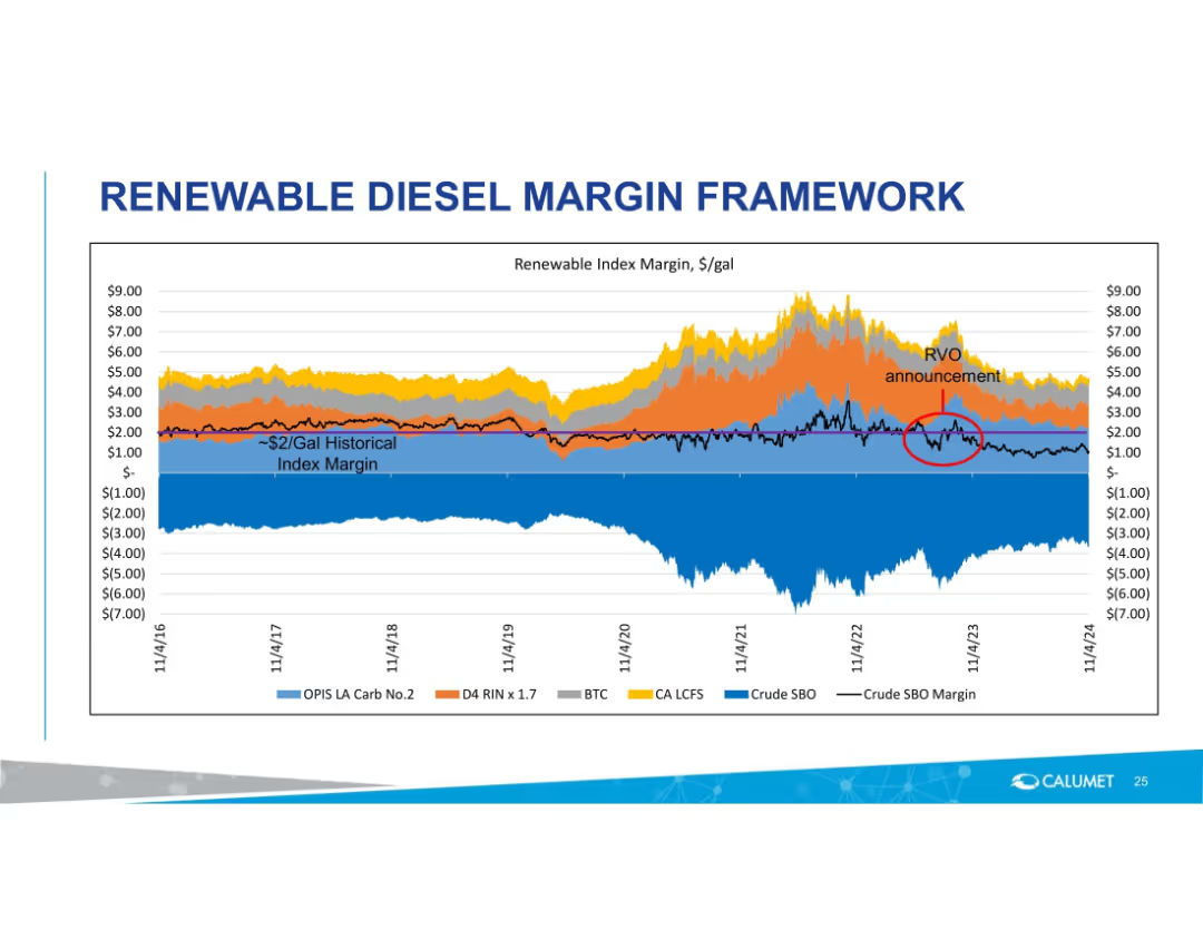
Area chart with multiple margin components and historical pricing trends from 2016–2024.
Pricing Strategies
Energy & Utilities
Illustrates historical renewable diesel index margins with breakdowns by regulatory and market components. Marks impact of RVO announcement and shows fluctuations in margins relative to various inputs like crude SBO and LCFS.
diesel margin, renewable fuel, index margin, OPIS, RVO, historical trend, LCFS, BTC, pricing framework
Single Chart
Goldman Sachs
Saved
Includes two line graphs tracking the average spread and annual default rate over time, with color coding to distinguish between loans and high yield corporate data.
Risk Assessment and Management
Financial Services
Analyzes the risk in the corporate bond market by displaying historical trends in credit spreads and default rates, useful for assessing the volatility and stability of the bond market.
corporate bonds, risk assessment, default rate, line graphs, credit spreads, market analysis
Multiple Chart
Morgan Stanley
Saved
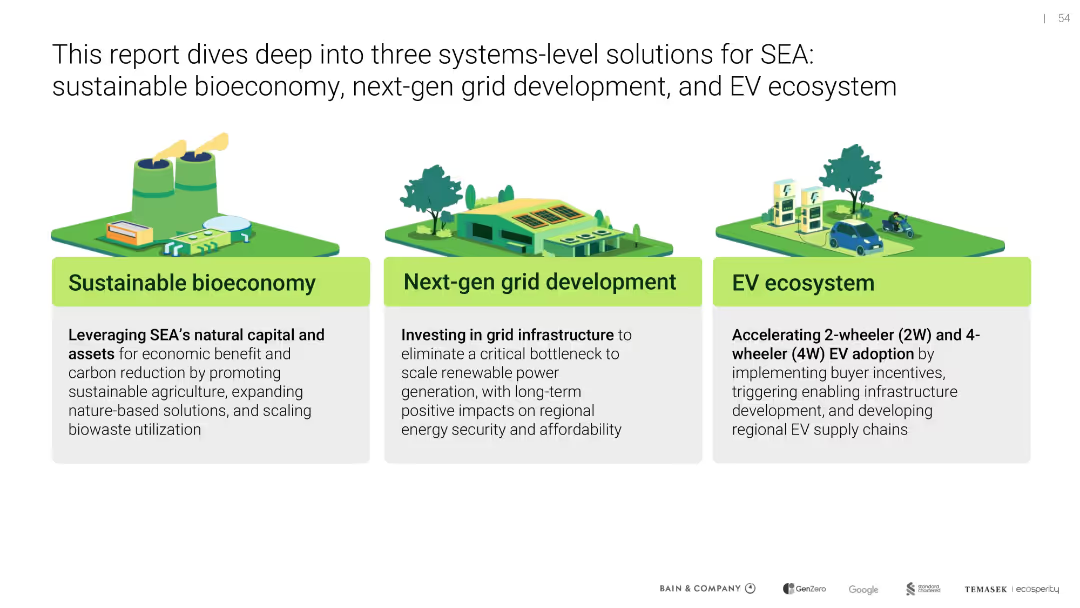
Horizontal 3-column layout with colorful illustrations and bolded subheads in green boxes; iconography for each solution
Strategic Planning
Environmental Services & Sustainability
The slide introduces three system-level solutions for Southeast Asia (SEA): sustainable bioeconomy, next-gen grid development, and EV ecosystem. Each is summarized with emphasis on carbon reduction, infrastructure investment, and EV adoption, highlighting their economic and environmental potential.
sustainable bioeconomy, grid development, EV adoption, carbon reduction, Southeast Asia, green infrastructure, electric vehicles
Pillar
Bain
Saved
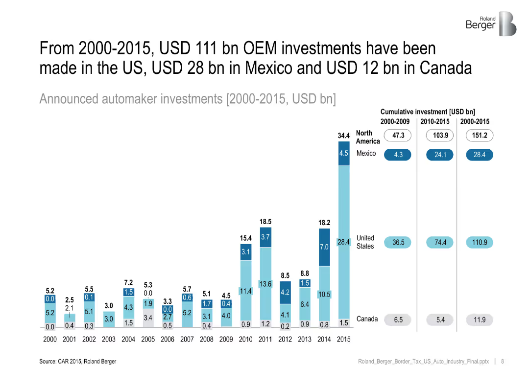
Bar chart of OEM investments per year with cumulative investments by country shown on right.
Investment Analysis
Industrial & Manufacturing
Tracks OEM investment trends across North America, revealing the majority of auto investments occurred in the US, with Mexico seeing a sharp rise post-2010.
OEM investment, North America, Mexico auto, cumulative investment, trend
Single Chart
Roland Berger
Saved
The slide includes column charts comparing the levelized cost of mobility per passenger for ICE buses, fuel cell buses, and BEV buses under different scenarios.
Operational Efficiency
Energy & Utilities
The slide compares the levelized cost of mobility per passenger for internal combustion engine buses, fuel cell buses, and battery electric buses, noting the higher cost for H2 buses.
LCOM, H2 buses, BEV, cost, passenger
Mixed Chart
Kearney
Saved
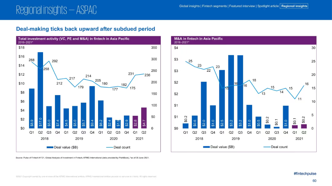
Two bar charts tracking quarterly investment and M&A in fintech across ASPAC from 2018–2021.
Market Analysis and Trends
Financial Services
This slide tracks quarterly fintech deal values and counts in ASPAC, indicating a slight recovery in Q2 2021 following a sustained dip. M&A values remained low but deal counts began to rise again.
Fintech, Quarterly Deals, M&A, VC, Recovery, ASPAC
Multiple Chart
KPMG
Saved
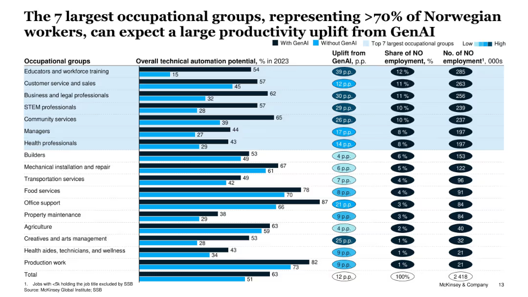
Extensive table layout showing automation potential uplift for major job groups, with % automation, employment share, and uplift from GenAI.
Human Resources and Talent Management
Artificial Intelligence
The slide evaluates the impact of GenAI on the top 7 occupational groups in Norway, which comprise over 70% of the workforce. It shows varying automation potentials and expected productivity gains.
GenAI, occupational groups, productivity uplift, automation, employment, Norway, workforce
Single Chart
McKinsey
Saved
Features icon-based design with minimalist text describing industries and regions. The slide is clean, using a map to indicate regions involved, and various industry icons representing sectors.
Market Analysis and Trends
Media & Entertainment
This slide presents a global study on digital marketing maturity, highlighting participation from 180 leading brands across various industries in the Asia Pacific region. It focuses on sectors such as automotive, retail, financial services, and more, illustrating a broad engagement in advancing digital marketing practices.
digital marketing, global study, Asia Pacific, industry participation, automotive, retail, financial services, technology, marketing trends, brand engagement
Graphic
BCG
Saved
Slide features purple and blue sections, icons for operational excellence, customer differentiation, and IT agility.
Technology and Digital Transformation
Technology & Software
Discusses how new technologies like GenAI enhance CSPs' ability to accelerate their tech transformation and gain a competitive edge, making them more likely to invest in updating their IT capabilities.
digital transformation, competitive advantage, GenAI, CSPs, IT investment
Header Vertical
Accenture
Saved
The slide has a title at the top, text in the middle, and a column chart at the bottom showing reliance on neighborhood help.
Risk Assessment and Management
Government & Public Sector
Highlights that 83% of respondents believe they can rely on someone in their neighborhood for help. The data compares responses from May and December 2020.
Neighborhood, Help, Survey, Community, Data
Single Chart
IPSOS
Saved
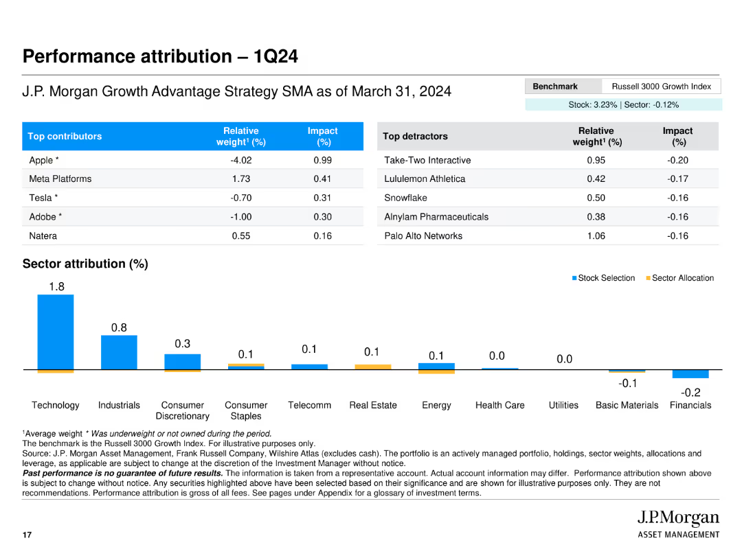
The slide features a table and a bar chart. The table lists the top contributors and detractors to performance, including relative weight and impact. The bar chart shows sector attribution percentages.
Financial Performance
Financial Services
Analyzes the performance attribution for the first quarter of 2024, detailing the contributions of specific stocks and sectors to the overall portfolio performance.
performance attribution, contributors, detractors, sector attribution, portfolio
Mixed Chart
JP Morgan
Saved
The slide features a diagram and detailed table presenting the total potential of agricultural residues for energy production by 2060, including theoretical, technical, and sustainable potentials, and various factors affecting its scalability and sustainability constraints.
Technology and Digital Transformation
Energy & Utilities
This slide provides a deep-dive into the potential of agricultural residues as a feedstock for energy production, analyzing its total potential by 2060 and highlighting the scalability issues and sustainability constraints associated with its use.
agricultural residues, feedstock, total potential, energy production, 2060, scalability, sustainability constraints
Mixed Chart
Kearney
Saved
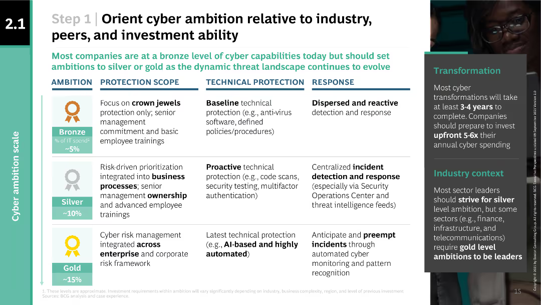
The slide features a table outlining different levels of cyber ambition (bronze, silver, gold) and their corresponding protection scope, technical protection, and response measures.
Strategic Planning
Professional Services
This slide helps organizations align their cyber ambition with industry standards, peer benchmarks, and investment capabilities. It provides detailed descriptions of bronze, silver, and gold levels of cyber ambition and their respective cybersecurity measures.
cyber ambition, industry standards, investment, protection scope, technical protection, response measures, BCG
Table
BCG
Saved
Column charts depicting the number of BEVs and PHEVs in use and the number of charging points per 100 vehicles across different regions, from 2015 to 2022.
Market Analysis and Trends
Energy & Utilities
This slide shows the growth of battery electric vehicles (BEVs) and plug-in hybrid electric vehicles (PHEVs) in use from 2015 to 2022 and their corresponding charging points.
BEVs, PHEVs, charging points, growth, regions
Multiple Chart
JP Morgan
Saved
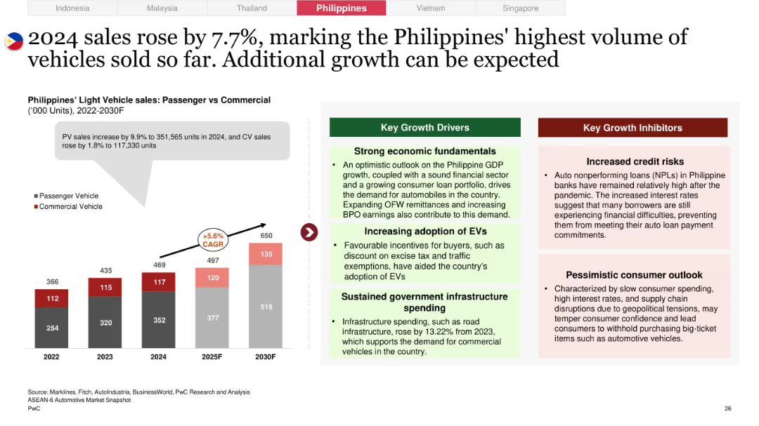
Left-aligned bar chart with PV/CV growth trends, growth and inhibitor boxes on right; light gray background behind graph annotation
Market Analysis and Trends
Industrial & Manufacturing
The Philippines experienced a 7.7% increase in vehicle sales, with strong gains in both PV and CV segments. Economic stability, EV adoption, and infrastructure spending are cited as enablers, while credit risk and weak consumer sentiment present hurdles.
Philippines, auto sales, growth forecast, credit risks, infrastructure spending, EV incentives, consumer outlook
Mixed Chart
PwC/Strategy&
Saved
Previous
Next
If nothing, comes up, please save your slides first
Create a FREE account to continue browsing
Receive Instant Access to 1,000+ slides from companies like McKinsey, Google, and Goldman Sachs
First Name
Last Name
Email
Password
I agree to all
Terms & Privacy Policy
Thank you! Your submission has been received!
Oops! Something went wrong while submitting the form.
Have an account?
Sign in
Column Chart
Heatmap
Chevron
Org Chart
Infographic
Callouts
Timeline
List
Graphic
Picture
Process Flow
Diagram
Paragraph
Map
Table
Framework
Subtitle
Takeaway Box
Icon
Other Chart
Radar Chart
Waterfall Chart
Mekko Chart
Pie Chart
Scatter Plot
Line Chart
Bar chart
Bullet points