Create a FREE Account
Instant access to 1,000+ real slides from top companies like McKinsey, BCG, Goldman Sachs, Google and many more!
First Name
Last Name
Email
Password
I agree to all
Terms & Privacy Policy
Thank you! Your submission has been received!
Oops! Something went wrong while submitting the form.
Have an account?
Sign in
Library
Templates
Courses
Pricing
My Account
My Slides
My Templates
✦ AI
AI Prompt Library
AI Search
Sign in
Start Here
Logout
My Saved Slides
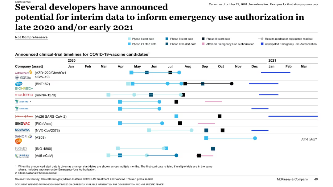
Timeline chart tracking vaccine candidates’ clinical trial phases, anticipated results, and EUA status. Very detailed and horizontally structured.
Regulatory and Compliance
Healthcare & Pharmaceuticals
This slide presents clinical development timelines for key COVID-19 vaccine candidates from companies like Pfizer, Moderna, and AstraZeneca. It shows when Phase I-III trials began and when emergency use authorizations (EUAs) were or are expected. The chart helps visualize the race to release vaccines and timelines for decisions.
EUA, vaccine trials, timelines, COVID-19, authorization, clinical phases
Single Chart
McKinsey
Saved
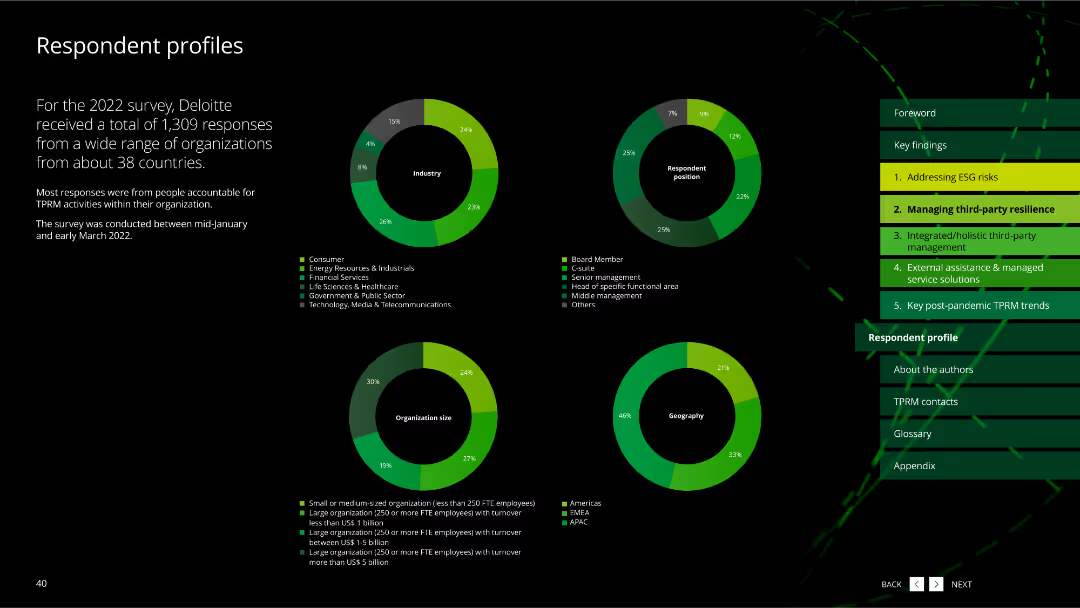
This slide includes multiple pie charts showing the distribution of survey respondents by industry, position, organization size, and geography.
Market Analysis and Trends
Professional Services
It provides an overview of the profiles of respondents who participated in the 2022 TPRM survey, detailing their industry, position, organization size, and geographical distribution.
respondent profiles, survey data, pie charts, industry, position, organization size, geography, professional services
Multiple Chart
Deloitte
Saved
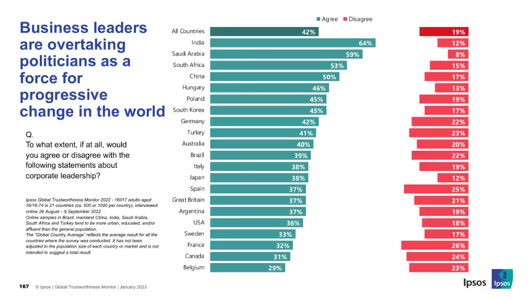
Same design as previous slides with vertical country list and agree/disagree bar chart; teal for "Agree", red for "Disagree".
Market Analysis and Trends
Government & Public Sector
This slide explores the perception that corporate leaders are becoming more progressive change agents than politicians. Agreement is highest in India and Saudi Arabia, showing a trend of growing corporate influence.
corporate influence, progressive change, politics, public perception, Ipsos, leadership, governance, reform
Mixed Chart
IPSOS
Saved
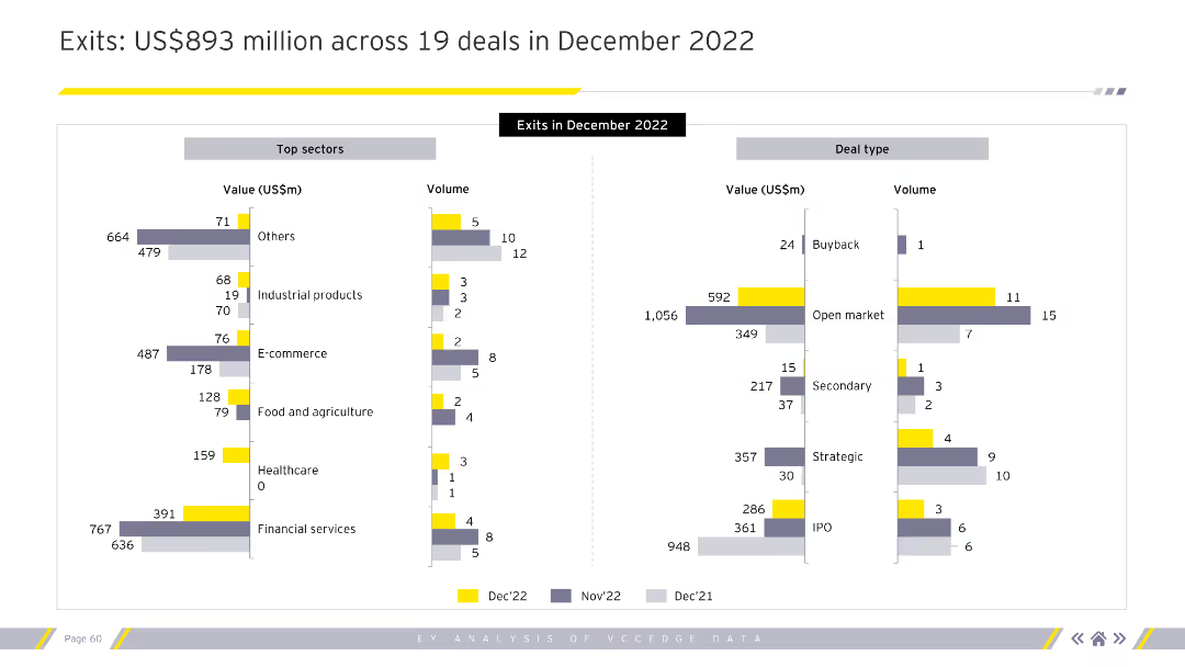
The slide features two bar charts. The left chart shows top sectors by value and volume. The right chart shows deal types by value and volume.
Market Analysis and Trends
Financial Services
This slide provides a detailed breakdown of exits in December 2022 by sector and deal type.
exits, December 2022, top sectors, deal types, value, volume, financial services
Multiple Chart
EY
Saved
Moderate visual complexity, this slide contains text blocks and icons representing various megatrends affecting the process industries. The design is organized to facilitate easy reading and identification of each megatrend and its impact.
Technology and Digital Transformation
Industrial & Manufacturing
The slide discusses the major global megatrends impacting process industries and the challenges they pose. It outlines the areas such as environmental sustainability and health & safety where these industries need to adapt and innovate, offering a strategic perspective on navigating these shifts.
Megatrends, Process industries, Environmental sustainability, Safety
Header Vertical
LEK
Saved
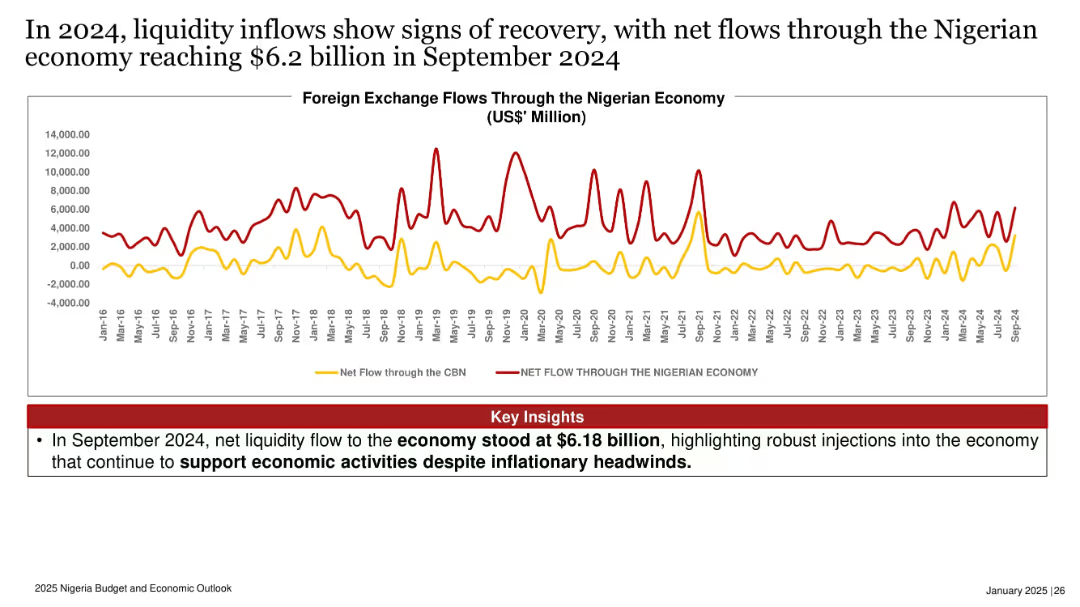
Time series chart comparing net foreign exchange flows through CBN and broader economy from 2016 to 2024.
Operational Efficiency
Government & Public Sector
Net liquidity into the Nigerian economy reached $6.2 billion in September 2024, reflecting robust foreign exchange inflows. The slide highlights ongoing efforts to sustain economic activity despite inflationary pressures.
FX inflows, liquidity, economy, Nigeria, foreign exchange, CBN, recovery
Mixed Chart
PwC/Strategy&
Saved
Horizontal bar chart with segmented responses per country and historic agreement data. Left side states the average agreement rate and survey details.
Market Analysis and Trends
Government & Public Sector
This slide visualizes global perceptions about immigrants displacing local workers. Agreement levels for 28 countries are shown in a color-coded bar chart, supplemented with historic agreement data. The framing implies a localized identity-based perspective.
immigration impact, job competition, labor market sentiment, Ipsos data, 2023 opinion, economic anxiety, nationalist view
Mixed Chart
IPSOS
Saved
Utilizes a combination of bar graphs and numerical data to display the trend of digital purchasing in ASEAN. It contrasts the years 2016 and 2021, with a side text summarizing the data's implications. The design is simple with a focus on clarity and contrast.
Customer and Market Segmentation
Technology & Software
This slide provides statistics on the growth of online shopping in ASEAN and its influence on the demand for digital talent, linking increased digital purchases with a need for specialized skills in e-commerce and digital services.
digital purchasing, ASEAN, trends, e-commerce, market segmentation
Multiple Chart
Kearney
Saved
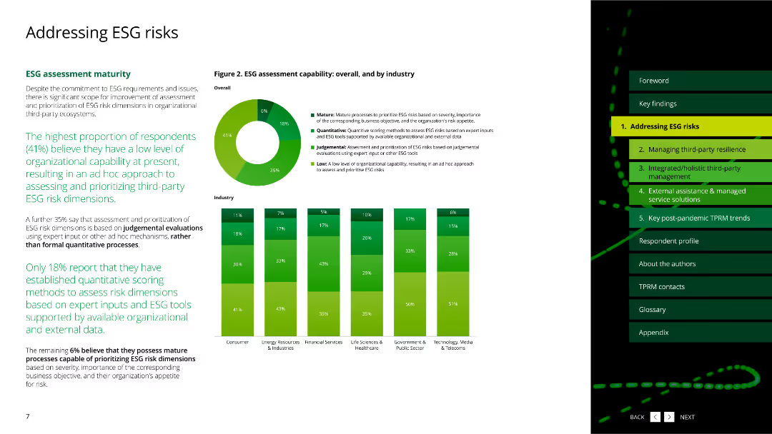
The slide includes column charts displaying ESG dimensions managed by respondents.
Risk Assessment and Management
Environmental Services & Sustainability
This slide highlights the quality of data used for managing and reporting ESG risks across various industries.
ESG, data quality, reporting, dimensions, industries
Multiple Chart
Deloitte
Saved
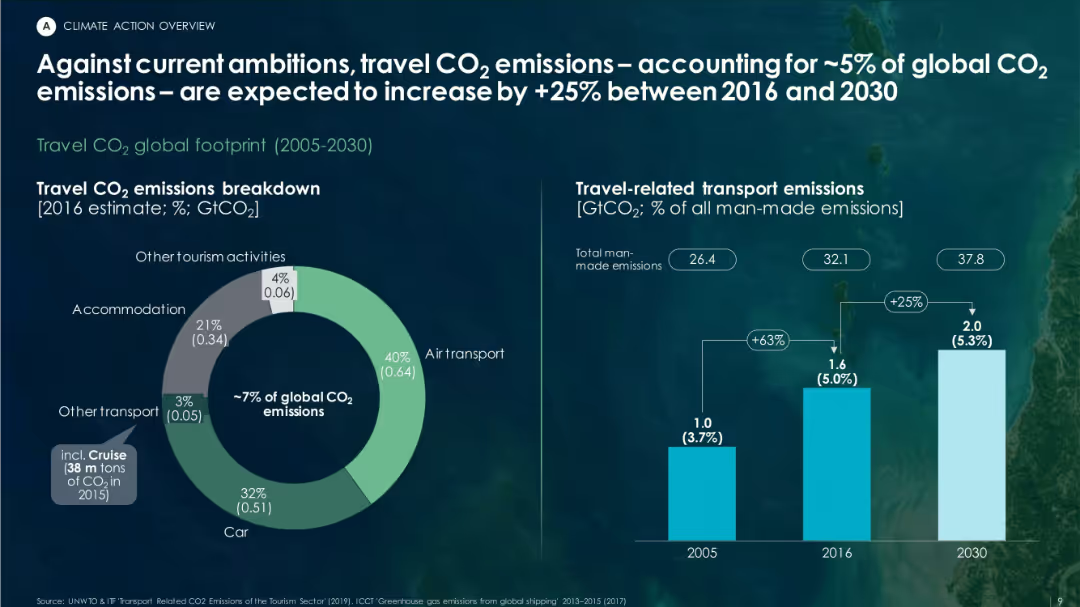
Split layout with pie chart on left showing CO₂ sources in travel; bar chart on right illustrating emissions growth from 2005 to 2030.
Market Analysis and Trends
Environmental Services & Sustainability
This slide breaks down the carbon footprint of global travel, showing how it accounts for about 5% of global CO₂ emissions. It forecasts a 25% increase from 2016 to 2030, with air transport and cars being major contributors.
travel emissions, CO₂, tourism footprint, air transport, sustainability, global warming
Multiple Chart
Roland Berger
Saved
The slide presents a column chart displaying the number of global CCUS projects over time. It includes different colored bars to indicate operational projects, projects in development, etc.
Market Analysis and Trends
Energy & Utilities
It provides an overview of global CCUS projects, showing trends in operational, developmental, cancelled, and completed projects from 1972 to 2030. It highlights the increase and decline phases.
CCUS projects, global overview, operational projects, development projects, cancelled projects, energy, utilities
Single Chart
Kearney
Saved
The slide features a large title at the top with three proportional circle diagrams beneath, showing the increasing number of internet users from 2019 to 2022. It includes percentages and numerical data, labeled clearly to show growth over the years. The colors range from light to dark blue.
Industry Overview
Technology & Software
This slide visually demonstrates the growth in the number of internet users over a three-year span, highlighting the impact of the pandemic on digital adoption. It's useful for illustrating market growth in technology use and for identifying digital expansion trends in Southeast Asia.
internet users, SEA, pandemic, market growth, technology adoption, digital expansion, 2019-2022, circle diagrams
Multiple Chart
Bain
Saved
This slide features multiple column charts showing adjusted fixed income sales, equity sales, capital markets, advisory fees, pre-tax income, and return on regulatory capital over several quarters. The slide is dense with data.
Financial Performance
Financial Services
The slide presents financial performance metrics for the investment bank, comparing quarterly results over time for various segments. It is used to analyze the financial health and trends in the investment banking sector.
Financial, investment, performance, quarterly, analysis, trends, advisory, equity, fixed income, regulatory capital
Multiple Chart
Credit Suisse
Saved
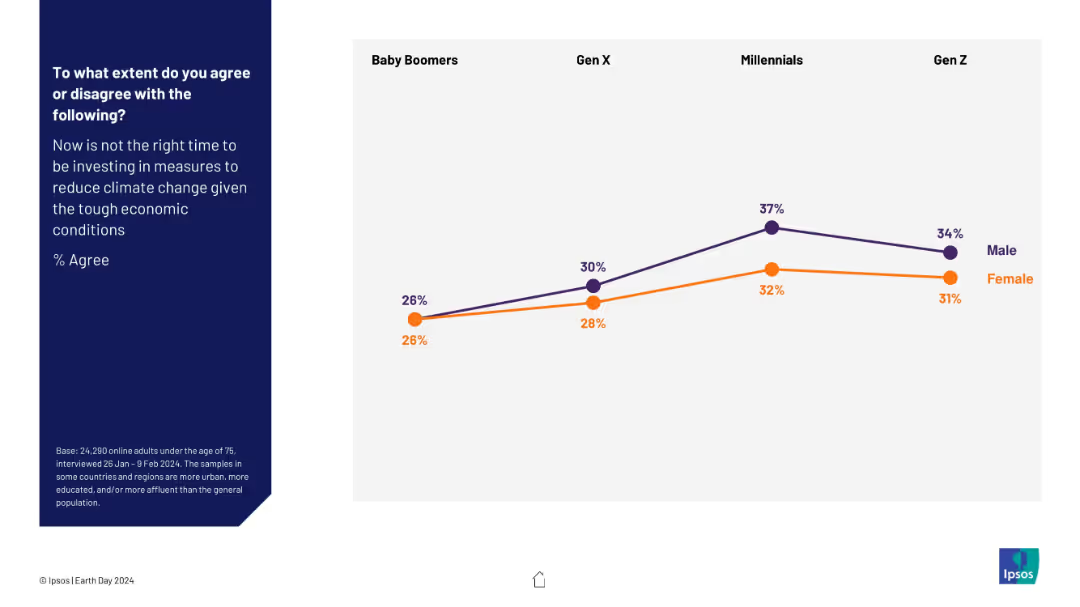
Line graph comparing gender-based agreement across four generations about delaying climate investment. Purple represents males; orange represents females.
Market Analysis and Trends
Environmental Services & Sustainability
This slide breaks down generational and gender differences in agreement with postponing climate-related investments due to economic conditions. Agreement increases with younger generations, peaking among Millennials. Males consistently show higher agreement levels than females, highlighting gendered economic risk perceptions.
climate investment, generational divide, gender perspectives, survey, economic conditions, public opinion, environment, Ipsos, Earth Day
Mixed Chart
IPSOS
Saved
A horizontal flow chart listing six execution priorities under the vision to create a global wealth manager.
Strategic Planning
Financial Services
Outlines the strategic priorities for Wealth Management, emphasizing integration, growth, and risk management.
strategy, execution priorities, wealth management, global vision, risk management
Diagram
Credit Suisse
Saved
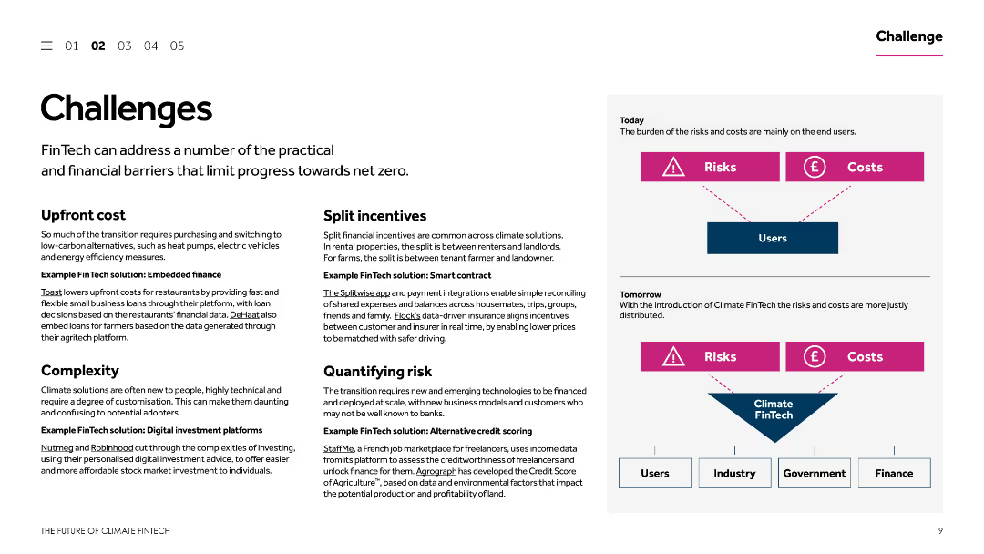
The slide is divided into multiple sections, each addressing different challenges and corresponding FinTech solutions. It includes textual descriptions and simple diagrams to explain concepts like upfront costs, split incentives, and quantifying risk.
Operational Efficiency
Financial Services
This slide outlines various challenges that limit progress towards net zero in the context of FinTech. It provides examples of FinTech solutions to address issues like upfront costs, split incentives, complexity, and risk quantification, aiming to enhance operational efficiency.
FinTech solutions, net zero, upfront costs, split incentives, risk quantification
Diagram
Barclays
Saved
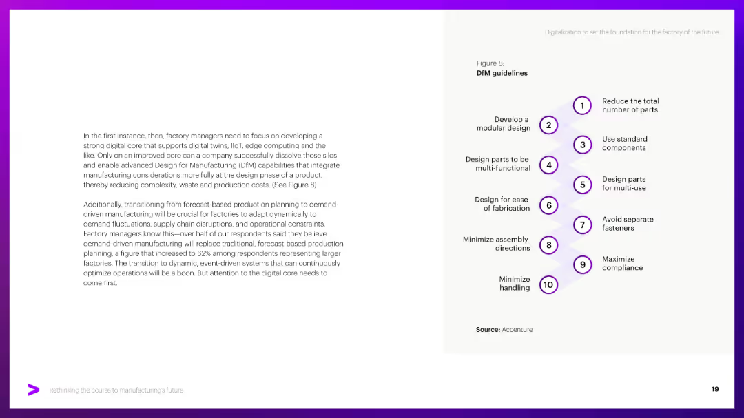
Left side narrative; right side features a vertical flow diagram with 10 numbered guidelines.
Operational Efficiency
Industrial & Manufacturing
Lists ten principles for Design for Manufacturing (DfM), such as minimizing parts and simplifying assembly. Emphasizes building a strong digital core to integrate IIoT, edge computing, and digital twins.
DfM, design guidelines, modular design, digital core, IIoT, simplification
Vertical Flow
Accenture
Saved
Line graph illustrating the loss ratio progression for cargo accounts from 2014 to Q2 2018.
Market Analysis and Trends
Financial Services
Evaluates the impact of soft market conditions on Lloyd's reserve strength, specifically for cargo lines, detailing how optimism in business planning affects financial results.
Market, Conditions, Reserves, Impact, Cargo
Single Chart
PwC/Strategy&
Saved
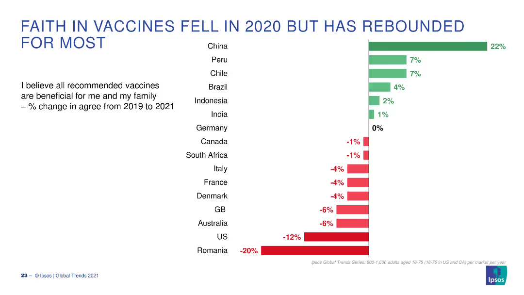
A bar chart displaying changes in faith in vaccines across various countries from 2019 to 2021. Green bars indicate positive change, red negative.
Market Analysis and Trends
Healthcare & Pharmaceuticals
The slide shows the percentage change in belief in the benefits of vaccines for various countries, highlighting changes between 2019 and 2021.
Vaccines, Belief, Change, 2019-2021, Countries
Single Chart
IPSOS
Saved
This slide showcases images of fluid storage systems and a pie chart detailing the revenue distribution between two major product lines. The slide is well-organized, making effective use of space and visual contrast to highlight important elements and data.
Market Analysis and Trends
Industrial & Manufacturing
Highlights TI Fluid Systems as a leader in automotive fluid systems, focusing on its strategic focus on highly engineered products like fuel tanks and thermal management systems for BEVs. The slide emphasizes the company’s strong market position and technological advancements in a niche market.
automotive, market leader, technology, BEVs, fluid systems
Diagram
Deutsche Bank
Saved
Features two major logos at the top, three columns with text and graphics representing global locations, transactions, and contact information.
Client Case Studies
Professional Services
Highlights a consultancy's global reach and expertise in automation, with emphasis on M&A advisory services.
Global Network, Automation, Expertise, M&A Advisory, Consulting, Global Reach
Uncategorized
LEK
Saved
The slide displays a column chart comparing reasons for not purchasing crypto assets between 2022 and 2023, with bars indicating percentage responses.
Risk Assessment and Management
Financial Services
It outlines the main reasons for avoiding crypto investments, such as perceived risk, lack of understanding, and concerns about volatility and security.
Crypto assets, non-purchase, reasons, risk, 2023, 2022, security, volatility, understanding, concerns
Multiple Chart
IPSOS
Saved
The slide employs a donut chart and a simple table to depict the distribution of commercial real estate loans. It is complemented by a blue and gray color scheme that adds visual clarity to the categorical distribution.
Market Analysis and Trends
Real Estate & Construction
Specialized for real estate professionals and investors, the slide analyzes commercial real estate loan distributions and investment grades, facilitating discussions on portfolio risk and investment opportunities within the commercial real estate sector.
commercial real estate, loans, investment grade, real estate distribution, portfolio risk
Mixed Chart
Goldman Sachs
Saved
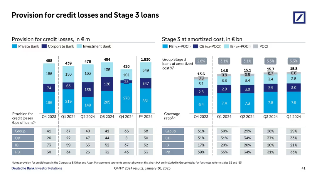
Stacked bar and column charts show credit loss provisions and Stage 3 loan amounts by division and time; includes table and key metrics
Risk Assessment and Management
Financial Services
Shows provisions for credit losses and Stage 3 loan balances by business unit from Q4 2023 to Q4 2024. Group-level ratios, coverage, and bps data illustrate a relatively stable risk environment, with investment and private banks absorbing most losses; Corporate Bank fluctuates moderately.
credit losses, Stage 3 loans, provisions, risk, amortized cost, coverage
Multiple Chart
Deutsche Bank
Saved
Pie chart of FDI by regions and a bar chart showing top five investing countries by FDI in Europe.
Market Analysis and Trends
Financial Services
This slide examines the origins of FDI in Europe, with a significant share coming from European companies.
FDI, Europe, investing countries, regions, origin
Multiple Chart
EY
Saved
Previous
Next
If nothing, comes up, please save your slides first
Create a FREE account to continue browsing
Receive Instant Access to 1,000+ slides from companies like McKinsey, Google, and Goldman Sachs
First Name
Last Name
Email
Password
I agree to all
Terms & Privacy Policy
Thank you! Your submission has been received!
Oops! Something went wrong while submitting the form.
Have an account?
Sign in
Column Chart
Heatmap
Chevron
Org Chart
Infographic
Callouts
Timeline
List
Graphic
Picture
Process Flow
Diagram
Paragraph
Map
Table
Framework
Subtitle
Takeaway Box
Icon
Other Chart
Radar Chart
Waterfall Chart
Mekko Chart
Pie Chart
Scatter Plot
Line Chart
Bar chart
Bullet points