Create a FREE Account
Instant access to 1,000+ real slides from top companies like McKinsey, BCG, Goldman Sachs, Google and many more!
First Name
Last Name
Email
Password
I agree to all
Terms & Privacy Policy
Thank you! Your submission has been received!
Oops! Something went wrong while submitting the form.
Have an account?
Sign in
Library
Templates
Courses
Pricing
My Account
My Slides
My Templates
✦ AI
AI Prompt Library
AI Search
Sign in
Start Here
Logout
My Saved Slides
Bar chart and pie chart showing the key factors MGAs consider when partnering with insurers and the importance of technology in these relationships.
Strategic Planning
Financial Services
Highlights the key factors MGAs look for in insurer partnerships, such as market reputation and claims record, and the role of technology in enhancing these relationships.
MGAs, insurers, partnerships, key factors, technology
Mixed Chart
Roland Berger
Saved
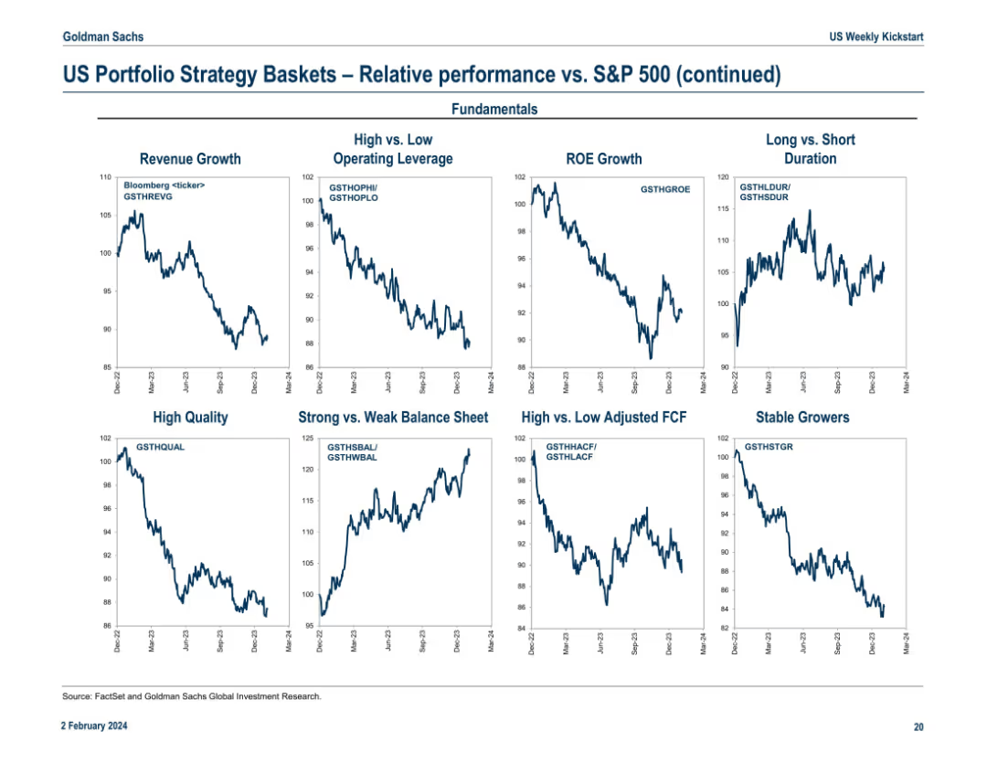
Continuation of the previous slide, featuring strategy baskets by fundamentals (e.g., ROE Growth, High Quality) and balance sheet quality. Layout mirrors Slide 17978 with 9 line charts labeled with Bloomberg tickers.
Investment Analysis
Financial Services
This slide adds depth by comparing strategy baskets on fundamentals such as ROE Growth, Balance Sheet Strength, and Operating Leverage. It helps identify which quality or growth factors outperform in current market conditions. For instance, baskets like Strong Balance Sheet show upward trends, suggesting investor preference for financially sound companies.
ROE growth, fundamentals, balance sheet, stable growers, operating leverage, FCF, S&P 500 comparison, quality investing
Multiple Chart
Goldman Sachs
Saved
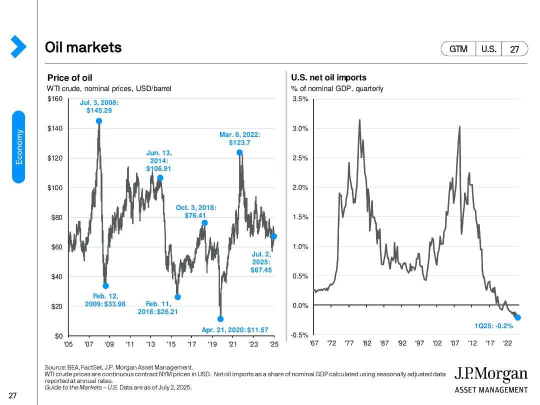
Two side-by-side line charts showing WTI oil price history and U.S. net oil imports as % of GDP; key data points annotated.
Market Analysis and Trends
Energy & Utilities
This slide tracks historical WTI crude oil prices and U.S. net oil imports as a share of GDP. It shows key peaks and troughs, with recent prices and import levels, highlighting the U.S.'s shift to net oil exporter status.
oil prices, WTI, GDP, imports, energy, trade balance, commodity, trend analysis, crude oil
Multiple Chart
JP Morgan
Saved
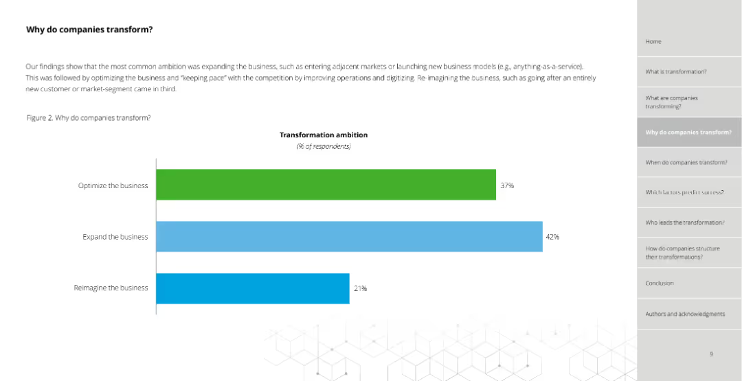
Bar chart (column chart) showing transformation ambitions with percentages for optimizing, expanding, and reimagining the business.
Strategic Planning
Professional Services
Illustrates the percentage of respondents focused on different transformation ambitions: optimizing (37%), expanding (42%), and reimagining (21%).
transformation, ambitions, optimizing, expanding, reimagining, percentages, business
Single Chart
Deloitte
Saved
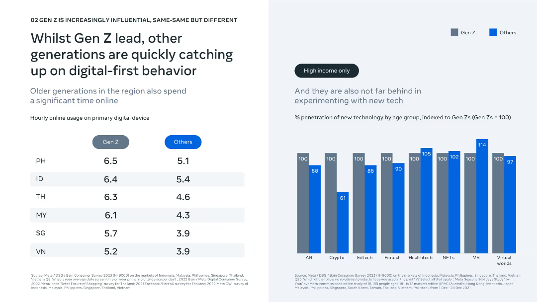
Dual-column layout showing device usage and tech adoption; clean bar and comparison chart visuals.
Technology and Digital Transformation
Technology & Software
The slide shows Gen Z leads in online engagement and tech adoption, but older generations are rapidly catching up, especially in high-income segments. Charts show hourly device usage and penetration of new tech by generation.
digital behavior, online usage, Gen Z, technology adoption, fintech, AR, VR, generational comparison, screen time, innovation trends
Mixed Chart
Bain
Saved
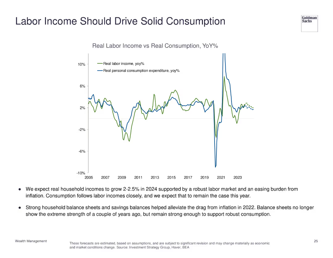
The slide features a line chart comparing real labor income vs. real personal consumption expenditure from 2005 to 2023, with annotations for key trends.
Market Analysis and Trends
Financial Services
This slide examines the relationship between labor income and consumption, predicting robust household income growth and solid consumption.
labor income, personal consumption, economic analysis, household income, consumption trends
Mixed Chart
Goldman Sachs
Saved
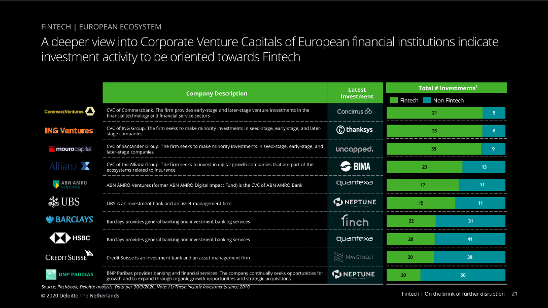
The slide shows a table with company descriptions, latest investments, and total number of investments divided into fintech and non-fintech categories. Visual complexity is moderate, with a clear color scheme and organized data presentation.
Investment Analysis
Financial Services
This slide provides insights into the venture capital investments by European financial institutions, focusing on the fintech sector. It compares the number of fintech versus non-fintech investments made by each institution.
Venture capital, investments, fintech, financial institutions, Europe
Mixed Chart
Deloitte
Saved
This slide contains a comparative table with two columns, comparing grain and cement supply chains with metrics such as size, growth, and supply chain costs.
Market Analysis and Trends
Agriculture & Food Production
The slide compares the grain and cement supply chains based on various metrics to show why they were selected for review, highlighting key differences.
Grain, Cement, Supply Chain, Comparison, Metrics
Multiple Chart
LEK
Saved
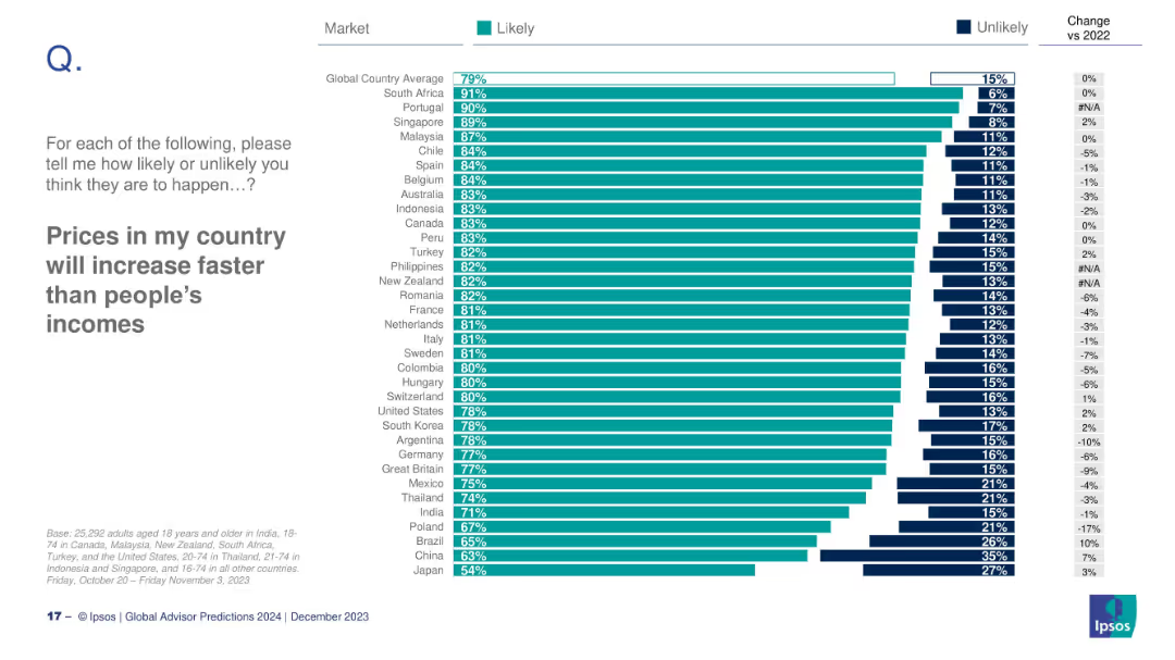
Country-level bar chart on likelihood of price growth outpacing income; includes % change vs 2022.
Financial Performance
Professional Services
This slide shows country-level expectations of price increases exceeding income growth. South Africa (91%) and Portugal (90%) are most concerned; Japan is lowest at 54%.
prices, income, inflation, global ranking, Ipsos, 2024 expectations
Mixed Chart
IPSOS
Saved
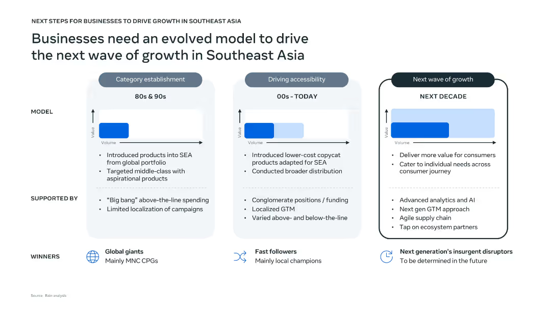
Three-panel vertical layout comparing historical, current, and future business models with text, arrows, and value-volume graphs. Clean design with light blue and white background tones, icons for winners, and dotted line dividers.
Strategic Planning
Professional Services
The slide outlines the evolution of business models in Southeast Asia from the 80s to the projected next decade. It highlights key characteristics, support structures, and market winners for each phase. The upcoming phase emphasizes AI, agile supply chains, and individual consumer targeting to drive future growth.
Southeast Asia, business growth, evolution model, AI, localization, consumer value, strategy
Single Chart
Bain
Saved
The slide features a column chart illustrating the energy potential of different feedstock types for the year 2060. The chart is color-coded, with each type of feedstock represented in different shades of purple. The data ranges are indicated above each column.
Market Analysis and Trends
Energy & Utilities
This slide highlights the two main sources of biomass supply by 2060, namely agricultural residues and energy crops, showcasing their potential energy contributions.
biomass supply, energy potential, agricultural residues, energy crops, 2060, feedstock, theoretical, technical, sustainable, energy
Single Chart
Kearney
Saved
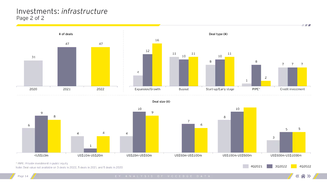
Column charts showing the number of deals, deal types, and deal sizes in the infrastructure sector for 2020-2022.
Market Analysis and Trends
Real Estate & Construction
Continued analysis of investment types, sizes, and segments within the infrastructure sector.
infrastructure, deals, deal types, deal sizes, analysis
Multiple Chart
EY
Saved
This slide includes a series of heatmaps detailing credit risk indicators and distressed company percentages across various sectors.
Risk Assessment and Management
Financial Services
Presents credit risk data and company distress levels across multiple sectors, providing insights into the economic impact and risk assessment by sector.
credit risk, sectors, distress levels, economic impact, heatmap
Table
BCG
Saved
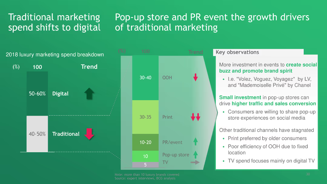
The slide features a bar chart comparing traditional and digital marketing spend in the luxury sector. It also discusses the growing impact of pop-up stores and PR events in traditional marketing strategies.
Technology and Digital Transformation
Media & Entertainment
The slide indicates a significant shift from traditional to digital marketing spend in the luxury industry, with pop-up stores and PR events being the main growth drivers for traditional marketing channels.
traditional marketing, digital marketing, pop-up stores, PR events, luxury marketing
Multiple Chart
BCG
Saved
The slide contains two bar charts: one depicting top sectors by investment value and the other by number of deals. It uses a color scheme to differentiate data from different months, making it easy to compare sector performance across different time periods.
Market Analysis and Trends
Financial Services
This slide highlights the distribution of PE/VC investments across various sectors by both value and number of deals. It provides a clear comparison of sector-wise investment trends, useful for identifying high-performing sectors and strategic planning.
PE/VC, sectors, investment value, number of deals, sector performance
Multiple Chart
EY
Saved
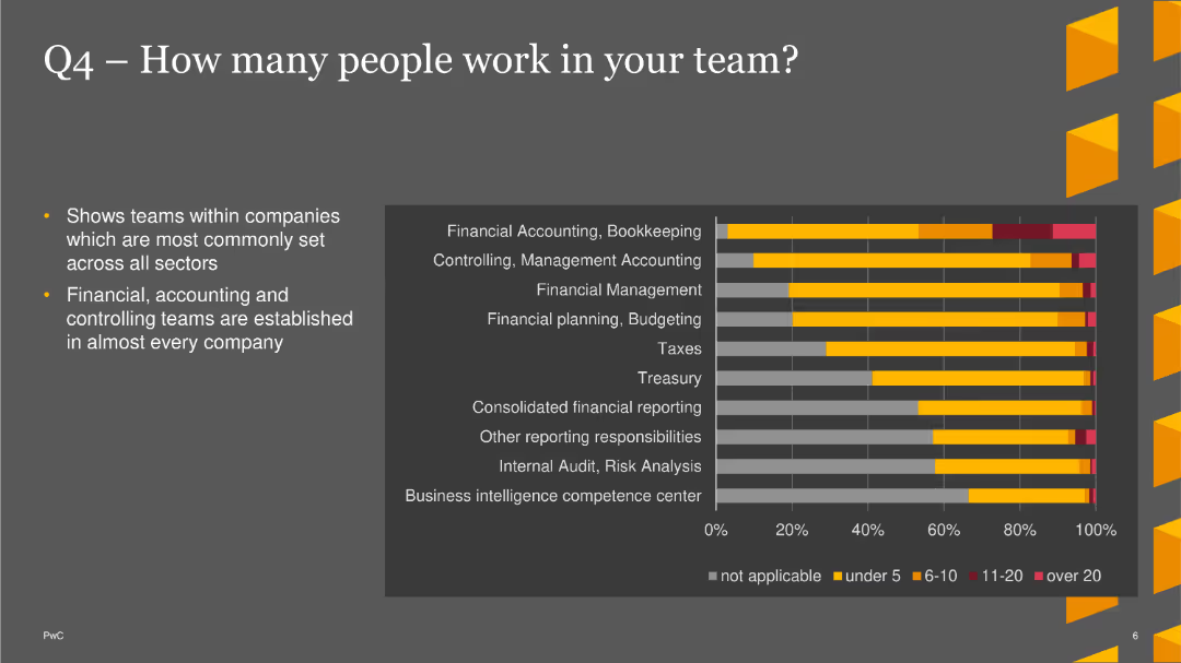
The slide features a bar chart showing the number of people in different teams across various sectors, highlighting common team sizes.
Market Analysis and Trends
Financial Services
This slide shows that financial, accounting, and controlling teams are common across companies, with detailed distribution of team sizes.
Team Size, Financial, Accounting, Bar Chart, PwC, Survey, 2022
Mixed Chart
PwC/Strategy&
Saved
The slide features two column charts. The left chart shows European real estate transaction volumes in EUR billions from 1Q13 to 1Q24. The right chart breaks down transaction volumes by property type from 1Q07 to 4Q23.
Market Analysis and Trends
Real Estate & Construction
This slide provides an overview of European real estate transaction volumes over time and by property type, offering insights into the market's performance and investment distribution across different property sectors.
European real estate, transaction volumes, property types, market performance, investment trends
Multiple Chart
JP Morgan
Saved
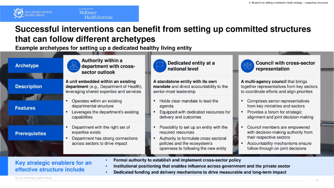
Matrix layout with three archetype models shown in adjacent columns. Each column includes description, features, and prerequisites. Icons and bold headers support structure.
Organizational Structure and Change
Government & Public Sector
Outlines three governance archetypes to support healthy living: departmental authority, national entity, and cross-sector council. It emphasizes structural roles, prerequisites, and institutional mandates to ensure effective implementation and accountability.
governance, cross-sector, archetypes, department, council
Table
McKinsey
Saved
This slide contains a text description and a column chart. The chart shows the average number of FTEs serving different functions within family offices in the APAC region.
Human Resources and Talent Management
Financial Services
The slide details the average number of full-time employees (FTEs) in different functions such as finance, tax, legal, investments, support, and technology within APAC family offices.
employment, FTE, functions, family offices, APAC
Mixed Chart
EY
Saved
Contains several column charts displaying the likelihood of cost programs, ambition levels, and success rates, with specific focus on the Nordic regions compared to others.
Market Analysis and Trends
Professional Services
The slide provides statistical data on the likelihood, ambition, and success rates of cost reduction programs globally, emphasizing lower initiation but higher ambition and failure rates in Nordic countries, compared to other regions.
Cost Reduction, Nordic, Ambition, Success Rates, Global Comparison
Multiple Chart
Deloitte
Saved
Visuals include bar charts detailing investments in built environment and solar/wind energy with corresponding icons and project examples.
Investment Analysis
Environmental Services & Sustainability
Analyzes infrastructure fund investments, emphasizing built environment and renewable energy sectors.
infrastructure, investment, built environment, renewable energy
Mixed Chart
Bain
Saved
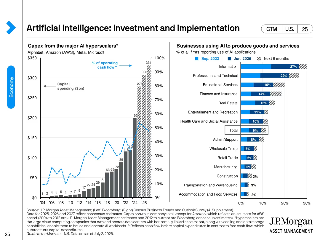
Split design. Left: bar and line chart showing capex by major AI hyperscalers from 2004 to projected 2026. Right: bar chart ranking industry AI adoption rates as of June 2025 and future intent.
Technology and Digital Transformation
Artificial Intelligence
Shows the surge in AI investment by major hyperscalers like AWS, Microsoft, and Alphabet. It also identifies sectors with highest AI adoption—led by Information and Professional Services—and expectations for broader deployment in the next 6 months.
AI investment, hyperscalers, technology adoption, AI implementation, industry adoption, digital transformation, capex, cloud
Multiple Chart
JP Morgan
Saved
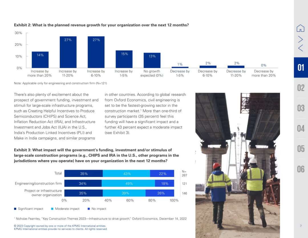
Dual-chart slide with bar graphs and image of construction workers; text explains implications of stimulus programs
Investment Analysis
Real Estate & Construction
Details planned revenue growth and anticipated impact of government infrastructure programs like CHIPS and IRA. Bar charts show varying growth expectations and perceived impact by firm type.
revenue forecast, stimulus impact, infrastructure funding, CHIPS Act, IRA, construction growth, investment outlook
Multiple Chart
KPMG
Saved
A bar extends across the slide, segmented into various client categories with associated market sizes and wealth management share, presented in a clear, hierarchical manner. The design is simple with a blue color scheme.
Financial Performance
Financial Services
Details the firm's market approach for different client segments across the wealth spectrum, from ultra-high net worth to mass affluent, indicating potential for market expansion.
Wealth Spectrum, Client Segmentation, Market Share
Table
Goldman Sachs
Saved
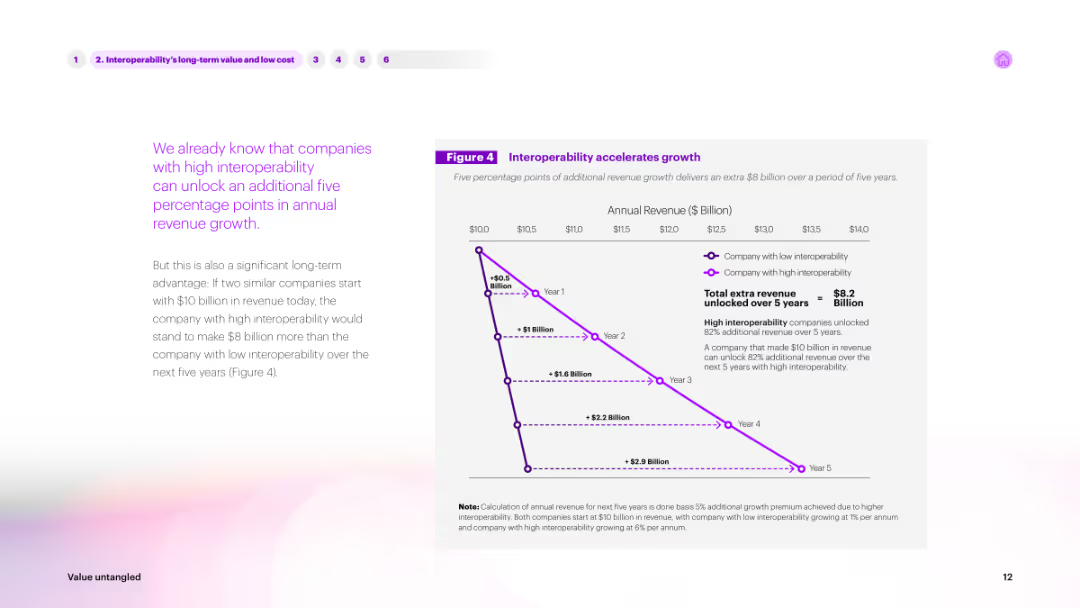
The slide features text on the left and a line graph on the right. The graph shows annual revenue growth over five years for companies with high vs. low interoperability, with a purple line indicating high interoperability advantages.
Market Analysis and Trends
Technology & Software
Describes the long-term value of interoperability. The line graph illustrates how companies with high interoperability can unlock significant revenue growth over five years, making a compelling case for investing in interoperable solutions.
interoperability, long-term value, revenue, growth, trends
Mixed Chart
Accenture
Saved
Previous
Next
If nothing, comes up, please save your slides first
Create a FREE account to continue browsing
Receive Instant Access to 1,000+ slides from companies like McKinsey, Google, and Goldman Sachs
First Name
Last Name
Email
Password
I agree to all
Terms & Privacy Policy
Thank you! Your submission has been received!
Oops! Something went wrong while submitting the form.
Have an account?
Sign in
Column Chart
Heatmap
Chevron
Org Chart
Infographic
Callouts
Timeline
List
Graphic
Picture
Process Flow
Diagram
Paragraph
Map
Table
Framework
Subtitle
Takeaway Box
Icon
Other Chart
Radar Chart
Waterfall Chart
Mekko Chart
Pie Chart
Scatter Plot
Line Chart
Bar chart
Bullet points